Welcome to the Archives of The Paul Rudolph Institute for Modern Architecture. The purpose of this online collection is to function as a tool for scholars, students, architects, preservationists, journalists and other interested parties. The archive consists of photographs, slides, articles and publications from Rudolph’s lifetime; physical drawings and models; personal photos and memorabilia; and contemporary photographs and articles.
Some of the materials are in the public domain, some are offered under Creative Commons, and some are owned by others, including the Paul Rudolph Estate. Please speak with a representative of The Paul Rudolph Institute for Modern Architecture before using any drawings or photos in the Archives. In all cases, the researcher shall determine how to appropriately publish or otherwise distribute the materials found in this collection, while maintaining appropriate protection of the applicable intellectual property rights.
In his will, Paul Rudolph gave his Architectural Archives (including drawings, plans, renderings, blueprints, models and other materials prepared in connection with his professional practice of architecture) to the Library of Congress Trust Fund following his death in 1997. A Stipulation of Settlement, signed on June 6, 2001 between the Paul Rudolph Estate and the Library of Congress Trust Fund, resulted in the transfer of those items to the Library of Congress among the Architectural Archives, that the Library of Congress determined suitable for its collections. The intellectual property rights of items transferred to the Library of Congress are in the public domain. The usage of the Paul M. Rudolph Archive at the Library of Congress and any intellectual property rights are governed by the Library of Congress Rights and Permissions.
However, the Library of Congress has not received the entirety of the Paul Rudolph architectural works, and therefore ownership and intellectual property rights of any materials that were not selected by the Library of Congress may not be in the public domain and may belong to the Paul Rudolph Estate.
LOCATION
Address: 300 Beach Road
City: Kallang, Central Region
State:
Zip Code: 199555
Nation: Singapore
STATUS
Type: Office
Status: Built; Partially Demolished
TECHNICAL DATA
Date(s): 1981-1994
Site Area:
Floor Area:
Height: 590.55 ft. (tower); 133.95 ft. (podium)
Floors (Above Ground): 42 (tower); 12 (podium)
Building Cost: S$248.1 million (1994)
PROFESSIONAL TEAM
Client: Hong Fok Corp. Ltd.
Architect: Paul Rudolph
Associate Architect: Architects 61 Pte., Ltd.
Interior Design: Richards Basmaijan Limited
Space Planning: Design Phase
Landscape: BCP Far East
Structural: Steen Consultants
MEP: Ewbank Preece Engineers
Lighting: H M Brandston & Partners
Exterior Facade Maintenance: Lerch; Bates and Associates
Acoustic: CCW Acoustic
Graphics: Studio 3 Graphic
QS/PM: Rider Hunt Levett & Bailey
Marketing: Richard Ellis
SUPPLIERS
Contractor: Maincon
Subcontractor(s):
Office and Shopping Complex (The Concourse)
The project is also known as Hong Fok Centre
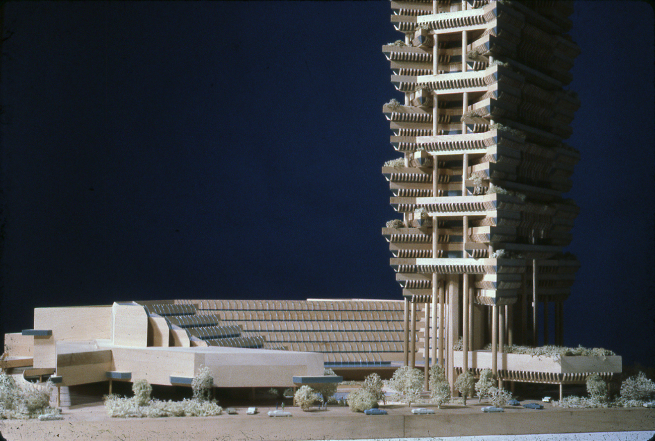
The project (then the third scheme also known as Beach Road II) as described in a January, 1980 text written by Paul Rudolph:
General Description
It is proposed that Land Parcel #8 and #9 at Beach Road be developed as a single project. A shopping area in essentially a “U” shape is proposed at the western portion of the site with a single combined apartment-office tower centered on Jalan Sultan at the eastern side of the site. The “U” of the shopping area conforms to the irregular site, as well as recognizing desired setbacks for better viewing of Merlin Plaza and to form forecourts to entries of the office and residential tower. Defined unloading areas for the offices, apartments, and shopping are provided. A one story parking garage in the basement serves all facilities. Three office floors are superimposed on the shopping, with the remainder of the shopping in a tower with its superimposed apartment units.
The exterior pedestrian circulation is arranged so that there are exterior shops at Nicoll Highway and Beach Road. One can walk entirely on the site through the center of the project from Beach Road to Nicoll Highway. Entrances to the shopping as well as separate entrance lobbies to the office complex and apartments are provided. In addition, automobile unloading and loading is related to each facility. There is a second level pedestrian bridge over Nicoll Highway to the Marina Centre which leads directly to the second floors of the shopping and office complexes, as well as to the pedestrian circulation. A second bridge at the northeast corner connects to the northern side of Beach Road to the second floor circulation system of the proposed complex. Elevators and escalators connect the various levels of the shopping center.
The scale of the project makes it desirable to have one multi-functional taller tower, rather than two towers (one for the offices and one for the apartments). The very large open space between Merlin Plaza and St. John’s Headquarters and the height of the surrounding towers suggests that the singlke talelr tower would be more satisfactory. Two smaller towers would appear out of scale for this site.
Shopping
The “U” shaped shopping embraces a centralized, glass-roofed atrium. Shops on fours levels step back from the first floor to form a bowl of space. Each setback forms the circulation for the shops beyond. This space becomes a “see and be seen” focal point where informal entrainment is encouraged. The ampitheater-like quality of the space would encourage more formal entertainments, as well.
The pedestrian circulation is arranged so that there are shops on the exterior at the north, south and east facades, as well as lining all walls of the atrium. One can enter the shopping from several points, entering an arcade of shops which leads directly to the central atrium. The clarity of interior circulation is emphasized by placing escalators within each arcade.
A two level restaurant is proposed at the roof of the atrium, the lower level looking directly over and down into the atrium, the upper level looking over a roof terrace to the Pacific beyond.
Offices
The offices above the shopping would be most suitable for tenants who require relatively small area. The offices in the tower would be most suitable for tenants requiring large areas of space. The fenestration of the office is proposed as follows: floor to ceiling glass is placed to focus on the views, but a continuous horizontal glass band at the eye level allows direct viewing when sitting. This arrangement allows a decrease in the air-conditioning load for t he offices. Further individuality of offices could be attained by developing the roof terraces, thereby turning these offices into “penthouses”.
The “low rise offices and high rise offices” are interconnected and are reached by elevators at the northwest corner of the complex, as well as through a lobby and elevators in the tower. They are, of course, separated from the lobby and elevators of the apartments, but are interconnected with the second floor circulation, which connects with the pedestrian bridges to the north and south.
Apartments
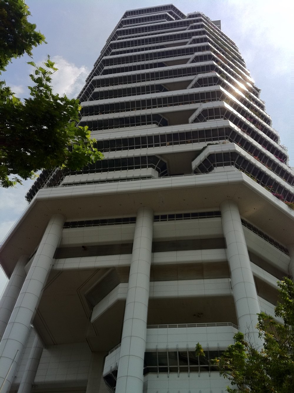
The apartments are superimposed above the offices so that they have the best views and are located at the quietest portion of the development. All of the two and three bedroom apartments are exposed on three sides with service balconies and living terraces. The scale of the apartments is broken down to indicate the domesticity of this portion of the complex. Roof terraces are developed at the top of the building to allow as much variety in the apartment types as possible. The tower is terminated by omitting one apartment unit at each two floors, so that a spiral is formed at the top. The distinctive silhouette of the building is a natural outgrowth of the varying functions and variety of the apartments introduced.
The project (then known as Beach Road II) as described in a January, 1981 text written by Paul Rudolph:
The building is the opposite of the “loft type” office tower. It is intended that each floor have its own character and that this character is made manifest on the outside. It is intended that the floors are clearly stated from the exterior, in order to give the building scale. In other words, it is the opposite of the loft type building sheathed in glass with no demarcation of floors whatsoever.
To achieve this greater sense of human occupancy the building is divided into four separate floors, which create atriums and terraces. These four floors are repeated in order to simplify the construction.
The three floor high atriums are formed by the enclosed office spaces themselves. The building is essentially an X in plan. The atriums are formed on the long side by the long legs of the X’s and terraces are formed by the short legs of the X’s. Two cores minimize the corridors and distances from elevator to offices. It is assumed that there would be sufficient number of single floor tenants to occupy the “atrium floors”.
The X form has been adopted in plan to minimize the number of interior office spaces and allow natural light to penetrate through the atriums or terraces to the innermost portions of the building. The use of natural light to light interior office space would materially minimize the cost of electricity, which accounts for roughly half of the operating cost for office buildings.
It is intended that the various office floors produce individual offices which look out through, or down onto terraces and balconies. The utilization of these areas is particularly appropriate to Singapore because of its climate, which allows planting to be introduced into such areas. The distant view is enhanced by looking through planting, affording a juxtaposition of the close at hand to the distant.
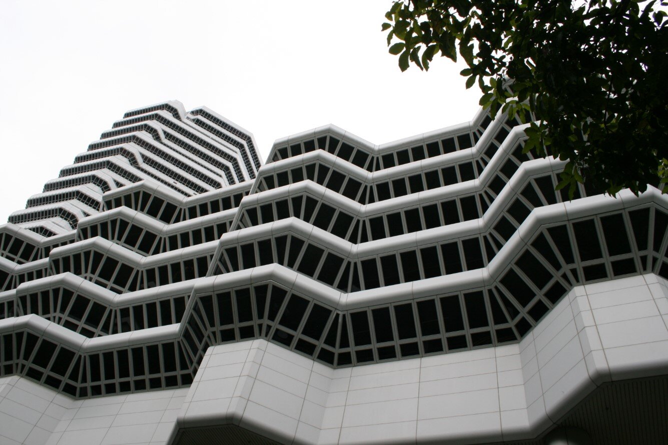
The elaboration of the floors in contrast to the undue emphasis on the vertical is achieved by allowing each floor to take its own configuration. The cantilevered elements, especially at the corners of the building, give the structure an aspect which is reminiscent of the traditional pagoda. In this way the building is intended to belong to its time and place and be the opposite of the “universal” building.
The windows are sloping, except where they are related directly to terraces or the atrium. This allows the glass to be shaded, since each of the repeated four floors is lower than the one immediately above it. The protection from the sun is augmented by vertical sunshades which are introduced also into the larger scaled atriums. The atriums are shaded more densely at their tops by means of the sunshades than they are at the bottoms, therefore suggesting a kind of “tree”.
The scale of the shopping center is broken down by revealing the floor heights and by introducing a fountain over the entire inner roofs of the building. The fountain plays the same scale-giving role for the low building that the sunshades serve in the higher building.
The shopping center is arranged around a plaza-reflecting pool. The plaza is essentially a “pool of space” in the sense that each floor is set back from the lower one. The entire glass roof for the circulation-atrium areas of the shopping center are intended to be heat resistant glass. The air-conditioning would be assisted by allowing flowing water to run continuously over the surface of the roofs and dropping in fountain-like form to the roof below. The water is collected in the reflecting pool and recirculated. The effect on the inside would be of natural light shining through the flowing water onto the glass roof and hence onto the building itself. The intention is to give a unique sense of place for the whole structure. The sound of the water plays an important part in isolating the “place” from the surrounding traffic.
The office building is oriented in a North-South direction and is arranged so that it would afford a constantly changing view from the two bridges which bound it, as well as the two streets. It favors none of these directions, but relates itself to the light. It, therefore, becomes a turning point for the circulation of travel. Its design is intended to afford constantly changing views of the building itself.
The building is designed as reinforced concrete with sheathing of tile in the traditional manner in Singapore. It is hoped that the surface paving would be very colorful and that the views from the building down onto its site form a “fifth facade”.
Project construction is completed on February 5, 1994
The podium is partially demolished in April, 2009 for the construction of adjacent residential towers
“The first five or six stories seem to have a certain organic quality, but then the tower seems to have been jammed down on top. My question is, why couldn’t you have continued the organic development upward, making a wall building rather than a tower? There is an uneasy relationship between the two parts, and the second one doesn’t seem finished. It could have finished quite naturally in a slab rather than in a tower.”
“In this building Paul aspires to do something that almost everyone who has ever designed a tall building has tried to do in one way or another: to transform an object into a space at the ground. This is a noble effort to transform the building as an object into a building as a space.”
“I don’t think, Paul, that we can discuss it as architecture in the same sense that we’ve been discussing other buildings here and fighting about our historical references. We can’t use the same terms of reference because you are sui generis. I don’t know any other architect in this country who is so off by himself and so successful.”
“It seems that he’s been doing this building for a long time. It has nothing to do with Singapore. It has to do with Paul Rudolph. Some of the issues that he has been concerned with over the years he handles very beautifully in this building. But I have real problems with a number of things. For example, I hate walking under the belly of buildings, especially ones that rise sixty to a hundred floors in the air. Those too tall columns, those stilts, are very disturbing. Yet the tower is very beautiful. Paul, your relentless pursuit of Mr. Wright is something I really applaud. Like much of Wright’s work, this is a kind of “city of tomorrow” building - like the ones we all saw when we were growing up - and it will actually be quite beautiful. I am interested in you as a singular architectural personality. You could build this building anywhere you want to because you’ve pursued it for so long.”
“Just as I criticized Harry earlier for being too minimalist, I think Paul’s buildings are excessive. On any of those residential floors, it is impossible to judge when one is finally home. Everything is an episode. I would have a very hard time finding the front door. It’s too much. The interest, as you say, is in the first six floors. However I can’t tell the north from the south anymore. I can’t tell faceted corner from faceted corner from faceted corner. It just keeps going. I miss the tension of the tower at the end of the street, and of one street versus the other street. They can’t all be equal. When the whole thing is episodic, it becomes a homogeneous world for me. All this is a matter of taste, of course, and I think this building is very good Rudolph.”
DRAWINGS - Design Drawings / Renderings
DRAWINGS - Construction Drawings
DRAWINGS - Shop Drawings
PHOTOS - Project Model
PHOTOS - During Construction
PHOTOS - Completed Project
PHOTOS - Current Conditions
LINKS FOR MORE INFORMATION
The Concourse Website
The Concourse Tower on Emporis
The Concourse Podium on Emporis
RELATED DOWNLOADS
PROJECT BIBLIOGRAPHY
David Frankel, editor. Envisioning Architecture: Drawings from the Museum of Modern Art. The Museum of Modern Art, 2002.
Jacquelin Robertson. The Charlottesville Tapes. Rizzoli, 1985.
James P. Warfield. Paul Rudolph: 1983-1984 Receipient of the Plym Distinguished Professorship. School of Architecture, University of Illinois at Urbana-Champaign, 1983.
Paul Rudolph. “Beach Road II.” Avant Garde 3, Winter 1990.
Paul Rudolph: Explorations in Modern Architecture, 1976-1993. National Institute for Architectural Education, 1993.
Robert Bruegmann and Mildred F. Schmertz. Paul Rudolph: Dreams + Details. Steelcase Design Partnership, 1989.
Robert Powell, et al. Singapore: Architecture of a Global City. Archipelago Press, 2000.
Robert Powell and Patrick Bingham-Hall. Singapore Architecture. Periplus, 2004.
Roberto De Alba. Paul Rudolph: The Late Work. Princeton Architectural Press, 2003.
Tony Monk. The Art and Architecture of Paul Rudolph. John Wiley & Sons Ltd., 1999.


