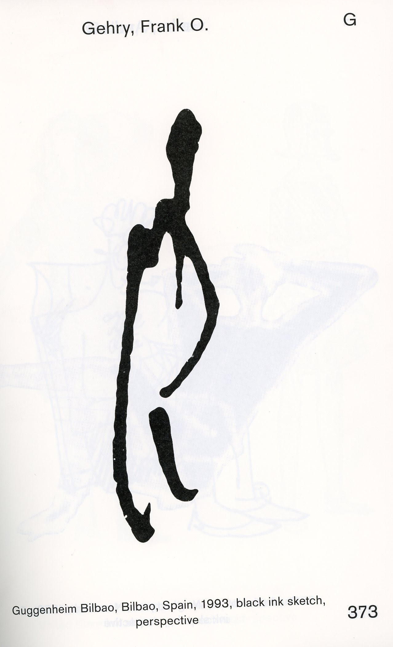
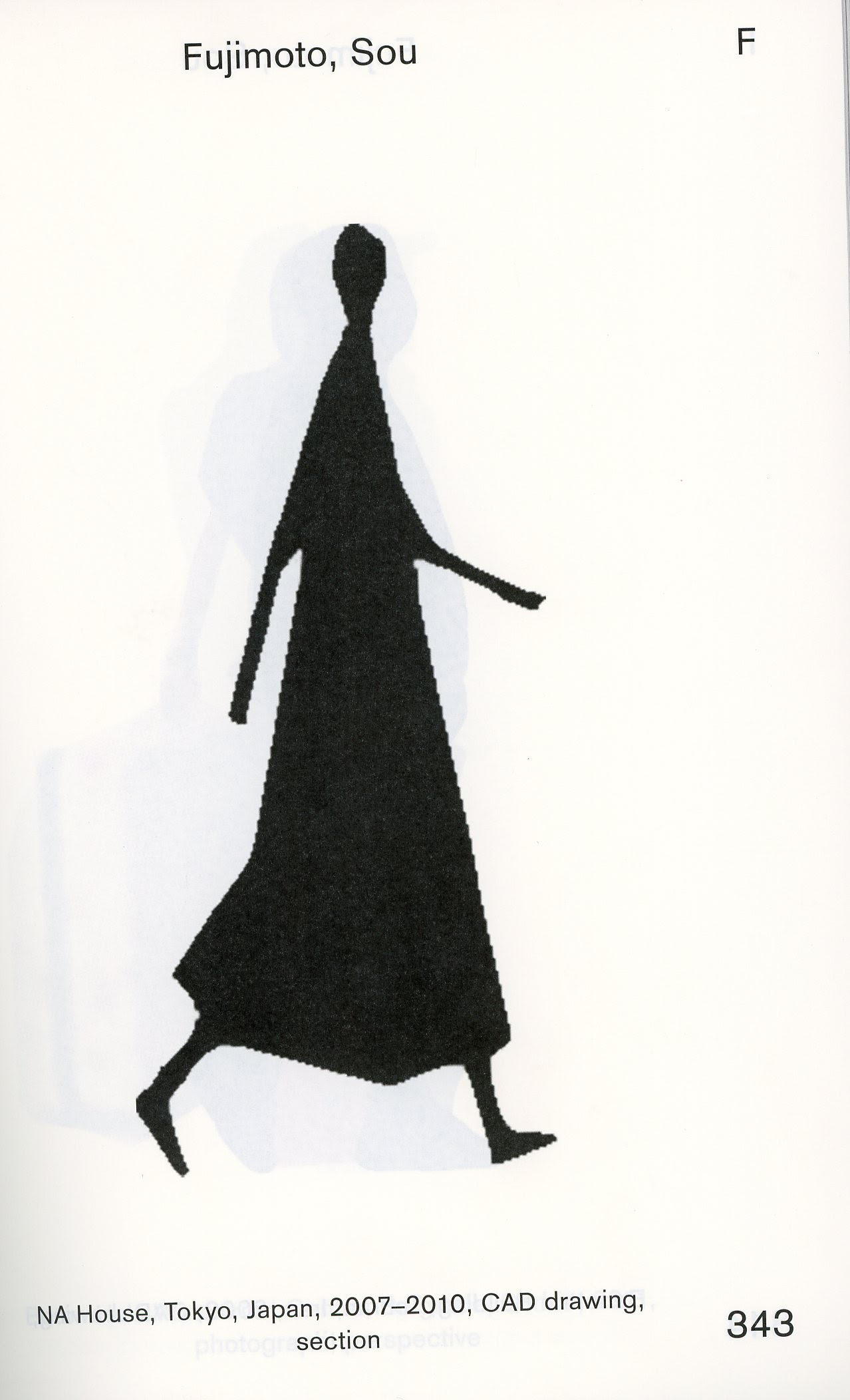
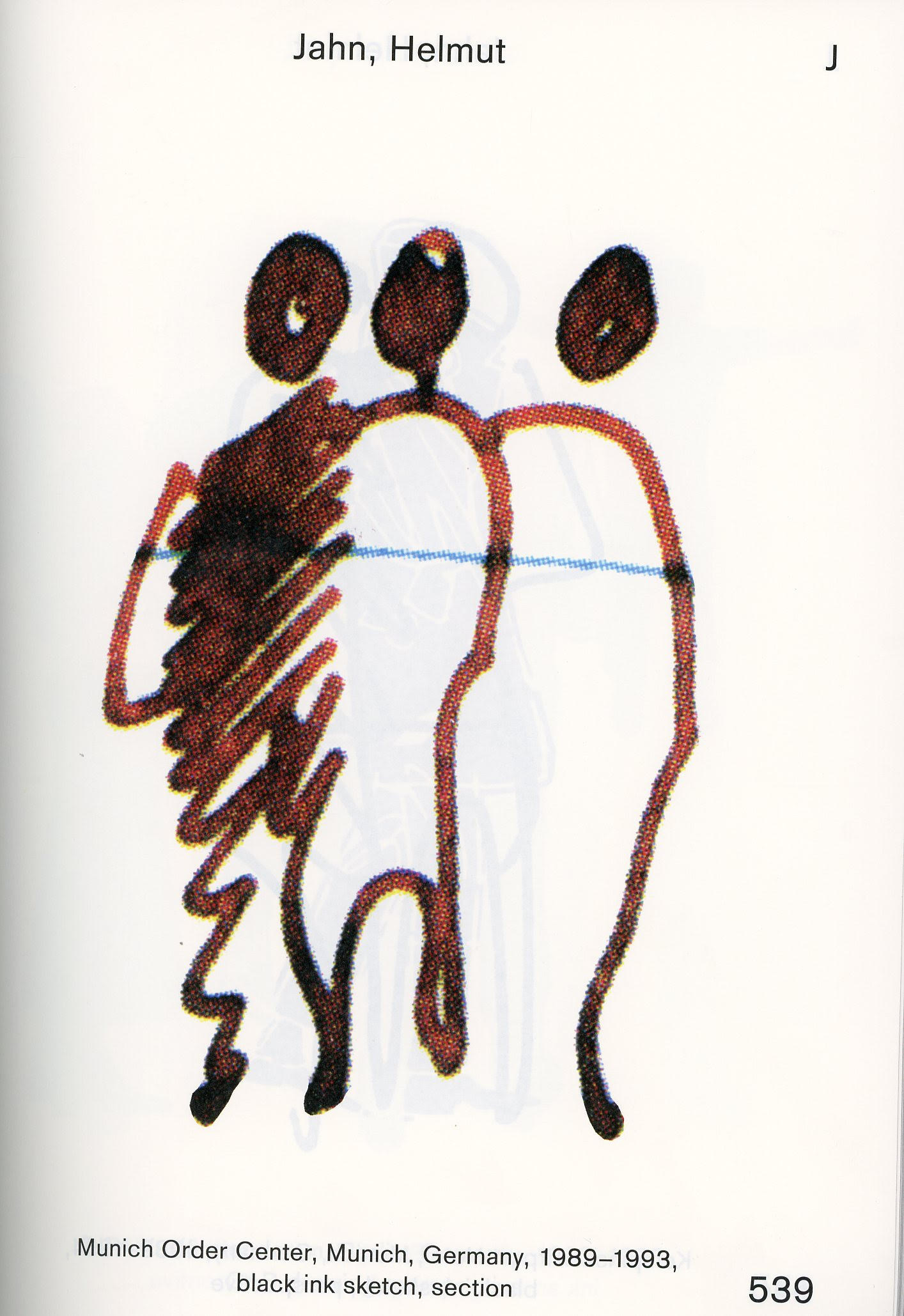
Three of the many scale figures which are in the book under review. Left-to-right are examples by Frank Gehry, Sou Fujimoto, and Helmut Jahn. The images shown here have been enlarged from the way that they were originally used by the architects—but the book enlarges them even further, each one covering an entire page.
A REVIEW OF:
An Unfinished …
Encyclopedia of …
Scale Figures without …
Architecture
Edited by Michael Meredith, Hilary Sample, and MOS
www.mitpress.mit.edu
Sometimes, when reviewing the work of architecture students, the teacher (the “design crit”) displays their pet peeve: things that make them “go off” in righteous indignation. Such reactions, to the student and outside observers, may seem out-of-proportion to the alleged offense. Even during public design juries (where you’d think that jurors tempers would be tamped) the anger is sometimes given dramatic play. When Paul Rudolph was chair at Yale’s school of architecture (1958-1965) such scenes were notorious (and Rudolph was sometimes one of the perpetrators.) We asked a Yale graduate, from that era, why he thought such displays were allowed. Was it self-indulgence? Immaturity or anger-management issues? Could be something else? The former student’s speculation was quite interesting: He thought that it was to get the student’s attention. He asserted that a lot of students were already coming to the Master’s program quite mature—at least in the sense of already having worked in architecture, been “out in the world”, maybe even having married and started a family. Some might have been veterans. But with that alleged “maturity” was the danger that their approach to design—both how to do it, and the desired end-results—had already ossified: they were already so filled-up with answers that they weren’t open to new questions (much less alternative answers). Those displays of the teachers and jury members’ anger (yes, sometimes verging on the cruel) were a kind of shock therapy to open up the student, to make them really start listening—and thinking.
The one time we were witness to such a scene was when a student showed a design, and the teacher growled with indignation: “How dare you present a drawing that does not include a scale figure?!!?” Scale figures: you know: those little pictures of people (often rather sketchily drawn) that designers sprinkle around their renderings. To tell you the truth, we’d really never thought much about scale figures before the teacher’s outburst. But (true to the former Yale student’s analysis) it got us thinking.
Scale figures can be inserted into an architectural drawing (generally an elevation, perspective, or section) for a range of reasons—often several simultaneously:
Primarily, to give a sense of scale to the proposed design. Without including such figures, the drawings of many designs don’t give a clear indication of their size, whether it be domestic or monumental. [By-the-way: the only other hint of scale, which drawings sometimes give, is if they include stairs (whose risers are presumably sized to allow regular humans to use them, hence giving a notion of the project’s overall size.)]
To explain the design: figures engaging in various activities (corresponding with the programming of the building’s different spaces) help show how the building is supposed to be used, and even how circulation flows.
To put the clients in the picture: It is assumed that, if the person who is commissioning the project is shown drawn within it, that will charm and engage them—making their approval of the design more likely.
To show a relation to the community. Similar to the above: when there are many stakeholders in a project, showing groups of figures—the anticipated participants who are to use the building—is an attempt to engage and bring them into understanding the design (and, hopefully, endorsing it.)
For artistic completion: just as, for example, grand classical buildings are not considered complete unless they include integral sculpture, some architects and renderers would not consider their drawing complete without figures.
To highlight one aspect of the design, or heighten the drama. Schinkel was famous for his superb perspective drawings. Part of their pleasure is noticing some of his figures pointing to an aspect of the building, as though they were exclaiming “Wow, look at this!”
The joy of drawing—and the showing off of one’s virtuosity. We suspect Schinkel partook of that too!
[We confess that, as practicing architects, we’ve tried (or indulged in) all of the above.]
One could make a lively compilation of the different graphic devices which architects have used. One could collect North arrows, scale bars, title blocks, or even styles of hand-drafted lettering. Scale figures are a prime subject to start such a collection—but you don’t have to, for MIT Press has published a truly gigantic collection: more than 1,000 examples, by over 250 different architects. They range from the above-mentioned early-19th century Schinkel (and from architects of even greater vintage) to Saarinen (both Eliel and Eero), from Alberti to Ant Farm, from Soane to Studio Gang—yes, a whole encyclopedia’s worth, from Aalto to Zumthor.
This is a bomb of a book: it’s as big and hefty as a giant old “unabridged” dictionary—this is not a volume you’d want to drop on your foot! Organized alphabetically by architect, each figure’s source and date is labeled, so one has at least some sense of what era and project to which it was applied.

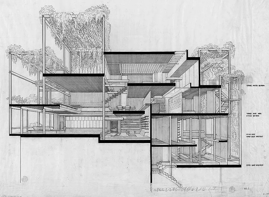
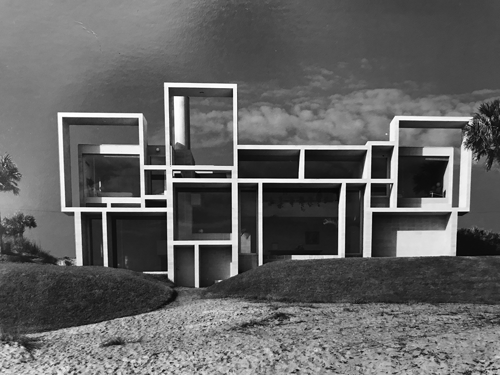
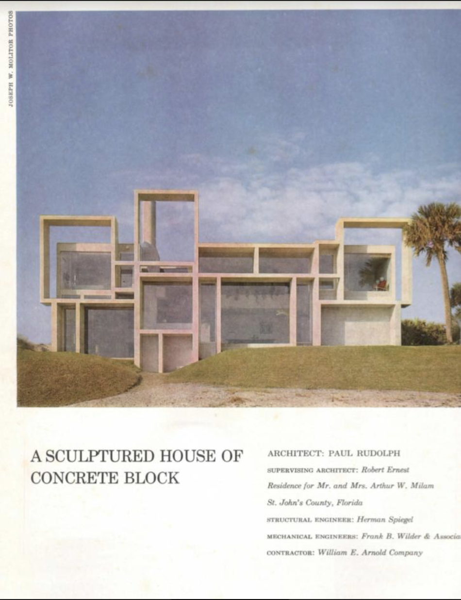
The book is huge and wide-ranging—a clearly done out of love of the topic—and the foot-long architect’s scale (shown here with the book) will give you a sense of its scale. We’ve opened it to a spread on which two more of Paul Rudolph’s figures are shown.
But what’s both illuminating and distorting is the size of the scale figures, as reproduced in the book: each is shown big enough to fill a full page. Most such figures would have hardly reached an inch tall—or, more likely, half that—on the original drawing. Moreover, they’d be seen at a fraction of even that size if the drawing was reproduced in a magazine or book. But, as presented in this volume, we’re seeing them at 500-or-600-or-800 percent larger than as first drawn (or maybe more.) As you can imagine, the effect is dramatic: we get to see these fascinating figures with lively vividness and detailed clarity.
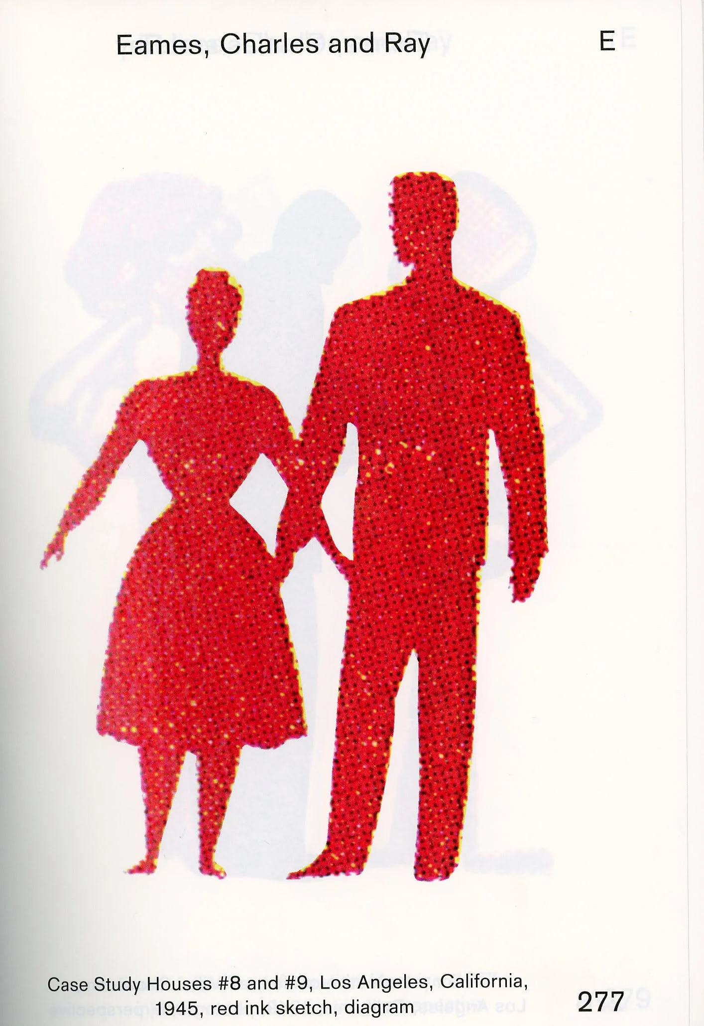
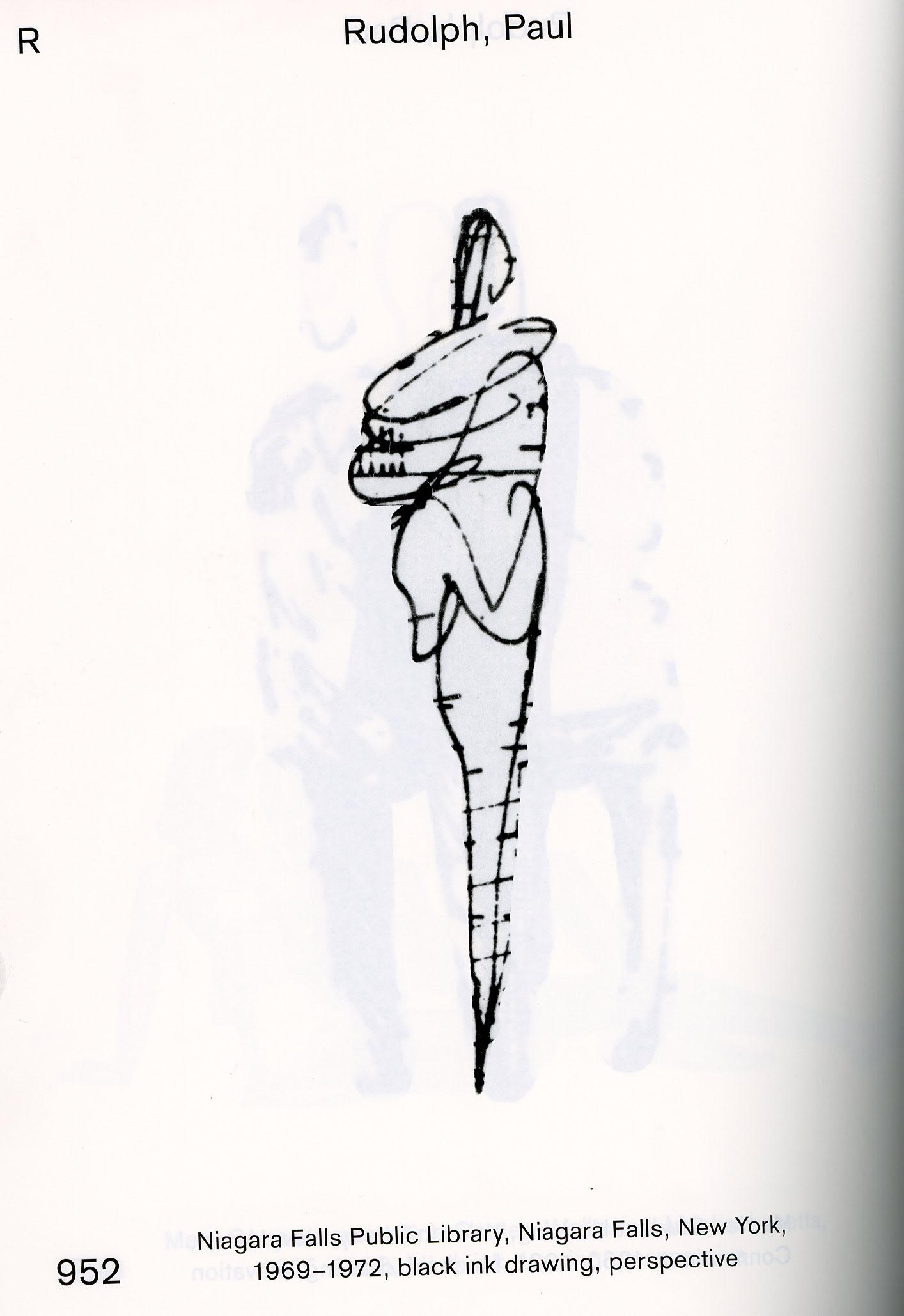
Two more examples of scale figures from the book. From left-to-right: Charles and Ray Eames, Paul Rudolph. This an example of one of Rudolph’s famous “squiggle” people (and one of 5 different examples of Rudolph’s figures included in the book.)
But perhaps seeing them this size is a bit problematic: these figures are being viewed at a scale which not even their original architect or renderer ever saw them! Moreover, they are totally isolated from their context: the drawing (and building design) which the figures were to help explain. So, in these vastly enlarged views, the figures might come off as slapdash. But in actual use, they’d be seen to have been carefully chosen, and contextually just-right for the drawing where the figure first resided. Even so, let us consider this a quibble, at least as compared with what’s offered: a vast wealth of examples from across a spectrum of centuries, styles (both architectural and graphic), and practitioners. But wait!—the book offers an additional resource (which would ameliorate even that objection): at the rear, there’s a “Visual Index” where all the figures are brought together, but at a much smaller scale (averaging about 3/4” high). There, one gets to see them not one-per-page, but dozens at a time. This allows for comparison, as well as reinforcing the overall impression that the authors have given us a treasure-trove.
Finally, we want to note the three illuminating texts which set off this amazing collection:
“Architects Draw People” - a brief introduction by authors, which sets out the scope of what they were doing, and some intriguing observations about what they found.
“Fare Buona Figure: Some Remarks on the Scale Figure in Architectural Representation” – by Martino Stierli, the Museum of Modern Art’s Chief Curator of Architecture and Design. As always, Mr. Stierli brings his keen-eye and open intelligence to the topic, delineating the various ways that we might view and interpret the use of scale figures over the centuries.
“Go Figure!” –an essay by Raymund Ryan, in which he vividly proclaims “The Figure is Back”—which he then backs-up with wittily sharp comments on some of the most famous users of scale figures.
This fascinating book is available through Amazon; and through the publisher, MIT Press.


![Lippo [Bond] Centre in Hong Kong. Photo: Craddocktm](https://images.squarespace-cdn.com/content/v1/5a75ee0949fc2bc37b3ffb97/1550097166525-5P6STAIQIGNEXYQ5S4DW/600px-Lippo_centre.jpg)