Edersheim Residence

Paul Rudolph's 1982 Edersheim Residence is on the market

The Edersheim Residence in Larchmont, New York in 2020. Photograph by Filip Michalowski of CT Plans, courtesy Houlihan Lawrence

The Edersheim Residence in Larchmont, New York in 2020. Photograph by Filip Michalowski of CT Plans, courtesy Houlihan Lawrence

Paul Rudolph’s Edersheim Residence at 862 Fenimore Road in Larchmont, New York is for sale.

The original house was constructed in 1958 and owners Maurits and Claire Edersheim hired Rudolph to design alterations to the property in 1982, following his interior renovation of their New York City Apartment on Fifth Avenue in 1970.

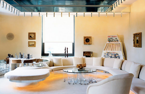
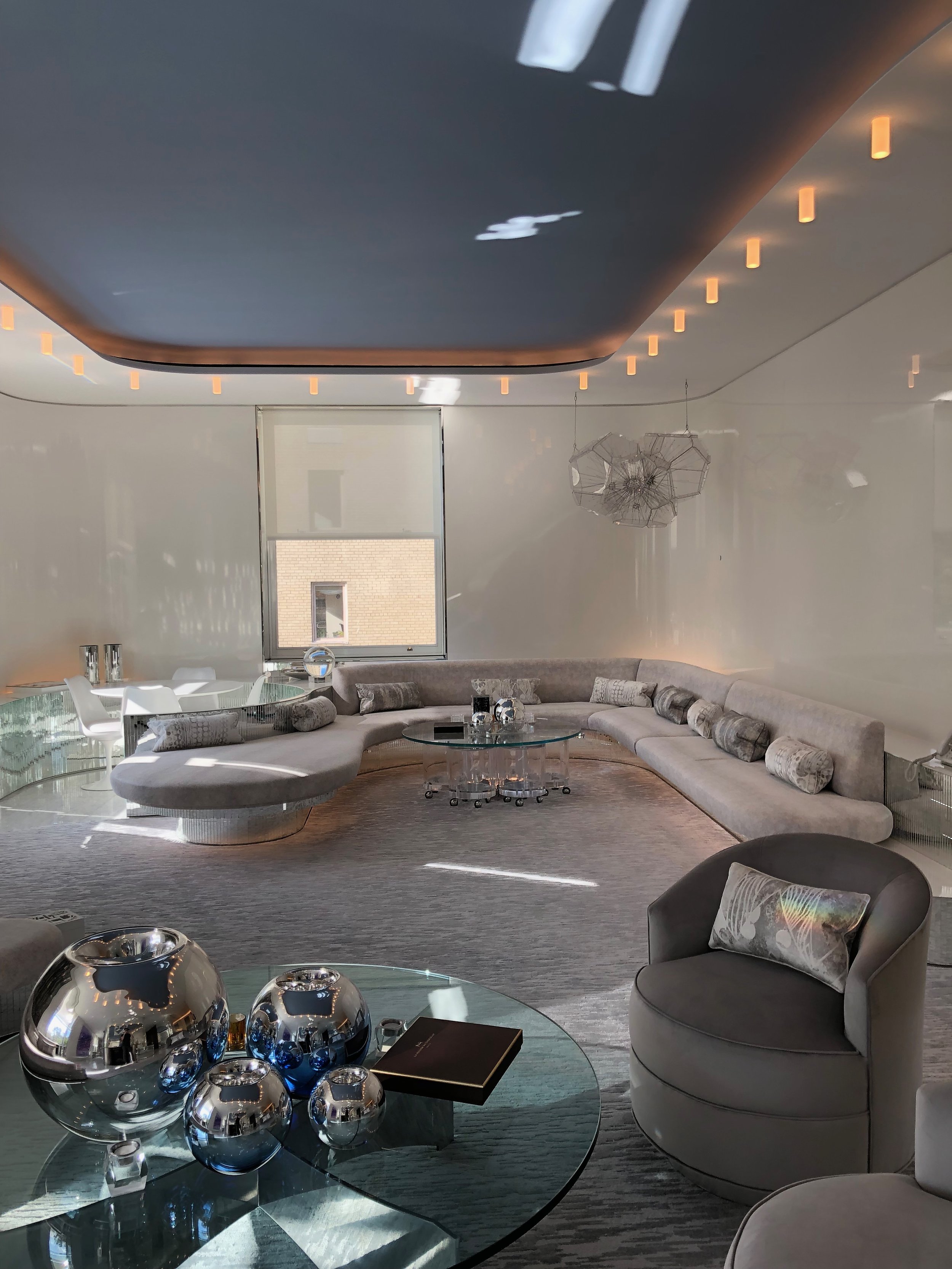
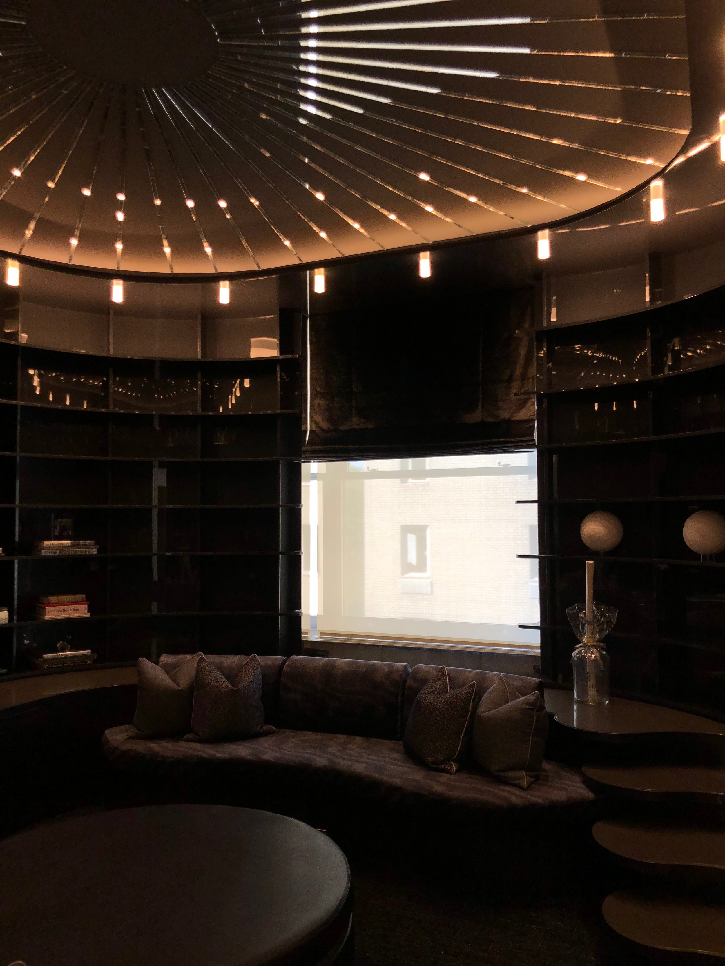
The Edersheim apartment in New York City in 2019. Photos by Ethan Shapiro © The Estate of Paul Rudolph, The Paul Rudolph Heritage Foundation.

The Edersheim apartment in New York City in 2019. Photos by Ethan Shapiro © The Estate of Paul Rudolph, The Paul Rudolph Heritage Foundation.

1970.07-02.04.0005.jpg

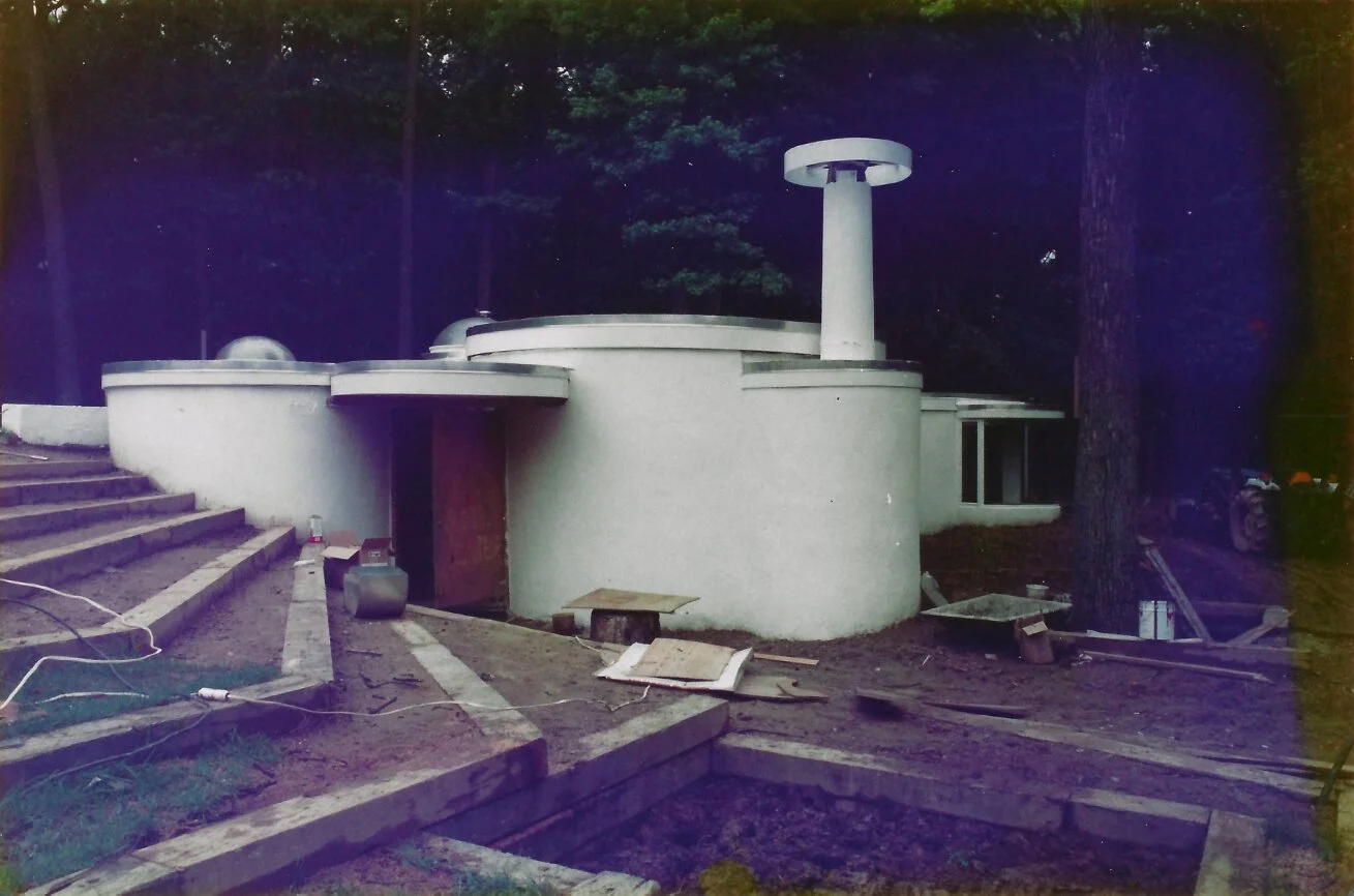
The Edersheims requested Rudolph design alterations and additions to the property again in 1989 and 1991. Original Rudolph designs include a pool/guest house, main residence entry, covered porch, expansive built-ins, skylights, interior lighting and a complete renovation of the main structure.

The Covered Porch under construction. Photo by R.D. Chin from the Archives of The Paul Rudolph Heritage Foundation.

The Covered Porch under construction. Photo by R.D. Chin from the Archives of The Paul Rudolph Heritage Foundation.

The Pool/Guest House under construction. Photo by R.D. Chin from the Archives of The Paul Rudolph Heritage Foundation.

The Pool/Guest House under construction. Photo by R.D. Chin from the Archives of The Paul Rudolph Heritage Foundation.

The Pool/Guest House under construction. Photo by R.D. Chin from the Archives of The Paul Rudolph Heritage Foundation.

The Pool/Guest House under construction. Photo by R.D. Chin from the Archives of The Paul Rudolph Heritage Foundation.

The Edersheims would become some of Rudolph’s most faithful clients, choosing him to design several projects including an office suite for Mr. Edersheim at the Salomon Smith Barney office in New York’s World Trade Center Complex in 1994.

The compound (renovated in 2020) includes the Main Residence, a separate Apartment/Office and a Pool/Guest House. This is a rare opportunity that is perfect for sheltering in place.

Located in Larchmont, NY - just north of New Rochelle and New York City - the home is sited on a 2.49 acre landscaped lot and is listed for $6.4 million USD.

The property includes indoor & outdoor swimming pools, wet/dry sauna, media room, gym, and multiple work spaces. The open flow floor plan features several additions designed by Paul Rudolph. The Master Suite includes a 21 jet tub, steam shower, rain/body showers, dual water closets, towel warmers, vanity/ dressing area and attached closets.

About 10,000 sq feet of outdoor living space includes a 1,000 sq ft screened-in outdoor covered porch with an outdoor kitchen for entertaining.

The residence is located on a unique 2.49 acre private landscaped property in Larchmont and is an easy NYC commute with access to golf, country clubs & the water.

You can learn more about the Edersheim Residence (including more images) at the Paul Rudolph Heritage Foundation’s page for the property’s sale here.

You can also reach out to us at office@paulrudolphheritagefoundation.org for more information.

McMansion Hell's Kate Wagner on Open Plans vs. Walls [And its resonance with Paul Rudolph's spatial archetypes]

The floor plan of Paul Rudolph’s Revere Quality House, used as an example of residential open-space planning in Kate Wagner’s article. The house was built in 1948 in Siesta Key, Florida, and was widely published. © The Estate of Paul Rudolph, The Pa…

The floor plan of Paul Rudolph’s Revere Quality House, used as an example of residential open-space planning in Kate Wagner’s article. The house was built in 1948 in Siesta Key, Florida, and was widely published. © The Estate of Paul Rudolph, The Paul Rudolph Heritage Foundation

KATE WAGNER STRIKES AGAIN

Everyone loves Kate Wagner’s site, McMansion Hell—well, almost everyone, for we can imagine the chagrin of being subject to her clear-eyed assessments of “McMansions” which have saturated the housing market. We’ll skip showing a picture of the house which was the focus of one of her analyses—but here’s a sample text from Kate Wagner and one can get a clear idea of her tone:

“If you combine all of the insipid elements of the other houses: mismatched windows; massive, chaotic rooflines; weird asphalt donut landscaping; pompous entrances, and tacked on masses; you’d get this house. The more one looks at this house the more upsetting it becomes . . . . What sends this one over the top is its surroundings: lush trees and clear skies that have been desecrated in order to build absolute garbage.”

More—much more—can be seen at her site, as well as the site’s archives. But it’s important to know that her work is not just about take-downs of dimwitted design and comatose construction. Ms. Wagner has delved into other design-related topics of significance—like land use, urbanism, and the history of architectural styles—and she’s one of the few writers on design to give a fascinating (but accessible) look at the intersection of acoustics and residential design. Nor is her work published only on her own website—Wagner has been a featured writer in Architectural Digest, The Atlantic, Curbed, and other venues.

It is an article by her, on the ever-fascinating CITYLAB website, that has our attention, as it intersects with a aspects of Paul Rudolph’s work and philosophy—and, as noted at the top of this post, a Rudolph house plan was used as one of the article’s illustrations.

“THE CASE FOR ROOMS”

Her post, The Case for Rooms is subtitled: It’s time to end the tyranny of open-concept interior design.

A screen-shot of the opening of “The Case for Rooms”, an article by Kate Wagner on the CITYLAB website. The illustration—showing diverse activities through the house—makes a case for the usefulness of separate rooms.

A screen-shot of the opening of “The Case for Rooms”, an article by Kate Wagner on the CITYLAB website. The illustration—showing diverse activities through the house—makes a case for the usefulness of separate rooms.

She opens by clarifying the definition of her topic:

“Much has been written about the open floor plan: how it came to be, why it is bad (or good), whether it should or shouldn’t be applied to existing housing. The open floor plan as we currently understand it—an entry-kitchen-dining-living combination that avoids any kind of structural separation between uses—is only a few decades old.”

She then gives a history of the [pre-“open concept”] development of separate rooms for different functions and family members—a significant evolution in residential design—and then covers the reasons (historic, social, economic, industrial, and aesthetic) why there has been a departure from such spacial differentiation. That departure is manifest in the open concept arrangement of so many houses and apartments today: where living-dining-cooking spaces meld into each other.
The Revere Quality House, a 1948 design by Paul Rudolph, was widely published—and is used in the article as an illustration of “open concept” home planning which began to permeate residential design in the housing boom after World War II.

While Rudolph’s elevations for the Revere Quality House are not included in the article, it is worth looking at them to see that design’s large expanses of “see-through” areas (at the Porch, Living Room, and Dining Room)/ They confirm the characteri…

While Rudolph’s elevations for the Revere Quality House are not included in the article, it is worth looking at them to see that design’s large expanses of “see-through” areas (at the Porch, Living Room, and Dining Room)/ They confirm the characterization of the house as an open plan (or “open concept”) design. Those rooms are examples of Rudolph’s “fishbowl” spaces. By contrast, the Kitchen, Bedrooms, and Bath use more solid walls and partitions—conferring on them the protective spatial quality of what Rudolph called “caves.” © The Estate of Paul Rudolph, The Paul Rudolph Heritage Foundation

Today—to judge from the floor plans, photos, and renderings seen in real estate advertising, the “open concept” approach prevails in the layout of houses and apartments.

The article goes on to question open concept planning on practical terms:

  • whether houses laid-out this way can give their residents the visual, acoustic, and mental privacy that is useful and healthy

  • whether they promote (or get in-the-way of) communication

  • whether they are energy-wise

  • whether the fixes that have been invented to compensate for their problems (like having a separate “mess kitchen” which is visually hidden from the open-plan areas) are just masking an overall planning mistake

Another Paul Rudolph design, from the post-World War II building boom era: the Lamolithic House of 1948, built in Siesta Key, Florida. As shown in Rudolph’s perspective rendering, the Living Room, Dining Room, and Kitchen merge into each other, and …

Another Paul Rudolph design, from the post-World War II building boom era: the Lamolithic House of 1948, built in Siesta Key, Florida. As shown in Rudolph’s perspective rendering, the Living Room, Dining Room, and Kitchen merge into each other, and are primarily bounded by large (and openable) glazing. This arrangement is a manifestation of the open planning approach which was becoming increasingly popular—and also worked well to allow for cross-ventilation in a hot region like Florida (and a pre-AC era). The Bedrooms and Bath are more conventionally enclosed with walls and shuttable doors. These two sets of rooms adhere to Rudolph’s differentiation of “fishbowl” and “cave” spaces. © The Estate of Paul Rudolph, The Paul Rudolph Heritage Foundation

The article provides a deep (and wonderfully-illustrated) dive into these issues, the emergence of the open plan approach, and its permutations through the 20th (and now 21st) Centuries.

Kate Wagner’s right, as always: open plans can have problems—and this has been observed not only in residential design, but also about the quality-of-life within open plan offices (though a recent study is beginning to challenge that), schools, health facilities, restaurants, and architecture/design/art studios. In all of these, the lack of acoustical privacy and its evil twin—noise—are prime offenders. But so is the absence of visual privacy. Moreover, in a set of joined open plan spaces, missing are the strong visual cues which gives that sense of security that helps occupants feel situated in the world. Peninsula shaped built-in seating and conversation pits try to make up (though not always completely) for absent walls and doors.

FINDING A BALANCE

As with many design problems, perhaps the real issue is disproportion—a lack of balance in the various forces and approaches: plans which rely almost exclusively on open planning will have the above-mentioned problems. But plans which only include closed-off spaces—having one door-shuttable-room-after-the-other—are doomed to architectural claustrophobia, and maybe induce a kind of over-privacy that is also destructive.

RUDOLPH ARTICULATED THE POLARITY (AND VARIETY) OF SPATIAL NEEDS

It’s one of Paul Rudolph’s most provocative quotes:

“We desperately need to relearn the art of disposing our buildings to create different kinds of space: the quiet, enclosed, isolated, shaded space; the hustling, bustling space, pungent with vitality; the paved, dignified, vast, sumptuous, even awe-inspiring space; the mysterious space; the transition space which defines, separates, and yet joins juxtaposed spaces of contrasting character. We need sequences of space which arouse one’s curiosity, give a sense of anticipation, which beckon and impel us to rush forward to find that releasing space which dominates, which acts as a climax and magnet, and gives direction.”

There, Rudolph was challenging the aridity of mainstream Modernism’s approach to city planning—but he might as well have been talking about the need for such variety within residences—and, as his career went on, he’d practice what he preached.

Distilling this even further, Rudolph spoke of the two archetypal spaces which humans create and need—the poles on the range of spaces that we inhabit. He called them The Fishbowl and conversely, The Cave.

We can describe and give examples for each:

THE FISHBOWL is the open/exposed space. Sometimes it is the type of residence where a Living Room flows into a Dining Room and then into the Kitchen (the planning approach for homes, which is the topic of Kate Wagner’s article)—but it could describe places as civically grand as the podium of the Pantheon or the balcony from which the Pope addresses the crowd in St. Peter’s square. The most frequent way that the entry spaces of an opera house are characterized are as “places to see and be seen”—a perfect example of this spatial type! You’ve probably seen the way the offices of a newspaper newsroom or a police precinct interior are depicted in films and on TV: there’s a glazed-in office within which sits the editor or police captain (observing and directing the action—but also being the object of observation).

THE CAVE is the enclosed space—maybe cozy, maybe fortress-like in its defensibleness—but above all protective and evoking security. A place where one is not exposed, but where one can be (and share) one’s private self. The most frequently cited room-type would be a bedroom—and every child who has ever built a “sofa cushion fort” will know the sought-after feeling of security of such spaces. But ‘the Cave” would also apply to other kinds of spaces: entry vestibules where potential visitors are vetted (and, if necessary, warded-off), rooms for medical examinations and healing, offices and studios for quiet creation, library spaces for study, chapels for contemplation, galleries for art appreciation, and restaurant booths for sharing confidences.

Rudolph knew (and preached) that well-planned residences, workplaces, museums—indeed whole cities, and all the places we live—need to have both.

A RUDOLPH DESIGN WHICH ACHIEVES BOTH

Early in his career (in his first independent commission) Rudolph designed a house which allows the owner to have either the character of a Fishbowl -or- a Cave—and every graduation in-between. His Walker Guest House—a work from 1952 which was built in Sanibel, Florida—had adjustable flaps on most of the house’s perimeter, and they provided almost infinite options for achieving a sense of enclosure -or- openness.

Paul Rudolph’s drawings of his Walker Guest House, showing how the exterior flaps work: the hinged panels (balanced by a simple counterweight system) swing open and closed, and can be set at almost any angle. This allows for flexibility in dealing w…

Paul Rudolph’s drawings of his Walker Guest House, showing how the exterior flaps work: the hinged panels (balanced by a simple counterweight system) swing open and closed, and can be set at almost any angle. This allows for flexibility in dealing with changes in sun, wind, and rain, and desire for privacy or openness. © The estate of Paul Rudolph, The Paul Rudolph Heritage Foundation

RUDOLPH’S DEPARTS FROM THE OPEN PLANNING APPROACH

It is interesting that, as Rudolph’s career progressed, the open concept approach appears less frequently in his residential designs. This may have been due to several factors:

  • The more complex programs for which he was asked to design

  • The increased budgets he was given to work with

  • Much of his early work was in Florida was designed & built well before air conditioning was widely and economically available—so open plans that allowed for cross-breezes were a practical (and “green”) way to work within that subtropical climate. As Rudolph did less work in Florida (and as AC became more affordable) open layouts were less needed.

  • The evolution of his own thinking about the Modern movement in architecture. Rudolph made his first trip to Europe at the end of the 1940’s. His experiences of the spatial and formal variety of traditional cities and buildings spurred him to seek for a a richer approach to the making, shaping, and modulation of spaces.

Paul Rudolph’s axonometric-plan drawing for the Edersheim Apartment in New York. which was built in the early 1970’s. Separate spaces for the Dining Room, Living Room, and Library-Office occupy the right-most third of the plan—and Bedrooms and other…

Paul Rudolph’s axonometric-plan drawing for the Edersheim Apartment in New York. which was built in the early 1970’s. Separate spaces for the Dining Room, Living Room, and Library-Office occupy the right-most third of the plan—and Bedrooms and other spaces are each accessed off a central corridor. In contrast to his early residential works in Florida, the spaces here are almost hyper-differentiated by function—and privacy is readily available to each family member. © The Estate of Paul Rudolph, The Paul Rudolph Heritage Foundation

In Paul Rudolph’s civic work, he used a range of spatial archetypes (including the Cave and the Fishbowl) to create spaces appropriate for each of a building’s functions. A building with as varied a program as Rudolph’s Boston Government Service Center is a prime example of this—and in their July, 1973 issue, Architectural Record published an article which highlighted this way of analyzing the complex.

The cover of Architectural Record’s July 1973 issue, on which is shown a staircase within Rudolph’s Boston Government Service Center. That area’s enveloping shape, the organic curves, and its warm lighting come together to create a space which can b…

The cover of Architectural Record’s July 1973 issue, on which is shown a staircase within Rudolph’s Boston Government Service Center. That area’s enveloping shape, the organic curves, and its warm lighting come together to create a space which can be characterized as belonging to the “Cave” spatial archetype. Image courtesy of US Modernist Library

The article on the Boston Government Service Center, in Architectural Record, analyzed the building complex in terms of a range of spatial archetypes. Using text by Carl John Black, photographs, and Rudolph’s renderings and sketches, it culminated w…

The article on the Boston Government Service Center, in Architectural Record, analyzed the building complex in terms of a range of spatial archetypes. Using text by Carl John Black, photographs, and Rudolph’s renderings and sketches, it culminated with “The Cave”—as exemplified by the building’s chapel. Image courtesy of US Modernist Library

THE OPEN PLAN REMAINS MANIFEST IN RUDOLPH’S WORK

But Rudolph did not totally abandon the open plan approach. He could (and did) deploy it in some projects—but with increased spatial variety, and a more developed sophistication than in his early Florida work. In these buildings’s public areas, he often used changing levels (as well as varied ceilings) to delineate different spaces. This provided the occupants a sense of spatial grounding—a sense of “here-ness” (if not always complete acoustical privacy.)

A prime example of his use of open planning—but with intense spatial variation through level and ceiling changes—would be his Deane Residence, a house design from the late 1960’s. The house’s rooms may flow into each other, but the occupant is made aware of the shift in uses—Living Room, Dining, Library, Music, and various Sitting Areas—by a banquet of level and ceiling changes (and articulations), almost unrivaled in Rudolph’s oeuvre.

An architectural model of the Deane Residence—a residence designed by Paul Rudolph in the late 60’s and built in Long Island, NY. It shows the volumetric and compositional complexity that he was achieving in his buildings—and contrasts with the more…

An architectural model of the Deane Residence—a residence designed by Paul Rudolph in the late 60’s and built in Long Island, NY. It shows the volumetric and compositional complexity that he was achieving in his buildings—and contrasts with the more platonic forms he used near the beginning of his career (like the two houses in Florida, that were cited earlier in this article). But even the sumptuousness of its exterior forms only hints at the richness of the spaces inside. © The Estate of Paul Rudolph, The Paul Rudolph Heritage Foundation

Paul Rudolph’s section-sketch for the Dean Residence more than hints at the variety of levels he used to differentiate the house’s various spaces—and Rudolph’s scale figures (which he sprinkled throughout the drawing) assist in perceiving his intent…

Paul Rudolph’s section-sketch for the Dean Residence more than hints at the variety of levels he used to differentiate the house’s various spaces—and Rudolph’s scale figures (which he sprinkled throughout the drawing) assist in perceiving his intentions. © The Estate of Paul Rudolph, The Paul Rudolph Heritage Foundation

Paul Rudolph’s floor plan of the Deane Residence’s main interior area—or rather, areas-plural: the spaces for various functions—Living Room, Library, Dining Room, and various nooks and areas for study, music, and sitting—flow together, but are also …

Paul Rudolph’s floor plan of the Deane Residence’s main interior area—or rather, areas-plural: the spaces for various functions—Living Room, Library, Dining Room, and various nooks and areas for study, music, and sitting—flow together, but are also delineated by multiple changes in level and ceiling heights. Plan © The Estate of Paul Rudolph, The Paul Rudolph Heritage Foundation

John Dessarzin’s lushly photographed view of the Living Room of the Deane Residence gives as sense of the house’s spatial variety—and that’s a quality which allows it to use open planning, while not giving up a sense of distinction between the space…

John Dessarzin’s lushly photographed view of the Living Room of the Deane Residence gives as sense of the house’s spatial variety—and that’s a quality which allows it to use open planning, while not giving up a sense of distinction between the spaces (and the sense of that some of them are “fishbowls” and some spaces are “caves.”) Photograph by John Dessarzin - Copyright Reserved

Rudolph Reimagined: A New York Family’s Reworking of an Iconic Rudolph Interior

“It’s pretty darn original,” Carolyn Rowan says with a beaming smile as she shows me into the living room of her family’s stunning apartment on Manhattan’s Upper East Side; and indeed it is. Described by Ms. Rowan as a “labor of love,” her apartment’s interior is one of particular note for more than purely aesthetic reasons. Redesigned for banker Maurits Edersheim and his wife Claire in 1970 from its original 1917 form, the interior of the 5th-floor apartment is a noted example of Paul Rudolph’s interior works.

When Ms. Rowan and her husband, Marc—longtime residents of the 6th floor—purchased the apartment, they made a promise to Claire Edersheim, who often spoke about how she and Maurits “built the apartment with Rudolph,” that it would remain largely unaltered and that she and her husband would do little to mar or obscure Rudolph’s mastery. The end result of this promise, which was lovingly undertaken with the assistance of noted interior designer Tony Ingrao, is a sleek and retro space that, while more contemporary, retains the Rudolphian whimsy that makes it so unique.

Pictured: A before shot, taken by Anthony Cotsifas courtesy of 1stDibs.com above an after shot, taken by Ethan Shapiro

The heart of Rudolph’s vision remains, but in an updated form. Original 1970’s features like track lighting have been supplanted by more modern fixtures, and features like the unique “u” shaped couch, which the Rowans remade in the exact same footprint as the one Ms. Edersheim took with her when she sold the unit, has been reupholstered in a more muted fabric.

Pictured: A before shot, taken by Anthony Cotsifas courtesy of 1stDibs.com above an after shot, taken by Ethan Shapiro

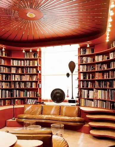
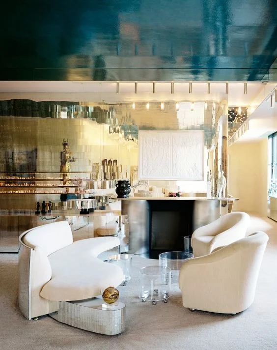
Unfortunately, many Rudolph interiors are lost, razed by later homeowners who lack a knowledge of his significance or an appreciation of his works, which is why it’s important to emphasize renovations like the one undertaken by the Rowan family. As pictured above, the Rowans’ transformed the office space from its original seventies feel to one that was better suited to their own taste, while retaining Rudolph’s couch, desk, stair-shelves, and ceiling decoration.
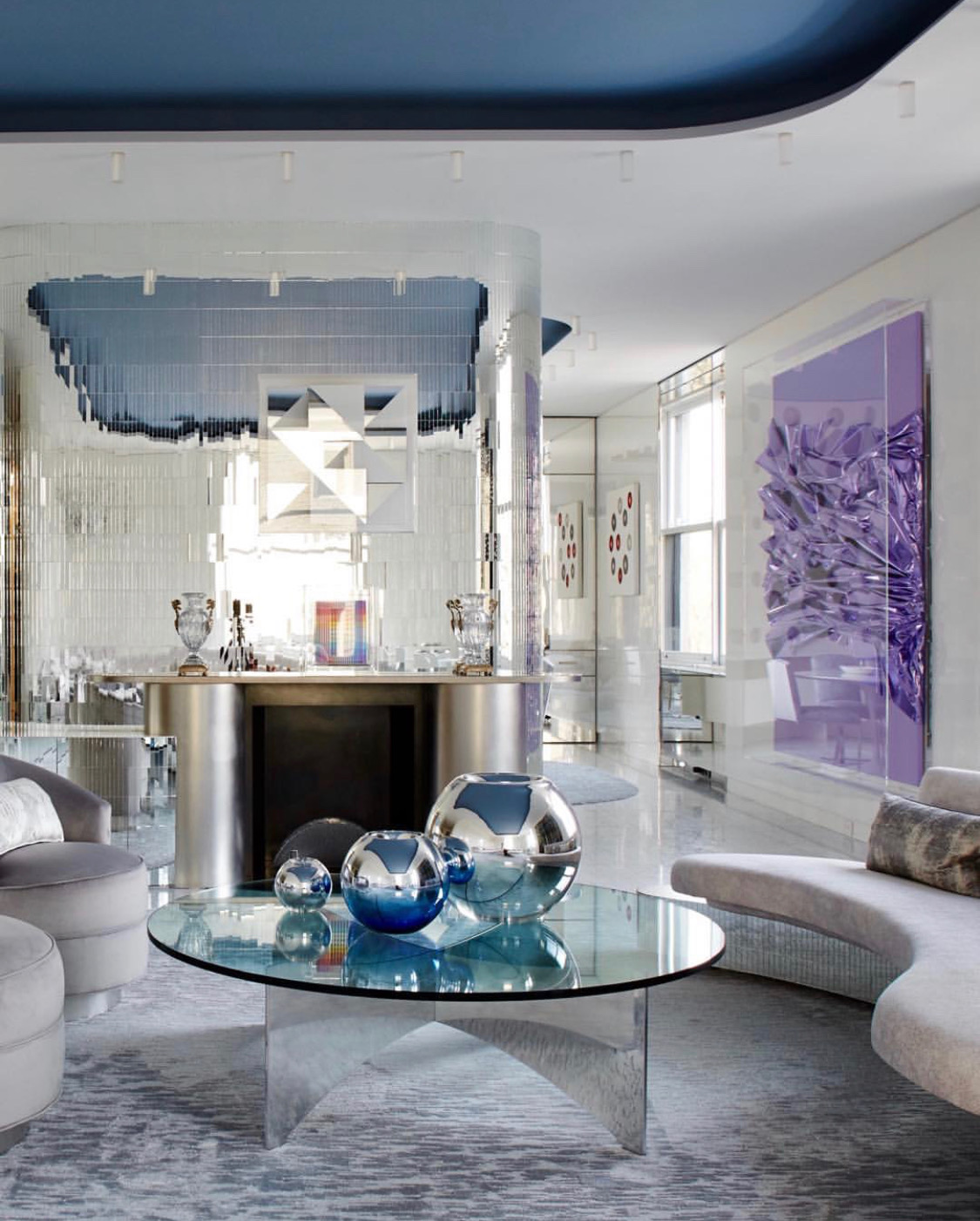
Pictured: A before shot, taken by Anthony Cotsifas courtesy of 1stDibs.com next to an after shot, taken by Genevieve Garruppo courtesy of Tony Ingrao Design’s Intagram

The Rowan renovation shows how an owner of a Rudolph property or interior can still allow for Rudolph’s details to shine through, like the mirrored walls and kidney-shaped sofa seen above.

Pictured: A before shot, taken by Anthony Cotsifas courtesy of 1stDibs.com next to an after shot, taken by Ethan Shapiro

The hallway, pictured above, received the most changes — however, Rudolph’s design is still present in the sloping walls that punctuate the center right of the hallway, which was once the playroom of the Edersheim children (and is now a foyer that leads to the second story of the Rowan duplex).

Pictured: A before shot, taken by Anthony Cotsifas courtesy of 1stDibs.com next to an after shot, taken by Ethan Shapiro

The dining room, seen above, has been repainted in an airy white, and retains the original Paul Rudolph dining table, which cleverly breaks apart into three smaller, circular tables whose connecting leaves fold neatly under the shelving unit against the wall. Though bereft of the delft pottery it was made to showcase, the unique feature wall Rudolph designed still remains in its original form.

Pictured: A before shot provided by Carolyn Rowan next to an after shot taken by Ethan Shapiro

It isn’t easy to be the steward of an iconic property, especially one full of original architectural details. Luckily, there are sensitive owners like the Rowan Family who value such a property and have, throughout their four-year-long renovation, kept the heart and soul of Rudolph alive in their space. Right down to the last mirrored wall pane.