Niagara Falls' Rudolph Masterpiece—but are we going to lose it?

Niagara Kidder-smith best view.jpg

The Earl. W. Brydges Library, designed by Paul Rudolph—Niagara Falls’ main library, the city’s center of knowledge! The project commenced in Rudolph’s office in 1969, and this view of a portion of it’s lively roofscape was photographed in the mid-1970’s. Image courtesy of the Massachusetts Institute of Technology, photograph by G. E. Kidder Smith

CIVIC STANDING

Among the many types of buildings to which Paul Rudolph applied his creative & practical talents—houses (and housing), churches, schools, university buildings, campus planning, exhibit design, office buildings, medical facilities, and laboratories—there’s also the type about which architects feel proudest: their civic works.“ Part of that pride emerges from the City Beautiful movement—a philosophy and practice, starting in the late 19th Century, which contended that beautifully-designed cities (and well-designed public buildings within them) could bring forth a better society and promote civic virtue. That movement helped energize city (and state and federal) governments to focus more (and spend more) on their streets, buildings, public facilities (and the civil engineering that undergirded those structures.) It’s worth noting that a building type which played a role in such planning were public libraries.

RUDOLPH IN THE PUBLIC REALM

Rudolph made a strong showing in the civic domain, being given commissions for government and public-use buildings in Boston, New Haven, Goshen, NY, Syracuse, Rockford, IL, Buffalo, Siesta Key, FL, Manhattan, and Bridgeport—as well as for international locations, like Jordan and Saudi Arabia. These projects ranged from city halls, to courts, a stadium, and an embassy. [We’ve even seen a 1995 listing, in the tabulation of projects which Rudolph’s office produced for its own use, for a design of an “office for special counsel”.]

PROMINENT ON THE STREETSCAPE

Not all those projects were built (as with the career of most architects, that’s par for the course)—but enough were constructed that we can see that Rudolph’s skills “scaled” well for significant public undertakings. Among those, the main library he did for the city of Niagara Falls—the Earl W. Brydges Public Library— is remarkable. Here, he literally created a “landmark”: a prominent and sizable structure of unforgettable form—an icon within the cityscape.

The library in 2004, as seen down from within the city of Niagara Falls, NY. The tall, glazed, staggered portions of the roof (which bring light into the reading spaces within the building) are prominent parts of the building—and these strong shapes…

The library in 2004, as seen down from within the city of Niagara Falls, NY. The tall, glazed, staggered portions of the roof (which bring light into the reading spaces within the building) are prominent parts of the building—and these strong shapes make the library a landmark within the city. Photograph by Kelvin Dickinson, © The Paul Rudolph Heritage Foundation.

LUMINOUS INTERIORS

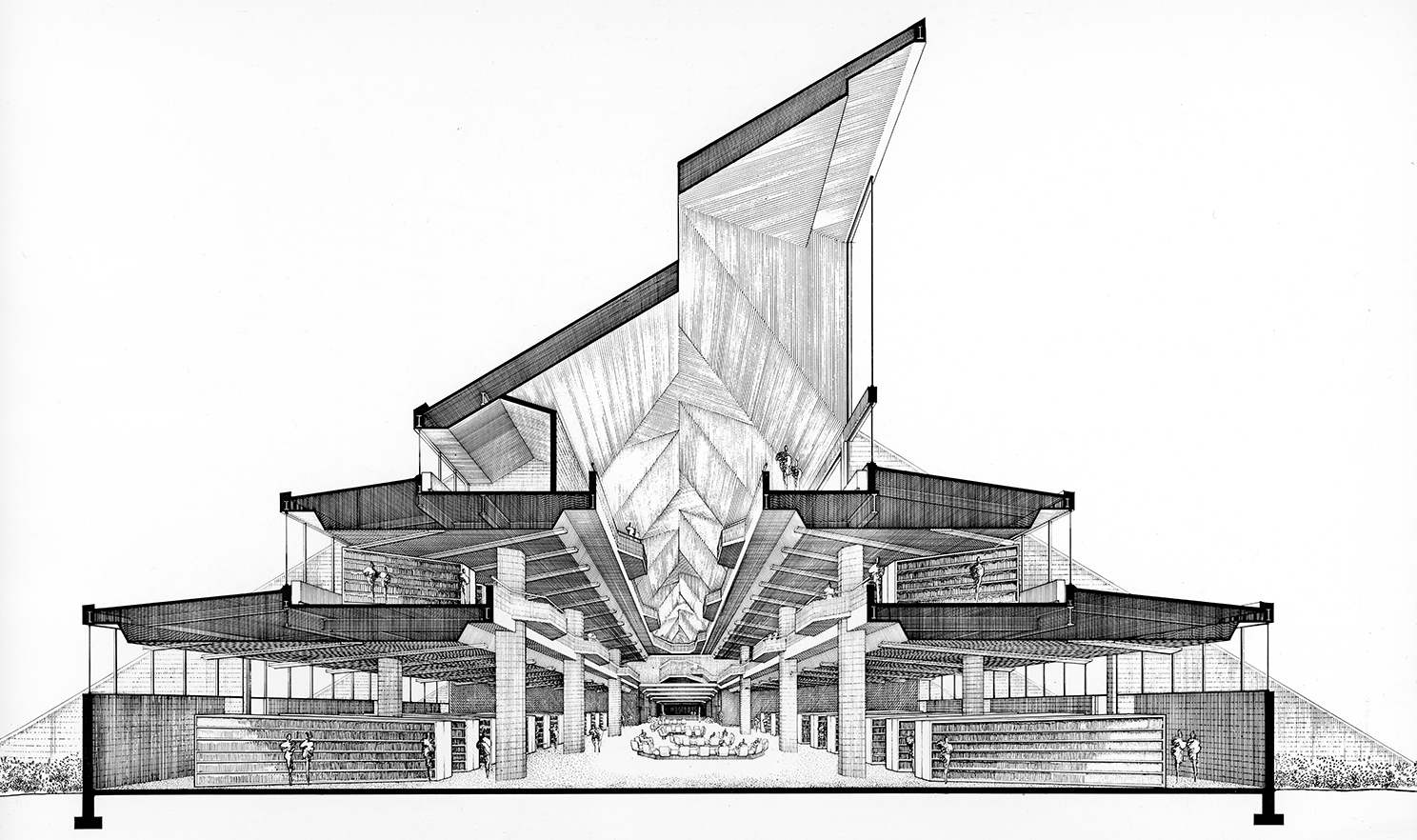
Equally memorable are the interiors, filled with light from the clerestory windows above (whose staggered emergence from the roof helps give the building its mountain-strength character). The 3-storey space within is exciting—yet serene enough for reading, research, and study.

“It’s so bright and open without being glaring.”

—Jennifer Potter, the library’s director

Rudolph’s section-perspective of the library, looking down its main axis. A series of tall clerestory windows, rising prominently from the roof, bring in natural light. The building rises in three stages, with each floor getting smaller than the one…

Rudolph’s section-perspective of the library, looking down its main axis. A series of tall clerestory windows, rising prominently from the roof, bring in natural light. The building rises in three stages, with each floor getting smaller than the one below—reflecting the library’s functional space needs. Image © The Estate of Paul Rudolph, The Paul Rudolph Heritage Foundation.

“I think my favorite thing about the building is looking up in the main atrium, where the adult collection is. So stunning. It feels strangely modern despite its age.”

—Library Patron

The library’s atrium-interior, as photographed in 1972. This view allows one to see all three levels, as well as the ceiling openings to the clerestory windows (in the angled roof) which bring natural light into the space. Joseph W. Molitor architec…

The library’s atrium-interior, as photographed in 1972. This view allows one to see all three levels, as well as the ceiling openings to the clerestory windows (in the angled roof) which bring natural light into the space. Joseph W. Molitor architectural photographs. Located in Columbia University, Avery Architectural & Fine Arts Library, Department of Drawings & Archives

A LANDMARK THREATENED?

The building’s birth had, admittedly, construction problems—ones that caused its architect and builder seeming endless grief. This history is well-told in an article by Mark Byrnes, published by CityLab a few years ago (from which the above quotes.were excerpted.) Ongoing issues continue to concern its users—to the point where the building’s future as the city’s main library is now being threatened.

Is this a case similar to another amazing civic work by Rudolph: his now-disfigured Orange County Government Center? There, a greater recognition of the building’s architectural value and excellence might have—whatever the problems—brought forth the commitment and resources to fix them. We hope that such understanding and support will come forth for the library in Niagara Falls—that it “gets some love”.

INTO THE FUTURE?

The Paul Rudolph Heritage Foundation will be following the fate of Niagara Falls’ Brydges Library (and working to preserve it.) We’ll be bringing you ongoing news of this in the coming months—and if you hear anything about the future of the building, please do let us know!

The entry side of Niagara Falls’Earl. W. Brydges Library, designed by Paul Rudolph. Image courtesy of the Massachusetts Institute of Technology, photograph by G. E. Kidder Smith

The entry side of Niagara Falls’Earl. W. Brydges Library, designed by Paul Rudolph. Image courtesy of the Massachusetts Institute of Technology, photograph by G. E. Kidder Smith

Errol Barron: Creativity Embodied (Plus: a New Memoir of Paul Rudolph)

Of all the photos we’ve seen of the insides of Paul Rudolph’s various offices, this is one that intrigues us most. In this version of the drafting room, the lower level was used for “tube storage” of rolled-up architectural drawings, and drafting st…

Of all the photos we’ve seen of the insides of Paul Rudolph’s various offices, this is one that intrigues us most. In this version of the drafting room, the lower level was used for “tube storage” of rolled-up architectural drawings, and drafting stations were positioned on platforms above. Errol Barron says that’s a photo of a staff member of Rudolph’s office, Max Lieberman, stepping across the gap—and describes that getting around the office as having its adventurous side.. Image © The Estate of Paul Rudolph, The Paul Rudolph Heritage Foundation.

DISCOVERING A RENAISSANCE MAN

 We sometimes refer former to staff members of Paul Rudolph’s office as “Rudolph veterans”—and we’re always glad to meet them and are curious to hear the stories they have to tell (and the assessments they’ve made, over time, of their former boss.) We’ve just discovered another such “veteran”:  Mr. C. Errol Barron. We came across his name while doing some Rudolph research, seeing him listed as one of Rudolph’s employees—so we decided to look him up.

In the case of Mr. Barron, “discovered” may be a strange way to put it, as he’s has been there all the time: living a professionally & artistically active life (in Louisiana, Greece, Italy, and other places), creating some beautiful architecture (and just-as-beautiful artwork), and also teaching (he’s a professor at Tulane) and writing.

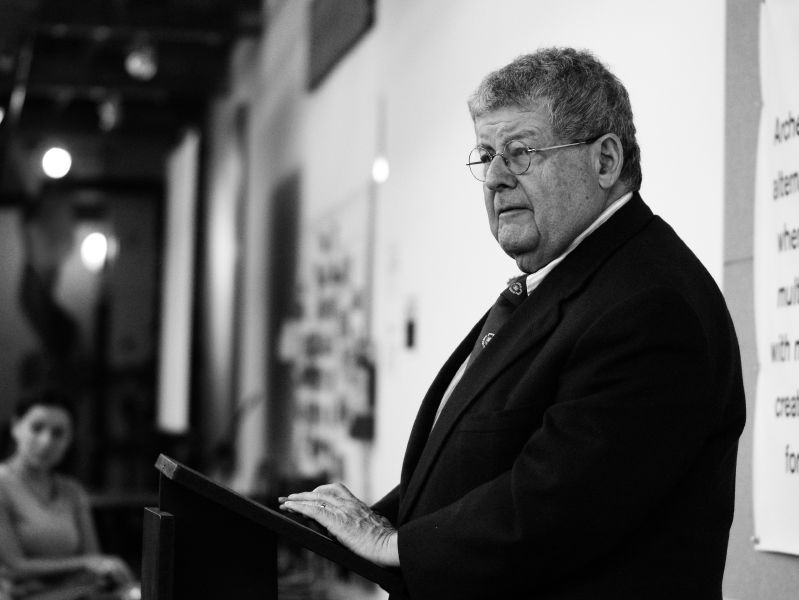
Mr. C. Errol Barron—architect, artist, photographer, writer—and the author of a fascinating memoir-essay about Paul Rudolph. Image: photograph by Lasimpson504, via Wikipedia.

Mr. C. Errol Barron—architect, artist, photographer, writer—and the author of a fascinating memoir-essay about Paul Rudolph. Image: photograph by Lasimpson504, via Wikipedia.

DISCOVERING PAUL RUDOLPH

Mr. Barron is a prolific writer, with many articles, and several books to his credit. We asked  him if he’d ever written anything about Paul Rudolph and he sent us a paper: “PMR”   In it, he recounts applying for a job in Rudolph’s office—intending to stay only one year, but ending-up being there for seven—and the fascinating projects in which he participated. With this, he also shares his overall observations of Rudolph: both his architecture and as a person.

You can read his entire text about Paul Rudolph at the Articles & Writings section of our website.  But we thought you’d like a taste of it here, so below is his description of the layout of Rudolph’s office when it was on 58th Street in Manhattan, and of the first project he worked on:

Rudolph’s office on 58th street was on the top floor of a typical row house out of which he fashioned a labrynthian space of many levels and floating planes creating precarious work spaces, ledges for magazines and benches and the main conference table that doubled as a landing of the stair leading to Mr. Rudolph’s work space at the very top of the space. He created this space( and the conference room) by raising the center section of the roof some 15 or 20 feet to bring in light and create more work levels.

In the rear of the 4th floor was the drafting room of about 8 work stations perched on boxes that contained the tubes of drawings of completed projects. To gain access to this storage one would walk under the drawing boards above and we were obliged to step across this gap to get to our desks. Occasional falls occurred!

It was a lively unorthodox, slightly dangerous environment but a delight to work in. There was just enough head height under the slope of the original room to make the space usable.

My first assignment was to assist Constantine “Connie Wallace”, the job captain, in the construction documents for the Interama Pavilion for the so named fair in Florida, a North and Central American project meant to stimulate commerce. Many other architects, Louis Kahn included, were enlisted. The Rudolph project was a delightful concoction of elliptical pavilions sunk into a sloping concrete floor under a curving sun shade roof  - it was never built. I remember the enthusiasm for this project was so high that we worked to complete the drawings on Christmas Eve of 1967.

You can learn much more about Mr. Barron--his career, architectural work, books, and artwork—at   errolbarron.com — but we’d like to share with you some images of his buildings and artworks (more of both can be seen on his website):

A house in Peleponnesos, Greece, designed by C. Errol Barron. Image: courtesy of C. Errol Barron

A house in Peleponnesos, Greece, designed by C. Errol Barron. Image: courtesy of C. Errol Barron

A house in Athens, Greece, designed by C. Errol Barron. Image: courtesy of C. Errol Barron

A house in Athens, Greece, designed by C. Errol Barron. Image: courtesy of C. Errol Barron

Water Land: Babb’s Rock, a watercolor by C. Errol Barron. Image: courtesy of C. Errol Barron

Water Land: Babb’s Rock, a watercolor by C. Errol Barron. Image: courtesy of C. Errol Barron

Water Land: Tower Rig II, a watercolor by C. Errol Barron. Image: courtesy of C. Errol Barron

Water Land: Tower Rig II, a watercolor by C. Errol Barron. Image: courtesy of C. Errol Barron

METABOLISM and MIES: FURTHER Influences on PAUL Rudolph

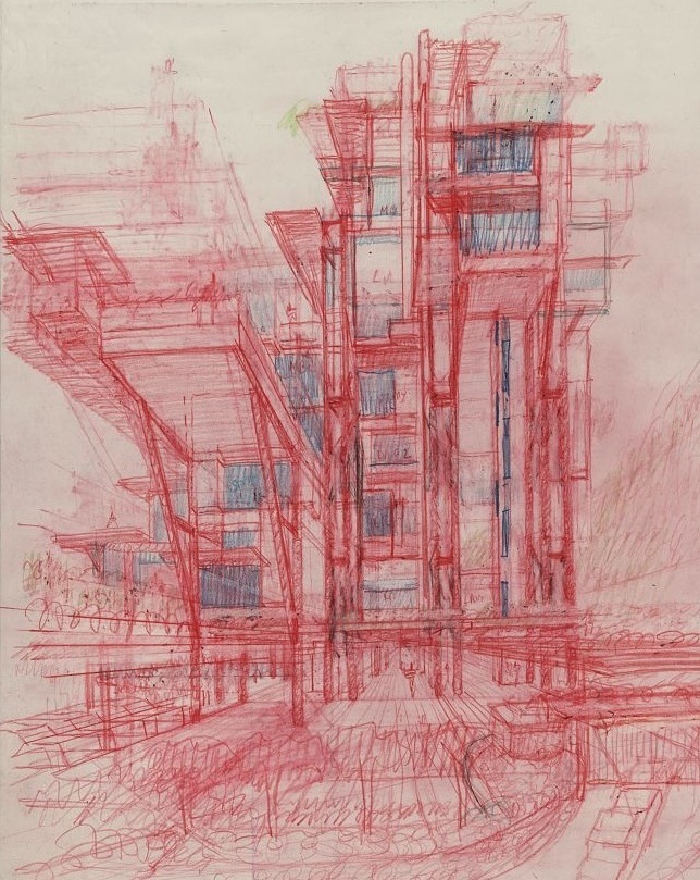
Paul Rudolph’s sketch for the Plantation Road Triplex project in Hong Kong, color pencil on vellum, 1995—a project he was working on towards the end of his half-century career. This perspective sketch (which one observer characterized as “Metabolist…

Paul Rudolph’s sketch for the Plantation Road Triplex project in Hong Kong, color pencil on vellum, 1995—a project he was working on towards the end of his half-century career. This perspective sketch (which one observer characterized as “Metabolist”) includes vertical and diagonal structure, multiple levels, and supported as well as cantilevered elements—and shows one of the series of different approaches that Rudolph explored while developing his ideas for this project. Image © The Estate of Paul Rudolph, The Paul Rudolph Heritage Foundation.

INFLUENCES AND INVESTIGATIONS

 It is often said that Paul Rudolph’s two main influences were:

  • Wright—for the layered, rich, flowing and complex organization of his spaces

  • Le Corbusier—for his sculptural shaping of masses in light (as well as his use of concrete).

But a wider look reveals a great range of inputs into Rudolph’s life and thinking.

Japan is an example. One of the Paul Rudolph Heritage Foundation’s exhibits, for Rudolph’s 2018 centennial, included a 1995 sketch for his Plantation Road project in Hong Kong (shown above).

A visitor to the exhibition looked at it and exclaimed “Metabolism!”—the name of a post-war Japanese architectural movement (primarily of the 1960’s and 70’s) which “fused ideas about architectural megastructures architectural with those of organic biological growth.” Rudolph was well aware of Metabolism, having been in Japan in 1960 to attend an architectural conference where—significantly—the movement was initiated. Rudolph also owned a large and richly illustrated book on Metabolist architecture—the significant monograph, we’re told (which is currently in the library of the Modulightor Building). So there’s a discernible link from that Japanese architectural movement -to- his 1995 design sketch. Like many great architects, Rudolph was always looking at and digesting what was happening in the world of design.

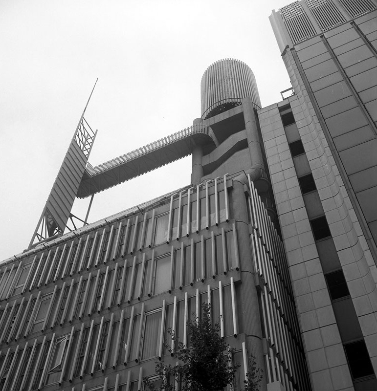
Another project of Rudolph’s, the Daiei Headquarters Building in Nagoya, Japan (from the early 1970’s), also shows his awareness of that Japanese Metabolist movement.

The Daiei Headquarters Building in Nagoya, Japan, designed by Paul Rudolph, 1971. The articulated elements at the roof (shown here), and also the expressive volumes and details at the building’s ground level and in its lobby, could be described as M…

The Daiei Headquarters Building in Nagoya, Japan, designed by Paul Rudolph, 1971. The articulated elements at the roof (shown here), and also the expressive volumes and details at the building’s ground level and in its lobby, could be described as Metabolist. Image © The Estate of Paul Rudolph, The Paul Rudolph Heritage Foundation.

RUDOLPH AND THE INTERNATIONAL STYLE—aND MIES

What about other influences on Rudolph?

After the initial Florida phase of career, the preponderance of Rudolph’s work—though clearly Modern—is not associated with the stricter (Gropius-ian) aspects of the International Style. But Rudolph was engaged with that approach—at least in his thinking—and we continue to be intrigued by this quote from him: 

“You must understand that all my life I have been interested in architecture, but the puzzle for me, in many ways, is the relationship of Wright to the International Stylists. Now perhaps for you that seems beside the point, or very, very strange. It has a little bit to do with when you come into this world, and that is when I came to grow. Wright’s interest in structure was, to a degree. a psychological one. I am fascinated by his ability to juxtapose the very heavy, which is probably most clear, almost blatant, too blatant, in Taliesin West with the very, very light tent roof. It isn’t that his structures are so clear, because they are not. It is that he bent the structure to form an appropriate space. He would make piers three times the size that they needed to be in order to make it seem really secure. Or he would make the eave line two or three inches deep by all sorts of shenanigans, from a structural point. My God, what did to achieve that, because he thought it ought to light. I would agree with him in a moment, but the International stylists would not. Well. they did and they didn’t. It was the bad and ones who did not. They didn’t know how, didn’t know why.” [Quoted from: “Paul Rudolph—Excerpts from a Conversation” which appeared in Perspecta 22, 1986]

So, within Rudolph’s deepest meditations on architecture, he declares an ongoing interest in the relationship (or dis-junction) between Wright’s approach and the International Style.

In a recent post, we spoke of Rudolph’s relationship to his teacher at Yale, Walter Gropius. Gropius was the living symbol of the Bauhaus and 20th Century Modern architecture—and hence the International Style. But for the actual, finest embodiment the International Style’s principles in built work, one would have to look to Mies. The first phase of Rudolph’s career—his early work in Florida—comprised numerous house designs which combined austere discipline with spatial (and material) cleverness. They are much closer to Mies van der Rohe’s oeuvre (especially Mies’ many courtyard house projects) than to any of Gropius works.

Mies van der Rohe’s project for 3 Courtyard Houses, circa 1931. Mies repeatedly investigated the theme of the courtyard house. Usually, Mies’ designs were for a single house on a site enclosed on all sides by walls (with one-or-more courtyards, incl…

Mies van der Rohe’s project for 3 Courtyard Houses, circa 1931. Mies repeatedly investigated the theme of the courtyard house. Usually, Mies’ designs were for a single house on a site enclosed on all sides by walls (with one-or-more courtyards, included as part of the composition, and opening to light and air). This design is at another level of complexity: Mies is integrating three residences into one overall composition.

Paul Rudolph’s project for the Revere Development in Florida, 1948. While significantly larger than Mies van der Rohe’s above project (and comprising twice as many houses), this design of Rudolph’s uses a similar compositional approach, design strat…

Paul Rudolph’s project for the Revere Development in Florida, 1948. While significantly larger than Mies van der Rohe’s above project (and comprising twice as many houses), this design of Rudolph’s uses a similar compositional approach, design strategies, architectural elements, and overall minimalist aesthetic—and shows a strong relationship with Mies’ oeuvre and aesthetic. Image © The Estate of Paul Rudolph, The Paul Rudolph Heritage Foundation.

MIES, RUDOLPH, AND SPACE

 Paul Rudolph spoke movingly of the importance of Mies with Peter Blake, in a conversation which took place about a year before Rudolph’s 1997 passing. Commenting on Mies’ Barcelona Pavilion, he said:

"To me, the Barcelona Pavilion is Mies’ greatest building. It is one of the most human buildings I can think of—a rarity in the twentieth century. It is really fascinating to me to see the tentative nature of the Barcelona Pavilion. I am glad that Mies really wasn’t able to make up his mind about a lot of things—alignments in the marble panels, or the mullions, or the joints in the paving. Nothing quite lines up, all for very good reasons. It really humanizes the building.”

 Rudolph did a set of analytical drawings of the building, and began to explain:

“I made a few sketches that are meant to illustrate the impact of the actual building [as rebuilt in 1992 on the same site as the original 1929 Pavilion], which is very different from drawings, photos, etc. The Barcelona Pavilion is religious in its nature and is primarily a spatial experience. We have no accepted way of indicating space, and therefore the sketches made are very inadequate. One is drawn by the sequence of space through it. Multiple reflections of the twentieth century modify the architecture of light and shadow in a manner that no other building can equal. Twentieth-century concepts have affected all the past. Reflections are organized so that shadows re lot and become spatial ornamentation for the whole. These shadows and reflections are most intense at crucial junctures, such as the principal entrances, or turning points in circulation. For instance, a forest is created via reflections and refractions in the marble and glass surrounding you. This multiplicity of reflections unites the exterior and interior but also helps to explain the mystery of the whole. I think it is simply unprecedented in architecture and the greatest of all Mies’ buildings.”

He then goes through the drawings, using each to help reveal a different aspect of the building.  Near the end of their chat, Rudolph says:

One of the series of drawings made by Paul Rudolph, analyzing Mies’ Barcelona Pavilion. The full set of drawings (and a discussion of the Barcelona Pavilion) are in Paul Rudolph: The Late Work. Image © The Estate of Paul Rudolph, The Paul Rudolph He…

One of the series of drawings made by Paul Rudolph, analyzing Mies’ Barcelona Pavilion. The full set of drawings (and a discussion of the Barcelona Pavilion) are in Paul Rudolph: The Late Work. Image © The Estate of Paul Rudolph, The Paul Rudolph Heritage Foundation.

“Well, I am influenced by everything I see, hear, feel, smell, touch, and so on. The Barcelona Pavilion affected me emotionally. It is one of the great works of art of all time. I could not understand at first why it affected me as it did. I really never liked the outside of it. But the inside of the Pavilion transports you to another world, a more spiritual world.”

Another of Rudolph’s drawings, analyzing the Barcelona Pavilion. Image © The Estate of Paul Rudolph, The Paul Rudolph Heritage Foundation.

Another of Rudolph’s drawings, analyzing the Barcelona Pavilion. Image © The Estate of Paul Rudolph, The Paul Rudolph Heritage Foundation.

The entire, fascinating conversation is in Roberto de Alba’s book, Paul Rudolph: The Late Work, and it includes the full set of Rudolph’s seven drawings the Barcelona Pavilion.

Geometry of Light installation, at the Barcelona Pavilion. View within the main body of the building. Photograph by Kate Joyce

Geometry of Light installation, at the Barcelona Pavilion. View within the main body of the building. Photograph by Kate Joyce

ILLUMINATING MIES

A recent site-specific project, using laser light and sound—an “art intervention”—took place at the Barcelona Pavilion: “Geometry of Light” 

The sponsor/creators described it:

This intervention of projected light and sound enlivens and alters our perception of the essential elements of the pavilion. By emphasizing the open floor plan and material selections, Geometry of Light heightens the illusion of physical and material boundaries. Focused on the gridded plan of the pavilion, a projected grid of light animates the travertine floor that extends beyond the steel-framed glass walls to accentuate the flowing space as it permeates through the interior and exterior. The animated projections are choreographed to trace, highlight, and alter the composition of the pavilion.

In concert with the projected light and patterns, a custom-designed sound piece by Oriol Tarragó is integral to this experience. Developed in direct response to the pavilion, this auditory component uses the pitch of the space to create a tonal reading. A spatial installation of this soundtrack creates a comprehensive, immersive experience. Together, these elements coalesce—both unifying and disjointing the physical and perceptual space—in a new, altered perception and interpretation of the Barcelona Pavilion.

The creative collaborators were:

… Chicago-based design studio Luftwerk, in a collaboration with MAS Studio's founding director and MAS Context's editor-in-chief Iker Gill, and Spanish sound editor Oriol Tarragó

The installation ended in February 2019—but the same team will be applying their visual-sonic magic at Mies’ Farnsworth House, in October 2019.

Geometry of Light installation, at the Barcelona Pavilion. View across the elevated plinth, towards the main body of the building. Photograph by Kate Joyce

Geometry of Light installation, at the Barcelona Pavilion. View across the elevated plinth, towards the main body of the building. Photograph by Kate Joyce

Given Paul Rudolph’s concern (expressed several times over the years) for “a way of indicating space”, our bet is that he’d be interested and pleased by these spatial-artistic explorations of Mies’ work—and emphatically at the Barcelona Pavilion, a work for which he held the profoundest esteem.

MAGNIFICENT GIFT OF RUDOLPH DRAWINGS

R. D. Chin donates “a treasure" of Paul Rudolph original drawings, prints, and graphics to the Paul Rudolph Heritage Foundation

Some of the Paul Rudolph drawings and documents donated by R.D. Chin to the Paul Rudolph Heritage Foundation. At the top-left is a rendering of the base of the Wisma Dharmala Tower in Jakarta; at the top-center are two sketches for the Yale Art &amp…

Some of the Paul Rudolph drawings and documents donated by R.D. Chin to the Paul Rudolph Heritage Foundation. At the top-left is a rendering of the base of the Wisma Dharmala Tower in Jakarta; at the top-center are two sketches for the Yale Art & Architecture Building; at the top-right is a poster for an exhibit of Rudolph drawings that took place at the Max Protetch Gallery; at the bottom right and center are drawings for the Edersheim guest facilities, and at the bottom-left is a perspective rendering of an interior in the LIcht Residence. Photo: Kelvin Dickinson, for the Paul Rudolph Heritage Foundation

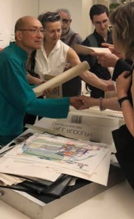
R. D. Chin—architect, interior designer, former key staff member of Paul Rudolph’s architectural office, and Feng Shui master (and author of a significant book on the subject)—gave a thrilling presentation at the Paul Rudolph Heritage Foundation’s first SpaceMaker Salon Series event.

R.D. Chin, standing at center—architect and Feng Shui master—and a former key member of Paul Rudolph’s staff. In this shot, taken during his presentation at July’s S;pacemaker Salon, he is explaining the various Rudolph drawings and documents which …

R.D. Chin, standing at center—architect and Feng Shui master—and a former key member of Paul Rudolph’s staff. In this shot, taken during his presentation at July’s S;pacemaker Salon, he is explaining the various Rudolph drawings and documents which he has generously donated to the archives of the Paul Rudolph Heritage Foundation. The event took place within the Modulightor Building, in the 5th & 6th floor duplex gallery space. Copies of R. D.’s book,, Feng Shui Revealed: an Aesthetic, Practical Approach to the Ancient Art of Space Alignment, can be seen on display at the lower-right corner Photo: Kelvin Dickinson, for the Paul Rudolph Heritage Foundation

During his talk, on Friday, July 19th, 2019, R. D. spoke of how he began to work at the Paul Rudolph office, and his many fascinating experiences there (working very closely with Rudolph). He revealed how he transitioned to his current path, becoming a highly-regarded Feng Shui consultant, and showed examples of his working method—on architectural projects ranging from residences to a bank.

RD Chin, at left, the featured speaker at July’s SpaceMaker Salon. Drawings from his professional portfolio are in the foreground, and one can see some of the diagrammatic analysis drawings which he uses in his Feng Shui consulting work. RD said tha…

RD Chin, at left, the featured speaker at July’s SpaceMaker Salon. Drawings from his professional portfolio are in the foreground, and one can see some of the diagrammatic analysis drawings which he uses in his Feng Shui consulting work. RD said that one of the things he leaned from Paul Rudolph was the use of color when working out a design problem and in evolving architectural solutions. Photo: Kelvin Dickinson, for the Paul Rudolph Heritage Foundation

During the presentation he rolled out drawings from the Rudolph office—both of projects he worked on, and other Rudolphian graphics—explaining the use and and meaning of each. He then surprised the Paul Rudolph Heritage Foundation by saying that he was donating them to our archives.

These drawings and documents are a significant addition to the body of sketches, renderings, construction drawings, and graphics that Rudolph and his staff generated across his half-century career—and the Paul Rudolph Heritage Foundation will be cataloging them and making them available for scholarly study. For now, we thought you’d like to see some of the amazing treasure which R.D. Chin has donated to us, and a selection is below.

One of the donations was a high-quality print of Rudolph’s detailed perspective rendering for the base and lower floors of the Wisma Dharmala Tower in Jakarta. Photo of drawing by Kelvin Dickinson, for the Paul Rudolph Heritage Foundation

One of the donations was a high-quality print of Rudolph’s detailed perspective rendering for the base and lower floors of the Wisma Dharmala Tower in Jakarta. Photo of drawing by Kelvin Dickinson, for the Paul Rudolph Heritage Foundation

A floor plan for changing rooms, rest room, and the lounging area in a proposed outbuilding for the Edersheim Residence in Larchmont, NY. The diazo print is dated 1988. Photo of drawing by Kelvin Dickinson, for the Paul Rudolph Heritage Foundation

A floor plan for changing rooms, rest room, and the lounging area in a proposed outbuilding for the Edersheim Residence in Larchmont, NY. The diazo print is dated 1988. Photo of drawing by Kelvin Dickinson, for the Paul Rudolph Heritage Foundation

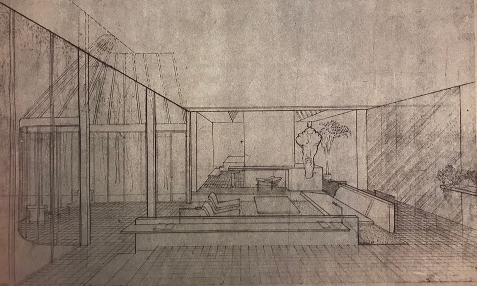
Rudolph’s perspective rendering of the “living room and glass loggia” of the Licht Residence in Hewlett Harbor, NY. A project of the mid-1980’s, this drawing was incorporated into the cover sheet of the construction drawings—of which a full set of d…

Rudolph’s perspective rendering of the “living room and glass loggia” of the Licht Residence in Hewlett Harbor, NY. A project of the mid-1980’s, this drawing was incorporated into the cover sheet of the construction drawings—of which a full set of diazo prints was donated by Mr. Chin. Photo of drawing by Kelvin Dickinson, for the Paul Rudolph Heritage Foundation

The donation included a print of a rendering of the Concourse in Singapore, a project of the late 1970’s/early 80’s. The print is the highest-resolution version we’d ever seen of that perspective drawing, and this is a detail from it. Photo of drawi…

The donation included a print of a rendering of the Concourse in Singapore, a project of the late 1970’s/early 80’s. The print is the highest-resolution version we’d ever seen of that perspective drawing, and this is a detail from it. Photo of drawing by Kelvin Dickinson, for the Paul Rudolph Heritage Foundation

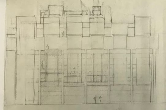
A preliminary sketch, pencil on tracing paper, for an exterior elevation of Paul Rudolph’s most famous work: the Yale Art & Architecture Building (now known as Rudolph Hall). Photo of drawing by Kelvin Dickinson, for the Paul Rudolph Heritage Fo…

A preliminary sketch, pencil on tracing paper, for an exterior elevation of Paul Rudolph’s most famous work: the Yale Art & Architecture Building (now known as Rudolph Hall). Photo of drawing by Kelvin Dickinson, for the Paul Rudolph Heritage Foundation

On the same sheet as the above elevation drawing is this small diagram, showing the “pinwheel” parti that is the basis of the Yale building’s floor plans. Photo of drawing by Kelvin Dickinson, for the Paul Rudolph Heritage Foundation

On the same sheet as the above elevation drawing is this small diagram, showing the “pinwheel” parti that is the basis of the Yale building’s floor plans. Photo of drawing by Kelvin Dickinson, for the Paul Rudolph Heritage Foundation

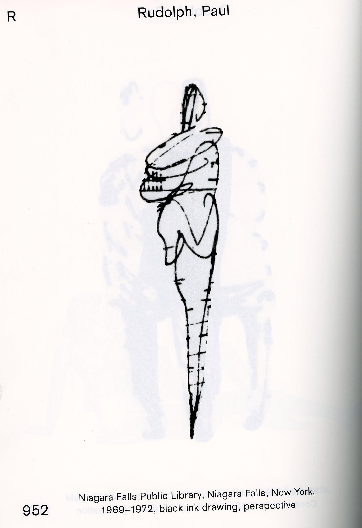
Two of Paul Rudolph’s “tornado people” (excerpted from the elevation sketch, above)—the type of scale figures which Rudolph used for much of his career, and a “signature” of his drawings. Photo of drawing by Kelvin Dickinson, for the Paul Rudolph He…

Two of Paul Rudolph’s “tornado people” (excerpted from the elevation sketch, above)—the type of scale figures which Rudolph used for much of his career, and a “signature” of his drawings. Photo of drawing by Kelvin Dickinson, for the Paul Rudolph Heritage Foundation

We give our profound thanks to R.D. Chin for this magnificent donation—a gift, not just to the foundation, but to the larger world of all those who admire Paul Rudolph, and seek to lean from his legacy.

A SERIOUS THINKER TAKES ON "BRUTALISM"

The exterior of the main hall of the Kyoto International Conference Center in Japan, designed by Sachio Otani. Kate Wagner uses a photo of this building in the introduction to her new series of articles, in which she considers Brutalism and other ke…

The exterior of the main hall of the Kyoto International Conference Center in Japan, designed by Sachio Otani. Kate Wagner uses a photo of this building in the introduction to her new series of articles, in which she considers Brutalism and other key issues in architecture. A detail of a photograph by Daderot; photo courtesy of Wikipedia.

Who Doesn’t Just Love McMansion Hell ?

You know it— McMansion Hell, Kate Wagner’s smart, funny, pointed, and insightful blog-website about what’s wrong (and occasionally right) with architecture, urbanism, and the environment. It’s most well-known for her “comedy-oriented takedowns of individual houses”, in which she shows, in her clear-eyed opinion, some of the most egregious “McMansions” and hilariously points out what’s false, ostentatious-without-taste or sense, or just dumb about them.

An sample, from a recent entry on the McMansion Hell blog, of Kate Wagner’s sharp analysis of a “McMansion”. This one is from June 13, 2019, which you can read in-full here.

An sample, from a recent entry on the McMansion Hell blog, of Kate Wagner’s sharp analysis of a “McMansion”. This one is from June 13, 2019, which you can read in-full here.

Hmmmm. Maybe the only people who don’t like McMansion Hell are those who market such pretentious flab. If you aren’t a regular visitor to McMansion Hell, we recommend you do so—it is a constant eye-opener—and if you want a rich education, also explore the site’s archive.

More Than Satirical

Yes, via her sharpshooter aim at flatulent architecture (and its boosters), she does evoke hilarity (tho’ one that has an authentically public-spirited purpose). But it’s really worth underlining that she’s a penetrating and careful (and caring) thinker—one of the most articulate on the scene today. Her writings take on vital issues, and she readily and clearly (with delightful power) points out what’s full of pretension, hypocrisy, obscuring and inflated language, or just muddy thinking.

An Approach to Brutalism—One That’s Needed, NOW

Here at the Paul Rudolph Heritage Foundation, it got our attention when Kate Wagner announced that she was commending a 5-part blog series on Brutalism. That term— “Brutalism”—has been used against Paul Rudolph like a demolition battering ram—and, less frequently, as a term of praise (tho’ sometimes bafflingly, to those outside intricacies of the debate.)

The opening page, image, and paragraph of McMansion Hell’s 5 part series on Brutalism. We’re delighted that she starts off with a image of one of Paul Rudolph’s most fascinating projects: his campus design at UMass Dartmouth.

The opening page, image, and paragraph of McMansion Hell’s 5 part series on Brutalism. We’re delighted that she starts off with a image of one of Paul Rudolph’s most fascinating projects: his campus design at UMass Dartmouth.

She explains the need for a thoughtful approach to the phenomenon (and built works) of Brutalism, explaining:

I’ve been a spectator to this debate since I first lurked in the Skyscraper City forums as a high school freshman, ten years ago, when Brutalism itself sparked the interest in architecture that brings me here today. I have, as they say, heard both sides, and when asked to pick one, my response is unsatisfying. Though my personal aesthetic tastes fall on the side of “Brutalism is good,” I think the actual answer is  it’s deeply, deeply complicated. 

And insightfully adds (and questions): 

Brutalism has a special way of inspiring us to ask big and difficult questions about architecture. “Is Brutalism good?” is really a question of “is any kind of architecture good?” - is architecture itself good? And what do we mean by good? Are we talking about mere aesthetic merits? Or is it more whether or not a given work of architecture satisfies the purpose for which it was built? Can architecture be morally good? Is there a right or wrong way to make, or interpret, a building? 

 She declares the need to approach this topic with the subtlety it deserves—and the urgency it demands::

I have bad news for you: the answers to all of these questions are complicated, nuanced, and unsatisfying. In today’s polemical and deeply divided world of woke and cancelled, nuance has gotten a bad rap, having been frequently misused by those acting in bad faith to create blurred lines in situations where answers to questions of morality are, in reality, crystal clear. This is not my intention here. 

Existential questions aside, there are other reasons to write about Brutalism. First, while we’ve been hemming and hawing about it online, we’ve lost priceless examples of the style to either demolition or cannibalistic renovation, including Paul Rudolph’s elegant Orange County Government Center, Bertrand Goldberg’s dynamic Prentice Women’s Hospital in Chicago, and the iconic Trinity Square, Gateshead complex, famous for the role it played in the movie Get Carter. My hope is that by bringing up the nuances of Brutalism before a broad and diverse audience, other buildings on the chopping block might be spared. 

 And promises:

This is a series on Brutalism, but Brutalism itself demands a level of inquiry that goes beyond defining a style. Really, this is a series about architecture, and its relationship to the world in which it exists. Architects, as workers, artists, and ideologues, may dream up a building on paper and, with the help of laborers, erect it in the material world, but this is only the first part of the story. The rest is written by us, the people who interact with architecture as shelter; as monetary, cultural, and political capital; as labor; as an art; and, most broadly, as that which makes up the backdrop of our beautiful, complicated human lives. 

Yes, this series is going to be an absorbing adventure. Kate Wagner is not only examining Brutalism, but also taking-on some of the most vital questions around architecture—and we look forward to future installments!

César Pelli, 1926-2019

César Pelli, 1926-2019. Image courtesy of Wikipedia; photo from the  Presidencia de la N. Argentina

César Pelli, 1926-2019. Image courtesy of Wikipedia; photo from the
Presidencia de la N. Argentina

2019 has been a year that’s encompassed the passing of too many distinguished architects—creative talents of a very high caliber: Stanley Tigerman, I. M. Pei, Kevin Roche, Alessandro Mendini—and, if we’re broadening the list to a wider scope of design, we’d include Florence Knoll and Karl Lagerfeld.
Thus it is with great sadness that we note the passing of a towering figure in the profession:

César Pelli, 1926-2019.

Across a half-century career, Pelli’s work ranged from housing to corporate headquarters, from educational to performing arts facilities, and from shopping spaces to civic buildings—and these works were spread worldwide, from Oklahoma to Japan. He could shock us into awareness of new possibilities for design—his Pacific Design Center, opening in 1975, was an eye-opening example—or work at the limits of structural daring. But he is is probably most well-known for his towers, many of which achieved a sculptural elegance and formal subtlety which is not often found in such titanic constructions. Moreover, he sustained that striving for architectonic grace to the end of his prolific career—his Salesforce Tower in San Francisco (which just opened last year) being a late example of his achievement.

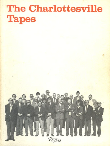
We don’t know to what extent Pelli and Rudolph interacted. They both ended-up settling in New York, and—this being, at least professionally, a “small town”—no doubt encountered each other from time-to-time. They were both selected to be members of the American Academy of Arts and Letters, and they both participated in the famous (or infamous) 1982 architecture conference at the University of Virginia—the one memorialized in the book “The Charlottesville Tapes”.

The cover of the book, The Charlottesville Tapes, which reported on the 1982 conference of architects—-a meeting in which both Pelli and Rudolph participated. Pelli can be seen at the far-left end of the front row, and we think that’s Rudolph at the…

The cover of the book, The Charlottesville Tapes, which reported on the 1982 conference of architects—-a meeting in which both Pelli and Rudolph participated. Pelli can be seen at the far-left end of the front row, and we think that’s Rudolph at the rear-center.

There are further intruding connections: Pelli was dean of Yale’s School of Architecture, arriving a dozen years after Rudolph’s departure from the school’s chairmanship (and serving from 1977 to 1984).

A “clipping” from Yale’s newsletter, in which there was an announcement of Sid R. Bass’s donation to renovate Paul Rudolph’s Yale Art & Architecture Building. As an illustration of recent work on a space within the building, they showed an image…

A “clipping” from Yale’s newsletter, in which there was an announcement of Sid R. Bass’s donation to renovate Paul Rudolph’s Yale Art & Architecture Building. As an illustration of recent work on a space within the building, they showed an image of a restored gallery space—n which was an exhibit on the work of César Pelli.

We take this moment, in a year of other profound losses, to mark the life and achievements of this fine designer, César Pelli.

PAUL RUDOLPH’S OWN HOME - HIS FAMOUS “QUADRUPLEX”: THE BEST COVERAGE

The cover of FDR: FLORIDA DESIGN REVIEW, showing the living room of Paul Rudolph’s multi-level apartment in New York City. That issue’s coverage was the most comprehensive (and best photographed) article to ever appear about this most personal of Ru…

The cover of FDR: FLORIDA DESIGN REVIEW, showing the living room of Paul Rudolph’s multi-level apartment in New York City. That issue’s coverage was the most comprehensive (and best photographed) article to ever appear about this most personal of Rudolph’s architectural works. The magazine is now out-of-print, but copies are available through the Paul Rudolph Heritage Foundation’s “Shop” page.

FDR: FLORIDA DESIGN REVIEW was a magazine devoted to architecture, interior design, and the allied arts. Its large format and high-quality photography allowed readers to have a rich and immersive experience of the buildings and spaces upon which they focused.

The magazine didn’t just look at design in Florida. They showed projects in a variety of locations—and in their issue number two (2007), they featured Paul Rudolph’s own home in New York City.

We’re frequently asked about Rudolph’s famous apartment—a design which he experimented with and refined and revised over many years. It contained some of his most spectacular residential spaces, and was certainly his most “personal” project.  It was a “quadruplex”—a magnificent four-story penthouse apartment, facing New York City’s East River. He used it as a “laboratory” for exploring ways to shape space and create dynamic experiences.

While Rudolph’s apartment was widely published, that issue of Florida Design Review is important, because it has an 18 page article on the quadruplex: the most comprehensive coverage ever published of this richly conceived & fascinating residence.

The author, Richard Geary, is himself a distinguished designer. The photographs in the article (often printed full-page) are by Ed Chappell. Also included in the article is a design sketch by Rudolph, as well as two of his famous section-perspective drawings of this multi-level apartment.

The bad news is that Florida Design Review is now out-of-print, and copies can be hard to find. But—

But the good news is that the Paul Rudolph Heritage Foundation has a number of copies of this issue available. It can be purchased through the PRHF’s website, on our “Shop” page (along with a number of other interesting Paul Rudolph publications and items.)

DINING WITH RUDOLPH

Some of the architectonically delicious creations of architect-turned-pastry-chef Dinara Kasko. Image courtesy of Dinara Kasko Pastry Art.

Some of the architectonically delicious creations of architect-turned-pastry-chef Dinara Kasko. Image courtesy of Dinara Kasko Pastry Art.

ARCHITECTS EAT…

One can easily imagine architects eating—or at least snacking. All those endless professional conferences, presentation meetings, site visits, class design crits, touring of the great monuments, ‘till-midnight toil at the drawing board (or screen)—surely any that will induce hunger and thirst.

Food is also a chance for bonding and relaxation. There are several pictures of the Frank Lloyd Wright’s fellowship community (including Frank and Olgivanna) out for what look like rather enjoyable picnics—and one can presume that Wright partook in the al fresco fare.

Some types of foods are the special focus of chefs with an eye for composition—particularly the design of cakes and pastry, which have a long history of architectonic expression. In fact, professional competitions in that field seem to bring out the builder in chefs’ hearts—and there is always the opportunity for innovation, as is shown so richly in the work of architect-designer-turned-pastry-chef, Dinara Kasko.

Frank Lloyd Wright and members of his Taliesen Fellowship, out for a countryside picnic. Wright is seated just right-of-center, in the hat and striped jacket. Photo by Pedro E. Guerrero, a superb photographer of architecture and the arts (many of wh…

Frank Lloyd Wright and members of his Taliesen Fellowship, out for a countryside picnic. Wright is seated just right-of-center, in the hat and striped jacket. Photo by Pedro E. Guerrero, a superb photographer of architecture and the arts (many of whose works are collected in fascinating books)—and who is well-known for creating some of the most memorable images of Wright and Wright’s community. Photo (c) The Estate of Pedro E. Guerrero

And we have this, from Robert A. M. Stern, It is from his affectionate memoir of fellow architect Charles Moore, recounting their time together during a group project in which they were engaged: 

“… we . . . stayed in a great downtown club where we would gather for breakfast before embarking on our day's work in the SOM offices. I remember those breakfasts with him vividly: Charles was not a person who watched his figure, and he would seat himself in the cavernous dining hall and dive into an enormous breakfast, taking generous helpings of chipped beef on toast and all kinds of other calorie-laden goodies. Faced with the pleasures of the table, he just couldn't say no.”

Philip Johnson was well-known for his regular lunches at the The Four Seasons restaurant in the Seagram Building (a set of elegant dining spaces he had designed, within Mies’ great skyscraper). Famously, Johnson even had his own booth, often inviting those whom he thought were the most-promising architectural up-and-comers.

Philip Johnson: master of many things—including the power lunch—but that’s not a napkin tucked under his chin. Image courtesy of Wikipedia; photo by: B. Pietro Filardo

Philip Johnson: master of many things—including the power lunch—but that’s not a napkin tucked under his chin. Image courtesy of Wikipedia; photo by: B. Pietro Filardo

And in Timothy M. Rohan’s comprehensive study of Paul Rudolph, he mentions that Johnson and  Paul Rudolph—old friends and rivals—used to eat at Billy’s: a bar-restaurant on Manhattan’s 1st Avenue (located about equidistant from both of their self-designed homes.) [Billy’s, which originally opened in 1870, closed in 2004—an amazing run, having been in continuous operation for 134 years!]

This may be an authentic, archival view of the old bar at Billy’s. We don’t know what it was like when Rudolph, Johnson, and their friends & colleagues dined there—but in this 1936 photo, it certainly had a most intriguing look. [And if it was l…

This may be an authentic, archival view of the old bar at Billy’s. We don’t know what it was like when Rudolph, Johnson, and their friends & colleagues dined there—but in this 1936 photo, it certainly had a most intriguing look. [And if it was like this when our heroes dined there, Johnson might have picked-up some ideas for his Post-Modern phase.] Photograph by: Bernice Abbott, courtesy of the Miriam and Ira D. Wallach Division of Art, Prints and Photographs - Photography Collection, The New York Public Library

Finally, we learn something we hadn’t before heard about Luis Barragan, according to an article in the famously fact-checked New Yorker. Among the design signatures of Barragan’s severely-shaped architectural work, was his use of color—frequently quite saturated—as in the intense pink he specified for some of his sun-drenched walls. It turns out that

“He enjoyed melon halves drizzled with sherry, and was known to have his maid prepare entirely pink meals.”

But be careful: getting architects mixed-up with food can be hazardous—at least as interpreted by this satirical news story fromThe Onion:

News story courtesy of the www.theonion.com

News story courtesy of the www.theonion.com

…BUT IS ARCHITECTURE EDIBLE?

We can’t think of too many buildings named after architects. Offhand, the couple we can readily recall are the Yale Art & Architecture Building which has been rededicated (after renovation) as “Rudolph Hall”; and the “Met Breuer”—the Marcel Breuer-designed Madison Avenue branch of the Metropolitan Museum of Art (which had previously been the Whitney Museum.)

 But on-the-other-hand, naming restaurants after architects does seem to be a thing—as in:  

  • The Aalto Lounge in Portland, Oregon (which is filled with mid-century Modern furniture.)

  • The The Wright which opened in 2009, within the Frank Lloyd Wright-designed Guggenheim Museum.

  • The restaurant which is part of the Le Corbusier Hotel, within Corb’s famous “Unite” apartment house in Marseilles (a venue whose appetizers look well-designed and proportioned.)

  • The Auberge de Mies, in Switzerland.

And, speaking of Mies, we discovered that this taste treat which had been offered by the creative (and design-oriented) dessert company, Coolhaus:

Image courtesy of www.cool.haus

Image courtesy of www.cool.haus

WHAT ABOUT RUDOLPH?

Well, of course Rudolph ate: as noted above, he used to go out with nearby-neighbor Philip Johnson—and, in the archives of the Paul Rudolph Heritage Foundation, we have snapshots of him at various dining events.

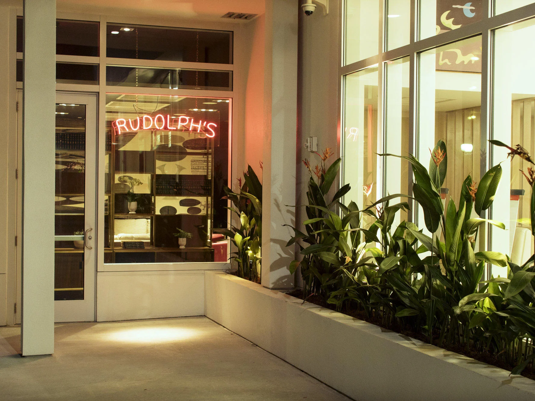
But now you too can eat with Rudolph—or at least in Rudolph’s—the new restaurant, named for him, that’s opened within The Sarasota Modern, a boutique hotel in the Rosemary District of Sarasota, Florida.

Image courtesy of The Sarasota Modern

Image courtesy of The Sarasota Modern

Sarasota is the perfect place for a restaurant honoring Paul Rudolph, as the “Sarasota School of Architecture” is the appellation for the post-World War II set of architects who practiced in that area, creating significant Modern designs. Rudolph was the creative & energizing center of that group (similar to the way that Wright is the pivotal figure for the “Prairie School”.)

Sarasota Magazine gave it a very good review, starting with:

If you name your restaurant after a legendary architect, you’d better make sure the space looks sharp. Rudolph’s, the restaurant inside The Sarasota Modern hotel, which opened in the Rosemary District in December, is named in tribute to Paul Rudolph, and its lush environs do justice to a revered name.

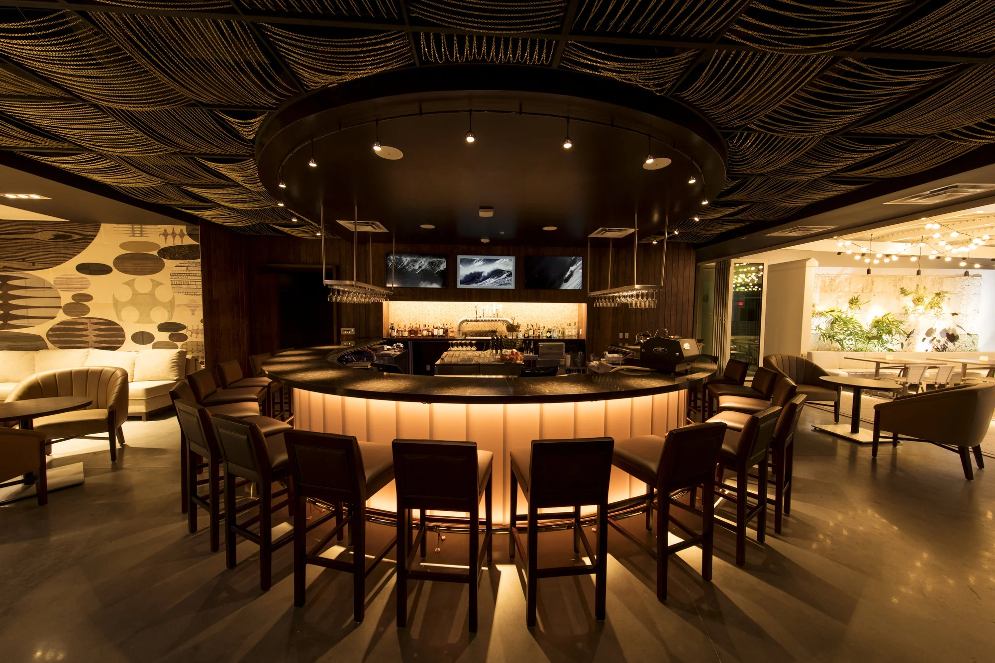
The restaurant is divided into three main areas: a brightly lit, glass-walled dining room that offers nighttime street-corner vistas; a mellow-mood round bar; and a lattice-ceilinged patio adjacent to the pool. Does it follow the strictures of the Sarasota School of Architecture that Rudolph helped pioneer? You’ll have to ask an architecture critic.

Sarasota Magazine’s reviewer went on to lavishly praise the food, the creative and enterprising chef, the selection of cocktails, and the overall ambiance. From some of the views we’ve seen—like of the interior—

Image courtesy of The Sarasota Modern

Image courtesy of The Sarasota Modern

—and of the food—

Image courtesy of The Sarasota Modern

Image courtesy of The Sarasota Modern

—a visit to Rudolph’s looks like it would be a well-designed (and tasty) treat.

BAUHAUS 100—Greatest Hits (and the Paul Rudolph Connection)

The Bauhaus building in Dessau, Germany, designed by the school’s director, Walter GropiusPhotograph by: Lelikron

The Bauhaus building in Dessau, Germany, designed by the school’s director, Walter Gropius

Photograph by: Lelikron

THE 100th BAUTHDAY

It’s hard to believe, but this year is the Bauhaus’ 100th birthday! Yes, it’s been a century since it was founded in 1919. In the course of three locations in Germany—it was started in Weimar, then to Dessau, and finally in Berlin—the Bauhaus had as many directors: Walter Gropius (in both Weimar and Dessau), Hannes Meyer (in Dessau), and Mies van der Rohe (in Dessau and Berlin). Each had a distinct personality and approach to design---and so each change in leadership also meant significant shifts in the focus and purposes of the school.

DESIGN SUPER-STARS 

As important to the Bauhaus’ vitality was the diverse range of teachers which came (and went!) over the school’s history (until it was closed in 1933). Each were to become influential, famous names in the history of design and art. Ones we recognize so well are:

  • Albers (both Anni and Josef)

  • Marianne Brandt

  • Gunta Stölzl

  • László Mololy-Nagy

  • Paul Klee

  • Oskar Schlemmer

  • Johannes Itten

  • Wassily Kandinsky

  • Lyonel Feininger

  • Marcel Breuer

They became a Who’s Who of modern art and design---and when asked about the great (and sometimes conflicting) diversity of the faculty, Gropius once said: 

“There are many branches on the Bauhaus tree, and on them sit many different kinds of birds.”

There’s no need here to go into the full history of the Bauhaus, as it has been archived, recorded, written about, and exhibited extensively over the decades: most notably in Hans Wingler’s magisterial book; and in MoMA’s comprehensive exhibit (and the accompanying catalog) of 2009-2010, done under the leadership and curatorship of Barry Bergdoll. Nor is it necessary to remark extensively on its influence, which can still be seen everywhere—in the design of everything from teacups -to- buildings, and in the way that design and art education is still conducted in classrooms worldwide. Perhaps it is sufficient to say that the Bauhaus—a hundred years since its beginning, has never really ended: is still pervading our lives. 

[For this centennial year, there are to be many celebratory events. To find them, just put the word “Bauhaus” with words like “centennial” or “centenary” or “100” or “celebration” into your search-engine, and you’ll find numerous leads.]

THE BAUHAUS’ “GREATEST HITS”

Still, it’s always worth “recharging” ourselves—and refreshing our vision—by taking a look at some of the most memorable images & inventive works which came out of the school. Enjoy these Bauhaus icons:

  • Oskar Schlemmer’s Bauhaus Symbol:

Image courtesy of Wikipedia

Image courtesy of Wikipedia

  • Walter Gropius’ Bauhaus School Building Complex in Dessau:

Image courtesy of Wikipedia.Photo by M_H.DE

Image courtesy of Wikipedia.Photo by M_H.DE

  • Marianne Brandt’s Teapot

Image courtesy of Wikipedia. Photo by: Sailko

Image courtesy of Wikipedia. Photo by: Sailko

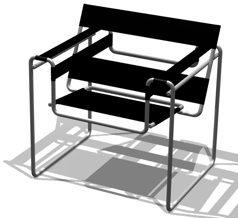
  •  Marcel Breuer’s Wassily Chair:

Image courtesy of Wikipedia, by Borowski

Image courtesy of Wikipedia, by Borowski

  •  Peter Keler’s Baby Cradle:

Image courtesy of www.tecta.de

Image courtesy of www.tecta.de

  • Wilhelm Wagenfeld’s and Karl Jakob Jucker’s Table Lamp:

Image courtesy of Wikipedia. Photo by Sailko

Image courtesy of Wikipedia. Photo by Sailko

  •  Walter Gropius’ Door Hardware:

Image courtesy of Double Stone Steel

Image courtesy of Double Stone Steel

  •   Josef Hartwig’s and Joost Schmidt’s Chess Set:

Image courtesy of Eye Magazine

Image courtesy of Eye Magazine

  •  Marcel Breuer’s Cantilever Chairs

Image courtesy of Wikipedia. Photo by Dibe

Image courtesy of Wikipedia. Photo by Dibe

  •  Oskar Schlemmer’s Design and Choreography for the Triadic Ballet:

Image courtesy of Wikipedia. Photo by Fred Romero

Image courtesy of Wikipedia. Photo by Fred Romero

THE BAUHAUS-RUDOLPH CONNECTION

How is Paul Rudolph related to the Bauhaus? The answers are both general and specific.

Broadly speaking, no Modern architect can escape the Bauhaus’ influence. Its approach to form, problem-solving, composition, aesthetics, theory, education, and even idealism are part of the genetic code of Modern Architecture. Rudolph—a man of the mid-20th century architectural generation—was saturated in this, and strongly self-identified with Modernism. 

Educationally, Gropius’ work extended to America—and not just via indirect influence, but through his direct teaching. After leaving Germany in 1934, he went to England—and settled in the US in 1937 where he restarted his pedagogical and professional life. Paul Rudolph chose to obtain his graduate (Masters) education at Harvard’s Graduate School of Design—whose architecture program was chaired by Walter Gropius! Even while a student, Rudolph’s special talent was recognized, and he was given a place in the studio which Gropius himself taught.

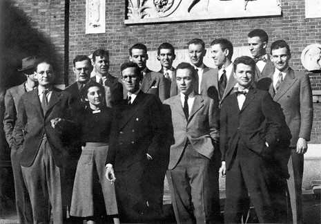
Paul Rudolph (front-row, at the far right) and his classmates at Harvard.Photo: Paul Rudolph Heritage Foundation

Paul Rudolph (front-row, at the far right) and his classmates at Harvard.

Photo: Paul Rudolph Heritage Foundation

In later years, people would point out to Rudolph the strong contrast between his own sculpturally expressive work vs. the relentlessly rectilinear “functionalist” buildings of Gropius and his followers (works that were derisively called “Harvard boxes”). But Rudolph acknowledged Gropius, saying that he had given a good basis for architectural work. Moreover, in 1950 Rudolph edited an issue of the French architecture journal, L’Architecture d’aujourd’hui, an issue that was focused on Gropius and his students in the US. Rudolph did not repudiate his teacher.

Finally, one can discern the Bauhaus influence on Rudolph—particularly in work from his Florida years—as in this striking drawing for the Denman Residence:

Axonometric drawing (circa 1946) by Paul Rudolph. Denman Residence, Siesta Kay, Florida.Courtesy of the Paul Rudolph Archive within the Library of Congress Prints and Photographs

Axonometric drawing (circa 1946) by Paul Rudolph. Denman Residence, Siesta Kay, Florida.

Courtesy of the Paul Rudolph Archive within the Library of Congress Prints and Photographs

Such fresh, clean, design—which embrace (and are drawn with) a clarity of conception—are expressions of the Bauhaus approach to composition and space-making. This is work which, we’d contend, Bauhaus-ian teachers would have been proud to see.

1968: AN AMAZING YEAR (INCLUDING FOR RUDOLPH)

“Earthrise”—probably the most famous photograph to come out of the space program. The photo was taken in 1968 during the Apollo 8 mission—the first time a manned ship had gone to the moon-and-back. Photo by US astronaut William Anders

“Earthrise”—probably the most famous photograph to come out of the space program. The photo was taken in 1968 during the Apollo 8 mission—the first time a manned ship had gone to the moon-and-back. Photo by US astronaut William Anders

THE BIG CHURN

1968 was an amazing year for the US—and the world. A year of firsts, a year of adventure, turbulence, war, creativity, and great sadness. A few examples of what it encompassed:

  • Apollo 8: first manned trip to the moon-and-back

  • First successful heart transplant

  • My Lai massacre in Vietnam

  • Prague Spring in Czechoslovakia

  • Martin Luther King and Robert Kennedy both assassinated.

  • Big Mac goes on sale nationwide

  • Founding of Intel corporation

  • Premiers of films Bonnie and Clyde, Rosemary’s Baby, and Planet of the Apes

  • North Vietnam launches Tet Offensive

  • 911 emergency phone service is initiated

  • Talking Barbie doll introduced

  • Massive student protests on campuses in the US and worldwide

  • London Bridge is sold to the US

  • Installation of first ATM machine in America

  • Chicago Democratic Convention protesters are met with violent police response—which is broadcast nationwide

  • Boeing introduces first jumbo jet

  • the musical Hair opens

 The cultural & domestic scenes were churning as well—wildly!—with pervasive questioning of the establishment in every domain, and extensive exploration of alternatives in lifestyle choices, religion, relationships, health, child-rearing, career, and education.

 The arts—painting, sculpture, dance, film, writing, curation—were especially affected. Nor did design escape, as fashion, display, advertising, graphics, architecture, and interiors saw their share of colorful and untamed experimentation.

MAINSTREAMING THE FAR-OUT

 While the mainstream architecture magazines kept publishing conventional work—plenty of International Style boxes filled their pages, and would do so for years to come!—the magazines also began to do articles on novel ideas and departures in design.

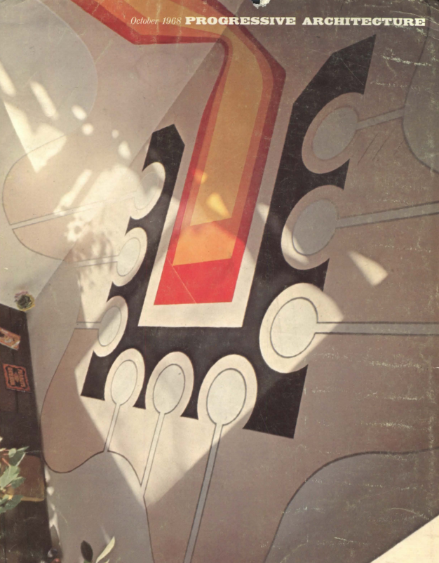
Cover of Progressive Architecture’s October 1968 issue, which dealt with the new adventures in interiors. Image: Courtesy of USModernist Library

Cover of Progressive Architecture’s October 1968 issue, which dealt with the new adventures in interiors. Image: Courtesy of USModernist Library

The October 1968 issue of Progressive Architecture was entirely devoted to looking at this strange new phenomena (as manifest in interiors)—and is a perfect example of the professional journals attempting to grapple with the wild things that were happening in design. The issue was titled:

THE REVOLUTION IN INTERIOR DESIGN: THE BOLD NEW POLY-EXPANDED MEGA DECORATION

 But, as though the editors couldn’t quite believe their eyes (or the sincere intent of the what they called “deviationist” designers), they kicked-off the issue with a meditative editorial asking:

“Is the work presented in this issue “serious”?

What followed were a series of article (each accompanied by a rich selection of designs) with provocative titles like:

  • Chaos As A System

  • Fun-House Architecture

  • The Synthetic Environment

  • Hard-Edge Interiors

  • Soft-Edge Exteriors

And, in a possible tribute to Tom Wolfe, one titled:

  • The Kinetic Electric Environment

RUDOLPH IN THE LATE 60’s

The year of that issue’s publication, 1968 (and the years bracketing it) was an exciting time for Paul Rudolph. They included some of his most interesting projects: Endo Labs, Tracey Towers, the Graphic Arts Center and LOMEX projects in NYC, the Green Residence, a stadium project for Saudi Arabia, Oriental Masonic Gardens (where he attempted to utilize prefabrication for housing units), the Burroughs Wellcome headquarters, the Brydges Library in Buffalo---and he also received the NY AIA’s Medal of Honor.

Paul Rudolph was referenced several times in that issue of Progressive Architecture. Ever the innovator, examples of Rudolph’s own designs were included—specifically in the last article, which was focused on light.

Even the title of that section of the magazine—via its unconventional (for the time) loose hand-lettering) reflected the adventurous nature of the content.

Even the title of that section of the magazine—via its unconventional (for the time) loose hand-lettering) reflected the adventurous nature of the content.

Here are the portions of the issue which showed Rudolph’s work:

Image courtesy of USModernist Library

Image courtesy of USModernist Library

Image courtesy of USModernist Library

Image courtesy of USModernist Library

Image courtesy of USModernist Library

Image courtesy of USModernist Library

In this work, as always, we see Rudolph-the-inventor: experimenting and exploring—and very much a part of that late 60’s hyper-creative era of design. Rudolph’s fascination with light (and light fixtures) would continue, and about a half-decade later he would go on to found a lighting company—Modulightor—in collaboration with Ernst Wagner.

CELEBRATING A MASTER[MIND]: WALTER GROPIUS passed 50 years ago, today—and we raise a toast

Walter Gropius standing in front of the rendering of his and Adolf Meyer’s entry in the 1922 Chicago Tribune tower design competition—an event which brought forth hundreds of submissions from architects all over the world. The design which Gropius a…

Walter Gropius standing in front of the rendering of his and Adolf Meyer’s entry in the 1922 Chicago Tribune tower design competition—an event which brought forth hundreds of submissions from architects all over the world. The design which Gropius and Meyer offered was formally aligned with what later came to be known as the International Style. Photo courtesy of The Charnel-House. Their in-depth article on the competition—and Gropius’ and Meyer’s entry in particular—can be found here.

HIS INFLUENCE IS EVERYWHERE…

It’s no exaggeration: every day, in every building, over the entire planet, when architects and designers put pen-to-paper (or mouse-to-pad), his effect is felt and seen. Walter Gropius (1883-1969)—whether you like the results-or-not (and they are controversial)—did change the world. A particular approach to design problem-solving and form—one which Aaron Betsky concisely calls “analytic reduction”—has shaped everything: from titanic buildings to teapots, from side-chairs to the “Simple Living” movement, from city plans to chess sets. Many of the alphabets you read and write with today wouldn’t exist without it—and neither, possibly, would Ikea or Pottery Barn (at least in their present forms). Even designers who reject that whole approach are still reacting to what was wrought by Gropius and his associates.

Gropius would probably identify himself as an architect—and he is credited (often with partners) for some intriguing and significant designs.

The Monument to the March Dead (Denkmal für die Märzgefallenen), in Weimar, Germany, designed by Walter Gropius. Conceived and constructed at the beginning of the 1920’s, it is an example of Gropius’ early Expressionist phase—a mode he’d abandon as …

The Monument to the March Dead (Denkmal für die Märzgefallenen), in Weimar, Germany, designed by Walter Gropius. Conceived and constructed at the beginning of the 1920’s, it is an example of Gropius’ early Expressionist phase—a mode he’d abandon as a more austere style, associated with later years of the Bauhaus, emerged.

But when we say “mastermind”, we’re mainly speaking of Gropius’ work shaping and leading the Bauhaus—the design school which he led from 1919 -to- 1928—and whose 100th birthday is being celebrated this year.

The Bauhaus in Dessau Germany: the second home of the school which Gropius led. The building complex was also his most famous work of architecture (though it is possible that Gropius worked on the project with others—as he was manifestly devoted to …

The Bauhaus in Dessau Germany: the second home of the school which Gropius led. The building complex was also his most famous work of architecture (though it is possible that Gropius worked on the project with others—as he was manifestly devoted to collaboration and had a history of design partners.) Photo: Detlef Mewes

The strange thing about the Bauhaus is that while we readily recognize a “Bauhaus style”—or think we do—the school’s faculty was composed of the widest range of teachers: a diverse group who came (and went!) over the school’s 14 year history. Their names are a Who’s Who of Modern design, and each of the teachers was a strong, distinctive personality, with their own aesthetics, philosophies, and approaches to teaching. So perhaps Gropius’ greatest contribution was gathering and managing this disparate and talented set—and keeping the school going during that tumultuous era between the World Wars. Asked about the great—and sometimes conflicting—diversity of the faculty, Gropius quaintly explained:

“There are many branches on the Bauhaus tree, and on them sit many different kinds of birds.”

THE GROPIUS - RUDOLPH CONNECTION

Paul Rudolph first studied architecture at the Alabama Polytechnic Institute (now known as Auburn University), and then went for his Masters at Harvard’s Graduate School of Design—where Walter Gropius was in-charge of the architecture program. There, Rudolph became one of Gropius’ favored students. Although Rudolph’s initial work, after Harvard, could be characterized as well within the Bauhausian tradition, his later architecture looks to many like a decisive repudiation of Gropius. Yet Rudolph never belittled his old teacher, and would later say that studying with Gropius had given “a good basis” for architectural work.

After Rudolph’s U.S. Navy service in World War II (and after he had graduated from Harvard), Rudolph was in the US Navy Reserve. He achieved the rank of lieutenant, and in 1951 was ordered to report for duty. This was an especially prolific and fruitful moment in the Florida phase of Rudolph’s career, with numerous projects commencing or under-construction—and Rudolph asked for a deferment. Reaching out to his former professor, Rudolph obtained this letter-of-support from Walter Gropius:

Written in 1951, on the letterhead of Harvard’s Graduate School of Design, Gropius gives his reasons for supporting Paul Rudolph’s request for a deferment from Naval service. From the archives of the Paul Rudolph Heritage Foundation.

Written in 1951, on the letterhead of Harvard’s Graduate School of Design, Gropius gives his reasons for supporting Paul Rudolph’s request for a deferment from Naval service. From the archives of the Paul Rudolph Heritage Foundation.

A TOAST!

We’ve learned that there’s a new way to celebrate Walter Gropius: Gropius House Cider (complete with Bauhaus-inspired graphics). As it is described—

Proceeds from the cider will benefit Historic New England’s efforts to restore the apple orchard that originally surrounded the house. Help us plant new trees with root stock identical to the original Baldwin apple trees . . . Gropius House Cider celebrates simple ingredients — Vermont cider, aged in gin barrels, sweetened with just a touch of honey — and a refined result. This crisp and refreshing cider draws its inspiration from the teachings of Bauhaus, and from the intimate dinner parties and gatherings the Gropiuses often hosted at their Lincoln home.

So, on this half-century anniversary of his passing, join us in a toast to Meister Gropius—influential teacher, and ultimately a world-maker—perhaps with a glass of this namesake cider.

The new Gropius House Cider, sales of which will help restore the orchard at Gropius’ own home in Lincoln, MA. Photograph by Tony Luong, from the Historic New England page devoted to Gropius House Cider.

The new Gropius House Cider, sales of which will help restore the orchard at Gropius’ own home in Lincoln, MA. Photograph by Tony Luong, from the Historic New England page devoted to Gropius House Cider.


RUDOLPH'S LOUIS SULLIVAN PANEL

An ornamental panel, designed by Louis Sullivan for the Schiller Theater (later known as the Garrick Theater) in Chicago, which opened in 1901. Photograph courtesy of Modulightor.

An ornamental panel, designed by Louis Sullivan for the Schiller Theater (later known as the Garrick Theater) in Chicago, which opened in 1901. Photograph courtesy of Modulightor.

Visitors to the Modulightor Building—and particularly to the Paul Rudolph-designed duplex which is the spatial gem within it—are always curious about one of the objects on display here: a large (nearly 2 feet x 2 feet) panel, with a creamy finish and a complex composition of organic and geometric forms. The panel was designed by Louis Sullivan, and we thought you’d like to hear its interesting story.

ORIGINS: THE WORK OF ANOTHER MASTER

Louis Sullivan (1856-1924) was a renowned American architect, often considered​ one of the creators of the modern concept the skyscraper. Frank Lloyd Wright, who worked for him, asserted Sullivan to have been his greatest mentor, referring to Sullivan as “Lieber Meister” (beloved master)—and for Wright, a towering ego, it says something that he so strongly acknowledged another architect. Sullivan was based in Chicago and worked mainly in the Midwest—although he also designed major buildings as far away as Buffalo and New York City.

Sullivan was famous for his exuberant, lively, and inventive ornament, creatively integrating both natural (generally plant-based) and geometric forms. The ornament was used on the exteriors and interiors of his buildings, and was made from a variety of materials: terracotta, carved stone, plaster, as well as cast and wrought metals such as bronze and iron.

 Adler & Sullivan—the firm he formed with his architectural partner, Dankmar Adler—designed the Schiller Theater (later known at the Garrick Theater) in Chicago, opening in 1901 with 1,300 seats. It was demolished in 1961, amid protests by preservationists. Although the building was not saved, a large number of ornamental elements from the building were recovered—including our ornamental panel made from cast plaster.

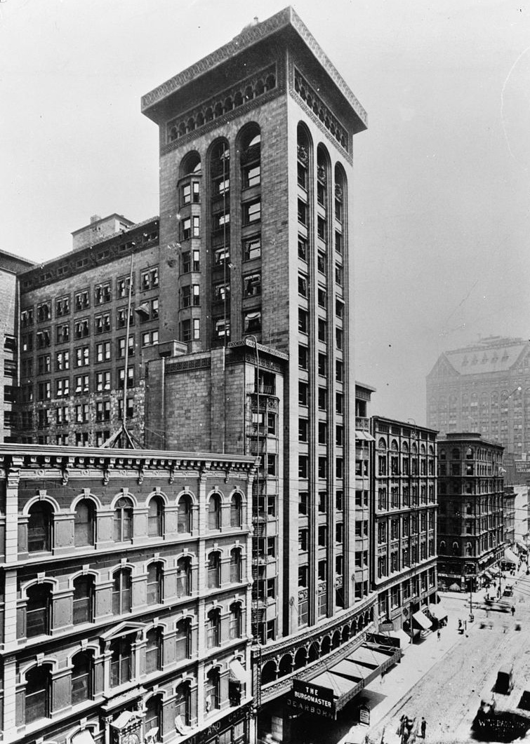
The Schiller Theater Building (later known as the Garrick) was designed by Louis Sullivan and Dankmar Adler of the firm Adler & Sullivan. Our “Sullivan panel” was part of the ornament of the theater’s proscenium arch. Image: Historic American Bu…

The Schiller Theater Building (later known as the Garrick) was designed by Louis Sullivan and Dankmar Adler of the firm Adler & Sullivan. Our “Sullivan panel” was part of the ornament of the theater’s proscenium arch. Image: Historic American Buildings Survey copy of a photograph taken circa 1900, Library of Congress Prints and Photographs Division.

Louis Sullivan is also considered to be America’s prime practitioner of Art Nouveau in architectural design. Though often grouped with other Art Nouveau practitioners, Sullivan’s personal “system of architectural ornament” really grew from his individual philosophy, as well as his investigations of patterns, systems of geometric and natural generation and growth, and by plant forms—and one can readily see that in his composition of this decorative panel.

This view, of the theater’s interior, shows that Sullivan used a variety of cast plaster ornament. The proscenium’s design (seen at the upper-right) is composed of a series of recessing, concentric arches, and one can see that those arches are lined…

This view, of the theater’s interior, shows that Sullivan used a variety of cast plaster ornament. The proscenium’s design (seen at the upper-right) is composed of a series of recessing, concentric arches, and one can see that those arches are lined by repeated castings of our “Sullivan panel.” Image: Historic American Buildings Survey copy of a photograph taken circa 1900, Library of Congress Prints and Photographs Division

FROM CHICAGO -TO- YALE

 When the Schiller/Garrick was demolished, at the beginning of the 1960’s, efforts were made to create a comprehensive record of the building (as well as to preserve as many examples of the ornament as possible.) Heroic in this work was Richard Nickel (1928-1972)—the Chicago-based photographer and preservationist. It is to him that we owe much of the documentation and artifacts which survive of Chicago’s lost architecture, as well as his helping to create the preservation movement.

Paul Rudolph took over as Chair of the architecture school at Yale in 1958—and he was to have a long run as head of the school, not leaving the post until 1965. While there, he achieved what is probably the dream of any chair or dean: to design his own school building. The design process began shortly after he started at Yale, and the building—now known as Rudolph Hall in his honor—was completed in 1963, almost instantly becoming one of the most famous Modern buildings in the world.

Although the building rapidly became an icon of the Modern Movement, Rudolph had placed examples of vintage architectural fragments, ornament, and sculpture throughout the building—including examples of Sullivan ornament. We don’t know the exact process whereby the Garrick panels got from Chicago to Yale, but the timing was right: the theater was demolished about the same time that Yale’s school building was being constructed and fitted-out. [Perhaps there was some intersection between Nickel and Rudolph?]

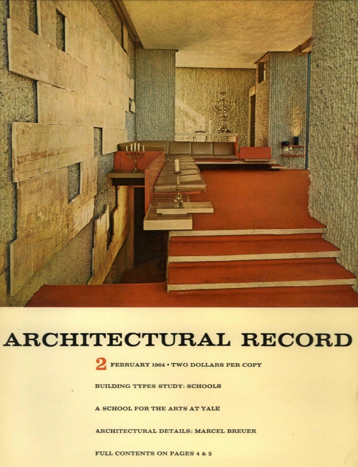
The Yale Art & Architecture Building—Paul Rudolph’s most famous design, and an icon of Modern architecture—was featured in Architectural Record’s February 1964 issue. The cover shows one of the interiors in which, as with many of the building’s …

The Yale Art & Architecture Building—Paul Rudolph’s most famous design, and an icon of Modern architecture—was featured in Architectural Record’s February 1964 issue. The cover shows one of the interiors in which, as with many of the building’s other spaces, Rudolph had incorporated vintage ornament, fragments, and objects. Image: Courtesy of USModernist Library.

Placing these objects into such an educational setting aroused responses of a “How could you!” flavor (as some thought that their inclusion was a betrayal of Modern principles)—most pointedly from Yale teacher, artist (and Bauhaus alumnus) Josef Albers. [The controversy is covered in recent book from Princeton University Press, Plaster Monuments: Architecture and the Power of Reproduction by Dr. Mari Lending, a professor of architectural history and theory at the Oslo School of Architecture and Design.]

FROM YALE -TO- RUDOLPH

Ernst Wagner, founder of the Paul Rudolph Heritage Foundation, tells us that when Rudolph left Yale in 1965, he was told that he could take anything he wanted—and the Sullivan panel was among the things he brought with him to his new home, New York City. In his New York rental apartment, Rudolph used the panel in a unique way: to form the back plane of his living room sofa. Actually, the images we’ve seen of that room show several panels in-a-row, forming that sofa back—so we don’t know if Rudolph owned several original Sullivan panels -or- if he had multiple castings made.

An article in the May, 1967 issue of Progressive Architecture magazine focused on innovative interiors—including Paul Rudolph’s floor-through apartment in a townhouse near the UN. In this view of the living room, the sofa back---made of a series of …

An article in the May, 1967 issue of Progressive Architecture magazine focused on innovative interiors—including Paul Rudolph’s floor-through apartment in a townhouse near the UN. In this view of the living room, the sofa back---made of a series of Sullivan panels—can be seen on the far left. Image: Courtesy of USModernist Library

THE PANEL GOES UPSTAIRS

Later (in collaboration with Ernst Wagner) Rudolph purchased the townhouse in which he’d been renting: 23 Beekman Place—and he went on to create his famous “Quadruplex” penthouse apartment atop the building. The Sullivan panel, placed at the Eastern end of the living room, acted as a strong formal focus point.

Paul Rudolph’s section-perspective of his Beekman Place “Quadruplex” apartment. In this longitudinal section, looking South, one can see the Sullivan panel at the lower-left. Image: Paul Rudolph Archive, Library of Congress – Prints and Photographs …

Paul Rudolph’s section-perspective of his Beekman Place “Quadruplex” apartment. In this longitudinal section, looking South, one can see the Sullivan panel at the lower-left. Image: Paul Rudolph Archive, Library of Congress – Prints and Photographs Division

A view of the Living Room in Rudolph’s Quadruplex apartment, looking East. The Sullivan panel at the end of the room, in front of the main window which looks out over the East River. Photograph by Ed Chappell

A view of the Living Room in Rudolph’s Quadruplex apartment, looking East. The Sullivan panel at the end of the room, in front of the main window which looks out over the East River. Photograph by Ed Chappell

FROM QUADRUPLEX -TO- DUPLEX

When Rudolph passed in 1997, Ernst Wagner was one of his heirs. A number of Rudolph’s possessions—including objets d’art from Rudolph’s Quadruplex apartment, passed to Wagner, and among them was the Sullivan Panel (with the mounting frame which Rudolph had designed for it).

The duplex residential spaces, within the Modulightor Building, were originally designed to be revenue-producing rental apartments, but Ernst Wagner (who’d become the sole owner of the building with Rudolph’s passing) began to occupy those spaces in 2000, opening up the doors between the north and south apartments so that it became one spacious, light-filled duplex. He furnished them with things he’d collected, as well as the legacy of objects and antiques he’d received from Rudolph—including the Sullivan panel—and that’s where the panel resides today.

The Sullivan panel, where it now resides in the living room of the Rudolph-designed duplex within the Modulightor Building. Photograph: courtesy of Annie Schlechter

The Sullivan panel, where it now resides in the living room of the Rudolph-designed duplex within the Modulightor Building. Photograph: courtesy of Annie Schlechter

SEE THE PANEL IN PERSON

The Modulightor Building—including the Rudolph-designed duplex (with the Sullivan panel) can be visited, either by attending our monthly Open House, or by scheduling a private tour. Find out about that through the Paul Rudolph Heritage Foundation’s Visit page on our website.

READ ALL ABOUT IT

This American Life’s Ira Glass, Chris Ware, and Tim Samuelson have produced a densely rich book-DVD set, “Lost Buildings,” which focuses on Sullivan’s work—including the efforts that Richard Nickel made to save that built heritage (and the Schiller/Garrick building receives a lot of the book’s attention).

“Lost Buildings” is a book-DVD set, which focuses on the lost work of Louis Sullivan in the Chicago area. The Schiller/Garrick building—and especially its ornament—is one of the buildings which the book delves into.

“Lost Buildings” is a book-DVD set, which focuses on the lost work of Louis Sullivan in the Chicago area. The Schiller/Garrick building—and especially its ornament—is one of the buildings which the book delves into.

If you’d like to get a copy, you can obtain it directly through This American Life’s website. Copies are also often available through Abebooks or Amazon—and the quickest way to locate them on those sites is by putting these 4 words into those pages’ search box: lost buildings collaboration ware

AND GET THE PANEL!

The Paul Rudolph Heritage Foundation, in collaboration with Modulightor, is also making available full-size reproductions of the Sullivan panel. They are fabricated by an art-casting firm (who also applies a finish which matches the original with great fidelity), and a portion of each sale goes to support the work of the Foundation. [If you’d like to discuss obtaining one of them, please contact us at:  office@paulrudolphheritagefoundation.org ]

ARCHITECTS AND HUMOR

Photo: Demilked.com

Photo: Demilked.com

ARCHITECTS LAUGH…

If you’re interested in architecture—whether as an active practitioner, historian, or witness—there’s plenty to laugh at [and even more to cry at—especially the fees]. Walloping misunderstandings of one’s design intent, whether by builders or clients, do happen—and, though such occasions are troublesome, as human beings we try to see the humor in them. Also, design work can go in unusual directions, sometimes to deal with unusual or unexpected site conditions—with amusing (and very clever) results, as in the above image.

LAUGHING ARCHITECTURE…

In the above case, one can well imagine the architect laughing, happily, at his own solution to a challenging situation. But what about projects where the intention seems to have been humorous from the beginning (perhaps a goal set by the client)?

Here are a couple of examples:

The Upside Down House, in Niagara Falls, Ontario. Photo: Infoniagara.com

The Upside Down House, in Niagara Falls, Ontario. Photo: Infoniagara.com

Yes, this is quite real: it is the office building of the National Fisheries Development Board, in Hyderabad, IndiaPhoto: Noah / Seelam, as seen on Unusualplaces.org

Yes, this is quite real: it is the office building of the National Fisheries Development Board, in Hyderabad, India

Photo: Noah / Seelam, as seen on Unusualplaces.org

LAUGHING AT ARCHITECTS…

Laughing at the foibles, pitfalls, and pretensions of architecture as a profession—as well as individual architects and their particular styles—is another category of humor where there are some great examples. The 1920’s and 1930’s issues of the American architectural magazine, Pencil Points (which later became Progressive Architecture) are full of reader-supplied examples. And the distinguished journal, Architectural Record, was a long-running venue for the work of the great cartoonist, Alan Dunn—of which this is a pointed offering:

While most people encountered Alan Dunn’s work in The New Yorker, he also had a long relationship with Architectural Record, supplying many cartoons over decades—of which this is a fine example. Image courtesy of Architectural Record

While most people encountered Alan Dunn’s work in The New Yorker, he also had a long relationship with Architectural Record, supplying many cartoons over decades—of which this is a fine example. Image courtesy of Architectural Record

Even Dilbert has taken on the vicissitudes of architectural life—and here’s an example of the masterful work of David Levine—the New York Review of Books’ long-time resident caricaturist. His portrait of Philip Johnson which incorporates a broken pediment (that Johnson had used for his famous—or infamous—AT&T Building in New York):

David Levine’s image of Philip Johnson, drawn in 1994. It has been used with essay-reviews about Johnson (focusing on books about him), which have appeared in The New York Review of Books.Image: The New York Review of Books

David Levine’s image of Philip Johnson, drawn in 1994. It has been used with essay-reviews about Johnson (focusing on books about him), which have appeared in The New York Review of Books.

Image: The New York Review of Books


There’s also The Onion—the joyously satirical publication (which had been an ink-on-paper weekly—but is now entirely online.). Some years ago, they published this item about Frank Gehry:

News story source: www.theonion.com

News story source: www.theonion.com

The Onion, we’re glad to report, just won’t leave architects alone—as Googling “The Onion” together with “Architecture” will quickly reveal. And that brings us to the main point of our post: that The Onion turned their attention to Paul Rudolph—as you can see here:

News story source: www.theonion.com

News story source: www.theonion.com

AND STOP ME IF YOU HEARD THIS ONE…


If you haven’t had enough, there are several books which engage with the topic of architectural humor. Alan Dunn’s cartoons were collected in several volumes, and Louis Hellman’s “Archi-Têtes”—his clever caricatures of famous architects (each in the style of their subject)—have been gathered into a book.


But seriously folks, if you’d like to read an in-depth study on the topic: Laughing at Architecture is a thorough and thoughtful set of essays on architecture and humor, edited by Michela Rosso:

Photo: Bloomsbury Publishing

Photo: Bloomsbury Publishing

The Duel Over Modernism

Paul Rudolph’s Orange County Government Center, prior to its partial demolition. Was it yet another victim of profound misunderstandings about architecture and beauty?Photo by Daniel Case

Paul Rudolph’s Orange County Government Center, prior to its partial demolition. Was it yet another victim of profound misunderstandings about architecture and beauty?

Photo by Daniel Case

THE DEBATE

SETTING UP THE DUEL

Prospect is a monthly British magazine which covers a variety of topics and issues, from national & international news to the arts—and their authors (and the points-of-views expressed) are from across the spectrum. They recently sponsored a debate about the value and effect of Modern architecture—and Brutalist architecture in particular. The article is titled:

The Duel: Has Modern Architecture Ruined Britain?

And subtitled:

Our two contributors go head-to-head on the brutality—or not—of brutalism

And you can read the full article about the debate here.

The “duelists” are intelligent, well-informed, and articulate—and, at the on-line article’s end, there was even an opportunity for readers to vote on who “won.” We thought it would be good to bring this debate to your attention. It’s not long, and is well worth reading—and we do have a few comments on it (which we’ll address at the end).

THE DUELISTS

Barnabas Calder:

Dr. Calder is an architectural historian at the University of Liverpool School of Architecture. He has written books about the history of architecture and about the work of Modern architect Denys Lasdun, as well as many papers, chapters, and reports on architecture, design, and urbanism. In 2016 he published his Modernist manifesto, “Raw Concrete: A Field Guide to British Brutalism.” In a recent article in Garage magazine, he remarks “People used to laugh out loud when I told them I was studying 1960s concrete buildings. Part of the change is no doubt just passing time. As with haircuts, clothes, and glasses, tastes change and the previous fashion goes violently out of style for a while, then gets gleefully rediscovered by younger people a bit later.” And in an article in Wallpaper, he goes on to says of Brutalism, “It’s  still both misunderstood and wildly underestimated”… “the period produced masterpieces equal to anything else produced in architecture.” 

James Stevens Curl:

Dr. Curl is an architectural historian, architect, and prolific author. He is Professor at Ulster University’s School of Architecture and Design, and Professor Emeritus at de Montfort University, and was a visiting fellow at Peterhouse, Cambridge. He was awarded the President’s Medal of the British Academy, and is a member of the distinguished Art Workers’ Guild. Among his many books are: “English Architecture: An Illustrated Glossary”; “Classical  Architecture: An Introduction to Its Vocabulary and Essentials”; and the “Oxford Dictionary of Architecture”. Most recently, Oxford University Press published his in-depth study of Modernism: “Making Dystopia: “The Strange Rise and Survival of Architectural Barbarism”.

Book cover images: Amazon

POINTS (AND COUNTERPOINTS) FROM THE DEBATE

The debate was frank, and the speakers expressed themselves forcefully. Here are excerpts from some points each made—direct quotations from the two “duelists”:

Points that Modern architecture is ruining Britain

(Quotes from Dr. Curl):

  • Visitors to these islands who have eyes to see will observe that there is hardly a town or city that has not had its streets—and skyline—wrecked by insensitive, crude, post-1945 additions which ignore established geometries, urban grain, scale, materials, and emphases.

  • Such structures were designed by persons indoctrinated in schools of architecture… Harmony with what already exists has never been a consideration for them …  [They have] done everything possible to create buildings incompatible with anything that came before. It seems that the ability to destroy a townscape or a skyline was the only way they have been able to make their marks. Can anyone point to a town in Britain that has been improved aesthetically by modern buildings?

  • How has this catastrophe been allowed to happen? A series of totalitarian doctrinaires reduced the infinitely adaptable languages of real architecture to an impoverished vocabulary of monosyllabic grunts. Those individuals rejected the past so that everyone had to start from scratch, reinventing the wheel and confining their design clichés to a few banalities. Today … modern architecture is dominated by so-called “stars,” and becomes more bizarre, egotistical, unsettling, and expensive, ignoring contexts and proving stratospherically remote from the aspirations and needs of ordinary humanity. 

  • You use the old chestnut that because some new buildings were initially perceived as “shocking,” but accepted later, this applies equally to modernist ones. Studies refute this. Modernist buildings seriously degrade the environment by generating hostile responses in humans and damaging their health. I suggest you peep at Robert Gifford’s “The Consequences of Living in High-Rise Buildings” in Architectural Science Review….

  • Much modernist design denies gravity and sets out to create unease. You love concrete, with its black, weeping stains, its tendency to crack, its ability only to deteriorate and never age gracefully. Your bizarre judgments ignore obvious signs that reinforced concrete is not the answer to everything.

  • You cannot see (or admit) that the harmoniousness of our townscapes has suffered dreadfully since the universal embrace of modernism so there is nothing I can do to help you or other Brutalist enthusiasts. Your myopia explains why you fail to notice that members of the “British Brutalist Appreciation Society” are less numerous than are paying members of the Victorian Society.

  • You employ a cheap debating-point: you assume that anyone who criticizes inhuman non-architecture wants a return to Greco-Roman Classicism, which is untrue. … I argue for environments fit for ordinary human beings, which embrace elements that are an integral part of what remains of our once-rich cultural heritage. I am also fully aware of the massive propaganda and bullying in architectural “schools” that brainwash our young architects to embrace what is inhuman, repellent, and ugly. 

Points that Modern architecture isn’t ruining Britain

(Quotes from Dr. Calder):

  • You make sweeping criticisms against the architecture of recent decades—a lot of styles and ideas have come and gone since 1945. The term “modern” covers a lot of ground. But the truth is that all of your allegations were [once] levelled with equal justice at Victorian buildings.

  • Today’s skyscrapers also change the skyline, as you say. But so did medieval castles and churches, or Victorian town halls and stations. Like the high buildings of earlier centuries, tall office blocks map where the money and power lie. The City of London is aggressively commercial—as it always has been. The developers of the 20th and 21st centuries are no more ruthless than those of the 17th to 19th centuries. The great post-1945 regenerations, by contrast, aimed to improve the housing of ordinary people.

  • Appreciating any style requires an open mind; any language sounds like “grunts” until you listen. Architects trained since 1945 have received better history teaching than any earlier generation; the Barbican is the proud descendant of the great Victorian projects. It recasts London’s Georgian crescents and squares into exhilarating and livable new forms using the unparalleled structural capabilities of concrete. Had Vanbrugh, Soane or Scott worked in the 1960s, they would have been proud to produce anything as heart-liftingly sublime.

  • By what definition has Britain been “ruined” since 1945? The high tide of modernism in post-war Britain coincided with a steep and sustained rise in the population’s health, education and prosperity.

  • However, much though I admire the best buildings of the period, I would not ascribe this improvement to architectural aesthetics. I do not share your peculiar faith in the power of architectural style to ruin lives.

  • Can anyone truly believe that crime and suffering in Britain’s poorest areas is caused by an absence of classical columns, rather than working-class unemployment from de-industrialization? Does anyone really think that if the Barbican had been brick, not concrete, it would not have been caught up in the industrial action of the 1970s? Anyone who finds concrete “black” with dirt should compare it with the coal-black sandstones of Glasgow under Victorian soot.

  • As to whether modernism has the potential to pass into a period of new public appreciation, as Victorian architecture did in the 1960s-70s, its stock has been rising fast for at least the past decade.

  • Your angry dismissal of several decades of world architecture as an evil conspiracy is implausible. Your “overwhelming evidence” of the psychological damage done by the architecture you happen to dislike largely consists of methodologically problematic, politicized writings.

  • Personally, I like architecture best when it’s as sublimely overwhelming as Michelangelo, Hawksmoor or Ernö Goldfinger. However, modernism can also be pretty and harmonious, …. It can be courteously contextual street architecture....

  • Modern architecture can be symmetrically dignified like Louis Kahn’s Salk Institute, or thrillingly asymmetrical like Lasdun’s Royal College of Physicians. Recent architecture can be as curvaceous and hallucinatory as the Italian baroque (Paul Rudolph in Boston, MA, or Gehry’s Bilbao Guggenheim exterior) or as tightly-controlled and rhythmical as the German classicist Schinkel (anything by Ludwig Mies van der Rohe). Interiors can be cozy like Alvar Aalto’s houses, or grandly formal like Kahn’s Dhaka parliament. Perhaps the thing modernist buildings’ detractors find hardest to see is that they can be beautifully crafted, like the meticulous concrete-work of the National Theatre, carefully poured into hand-made wooden moulds.

  • I urge readers to enjoy what is good about any architecture. Frothing with fury at the sight of newer buildings is an unproductive use of emotional energy and serves only to impoverish the rich experience of our varied cityscapes. 

WHAT’S FAIR IS FAIR

We’ve tried, in the excerpts above, to give representative and approximately equal space to each speaker (as well as their biographies).

And now—offered in that same spirit of fairness—we have some comments:

  • If you’re iffy on the architectural value and long-term worth of concrete/Brutalist architecture, Dr. Calder’s book is “a way in” to understanding and—just as important—appreciating such designs as being true works of architectural merit (and art), as well as places that can nourish the human spirit. In his debate points, he exhorts us to stay open—and his book is the sort of design-meditation which helps us to look for poetry and humanity where we might not think it can be found.

  • On-the-other-hand, Dr. Curl’s recent book is a shocker. If you are on his “side” (and we would do well to remember Alex Comfort’s wisdom about sides: “… the flags are phony anyhow.”) then in Curl’s book will find confirmation of your inclinations, backed by in-depth research about the points he makes above. But even if you are opposed, you will find eye-opening historical information on the origins and sub-texts of Modernism.

  • It does no one any good to deny the faults and problems of Modern architecture—and this is particularly true when it comes to city planning (as distinct from individual buildings). While it can create some marvelous perspective drawings, the more than half-a-century of the “tower in the park” model of Le Corbusier shows how preponderantly unsuccessful it is—and sometimes a disaster. This is usually and especially so when the tenants (the “demographics”) of a project are not of a high-enough income level supply sufficent funds to building management, to allow the staff to maintain & manicure their buildings and districts.

  • But it is really unfair to impugn the motives of Modern designer and planners. Many were utterly sincere—sincerely idealistic!—that new approaches could yield better lives.

  • People today have no idea of the devastatingly inhuman conditions of pre-WWII cities, particularly in the working-class sections (and a reading of Jacob Riis’ book is illuminating on what citizens really had to live in and with.) So consider the case of Ludwig Hilberseimer: a teacher at the Bauhaus (who, after emigrating to the US, ended up working for Mies and teaching at IIT). Visions of rebuilt cities and mass-habitations, like those offered by Hilberseimer, may look weirdly dystopian—But: they were sincerely-offered proposals, trying to give ground-down citizens places that were clean, with light and air; and access to electricity, plumbing, and heating (services which we’d consider “basic” today, but which most city dwellers back then could only dream of). Hilberseimer’s vision, tho’ repugnantly reductive to our eyes today, was part of a sincere program to replace existing urban hells.

One of Ludwig Hilberseimer’s visions for the a reformed, rebuilt, efficient city.  Image: Drawing by Hilberseimer, from 1924.

One of Ludwig Hilberseimer’s visions for the a reformed, rebuilt, efficient city. Image: Drawing by Hilberseimer, from 1924.

  • It’s foolish to deny the beauty of some Modern works. We’re a particular fan of Le Corbusier’s Villa Savoye:

The Villa Savoye, in Poissy, on he outskirts of Paris. Design work was begun by Le Corbusier in 1928, and the building was completed in 1931. Source: Wikipedia

The Villa Savoye, in Poissy, on he outskirts of Paris. Design work was begun by Le Corbusier in 1928, and the building was completed in 1931. Source: Wikipedia

  • But, admittedly, that iconic house is an “object” in the landscape—and, yes, almost anything can look good in such an isolated sculpture-ish context. It’s much harder to do a successful building in the city, and even harder to create good urban spaces. Rudolph was aware of this, and called for urban vitality and variety, saying: 

“We desperately need to relearn the art of disposing our buildings to create different kinds of space: the quiet, enclosed, isolated, shaded space; the hustling, bustling space, pungent with vitality; the paved, dignified, vast, sumptuous, even awe-inspiring space; the mysterious space; the transition space which defines, separates, and yet joins juxtaposed spaces of contrasting character. We need sequences of space which arouse one’s curiosity, give a sense of anticipation, which beckon and impel us to rush forward to find that releasing space which dominates, which acts as a climax and magnet, and gives direction. Most important of all, we need those outer spaces which encourage social interaction.” 

  • We also have to be honest about acknowledging the problems of concrete construction—particularly exposed concrete. Curl and company are not “seeing things” when they report streaking, grayness, and an overall depressingly dingy look. But that is not true of all concrete construction—as many works of Rudolph and others show over-and-over. Moreover, the techniques to care for and repair concrete buildings are getting better-and-better.

  • The challenge is, when concrete is used, to use it with the mastery of those who make it luminous. There are ways to do that—but it takes knowledge (both in the drafting room and on the construction site), and it’s hard to transcend rock-bottom budgets.

  • When concrete is done well—and Rudolph’s Temple Street Garage in Boston comes to mind as a superb example—it is sculptural, moving, captures the light in wonderful ways, and is even sensuously textured:

Paul Rudolph’s Temple Street Garage, Boston. Photo: NCSU Library – Design Library Image Collection

Paul Rudolph’s Temple Street Garage, Boston. Photo: NCSU Library – Design Library Image Collection

  • Or it can be mindfully serene, as in much of Ando’s work:

Ando’s Benesse House, Japan. Photo: courtesy of Tadao Ando

Ando’s Benesse House, Japan. Photo: courtesy of Tadao Ando

  • Finally, we’ll quote from one of Rudolph’s former students, Robert A. M. Stern. When considering such seeming oppositions (as in this “duel”), he said:

“It is not a matter of Modern Architecture or Classical Architecture—but rather of Good Architecture and Bad Architecture!”

Do we have to condemn a whole architectural style or approach? The world, including its architectural history, is complex, messy, big—and terribly hard to classify or comprehensively judge. Who could? 

Better that we should develop and sharpen our ability to practice and make caring decisions—that’s the way to better architecture.

Paul Rudolph’s Pencils and Pens. Image: Library of Congress, Prints and Photographs Division

Paul Rudolph’s Pencils and Pens. Image: Library of Congress, Prints and Photographs Division

RUDOLPH vis-à-vis THOMPSON

Left: Paul Rudolph, architect and urbanist. Photo: Library of Congress – Prints and Photographs Division.

Right: Benjamin Thompson, architect and urbanist. Photo: http://architectuul.com.

Vis-à-vis is a French phrase which translates as: face-to-face. It has been applied in assorted, quite literal ways, for example: for the kind of carriage wherein passengers sit in that configuration. Here’s the Queen being conveyed in a vis-à-vis:

Queen Elizabeth at the Royal Ascot races.Photo: www.phrases.org.uk

Queen Elizabeth at the Royal Ascot races.

Photo: www.phrases.org.uk

But we frequently see it used in the a rather less literal sense, to mean a direct contrast between two arguments, or two examples, or two sets of evidence, or two points-of-view. Making a case for policy, by using starkly contrasting examples, is an effective way to examine a point or advocate for a specific course-of-action.

A powerful example is a contrast that’s built into the DNA of the United States: it’s in the founding document, the Declaration of Independence. A key passage states:

Prudence, indeed, will dictate that Governments long established should not be changed for light and transient causes; and accordingly all experience hath shewn, that mankind are more disposed to suffer, while evils are sufferable, than to right themselves by abolishing the forms to which they are accustomed.

Then, vis-à-vis, it states the contrasting case:

But when a long train of abuses and usurpations, pursuing invariably the same Object evinces a design to reduce them under absolute Despotism, it is their right, it is their duty, to throw off such Government, and to provide new Guards for their future security.

It then it goes on to present evidence, by listing a devastating set of abuses. It is an effective document, and—even today—still moving to read in-full.

We’ve just come across another example of a contrasting vis-à-vis—this interesting article, by David N. Fixler, which invokes Paul Rudolph:

The Paul in the headline is Paul Rudolph, and the Ben is Benjamin Thompson. Readers of these posts will probably need no introduction to Rudolph—but some words on Thompson may be of use.

Benjamin Thompson (1918-2002) was an almost exact contemporary of Rudolph—indeed, they were born in the same year. He was an architect and urbanist, and was associated with two significant firms: The Architects Collaborative (of which Walter Gropius was a partner), and then his own firm, Benjamin Thompson and Associates. Many of his works—particularly when he was associated with Gropius—were of canonically Modern design, often in the “Harvard Box” mode. Later, in connection with his serious thinking about the power of architecture to enliven and energize urban (and other) settings, he started to incorporate more stimulating forms into his architecture. Like Rudolph, he worked in many parts of the country, and on many different building types—and his firm was very successful with abundant commissions. We’d like to note one of his most well-known designs, a work of architecture of enduringly fine quality: his Design Research flagship store-building in Cambridge, MA (built for a company he also founded).

The Design Research store in Cambridge, MA, first opened in 1969.Photo: Daderot

The Design Research store in Cambridge, MA, first opened in 1969.

Photo: Daderot

But what Benjamin Thomson will probably be most remembered for is his conception, planning & design of“festival marketplaces”—especially incollaborationwith legendary developer and urbanist James W. Rouse. These are concentrated, walkable urban settings that combine shopping, dining (interior and al fresco), food stalls, pushcarts, plazas, bright graphics and banners, seating, preservation and/or renovation of vintage architecture (or new buildings that evoked the enchantment of older ones), and public art. The most famous of these are Harborplace in Baltimore, South Street Seaport in New York, Jacksonville Landing in Florida, and Faneuil Hall-Quincy Market in Boston. These projects were such successes, and such invigorating islands of urban energy, that they were seen and studied as almost magically effective models for civic design and revitalization. Purportedly, not all remained successful, as some contend is shown in the alleged uneven fortunes of places likeSouth Street Seaport and Jacksonville Landing.

The author of the Ben & Paul article is David N. Fixler, FAIA, who has been president of the New England chapter of DOCOMOMO. Mr. Fixler is extremely knowledgeable about the many tributaries of Modernism, and is well-qualified to talk about the contrasting approaches of figures like Rudolph and Thompson. As he points out, it’s Thompson’s “festival marketplaces” which exemplify the “vis-à-vis” to Paul Rudolph’s approach to larger-scale urban design.

The article makes astute annotations on the parallel tracks of the two architects, and equally insightful observations on how their approaches to design manifestly diverge. This is markedly shown in photographs, in the article, of models for two projects. The Thompson model is on top, and the Rudolph model is below:

The two approaches, of Thompson and Rudolph, are embodied in architectural models from each, which are depicted in the article.Image: a page from the article, “Ben & Paul” by David N. Fixler, in the Spring,2011 issue of Architecture Boston magaz…

The two approaches, of Thompson and Rudolph, are embodied in architectural models from each, which are depicted in the article.

Image: a page from the article, “Ben & Paul” by David N. Fixler, in the Spring,2011 issue of Architecture Boston magazine.

Here are passages from Mr. Fixler’s fine text, which we think represent the essence of the argument:

The next leap is to the scale of the city, where the contrast of their respective philosophies is most starkly revealed. Here the idea of the “festival marketplace” — and the city as theater — becomes most evident in Thompson’s work. His buildings are backdrops, armatures that enable the unfolding of a colorful, flavorful, and (most important) desirable urban experience. As these expand into the realm of the unbuilt or partially realized megaproject — such as the Custom House Development in Dublin, or Harumi 1 Chome in Japan — the architecture remains unassertive and almost self-deprecating relative to the splendor of the experience.

In contrast, Rudolph asserts a utopian ideal about the ability of architecture to mold one’s experience of both the institution and the city. Nowhere is this more evident than in the 1962–71 Boston Government Services Center (Lindemann and Hurley) buildings — which stand, imperfectly realized, quasi-ruinous, but exalting in their formal glory, less than 1,000 yards from the Faneuil Hall Marketplace. It is easy to point to this complex as an act of architectural hubris — formally virtuosic but utterly dystopian from the perspective of the pedestrian either experiencing the complex at street level or trying to navigate its labyrinthine plan — but it is nonetheless heroic, if seriously flawed. At the larger urban scale, analogous with Thompson’s revitalization of the urban waterfront, one need look no further than Rudolph’s 1967 proposal for the New York Graphic Arts Center, a megastructure that builds on the modular principle of Safdie’s Habitat ’67 with the scale, utopian vigor, and structural pyrotechnics of the Japanese Metabolists.

There is a final lesson in comparing the models prepared for this project and those that Thompson’s office built for its large urban projects. Rudolph’s is monochromatic, minimally populated, mysteriously lit from within and relentlessly focused on the architecture as spectacular, theatrical sculpture that backs a hard edge up to the city while opening out to the Manhattan waterfront and the infinite beyond. Thompson’s, by contrast, are bright, colored, heavily populated, bannered, and snugly embedded within their urban context.

These two architectural approaches couldn’t be more vis-à-vis!

We may live in an era of concentrating wealth and power, but the general discourse is consumerist-populist (with a sharp orientation to entertainment and spectacle.) So there’s a strong disposition—these days we’d say meme—to publicly decry the individual design genius, and instead valorize anything that seems less formal, less controlled, and with a bigger, more colorful “menu” (in all senses). Moreover, anti-elitism has been an ever self-replicating thread throughout our history—so the work of “heroic” strong-willed designers (which entail creating total, highly-directed architectural experiences), have become a “hard sell”.

We’d opine that Thompson was offering an urbanism (and architecture) that is a delivery system for various kinds of simulative entertainment—especially shopping and dining. We’re not-at-all against stimulation or entertainment—but Rudolph is offering something else. His architecture—through its sculptural, spatial, textural, and material qualities—itself provides the stimulation. And, while Rudolph’s architecture can offer pleasurable encounters, it can also truly offer more: it can prompt experiences of the sublime, of peace, of meditation, of inquiry, and of exaltation.

We’ll go for that.

RUDOLPH’S FIRST DESIGN?

An illustration from the cover of a 1938 issue of “The Plainsman”, the official student newspaper of the Alabama Technical Institute (now: Auburn University). Could this be Paul Rudolph’s first published design? Image from an original newspaper clip…

An illustration from the cover of a 1938 issue of “The Plainsman”, the official student newspaper of the Alabama Technical Institute (now: Auburn University). Could this be Paul Rudolph’s first published design? Image from an original newspaper clipping in the archives of the Paul Rudolph Heritage Foundation.

BEFORE YALE AND BEFORE HARVARD: ALABAMA!

When it comes to educational institutions, Paul Rudolph is most strongly associated with Yale, where he was chair of the architecture department from 1958 -to- 1965 (a good, long run for any chair or dean). If we were to think about his educational involvements a bit further, one would focus on Harvard: there he received his Master’s degree, studying during a period when Walter Gropius (1883-1969) was in charge of the architecture program.

A studio project by Paul Rudolph, made while he was completing his Masters degree in Harvard’s architecture program, then under the direction of Walter Gropius. The house was to be sited in Siesta Key, FL, and was known as “Weekend House for an Arch…

A studio project by Paul Rudolph, made while he was completing his Masters degree in Harvard’s architecture program, then under the direction of Walter Gropius. The house was to be sited in Siesta Key, FL, and was known as “Weekend House for an Architect” (and was later transformed into his design for the Finney Guest House project.)

Image courtesy of Harvard student work archives.

But where did Rudolph’s architectural eduction actually begin? There’s abundant evidence that he was interested in architecture, design, and art from an early age (in addition to a youthful involvement with music—which also became a life-long focus). A letter from his mother recounts his boyhood explorations in design. And Rudolph’s own memory, about his first experience of a Frank Lloyd Wright building (at about age 13) testifies to the impression that it made on him.

His formal education commenced at the Alabama Technical Institute—now known as Auburn University. It was a traditionally-oriented architecture program, but the students were also made aware of Modern developments. By all accounts, Rudolph excelled—and we have his grade report for the first semester of 1939-1940:

Rudolph’s highest grades show his great focus on design—and music.Document is from the archives of the Paul Rudolph Heritage Foundation.

Rudolph’s highest grades show his great focus on design—and music.

Document is from the archives of the Paul Rudolph Heritage Foundation.

HIS FIRST DESIGN?

Among the other documents in the archives of the Paul Rudolph Heritage Foundation is a clipping from The Plainsman—then and now, the school’s official student newspaper. The article, from February 9, 1938, shows a pen-and-ink rendering of a proposed campus gateway, and the caption says the the Senior Class of ’38 may fund it.

What’s intriguing to us is the signature on the drawing: Rudolph

The caption confirms the authorship, saying “Drawing by Paul Rudolph”—and combined with the fact that Rudolph had held onto the clipping for decades (whence its origin in our archives) connects him firmly to the drawing.

The rendering, tantalizingly, is signed by Rudolph—but is it his design?

The rendering, tantalizingly, is signed by Rudolph—but is it his design?

For a while, it looked like the project was going forward. An follow-up article in the February 23rd issue of The Plainsman showed the same rendering, and reported:

SENIORS APPROVE MAIN GATE

Proposed Gateway: Construction work upon the Senior Main Gate, for which the senior class showed a decided preference in the election last Wednesday, will begin as soon as the architect in charge has completed the exact plans and specifications for its building. It will be situated at the South-East corner of the campus across from the “Y” Hut. But a subsequent story, exactly one month later, reported that the project had been “dropped”—the explanation being that the projected cost far outstripped the original rough estimates, and “… no gate worthy of the class or the school could be constructed with the money appropriated.”

The gate remains, to our knowledge, unbuilt. But beyond these few facts, the mysteries of history begin, and we wonder:

  • Did Rudolph create that design? The caption says “Drawing by…”, but does not make clear the authorship of the design.

  • If it was his design, was the gate a project assigned to his class, with Rudolph’s scheme the one that stood-out among his classmates (and hence was chosen)?

  • Or was it the design by someone else—perhaps one of the professors or a local professional—and Rudolph only did the rendering?

  • If the latter, was the rendering done as a course project—perhaps an exercise in perspective rendering?—or did he volunteer, or was this a freelance project?

  • The second article about the project, quoted above, mentions “the architect in charge”—but who was that, and what was their relation to the design in the rendering? Could it have been a local firm (which handled the school’s routine work)—but the design was Rudolph’s

All tantalizing questions—but where or how could one find any convincing answers? The facts may be hidden in a diary, or stray letter—or nowhere. We may hope for some later revelation, for some illuminating document that comes to light—and things are sometimes found—but we must face the fact there are many more cases where history will never reveal her secrets.

RUDOLPH DID BUILD AT AUBURN

Paul Rudolph did eventually build at his old school: he designed the Kappa Sigma Fraternity House (the society to which he belonged as a student)—a frank, Modern design, from the early 1960’s.

Time passed and the building, after years of service, no longer fit the needs of the fraternity. They wrote to Rudolph, asking if he’d engage in a renovation—but, according to a letter in our archives, he told them that it would be better if they worked with someone locally. This brings up another mystery: Rudolph worked all over the country, indeed, internationally—and he was not un-used to being asked to come back and do alterations or changes on his already-built designs. So why would the distance from his office to Alabama present any difficulty? We’ll probably never know his reasons for the rebuff.

After Rudolph’s passing, Preston Philips—an architect who had gone onto a distinguished career, after having worked for Rudolph—visited the building. According to his April 25, 2007 letter in the Paul Rudolph Heritage Foundation archives, he reported that the fraternity had abandoned the it several years before, and the building was owned by the University. It stood empty and “in desperate condition”—though “largely intact”, and “beautifully sited in a Pine grove on a large corner site.” However, water was intruding due to some roof and glazing problems. Mr. Philips hoped that the University might find another use for the building and renovate, possibly as a guest house for visiting dignitaries and a place for dinners and receptions—but he was fearful that without some quick action, the building could be lost.

Regrettably, the building was demolished in 2016.

The Kappa Sigma Fraternity House at Auburn University, Auburn, AL. Paul Rudolph, architect.Photograph: Paul Rudolph Heritage Foundation.

The Kappa Sigma Fraternity House at Auburn University, Auburn, AL. Paul Rudolph, architect.

Photograph: Paul Rudolph Heritage Foundation.


HONORING A MASTER: Frank Lloyd Wright—celebrating the birth of an architectural Titan

Frank Lloyd Wright in 1954, photographed when he was late 80’s—but still going strong and working on new designs.Photo by a staff photographer for the New York World-Telegram and Sun newspaper, courtesy of the Prints and Photographs division of the …

Frank Lloyd Wright in 1954, photographed when he was late 80’s—but still going strong and working on new designs.

Photo by a staff photographer for the New York World-Telegram and Sun newspaper, courtesy of the Prints and Photographs division of the Library of Congress.

A FORCE OF NATURE

Frank Lloyd Wright endlessly spoke about (and celebrated) Nature—particularly nature’s importance as the teacher for designers. Wright—also a prolific writer—is an abundant source of quotes about this, as in this example:

“Nature is my manifestation of God. I go to nature every day for inspiration in the day’s work. Follow in building the principles which nature has used in its domain.”

But in the world of architecture, Wright himself was a “force of nature”: for nearly three-quarters of a century he was innovating and exploring all aspects of architecture and urbanism, and his activities extended to every aspect of design: interiors, landscaping, furniture, lighting, textiles, the decorative arts, sculpture, graphics—and he even designed some futuristic vehicles for land, water, and air! His concerns extended to larger issues of ecology and lifestyle.

Especially relevant for today is that, of all the great Modern architects, he was the first “Green” one—both in integrating low-energy-use principles into his designs, as well as in the long-term value of his buildings. A Wright building, well-maintained, could last 100’s of years (or longer), a most responsible use of “embodied energy”—both in beauty and resources!

A TITANIC EFFECT

Wright influenced generations of architects during his long life—and continues to do so. Here at the Paul Rudolph Heritage Foundation we’re especially aware of his impact: a key moment in Rudolph’s development was his visit to Wright’s Rosenbaum House, in Florence, Alabama.

Here is Rudolph recalling it:

I was twelve or fourteen when I first saw a Frank Lloyd Wright house. That was in Florence, Alabama. I forget how I knew about this house, but I did, so I got my parents to drive over. I lived in Athens, Alabama. My father was head of a school there, a rural school, a Methodist girls’ school. I have probably told you about the piano hinges and cantilevered roof, no? The cantilevered roof, I suppose, was about eighteen feet. I had never seen anything like that. Well! I was completely delighted with the whole idea that this would hold Itself up, and I didn’t understand it at all. There it was. I always thought the car looked a little funny, but I loved the roof. The interior of the house was in rather typical Usonian style. I had never seen detailing like that, the idea of storage units, of which there were many of various kinds, being such an important element in the house. I specifically the piano hinges, which I thought the most beautiful things I had ever seen. I still do think they are beautiful, and idea of the clerestory lighting. quite open above, and the way the light goes onto the ceiling and comes back down. I remember disliking and not understanding the narrowness of the passageways. That seemed terribly constricted to me. I also remember the built-in furniture and how completely satisfying it was. especially the couches. There are very few architects whose work I would go out of my way to see, but I would always go to see anything, even the worst, of Wright’s.

Young Paul Rudolph, at Frank Lloyd Wright’s Rosenbaum house in Florence, Alabama—a visit that had lasting impact on his views (and practice) of architecture.Photo: Paul Rudolph Heritage Foundation

Young Paul Rudolph, at Frank Lloyd Wright’s Rosenbaum house in Florence, Alabama—a visit that had lasting impact on his views (and practice) of architecture.

Photo: Paul Rudolph Heritage Foundation

Rudolph went on to say of Wright:

You must understand that all my life I have been interested in architecture, but the puzzle for me, in many ways, is the relationship of Wright to the International Stylists. Now perhaps for you that seems beside the point, or very, very strange. It has a little bit to do with when you come into this world, and that is when I came to grow. Wright's interest in structure was, to a degree. a psychological one. I am fascinated by his ability to juxtapose the very heavy, which is probably most clear, almost blatant, too blatant, in Taliesin West with the very, very light tent roof. It isn’t that his structures are so clear, because they are not. It is that he bent the structure to form an appropriate space. He would make piers three times the size that they needed to be in order to make it seem really secure. Or he would make the eaveline two or three inches deep by all sorts of shenanigans, from a structural point. My God, what did to achieve that, because he thought it ought to light. I would agree with him in a moment, but the International stylists would not. Well. they did and they didn’t. It was the bad and ones who did not. They didn’t know how, didn’t know why.

[Quotes are from: “Paul Rudolph—Excerpts from a Conversation” which appeared in Perspecta 22, 1986]

CELEBRATING WRIGHT

Over his long life (and after!) Wright has been celebrated in many ways, including the creation of 3 dozen house museums and endless exhibits, books (including some novels in which he’s the featured character), and TV documentaries—and there’s a line of Wrightian scarves, lamps, posters, hardware, journals… The US Postal Service even put Wright and his work on postage stamps 4 times—probably the record for any American architect.

Two of the four stamps, devoted to Wright and his work, created by the United States Postal Service.

Two of the four stamps, devoted to Wright and his work, created by the United States Postal Service.

To celebrate his 152nd birthday, you might want to seek-out a “Wright site” to visit. Since Wright built all over the US (and internationally), chances are that there’s one to visit that’s not far from you. The Frank Lloyd Wright Trust has put together a list of publicly visitable sites in the US: https://flwright.org/researchexplore/publicwrightsites

The Frank Lloyd Wright Foundation offers a list of “5 Ways to Celebrate Frank Lloyd Wright’s Birthday”: https://franklloydwright.org/5-ways-to-celebrate-frank-lloyd-wrights-birthday/

And for those who really want to “take him in,” this link will take you directly to the recipe for his favorite birthday cake! https://franklloydwright.org/frank-lloyd-wrights-birthday-cake-recipe/

Heroic Scale

Three of the many scale figures which are in the book under review. Left-to-right are examples by Frank Gehry, Sou Fujimoto, and Helmut Jahn. The images shown here have been enlarged from the way that they were originally used by the architects—but the book enlarges them even further, each one covering an entire page.

A REVIEW OF:

An Unfinished …

Encyclopedia of …

Scale Figures without …

Architecture

Edited by Michael Meredith, Hilary Sample, and MOS

www.mitpress.mit.edu

Sometimes, when reviewing the work of architecture students, the teacher (the “design crit”) displays their pet peeve: things that make them “go off” in righteous indignation. Such reactions, to the student and outside observers, may seem out-of-proportion to the alleged offense. Even during public design juries (where you’d think that jurors tempers would be tamped) the anger is sometimes given dramatic play. When Paul Rudolph was chair at Yale’s school of architecture (1958-1965) such scenes were notorious (and Rudolph was sometimes one of the perpetrators.) We asked a Yale graduate, from that era, why he thought such displays were allowed. Was it self-indulgence? Immaturity or anger-management issues? Could be something else? The former student’s speculation was quite interesting: He thought that it was to get the student’s attention. He asserted that a lot of students were already coming to the Master’s program quite mature—at least in the sense of already having worked in architecture, been “out in the world”, maybe even having married and started a family. Some might have been veterans. But with that alleged “maturity” was the danger that their approach to design—both how to do it, and the desired end-results—had already ossified: they were already so filled-up with answers that they weren’t open to new questions (much less alternative answers). Those displays of the teachers and jury members’ anger (yes, sometimes verging on the cruel) were a kind of shock therapy to open up the student, to make them really start listening—and thinking.

The one time we were witness to such a scene was when a student showed a design, and the teacher growled with indignation: “How dare you present a drawing that does not include a scale figure?!!?” Scale figures: you know: those little pictures of people (often rather sketchily drawn) that designers sprinkle around their renderings. To tell you the truth, we’d really never thought much about scale figures before the teacher’s outburst. But (true to the former Yale student’s analysis) it got us thinking.

Scale figures can be inserted into an architectural drawing (generally an elevation, perspective, or section) for a range of reasons—often several simultaneously:

  • Primarily, to give a sense of scale to the proposed design. Without including such figures, the drawings of many designs don’t give a clear indication of their size, whether it be domestic or monumental. [By-the-way: the only other hint of scale, which drawings sometimes give, is if they include stairs (whose risers are presumably sized to allow regular humans to use them, hence giving a notion of the project’s overall size.)]

  • To explain the design:  figures engaging in various activities (corresponding with the programming of the building’s different spaces) help show how the building is supposed to be used, and even how circulation flows.

  • To put the clients in the picture:  It is assumed that, if the person who is commissioning the project is shown drawn within it, that will charm and engage them—making their approval of the design more likely.

  • To show a relation to the community. Similar to the above: when there are many stakeholders in a project, showing groups of figures—the anticipated participants who are to use the building—is an attempt to engage and bring them into understanding the design (and, hopefully, endorsing it.)

  • For artistic completion: just as, for example, grand classical buildings are not considered complete unless they include integral sculpture, some architects and renderers would not consider their drawing complete without figures.

  • To highlight one aspect of the design, or heighten the drama. Schinkel was famous for his superb perspective drawings. Part of their pleasure is noticing some of his figures pointing to an aspect of the building, as though they were exclaiming “Wow, look at this!”

  • The joy of drawing—and the showing off of one’s virtuosity. We suspect Schinkel partook of that too!


[We confess that, as practicing architects, we’ve tried (or indulged in) all of the above.]

One could make a lively compilation of the different graphic devices which architects have used. One could collect North arrows, scale bars, title blocks, or even styles of hand-drafted lettering. Scale figures are a prime subject to start such a collection—but you don’t have to, for MIT Press has published a truly gigantic collection: more than 1,000 examples, by over 250 different architects. They range from the above-mentioned early-19th century Schinkel (and from architects of even greater vintage) to Saarinen (both Eliel and Eero), from Alberti to Ant Farm, from Soane to Studio Gang—yes, a whole encyclopedia’s worth, from Aalto to Zumthor.

This is a bomb of a book: it’s as big and hefty as a giant old “unabridged” dictionary—this is not a volume you’d want to drop on your foot! Organized alphabetically by architect, each figure’s source and date is labeled, so one has at least some sense of what era and project to which it was applied.

The book is huge and wide-ranging—a clearly done out of love of the topic—and the foot-long architect’s scale (shown here with the book) will give you a sense of its scale. We’ve opened it to a spread on which two more of Paul Rudolph’s figures are …

The book is huge and wide-ranging—a clearly done out of love of the topic—and the foot-long architect’s scale (shown here with the book) will give you a sense of its scale. We’ve opened it to a spread on which two more of Paul Rudolph’s figures are shown.

But what’s both illuminating and distorting is the size of the scale figures, as reproduced in the book: each is shown big enough to fill a full page. Most such figures would have hardly reached an inch tall—or, more likely, half that—on the original drawing. Moreover, they’d be seen at a fraction of even that size if the drawing was reproduced in a magazine or book. But, as presented in this volume, we’re seeing them at 500-or-600-or-800 percent larger than as first drawn (or maybe more.) As you can imagine, the effect is dramatic: we get to see these fascinating figures with lively vividness and detailed clarity.

Two more examples of scale figures from the book. From left-to-right: Charles and Ray Eames, Paul Rudolph. This an example of one of Rudolph’s famous “squiggle” people (and one of 5 different examples of Rudolph’s figures included in the book.)

But perhaps seeing them this size is a bit problematic: these figures are being viewed at a scale which not even their original architect or renderer ever saw them! Moreover, they are totally isolated from their context: the drawing (and building design) which the figures were to help explain. So, in these vastly enlarged views, the figures might come off as slapdash. But in actual use, they’d be seen to have been carefully chosen, and contextually just-right for the drawing where the figure first resided. Even so, let us consider this a quibble, at least as compared with what’s offered: a vast wealth of examples from across a spectrum of centuries, styles (both architectural and graphic), and practitioners. But wait!—the book offers an additional resource (which would ameliorate even that objection): at the rear, there’s a “Visual Index” where all the figures are brought together, but at a much smaller scale (averaging about 3/4” high). There, one gets to see them not one-per-page, but dozens at a time. This allows for comparison, as well as reinforcing the overall impression that the authors have given us a treasure-trove.

Finally, we want to note the three illuminating texts which set off this amazing collection:

  • “Architects Draw People” - a brief introduction by authors, which sets out the scope of what they were doing, and some intriguing observations about what they found.

  • Fare Buona Figure: Some Remarks on the Scale Figure in Architectural Representation” – by Martino Stierli, the Museum of Modern Art’s Chief Curator of Architecture and Design. As always, Mr. Stierli brings his keen-eye and open intelligence to the topic, delineating the various ways that we might view and interpret the use of scale figures over the centuries.

  • “Go Figure!” –an essay by Raymund Ryan, in which he vividly proclaims “The Figure is Back”—which he then backs-up with wittily sharp comments on some of the most famous users of scale figures.

This fascinating book is available through Amazon; and through the publisher, MIT Press.

Stanley Tigerman (1930-2019)

Vincent Scully and Paul Rudolph (with arms crossed), observing Yale student Stanley Tigerman present his design project. Photograph from the archives of the Paul Rudolph Heritage Foundation.

Vincent Scully and Paul Rudolph (with arms crossed), observing Yale student Stanley Tigerman present his design project. Photograph from the archives of the Paul Rudolph Heritage Foundation.

In his recent memoir, Designing Bridges to Burn, Stanley Tigerman recounts that he was already a practicing architect when he applied to Yale’s architecture program in 1958. Paul Rudolph, department chair, sent an application with a note: “I’m sure I’ll live to regret this.” After two years—thrilling for the quality of education he received directly from Rudolph, grueling for the long hours, shortage of funds, tension, and loss of sleep (plus, in addition to his academic load, working part-time in Rudolph’s New Haven office)—Tigerman graduated. He went on to a colorful and prolific career: designing, building, teaching, curating, writing, and highly articulate (and graphic) hell-raising about all aspects of architecture and urbanism [often in association with his professional and life partner, Margaret McCurry.]

In many ways, Tigerman was a model of how effective (and interesting!) an architect’s life could be: outreaching to every facet of practice, theory, history, and activism. He was one of the most energetic and colorful (and creative) figures of architecture’s last half-century—and could always be counted on to weigh-in with an outspoken (if rarely diplomatic) insight on any issue. [Time did not diminish that fire, as can be shown in his recent comments on the future of a controversial building in his own hometown.]

That candidness of opinion extended to his old teacher-employer-friend, Paul Rudolph—something for which we, at the Paul Rudolph Heritage Foundation, are particularly grateful. In a tribute to his mentor, written on the occasion of a 1997 memorial exhibit at the Architectural League of New York, Tigerman praised outlined his experience with Rudolph and praised his many virtues—and pointedly offered:

Paul Rudolph is an example of a man whose peers never satisfactorily recognized his capacious career; e.g., he never won the Pritzker Prize, the AIA Gold Medal or the Topaz Award, yet others of equal (or questionable) stature somehow accomplished those very ends. No one who knew Paul Rudolph would debate his well known apolitical inclinations to suffer fools gladly, which in turn may have limited his potential for recognition. No matter: that only brings into question reward systems generally . . . There is a theory that it is far better to be appreciated after death, such that, that one's innocence is left intact during life. If the way in which adherents of this discipline exercised selective amnesia related to Paul Rudolph's accomplishments is an example of that theory, leave me out.

[You can read the full text of Tigerman’s memorial remarks at the Paul Rudolph Heritage Foundation’s Articles & Writings page, here.]

We mourn the loss of this colleague—an architectural volcano whose stature, like Rudolph’s, will only increase with time and openhearted attention.

Sincerely,

the Paul Rudolph Heritage Foundation

Stanley Tigerman 1930-2019. Photograph by Lee Bay, via Wikipedia

Stanley Tigerman 1930-2019. Photograph by Lee Bay, via Wikipedia

PAUL RUDOLPH’S MILAM RESIDENCE: HISTORY & VIEWS OF AN ICON

An “elevation view” (a straight-on shot) of the Milam Residence in Ponte Verda Beach, FL. This photo, of the beach-facing side, was taken in 1962, not long after the building was completed. Photograph by Joseph W. Molitor.Courtesy of the Joseph W. M…

An “elevation view” (a straight-on shot) of the Milam Residence in Ponte Verda Beach, FL. This photo, of the beach-facing side, was taken in 1962, not long after the building was completed. Photograph by Joseph W. Molitor.

Courtesy of the Joseph W. Molitor architectural photograph collection, located in the Columbia University, Avery Architectural and Fine Arts Library, Department of Drawings and Archives.

A FASCINATING HOUSE

Our recent article about the Milam Residence went viral—and so we thought it would be good to share some more information about this landmark of 20th century design. Here, we’ll cover two other interesting aspects of the building: the story of its construction, and how the design was received by the architectural and lifestyle press.

BUILDING AN ICON

We asked the Robert C. Champion, the son of the original owner, to tell us about the origin of the project, including the Milam’s relationship with Rudolph. He answered several of our questions:

Q: Do you know anything about the relationship between your parents and Rudolph, and how they found-out about him?

A: My stepfather, Arthur Milam, knew of Rudolph’s work in Sarasota. My stepfather was a graduate of Yale Class 1950. Rudolph became Chair of Yale Architecture in 1958, so they had a common bond. Also my stepfather was a big collector of modern art, so he was interested in an architect and specialized in modern art.

Q: Do you know what “program” they presented to Rudolph (what set of requirements he was asked to fulfill?)

A: My stepfather gave Rudolph free rein to design the house. He did tell him how much square footage and how many bedrooms, but other than that he left the whole creation to Rudolph.

Q: Do you know how the architect-client relationship went with them all? [We’re guessing they got along pretty well, as Rudolph was invited back to do the additions/alterations.]

A: They got along very well as far as I know. My stepfather left the creating to Rudolph.

Q: Did you hear anything about the construction period—for example: stories about things that needed adjusting because of site conditions?

A: Rudolph wanted to build the house in poured concrete and rebar. When they calculated the cost it was very cost prohibitive so they changed it to concrete block with rebar and all concrete poured cells.

Q: Was this a year-round residence—or—primarily a vacation home?

A: It was a year-round residence.

Q: Any reflections of your own, about growing-up in it?

A: It was by far the largest home in north Florida when it was built. Most of the homes on the ocean were second homes and were cottages made out of cedar. So this house really stood out. It was known as the crazy house of rectangles and was labeled so on the fisherman’s map. We had very few neighbors back then. We had one neighbor a half mile to the north and another a half mile to the south.

Mr. Champion’s notes about the Milam’s initial knowledge of Rudolph meshes well with the information in a fascinating document: the National Register of Historic Places’ Registration Form for this building—which is also linked-to on the Paul Rudolph Heritage Foundation’s Project Page for this house. The National Register’s document gives a complete history of the site and context---both physical, historical, and cultural—and a detailed description of the building, inside-and-out. It also includes an evaluation of the building’s significance and how it fits into Rudolph’s overall oeuvre, as well as drawings, maps, and photographs.

The building went through several phases:

  • Original state: As designed by Paul Rudolph, for Arthur and Teresa Milam—with the house being occupied at the beginning of the 1960’s.

  • Alterations by Rudolph: Rudolph was brought back more-than-once, by the Milams, to make alterations and/or additions. Their extent is well described in the National Register’s report:

    “After the house was complete, the Milams contacted Paul Rudolph for his design services once again. In the early 1970s, Milam had Rudolph add two ancillary structures on either side of the main house—one for a three car garage and one for a guest house/studio. Rudolph used the same materials and design vocabulary for the new wings. The two original garages, which flanked the house to the north and to the south, have been converted into a dining room (on the north side), and an office (on the south side). The addition, which runs perpendicular to the house on the south side is a guest house/office. The pool is on the west side of a courtyard, with the house on the east facing the ocean. So it fits together around the center courtyard. In 1973, Paul Rudolph designed a smaller addition southwest of the main house that serves as another family room with a downstairs bath and upstairs sleeping loft. A breezeway connects it to the main house. The original south garage was converted into an office, with a folding partition that hides away storage. This alteration connects to the breezeway and does not significantly alter the building’s facade. This alteration is complementary to Rudolph’s design and to his 1973 addition. During the Rudolph addition, phase, Teresa Milam redesigned the original kitchen. These additions and alterations are sympathetic to the overall vision of Paul Rudolph, and are considered to be contributing elements.”

  • Post-Rudolph: After Rudolph’s passing, KBJ Architects (a prominent Florida architectural firm, based in Jacksonville) was asked to add a weight room and an additional garage.

AN INFLUENTIAL DESIGN

Robert Adams Ivy, Jr., the editor of Architectural Record, told Ernst Wagner (founder of the Paul Rudolph Heritage Foundation) that when the Milam Residence was published, it was a powerful and compelling design—and that it influenced a whole generation of architects.

The evidence is strong that this was a remarkable design for it’s time—in that it was widely noted and remarked upon by the editors and writers of architectural and lifestyle publications. Both American and international magazines covered the Milam Residence, either focusing on it individually, or including it as an indicator of larger trends in contemporary architectural design.

Prominent among the magazines which published the house (near the time of its completion) were:

  • Architectural Record (three times)

  • House and Garden

  • Vogue

  • Architectural Design (UK)

  • House and Home

  • Architecture D’aujourd’hui (France)

  • Architettura (Italy)

  • Zodiac (Italy)

The coverage seems to have, near-universally, given praise: either about the house itself, or about it as a representative of positive trends in residential design, or about its architect. Here are some examples:

HOUSE AND HOME:

Their April 1964 issue had an article about Modern trends in home design, “Three Houses WIth Daring New Shapes,” and illustrated it with designs by Eric Defty, John Rex, and Paul Rudolph. The introduction explained their viewpoint—and mentions Rudolph’s house with praise:

“Architecture worthy of the name never leaves the viewer bored. It is dynamic, exciting and often daring because the juxtaposition of shapes and volumes sets up a flow of space related to the textures, patterns and colors in the house. Often, it artfully contrasts a sense of openness with the security feeling of shelter. Too many of today’s houses are familiar, static and so impersonal they hardly qualify as architecture. Not so the houses shown at the right and on the following pages. Architect Paul Rudolph’s beach house in Jacksonville, Fla. has a three dimensional facade of concrete block that spells out the interior arrangement of rooms and floor levels. The working facade—some architectural critics believe it has started a whole new trend in design—is a series of deep squares and rectangles that look out on the sea and shade the interior. Inside the house, seven floor levels follow the pattern of the facade and help define the flow of space.”

The article’s extended captions pointed-out various features of the house’s design:

“Changing levels and varied ceiling heights emphasize the different uses of space in Architect Paul Rudolph’s concrete-block beach house. For example: the floor plane drops to form a big conversation pit in the high-ceilinged living room, then rises two steps in the rear to the open dining room and rises another three steps to an intimate, low-ceilinged inglenook. Space flows smoothly from one area to another.

Plan orients the active living areas and master bedroom to the sea. The basic planning module is the length of a concrete block. View of ocean, seen here from the dining room is framed by deep sun-breaks. The conversation pit is in foreground, the inglenook at right. View of living and dining areas from the inglenook in the foreground shows variety of floor levels and ceiling heights. Moors arc terrazzo. Facade on the sea is a geometric arrangement o f sun-breaks , or brise-soleils , that hint at the interior arrangement of space. Sand-colored concrete-block rectangles are deep enough to shade the interior and help keep the house cool without drapes which would block the magnificent ocean view. The lowest sun- break, at lower left, frames a utility room; the highest make a rooftop lookout — a widow’s walk in a modern idiom.”

House and Home’s article on contemporary examples of residential design had a section on the Milam residence---and it included some atmospheric views.Image courtesy of: US Modernist Library of 20th century architectural journals.

House and Home’s article on contemporary examples of residential design had a section on the Milam residence---and it included some atmospheric views.

Image courtesy of: US Modernist Library of 20th century architectural journals.

The article’s extended captions pointed-out various features of the house’s design:

“Changing levels and varied ceiling heights emphasize the different uses of space in Architect Paul Rudolph’s concrete-block beach house. For example: the floor plane drops to form a big conversation pit in the high-ceilinged living room, then rises two steps in the rear to the open dining room and rises another three steps to an intimate, low-ceilinged inglenook. Space flows smoothly from one area to another.

Plan orients the active living areas and master bedroom to the sea. The basic planning module is the length of a concrete block. View of ocean, seen here from the dining room is framed by deep sun-breaks. The conversation pit is in foreground, the inglenook at right. View of living and dining areas from the inglenook in the foreground shows variety of floor levels and ceiling heights. Moors arc terrazzo. Facade on the sea is a geometric arrangement of sun-breaks , or brise-soleils , that hint at the interior arrangement of space. Sand-colored concrete-block rectangles are deep enough to shade the interior and help keep the house cool without drapes which would block the magnificent ocean view. The lowest sun- break, at lower left, frames a utility room; the highest make a rooftop lookout — a widow’s walk in a modern idiom.”

VOGUE:

While not an architectural journal, the fashion magazine, Vogue, did supply its readers with news about other trends in contemporary culture---including about architecture. An article, in the magazine’s September 1963 issue, focused on the architect (and showed the Milam residence), and it was titled “Paul Rudolph: Young Mover, Changing The Look Of American Architecture.”

The fashion magazine, Vogue, told its readers about new trends in design, including architecture. This 1963 issue carried an article about Paul Rudolph, and—as part of the article—included the Milam residence.

The fashion magazine, Vogue, told its readers about new trends in design, including architecture. This 1963 issue carried an article about Paul Rudolph, and—as part of the article—included the Milam residence.

ARCHITECTURAL RECORD:

Architectural Record seems to have been especially taken with the house, including it in their pages several times during the decade—and it was honored to be among the designs chosen for their annual Record Houses issue in May 1963.

Architectural Record included the house in it’s 1963 Record Houses issue. This is the opening page of the article about the house---and the layout featured a photo by Ezra Stoller.Image courtesy of: US Modernist Library of 20th century architectural…

Architectural Record included the house in it’s 1963 Record Houses issue. This is the opening page of the article about the house---and the layout featured a photo by Ezra Stoller.

Image courtesy of: US Modernist Library of 20th century architectural journals.

Architectural Record’s comments are worth quoting at length:

“One of the most uniquely different designs among this year’s Record Houses, is this one with its very sculptural use of concrete block. The exterior of the house is dominated by the powerful composition of rectangles forming a sunshade across the rear facade (shown above i the original sketch and completed structure). The spirit of this wall is continued on the interior of the house, where the floors rearranged on seven different levels. Comments of the owners, after having lived in the house for some time, are worth noting: “We knew enough of Mr. Rudolph’s previous works to know that the end result would correspond to our ideas of beauty . . . (and) our faith in the architect was well placed. We are extremely fond of the house. Externally, it is a beautiful piece of sculpture-blending graciously with the sea and the sand surrounding it. It is very comforting inside ... different ceiling heights, different views, different floor levels make it always interesting, always varied

The house is a very spacious and conveniently arranged one. All the living areas are essentially one room, with areas for dining, sitting by the fireplace, and the like, created principally by changes in the floor levels. The hallway linking the upstairs bedrooms is treated as a balcony, and adds yet another level to this varied space. As a counterfoil, colors and other decoration are subdued. As can be noted in these photos of the Milam house, the already big living areas are made to appear even larger and more open by using very few pieces of portable furniture. In fact, about the only ones are the dining table and its seats. Basic seating for conversation and lounging is formed by cushioned units supported by one of the floor levels. The house is constructed of sand colored concrete block, left exposed inside and out. The main floor is terrazzo, and the second floors are hardwood or carpet except for tile in the bathrooms. Ceilings are acoustical plaster for noise absorption in the big areas. The small windows in the baths are supplemented for daylighting by plastic skylights. One of the baths also has an outside exit and stair to serve as a dressing area for swimmers from the beach. Bedroom closets are provided in the nooks near each entrance. The kitchen is conveniently placed for access to the living and dining areas (via a pass through), to the garage for unloading groceries, and to the front door. The entire house is air conditioned. The cost of the house itself was about $88,074.”

OWNING A MASTERPIECE

If you’re interested in possibly purchasing this distinguished house in Ponte Verda Beach, Florida, please contact:

Mr. Robert C. Champion (904) 755-4785 robertchampion@bellsouth.net The asking price is $ 4,450,000