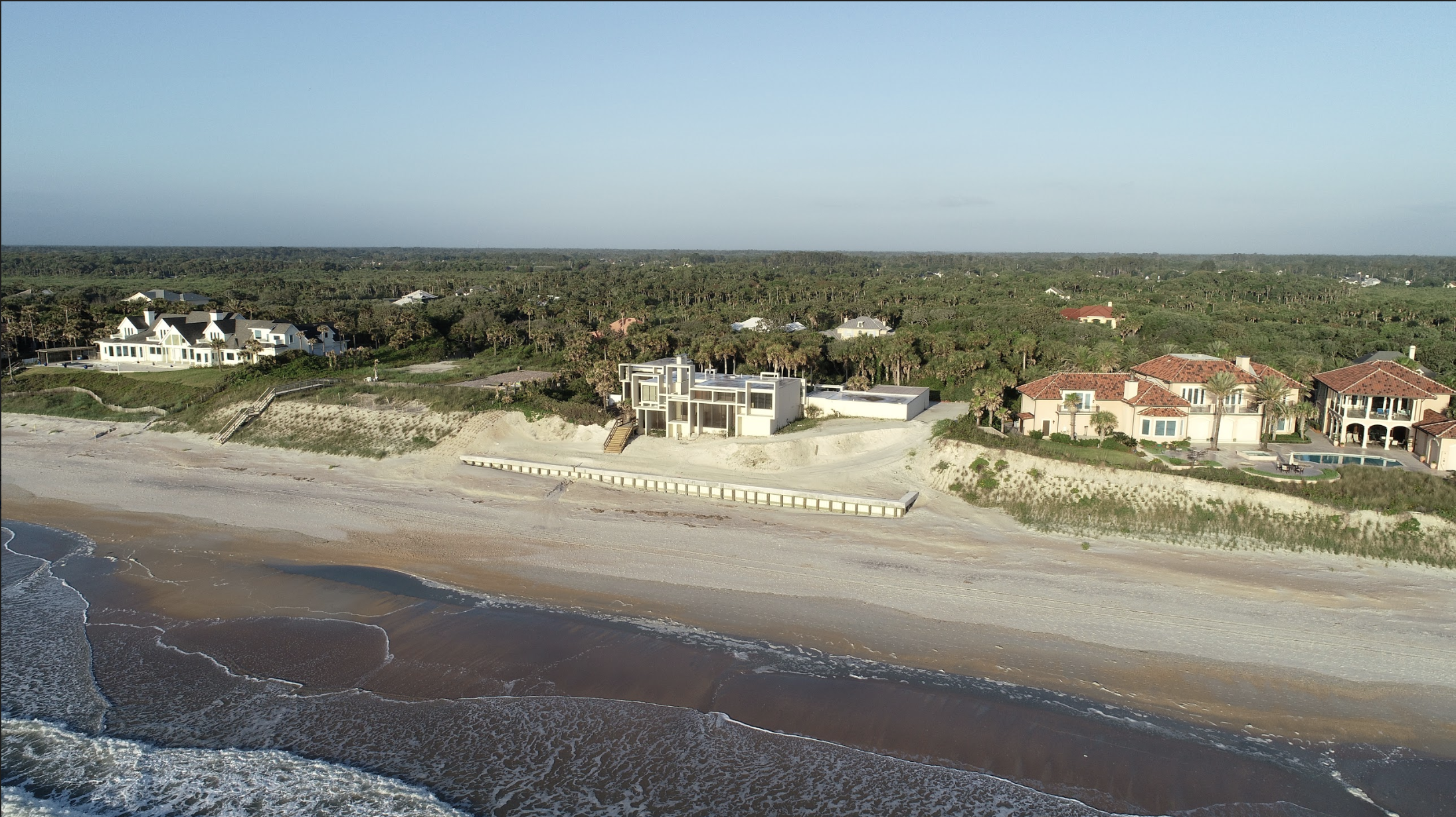
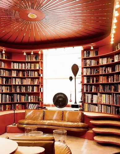
The state government of Massachusetts wants to sell parts of Rudolph’s Boston Government Service Center—and that would mean the likely destruction of the two symbolic and lively murals by artist Constantino Nivola within the building. The Nivola family, foundation, and museum have come out with powerful statements in support of saving the murals (and the building for which they were designed). Your support could help save them.
New Film Features Paul Rudolph's Boston Government Service Center
Alert: Important Meeting On Future of Rudolph's Boston Government Service Center
Update: Development "Alternatives" Report Released for Rudolph's BOSTON GOVERNMENT SERVICE CENTER
Constantino Nivola - a New Exhibit Focuses on A Modern Sculptor in the Public Realm
Constantino Nivola artistry wasn’t just for private appreciation. Over a multi-decade career, his sculptures and murals were part of the experience of our cities, and were used in all kinds of public sites: schools, government buildings, a firehouse…and at Rudolph’s Boston Government Service Center.
Halston meets tom ford - what is being done at 101 east 63rd
The great fashion designer Halston, enthroned in his living room—within the famous “101”, the townhouse in New York’s Upper East Side neighborhood in Manhattan . Photo by Harry Benson, from a feature on Halston in Life Magazine.
A House with a History
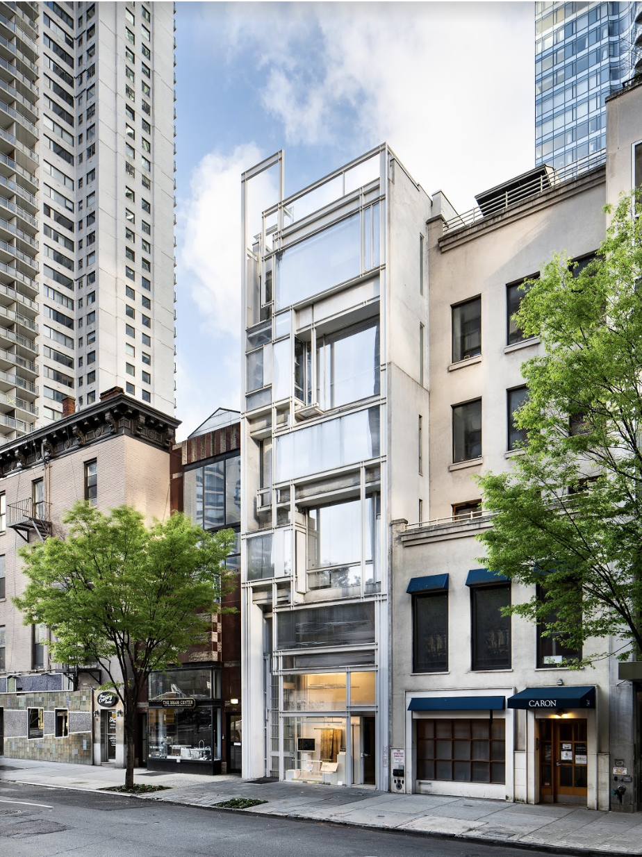
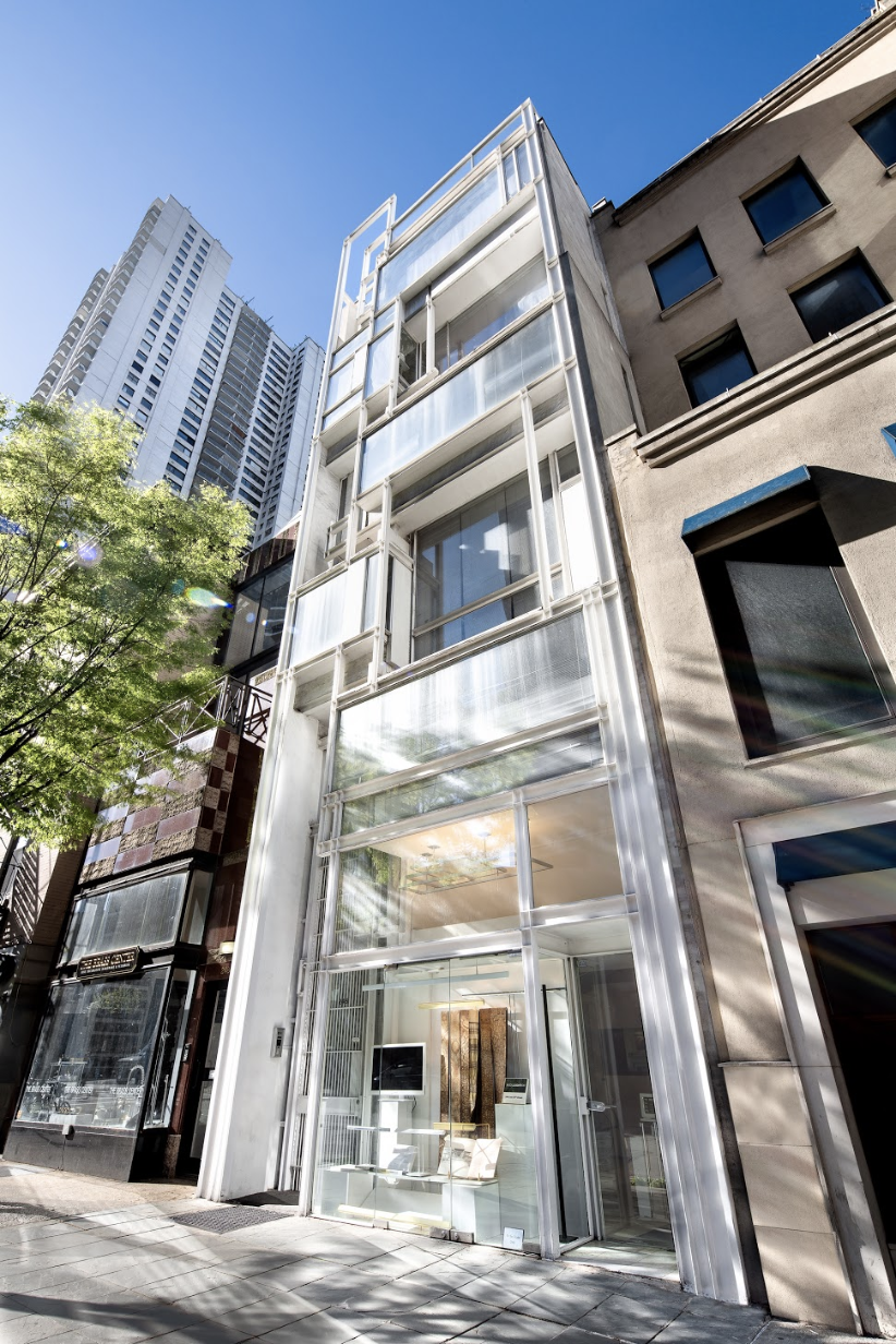
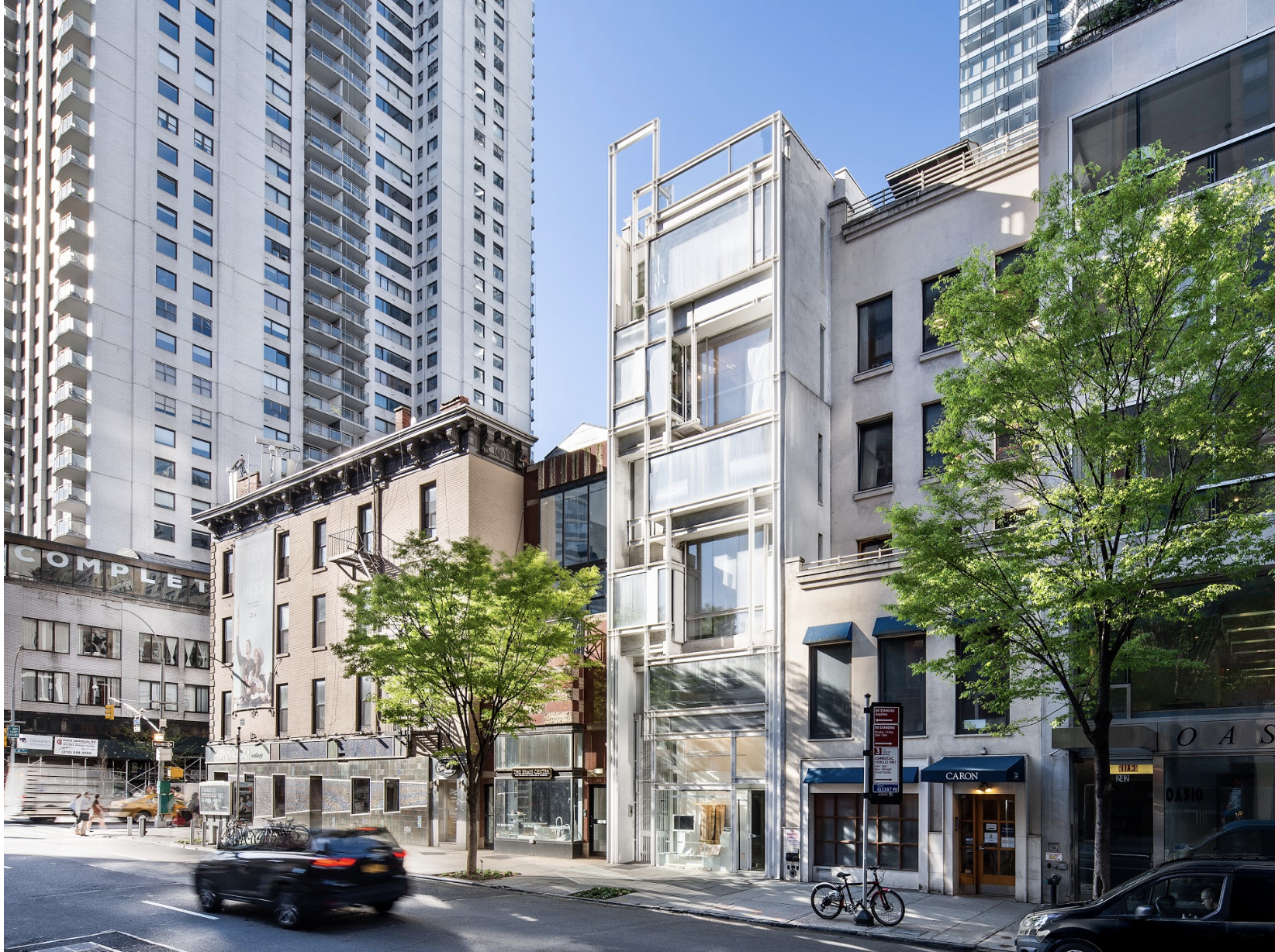
Paul Rudolph designed the original residence at 101 East 63rd street for Mr. Alexander Hirsch in 1966. He created a Modernist oasis for his client, an intensely private person who wanted a place to escape to while still being in the heart of Manhattan. As Rudolph later described the project in Sibyl Moholy-Nagy’s 1970 book, The Architecture of Paul Rudolph:
A world of its own, inward looking and secretive, is created in a relatively small volume of space in the middle of New York City. Varying intensities of light are juxtaposed and related to structures within structures. Simple materials (plaster, paint) are used, but the feeling is of great luxuriousness because of the space. The one exposed facade reveals the interior arrangement of volumes by offsetting each floor and room in plan and section.
The house later went from being a private refuge to a celebrity hot spot known for its notorious parties when it was sold to the fashion designer Halston in the 1970’s. Halston himself spoke about the space in a recent documentary about his life that was featured on CNN:
I’m Halston and this is my home. The architect was Paul Rudolph and the day I saw it, I bought it. Its the only real modern house built in the city of New York since the second world war. Its like living in a three dimensional sculpture.
A video portion of Halston walking through 101 East 63rd from the CNN documentary. Halston’s description of the house begins at 0:46:50.
His lawyer upon visiting the house quipped, “I’m going to enjoy making money for you Halston because you know how to spend it.”
For more information about the house, you can find drawings and photos of it on our project page here.
Perspective Section Rendering. © The Estate of Paul Rudolph, Paul Rudolph Heritage Foundation
A Buyer as Famous as the House
As we reported in a previous blog post back in March, the house was finally sold to fashion designer Tom Ford after being on the market for a number of years. The sale, first reported in an article in Women’s Wear Daily after being the subject of rumors for a few weeks, was reported across social media and the design community. Articles appeared in Garage, Vogue, GQ, Mansion Global, the Daily Mail and New York Times.
Halston had hired Rudolph to renovate the space when he bought it. Wall to wall grey carpet, mirrored and Plexiglas furniture and chain-mail curtains were installed as a result. Members of the design community were pleased to learn that Tom Ford intended to restore the interior to the glamour that many remembered.
A Restoration, or Renovation?
Shortly before the sale was announced, The Paul Rudolph Heritage Foundation was approached by Mr. Ford’s architect, Atmosphere Design Group, to obtain copies of Rudolph’s original drawings. We were told ‘the client’ wanted to restore the interiors.
Paul Rudolph’s Mezzanine Floor Plan. © The Estate of Paul Rudolph, Paul Rudolph Heritage Foundation
Paul Rudolph’s Third Floor Plan. © The Estate of Paul Rudolph, Paul Rudolph Heritage Foundation
We asked the architect to consider consulting with the Paul Rudolph Heritage Foundation during the design process to ensure the design was faithful to Mr. Rudolph’s original vision. They said they would consider it and were never heard from again. Given the architect is generally known for Mr. Ford’s retail store design, we were concerned when we learned a demolition permit was issued in August, 2019.
Our request was not without precedent - the Paul Rudolph Heritage Foundation has given advice, free of charge, to owners of Rudolph-designed properties in the past. We were part of the design review of proposed replacement windows at the Mary Jewett Arts Center. We also helped a home owner in New Jersey find an architect to design an addition. In the end, he was able to hire Rudolph’s original project manager to construct the addition in way that fit into the original design.
A Cautious Optimism
We continued to hold out hope that - despite not hearing from the architect - the project was ‘in good hands.’ From online comments and at our public events, people were relieved to hear Mr. Ford had purchased the property as he was known for taking care of homes designed by significant architects, such as Richard Neutra.
Following the CNN documentary, Netflix announced that it too was going to do a story about Halston and were scouting locations to use for filming. Netflix location scouts visited us in the Rudolph-designed apartment at Modulightor and we spoke to them about Mr. Ford’s proposed changes and they said they would call us after seeing the original home for themselves. That was followed by the New York Times publishing the Halston interior as #19 on its ‘25 Rooms that Influence the Way We Design’
As the iconic interior continued to be in the news, we waited to see what was being done to the space.
Then we got a call - “The space is gutted, Its unrecognizable.’
What Will Change and What Will Stay the Same
The foundation immediately made phone calls and was able to obtain a set of the permit drawings. The following is what we learned about the work:
First Floor - Existing Plan. © The Estate of Paul Rudolph, Paul Rudolph Heritage Foundation
First Floor - Demolition Plan. Drawing by Atmosphere Design Group, from the NYC DOB.
First Floor - Construction Plan. Drawing by Atmosphere Design Group, from the NYC DOB.
Second Floor - Existing Plan. © The Estate of Paul Rudolph, Paul Rudolph Heritage Foundation
Second Floor - Demolition Plan. Drawing by Atmosphere Design Group, from the NYC DOB.
Second Floor - Construction Plan. Drawing by Atmosphere Design Group, from the NYC DOB.
What’s different:
All of the bathrooms are being gutted and some are combined to become larger. Looking at the elevations, we are pleased to learn it will include floor to ceiling mirrors with chrome vanities and toilets in some of them.
Mirrors, mirrors everywhere… reminds us of the note ‘melamine everything’ that was found during a renovation of Rudolph’s own 23 Beekman Place. We especially love the polished chrome toilet and vanity with undercounter lighting. Drawing by Atmosphere Design Group, from the NYC DOB.
The Kitchen will be enlarged (presumably for a menu greater than just ‘baked potatoes’)
Mirrors used for the kitchen back-splash are reminiscent of the kitchen designed by Paul Rudolph at the Modulightor’s duplex apartment. Drawing by Atmosphere Design Group, from the NYC DOB.
The Master Bedroom’s walk in closet is being removed and turned into a separate bedroom
What’s the same:
The main space for the most part is left alone. While this is a relief, it will disappoint anyone who was hoping the hardwood flooring, installed by a previous owner, would be replaced by Halston’s signature grey wall-to-wall plush carpeting.
The iconic living room will be left mostly as is. The furniture layout suggests it may be recreated to match Halston’s Rudolph-designed originals. Drawing by Atmosphere Design Group, from the NYC DOB.
The living room floor and stair treads are now wood. According to the plans, they will remain wood. Photo by Carl Bellavia, Archives of the Paul Rudolph Heritage Foundation.
The original funriture layout designed by Paul Rudolph for Halston. Photo by Harry Benson, from a feature on Halston in Life Magazine.
What could be a concern:
Despite being in a landmark district - and signed off by the Landmark’s Commission as having no affect on the building exterior - the drawings show the original garage door will be removed and replaced.
Note the garage door is dotted on the demolition plan, with a note calling for it to be replaced. Drawing by Atmosphere Design Group, from the NYC DOB.
The drawings call for renovations of the landscaping and roof to be filed separately
The Fourth Floor construction plan, showing no work to be done on the roof, but calling for new roof tree planters. Drawing by Atmosphere Design Group, from the NYC DOB.
The Paul Rudolph Heritage Foundation will continue to watch for future applications to see what is planned for these areas that fall under landmarks review and protection.
S.O.S. Update # 4 : Proposed Demo & Development at Rudolph's Boston Government Service Center
Paul Rudolph’s original, overall conception for the Boston Government Service Center included a tower (which, unfortunately, was not built). The proposed development of the site brings up a serious question: Would/could new construction be as harmonious (with the existing buildings) as the design Rudolph created? Rendering by Helmut Jacoby. The Paul Rudolph Heritage Foundation
In this developing story, the state of Massachusetts’ Division of Capital Asset Management & Maintenance issued a power point presentation about their redevelopment proposal for the Boston Government Service Center—one of Paul Rudolph’s largest urban civic commissions. We’ve been looking at the various slides in their power point “deck” and examining the various assertions they make—and bringing forth our sincere and serious questions.
In previous posts we’ve looked at the ideas (as shown in their presentation) on the current building, development, how current occupants of the building would be handled, etc… —and offered our concerns about each.
Let’s look at the their next two slides:
WHAT WILL BE DEVELOPED THERE?
Following each of the slide’s points, we offer responses/questions:
The redevelopment partner that the state chooses will be responsible for planning, financing, and permitting the redevelopment.
The key word here is: planning—and we ask: How are they getting input during that process? And from what stakeholders? (and how is it weighted, and who has a veto?)
This process will be subject to Large Development Review by the Boston Planning and Development Agency under Article 80, and to review by MEPA.
It would be useful to all parties to lay this out in more detail, so that all can see what’s involved—and where (at what points) real input and interventions can be offered to improve all proposals.
The site is zoned for more intensive use than is currently realized. – Allowable Floor Area Ratio (FAR) is 8-10 (currently ~2.0).
Ideas about zoning (especially levels of density) change over time, as different planning theories and urban design schools-of-thought become popular and wane. Moreover, the question of desirable density is subject to political pressures. What makes a good building/public space/block/street is not always determined by zoning codes, equations, or the theories of the moment.
Generally, height is limited to 125’ towards the street edges, and up to 400’ on the interior.
Perhaps they’re saying that those are the current code’s height limits, which a developer must work within. It would be useful to know if that is the intent, or if there are other consequences.
Planned Development Areas (PDAs) are allowed on a portion of the site. The redevelopment partner may use the PDA process in order to allow the site to be more thoughtfully planned.
The consequences of this statement are not clear, and it would be useful to know more about PDA’s. The phrase “more thoughtfully planned” begs the question: more than what?
And let’s consider their next slide:
hISTORIC PRESERVATION APPROACH
Following each of this slide’s points, we offer our responses/questions:
DCAMM’s approach to redevelopment will acknowledge the architecturally significant elements of the Hurley-Lindemann site, while addressing its flaws.
The language begs the question about the building having flaws—-whose nature and quantity is unspecified. Any building can probably be renovated over time, and made more congruent with current needs—and we need clarity on what’s claimed and what’s proposed.
The Government Services Center complex was planned by prominent architect Paul Rudolph.
Yes, Paul Rudolph conceived of the overall plan and design: it is one of his major urban-civic buildings.
The complex was meant to include three buildings, but only two of the original buildings were built (Brooke courthouse was added later).
It is unfortunate that the scheme was not fully realized.
The Lindemann Mental Health Center was also designed by Rudolph, and is more architecturally significant than the Hurley building.
This project was designed as a set connected buildings that are strongly related—with a level of coordination in design that would create a feeling of wholeness to the block. That sense of wholeness is fundamental to good architecture—and is something to which Paul Rudolph was committed. Setting-up one building against the other is contrary to the way the complex was conceived and designed—and one can even see this from Rudolph’s earliest sketch.
DCAMM is required to file a Project Notification Form (PNF) with the Massachusetts Historical Commission (MHC). DCAMM will then work with MHC to develop a Memorandum of Agreement (MOA) regarding future development at the site.
It would be useful to know more about this process, how it functions, and how input is received from all interested parties—and, in this case, what ingredients go into creating a Memorandum of Agreement (MOA).
NEXT STEPS: LISTENING AND ACTING
We will continue to respectfully review the state’s proposals—and raise sincere questions when appropriate.
If you have information or insights to contribute, for preserving this important civic building by Paul Rudolph, please let us know at:
office@paulrudolphheritagefoundation.org
Paul Rudolph’s original sketch for the layout of the Boston Government Service Center. The drawing summarizes the overall concept of having the set of strongly related buildings wrapping around the triangular site—with a large, open plaza in the center.. A tower is indicated by the hatched pinwheel-shape toward the middle. © The estate of Paul Rudolph, The Paul Rudolph Heritage Foundation
S.O.S. Update # 3 : Proposed Demo & Development at Rudolph's Boston Government Service Center
The publicly accessible courtyard at the center of of Paul Rudolph’s Boston Government Service Center. While one sometimes hears accusations against the building, it should be equally noted that it is also a public oasis of green and peace. Photo courtesy of UMASS
In this developing story, the state of Massachusetts’ Division of Capital Asset Management & Maintenance has issued a power point deck about their redevelopment proposal; We’ve been looking at the various assertions they put forth—and offering our sincere and serious questions and concerns.
We’ve looked at (and offered our questions about) the first set of their powerpoint slides, and then did so with a second set.
Let’s look at the next two:
PLANS FOR CURRENT BUILDING OCCUPANTS
Following each of the slide’s points, we offer responses/questions:
DCAMM will work with all occupants and relevant union leadership to find temporary and permanent relocation space that suits agency operational needs in a cost-effective way.
With any relocation of multiple departments and numerous staff, the question must be asked: How much disruption to services (and employee lives) will be caused by this? -and- For how long? We understand that promises based on projected timelines are offered in good faith—but often projects are delayed (sometimes for years) by unexpected factors (for example: construction delays, changing budgetary priorities, changes in administrative structure, changes in leadership….) So: however long the relocation/disruption/dislocation has been projected to last, in reality is could go on for much longer.
Current plans entail the majority of EOLWD employees who currently work at the Hurley Building returning to the redeveloped site.
Since the development plans are not even sketched out, on what basis can this promise be made?
No state employees will lose their jobs as a result of this redevelopment.
Same as above: plans are not even known—on what basis can promises be made?
Employees will remain in or near Boston, in transit accessible locations
What’s meant by near and transit accessible needs to be defined.
And let us consider the next slide:
US DEPARTMENT OF LABOR
Following each of this slide’s points, we offer our responses/questions:
The US Department of Labor funded the initial construction and site acquisition of the Hurley Building, and still has a significant amount of equity in the site.
It would be useful to know the extent of the equity, and the tangible consequences of this statement.
As required by federal rules, the Commonwealth is working with USDOL to ensure that federal equity is used to further the work of the Commonwealth’s Labor and Workforce Development agencies.
Here too, it would be useful to have things made more explicit: What rules are being invoked? What federal equity is being referred to? and overall: What are the consequences of this statement?
NEXT STEPS: LISTENING AND ACTING
We will continue to respectfully review the state’s proposals (and raise questions when items need review or clarification.)
If you have information / resources / insights to contribute, for preserving this important civic building by Paul Rudolph, please let us know at:
office@paulrudolphheritagefoundation.org
Even with a few signs of a coming Fall, the center plaza’s oasis is still very green! Photo © the estate of Paul Rudolph, The Paul Rudolph Heritage Foundation
S.O.S. Update # 2 : Proposed Demo & Development at Rudolph's Boston Government Service Center
For context, it may be useful to look at the overall plan of Boston’s Government Center area, which was laid out by I.M. Pei. There are several prominent buildings in the area, which were all built as part of the development of this center. The large rectangular building (near the center of this drawing) is the Boston City Hall (by Kalllmann, McKinnell & Knowles). The large, gently curving building to its left is Center Plaza (built as offices and ground-floor retail) designed by Welton Becket. Rudolph’s Government Service Center follows the perimeter of the triangular site at the map’s upper-left. About equidistant between the City Hall and the Government Service Canter are the two towers (shown as offset rectangles) of the John F. Kennedy Federal Building by Walter Gropius and The Architects Collaborative. Quincy Market, the celebrated food marketplace, is the long, horizontal, dark rectangle at the far right. It was designed by Alexander Parris and built in the early 19th Century.
Here’s a satellite view of the same area as shown in the drawing at the top of this post (and shown at approximately the same scale.) If you look at the drawing above, the entire site for Government Service Center was to be utilized for its building (plus the outdoor plazas, also designed by Rudolph)—and there was to be a tower in the center. In the photo above, one can see that the tower was not built, and the right-hand side of the site is now occupied by a wedge-shaped structure which was constructed later: it’s a municipal courthouse building, designed by another firm. Image courtesy of Google: Imagery ©2019 Google, Imagery
As we mentioned in our last update on this developing story, the State of Massachusetts’ Division of Capital Asset Management & Maintenance has issued a power point deck about the redevelopment proposal. In our last posting, we looked at their first slide: “Hurley Building at a Crossroads” (which was about the current condition and challenges of the building)—and offered our sincere questions and concerns.
Now it’s time to go a bit deeper into the deck, and consider the state’s further assertions and proposals. Let’s look at the next two:
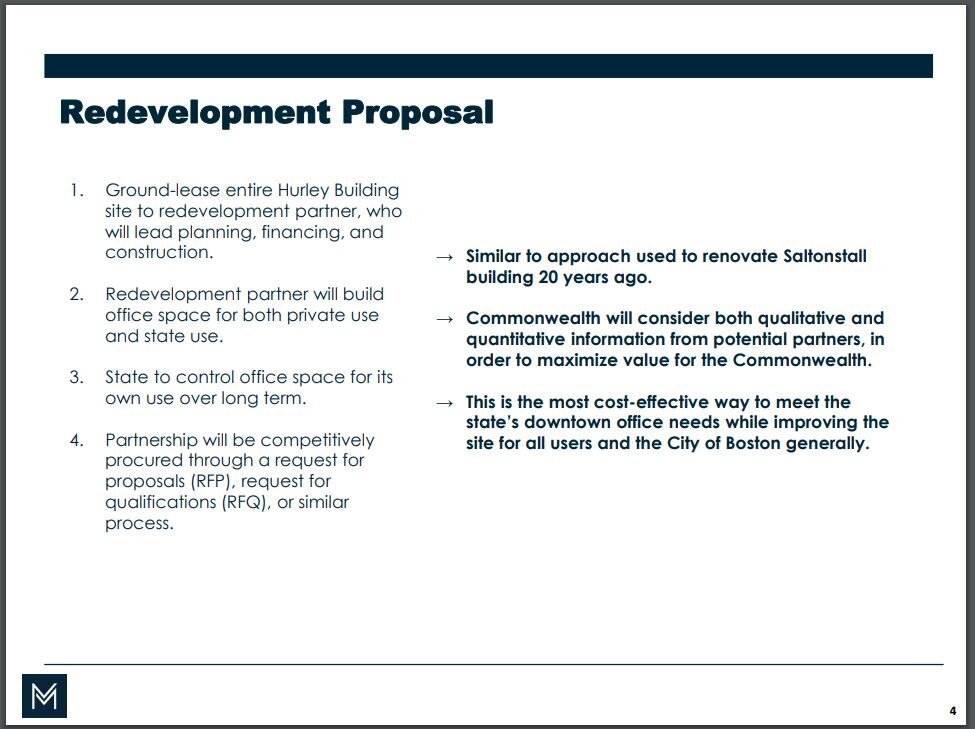
REDEVELOPMENT PROPOSAL
Following each of the slide’s points, we offer responses/questions:
Ground-lease entire Hurley Building site to redevelopment partner, who will lead planning, financing, and construction.
Shouldn’t there be a wider array of input from the beginning, to achieve good, public-spirited design? That would be lost if the development process is walled-off at its beginning—only soliciting public input later, (after the parameters seem to have been set). Without getting public input early it, it can lead to less-than-optimal results for the state and its citizens.
Redevelopment partner will build office space for both private use and state use.
It would be useful to know how the ratio determined?
State to control office space for its own use over long term.
It is important that the definition of “long term” be made explicit. If there’s a termination date to that agreement, then—at that end-date—how are disruptions to be avoided? Conversely: the state already owns the site—so, as long as they are their own tenant, there’s no need to worry about end-dates.
Partnership will be competitively procured through a request for proposals (RFP), request for qualifications (RFQ), or similar
It’s important to keep in mind that the overall proposal requires turning public space and buildings over to private use. Occasionally this can be done as a win-win situation, but it depends on many factors—and one of them is the quality and track-record of the development partner. So a key question is: Will the qualifications examine whether the developer has a real record of tangibly “giving back” (through the quality of what they build/plan)?
Similar to approach used to renovate Saltonstall building 20 years ago.
It would clarify things if we were told by what set of standards that success was judged—and how that was measured, and how far the project went to fulfill that.
Commonwealth will consider both qualitative and quantitative information from potential partners, in order to maximize value for the Commonwealth.
It would be useful to all parties if the above terms could be clarified—particularly the qualitative aspect.
This is the most cost-effective way to meet the state’s downtown office needs while improving the site for all users and the City of Boston generally.
Much is condensed into this one sentence. Implicit are assertions about: cost-effectiveness, state needs, the nature of the improvements, and who the users are. These would each need careful definition and review.
Lets consider the next slide:
EXPECTED BENEFITS
Following each of this slide’s points, we offer our responses/questions:
New, modern office space for state employees for same or less cost than comparable space elsewhere.
Renovation can usually yield modernization as comparable/less cost---if done efficiently. Moreover, renovation is almost always the greener alternative.
Long-term cost stability for both capital and operating budgets.
It would be good to know what this is this being compared to.
Improved public realm across 8-acre block. Increased site utilization and activation.
There’s abundant knowledge, from today’s public space designers, about making plazas and public spaces more alive and used—and many good case-studies of success. Don’t destroy what we have—but, instead, use that knowledge to make these unique spaces more alive to the public.
Economic benefits from large-scale development (jobs, tax revenue, etc.).
What’s often missing from balance-sheet are the costs of over-(“large scale”) development: especially overburdening the already under-pressure transit system and city services. Jobs will also be created through the modernization of the existing building.
NEXT STEPS
We’ll continue to respectfully review the state’s proposals—and raise questions when items need review an clarification.
If you have information or resources to contribute to preserving this important building by Paul Rudolph, please let us know at:
office@paulrudolphheritagefoundation.org
The overall design for the Boston Government Service Center. Although it is the work of a team of archiects, the design leader was Paul Rudolph-and it is truly his conception. This axonometric drawing shows his original full design for the complex—including public plazas in the center and at the three corners. In the middle was to be a tower with a “pinwheel”-shaped plan (in this drawing only the first few floors of it are shown.) © The Paul Rudolph estate, Paul Rudolph Heritage Foundation.
S.O.S. - Boston Government Center Update: Considering the Development Proposal's Assessment of Rudolph's Building
S.O.S: - Save Rudolph's Boston Government Service Center
A note from Yasmine
A goup photo with Yasmine Rajkarnicar (seated) on her last day of volunteering at the Paul Rudolph Heritage Foundation.
INTRODUCTION
Volunteering at the Paul Rudolph Heritage Foundation matters and makes a difference - and we rely on volunteers to help us with our mission and to reach our goals. This year we were fortunate to have the help of several volunteers including Ethan Shapiro and Yasmine Rajkarnicar - who each brought a fresh perspective and a shared passion for Paul Rudolph’s work.
We received the following note from Yasmine Rajkarnicar. She recently returned to St. Cloud, Minnesota to study construction management at St. Cloud State University. Yasmine's enthusiasm and hard work were a great asset for us, helping with research and updates to our archives. It was also a plus that she loves brutalism :)
A SUMMER WITH PAUL RUDOLPH
I stumbled across the Paul Rudolph Heritage Foundation’s webpage one day as Summer was coming to a close and I was feeling that my Summer had not been exactly fulfilling. The Foundation had people like Anton Garcia Abril, Normal Foster and Iwan Baan follow them on Instagram. And I was fascinated to learn that their office was inside the iconic Modulightor building - the epitome of Paul Rudolph’s architecture of interconnected complex spaces, giving the feel of levitating planes and spaces. Before I knew it, I had signed up for a volunteer-internship with the Foundation and I was on my way to New York City.
During my time at the Foundation, I had the chance to explore many of Paul Rudolph’s wonderful buildings. I researched about the current condition of some Paul Rudolph houses and updated the Foundation’s website. I wrote a report on the Niagara Falls Public Library that is currently being threatened with demolition. My research assignments led me to books such as Paul Rudolph: The Florida Houses, Paul Rudolph the Late Work by Roberto de Alba and magazines at USModernist. As I worked on Rudolph’s buildings, the story behind the design of each building came to life for me. I heard many interesting stories about Paul Rudolph’s life and his source of inspiration behind his buildings from his two best friends. The Foundation’s building is ornamented with Paul’s artifacts and drawings and it’s like a living documentary of Paul Rudolph’s life.
The office staff always seem like they are on an adventure or a mission of some kind, working on saving one building one day and another the next day. Kelvin Dickinson, the President of the Foundation, is always running from one state to another to gather more information or pictures of buildings threatened by demolition.
The office is busy with so many things going on and buzzing with exciting news about architecture and design. Everyone is constantly working on something and when we’re not working, we’re talking about Émilie du Châtelet or Ludwig Wittgenstein or Peter Eisenmann debates or Louis Barragan’s new documentary and of course, Paul Rudolph!
The Foundation also hosts many exciting events where a lot of design professionals, architecture enthusiasts and scholarly people come to socialize and network in this niche circle. I got to attend a ‘Women in Events’ party by peerspace, an open house party and Vladimir Belogolovsky’s (founder of the Intercontinental Curatorial Project) talk on the iconic Buildings of New York.
I learned so much more about architecture on the whole - concepts, issues and personalities. I didn’t expect to learn or do much at the Foundation, but I was actually given meaningful assignments and not just scanning or filing. I came out feeling inspired and transformed. I am not sure I actually did make a difference to the legacy of Paul Rudolph but what is important is that I felt like it in my own small way. Well, Mr. Rudolph ………...it’s been real! You just made my Summer of 2019!
Like Yasmine, you too can share your passion for Paul Rudolph’s work by volunteering with us. Join our dedicated team and help us preserve and share Paul Rudolph’s legacy. If you would like to know more, please reach out to us at office@paulrudolphheritagefoundation.org
Niagara Falls' Rudolph Masterpiece—but are we going to lose it?
The Earl. W. Brydges Library, designed by Paul Rudolph—Niagara Falls’ main library, the city’s center of knowledge! The project commenced in Rudolph’s office in 1969, and this view of a portion of it’s lively roofscape was photographed in the mid-1970’s. Image courtesy of the Massachusetts Institute of Technology, photograph by G. E. Kidder Smith
CIVIC STANDING
Among the many types of buildings to which Paul Rudolph applied his creative & practical talents—houses (and housing), churches, schools, university buildings, campus planning, exhibit design, office buildings, medical facilities, and laboratories—there’s also the type about which architects feel proudest: their ”civic works.“ Part of that pride emerges from the City Beautiful movement—a philosophy and practice, starting in the late 19th Century, which contended that beautifully-designed cities (and well-designed public buildings within them) could bring forth a better society and promote civic virtue. That movement helped energize city (and state and federal) governments to focus more (and spend more) on their streets, buildings, public facilities (and the civil engineering that undergirded those structures.) It’s worth noting that a building type which played a role in such planning were public libraries.
RUDOLPH IN THE PUBLIC REALM
Rudolph made a strong showing in the civic domain, being given commissions for government and public-use buildings in Boston, New Haven, Goshen, NY, Syracuse, Rockford, IL, Buffalo, Siesta Key, FL, Manhattan, and Bridgeport—as well as for international locations, like Jordan and Saudi Arabia. These projects ranged from city halls, to courts, a stadium, and an embassy. [We’ve even seen a 1995 listing, in the tabulation of projects which Rudolph’s office produced for its own use, for a design of an “office for special counsel”.]
PROMINENT ON THE STREETSCAPE
Not all those projects were built (as with the career of most architects, that’s par for the course)—but enough were constructed that we can see that Rudolph’s skills “scaled” well for significant public undertakings. Among those, the main library he did for the city of Niagara Falls—the Earl W. Brydges Public Library— is remarkable. Here, he literally created a “landmark”: a prominent and sizable structure of unforgettable form—an icon within the cityscape.
The library in 2004, as seen down from within the city of Niagara Falls, NY. The tall, glazed, staggered portions of the roof (which bring light into the reading spaces within the building) are prominent parts of the building—and these strong shapes make the library a landmark within the city. Photograph by Kelvin Dickinson, © The Paul Rudolph Heritage Foundation.
LUMINOUS INTERIORS
Equally memorable are the interiors, filled with light from the clerestory windows above (whose staggered emergence from the roof helps give the building its mountain-strength character). The 3-storey space within is exciting—yet serene enough for reading, research, and study.
“It’s so bright and open without being glaring.”
—Jennifer Potter, the library’s director
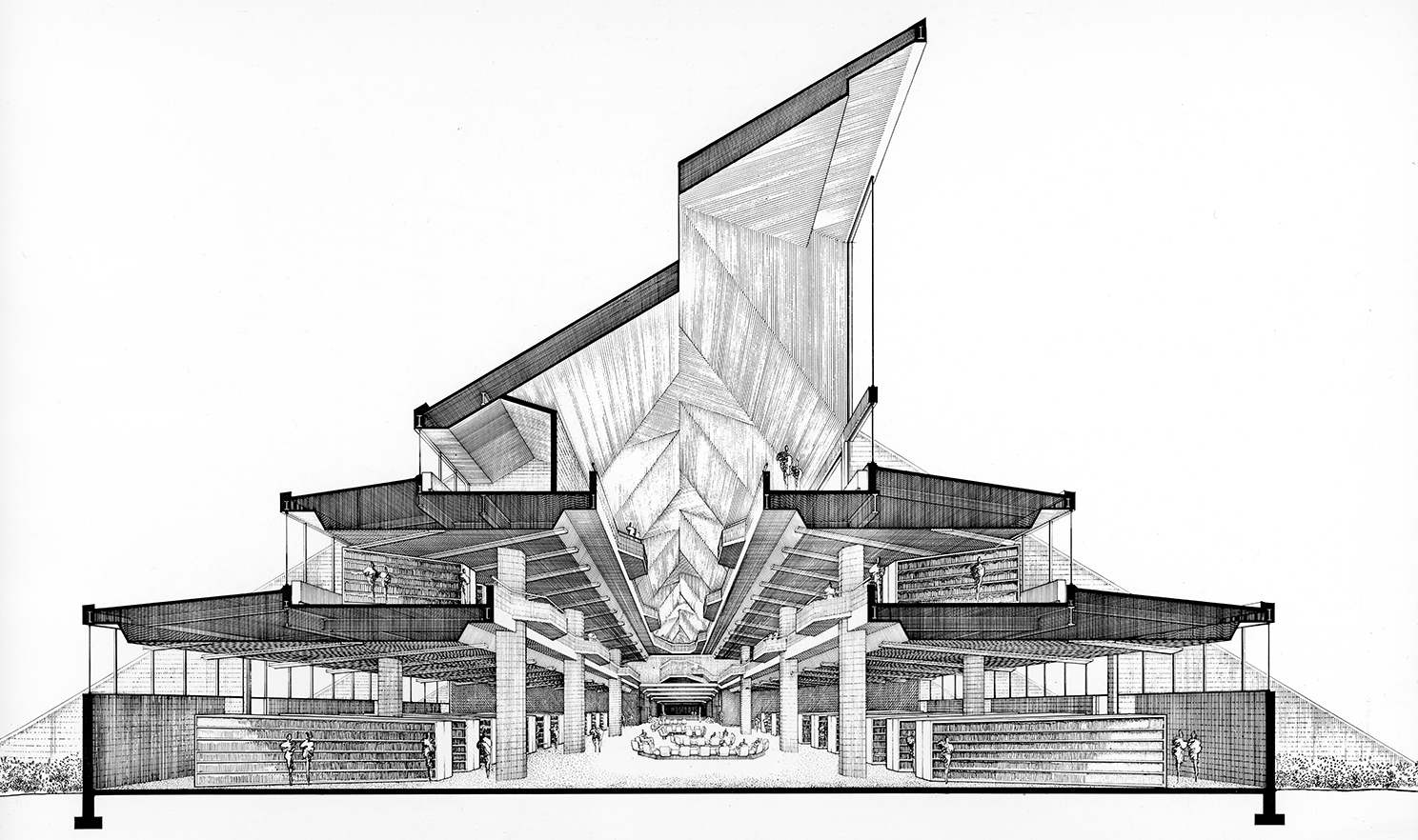
Rudolph’s section-perspective of the library, looking down its main axis. A series of tall clerestory windows, rising prominently from the roof, bring in natural light. The building rises in three stages, with each floor getting smaller than the one below—reflecting the library’s functional space needs. Image © The Estate of Paul Rudolph, The Paul Rudolph Heritage Foundation.
“I think my favorite thing about the building is looking up in the main atrium, where the adult collection is. So stunning. It feels strangely modern despite its age.”
—Library Patron
The library’s atrium-interior, as photographed in 1972. This view allows one to see all three levels, as well as the ceiling openings to the clerestory windows (in the angled roof) which bring natural light into the space. Joseph W. Molitor architectural photographs. Located in Columbia University, Avery Architectural & Fine Arts Library, Department of Drawings & Archives
A LANDMARK THREATENED?
The building’s birth had, admittedly, construction problems—ones that caused its architect and builder seeming endless grief. This history is well-told in an article by Mark Byrnes, published by CityLab a few years ago (from which the above quotes.were excerpted.) Ongoing issues continue to concern its users—to the point where the building’s future as the city’s main library is now being threatened.
Is this a case similar to another amazing civic work by Rudolph: his now-disfigured Orange County Government Center? There, a greater recognition of the building’s architectural value and excellence might have—whatever the problems—brought forth the commitment and resources to fix them. We hope that such understanding and support will come forth for the library in Niagara Falls—that it “gets some love”.
INTO THE FUTURE?
The Paul Rudolph Heritage Foundation will be following the fate of Niagara Falls’ Brydges Library (and working to preserve it.) We’ll be bringing you ongoing news of this in the coming months—and if you hear anything about the future of the building, please do let us know!
The entry side of Niagara Falls’Earl. W. Brydges Library, designed by Paul Rudolph. Image courtesy of the Massachusetts Institute of Technology, photograph by G. E. Kidder Smith
The Duel Over Modernism
Paul Rudolph’s Orange County Government Center, prior to its partial demolition. Was it yet another victim of profound misunderstandings about architecture and beauty?
Photo by Daniel Case
THE DEBATE
SETTING UP THE DUEL
Prospect is a monthly British magazine which covers a variety of topics and issues, from national & international news to the arts—and their authors (and the points-of-views expressed) are from across the spectrum. They recently sponsored a debate about the value and effect of Modern architecture—and Brutalist architecture in particular. The article is titled:
The Duel: Has Modern Architecture Ruined Britain?
And subtitled:
Our two contributors go head-to-head on the brutality—or not—of brutalism
And you can read the full article about the debate here.
The “duelists” are intelligent, well-informed, and articulate—and, at the on-line article’s end, there was even an opportunity for readers to vote on who “won.” We thought it would be good to bring this debate to your attention. It’s not long, and is well worth reading—and we do have a few comments on it (which we’ll address at the end).
THE DUELISTS
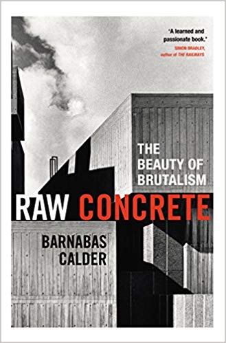
Barnabas Calder:
Dr. Calder is an architectural historian at the University of Liverpool School of Architecture. He has written books about the history of architecture and about the work of Modern architect Denys Lasdun, as well as many papers, chapters, and reports on architecture, design, and urbanism. In 2016 he published his Modernist manifesto, “Raw Concrete: A Field Guide to British Brutalism.” In a recent article in Garage magazine, he remarks “People used to laugh out loud when I told them I was studying 1960s concrete buildings. Part of the change is no doubt just passing time. As with haircuts, clothes, and glasses, tastes change and the previous fashion goes violently out of style for a while, then gets gleefully rediscovered by younger people a bit later.” And in an article in Wallpaper, he goes on to says of Brutalism, “It’s still both misunderstood and wildly underestimated”… “the period produced masterpieces equal to anything else produced in architecture.”
James Stevens Curl:
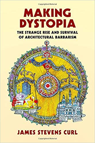
Dr. Curl is an architectural historian, architect, and prolific author. He is Professor at Ulster University’s School of Architecture and Design, and Professor Emeritus at de Montfort University, and was a visiting fellow at Peterhouse, Cambridge. He was awarded the President’s Medal of the British Academy, and is a member of the distinguished Art Workers’ Guild. Among his many books are: “English Architecture: An Illustrated Glossary”; “Classical Architecture: An Introduction to Its Vocabulary and Essentials”; and the “Oxford Dictionary of Architecture”. Most recently, Oxford University Press published his in-depth study of Modernism: “Making Dystopia: “The Strange Rise and Survival of Architectural Barbarism”.
Book cover images: Amazon
POINTS (AND COUNTERPOINTS) FROM THE DEBATE
The debate was frank, and the speakers expressed themselves forcefully. Here are excerpts from some points each made—direct quotations from the two “duelists”:
Points that Modern architecture is ruining Britain
(Quotes from Dr. Curl):
Visitors to these islands who have eyes to see will observe that there is hardly a town or city that has not had its streets—and skyline—wrecked by insensitive, crude, post-1945 additions which ignore established geometries, urban grain, scale, materials, and emphases.
Such structures were designed by persons indoctrinated in schools of architecture… Harmony with what already exists has never been a consideration for them … [They have] done everything possible to create buildings incompatible with anything that came before. It seems that the ability to destroy a townscape or a skyline was the only way they have been able to make their marks. Can anyone point to a town in Britain that has been improved aesthetically by modern buildings?
How has this catastrophe been allowed to happen? A series of totalitarian doctrinaires reduced the infinitely adaptable languages of real architecture to an impoverished vocabulary of monosyllabic grunts. Those individuals rejected the past so that everyone had to start from scratch, reinventing the wheel and confining their design clichés to a few banalities. Today … modern architecture is dominated by so-called “stars,” and becomes more bizarre, egotistical, unsettling, and expensive, ignoring contexts and proving stratospherically remote from the aspirations and needs of ordinary humanity.
You use the old chestnut that because some new buildings were initially perceived as “shocking,” but accepted later, this applies equally to modernist ones. Studies refute this. Modernist buildings seriously degrade the environment by generating hostile responses in humans and damaging their health. I suggest you peep at Robert Gifford’s “The Consequences of Living in High-Rise Buildings” in Architectural Science Review….
Much modernist design denies gravity and sets out to create unease. You love concrete, with its black, weeping stains, its tendency to crack, its ability only to deteriorate and never age gracefully. Your bizarre judgments ignore obvious signs that reinforced concrete is not the answer to everything.
You cannot see (or admit) that the harmoniousness of our townscapes has suffered dreadfully since the universal embrace of modernism so there is nothing I can do to help you or other Brutalist enthusiasts. Your myopia explains why you fail to notice that members of the “British Brutalist Appreciation Society” are less numerous than are paying members of the Victorian Society.
You employ a cheap debating-point: you assume that anyone who criticizes inhuman non-architecture wants a return to Greco-Roman Classicism, which is untrue. … I argue for environments fit for ordinary human beings, which embrace elements that are an integral part of what remains of our once-rich cultural heritage. I am also fully aware of the massive propaganda and bullying in architectural “schools” that brainwash our young architects to embrace what is inhuman, repellent, and ugly.
Points that Modern architecture isn’t ruining Britain
(Quotes from Dr. Calder):
You make sweeping criticisms against the architecture of recent decades—a lot of styles and ideas have come and gone since 1945. The term “modern” covers a lot of ground. But the truth is that all of your allegations were [once] levelled with equal justice at Victorian buildings.
Today’s skyscrapers also change the skyline, as you say. But so did medieval castles and churches, or Victorian town halls and stations. Like the high buildings of earlier centuries, tall office blocks map where the money and power lie. The City of London is aggressively commercial—as it always has been. The developers of the 20th and 21st centuries are no more ruthless than those of the 17th to 19th centuries. The great post-1945 regenerations, by contrast, aimed to improve the housing of ordinary people.
Appreciating any style requires an open mind; any language sounds like “grunts” until you listen. Architects trained since 1945 have received better history teaching than any earlier generation; the Barbican is the proud descendant of the great Victorian projects. It recasts London’s Georgian crescents and squares into exhilarating and livable new forms using the unparalleled structural capabilities of concrete. Had Vanbrugh, Soane or Scott worked in the 1960s, they would have been proud to produce anything as heart-liftingly sublime.
By what definition has Britain been “ruined” since 1945? The high tide of modernism in post-war Britain coincided with a steep and sustained rise in the population’s health, education and prosperity.
However, much though I admire the best buildings of the period, I would not ascribe this improvement to architectural aesthetics. I do not share your peculiar faith in the power of architectural style to ruin lives.
Can anyone truly believe that crime and suffering in Britain’s poorest areas is caused by an absence of classical columns, rather than working-class unemployment from de-industrialization? Does anyone really think that if the Barbican had been brick, not concrete, it would not have been caught up in the industrial action of the 1970s? Anyone who finds concrete “black” with dirt should compare it with the coal-black sandstones of Glasgow under Victorian soot.
As to whether modernism has the potential to pass into a period of new public appreciation, as Victorian architecture did in the 1960s-70s, its stock has been rising fast for at least the past decade.
Your angry dismissal of several decades of world architecture as an evil conspiracy is implausible. Your “overwhelming evidence” of the psychological damage done by the architecture you happen to dislike largely consists of methodologically problematic, politicized writings.
Personally, I like architecture best when it’s as sublimely overwhelming as Michelangelo, Hawksmoor or Ernö Goldfinger. However, modernism can also be pretty and harmonious, …. It can be courteously contextual street architecture....
Modern architecture can be symmetrically dignified like Louis Kahn’s Salk Institute, or thrillingly asymmetrical like Lasdun’s Royal College of Physicians. Recent architecture can be as curvaceous and hallucinatory as the Italian baroque (Paul Rudolph in Boston, MA, or Gehry’s Bilbao Guggenheim exterior) or as tightly-controlled and rhythmical as the German classicist Schinkel (anything by Ludwig Mies van der Rohe). Interiors can be cozy like Alvar Aalto’s houses, or grandly formal like Kahn’s Dhaka parliament. Perhaps the thing modernist buildings’ detractors find hardest to see is that they can be beautifully crafted, like the meticulous concrete-work of the National Theatre, carefully poured into hand-made wooden moulds.
I urge readers to enjoy what is good about any architecture. Frothing with fury at the sight of newer buildings is an unproductive use of emotional energy and serves only to impoverish the rich experience of our varied cityscapes.
WHAT’S FAIR IS FAIR
We’ve tried, in the excerpts above, to give representative and approximately equal space to each speaker (as well as their biographies).
And now—offered in that same spirit of fairness—we have some comments:
If you’re iffy on the architectural value and long-term worth of concrete/Brutalist architecture, Dr. Calder’s book is “a way in” to understanding and—just as important—appreciating such designs as being true works of architectural merit (and art), as well as places that can nourish the human spirit. In his debate points, he exhorts us to stay open—and his book is the sort of design-meditation which helps us to look for poetry and humanity where we might not think it can be found.
On-the-other-hand, Dr. Curl’s recent book is a shocker. If you are on his “side” (and we would do well to remember Alex Comfort’s wisdom about sides: “… the flags are phony anyhow.”) then in Curl’s book will find confirmation of your inclinations, backed by in-depth research about the points he makes above. But even if you are opposed, you will find eye-opening historical information on the origins and sub-texts of Modernism.
It does no one any good to deny the faults and problems of Modern architecture—and this is particularly true when it comes to city planning (as distinct from individual buildings). While it can create some marvelous perspective drawings, the more than half-a-century of the “tower in the park” model of Le Corbusier shows how preponderantly unsuccessful it is—and sometimes a disaster. This is usually and especially so when the tenants (the “demographics”) of a project are not of a high-enough income level supply sufficent funds to building management, to allow the staff to maintain & manicure their buildings and districts.
But it is really unfair to impugn the motives of Modern designer and planners. Many were utterly sincere—sincerely idealistic!—that new approaches could yield better lives.
People today have no idea of the devastatingly inhuman conditions of pre-WWII cities, particularly in the working-class sections (and a reading of Jacob Riis’ book is illuminating on what citizens really had to live in and with.) So consider the case of Ludwig Hilberseimer: a teacher at the Bauhaus (who, after emigrating to the US, ended up working for Mies and teaching at IIT). Visions of rebuilt cities and mass-habitations, like those offered by Hilberseimer, may look weirdly dystopian—But: they were sincerely-offered proposals, trying to give ground-down citizens places that were clean, with light and air; and access to electricity, plumbing, and heating (services which we’d consider “basic” today, but which most city dwellers back then could only dream of). Hilberseimer’s vision, tho’ repugnantly reductive to our eyes today, was part of a sincere program to replace existing urban hells.
One of Ludwig Hilberseimer’s visions for the a reformed, rebuilt, efficient city. Image: Drawing by Hilberseimer, from 1924.
It’s foolish to deny the beauty of some Modern works. We’re a particular fan of Le Corbusier’s Villa Savoye:
The Villa Savoye, in Poissy, on he outskirts of Paris. Design work was begun by Le Corbusier in 1928, and the building was completed in 1931. Source: Wikipedia
But, admittedly, that iconic house is an “object” in the landscape—and, yes, almost anything can look good in such an isolated sculpture-ish context. It’s much harder to do a successful building in the city, and even harder to create good urban spaces. Rudolph was aware of this, and called for urban vitality and variety, saying:
“We desperately need to relearn the art of disposing our buildings to create different kinds of space: the quiet, enclosed, isolated, shaded space; the hustling, bustling space, pungent with vitality; the paved, dignified, vast, sumptuous, even awe-inspiring space; the mysterious space; the transition space which defines, separates, and yet joins juxtaposed spaces of contrasting character. We need sequences of space which arouse one’s curiosity, give a sense of anticipation, which beckon and impel us to rush forward to find that releasing space which dominates, which acts as a climax and magnet, and gives direction. Most important of all, we need those outer spaces which encourage social interaction.”
We also have to be honest about acknowledging the problems of concrete construction—particularly exposed concrete. Curl and company are not “seeing things” when they report streaking, grayness, and an overall depressingly dingy look. But that is not true of all concrete construction—as many works of Rudolph and others show over-and-over. Moreover, the techniques to care for and repair concrete buildings are getting better-and-better.
The challenge is, when concrete is used, to use it with the mastery of those who make it luminous. There are ways to do that—but it takes knowledge (both in the drafting room and on the construction site), and it’s hard to transcend rock-bottom budgets.
When concrete is done well—and Rudolph’s Temple Street Garage in Boston comes to mind as a superb example—it is sculptural, moving, captures the light in wonderful ways, and is even sensuously textured:
Paul Rudolph’s Temple Street Garage, Boston. Photo: NCSU Library – Design Library Image Collection
Or it can be mindfully serene, as in much of Ando’s work:
Ando’s Benesse House, Japan. Photo: courtesy of Tadao Ando
Finally, we’ll quote from one of Rudolph’s former students, Robert A. M. Stern. When considering such seeming oppositions (as in this “duel”), he said:
“It is not a matter of Modern Architecture or Classical Architecture—but rather of Good Architecture and Bad Architecture!”
Do we have to condemn a whole architectural style or approach? The world, including its architectural history, is complex, messy, big—and terribly hard to classify or comprehensively judge. Who could?
Better that we should develop and sharpen our ability to practice and make caring decisions—that’s the way to better architecture.
Paul Rudolph’s Pencils and Pens. Image: Library of Congress, Prints and Photographs Division
PAUL RUDOLPH’S MILAM RESIDENCE: HISTORY & VIEWS OF AN ICON
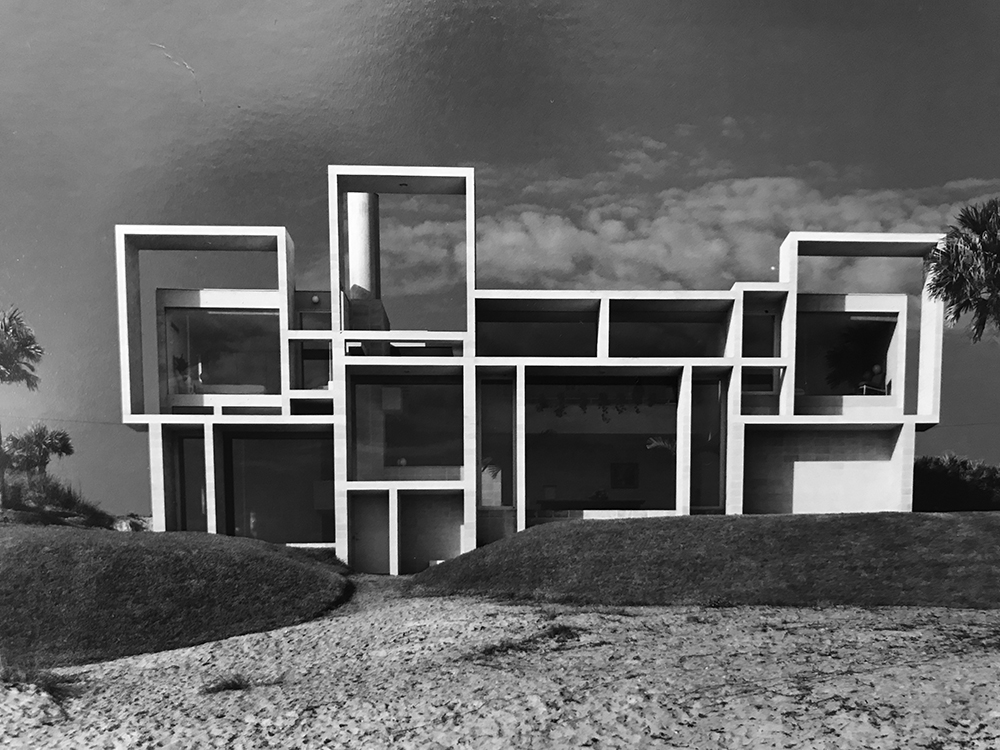
An “elevation view” (a straight-on shot) of the Milam Residence in Ponte Verda Beach, FL. This photo, of the beach-facing side, was taken in 1962, not long after the building was completed. Photograph by Joseph W. Molitor.
Courtesy of the Joseph W. Molitor architectural photograph collection, located in the Columbia University, Avery Architectural and Fine Arts Library, Department of Drawings and Archives.
A FASCINATING HOUSE
Our recent article about the Milam Residence went viral—and so we thought it would be good to share some more information about this landmark of 20th century design. Here, we’ll cover two other interesting aspects of the building: the story of its construction, and how the design was received by the architectural and lifestyle press.
BUILDING AN ICON
We asked the Robert C. Champion, the son of the original owner, to tell us about the origin of the project, including the Milam’s relationship with Rudolph. He answered several of our questions:
Q: Do you know anything about the relationship between your parents and Rudolph, and how they found-out about him?
A: My stepfather, Arthur Milam, knew of Rudolph’s work in Sarasota. My stepfather was a graduate of Yale Class 1950. Rudolph became Chair of Yale Architecture in 1958, so they had a common bond. Also my stepfather was a big collector of modern art, so he was interested in an architect and specialized in modern art.
Q: Do you know what “program” they presented to Rudolph (what set of requirements he was asked to fulfill?)
A: My stepfather gave Rudolph free rein to design the house. He did tell him how much square footage and how many bedrooms, but other than that he left the whole creation to Rudolph.
Q: Do you know how the architect-client relationship went with them all? [We’re guessing they got along pretty well, as Rudolph was invited back to do the additions/alterations.]
A: They got along very well as far as I know. My stepfather left the creating to Rudolph.
Q: Did you hear anything about the construction period—for example: stories about things that needed adjusting because of site conditions?
A: Rudolph wanted to build the house in poured concrete and rebar. When they calculated the cost it was very cost prohibitive so they changed it to concrete block with rebar and all concrete poured cells.
Q: Was this a year-round residence—or—primarily a vacation home?
A: It was a year-round residence.
Q: Any reflections of your own, about growing-up in it?
A: It was by far the largest home in north Florida when it was built. Most of the homes on the ocean were second homes and were cottages made out of cedar. So this house really stood out. It was known as the crazy house of rectangles and was labeled so on the fisherman’s map. We had very few neighbors back then. We had one neighbor a half mile to the north and another a half mile to the south.
Mr. Champion’s notes about the Milam’s initial knowledge of Rudolph meshes well with the information in a fascinating document: the National Register of Historic Places’ Registration Form for this building—which is also linked-to on the Paul Rudolph Heritage Foundation’s Project Page for this house. The National Register’s document gives a complete history of the site and context---both physical, historical, and cultural—and a detailed description of the building, inside-and-out. It also includes an evaluation of the building’s significance and how it fits into Rudolph’s overall oeuvre, as well as drawings, maps, and photographs.
The building went through several phases:
Original state: As designed by Paul Rudolph, for Arthur and Teresa Milam—with the house being occupied at the beginning of the 1960’s.
Alterations by Rudolph: Rudolph was brought back more-than-once, by the Milams, to make alterations and/or additions. Their extent is well described in the National Register’s report:
“After the house was complete, the Milams contacted Paul Rudolph for his design services once again. In the early 1970s, Milam had Rudolph add two ancillary structures on either side of the main house—one for a three car garage and one for a guest house/studio. Rudolph used the same materials and design vocabulary for the new wings. The two original garages, which flanked the house to the north and to the south, have been converted into a dining room (on the north side), and an office (on the south side). The addition, which runs perpendicular to the house on the south side is a guest house/office. The pool is on the west side of a courtyard, with the house on the east facing the ocean. So it fits together around the center courtyard. In 1973, Paul Rudolph designed a smaller addition southwest of the main house that serves as another family room with a downstairs bath and upstairs sleeping loft. A breezeway connects it to the main house. The original south garage was converted into an office, with a folding partition that hides away storage. This alteration connects to the breezeway and does not significantly alter the building’s facade. This alteration is complementary to Rudolph’s design and to his 1973 addition. During the Rudolph addition, phase, Teresa Milam redesigned the original kitchen. These additions and alterations are sympathetic to the overall vision of Paul Rudolph, and are considered to be contributing elements.”
Post-Rudolph: After Rudolph’s passing, KBJ Architects (a prominent Florida architectural firm, based in Jacksonville) was asked to add a weight room and an additional garage.
AN INFLUENTIAL DESIGN
Robert Adams Ivy, Jr., the editor of Architectural Record, told Ernst Wagner (founder of the Paul Rudolph Heritage Foundation) that when the Milam Residence was published, it was a powerful and compelling design—and that it influenced a whole generation of architects.
The evidence is strong that this was a remarkable design for it’s time—in that it was widely noted and remarked upon by the editors and writers of architectural and lifestyle publications. Both American and international magazines covered the Milam Residence, either focusing on it individually, or including it as an indicator of larger trends in contemporary architectural design.
Prominent among the magazines which published the house (near the time of its completion) were:
Architectural Record (three times)
House and Garden
Vogue
Architectural Design (UK)
House and Home
Architecture D’aujourd’hui (France)
Architettura (Italy)
Zodiac (Italy)
The coverage seems to have, near-universally, given praise: either about the house itself, or about it as a representative of positive trends in residential design, or about its architect. Here are some examples:
HOUSE AND HOME:
Their April 1964 issue had an article about Modern trends in home design, “Three Houses WIth Daring New Shapes,” and illustrated it with designs by Eric Defty, John Rex, and Paul Rudolph. The introduction explained their viewpoint—and mentions Rudolph’s house with praise:
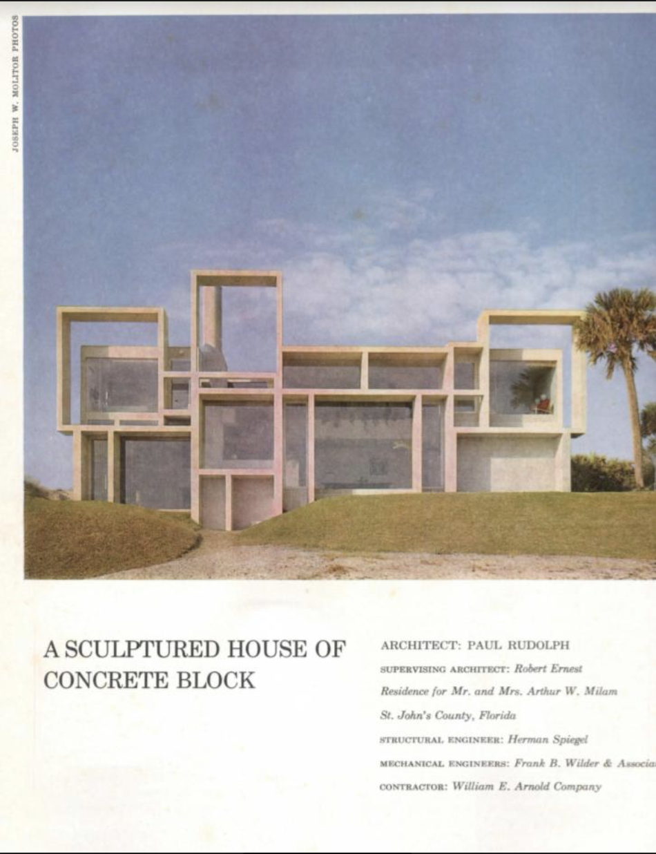
“Architecture worthy of the name never leaves the viewer bored. It is dynamic, exciting and often daring because the juxtaposition of shapes and volumes sets up a flow of space related to the textures, patterns and colors in the house. Often, it artfully contrasts a sense of openness with the security feeling of shelter. Too many of today’s houses are familiar, static and so impersonal they hardly qualify as architecture. Not so the houses shown at the right and on the following pages. Architect Paul Rudolph’s beach house in Jacksonville, Fla. has a three dimensional facade of concrete block that spells out the interior arrangement of rooms and floor levels. The working facade—some architectural critics believe it has started a whole new trend in design—is a series of deep squares and rectangles that look out on the sea and shade the interior. Inside the house, seven floor levels follow the pattern of the facade and help define the flow of space.”
The article’s extended captions pointed-out various features of the house’s design:
“Changing levels and varied ceiling heights emphasize the different uses of space in Architect Paul Rudolph’s concrete-block beach house. For example: the floor plane drops to form a big conversation pit in the high-ceilinged living room, then rises two steps in the rear to the open dining room and rises another three steps to an intimate, low-ceilinged inglenook. Space flows smoothly from one area to another.
Plan orients the active living areas and master bedroom to the sea. The basic planning module is the length of a concrete block. View of ocean, seen here from the dining room is framed by deep sun-breaks. The conversation pit is in foreground, the inglenook at right. View of living and dining areas from the inglenook in the foreground shows variety of floor levels and ceiling heights. Moors arc terrazzo. Facade on the sea is a geometric arrangement o f sun-breaks , or brise-soleils , that hint at the interior arrangement of space. Sand-colored concrete-block rectangles are deep enough to shade the interior and help keep the house cool without drapes which would block the magnificent ocean view. The lowest sun- break, at lower left, frames a utility room; the highest make a rooftop lookout — a widow’s walk in a modern idiom.”
House and Home’s article on contemporary examples of residential design had a section on the Milam residence---and it included some atmospheric views.
Image courtesy of: US Modernist Library of 20th century architectural journals.
The article’s extended captions pointed-out various features of the house’s design:
“Changing levels and varied ceiling heights emphasize the different uses of space in Architect Paul Rudolph’s concrete-block beach house. For example: the floor plane drops to form a big conversation pit in the high-ceilinged living room, then rises two steps in the rear to the open dining room and rises another three steps to an intimate, low-ceilinged inglenook. Space flows smoothly from one area to another.
Plan orients the active living areas and master bedroom to the sea. The basic planning module is the length of a concrete block. View of ocean, seen here from the dining room is framed by deep sun-breaks. The conversation pit is in foreground, the inglenook at right. View of living and dining areas from the inglenook in the foreground shows variety of floor levels and ceiling heights. Moors arc terrazzo. Facade on the sea is a geometric arrangement of sun-breaks , or brise-soleils , that hint at the interior arrangement of space. Sand-colored concrete-block rectangles are deep enough to shade the interior and help keep the house cool without drapes which would block the magnificent ocean view. The lowest sun- break, at lower left, frames a utility room; the highest make a rooftop lookout — a widow’s walk in a modern idiom.”
VOGUE:
While not an architectural journal, the fashion magazine, Vogue, did supply its readers with news about other trends in contemporary culture---including about architecture. An article, in the magazine’s September 1963 issue, focused on the architect (and showed the Milam residence), and it was titled “Paul Rudolph: Young Mover, Changing The Look Of American Architecture.”
The fashion magazine, Vogue, told its readers about new trends in design, including architecture. This 1963 issue carried an article about Paul Rudolph, and—as part of the article—included the Milam residence.
ARCHITECTURAL RECORD:
Architectural Record seems to have been especially taken with the house, including it in their pages several times during the decade—and it was honored to be among the designs chosen for their annual Record Houses issue in May 1963.
Architectural Record included the house in it’s 1963 Record Houses issue. This is the opening page of the article about the house---and the layout featured a photo by Ezra Stoller.
Image courtesy of: US Modernist Library of 20th century architectural journals.
Architectural Record’s comments are worth quoting at length:
“One of the most uniquely different designs among this year’s Record Houses, is this one with its very sculptural use of concrete block. The exterior of the house is dominated by the powerful composition of rectangles forming a sunshade across the rear facade (shown above i the original sketch and completed structure). The spirit of this wall is continued on the interior of the house, where the floors rearranged on seven different levels. Comments of the owners, after having lived in the house for some time, are worth noting: “We knew enough of Mr. Rudolph’s previous works to know that the end result would correspond to our ideas of beauty . . . (and) our faith in the architect was well placed. We are extremely fond of the house. Externally, it is a beautiful piece of sculpture-blending graciously with the sea and the sand surrounding it. It is very comforting inside ... different ceiling heights, different views, different floor levels make it always interesting, always varied
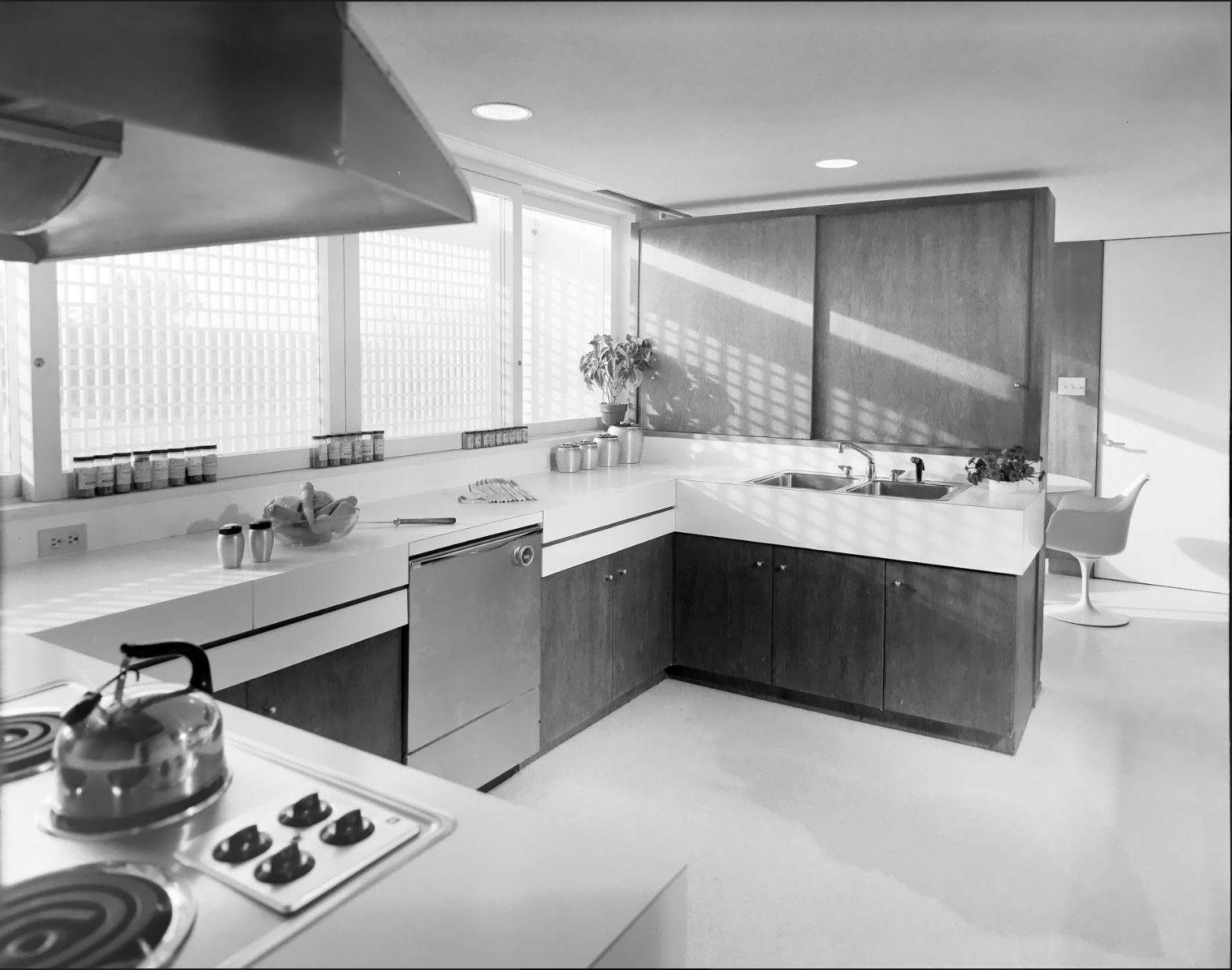
The house is a very spacious and conveniently arranged one. All the living areas are essentially one room, with areas for dining, sitting by the fireplace, and the like, created principally by changes in the floor levels. The hallway linking the upstairs bedrooms is treated as a balcony, and adds yet another level to this varied space. As a counterfoil, colors and other decoration are subdued. As can be noted in these photos of the Milam house, the already big living areas are made to appear even larger and more open by using very few pieces of portable furniture. In fact, about the only ones are the dining table and its seats. Basic seating for conversation and lounging is formed by cushioned units supported by one of the floor levels. The house is constructed of sand colored concrete block, left exposed inside and out. The main floor is terrazzo, and the second floors are hardwood or carpet except for tile in the bathrooms. Ceilings are acoustical plaster for noise absorption in the big areas. The small windows in the baths are supplemented for daylighting by plastic skylights. One of the baths also has an outside exit and stair to serve as a dressing area for swimmers from the beach. Bedroom closets are provided in the nooks near each entrance. The kitchen is conveniently placed for access to the living and dining areas (via a pass through), to the garage for unloading groceries, and to the front door. The entire house is air conditioned. The cost of the house itself was about $88,074.”
OWNING A MASTERPIECE
If you’re interested in possibly purchasing this distinguished house in Ponte Verda Beach, Florida, please contact:
Mr. Robert C. Champion (904) 755-4785 robertchampion@bellsouth.net The asking price is $ 4,450,000
CONCRETE HEROES: SAVING THE MONUMENTS OF MODERN ARCHITECTURE
A review of:
CONCRETE: CASE STUDIES IN CONSERVATION PRACTICE
Edited by Catherine Croft and Susan Macdonald with Gail Ostergren
Conserving Modern Heritage series of the The Getty Conservation Institute
www.getty.edu/publications
These images, from “Concrete: Case Studies in Conservation Practice,” are from the chapter about concrete restoration at Le Corbusier’s Unité d’habitation in Marseille.
Buildings are like human bodies: over time, things happen to them—generally not good things….Even when Modern architects had the best intentions, and relied on what they thought was forward-looking and scientifically derived construction methods, the “bodies” of Modern buildings are showing their age. Some repairs are easier than others: one can re-plaster or re-apply stucco without too much trouble. But some are head-scratchers, as when, during renovation, one finds that the original architect used a product that is no longer available. That happened when renovating a famous mid-century Modern house: a plastic corrugated panel (of a type popular in that era) was not made any more—leading to an expensive custom order. But among all the materials that present themselves for repair, concrete—especially exposed concrete as used in some of Modernism’s most iconic works—is among the most difficult to work with.
We’re all familiar with classic views of Le Corbusier’s Unité d’habitation at Marseille—truly an icon of Modern architecture—but what of the reality when moisture has seeped below the surface and corroded the reinforcing, and parts of the surface have flaked off? Can it be repaired? [And by “repair”, we don’t just mean excising and replacing broken or decayed areas, but rather making the repair blend-in as much as possible, so that it does not look like a carelessly done patch. ]
Moreover, concrete buildings have their own special issues. When moisture reaches reinforcing, it not only leads to spalling (as the rusting steel expands), but also possibly undermines the structure itself—with serious consequences for the building’s integrity. Dirt from the atmosphere and streaks from flowing water adhere to concrete’s subtly fissured surfaces… Well, there’s no need to go on, as the indictments against aging concrete are already part of the pro-and-anti Modern architecture discourse—and particularly when discussing works that have been characterized as “Brutalist” [A term, by-the-way, which we dispute—but that’s another discussion.] Since a significant portion of Paul Rudolph’s oeuvre used exposed concrete—beautifully and artistically, we contend—we are naturally concerned about repair issues and techniques.
“Concrete: Case Studies in Conservation Practice” is a fascinating new book that offers hope and tangibly useful information on the repair of concrete architecture. They do it via case studies—and oh what “cases” they show: some of the most famous buildings of the Modern era!
Among their 14 case studies are:
Unité d’habitation by Le Corbusier
Brion Cemetery by Carlo Scarpa
New York Hall of Science by Harrison and Abramovitz
Morse and Ezra Stiles Colleges, Yale, by Eero Saarinen
Church of Saint Francis of Assisi, Pampulha by Oscar Niemeyer
“Untitled,” an artwork by Donald Judd
Each had its own problems, and the many authors (34 contributors in all) show the unique issues of the buildings, the solutions proposed and executed—and, finally, the superb, fresh results of their ministrations.
Did we say that the book is beautiful? One doesn’t usually expect technically-oriented studies to be visually attractive but this volume shows it can be done. The writers and editors (with Getty’s book designer for this project, Jeffrey Cohen) have assembled a wealth of good photographs (many in color), intriguing drawings (some vintage, and may newly created), and vivid diagrams—and put them together in a way that is inviting. Each case/chapter’s text clearly describes the various teams’ approaches to their building, their careful investigations, their considerations in choosing which techniques were to be used, and the consequences. Yet, while fully informative, the amount of detail is not overloaded, and can be readily digested by the interested reader. We wish more architecture/construction-science books were so appealingly and richly communicative.
There is nothing as convincing as “before and after.” This book shows a multiplicity of projects—differing in their problems, sizes, scales, locations, and building types. It makes abundantly clear that, however grim and despair-inducing concrete repair problems can be, there are effective, creative, rigorous techniques for resolving them. Bravo to the authors and editors of this fine book—and to the Getty Conservation Institute for bringing it forth. We look forward to future volumes in their Conserving Modern Heritage series.
Milam Residence - with beach restored - put back on the market in time to celebrate NATIONAL PRESERVATION MONTH
It doesn’t get more “classic Rudolph” than this: the Milam Residence’s beach-facing elevation. The house is located in Ponte Verda Beach, FL, and this striking view was taken in January, 1962, one year after its completion. Photograph by Joseph W. Molitor. Courtesy of the Joseph W. Molitor architectural photograph collection, located in the Columbia University, Avery Architectural and Fine Arts Library, Department of Drawings and Archives.
Human beings are, for the most part, naturally acquisitive beings: if we see something desirable, we want it - to hold it, to keep it, to own it, and - hopefully - to protect it. There’s no shame in that yearning - it’s a response built into us, a product of our evolution. How much the better when our eyes and tastes are attracted to excellence: when our desires are for things of the greatest beauty, elegance, and high achievement. Well, you can now fulfill that thirst in the domain of architecture: one of Paul Rudolph’s most important homes - a true “signature” work - is now available.
The Milam Residence in Ponte Verda Beach, Florida, by Paul Rudolph, was completed at the beginning of the 1960’s, and instantly became one of - maybe the - paradigm image of what great, Modern, American residential architecture could be. And no wonder: Rudolph’s design elegantly combines:
visual richness, via a celebration of geometry
striking clarity in composition
functional rigor in planning
sensible response to the environment’s potential for creating intense solar gain and glare
a diversity of spaces which allow for varied uses—and a relaxed-but-elegant way-of-living
a practical approach to construction
superb siting along an attractive beach
Rudolph commented on his design:
“A composition of considerable spatial variety with vertical and horizontal interpenetration of spaces clearly defined inside and out. Gone are the earlier notions of organization through regular structure with subdivisions of space freely spaced. Spatial organization has taken the place of purely structural organization. Floors and walls are extended in elaborated forms toward the views, thereby making of the facade a reflection of the interior space. The brises-soleil also serve as mullions for the glass, turning the exterior wall into a series of deep openings filled only with glass. The exceptional wild Florida site 60 ft. above the Atlantic Ocean is a counterfoil to the geometry of the structure.” [Paul Rudolph quoted in: The Architecture of Paul Rudolph. New York: Praeger, 1970]
The family of Arthur W. Milam, who originally commissioned the building, have been owner-residents since the building was finished, and have cared for it with pride. Now, they are making the building available - and they are hoping that the next owner will be struck by the building’s many beauties and virtues, as well as understanding its importance as a work of truly great Modern architecture.
The Milam family has also been doing some site restoration: installing a new retaining wall along the beach. This stabilizes the beautiful terrain which ascends up to the house.
A new retaining wall has been installed, stabilizing the terrain on the beach-side of the house. Photo: courtesy of the Milam family.
This could allow the next owner the option to build decks and/or stairs, as needed, upon the site—perhaps ones like Rudolph himself envisioned in his superb drawings of the house:
Paul Rudolph’s drawing of the Milam Residence’s site plan, and his perspective of the beach side of the house. They show his proposed design for stairs and platforms: they would elegantly cascade from the house, down the dunes, towards the beach below. Drawings: Paul Rudolph Heritage Foundation
You can learn more about the Milam House (and see more images) at the Paul Rudolph Heritage Foundation’s project page for this building.
Interested? As William F. Buckley once said “I cannot imagine that anyone who has the money will put off the purchase …; or that anyone who hasn’t the money will put off borrowing to buy…” We endorse such enthusiasm for excellence—and we’ll be happy to put you in-touch with the owner. Just contact us via our email at office@paulrudolphheritagefoundation.org
AN OCCASION FOR CELEBRATION
The National Register of Historic Places is the official list of the Nation’s historic places worthy of preservation. Authorized by the National Historic Preservation Act of 1966, the National Park Service’s National Register of Historic Places is part of a national program to coordinate and support public and private efforts to identify, evaluate, and protect America’s historic and archaeological resources.
We are happy to note the Milam Residence is on that distinguished list. It achieved that status in 2016, and you can see their official page on the house here—and their extensive and deeply researched report on the house here.
It is always a good time to celebrate Paul Rudolph—and the combination of Preservation Month and news of the restored beachfront at the Milam Residence is a double-treat.
Rudolph Reimagined: A New York Family’s Reworking of an Iconic Rudolph Interior
“It’s pretty darn original,” Carolyn Rowan says with a beaming smile as she shows me into the living room of her family’s stunning apartment on Manhattan’s Upper East Side; and indeed it is. Described by Ms. Rowan as a “labor of love,” her apartment’s interior is one of particular note for more than purely aesthetic reasons. Redesigned for banker Maurits Edersheim and his wife Claire in 1970 from its original 1917 form, the interior of the 5th-floor apartment is a noted example of Paul Rudolph’s interior works.
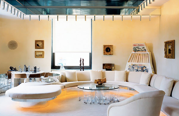
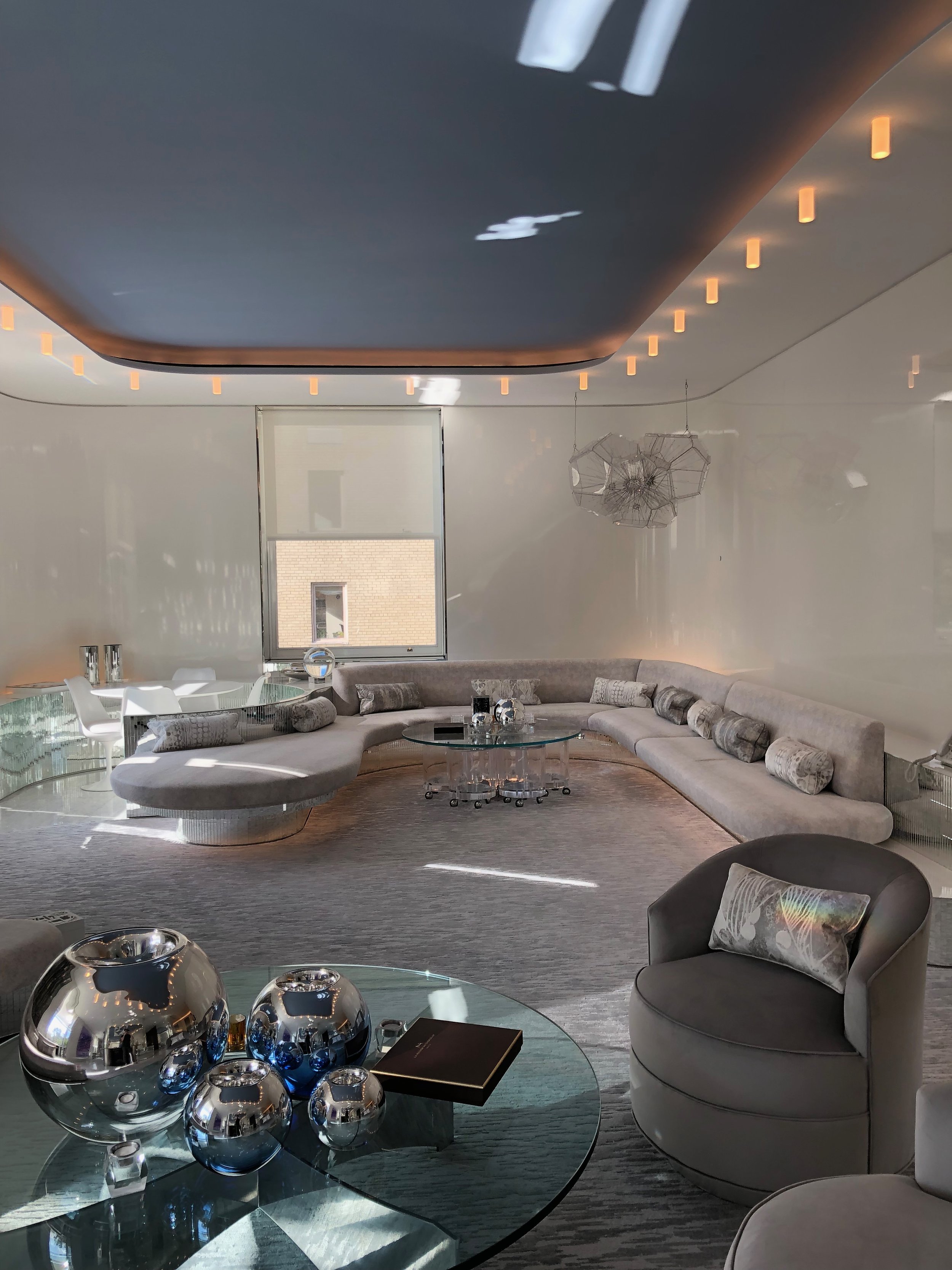
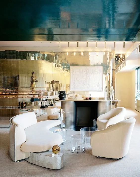
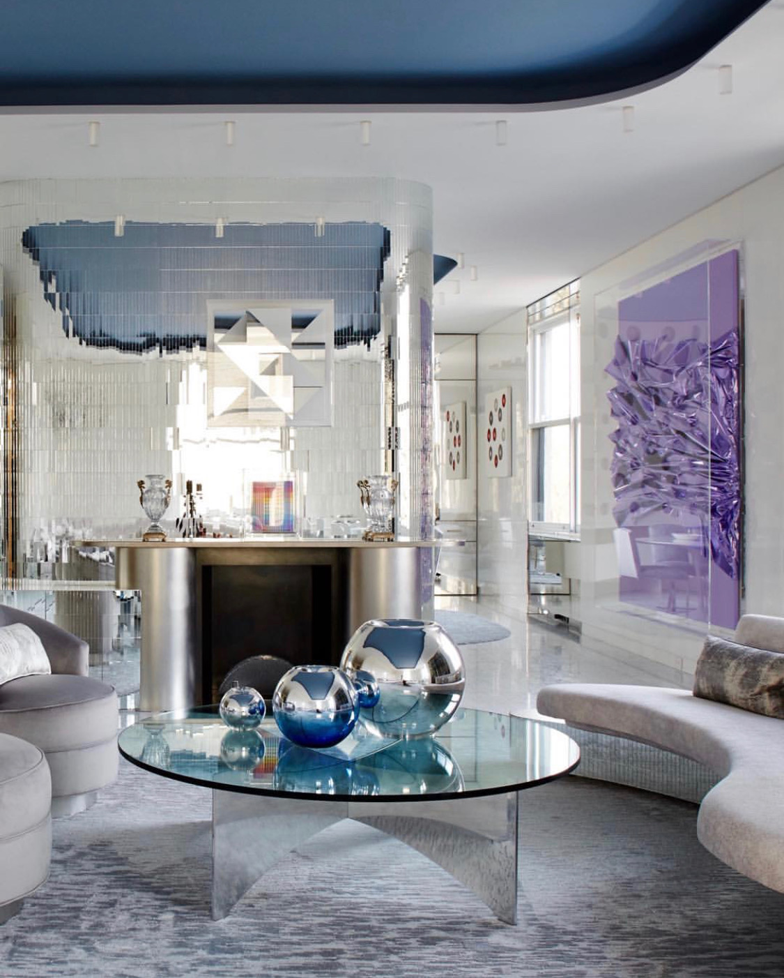
When Ms. Rowan and her husband, Marc—longtime residents of the 6th floor—purchased the apartment, they made a promise to Claire Edersheim, who often spoke about how she and Maurits “built the apartment with Rudolph,” that it would remain largely unaltered and that she and her husband would do little to mar or obscure Rudolph’s mastery. The end result of this promise, which was lovingly undertaken with the assistance of noted interior designer Tony Ingrao, is a sleek and retro space that, while more contemporary, retains the Rudolphian whimsy that makes it so unique.
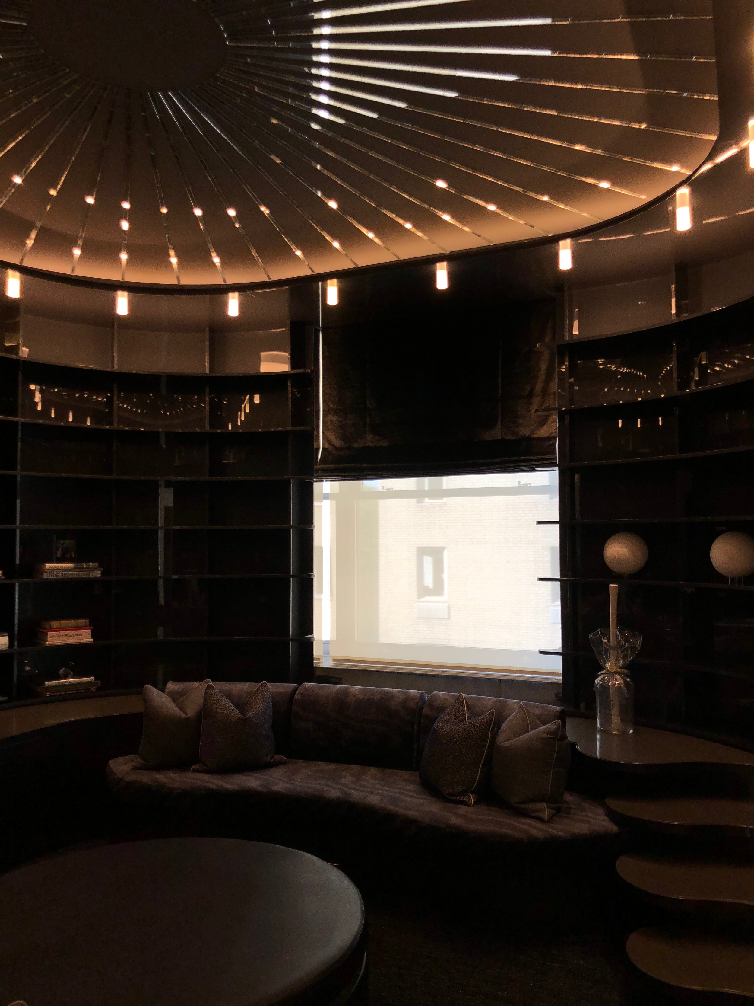
Pictured: A before shot, taken by Anthony Cotsifas courtesy of 1stDibs.com above an after shot, taken by Ethan Shapiro
The heart of Rudolph’s vision remains, but in an updated form. Original 1970’s features like track lighting have been supplanted by more modern fixtures, and features like the unique “u” shaped couch, which the Rowans remade in the exact same footprint as the one Ms. Edersheim took with her when she sold the unit, has been reupholstered in a more muted fabric.
Pictured: A before shot, taken by Anthony Cotsifas courtesy of 1stDibs.com above an after shot, taken by Ethan Shapiro
Unfortunately, many Rudolph interiors are lost, razed by later homeowners who lack a knowledge of his significance or an appreciation of his works, which is why it’s important to emphasize renovations like the one undertaken by the Rowan family. As pictured above, the Rowans’ transformed the office space from its original seventies feel to one that was better suited to their own taste, while retaining Rudolph’s couch, desk, stair-shelves, and ceiling decoration.
Pictured: A before shot, taken by Anthony Cotsifas courtesy of 1stDibs.com next to an after shot, taken by Genevieve Garruppo courtesy of Tony Ingrao Design’s Intagram
The Rowan renovation shows how an owner of a Rudolph property or interior can still allow for Rudolph’s details to shine through, like the mirrored walls and kidney-shaped sofa seen above.
Pictured: A before shot, taken by Anthony Cotsifas courtesy of 1stDibs.com next to an after shot, taken by Ethan Shapiro
The hallway, pictured above, received the most changes — however, Rudolph’s design is still present in the sloping walls that punctuate the center right of the hallway, which was once the playroom of the Edersheim children (and is now a foyer that leads to the second story of the Rowan duplex).
Pictured: A before shot, taken by Anthony Cotsifas courtesy of 1stDibs.com next to an after shot, taken by Ethan Shapiro
The dining room, seen above, has been repainted in an airy white, and retains the original Paul Rudolph dining table, which cleverly breaks apart into three smaller, circular tables whose connecting leaves fold neatly under the shelving unit against the wall. Though bereft of the delft pottery it was made to showcase, the unique feature wall Rudolph designed still remains in its original form.
Pictured: A before shot provided by Carolyn Rowan next to an after shot taken by Ethan Shapiro
It isn’t easy to be the steward of an iconic property, especially one full of original architectural details. Luckily, there are sensitive owners like the Rowan Family who value such a property and have, throughout their four-year-long renovation, kept the heart and soul of Rudolph alive in their space. Right down to the last mirrored wall pane.
A LUMINOUS PHOTOGRAPHER: JOE POLOWCZUK
The Modulightor Building, on 58th street in New York City, designed by Paul Rudolph. Joe Polowczuk’s photograph, taken as evening was coming on—what he poetically calls “the blue hour”—shows the building glowing from within.
Architecture and photography have had a long relationship—maybe the longest: the three prime candidates for the world’s first photograph are a streetscape (in which buildings are sharply prominent); a roofscape; or a still-life which includes architectural fragments or castings of ornament.
Of course, photography and Modern architecture are even more intimate: from the very beginnings of Modernism, its advocates have used dramatically composed photographs to spread the gospel, publicize, and persuade. Indeed, a number of architectural photographers have themselves become legendary (at least within the architectural community). Some of the most prominent examples would be: Ezra Stoller, G. E. Kidder Smith, Julius Shulman, and Yukio Fukazawa. Also, a number of distinguished Modern architects and designers have shown a personal passion for photography, getting behind the camera themselves - and that would include Frank Lloyd Wright, Charles Eames, László Moholy-Nagy, and Le Corbusier.
Joe Polowczuk is in that great tradition: A trained architect, who has been working in New York for the past 20 years, he explains that he
“… naturally gravitated towards documenting the built environment for my own projects and other design peers. I strive to provide the finest images for my clients using a keen eye for composition, and the most up to date technical methods available with digital imaging.”
He won a distinguished award in 2012: the New York City Landmarks Conservancy, Lucy G. Moses Preservation Award, for his work on the Banner Building (in New York’s NoHo Historic District.)
His design-oriented photography includes work that includes both architecture and interiors (offices, residential, hospitality, and retail). He has also caught the most beautiful images of moving water and of surfing (his main non-architectural pleasure, he admits!)
The Paul Rudolph Heritage Foundation was so impressed with Joe Polowczuk’s work that we commissioned him photograph our headquarters building - the Modulightor Building - and also make photographs of the Paul Rudolph-designed chair [which the Foundation is now reproducing, using Rudolph’s original dimensions & details, and offering to interested collectors - see: https://www.paulrudolphheritagefoundation.org/shop/paul-rudolph-rolling-armchair
To see works from Joe Polowczuk’s luminous portfolio, you can visit his website:
and his Instagram page:
https://www.instagram.com/jpolowczuk_photography/
But, for this moment, you might enjoy these works of Joe’s:
Rudolph's Shoreline Apartments in Buffalo - an Artist Responds - Artistically!
“Disposable: Shoreline Apartment Complex Unit” Plastic canvas, acrylic yarn, tissue box, 8 X 16.5 X 21 inches, 2016.
An artwork by Buffalo-born & based, fiber artist Kurt Treeby. This is his depiction of Paul Rudolph’s Shoreline Apartments in Buffalo. It is part of a set of works by Treeby, the “Disposable” series, involving—in the artists recounting—“thousands of precise stitches, all sewn by hand…”
Photo: www.kurttreeby.com
SHORELINE APARTMENTS IN BUFFALO
Shoreline Apartments is a fascinating complex of residences on Niagara Street in Buffalo, NY, completed in 1974 to the designs of Paul Rudolph. To say that it “is” is a bit problematic, because the entire set of residences is slated for demolition - and, as of this writing, about half of the complex still exists (but how long that extant portion will remain is unknown.)
“Rudolph’s original scheme, composed of monumental, terraced, prefabricated housing structures, provided an ambitious alternative to high-rise dwelling that was meant to recall the complexity and intimacy of old European settlements.” – Nick Miller, in The Architect’s Newspaper
Here’s a good, concise background on the project, as reported by Nick Miller in The Architect’s Newspaper (November 5, 2013):
[Arthur] Drexler exhibited Rudolph’s original, much more dramatic scheme for Buffalo’s Shoreline Apartments alongside pending projects by Philip Johnson and Kevin Roche in an exhibition entitled Work in Progress. The projects on display were compiled to represent a commitment “to the idea that architecture, besides being technology, sociology and moral philosophy, must finally produce works of art.”
Completed in 1972, the 142-unit low-income housing development was featured in both the September 1972 issue of Architectural Record as well as the 1970 exhibition at New York’s Museum of Modern Art. Like many of their contemporaries, the inventive, complex forms and admirable social aspirations of the development have been overshadowed by disrepair, crime, and startling vacancy rates (30 percent in 2006 according to Buffalo Rising).
The Shoreline Apartments that stand today represent a scaled down version of the original plan. Featuring shed roofs, ribbed concrete exteriors, projecting balconies and enclosed gardens, the project combined Rudolph’s spatial radicalism with experiments in human-scaled, low-rise, high-density housing developments. The project’s weaving, snake-like site plan was meant to create active communal green spaces, but, like those of most if its contemporaries, the spaces went unused, fracturing the fabric of Buffalo.
Here’s an image of a portion of the Shoreline complex, as built:
The Shorelines Apartments in 1975, shortly after opening. The large Art Deco skyscraper, at the rear-right, is Buffalo’s City Hall.
Image: Courtesy of EPA/Library of Congress
THE ARTIST: KURT TREEBY
Mr. Treeby, a fiber artist that’s a native of Buffalo (and who is based here), does fascinating work, and—on his website—you can find his own text on his career, from which we quote:
Kurt Treeby first studied art at the College of Art and Design at Alfred University. While at Alfred he studied painting, drawing, and art history. After receiving his MFA from Syracuse University Treeby develped a conceptual-based approach to art making that continues to develop as he works with a wide range of fiber and textile processes. His work comments of the production and reception of art, as well as the role art plays in our collective memories. He focuses on iconic imagery and the connection between so-called "high" and "low" art forms. Treeby has exhibited his work on a national and international level. He teaches studio art and art appreciation at the College at Brockport, State University of New York, and Erie Community College.
KURT TREEBY’S “DISPOSABLE” SERIES
The artist has done a series of artworks, each of which is a significant building (or complex of buildings) that has been demolished—or, like Shoreline, is on the way to being demolished. Among the building’s he’s focused on are: The Larkin Building (by Frank Lloyd Wright), BEST Products Showrooms (by SITE), the Niagara Falls Wintergarden (by Cesar Pelli), and various other structures. The one he did, of a portion of the Shoreline, captures the Paul Rudolph’s design very nicely!
Here are some excerpts from Mr. Treeby’s beautiful and sensitive artistic statement on his work—and this series in particular:
Every city includes a variety of structures including historical landmarks, industrial factories, and utilitarian homes. My work examines the architectural ecosystem of production, consumption, and destruction embedded into the social, economic, and physical landscape of cities, reimagining a future apart from their industrial or commercial past.
Focusing on iconic structures, I faithfully replicate architectural and structural details from an alchemy of historical records and collective memory. I recreate these buildings in plastic canvas and craft-store yarn, amplifying the tension between fine art and craft. The final sculptures function as the visual embodiment of the restoration process, as historical records, and as personal memories; all imperfect and incomplete.
I use the medium of plastic canvas because it is rooted in domestic crafts. Traditionally, the medium is used to construct decorative covers resembling quaint cottages or holiday-themed houses for disposable items like tissues and paper napkins. Unlike the fantastical commercial patterns, my sculptures are often larger, replicating complex buildings that have been demolished or significantly altered over time. Because I cannot always experience the original structures, I combine archival records and satellite imagery to help me understand the building’s original site.
The hours spent on each piece are a meditation and a reflection on loss. Engaging in this meticulous process is my way of paying tribute to the original architects. My imperfect buildings act a stand in for the original, and as monuments to memory itself.
We urge you to visit Kurt Treeby’s website, and explore his movingly intriguing work for yourself: http://kurttreeby.com


