Architectural History

We need to fight harder to protect the future of our past

FROM AN EXAMPLE OF CORPORATE PRIDE AND CUTTING EDGE RESEARCH—

FROM AN EXAMPLE OF CORPORATE PRIDE AND CUTTING EDGE RESEARCH—

—TO DEMOLITION BY NEGLECT AND MISINFORMATION.

—TO DEMOLITION BY NEGLECT AND MISINFORMATION.

The Burroughs Wellcome Building is no more.

  • One of America’s most forward-looking buildings, an icon of design, and -

  • the site of Nobel Prize-winning and life-saving research, and -

  • a research center designed for growth - a feature so appreciated by the client that they brought the architect back (three times!) to expand the building, and -

  • a building made, inside and out, to inspire and foster innovation, and -

  • a design so striking that it was used as sets for film and television, and -

  • a landmark of its region and state, and -

  • one of architect Paul Rudolph’s largest creations -

is gone.

Modern architecture is part of America’s cultural legacy - and buildings designed by Paul Rudolph are among some of the best examples of the our architectural achievements: Rudolph’s architecture simultaneously displays practical innovation, creative exuberance, spatial richness, and symbolic depth.

Built as Burroughs Wellcome’s US headquarters and research center (and a prominent landmark within North Carolina’s Research Triangle Park), the building was praised by the company leadership which commissioned it:

“This building is an exciting and ingenious combination of forms [in which] one discovers new and different qualities of forms and spaces . . . a splendid climate for scientific scholarship and for the exchange of ideas.” — Fred A. Coe Jr., President of Burroughs Wellcome

and was hailed by:

“. . . .all of us who recall the vibrancy of this building . . . .I count myself very fortunate to have worked there. It was an amazing structure. We were young, and life was full of hope and promise. We were all witnesses, if not direct contributors, to amazing scientific discoveries and their promotion, during an exciting time for medical research.”

“I spent 32 years with [Burroughs Wellcome]. . . At that time, if any space was conceived to bring out the creative, inspirational, thoughts—this was it, in my opinion. I loved working there. We invented and developed more pharmaceutical products in those years. . . .We were “family” but more to the point we were colleagues who were allowed to trust the expertise of each other.”

United Therapeutics - the current owner of the site - had asserted that a significant portion of the building would be restored and reused, but - despite Burroughs Wellcome’s important history and innovative design - they decided to demolish the structure without discussion. So little discussion, that local preservation groups we reached out to about the demolition permit thought it must be for an anticipated asbestos abatement. Wholesale demolition was not considered a possibility.

When supporters learned of its impending demolition, there was enough people trying to see it that security had to push an existing fence farther from it to hide the destruction from the public. People we spoke to who tried to photograph the building were threatened by security guards with trespassing and had photos deleted from their cameras.

PROTECTING THE FUTURE OF THE PAST

Burroughs Wellcome, a significant work of architecture, is now permanently, irretrievably lost. This puts a spotlight on the need to protect America’s cultural heritage—and that includes this country’s great buildings.

The Paul Rudolph Heritage Foundation and other organizations are engaged in that fight to preserve our past.

The destruction of Burroughs Wellcome led the United States chapter of the international preservation organization Docomomo to create The Advocacy Fund:

As part of our #ModernLove campaign, and in response to the recent demolition of Burroughs Wellcome, Docomomo US is announcing the creation of a new initiative: The Advocacy Fund. Gifts to this new initiative will go directly to critical advocacy efforts and will support local and national work.

Modern Love means many things to us: it means celebrating iconic sites like the Ford Foundation Center for Social Justice that received a 2020 Modernism in America Award of Excellence; it means fighting for significant sites like the Hirshhorn Museum and Sculpture Garden; and it means avoiding the loss of significant buildings like Burroughs Wellcome designed by Paul Rudolph that was demolished earlier this year because it lacked appropriate preservation protections.

With your support, Docomomo US can provide assistance to local advocates and campaigns, participate in local and national preservation review meetings including the Section 106 process, and continue to speak out on the issues that concern you the most.

If the loss of the Burroughs Wellcome building makes you angry, please consider donating to the Advocacy Fund. All gifts up to $10,000 will be matched by the Docomomo US Board of Directors!

Buildings by Rudolph—among the world’s most significant works of Modern architecture—are continually threatened with demolition or abuse. Vigilance and advocacy is needed.

We are committed to urging, advising, and campaigning for the preservation (and proper care) of PAUL RUDOLPH’s architectural legacy.

Please give to the Advocacy Fund to preserve the richness of Paul Rudolph’s contributions—and to show:

Demolition is never the answer.

FROM AN ICON OF AMERICAN DESIGN —

FROM AN ICON OF AMERICAN DESIGN

— TO DEMOLITION DEBRIS.

TO DEMOLITION DEBRIS.

And if you see something going on at a Rudolph site—that a building may be threatened, or is not maintained, or is about to be marred by an insensitive ‘update’ - please let us know (we’re easy to contact.)


IMAGE CREDITS:

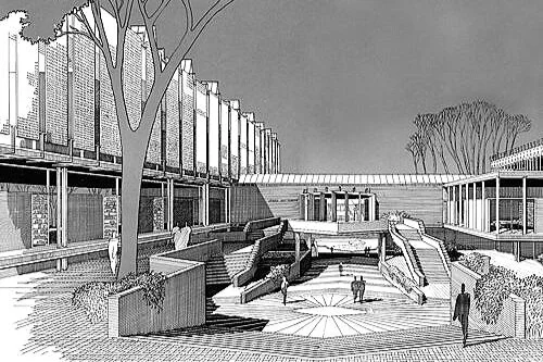
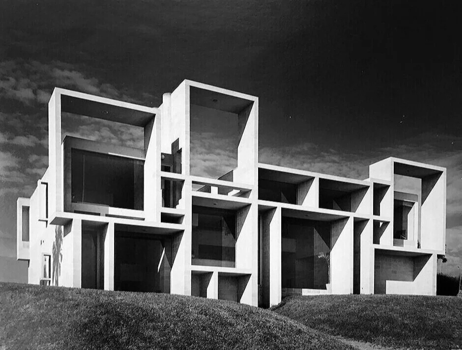
Top photograph of the Burroughs Wellcome Building: image courtesy of the Joseph W. Molitor architectural photographs collection, located in Columbia University, Avery Architectural & Fine Arts Library, Department of Drawings & Archives; Photographs of the Burroughs Wellcome building, in the process of demolition: photography by news photojournalist Robert Willett, as they appeared in a January 12, 2021 on-line article in the Raleigh, NC based newspaper The News & Observer; Perspective-section drawing, by Paul Rudolph, through the main body of the Burroughs Wellcome building: © The Estate of Paul Rudolph, The Paul Rudolph Heritage Foundation

Adding To Our Knowledge of Paul Rudolph: his 1994 interview with Zak Ghanim

Paul Rudolph (left) with Zak Ghanim (right) during the 1994 interview at Rudolph’s Beekman Place home-office in NYC.

Paul Rudolph (left) with Zak Ghanim (right) during the 1994 interview at Rudolph’s Beekman Place home-office in NYC.

THE HISTORICAL MISSION

The mission of the Paul Rudolph Heritage Foundation is to spread knowledge about the profound legacy of Paul Rudolph, and to preserve the work of this great and internationally-important 20th century architect - and we do accomplish this in many ways, including:

  • Education

  • Advocating for preservation

  • Actively engaging with the scholars, students, and journalists

  • Publications

  • Encouraging the proper care and stewardship of Rudolph-designed buildings

And— some of our most rewarding activities involve historical research. Rudolph, across a half-century career (and hundreds of projects), created an enormous body of work. Moreover he was involved in a variety of other activities (education, writing, travel, research, entrepreneurship…). While Rudolph left a large body of documents, and several important books have been written about him, we still find that that numerous questions emerge—and the mysteries are compounded by gaps in the records. So we become detectives (which is part of a historian’s role): seeking out clues that lead to further insights and facts about Paul Rudolph. When we find another a new facet of Rudolph’s work and thought (another “piece of the puzzle”), we’re thrilled.

That is why we were happy to discover an interview with him, one which we were not aware of until recently. It was conducted in 1994 (a few years before Rudolph’s passing in 1997), at Paul Rudolph’s “Quadruplex” residence-office on Beekman Place in New York City.

At the time of the interview, Paul Rudolph was still very active, with several projects underway (especially in Asia)—but, at age 78, he also had a long-view perspective on his life and career, and ZAK GHANIM, the interviewer, was able to elicit some fascinating comments from Rudolph. The fact that Mr. Ghanim is an architect, with an active practice of his own, no doubt enhanced his ability to question Rudolph with the insight of a fellow professional.

Architect Zak Ghanim—who conducted this insightful interview with Rudolph.

Architect Zak Ghanim—who conducted this insightful interview with Rudolph.

THE INTERVIEWER: ARCHITECT ZAK GHANIM

Zak Ghanim is an award-winning architect, urban planner, interior designer, illustrator, writer, lecturer, editor and journalist. He was born in Egypt and received his degree in Architecture from Alexandria University. His office is based in Toronto, and he has produced over 1,000 international projects---including in the domains of commercial, hospitality, religious, retail, and residential design, as well as community centers and factories.

He has received awards from a variety of distinguished organizations—and his projects have appeared on the covers of numerous publications, and featured in international newspapers, periodicals and books—as well as having been in exhibitions and featured on television shows and primetime news.

Mr. Ghanim is in the process of publishing two books: New Visions on Architecture (which will include this interview with Paul Rudolph), and Travel Photography: a collection of architectural and artistic images photographed by him in over 5 continents. The full text of his books—as well as his comprehensive design portfolio—can be found on Mr. Ghanim’s website, which you can see here.

We are grateful to Zak Ghanim for giving us permission to share his interview with Rudolph, and to include it as part of our documentary archive.

GHANIM ON ARCHITECTURE aND INTERVIEWS

In the introduction to his book of interviews of architects, New Visions on Architecture, Mr. Ghanim offers some insights on his interest in architecture and intentions for the interviews—and here are several excerpts:

“Since my early undergraduate years, I have been fascinated with the work of the masters of architecture. I have tried to comprehend how they evolved their ideas and opinions, where they drew all that creativity from, and how can an ambitious young designer be a part of that process.”

“Frank Lloyd Wright, Le Corbusier and Mies van der Rohe had all made their marks in the early 20th Century, but now their disciples must come forth and develop their own styles. It is time for the new generation to stand on a higher plateau. Our needs have altered and our understanding of nature's role in architecture has been redefined. As lifestyles, change so do values, both artistically and socially.”

“As we come to the dawn of a new century, I wanted to present the words of these leaders to everyone who is interested in art and architecture, so that they can understand where the future of architecture is taking us. It has become more evident that the ordinary person on the street is concerned and intrigued with the role of architects. I feel by committing their words to paper, many can gain an insight into their creativity and understand the discipline and aspiration that it takes to become a pioneer in a specific domain.”

EXCERPTS FROM THE INTERVIEW

The interview covers many aspects of Paul Rudolph’s life and career, and below are several examples of Zak Ghanim’s questions and Rudolph’s responses:

ZAK GHANIM:  YOUR FATHER WAS A METHODIST MINISTER, DID THIS HAVE AN EFFECT ON YOUR ARCHITECTURE AS BEING CONSERVATIVE, PRAGMATIC OR DISCIPLINED?

PAUL RUDOLPH:  Most definitely. When I was six years old, my father built a church and of course an Architect was involved. When I saw his drawings and models, I knew instantly it was for me, and I have never changed my mind.

Z.G.  SO, YOU ALWAYS WANTED TO BE AN ARCHITECT?

P.R.  I had no choice, I was very lucky. If someone asked me should he/she be an architect, I would say, you cannot teach people to be talented, you cannot teach people to design by showing what others have done, you can only clarify principles, but you cannot really teach youth to be designers. I have always been able to draw easily, since I was a child, and still do.

* * *

Z.G.  WHAT KIND OF EXPERIENCE DID YOU GAIN FROM THE BROOKLYN NAVY?

P.R.  Apparently, you did some homework. They thought they could make a Naval Architect out of me, in four months, by sending me to M.I.T. for a ridiculous course. I found myself in charge of 300 people making repairs to destroyers in the Brooklyn Naval Yard. That was some fantastic experience. I saw how a very large organization went about dividing its work. Trying to utilize talents of a person was of the utmost importance, I could understand drawings while other people could not, and I began to understand the relationship between the administration and the people who were building, so I really had a fantastic job.

* * *

Z.G.  BACK IN 1954, YOU WERE AWARDED THE TITLE OF "OUTSTANDING YOUNG ARCHITECT" AT THE INTERNATIONAL COMPETITION HELD IN SAO PAULO IN BRAZIL, THAT MUST HAD A THRILL FOR YOU AT YOUR EARLY STAGE OF YOUR PROFESSION.

P.R.  Not only was it a thrill, it helped me financially.

Z.G.  WHAT WAS THE BASIS OF YOUR SELECTION?

P.R.  I entered that completion with the design of the Walker guest house that was built in Sanibel Island, Florida back in 1953. It was a 24 by 24 foot wooden house. It had three 8 by 8 foot bays. One of glass, the other two clad with solid panels. There was an arcade around the outside of the house to support the panels. These panels changed the interior space from a cozy room, in terms of closure and light, to a wide-open pavilion.

* * *

Z.G.  IN YOUR EARLY CAREER, YOU SPENT SOME TIME IN EUROPE, THROUGH A SCHOLARSHIP. WHAT KIND OF IMPACT DID THIS HAVE ON YOU?

P.R.  The United States was built in the nineteenth century, and has never been strong in terms of Urbanism. The U.S. is essentially based on eclecticism, where Europe is the exact opposite. The strength of Urbanism in Europe to this day is fantastic. You could not believe the effect which European Cities had on me. I began to understand that architecture is about Urbanism, that the small must be related to the large and vice versa, that you cannot ignore the environment. I began to understand the importance of the relationship between the vehicular architecture and the so-called high style architecture, the importance of building types, the relationship of transportation of all kinds to the city. I understood that the chariot entrance to the Acropolis was formed absolutely beautifully in relationship to the pedestrian entrance. Until today, we have not learned how to relate our automobile, which is our chariot, to the vehicular system in this country. We build the ugliest cities in the world and this is so painful, because I do not think it has to be that way.

* * *

Z.G.  BUT YOU STUDIED UNDER GROPIUS WHO BELIEVED IN COLLABORATION IN DESIGN.

P.R.  I do not work with other designers, but I do believe in that concept, because for many people it may be the only way they can work. Gropius himself would be the first one to say there are many ways for teamwork; it's a question of what you mean by teamwork. If there is a team of architectural designers, goodbye, but if the architect teams up with a structural engineer, a mechanical engineer, an acoustical engineer, an electrical engineer, a geographer, an economist and so on, but not five architectural designers. You see, Gropius believed that through discussions, one could reach a clarification and a higher level of understanding, but then I say if that is true, I believe it depends on who you are discussing things with. It is a very complicated issue. I make no bones about what I do, I know what I do well and what I don't do well. I just want to be used in a good way, that's all.

* * *

Z.G.  I UNDERSTAND THAT YOU WERE NOT HAPPY WITH THE FINAL LOOK OF THE MARY COOPER JEWETT ARTS CENTRE FOR WELLESLEY COLLEGE, WELLESLEY, MASSACHUSETTS BACK IN 1955. WHY IS THAT?

P.R.  In the U.S. architects tend to think that the nineteenth century has spilled over into the twentieth century, and that one should build only twentieth century architecture. I am very proud that this building was part of the very beautiful campus, and one had to say it was built in this century. That was the basic notion. In other words, I am talking about urbanism, which I did not really learn in school. I am a great believer that education is based on many things. In any event the idea of adding a 20th century building to a Gothic campus created a form of space, kind of Acropolis, looking down south to the lake. If I were to have the same commission today, I would do it the same way, in principle. The thing I feel inferior about the building, has to do with the interior space, which was not developed exactly the way I wanted. Regardless, in my opinion, Wellesley College was one of the first buildings that tried to marry the new and the old United States.

* * *

Z.G.  WHAT DID YOU CONTRIBUTE AS A CHAIRMAN OF YALE SCHOOL OF ARCHITECTURE?

P.R.  I do not know if I made any contribution. I patterned my eight years there very much after Gropius, not stylistically but in principle. What Gropius basically said, was that architecture, in the real sense of the word, is a means by which people express their aspiration. In that sense, we really are servants to society. I genuinely believe that things are constantly changing, and that is based on the series of principals that we started speaking of. I tried to teach that architectural space is what determines, any project whether religious, governmental or housing, and that scale is of the utmost importance, especially in terms of Urbanism.

* * *

Z.G.  I WOULD LIKE TO HEAR YOUR OPINION ABOUT THE LATEST TRENDS IN ARCHITECTURE; POST- MODERNISM, DECONSTRUCTION....

P.R.  The only thing I like about Post-Modernism is its light interest in urbanism, but it is far too nostalgic and stylish. If you had a bunch of Cape Cod cottages, according to Post-Modernism, the only thing to do is to build more cape cod cottage. I don't believe in this, I am totally against Post- Modernism, as conceptually seen, other than what little it has to say about urbanism. Modernism does not have all the answers, I do not think it does, but it tends to address this century's problems, and has within its concepts a great many possible solutions.

* * *

Z.G.  HOW DO YOU LIKE THE AT&T BUILDING?

P.R.  No comment.

* * *

Z.G.  FOR THE PAST EIGHTEEN YEARS YOU HAVE BEEN DEALING WITH DIFFERENT INTERNATIONAL PROJECTS. WHAT KIND OF EXPERIENCE DID YOU OBTAIN FROM SUCH INVOLVEMENT?

P.R.  I have been working mostly in South East Asia, and I have found that very rewarding on many levels. The attitudes are very different from the United States. It is also the idea that the labor is still relatively very inexpensive, and what I want to do is very labor intensive. The Pacific Rim is in its most important stage economically, but artistically it is not very clearly defined yet. I think it will be soon.

* * *

Z.G.  HOW DO YOU VISUALISE THE FUTURE OF CONTEMPORARY ARCHITECTURE? ARE WE GOING IN THE RIGHT DIRECTION?

P.R.  First of all, do you see that each new trend cancels out the other, and leaves you with nothing. I really, honestly believe in movements that add to urbanism or add some dimensions to human life. Then I am for it, but if I do not see that, then I am against it. I feel sad about things right now, but I also feel very hopeful. Many false paths have been perceived, and I believe the problems that one sees everywhere will not go away. Architects right now, as I see, tend to solve or address themselves to problems which are fine in terms of magazines, but have nothing to do with human needs or aspirations.

* * *

Z.G.  YOU PRODUCED SOME OF THE MOST METICULOUS AND ORDERLY DETAILED BLACK AND WHITE COLLECTION OF PERSPECTIVES. HOW MUCH WERE YOU PERSONALLY INVOLVED IN THE PRODUCING OF THOSE RENDERINGS?

P.R.  When I was very young, I personally drew every line. In many ways those are the only drawings which I like. Then I became very busy, and what I would do perspective and almost everything in pencil, then I had staff to fill in certain passages. But when it came a matter of gradation, I would always do that, and when it was a matter of hatching, someone else could do that. So I always had some assistance.

* * *

Z.G.  WHAT IS ON THE DRAFTING BOARD NOW?

P.R.  I am still working in South East Asia and Hong Kong. I don't know why, but I have a bunch of projects I'm working on, a total of six private homes and a small office building in Indonesia. An office building in Singapore, also I'm working on a town in Indonesia.

Z.G.  HOW ABOUT THE US?

P.R.  One house!

THE COMPLETE INTERVIEW

The complete text of Zak Ghanim’s interview with Paul Rudolph can be found at the Paul Rudolph Heritage Foundation’s ARTICLES & WRITINGS page (which has a large collection of written resources on and by Rudolph)—and a direct link to the full interview is here.


IMAGE CREDITS

NOTES:

The Paul Rudolph Heritage Foundation gratefully thanks all the individuals and organizations whose images are used in this non-profit scholarly and educational project.

The credits are shown when known to us, and are to the best of our knowledge, but the origin and connected rights of many images (especially vintage photos and other vintage materials) are often difficult determine. In all cases the materials are used in-good faith, and in fair use, in our non-profit, scholarly, and educational efforts. If any use, credits, or rights need to be amended or changed, please let us know.

When/If Wikimedia Commons links are provided, they are linked to the information page for that particular image. Information about the rights for the use of each of those images, as well as technical information on the images, can be found on those individual pages.

CREDITS:

Photos of Zak Ghanim interviewing Paul Rudolph: courtesy of Mr. Zak Ghanim; Photo of Zak Ghanim: courtesy of Mr. Zak Ghanim.

Rudolph's BOSTON GOVERNMENT SERVICE CENTER: it's fate moves to a new phase

PAUL RUDOLPH’S BOSTON GOVERNMENT SERVICE CENTER: PAST, PRESENT—AND A POSSIBLE FUTURE

The cover of the recently issued OFFEREING MEMORANDUM: an extensive booklet which gives an overview of the Boston Government Service Center’s HURLEY BUILDING site as a development opportunity.

The cover of the recently issued OFFEREING MEMORANDUM: an extensive booklet which gives an overview of the Boston Government Service Center’s HURLEY BUILDING site as a development opportunity.

The BGSC — the BOSTON GOVERNMENT SERVICE CENTER — is Paul Rudolph’s large, civic building in Boston—and one of the largest projects in his long and prolific career. The building—really, several buildings in one—is a composition of plazas, interiors, offices, public spaces, forms, textures, and seating, was designed to serve many functions. It contains facilities for education, health (including mental health), welfare, unemployment, parking, and other state government offices.

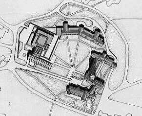
The HURLEY BUILDING is a large part of this complex. Paul Rudolph’s aerial view of the complex, as he originally envisioned it, is at the top of this article—and the oval encloses the Hurley Building section. At right is an aerial photo of the complex—and Hurley is the building at the lower center with the white roof.

The HURLEY BUILDING is under threat—and the following is an update on the developing situation.

THE PLAN UNFOLDS…

In 2019, Boston Globe reporter John Chesto reported:

“The [Massachusetts state government] administration. . . .unveiled plans to redevelop the state-owned Charles F. Hurley Building, at the edge of the old West End and Government Center, to open up a prime 3.25-acre site on the corner of Staniford and Cambridge streets. The deal could, at a minimum, fetch the state tens of millions of dollars.

“The state would issue a ground lease to a development partner that would oversee the design, planning, and construction of a new office complex, with the likelihood of new ground-floor retail and restaurant spaces as well. The administration said it expects to identify a redeveloper within the next 18 to 24 months after putting the project out to bid.’

STUDIES, MEETINGS, TESTIMONY—AND MAYBE MOVEMENT:

The threat to the building—a strong implication of the above announcement—got the full attention of the Paul Rudolph Heritage Foundation, as well as Boston/Massachusetts-area preservation organizations and a series of “stakeholder” meetings were held to learn about the project and get input. Studies were commissioned by the state (and made available for review), and further input/pushback was given. The opinions of state agencies were also part of the discourse.

At the end of this, we did learn of one positive development, from a report the state issued last February. It said that the state:

”. . . .intends to express a preference. . . .for redevelopment schemes that pursue adaptive reuse of the existing building – that is, schemes that retain some or all of the existing building. . . .”

It seemed that activism had moved the state to a more positive, adaptive reuse preference—one which we and others had been advocating. But we also pointed-out the elastic nature of the language used in the state’s report, with no clear and strong commitment to actually acting on the recommendations of those focused on the preservation of our cultural-historical heritage.

The OFFERING MEMORANDUM’s Executive Summary uses  impressive photographs of the Hurley Building.

The OFFERING MEMORANDUM’s Executive Summary uses impressive photographs of the Hurley Building.

THE LATEST DEVELOPMENT

The state is moving ahead with the project. They’ve now issued an “OFFERING MEMORANDUM—-a 60 page booklet on the development potential of the site. It’s an invitation to developers to engage in this “EXCEPTIONAL PARTNERSHIP OPPORTUNITY” and “PREMIERE DEVELOPENT OPPORTUNITY”.

The booklet offers statistics and facts about the neighborhood & region (highlighting the nearby concentration of medically-oriented companies and institutions, showing local transportation facilities, sharing economic and demographic factors, identifying major employers in the area, showing plans and data for the existing building and site, and defining parameters & goals of the project—-and it uses some of the best photographs of the building we’ve seen in a long time.

The OFFERING MEMORANDUM is a model of how to make a project attractive, and it is worth studying for the way it piles-up evidence that this is a prime opportunity for a developer.

For Example: Below are two spreads from the booklet highlighting the site:

medical center.JPG
mixed use environment.JPG
Key players at the creation of the Boston Government Service Center. In the foreground is a model of the complex, with the Hurley Building closest to the front of the picture (the model also includes the unbuilt office tower.) In the background are architectural drawings of the complex: an elevation and numerous floor plans. Among the people assembled for the photo are Edward Logue and Paul Rudolph (who is standing at far right.)

Key players at the creation of the Boston Government Service Center. In the foreground is a model of the complex, with the Hurley Building closest to the front of the picture (the model also includes the unbuilt office tower.) In the background are architectural drawings of the complex: an elevation and numerous floor plans. Among the people assembled for the photo are Edward Logue and Paul Rudolph (who is standing at far right.)

WHAT’S IN THERE—

The state’s goals are explicit:

'“[The state] is seeking to establish a long-term ground lease with a development partner. . . .for the redevelopment of the Hurley Building. It has identified three primary goals for the project:

• Cost-effectively address capital renewal needs of an outdated state asset

• Consolidate state office space into assets under long-term control

• Transform an imposing “super-block” into a pedestrian-friendly, 24/7 neighborhood asset

[The state} anticipates anchoring the project via a long-term lease or leasehold condominium interest for up to 350,000 gross square feet of space in the redeveloped property.”

There is also a section outlining what interested developers will be required to submit: requirements for qualifying to participate, and the features that each proposal must address.

The OFFEERING MEMORANDUM devotes a page to “Stakeholder Engagement”—which outlines both neighborhood considerations as well as preservation & design factors—and there’s another page on “Design Guidelines” (with sub-sections on Urban, Building, and Sustainable design).

And, elsewhere in the booklet, there’s information about the building's history, which identifies several of its key architectural characteristics. There’s language about “HISTORIC PRESERVATION CONSIDERATIONS” including:

“The Massachusetts Historical Commission and other preservation advocates have been and will continue to be integral in the redevelopment of the Hurley Building. . . .

The BGSC is eligible for listing on the state and federal registers of historic places.

[The state] engaged Stantec Architecture to establish design guidelines for the Hurley Building redevelopment. These guidelines, which have been reviewed by the project’s various stakeholders, include design principles categorized into three sections:

• Urban Design — Encourage significant, creative, dynamic urban interventions that complement, celebrate and improve the Hurley Building, its site and the entire urban block

• Building Design — Seek a solution that leads the nation in addressing a common challenge of adapting and adding to assets in ways that respect the Hurley and Lindemann [the other art of the BGSC] Buildings’ unique architecture

• Sustainable Design — Anticipate that the project will be a showcase of sustainable redevelopment strategies for similar buildings of its era in the Commonwealth and the nation.”

The Design Guidelines page from the OFFERING MEMORANDUM for the Hurley Building.

The Design Guidelines page from the OFFERING MEMORANDUM for the Hurley Building.

The “DESIGN GUIDELINES” state:

BUILDING DESIGN

Goal

Seek a solution that leads the nation in addressing a common challenge of adapting and adding to assets in ways that respect the Hurley and Lindemann Buildings’ unique architecture.

Design Principles

• Prioritize adaptive reuse/rehabilitation

• Develop an innovative and complementary new composition of massing at various scales

• Create a signature new renovation and addition(s) to complement the existing Hurley/Lindemann/Courthouse block”

Moreover, elsewhere in the document, there’s a further statement that potential developers’ proposals will be expected to show “Integration of design excellence and historic preservation considerations”.

The Boston Preservation Alliance is a major organization  that “protects and improves the quality of Boston’s architectural heritage. Through advocacy and education, we bring people and organizations together to influence the future of Boston’s historic buildings, landscapes, and communities.”

The Boston Preservation Alliance is a major organization that “protects and improves the quality of Boston’s architectural heritage. Through advocacy and education, we bring people and organizations together to influence the future of Boston’s historic buildings, landscapes, and communities.”

A POSITIVE ASSURANCE

The Boston Preservation Alliance is an important player in seeking to preserve the BGSC building, and said of the complex:

“The Government Services Center is historically significant for its team of architects, especially Paul Rudolph, its design, materiality, and architectural statement. Still today, the concrete complex stands in sharp contrast to common curtain-wall construction and the standard glass and metal we see throughout the city. The Alliance feels that the original buildings play a critical role in the landscape of Boston, telling an important story about the evolution of American design. The buildings could embrace a new life if properly upgraded. . . [They] urge the redevelopment program for the Hurley Building to preserve as much of the building as possible. Creative, sensitive modifications to keep the site functional relevant to contemporary needs are attainable without wholesale demolition, and there is a great desire in the community to preserve the integrity of this complex. . . .”

And, according to their July 22nd entry of their activity log for the Hurley Building, they have also been assured by the state:

“. . . .[That] Alliance staff that we will continue to be a part of the process, and have expressed clearly and with appreciation that our efforts to date altered their perspective from an offering which directed interested parties to focus on complete demolition to one that acknowledges the historic and architectural significance and opportunities for a creative redevelopment and adaptation of the existing buildings. We have been told that proposals that propose full demolition will not be considered competitive or viable.”

This is good to hear—and we hope that what the state has assured will be fulfilled.

WHAT’S NOT IN THERE (THE LACK OF SPECIFICS)—

But, reading the OFFERING MEMORANDUM, we are still concerned—

What is NOT clearly stated, by the state, is vital/specific information about how the project will proceed - factors which have consequences for how much weight will be given to preservation and adaptive reuse:

  • How is the success and thoroughness of the developer’s proposals to be judged?

  • What is the process by which the review/judgement will be performed?

  • Who will do the judging?

  • What opportunities will there be—and at what junctures—for stakeholder input (including from preservation agencies and advocacy groups)?

  • Will there be opportunities for reviewing (and commenting on) proposals submitted during the process, including proposals initially submitted by developers —and— the proposals of the finalists —and— the proposal of the winner?

Paul Rudolph Heritage Foundation is carefully watching this process—and will seek to participate in positive ways for attaining the maximum respect for this landmark work of architecture.


P.S. — THE LOGIC OF RUDOLPH’S PLANS

The OFFERING MEMORANDUM includes something not often seen in publications about the Boston Government Service Center: a full set of the floor plans of the affected structure (the HURLEY BULDING). We reproduce, from the report, those plans—-which include all levels from the Basement -to- the Sixth Floor.

Worth noting about these plans are:

  1. The columns are laid-out in a logical grid, and spaced-out with sufficient distance to allow for flexible arrangements.

  2. Exit stairs are well placed at the ends of the building, and at the mid-point.

  3. Among the most expressive features of the exterior are the curved towers. They are used to enclose exit stairs, so their unusual shape does not impinge on the more conventionally-formed office spaces.

  4. The elevator cluster is placed centrally, making users close to it from both sides of the building.

  5. Bathrooms and other facilities are distributed within the grid, providing service to both sides of the building.

  6. There’s a balance of straightforward rectilinear spaces —and— of “shaped” spaces (at the entry halls, the elevator cluster, a top-floor meeting room, and the end of one wing); the latter type giving the interior experience of the building a memorable character.

  7. As the building rises, it steps-back on the courtyard side (which would be at the top-left of each plan)—gradually reducing its mass, and opening more of the courtyard to the sky and sun.

The Paul Rudolph Heritage Foundation believes the HURLEY is perfect for ADAPTIVE REUSE. The logical layout of the Hurley Building’s floor plans show that it is a prime candidate for such a planning approach.
ABOVE:  Hurley Building BASEMENT FLOOR PLAN

ABOVE: Hurley Building BASEMENT FLOOR PLAN

ABOVE:  Hurley Building FIRST FLOOR PLAN

ABOVE: Hurley Building FIRST FLOOR PLAN

ABOVE:  Hurley Building SECOND FLOOR PLAN

ABOVE: Hurley Building SECOND FLOOR PLAN

ABOVE:  Hurley Building THIRD FLOOR PLAN

ABOVE: Hurley Building THIRD FLOOR PLAN

ABOVE:  Hurley Building FOURTH FLOOR PLAN

ABOVE: Hurley Building FOURTH FLOOR PLAN

ABOVE:  Hurley Building FIFTH FLOOR PLAN

ABOVE: Hurley Building FIFTH FLOOR PLAN

ABOVE:  Hurley Building SIXTH FLOOR PLAN

ABOVE: Hurley Building SIXTH FLOOR PLAN


IMAGE CREDITS

NOTES:

The Paul Rudolph Heritage Foundation gratefully thanks all the individuals and organizations whose images are used in this non-profit scholarly and educational project.

The credits are shown when known to us, and are to the best of our knowledge, but the origin and connected rights of many images (especially vintage photos and other vintage materials) are often difficult determine. In all cases the materials are used in-good faith, and in fair use, in our non-profit, scholarly, and educational efforts. If any use, credits, or rights need to be amended or changed, please let us know.

When/If Wikimedia Commons links are provided, they are linked to the information page for that particular image. Information about the rights for the use of each of those images, as well as technical information on the images, can be found on those individual pages.

CREDITS:

Axonometric view of the overall design of Boston Government Service Center: drawing by Paul Rudolph, © The Estate of Paul Rudolph, The Paul Rudolph Heritage Foundation; Photograph of BGSC model, surrounded by key players in the development of the project (with Rudolph included at right: vintage news photo: all other images are from the “OFFERING MEMORANDUM”, created for this project of the Commonwealth of Massachusetts, with the offering being administered by Newmark.

LONG ISLAND MODERNISM: a Book for Architecture Lovers (especially if you admire Paul Rudolph)

Paul Rudolph and Philip Johnson were friends for decades, and both are well represented in Caroline Rob Zaleski’s book on Modern architecture on Long Island. The book’s cover shows Johnson’s Leonhardt House, a work from 1956 in Lloyd's Harbor, NY—a design which combined platonic forms, structural daring, detailing elegance, and efficient planning.

Paul Rudolph and Philip Johnson were friends for decades, and both are well represented in Caroline Rob Zaleski’s book on Modern architecture on Long Island. The book’s cover shows Johnson’s Leonhardt House, a work from 1956 in Lloyd's Harbor, NY—a design which combined platonic forms, structural daring, detailing elegance, and efficient planning.

“With eye-opening photographs and surprising discoveries from a forgotten past … Long Island Modernism: 1930-1980 surveys a wealth of pioneering architecture produced locally by famous builders from around the world.”
— The Wall Street Journal

A LINE-UP OF ARCHITECTURAL STARS—AND THEY ALL DESIGNED FOR LONG ISLAND

Wright-Mies-Gropius-Rudolph-Johnson-Breuer-Meier-Harrison-Sert-Johansen-Pei-Raymond-Goodman-Nelson-Stone-Neutra-Lescaze— When it comes to famous architects working in America, did we leave anybody out? .

Within a 50 year period, all of the above-mentioned architects—a constellation of some of Modernism’s most celebrated designers—designed buildings and interiors for sites on Long Island, that island landmass which extends eastward from New York City and into the Atlantic.

To have all the above listed designers working within in the same area is an indication that, with respect to Modern architecture, it must be one of the culturally richest regions in the country. Clearly, this concentration of stellar talent and superb design had a history that needed to be revealed—and architectural historian Caroline Rob Zaleski delves into it, in her fascinating and visually rich book, LONG ISLAND MODERNISM 1930-1980

A rendering of Endo Laboratories, which was built in Garden City, Long Island— a Paul Rudolph design from the first half of the 1960’s. In 1964 it was the recipient of an award from the Concrete Industry Board of New York as “Concrete Building of the Year” for “representing the best in conception, originality, and applicability of concrete in both design and construction.” Caroline Rob Zaleski’s book, “Long Island Modernism,” delves into this fascinating and complex project.

A rendering of Endo Laboratories, which was built in Garden City, Long Island— a Paul Rudolph design from the first half of the 1960’s. In 1964 it was the recipient of an award from the Concrete Industry Board of New York as “Concrete Building of the Year” for “representing the best in conception, originality, and applicability of concrete in both design and construction.” Caroline Rob Zaleski’s book, “Long Island Modernism,” delves into this fascinating and complex project.

The Siegel Residence is one of several Paul Rudolph designs that are explored in “Long Island Modernism”

The Siegel Residence is one of several Paul Rudolph designs that are explored in “Long Island Modernism”

THE BOOK

LONG ISLAND MODERNISM 1930-1980 belongs in the library of anyone interested in the history of Modernism in the USA. It engages with the fascinating question: What motivated clients to commission Modern architects for their buildings—in a range of building types: commercial, residential, and institutional—and in an era when Modernism was still emerging as a style that was yet-to-be fully appreciated (and was not as comprehensively accepted as it is now.) As William L. Hamilton, in his positive review of the book in The Architect’s Newspaper put it:

Zaleski rises to the occasion, as architectural writers so often don’t, when pressed into play to give social context to builders and their buildings.”

The book includes an abundance archival photographs and drawings—often of surprising projects: real “discoveries” that are little-known even to design aficionados. Moreover the book itself, designed by Abigail Sturges, has an expansive character: its reproduced images and large format manifests some of the highest production values in architectural publishing.

Author, scholar, and preservation activist Caroline Rob Zaleski did extensive research to bring forth this book—one that is rich in history, and design excellence.

Author, scholar, and preservation activist Caroline Rob Zaleski did extensive research to bring forth this book—one that is rich in history, and design excellence.

THE AUTHOR

Caroline Rob Zaleski received her graduate degree in architectural preservation from Columbia University’s School of Architecture, Planning and Preservation, and soon after became a leading advocate for the preservation of modern architecture in New York City and on Long Island. Her book, LONG ISLAND MODERNISM 1930-1980, is based on her field survey for the Society for the Preservation Antiquities—recently re-named Preservation Long Island, where she is also a trustee. She has been chair of the Preservation League of New York State “7 to Save Endangered Sites Program” wherein she encouraged the inclusion of applications relating to twentieth-century Modernism and recent New York State history. Her proudest “Save” was working to place the Edward Durell Stone–designed A. Conger Goodyear House, in Old Westbury, Long Island, on the State and National Register and World Monuments Watch. She also led a successful campaign to raise awareness of and civic involvement in the preservation and repurposing of Eero Saarinen’s TWA Terminal at John F. Kennedy Airport.

ENDORSEMENTS & REVIEWS

LONG ISLAND MODERNISM has received significant, positive reviews—including:

“Not only highlights what the island offers in terms of modern architecture, it is an excellent primer on modernism itself.”
—  Regional Planning Association

“Stunningly illustrates how modernism is alive and well on Long Island.”
—  ON: A Global Lighting Publication

“Comprehensive, exhaustively researched, and carefully detailed . . . . This is a book that enriches our understanding of an important component of twentieth-century culture and belongs in the library of anyone interested in the history of Modern architecture in America.”
—  APT Bulletin: Journal of Preservation Technology

“A sweeping and authoritative new book, Long Island Modernism 1930-1980, by Caroline Rob Zaleski thoughtfully covers the astonishing architectural and landscape architectural achievements in the area.”
— Huffington Post

BOOK AVAILABILITY

Long Island Modernism is available through a variety of sellers—but a limited number of copies are still available at a significant discount through the Paul Rudolph Heritage Foundation’s Shop” page, HERE.

BOOK DATA

  • Title: Long Island Modernism 1930-1980

  • Author: Caroline Rob Zaleski

  • Publisher: W. W. Norton

  • Publisher’s web page for the book: here

  • ISBN: 978-0-393-73315-D

  • Cover Size: 12-1/4” tall × 9-1/4” wide

  • Format: Hardcover

  • Pages: 336

  • Illustrations:  200 black-and-white illustrations, 20 color illustrations


IMAGE CREDITS

NOTES:

The Paul Rudolph Heritage Foundation gratefully thanks all the individuals and organizations whose images are used in this non-profit scholarly and educational project.

The credits are shown when known to us, and are to the best of our knowledge, but the origin and connected rights of many images (especially vintage photos and other vintage materials) are often difficult determine. In all cases the materials are used in-good faith, and in fair use, in our non-profit, scholarly, and educational efforts. If any use, credits, or rights need to be amended or changed, please let us know.

When/If Wikimedia Commons links are provided, they are linked to the information page for that particular image. Information about the rights for the use of each of those images, as well as technical information on the images, can be found on those individual pages.

CREDITS, FROM TOP-TO-BOTTOM:

Book cover: provided by author; Perspective rendering of Paul Rudolph’s Endo Labs: rendering by Brian Conant, © The Estate of Paul Rudolph, The Paul Rudolph Heritage Foundation; Paul Rudolph’s Siegel Residence: photograph by Donald Luckenbill, © The Estate of Paul Rudolph, The Paul Rudolph Heritage Foundation; Author’s photo: provided by author

Celebrating Ralph Twitchell, Architect: With and Beyond Paul Rudolph

The plan of the Twitchell Residence: Ralph Twitchell’s residence in Sarasota, Florida, a design of 1941. It is Paul Rudolph’s second built design, and his first in association with the senior architect. What might one learn (or speculate about) from studying such a floor plan?

The plan of the Twitchell Residence: Ralph Twitchell’s residence in Sarasota, Florida, a design of 1941. It is Paul Rudolph’s second built design, and his first in association with the senior architect. What might one learn (or speculate about) from studying such a floor plan?

Ralph Spencer Twitchell, Architect (1890-1978)

Ralph Spencer Twitchell, Architect (1890-1978)

RALPH TWITCHELL

It is the birthday of Ralph Spencer Twitchell (July 27, 1890 – January 30, 1978)—and we take this moment to celebrate this architect, one who not only played a key part in the life and career of Paul Rudolph, but who contributed to the Sarasota community.

TWITCHELL AND RUDOLPH

Even to those who have a deep interest in the history of Modern architecture, Ralph Twitchell is not known much beyond a brief summary that peppers many biographies of Rudolph. What one often reads is that the senior architect gave Rudolph his start (Twitchell was nearly 3 decades older than Rudolph), bringing the young designer into his practice, and (and, as soon as Rudolph obtained his architectural license, taking him into partnership).

To this alliance, Twitchell is seen as having contributed an established position in the Sarasota community, a track record of successful projects, a way with clients, and a firm knowledge of construction—and Rudolph was the ultra-talented (and hardworking and prolific) youthful design genius. A productive period ensued, with many houses built and proposed—some of them among Paul Rudolph’s most striking designs, including: the widely-published Healy (“Cocoon”) House; the innovative Knott Residence; and the proposal for a complex of houses for the Revere Development (which showed Rudolph working skillfully within the vocabulary of Mies van der Rohe's “courtyard house” design experiments).

The Knott Residence, proposed for Yankeetown, Florida

The Knott Residence, proposed for Yankeetown, Florida

The Healy (“Cocoon”) House, built in Sarasota, Florida

The Healy (“Cocoon”) House, built in Sarasota, Florida

The Revere Development,  proposed for Siesta Key, Florida

The Revere Development, proposed for Siesta Key, Florida

But, after about a half-decade of intense and successful work, Rudolph splits with Twitchell—apparently after a disagreement. Rudolph went on to found his own firm, attaining amazing success in the coming decades—both professionally and artistically.

ARCHETYPAL STORIES

So the impression one gets, from this highly condensed duo-biographical sketch, is that Twitchell provided the assets of the establishment: boring but practical and useful; whereas Rudolph injected the artistically energetic ingredients which really made their work interesting. Then, ultimately, it is the young genius who rebels and pursues his own path: an adventurous road to great achievement. From then on, we hear no more of Twitchell.

It is an appealing story, with its depiction of the talented and irrepressible “rebel”—and one wouldn’t have to search very hard into the work of Joseph Campbell to find, within the world of comparative mythology, that this is tale that can be found in all ages and cultures across the globe: the archetypal “Hero’s Journey”.

DEEPER AND BROADER

But, if there’s one thing that historians learn, it is that no story is simple—and, if one has the interest to dig, and to challenge the received wisdom, all stories keep opening up new questions and possibilities. The honest historian always wants—needs—to go deeper into the evidence, and look ever more broadly at what might have influenced/created a situation.

So let’s see if we can open-up (or as historians say, “unpack”) the above story. To do that, let’s consider the Twitchell Residence: how much is Twitchell and how much is Rudolph? We’ll probably never know the exact ratio and nature of their contributions to the design, but we can consider some of the factors that might have affected its planning and form. Items to consider include:

  • This is Twitchell’s personal home—and it is a natural feeling to be particularly focused on the design of one’s own home—and that’s especially true for architects! No matter how talented his young associate (Rudolph), is it plausible that a senior architect would hand-over the full responsibility for the architecture of his own home to someone else? Or is it more likely that he had important and key input into the design?

  • The building was completed in 1941. War is raging in Europe and Asia, and tremors of possible US involvement in the war—and a general national nervousness—are pervasive. Twitchell was old-enough to recall what happened during the previous World War: labor and materials had been in short-supply, and most construction was put on-hold for the duration of the fighting. Twitchell might have wanted to get his house built while it was still possible to do soand he’d have only one chance to get it right. So—for this one chance—would he completely abdicate design responsibly for that to another?

  • There are many striking similarities between the Living-Dining area of the Twitchell Residence, and the famous drafting room at Frank Lloyd Wright’s Taliesin West—too many to be just a coincidence [See comparison photos, below.]

  • There are other Wrightian aspects of the Twitchell House: the compactness of the bedrooms (Wright thought bedrooms should be small, almost cabin-like, and primarily for sleeping—and that residents would/should spend their time outside of them); Dining and Living Room Areas that merge into each-other; the primacy of a solid, prominent fireplace wall, as one of the defining elements of the Living Room; and the set of visually solid piers which define the parking area, which create a strong entry sequence to the house.

  • We know that Paul Rudolph was an ardent admirer of Wright—and that visiting a Wright home, at an early age, had been a decisive moment in Rudolph’s development. Rudolph’s devotion to Wright is something he’d acknowledge for his whole life. But—

The drafting room of Frank Lloyd Wright’s Taliesin West  —and iconic part of the Taliesin complex. Key features—the ones that create it’s overall character are: the open, uninterrupted space; the inclined ceiling; the expressed structure inclined beams across that ceiling: the directionality of the space, with one side opening to the exterior; the V-shaped, angled columns, at the open side of the room, which support the beams above.

The drafting room of Frank Lloyd Wright’s Taliesin West —and iconic part of the Taliesin complex. Key features—the ones that create it’s overall character are: the open, uninterrupted space; the inclined ceiling; the expressed structure inclined beams across that ceiling: the directionality of the space, with one side opening to the exterior; the V-shaped, angled columns, at the open side of the room, which support the beams above.

Both Twitchell and Paul Rudolph were aware of Wright’s work—and, from a young age, Rudolph was especially influenced by Wright’s designs (something he’d warmly acknowledge all his life). Above is the main living space of the Twitchell Residence: one is looking South into the Living Room, with the Dining area in the foreground. Was it Rudolph who urged that it follow so many of the features of Wright’s Taliesin drafting room?

Both Twitchell and Paul Rudolph were aware of Wright’s work—and, from a young age, Rudolph was especially influenced by Wright’s designs (something he’d warmly acknowledge all his life). Above is the main living space of the Twitchell Residence: one is looking South into the Living Room, with the Dining area in the foreground. Was it Rudolph who urged that it follow so many of the features of Wright’s Taliesin drafting room?

  • But Twitchell could equally have been aware of Wright. Frank Lloyd Wright was a relentless self-promoter and had been widely published for decades—so it would be impossible for any architect, of Twitchell’s era and age, to be ignorant of Wright. Further, given Wright’s decades of fame, Twitchell’s awareness of Wright’s work would have started well before he met Paul Rudolph.

  • But, beyond familiarity, there’s a strong affinity between Wright’s work and another Twitchell project: one of his largest works, the Lido Beach Casino in Sarasota. The complex—an extensive structure with multiple parts and functions—was built in 1940, and probably planned in the previous year(s)—well before Rudolph was engaged by Twitchell. It was a venue for beach and pool swimming, dining, dancing, a nightclub, and shopping—and events of all kinds (beauty contests, swim meets, school and social) were held there.

  • The project bears a striking similarity to Wright’s Midway Gardens: excluding swimming, both the Lido Beach Casino and Midway are of similar scale, encompass nearly matching programs, and were aimed at the same type of audience.

Frank Lloyd Wright’s Midway Gardens in Chicago

Frank Lloyd Wright’s Midway Gardens in Chicago

Ralph Twitchell’s Lido Beach Casino in Sarasota

Ralph Twitchell’s Lido Beach Casino in Sarasota

  • The two entertainment complexes share a “parti" (their basic architectural organization): both having a large, central, open space—which is enclosed and defined by structures for various functions, and which is anchored at one side by a taller main building.

Beachside view of the Lido Beach Casino—a view from circa 1956—showing the main, central structure that visually anchored the complex.

Beachside view of the Lido Beach Casino—a view from circa 1956—showing the main, central structure that visually anchored the complex.

  • Other aspects of the building display possible Wrightian influences, such as—-

  • The pronounced horizontality of the composition—both overall, and in its elements: the low, hipped roofs of the two towers (and in the linear detail at their mid-areas), and the disc-shaped cantilevered roof at the center of the beach elevation

  • The detailing of the columns

  • The use of block—and prominently including a pattern of penetrations in the block masonry walls

  • The creation of deep colonnades—not only offering protection from the sun, but also creating dramatically shadowed areas

  • The almost Mayan “introverted” feel of the building—like Wright’s Hollyhock House, due to the solidity of the massing and of individual elements like the columns

  • The display/celebration of structure—as in the rafters over the beachside elevation’s central roof, the hefty piers supporting that roof, and the line of columns

  • Altogether, one cannot ignore the possible Wright influences in this Twitchell-before-Rudolph project.

  • So the question becomes: If we see Wrightian influences here, could Twitchell also have brought such design input into his work with Rudolph?

postcard with tower.jpg
postcard%2Bwith%2Bcolumns.jpg
Sarasota-FL-Palms-White-Sands-Lido-Beach.jpg
lido another view.jpg

WITHER RALPH TWITCHELL?

In the standard history of their Twitchell and Rudolph’s partnership, Twitchell is known as the “business partner” -or- the “public face” (who charmed clients) -or- “the [construction] site guy”. But though he was all those things (and, apparently, excelled in those roles), perhaps he was more than that. He had an extensive career both before and after his partnership with Rudolph, and—as looked-at in the above two cases (his 1941 Residence, and the Lido Beach Casino) there are reasons to contend that he might have had more of a design talent and sensibility than he’s usually given credit for. The import of this is: his input into projects in the Twitchell and Rudolph partnership might possibly have been stronger than previously assumed.

THE HISTORIAN’S PERSPECTIVE

To be fair to both sides, we should mention that we do have Paul Rudolph’s counter-testimony to such an idea (Rudolph said that whatever was good and interesting in their work was attributed to himself alone!). We don’t mean to assail the integrity of Rudolph’s claim—but part of the work of history is to question such self-contained, categorical statements. “Meta-narratives”—the big, central stories by which we’ve long understood the course of events (at world, local, and personal scales)—are never quite inclusive-enough of all the facts: there always dissonant evidence (“out-of-place artifacts”), clues, even “hints” that stubbornly won’t go away, and a real historian will never ignore them. So the question of Twitchell’s ability and input as a designer is an open one.

CELEBRATING TWITCHELL

So today,. on his birthday, we give Twitchell some renewed attention and consideration—”giving him a little love” that he’s rarely received in the soundbite assessment that he often gets.

A talented, energetic, and enterprising figure—and one who may have had more focus on design than usually acknowledged—it is worth celebrating this important architect: RALPH SPENCER TWITCHELL

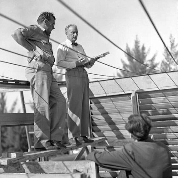
Ralph Twitchell (center) consulting with builders on-site. What’s intriguing about this image is that it shows the Healy (“Cocoon”) House under construction—and one can see the catenary metal straps, upon which house’s curved roof (its most pronounced feature) was to be suspended. Healy was the most famous building completed during Twitchell and Rudolph’s partnership, but after Rudolph departed, Twitchell continued to practice until at least the mid-1960’s, and lived until 1978—long enough to see his former partner, Rudolph, achieve stratospheric success and fame. One wonders what Twitchell thought of that: was he jealous, bitter, tranquil—or glad that he’d fostered such a profound and prodigious talent as Paul Rudolph?

Ralph Twitchell (center) consulting with builders on-site. What’s intriguing about this image is that it shows the Healy (“Cocoon”) House under construction—and one can see the catenary metal straps, upon which house’s curved roof (its most pronounced feature) was to be suspended. Healy was the most famous building completed during Twitchell and Rudolph’s partnership, but after Rudolph departed, Twitchell continued to practice until at least the mid-1960’s, and lived until 1978—long enough to see his former partner, Rudolph, achieve stratospheric success and fame. One wonders what Twitchell thought of that: was he jealous, bitter, tranquil—or glad that he’d fostered such a profound and prodigious talent as Paul Rudolph?


IMAGE CREDITS

NOTES:

The Paul Rudolph Heritage Foundation gratefully thanks all the individuals and organizations whose images are used in this non-profit scholarly and educational project.

The credits are shown when known to us, and are to the best of our knowledge, but the origin and connected rights of many images (especially vintage photos and other vintage materials) are often difficult determine. In all cases the materials are used in-good faith, and in fair use, in our non-profit, scholarly, and educational efforts. If any use, credits, or rights need to be amended or changed, please let us know.

When/If Wikimedia Commons links are provided, they are linked to the information page for that particular image. Information about the rights for the use of each of those images, as well as technical information on the images, can be found on those individual pages.

CREDITS, FROM TOP-TO-BOTTOM and LEFT-TO-RIGHT:

Floor plan of the Twitchell Residence: © The Estate of Paul Rudolph, The Paul Rudolph Heritage Foundation; Photo portrait of Ralph Twitchell: by Joseph Steinmetz, from the State Library & Archives of Florida, via Wikimedia Commons; Perspective renderings by Paul Rudolph of the Knott Residence, Healy (“Cocoon”) House, and the Revere Development: © The Estate of Paul Rudolph, The Paul Rudolph Heritage Foundation; Taliesin West drafting room: photo by Steven C. Price, via Wikimedia Commons [Note: to help facilitate comparisons between this space and the Twitchell Residence Living Room (the next picture), this photo of the drafting room has been flipped, and color was removed.]; Ralph Twitchell Residence Living Room: by Joseph Steinmetz, from the State Library & Archives of Florida; Midway Gardens: vintage post card. circa 1915, via Wikimedia Commons; Beachside view of Lido Beach Casino, circa 1956: photo, circa 1956, via Wikimedia Commons; Post cards and photos of Lido Beach Casino: vintage images; Photo portrait of Ralph Twitchell at Healy construction site: by Joseph Steinmetz, from the State Library & Archives of Florida, via Wikimedia Commons

Japan's CAPSULE TOWER — Losing a National (and International) Treasure?

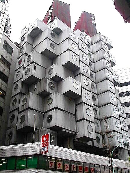
The Nakagin Capsule Tower in Tokyo, designed by Kisho Kurokawa, and completed in 1972—a building of national (and international) importance in the history of Modern architecture.

The Nakagin Capsule Tower in Tokyo, designed by Kisho Kurokawa, and completed in 1972—a building of national (and international) importance in the history of Modern architecture.

Nakagin_Capsule_Tower_20071012-05.jpg

AN ARCHITECTURE OF OPTIMISM

Looking at it today, Tokyo’s NAKAGIN CAPSULE TOWER—with its streaky surfaces, hanging cables, and patina of aging—the building may seem like it emerged from a dystopian Japanese anime series, the kind which shows a future world of high-tech slums. Several times, its immanent destruction has been announced—and now it seems to be edging closer to that fate—though a final decision may not have yet been made. Indeed, it has real problems that only a well-funded restoration program could fully solve. But such a program (however costly) would be worth it:

Because this building, above all, is about OPTIMISM

Tokyo, at the end of World War II, showing the devastated city. On a plain of destruction, only a few of the more substantially-constructed buildings remained (and even those were terribly damaged.)

Tokyo, at the end of World War II, showing the devastated city. On a plain of destruction, only a few of the more substantially-constructed buildings remained (and even those were terribly damaged.)

A CONTEXT OF DESTRUCTION, REBIRTH—AND QUESTIONING

At the end of World War II, Japan was devastated: It had lost its empire of colonies and territories; it had nearly 3,000,000 dead (military personnel and civilians), its cities and industrial infrastructure were in ruins, and it had to face a history of war-crimes, and adjust to a vastly new form of government. Perhaps most difficult of all was to submit to having a subservient position in the world.

A combination of post-war policies and actions—economic, political, and diplomatic—brought forth the “Japanese Economic Miracle,” and by the mid-1950’s the economy had exceeded pre-war levels, and with that came the beginnings of a consumer economy. But destroyed urban areas had yet to recover, and widespread quality-of-life improvement for all was a long way off.

Kenzo Tange’s metal-covered Shizuoka Press and Broadcasting Tower, of 1966, looked like its cantilevered wings could start rotating at any movement.

Kenzo Tange’s metal-covered Shizuoka Press and Broadcasting Tower, of 1966, looked like its cantilevered wings could start rotating at any movement.

METABOLISM

Even with its economic renewal, no country—and especially a highly-integrated, intensely hierarchal, and sophisticated civilization as Japan had been—could go through such trauma and change without being profoundly affected—to the point where the deepest assumptions about life were ripe for questioning and reevaluation. That is the historical context in which a major Japanese architectural movement, METABOLISM, came to exist.

While its birth involved a large number of influences and architects, meetings, conversations, and changes in personnel, what resulted—by the time of the proclamation of its existence in 1960—was a movement of immense creative vitality. Since the Metabolist Manifesto spoke in forward-looking generalities, there were no rigid rules about what building or urban design had to look like.

From the METABOLIST MANIFESTO:

“Metabolism is the name of the group, in which each member proposes further designs of our coming world through his concrete designs and illustrations. We regard human society as a vital process - a continuous development from atom to nebula. The reason why we use such a biological word, metabolism, is that we believe design and technology should be a denotation of human society. We are not going to accept metabolism as a natural process, but try to encourage active metabolic development of our society through our proposals”

Like the the BAUHAUS, the architectural works of the Metabolist architects were diverse in form. But—equally like the BAUHAUS—there’s a shared family resemblance among their designs. Their buildings embraced a characteristic frequently found in future-oriented projects: a machine-like vocabulary—even sometimes looking like giant machines. Also, their buildings had a module or “systems” look—as though constructed from a kit-of-parts, with the implication that such a modular approach would allow for ongoing change and growth. Finally, perceiving the titanic challenges involved in rebuilding the country, rising population growth, and the issues of land use, urban design, infrastructure, and re-industrialization, they “thought big”—and so came up with designs of “mega-structural” scale.

Kyoto International Conference Center by Sachio Otani

Kyoto International Conference Center by Sachio Otani

Aquapolis City, for the Okinawa Ocean Expo, by Kiyonori Kikutake

Aquapolis City, for the Okinawa Ocean Expo, by Kiyonori Kikutake

The Yamanashi Broadcasting and Press Centre, by Kenzo Tange

The Yamanashi Broadcasting and Press Centre, by Kenzo Tange

Beyond these formal qualities, what one discerners in Metabolist designs are HOPE, a sense of NEW OPPORTUNITES, OPTIMISM, and looking to A BETTER FUTURE—often through architectural expressions of the possibilities of technology. These are not trivial or side-effects of their designs: looking at the multitude of sketches, writings, proposals, drawings, and models they produced—and they were prolific!—one senses the JOY of CREATION.

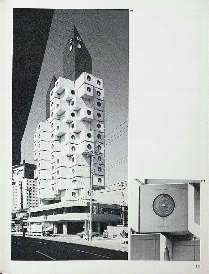
Arthur Drexler’s book, “Transformations in Modern Architecture” had a page that was devoted to the NAKAGIN CAPSULE TOWER. Shown when it was fresh and new—an a vision for the future of architecture.

Arthur Drexler’s book, “Transformations in Modern Architecture” had a page that was devoted to the NAKAGIN CAPSULE TOWER. Shown when it was fresh and new—an a vision for the future of architecture.

NAKAGIN CAPSULE TOWER: INNOVATIVE IN CONCEPTION AND CONSTRUCTION

The NAKAGIN CAPSULE TOWER was designed by one of the leading Metabolist architects: Kisho Kurokawa (1934-2007). It was constructed between 1970 and 1972—and is considered one of the the prime examples of Metabolism (and one of the few of their many proposed designs to get built)

It is mixed-use, providing space for both residential and office use, and is composed of two concrete towers, to which are attached 140 self-contained prefabricated capsules. Each capsule is approximately 8 feet by 13 feet, with a circular window at one end, and each is connected to the main shafts only four high-strength steel bolts

As with such capsule-oriented designs, construction combined both on-site work (the reinforced concrete core towers and the main lines of the electrical and mechanical systems, as well as stairs and elevators) —and— off-site work (the prefabricated capsules, whose parts were fabricated and assembled in a factory.) The capsules are lightweight steel-truss boxes, clad in galvanized, rib-reinforced steel (which was coated with rust-preventative paint and finished with a sprayed-of glossy spray coat).

In our time, when factory-fabricated residential structures and hotels are an increasingly encountered fact, none of the above may seem exciting enough to gain our attention today—yet when NAKAGIN CAPSULE TOWER was created, the approach and technologies were new and hardly tried. Moreover, the form of the tower—which so directly expressed its modular construction—was fresh and powerful.

cubistic view.jfif
upward view.jpg

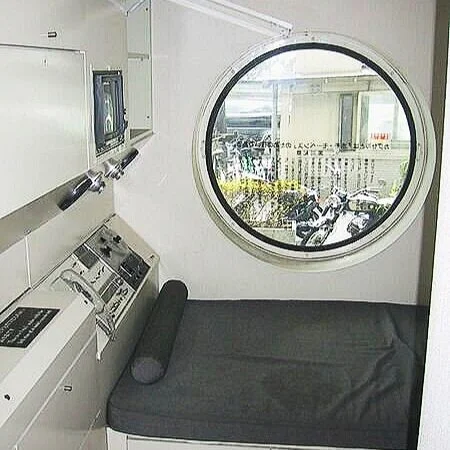
It was thought that the market for the apartment units would be Tokyo’s abundant population of white-collar bachelors, and each residential capsule included carefully designed, built-in kitchen appliances and cabinets (including a built-in bed, television set, and tape recorder, and a fold-out desk.) An ultra-compact bathroom unit, not much larger than the size of an airplane lavatory, uses part of the capsule space. A large, circular window—each of which originally had an inventive radial shade— is seen on-axis from the entry door.

The inside of the tower’s residential capsules were all fitted out with built-in cabinetry and equipment.

The inside of the tower’s residential capsules were all fitted out with built-in cabinetry and equipment.

Inside a residential capsule, looking toward the circular window, showing built-in cabinetwork and bed.

Inside a residential capsule, looking toward the circular window, showing built-in cabinetwork and bed.

An axonometric diagram, from a Japanese publication, showing the layout of a single capsule. The view is looking downward on the unit, and included in this drawing are: the single circular window (at the lower-right); the bed (the large, light rectangle under the window); the full bathroom (at upper-left): and the wall of built-in cabinets, including a fold-out desk, integral tape recorder and TV, and storage (all along the upper-right wall). Some indication of the unit’s connections to building services (power, telephone, plumbing) seems to be indicated by the pipes and conduits emerging at the top-center of the drawing. A marvel of compact, efficient (and delightful) planning, the Nakagin Capsule Tower is a monument of Modernism that is worth saving.

An axonometric diagram, from a Japanese publication, showing the layout of a single capsule. The view is looking downward on the unit, and included in this drawing are: the single circular window (at the lower-right); the bed (the large, light rectangle under the window); the full bathroom (at upper-left): and the wall of built-in cabinets, including a fold-out desk, integral tape recorder and TV, and storage (all along the upper-right wall). Some indication of the unit’s connections to building services (power, telephone, plumbing) seems to be indicated by the pipes and conduits emerging at the top-center of the drawing. A marvel of compact, efficient (and delightful) planning, the Nakagin Capsule Tower is a monument of Modernism that is worth saving.

Included in the Museum of Modern Art’s  comprehensive exhibit, Transformations in Modern Architecture and catalog, (shown above) were several other examples of the modular/capsule approach to building design.

Included in the Museum of Modern Art’s comprehensive exhibit, Transformations in Modern Architecture and catalog, (shown above) were several other examples of the modular/capsule approach to building design.

PREDEDENTS, CONNECTIONS, AND CROSS-CURRENTS

METABOLISM—of which this building is a prime example—had connections to the thinking and works of architects (as well as movements and cultural trends) in other parts of the world. This could be seen in the major 1979 exhibition at the Museum of Modern Art, “TRANSFORMATIONS IN MODERN ARCHITECTURE” and its catalog-book (in both of which Paul Rudolph was also prominently included.) Not only did it prominently show the NAKAGIN CAPSULE TOWER, but it also included buildings—by other architects in France and Japan—with similar ideas and configurations.

Paul Rudolph, more than a decade before the NAKAGIN CAPSULE TOWER, had been thinking along these lines lines—as is shown in his 1959 project for a Trailer Apartment Tower. About this design, Rudolph said:

Rudolph’s 1959 design for a tower of prefabricated residential units, which would be mounted to a central shaft—not unlike the concept for NAKAGIN CAPSULE TOWER, which was built over a decade later in Japan.

Rudolph’s 1959 design for a tower of prefabricated residential units, which would be mounted to a central shaft—not unlike the concept for NAKAGIN CAPSULE TOWER, which was built over a decade later in Japan.

“For a number of years now I have felt that one way around the housing impasse would be to utilize either mobile houses or truck vans placed in such a way that the roof of one unit provides the terrace for the one above. Of course the essence of this is to utilize existing three dimensional prefabricated units of light construction originally intended as moving units but adapted to fixed situations and transformed into architecturally acceptable living units. One approach would be to utilize vertical hollow tubes, probably rectangular in section, 40 or 50 stories in height to accommodate stairs, elevators and mechanical services and to form a support for cantilever trusses at the top. These cantilever trusses would give a ‘sky hook’ from which the three dimensional unit could be hoisted into place and plugged into its vertical mechanical core.”

In the following decades, Rudolph would continue to explore variations of this idea—part of his ongoing interest in modularity—at various scales and in a variety of projects (and you can read about those projects here. )

There are further verifiable connections and possible cross-influences: Rudolph had been aware of the basic tenets of the METABOLIST movement from its official founding. Along with fellow architects Alison and Peter Smithson and Louis Kahn (and other distinguished practitioners from around-the-world), he was present at the 1960 World Design Conference in Tokyo, where the ideas of the Metabolists were first announced. Rudolph even proposed to Arthur Drexler, then curator of the Museum of Modern Art’s Architecture and Design Department, that Kikutake’s Metabolist Marine City be included in the museum’s 1960 exhibition Visionary Architecture—the exhibition which introduced the ideas of the Metabolists to the United States.

Megastructures were a key part of METABOLIST thinking—and one could argue that the Nakagin tower is a “megastructure in miniature.” Like Paul Rudolph’s Graphic Arts Center (one of Rudolph’s megastructure designs), Kikutake’s Marine City is constructed of tower cores and plug-in residences set atop artificial landmasses—and the parallels shared by the works of the two architects are striking (and you can read more about these resonances here.)

LIFE Magazine’s December 15, 1972 Special Double Issue on the Joys of Christmas included an article showing Paul Rudolph exploring the potential of LEGO bricks to create architectural forms and configurations. Among the designs shown, for which he used the LEGO system, is a tower made of prefabricated residential units that would be mounted to vertical structural supports and service shafts—another clear manifestation of the idea that he first began to work with near the end of the 1950’s

LIFE Magazine’s December 15, 1972 Special Double Issue on the Joys of Christmas included an article showing Paul Rudolph exploring the potential of LEGO bricks to create architectural forms and configurations. Among the designs shown, for which he used the LEGO system, is a tower made of prefabricated residential units that would be mounted to vertical structural supports and service shafts—another clear manifestation of the idea that he first began to work with near the end of the 1950’s

Architectural historian Reyner Banham’s book, “Megastructure: Urban Futures Of The Recent Past” was his “first approximation” look at the history of this important international architectural movement—one to which METABOLISM contributed key thinking…

Architectural historian Reyner Banham’s book, “Megastructure: Urban Futures Of The Recent Past” was his “first approximation” look at the history of this important international architectural movement—one to which METABOLISM contributed key thinking and iconic projects. The original edition was published in 1976, and is long out-of-print—but Monacelli Press has come out with a new edition (and, as before, Rudolph’s LOMEX project is featured on the cover.)

The streaked façade of the capsule tower.

The streaked façade of the capsule tower.

DECADES OF USE AND SUCCESS—THEN DECLINE

Kelvin Dickinson has observed that “50 years is a dangerous age” for a building: it’s just about at that point in a building’s life when—

  • mechanical and electrical systems have worn-out, and need replacement and/or updating

  • significant repairs are probably needed to the building envelope

  • changing demographics or business practices may have made the original use of the building seem old-fashioned and less attractive to tenants—and so the building may need to be adapted for re-use

  • changing regulations can require upgrades or alterations (i.e.: for energy use; accessibility; containing toxic materials; fire safety; and earthquake or storm resistance)

And so a tough decision has to be made on whether to make the major investments needed to maintain and revivify a building -or- to demolish it and rebuild.

The NAKAGIN CAPSULE TOWER not only became world-famous as a work of architecture—but also had full occupancy (with a waiting-list). So it was a success, but—

But the building is approaching 50 years-of-age, and has accumulated numerous problems—ones that can’t be dismissed, and which will take large expenditures to fix. Also: it sits on land which can be more profitably utilized if a higher building is built on that site—and that always energizes the forces arguing for demolition.

Japan Forward’s recent article on the projected destiny of the NAKAGIN CAPSULE TOWER

Japan Forward’s recent article on the projected destiny of the NAKAGIN CAPSULE TOWER

CAN THE NAKAGIN CAPSULE TOWER BE SAVED?

The seemingly imminent destruction NAKAGIN CAPSULE TOWER is being protested by some residents, by the Japanese Institute of Architects, and by admirers world-wide—and there’s even a Facebook page for the SAVE NAKAGIN CAPSULE TOWER PROJECT

WANTED: VISION

It takes vision—being able to understand design greatness—to see the value of a work of architecture beyond immediate economic pressures.

The Facebook page for the SAVE NAKAGIN CAPSULE TOWER PROJECT

The Facebook page for the SAVE NAKAGIN CAPSULE TOWER PROJECT

Of course, practical issues must be dealt with—but the motivation (to come up with creative solutions to those challenges) only emerges when there’s a clear sense that a building is worthy of the significant effort and investment needed to save it.

We’ve seen what happens when that energy does not come forth—because that’s recently happened with two of Paul Rudolph’s works: the Burroughs-Wellcome headquarters and research center in Durham North Carolina, and the Orange County Government Center in Goshen, NY: they were both demolished. These were two of the most significant buildings of Paul Rudolph’s career—high points showing how he could powerfully, beautifully, and practically integrate creative forms and space-making with corporate, scientific, and civil functions—and now they’re lost forever.

Great architecture is part of a country’s cultural heritage. The NAKAGIN CAPSULE TOWER is one of Japan’s national treasures (as were those Rudolph buildings for the US)—and they were as significant as each country’s most valued artworks, documents, and historic monuments.

Beyond their national significance, these are international treasures that transcend borders: they are part of the profound legacy given by great artists, architects, and thinkers and creators of all kinds.

We must not lose these gifts to us. Save the Nakagin Capsule Tower. Save Culture.


UPDATE — END OF AN ICON OF MODERN DESIGN?

Searching for “Nakagin Capsule Tower” on Amazon yields several items which testify—as this screen-capture shows—to the esteem with in the building is held: several books, a video, and even a face-mask.

Searching for “Nakagin Capsule Tower” on Amazon yields several items which testify—as this screen-capture shows—to the esteem with in the building is held: several books, a video, and even a face-mask.

The NAKAGIN CAPSULE TOWER is incontrovertibly a Modern architecture landmark—one of international fame and importance. Its design has inspired several books, a video, clothing (including a face-mask)—and even atmospheric music: “Sleepless in Nakagin Capsule Tower” from the album "E S P E R—you can hear an excerpt from the song here. [Yet another example of the fascinating relationship between architecture and music, which we explored in another article.]

The moves to remove the tower began a number of years ago. There was push-back from the tenants and from the Japanese architect’s professional association; various counter-proposals were put forth; funding to save the building was sought; the 2008 recession put a break on things—and, most recently, the Covid shut-down also created a delay in moving ahead to demolition. But all that, it seems, has not been enough to save the building. According to a July 16, 2021 article by India Block, on the Dezeen website:

. . . .owners and residents of Nakagin Capsule Tower have decided to sell their homes and divvy up the capsules after attempts to find a buyer prepared to fund the restoration failed.

A module is already on display at Japan's Museum of Modern Art Saitama and the Centre Pompidou in Paris is reportedly keen to acquire one for its collection.

The owners are now crowdfunding to renovate the remaining 139 capsules so that they can be donated to institutions, or be relocated elsewhere in Tokyo and rented out to people who want to experience staying in one.

In 2007 the collective of owners announced they would sell to a developer who planned to demolish the building and build a new apartment block in its place.

However, the developer went bust in the 2008 recession, leaving the future of the tower uncertain.

In 2018 the owners started renting out the capsules on a monthly basis to architecture enthusiasts while the search for a buyer continued, until the coronavirus pandemic shut down negotiations.

A few days later, a July 19, 2021 article by Ryan Waddoups on the SURFACE website, reports:

The tower’s fate now appears to be sealed. Despite attempts to find a buyer who would fund its restoration, building owners have decided to disassemble the tower to make way for new development. “Aging has been a major issue in recent years,” Tatsuyuki Maeda, who owns 15 capsules, told a local magazine. “I was looking for a developer who would leave the building standing while repairing it. We think that it’s difficult for the management association to take measures against aging.” 

The owners are currently crowdfunding to renovate the capsules so they can be donated to museums or relocated throughout Tokyo for short-term stays. One module is already on display at Japan’s Museum of Modern Art Saitama; the Centre Pompidou has also expressed interest in acquiring one for its permanent collection. Nicolai Ouroussoff, former architecture critic for the New York Times, wrote during one of the many demolition scares that the Nakagin Capsule Tower is “the crystallization of a far-reaching cultural ideal. Its existence also stands as a powerful reminder of paths not taken, of the possibility of worlds shaped by different sets of values.” And while losing one of the few examples of this rare architectural movement feels like an undoubtedly sad occurrence, it’s rare to see buildings physically preserved as art post-demolition. 

Although one hopes for a last-minute reprieve from a far-sighted and wealthy architecture-loving patron—such things have happened in the history of preservation—at the moment the future of the NAKAGIN CAPSULE TOWER looks bleak. We’ve lost numerous masterworks of Modern Architecture—the recent demolition of Paul Rudolph’s BURROUGHS WELLCOME headquarters and research center being a particularly great and painful loss. Such short-sighted destruction of our national and international cultural treasures must stop.

The Nakagin Capsule Tower in Tokyo—an icon of Modern Architecture

The Nakagin Capsule Tower in Tokyo—an icon of Modern Architecture

IMAGE CREDITS

NOTES:

The Paul Rudolph Heritage Foundation gratefully thanks all the individuals and organizations whose images are used in this non-profit scholarly and educational project.

The credits are shown when known to us, and are to the best of our knowledge, but the origin and connected rights of many images (especially vintage photos and other vintage materials) are often difficult determine. In all cases the materials are used in-good faith, and in fair use, in our non-profit, scholarly, and educational efforts. If any use, credits, or rights need to be amended or changed, please let us know.

When/If Wikimedia Commons links are provided, they are linked to the information page for that particular image. Information about the rights for the use of each of those images, as well as technical information on the images, can be found on those individual pages.

CREDITS, FROM TOP-TO-BOTTOM and LEFT-TO-RIGHT:

Capsule Tower, general view: photo by Kakidai, via Wikimedia Commons;  Capsule Tower, looking up to capsules; photo by scarletgreen, via Wikimedia Commons;  Tokyo, at the end of World War II: photo by 米軍撮影  , via Wikimedia Commons;  Shizuoka Press and Broadcasting Center in Tokyo: photo by Jonathan Savoie, via Wikimedia Commons;  Kyoto International Conference Center: photo by Daderot, via Wikimedia Commons;  Model of Aquapolis; photo via Wikimedia Commons;  Page devoted to the Nakagin Capsule Tower, from the “Transformations In Modern Architecture” book, via the Museum of Modern Art on-line archive website;  View of the Nakagin Capsule Tower: photo by marcinek, via Wikimedia Commons;  View of the Nakagin Capsule Tower: photo by yusunkwon, via Wikimedia Commons;  View of interior of a residential capsule, showing built-in cabinetwork and equipment: photo by Dick Johnson, via Wikimedia Commons;  View of interior of a residential capsule, looking toward window and bed: photo by  Chris 73, via Wikimedia Commons;  Page devoted to projects similar to the idea of the Nakagin Capsule Tower, from the “Transformations In Modern Architecture” book, via the Museum of Modern Art on-line archive website;  Paul Rudolph’s drawing of his 1959 design for a Trailer Apartment Tower, © The Estate of Paul Rudolph, The Paul Rudolph Heritage Foundation;  Cover of “Megastructure” book: screen capture from the Amazon web page for the book;  View of the exterior of many capsules: photo by Michael, via Wikimedia Commons;  Japan Forward’s article about the Nakagin Capsule Tower: screen capture of their page with the article;  Save Nakagin Capsule Tower Project’s Facebook page: screen capture from Facebook; Nakakin Capsule Tower merchandise available from Amazon (books, video, facemask): screen-capture from Amazon web search; General exterior view of Nakagin Capsule Tower: photo by Jordy Meow, via Wikimedia Commons

Rudolph On Fire: July 14th, 1969

Saturday, 3:38 AM, July 14, 1969 — the moment that New Haven police were alerted that the Yale Art & Architecture Building was on fire. The blaze was quickly contained, but serious damage —from fire, smoke, and water—extended across several floors of Rudolph’s most iconic building.

Saturday, 3:38 AM, July 14, 1969 — the moment that New Haven police were alerted that the Yale Art & Architecture Building was on fire. The blaze was quickly contained, but serious damage —from fire, smoke, and water—extended across several floors of Rudolph’s most iconic building.

When we say that someone’s “on fire”, it usually means something positive— that they’re in a state of great productivity, or they’re achieving their goals, or they’re becoming famous—or sometimes all of those. In that sense, the late 50’s and the 1960’s was certainly a period when Paul Rudolph was “on fire”: important commissions—often large scale, with significant budgets, and in a variety of building types—were coming into the office in abundance, and Rudolph was creating some of his most iconic buildings.

Rudolph was widely published, and seen as the face of a lively and creative American Modernism—and in 1957, at age 39, he was appointed Chair of the school of architecture at Yale (taking office in 1958). Soon after his appointment, he was given the commission to design Yale’s new Art & Architecture Building.

In February, 1964. something occurred which had probably never happened in the history of architectural publishing (and may never happen again): All three major American architectural journals—Architectural Record, Architectural Forum, and Progressive Architecture—had the same building as their cover story: Rudolph’s Yale Art & Architecture Building. John Morris Dixon, an editor at Progressive Architecture at the time, told us that there was no coordination for this—and, given that magazines generally avoid covering the same projects (and would certainly never want to make the same project their “cover story”), it is all-the-more evidence that this building was powerful enough to warrant such across-the-board coverage.

Rudolph’s Yale A&A Building on the cover of the February 1964 issue of ARCHITECTURAL FORUM

Rudolph’s Yale A&A Building on the cover of the February 1964 issue of ARCHITECTURAL FORUM

Rudolph’s Yale A&A Building on the cover of the February 1964 issue of ARCHITECTURAL RECORD

Rudolph’s Yale A&A Building on the cover of the February 1964 issue of ARCHITECTURAL RECORD

Rudolph’s Yale A&A Building on the cover of the February 1964 issue of PROGRESSIVE ARCHITECTURE

Rudolph’s Yale A&A Building on the cover of the February 1964 issue of PROGRESSIVE ARCHITECTURE

Reports on the building were nearly ecstatic—and the venerable critic Sibyl Moholy-Nagywhose Modernist credentials could not be questioned—had an essay in Architectural Forum that can be taken as emblematic of the design’s initial reception. With insight and numerous historical references, she plumbed the building’s formal and spatial roots—and offered some qualifications—but her overall assessment was glorious. Here ae some of her remarks:

Architectural Forum’s February 1964 issue gave extensive coverage to all aspects of the Yale building. Shown here is a page from that issue, with Rudolph’s famous perspective-section drawing, as well as the main floor plan.

Architectural Forum’s February 1964 issue gave extensive coverage to all aspects of the Yale building. Shown here is a page from that issue, with Rudolph’s famous perspective-section drawing, as well as the main floor plan.

“It is gratifying to know that the world of academic honors and medals has so profusely acknowledged the Bauhaus doctrine of architectural education as taught at Harvard since 1937; because never before has a curriculum turned out such a star roster of infidels. Johnson, Lundy, Barnes, Rudolph, Franzen, and others have revered their teacher [Gropius—ed.] while confounding his teaching. They all have left the safe anchorage of functionality, technology and anonymous teamwork to start the long voyage home to architecture as art. A few faithfuls still repeat the old incantations, but the guns by which they struck have stopped firing while those of the apostates are blazing.”

“. . . . [Rudolph’s] latest building. It is a splendid achievement, crystallizing potential solutions for some of the most vexing propositions facing architecture today.”

“The concrete surface has been widely criticized as being arty in an age of technology. However, the visual relief from the beton brut cliché of random formwork in the wake of Le Corbusier's revolution is so pleasing, and the purpose of the building so nontechnological, that the artifice seems wholly justified.”

“Space is an abstraction that must be conceived for its specific purpose. Every user is a judge. It is from their total involvement in this dichotomy of idea and realization that the architectural students will learn the essence of their profession. The Yale school is Paul Rudolph's confessional proof that architecture is not a commodity but an infinite potential of art, and therefore free and imperishable.”

“Earthrise”—probably the most famous photograph to come out of the US space program. The photo was taken in 1968 during the Apollo 8 mission—the first time a manned ship had gone to the moon-and-back.

“Earthrise”—probably the most famous photograph to come out of the US space program. The photo was taken in 1968 during the Apollo 8 mission—the first time a manned ship had gone to the moon-and-back.

GOOD TIMES, AND…

After 6 years as chair, during which he revolutionized architectural education at Yale, Rudolph left in 1964—relocating his home and office in New York City (where he’d reside for the rest of his life). The later 60’s continued to be a good period for him, and in a previous article we surveyed how a representative year—1968—was both a time of cultural and political churning in the country, and a creatively rich time for Rudolph.

Things were going well in the US economy, and technology and culture [including architecture] were advancing in multiple directions—but that cultural & political “churning” (referred-to above) also involved protests of increasing number and intensity: of the war in Vietnam, the lack of rights for Women and minorities, the devastation of the environment, and of inequalities in wealth and community resources.

The Yale’s Art & Architecture Building’s main atrium drafting room, after the 1969 fire. The space’s signature statue of Minerva, though streaked by smoke, was undamaged.

The Yale’s Art & Architecture Building’s main atrium drafting room, after the 1969 fire. The space’s signature statue of Minerva, though streaked by smoke, was undamaged.

…FIERY TIMES

Moreover, the very consumer/conformist culture which was so celebrated in mainstream media—and the values on which it was founded—were being questioned by a younger (and increasingly activist) generation. This led to campuses ablaze with protest.

The 1960’s—with all its growing openness and freedoms, as well as its clashing bitterness—is the subject of numerous historical-cultural studies, and has been dramatized in literature. For our purposes, we just want to note that it is within this heated atmosphere that Rudolph’s Yale Art & Architecture Building caught fire.

[RETROSPECTA 40 (the 2016-2017 issue), published by the Yale School of Architecture, has a section on the campus cultural context within which the fire occurred—as does Robert A. M. Stern and Jimmy Stamp’s history of a century of architectural education at Yale, “Pedagogy and Place” (which also covers the fire’s aftermath).]

Paul Rudolph, in the uniform of an officer in the US Navy during World War II. He was stationed at the Brooklyn Navy Yard, and engaged in the repair of damaged ships.

Paul Rudolph, in the uniform of an officer in the US Navy during World War II. He was stationed at the Brooklyn Navy Yard, and engaged in the repair of damaged ships.

DID RUDOLPH CAUSE THE YALE A&A FIRE?

Rudolph left Yale in 1964, and his stated reason was to deal with his expanding professional practice—and, given the number and complexity of the commissions he was receiving, one can see that as a legitimate reason. Yet there may be an additional cause—emerging from Rudolph himself.

The sensitive and reticent country fellow, who went into the Navy during World War II, emerged as an experienced 0fficer who had commanded hundreds, working in a navy yard on the repair of damaged warships. Rudolph retained that mood and mode of command for the rest of his career. Even his look changed: gone was his pre-war bouffant, replaced by a severe flat-top cut that he wore for another half-century. While he was capable of showing warmth and generosity, he was known to students, faculty, and employees as a leader who was assertive and demanding. This brought forth superb achievements from students and staff—and often evoked life-long appreciation and loyalty to Rudolph—but, as the 60’s got going, the culture was changing: anything that had an authoritarian feel was ripe for questioning and push-back. Perhaps Rudolph began to feel this—and wanted none of it. So 1964 was the right time for him to depart.

Moreover, Rudolph’s own building—his great legacy to Yale—conveyed that same feeling of forcefulness. By the later 60’s, it too was being questioned—both functionally and conceptually—with its almost aggressive use of materials and “overdetermined” spaces were being undermined by the way it was used (and, some say, abused) during the chairmanship of Charles Moore, Rudolph’s successor as chair.

So if there was on-campus anger in the air (directed at a menu of legitimate grievances), there was also anger at the building—or rather, what it represented: power and authority, and the society (the campus and beyond) in which that was solidified and wielded.

Rudolph may have been gone, but his building felt like a tangible manifestation of what was wrong with the world.

The photographer of this scene, taken within Yale’s Art and Architecture Building in 2008, labeled it as having “crowded desks” and “littered with food, models, draft designs, and instruments of architectural design”. The studios in 1969—also a time of widespread smoking—were even denser with combustible materials.

The photographer of this scene, taken within Yale’s Art and Architecture Building in 2008, labeled it as having “crowded desks” and “littered with food, models, draft designs, and instruments of architectural design”. The studios in 1969—also a time of widespread smoking—were even denser with combustible materials.

WHAT REALLY CAUSED THE YALE A&A FIRE?

Many causes were advanced for the fire. Several that have been put forth are:

  • The boiling, angry atmosphere, in that era of campus protest, was the context for student acts of violence and possibly arson.

  • The above—a period of profoundly “anti-establishment” (anti-authoritarian) protest—combined with the almost aggressively powerful character of Rudolph’s design, made the building itself an attractive target for a protesting act of destruction.

  • The building was permeable, and known to be subject to occasional petty theft, so local “kids”—delinquent teenagers—have been alleged to have started the fire.

  • The studios were allowed—during Moore’s chairmanship—to become “favelas”: divided up by makeshift partitions of highly combustible materials—an environment of tinder, and in an era when smoking by students and faculty was still prevasive.

  • The materials used by students—-paper, cardboard, glue, brushed and sprayed paint, wood, rubber cement…—are highly flammable. Moreover, as anyone who has ever visited an architecture school studio will report, these environments often become anarchic with scraps and debris on every surface.

Investigations of the fire were conducted, but never identified a distinct culprit. The local fire marshal said the cause was “undetermined” and possibly accidental, and cited the mass and density of combustible materials—but the local fire chief publicly said it was “of suspicious origin".

The Yale Art & Architecture Building did eventually receive a thorough renovation (and upgrading of systems), and was rededicated as Rudolph Hall in 2008.

The Yale Art & Architecture Building did eventually receive a thorough renovation (and upgrading of systems), and was rededicated as Rudolph Hall in 2008.

REBIRTH OF THE PHOENIX

When Rudolph was asked about his reaction to the fire, he said:

“I felt as if somebody had died.”

Others reflected on the fire as symbol and message. A student said:

“. . . .the building burst into flames out if its own psychic guilt. It was the only solution.”

Peter Blake—an architect, journalist, and architectural magazine editor (and friend of Rudolph) wrote:

“The Yale fire did dramatize a state of concern. . . .a profound uneasiness among students (and some faculty) about the priorities that today govern American architecture and American architectural education”

In the fall of 1988, Yale students created an exhibit about the building—one to which Rudolph gave his full cooperation (including lending drawings.) The catalog had essays by Alan Plattus, George Ranailli, and Thomas L. Schumacher—each expressing their insights about (and appreciation of) the building—but the contribution by the late Michael Sorkin, “Auto da Fe”, meditated on the fire, and ends by evoking the mythical and immortal phoenix bird that regenerates out of fire:

“Too soon, but not too late for the Phoenix. The ruin waits to blaze again.”

The fire left the building was unusable, and the school had to move-out while repairs were done—not returning until 1971. Even without the fire, Rudolph had not been happy with way the building had been left subject to poor maintenance, and allowed to fall into disrepair. This was compounded by the way the subsequent administration (Moore’s) seemed to encourage a disrespect for the building and the values—Rudolph’s values—it represented. It was many years before Rudolph would even visit the building.

The building continued to decline, and Yale even considered demolition. Fortunately, it eventually received a complete and respectful interior & exterior renovation, undertaken with the support of Sid R. Bass (for whom Rudolph had designed an elegant residence, as well as other projects)—and in 2008 it was rededicated as

RUDOLPH HALL

Another view, taken after the 1969 fire, showing internal damage to the Art & Architecture Building. When Rudolph later remarked about his reaction to the fire: “I felt as if somebody had died.”

Another view, taken after the 1969 fire, showing internal damage to the Art & Architecture Building. When Rudolph later remarked about his reaction to the fire: “I felt as if somebody had died.”


IMAGE CREDITS

NOTES:

The Paul Rudolph Heritage Foundation gratefully thanks all the individuals and organizations whose images are used in this non-profit scholarly and educational project.

The credits are shown when known to us, and are to the best of our knowledge, but the origin and connected rights of many images (especially vintage photos and other vintage materials) are often difficult determine. In all cases the materials are used in-good faith, and in fair use, in our non-profit, scholarly, and educational efforts. If any use, credits, or rights need to be amended or changed, please let us know.

When/If Wikimedia Commons links are provided, they are linked to the information page for that particular image. Information about the rights for the use of each of those images, as well as technical information on the images, can be found on those individual pages.

CREDITS:

Yale Art & Architecture Building, during the 1969 fire: courtesy of Yale University; Photo of earth from space: photograph by US astronaut William Anders; Covers of the February, 1964 issues of Architectural Forum, Architectural Record, and Progressive Architecture, courtesy of USModernist Library; Yale Art & Architecture section and plan: page from Architectural Forum, courtesy of USModernist Library; Interior views of the Yale Art & Architecture Building, showing fire damage: courtesy of Yale University; Rudolph in US Navy officer’s uniform: © The Estate of Paul Rudolph, The Paul Rudolph Heritage Foundation; Renovated Yale Art & Architecture Building (Rudolph Hall): photo by Sage Ross, via Wikimedia Commons; Studio interior, within the Rudolph Hall (the Yale school of architecture building): photo by Ragesoss, via Wikimedia Commons

When the Right Client Comes Along: John McAndrew and Paul Rudolph at Wellesley

Paul Rudolph’s perspective rendering of the design for the Jewett Arts Center at Wellesley College—the distinguished liberal-arts college in Massachusetts. As director of Wellesley’s art museum, John McAndrew’s support for having Rudolph be the architect (and his input during the design process) was key to making this project go forward to success.

Paul Rudolph’s perspective rendering of the design for the Jewett Arts Center at Wellesley College—the distinguished liberal-arts college in Massachusetts. As director of Wellesley’s art museum, John McAndrew’s support for having Rudolph be the architect (and his input during the design process) was key to making this project go forward to success.

JOHN MCANDREW’S MODERNIST VISION is Mardges Bacon’s study of the life and accomplishments of an accomplished—but too little known—figure. McAndrew’s name often comes up in the histories of Modernism in design and the arts in the US—but, before this publication, little coherent and concentrated information had been available about him and his activities, projects, and connections.

JOHN MCANDREW’S MODERNIST VISION is Mardges Bacon’s study of the life and accomplishments of an accomplished—but too little known—figure. McAndrew’s name often comes up in the histories of Modernism in design and the arts in the US—but, before this publication, little coherent and concentrated information had been available about him and his activities, projects, and connections.

IN THE BACKGROUND—BUT THEY’RE DECISIVE

If one studies the history of any topic, discipline, or historical era, you’ll come across an intriguing phenomenon: a few names that keep popping-up, often-enough that these persons must have had some real significance—but about whom little is known. No biographies have been published about them, their Wikipedia entries—if they exist at all—are thin, and their obituaries are brief and opaque.

Such figures are almost never in the foreground, yet there’s enough hints about their activities that they come to seem quietly ubiquitous and influential:

  • they’re involved in significant projects

  • they have key jobs/positions/appointments

  • they are thoroughly networked—socially, through family, class, school, profession, or other affinity

  • they have access to the famous and powerful people of their era or discipline

  • in the acknowledgements sections of project reports, speeches, books, and dedications, they’re thanked (but it’s never clear for what)

  • they’re a member of significant boards, committees, commissions, and juries

They just keep showing up.

John Dee (1527 –1609), who performed multiple duties for Queen Elisabeth —including as a national policy advisor, court astronomer, and science advisor. The full extent of his activates and influence still remains a tantalizing mystery.

John Dee (1527 –1609), who performed multiple duties for Queen Elisabeth —including as a national policy advisor, court astronomer, and science advisor. The full extent of his activates and influence still remains a tantalizing mystery.

IN FICTION AND IN LIFE

Fiction has characters similar to this: the cinema has given us Forrest Gump and Zelig; they seemed to saturate TV’s X-Files, and Robert Grossbach’s hilarious novel, A Shortage of Engineers includes the mysterious “OMIT B” (the initials standing for “Old Man In The Back”)—the hidden ultra-expert that one appealed-to when problems seemed insolvable.

But history gives us real examples in every field and era. John J. McCloy is a name that will elicit a shrug from most people—but looking at his resume, one discovers that he was central and active at some of the most important points in the history of mid-20th century international relations, war, and government affairs. François Vatel—the can-do majordomo of France’s Louis IV era—has only recently received a bit of name recognition, due to movie in which he’s depicted by Gérard Depardieu.

Because little is known of them, these figures often become subjects of suspicion: being characterized as éminence griseone who has power, but is behind the scenes. John Dee, the multifaceted magician-scholar that worked for Queen Elizabeth I, is—four centuries after his passing—still such a figure of tantalizing mystery. But sometimes they later became known as benign or positive forces (who had been forced to remain out of the spotlight because of the prejudices of their era)—Edith Wilson and Bayard Rustin being prime examples.

While McAndrew was associated with the Museum of Modern Art, he wrote several important publications that helped the public begin to understand the Modern movement in design: “What Is Modern Architecture?” (co-written with Elizabeth Mock), and “Guide To Modern Architecture: Northeast States”

While McAndrew was associated with the Museum of Modern Art, he wrote several important publications that helped the public begin to understand the Modern movement in design: “What Is Modern Architecture?” (co-written with Elizabeth Mock), and “Guide To Modern Architecture: Northeast States”

JOHN McANDREW AND MODERNISM

JOHN McANDREW was one such figure. McAndrew (1904-1978) was active during some of the most exciting years of the introduction of Modernism in America. He was networked with other campaigners for the cause, and engaging in a wide range of projects and roles in the fields of architecture and art. Yet, until the recently published full biography by architectural historian Mardges BaconJohn McAndrew’s Modernist Vision—the full extent of his multiple contributions was not known.

Even now, McAndrew still does not have a Wikipedia page—and this indicates the intractability of anonymity. Yet his CV is broad, deep, and impressive. McAndrew—

Mcandrew%2Bbook.jpg
  • Studied and practiced architecture and interior design

  • Was a key staff member of the Julien Levy Gallery in New York—the premiere gallery showing (and advocating for) Modern art in the US in the 1930’s and 40’s

  • Helped helped develop (and became head of) the Department of Architecture and Design at New York’s Museum of Modern Art—the world’s first curatorial department devoted to Modern work in those fields.

  • While there, he mounted landmark exhibitions on the Bauhaus, Frank Lloyd Wright’s Fallingwater, Modern Furniture, and a comprehensive show on Wright’s career. He also co-designed the first version of the museum’s garden, and was involved with numerous museum exhibits, activities, and publications.

  • Wrote (for the Museum of Modern Art) Guide To Modern Architecture: Northeastern States (1940), and the popular book (co-written with Elizabeth Mock, who became director after him) What Is Modern Architecture? (1942, with a second edition in 1946)

  • Wrote several books on architecture—modern and traditional

  • During World War II, while based in Mexico, coordinated inter-American affairs for the US government

  • Lectured internationally for the US Information Service

  • Taught at Vassar, Wellesley, the Hartford Art School, and New York University

  • Designed the Vassar College Art Library—possibly the first modern interior on a US college campus

  • Director of the Wellesley College Art Museum, from 1948-to-1958

  • Founded (and was later president) of the Save Venice fund, devoted to preserving that treasured—but ever threatened—city

A page from the Mardges Bacon’s study of McAndrew. The book delves into the subject’s networks and colleagues—making us aware of the connections, without which McAndrew’s life (or anyone’s) cannot be understood. Shown are photos of three key figures in McAndrew’s life (left-to-right): architectural historian Henry-Russell Hitchcock (who also worked closely with Philip Johnson), modern art gallery dealer Julien Levy, and museum curator A. Everett Austin.

A page from the Mardges Bacon’s study of McAndrew. The book delves into the subject’s networks and colleagues—making us aware of the connections, without which McAndrew’s life (or anyone’s) cannot be understood. Shown are photos of three key figures in McAndrew’s life (left-to-right): architectural historian Henry-Russell Hitchcock (who also worked closely with Philip Johnson), modern art gallery dealer Julien Levy, and museum curator A. Everett Austin.

Another page from Mardges Bacon’s McAndrew biography, showing the lively design of an invitation to a 1932 opening of Surrealist art at the Julien Levy Gallery. McAndrew was a key creative and organizational force in the gallery, and might well have coordinated the production of this graphic. This graphic object is significant because it was designed by Joseph Cornell (whom, near that year, began creating the diorama artworks which would bring him world-wide fame.)

Another page from Mardges Bacon’s McAndrew biography, showing the lively design of an invitation to a 1932 opening of Surrealist art at the Julien Levy Gallery. McAndrew was a key creative and organizational force in the gallery, and might well have coordinated the production of this graphic. This graphic object is significant because it was designed by Joseph Cornell (whom, near that year, began creating the diorama artworks which would bring him world-wide fame.)

McAndrew is well-deserving of the attention he’s now received via Madres Bacon’s book, which reveals the banquet of his involvements and accomplishments—but it’s his connection with Paul Rudolph that we seek to highlight.

An aerial photograph of the completed Jewett Arts Center at Wellesley, showing approximately the same set of elements as in Rudolph’s perspective rendering below—including the dramatic staircases that took visitors up to the reception area and large art gallery (which bridged over a ground-level passage.)

An aerial photograph of the completed Jewett Arts Center at Wellesley, showing approximately the same set of elements as in Rudolph’s perspective rendering below—including the dramatic staircases that took visitors up to the reception area and large art gallery (which bridged over a ground-level passage.)

WELLESLEY’S ARTS CENTER: A BREAKTHROUGH PROJECT FOR RUDOLPH

Up through the mid-1950’s, Paul Rudolph was primarily an architect of houses. That’s not unusual for the trajectory of most American architects, whose work usually commences with residential projects—and, in the era just after WWII, Rudolph was preeminent in designing some of the US’ most creative, inventive, and elegant Modern homes. For Rudolph, this was soon to change. He continued to do residential design throughout his half-century career, but he became as well-known for his non-residential works: civic buildings, offices, churches, laboratories—and especially educational buildings.

In that career path, the Mary Cooper Jewett Arts Center, at Wellesley College was the breakthrough project for him—the one in which Rudolph (who was always ambitious to try new design challenges) branched-out from residential work.

Paul Rudolph become known as a master of architectural perspective drawing—and above is a one of his renderings for the Jewett Arts Center at Wellesley. In this drawing, Rudolph showed some key features of the building’s design, including the roofto…

Paul Rudolph become known as a master of architectural perspective drawing—and above is a one of his renderings for the Jewett Arts Center at Wellesley. In this drawing, Rudolph showed some key features of the building’s design, including the rooftop skylights and the exterior screens.

Rudolph’s site plan shows the new arts building complex at the upper-left. It completes the quadrangle which had already been partially defined by the existing Wellesley buildings at the top, right, and bottom.

Rudolph’s site plan shows the new arts building complex at the upper-left. It completes the quadrangle which had already been partially defined by the existing Wellesley buildings at the top, right, and bottom.

THE CHALLENGE—AND RUDOLPH’S STRATEGY

Wellesley College, in Wellesley, Massachusetts, was founded in 1870, and is an elite private liberal arts college with a stellar list of alumni. When Paul Rudolph received the commission to design a new arts center, he was working within an existing context of buildings that were built in a style most often characterized as “Collegiate Gothic.”

Rudolph’s challenge was to complete one side of an existing quadrangle (on whose other sides were situated the vintage college buildings.) The new complex would have to accommodate a variety of spaces and uses: a reception area, theater workshop, auditorium, two art galleries, two libraries, research facilities, classrooms, and storage.

In the 1971 book, Paul Rudolph (which featured photographs of Yukio Futagawa, and was the first independent monograph devoted to the Rudolph) Rupert Spade (the pseudonym of writer-editor-critic Martin Pawley) gives a concise description and Rudolph’s strategy:

“Built in association with Anderson, Beckwith, and Haible, and commissioned at a time when Rudolph had never designed anything larger than a three-bedroom house, the Wellesley Arts Center represents his tour de force of integration with an existing style—in this case the pseudo-gothic. Careful study of proportion and massing led him to create a design combining the dimensional basis of the original with a novel massing and use of materials—including the use of porcelain-enameled aluminum sun-screens conceived as a kind of ‘built-in ivy’. The structure of the extension is in reinforced concrete and the facing materials are brick and limestone. The art department itself is linked to a classroom and auditorium block by a bridging exhibition gallery. The conical skylights—much criticized by opponents of Rudolph’s eclecticism—are intended to echo the repeated gables of the existing building.”

[By-the-way: Spade is not-quite-accurate in saying that Paul Rudolph, up to that time, had never designed anything larger than a house. He had designed several larger buildings—but Spade is correct in spirit: none of those projects had been built. So Jewett was the first, large, non-residential design of Rudolph’s to progress all-the-way to construction.]

A Rudolph-designed construction detail of the Jewett Arts Center building, as shown in Design With Glass.

A Rudolph-designed construction detail of the Jewett Arts Center building, as shown in Design With Glass.

John Peter’s 1964 book on the use of glass in Modern architecture, Design With Glass, looks further at the building’s materials. Speaking of the harmony that the Rudolph’s complex achieved with the campus’ older buildings, Peter asserts:

“It would be difficult to find a better example of this in in detail than the way in which the glass is handled. The pointed skylights of the visual arts wing recall the pattern of triangular dormer visible all over the older campus. the slot-like windows of the performing arts wing echo the perpendicular windows of the existing Neo-Gothic building. The large applied wood strips provide a deep reveal with structural solidity backed by solid lumber which eliminates exposed fastener heads on the interior. Perhaps the most intriguing example of planned relationship is the great porcelain-enamel of aluminum grille protecting the north and south windows of the visual arts wing. Designed to the lacy scale of “man-made ivy” it matches in color the limestone of the other campus buildings.”

Philip Johnson, in a 1960 article in Art In America, “Great Reputations in the Making: Three Architects,” presented architects whom he [then] defined as “under-recognized artists”: Louis Kahn, Paul Rudolph, and Frederick Kiesler—and he characterized Rudolph as: “. . . .articulate, inventive, mercurial, tough.” Rudolph’s section included a photo of Jewett with its metallic screens, and Johnson uses their form to conclude:

“This is an example of Rudolph’s strong linear quality combined with his discontent with plain surfaces.”

That “discontent with plain surfaces” would manifest throughout Rudolph’s later work, as is evident in Rudolph’s most famous masterwork, the Yale Art & Architecture Building—whose ribbed concrete (and other texturing techniques) he’d continue to utilize in other projects.

Rudolph himself spoke about Wellesley’s design challenge:

The problem was to add to a pseudo-gothic campus in such a way as to enhance the existing campus and still make a valid twentieth century building. The siting, manipulation of scale, use of materials, and silhouette helped to extend the environment.

Wellesley’s alumni magazine covered the project several times, from beginning to completion—as can be seen in these two examples:

In a March, 1956 issue: showing the proposed design in model form, in the context of the campus’ existing buildings

In a March, 1956 issue: showing the proposed design in model form, in the context of the campus’ existing buildings

In a November, 1958 issue: after completion, showing an interior of one of the center’s two art galleries.

In a November, 1958 issue: after completion, showing an interior of one of the center’s two art galleries.

Looking back, more than a decade later, Rudolph was frank in his own assessment of the result:

The sequence of spaces leading under the connecting bridge up to the raised courtyard and the tower beyond works, but the interior spatial sequence is unclear, overly detailed and in many cases badly proportioned.”

Whether the Jewett Arts Center met with Rudolph’s ultimate approval is one thing—but it did get broad coverage in the architectural press, indicating that—at least to journal editors—the design seemed interesting and fresh. Wellesley maintains a website with a fascinating collection of such articles, including a 1959 issue of the distinguished French architectural journal, L'Architecture d'Aujourd'hui. Here, in one representative page from that magazine’s coverage of Rudolph’s design, one can get an idea of the visual richness that he achieved:

architecture%2Bd%2527aujour%2527d%2Bhui.jpg
Another of Rudolph’s perspective renderings for the Jewett Arts Center: here he shows the entry plaza that was part of the arts center complex—and, centered in the near-distance, is the bridging section of the building (which connected its two main volumes.). McAndrew moved the college’s art museum into these expanded quarters in 1958.

Another of Rudolph’s perspective renderings for the Jewett Arts Center: here he shows the entry plaza that was part of the arts center complex—and, centered in the near-distance, is the bridging section of the building (which connected its two main volumes.). McAndrew moved the college’s art museum into these expanded quarters in 1958.

McANDREW AND RUDOLPH

John McAndrew joined the faculty of Wellesley College’s Art Department in 1946, starting as a lecturer, and rising to a professorship—and would stay there for over two decades, retiring in 1968.

In 1948, he was appointed to be Director of the Wellesley College Museum—and remained so for a decade, until 1958. According to Wellesley’s website, “He was a robust collections builder, and under his leadership the collections came to include works by many pioneers of European modernism.”

The Jewett Arts Center commission was given to Paul Rudolph in 1955—but how did he obtain this project, one which was so important to his career?

It turns-out that the connections between McAndrew and Rudolph were multiple:

  • John McAndrew was familiar with Paul Rudolph’s work in Sarasota

  • McAndrew would have known of Rudolph’s design work for the Museum of Modern Art (where McAndrew had been a key staff member)

  • They both knew Philip Johnson—another major campaigner for architectural Modernism, and a pillar of the Museum of Modern Art

  • In 1941 McAndrew had received his graduate architecture degree at Harvard (under Gropius), and 1941 is the year that Rudolph started in the same program—so the two of them may have first intersected on the Harvard campus

Mardges Bacon is illuminating about McAndrew’s contribution to the project, and relation to Rudolph’s work there—and we’ll let her tell the story:

For a decade McAndrew served concurrently as a professor and as director of the Wellesley college Museum, known as the Farnsworth Museum (1948-1958). In that capacity he represented the college as client for the new art museum, the Mary Cooper Jewett Arts Center. In the fall of 1955 Paul Rudolph received the commission as a result of a closed competition among a short list of candidates drawn up by McAndrew, which included Eero Saarinen, Edward Durrell Stone, Marcel Breuer, Hugh Stubbins, and Paul Rudolph. Most were experienced and highly respected architects with whom McAndrew had previously worked during his curatorship at MoMA. That was not the case with the young Rudolph. McAndrew knew Rudolph and his early work with Ralph Twitchell in Sarasota, Florida, at least since the spring of 1950. . . . Impressed with Rudolph’s Sarasota buildings, McAndrew expressed the Department of Art’s preference in a letter to Wellesley president Margaret Clap inferring that Rudolph would be “likely to produce the most distinguished design . . . one of quality.”

 Bacon continues:

McAndrew seemed to have had a personal stake in shaping Rudolph’s final design During the two-year phase of the project’s design development, the museum director worked with the Department of Art chair Agnes Abbot to supply Rudolph with continual critiques, especially on the articulation of the building’s exterior.

And Bacon give further confirmation of McAndrew’s own thoughts about his contribution the project:

To accompany a 1960 editorial by McAndrew, the editors Museum News included a text that. . . .also affirmed his advisory role in planning the Jewett Arts Center. Find an architect ‘sympathetic to your needs,” McAndrew counseled readers in his editorial: “if the building is fine, part of the credit is yours; if not, yours may be half the fault.” Clearly, McAndrew felt that he was responsible for selecting the right architect and helping to craft the building’s design such that he could also share its success.

The history and development of the Jewett building is complex: Rudolph struggled over the design, seeking a contextually sensitive solution that would also be true to the principles of Modernism. He came up with a succession of schemes, and the story of the building’s evolution is described in Timothy M. Rohan’s monograph on Rudolph—and also studied, in-depth, in “The Landscape & Architecture of Wellesley College.”

JOHN McANDREWS—INTO THE LIGHT

While there are a variety of sources about the history of the Jewett Arts Center (like the ones mentioned above) we are especially glad to have Mardges Bacon’s book—both for what it shares about McAndrew and Rudolph; but even more because she has brought a key “background” player in 20th culture out of the shadows, and given him the biography and acknowledgments he deserves: John McAndrew.

The proposed Revere Development, for Siesta Key, Florida, a project from 1948. The drawing appears to be a tempera-gouache rendering, and it is signed by Rudolph.

The proposed Revere Development, for Siesta Key, Florida, a project from 1948. The drawing appears to be a tempera-gouache rendering, and it is signed by Rudolph.

P.S. - PAUL RUDOLPH AND HIS RENDERING

The rendering of the proposed Jewett Arts Center (shown at the top of this article) is of a different character from most of the presentation drawings which Rudolph created during his half-century career. Rudolph is most well-known for his pen-and-ink perspective drawings (and especially his perspective-sections)—but this drawing was done in tempera or gouache.

We do know of a very few drawings from the Rudolph office which appear to be in that medium—notably his aerial view of the Revere Development project in Florida (which is signed by Rudolph), and a rendering of his 1957 Blue Cross-Blue Shield Building in Boston. But examples of tempera-gouache drawings become rarer as Rudolph’s career progresses.

In fact, we have some testimony about Paul Rudolph’s attitude to that drawing medium from his former student, Robert A. M. Stern. In an interview with the editors of Paprika (the student publication of Yale’s School of Architecture), Stern remarks:

Question: “Have you ever been ‘Bobbed’ during a review or presentation?”
Answer: (confused) “ ‘Bobbed’? What’s that mean? I think it’s a common term amongst students. What does that mean? You mean, given hell? (editors laugh) I think that’s down to the point. Oh, of course! First of all, as a student… I mean, Paul Rudolph took no prisoners. If you think I’m a tough critic, you don’t know what a tough critic is. (laughter) Once there was a student, I think we were in second year, and he hung up a drawing—there used to be things like sketch problems and short problems in studios in a term, you did two projects in a term, not one. Anyhow, he put up a drawing, which was a tempera rendering. Rudolph thought tempera drawings were terrible, and certainly thought this guy’s was terrible and he said, ‘Mr. X,’—I won’t use his name,—‘that is the single ugliest drawing I have ever seen.’ ”

BOOK INFORMATION AND AVAILABILITY:

  • TITLE: John McAndrew’s Modernist Vision

  • AUTHOR: Mardges Bacon

  • PUBLISHER: Princeton Architectural Press

  • PRINT FORMAT: Hardcover, 9-1/2” x 7'“, 192 pages, numerous black & white and color illustrations

  • ISBN: 9781616896409

  • ELECTRONIC FORMAT: Kindle (Amazon) and Nook (Barnes & Noble) versions available

  • PUBISHER’S WEB PAGE FOR THE BOOK: here

  • AMAZON PAGE: here

  • BARNES & NOBLE PAGE: here

The exterior stairs of the Jewett Arts Center at Wellesley College, centrally located in the building complex This view is looking away from the building, and towards the other side of the campus quadrangle.

The exterior stairs of the Jewett Arts Center at Wellesley College, centrally located in the building complex This view is looking away from the building, and towards the other side of the campus quadrangle.


IMAGE CREDITS

NOTES:

The Paul Rudolph Heritage Foundation gratefully thanks all the individuals and organizations whose images are used in this non-profit scholarly and educational project.

The credits are shown when known to us, and are to the best of our knowledge, but the origin and connected rights of many images (especially vintage photos and other vintage materials) are often difficult determine. In all cases the materials are used in-good faith, and in fair use, in our non-profit, scholarly, and educational efforts. If any use, credits, or rights need to be amended or changed, please let us know.

When/If Wikimedia Commons links are provided, they are linked to the information page for that particular image. Information about the rights for the use of each of those images, as well as technical information on the images, can be found on those individual pages.

CREDITS, FROM TOP-TO-BOTTOM and LEFT-TO-RIGHT:

Wellesley Jewett Arts Center Building, perspective rendering, in color: © The Estate of Paul Rudolph, The Paul Rudolph Heritage Foundation;  Cover of Madres Bacon’s biographical study of John McAndrew, “John McAndrew’s Modernist Vision”: from the publisher’s page for that book;  Line engraving portrait of John Dee: from the Wellcome Collection gallery, via Wikimedia;  Cover of “What Is Modern Architecture”: from the Amazon page for that book;  Cover of “Guide to Modern Architecture: Northeast States”: from the Amazon page for that book;  Sample pages from Madres Bacon’s book: screen captures from on-line images of the book;  Aerial view of the Jewett Arts Center: from the archives of the Paul Rudolph Heritage Foundation, © The Estate of Paul Rudolph, The Paul Rudolph Heritage Foundation;  Wellesley perspective rendering (in black & white linework) by Paul Rudolph: © The Estate of Paul Rudolph, The Paul Rudolph Heritage Foundation;  Wellesley campus plan, showing Rudolph’s proposed new building (drawn in black & white linework) by Paul Rudolph: © The Estate of Paul Rudolph, The Paul Rudolph Heritage Foundation;  Wellesley glazing construction detail drawings, as reproduced in “Design With Glass” book, drawings by Paul Rudolph (in black & white linework: © The Estate of Paul Rudolph, The Paul Rudolph Heritage Foundation;  Covers of Wellesley Alumnae Magazine: screen captures from Wellesley’s “Jewett in Print” archive page;  Page from L'Architecture d'Aujourd'hui coverage of Rudolph’s building: screen capture from Wellesley’s “Jewett in Print” archive page;  Wellesley perspective rendering, by Paul Rudolph: © The Estate of Paul Rudolph, The Paul Rudolph Heritage Foundation; Revere Development rendering by Paul Rudolph: © The Estate of Paul Rudolph, The Paul Rudolph Heritage Foundation; Exterior stairs at Wellesley Jewett Arts Center: from the from the archives of the Paul Rudolph Heritage Foundation, © The Estate of Paul Rudolph, The Paul Rudolph Heritage Foundation

Celebrating I. M. PEI

I. M. Pei’s Dallas City Hall, completed in 1978. Of this project, he said: “When you do a city hall, it has to convey an image of the people, and this had to represent the people of Dallas. . . .The people I met—rich and poor, powerful and not so po…

I. M. Pei’s Dallas City Hall, completed in 1978. Of this project, he said: “When you do a city hall, it has to convey an image of the people, and this had to represent the people of Dallas. . . .The people I met—rich and poor, powerful and not so powerful—were all very proud of their city. They felt that Dallas was the greatest city there was, and I could not disappoint them.”

CELEBRATING I. M. PEI

I.M. Pei (1917 – 2019) as photographed in 2006.

I.M. Pei (1917 – 2019) as photographed in 2006.

IEOH MING PEI (April 26, 1917 – 16 May 16, 2019) lived a long and celebrated life. Well before his passing at age 102, he had received about every award and prize offered within in the profession of architecture.

While some of his projects had problems in their initial acceptance, usually they went on to be prized and a source of local pride—the Louvre Pyramid (part of the Grand Louvre project) being the prime example (and the John F. Kennedy Presidential Library and Museum being another.) Other projects were well appreciated from the start, like the Mesa Laboratory of the National Center for Atmospheric Research in Colorado, the East Building of the National Gallery in Washington, the Myerson Symphony Center in Dallas, the Dallas City Hall, and the OCBC Centre skyscraper in Singapore.

These are buildings whose ideas remain FRESH - one of the highest values to which a Modern architect could aspire - and one rarely achieved.

THE SPECIAL COMBINATION WHICH IS PEI’S ARCHITECTURE

Initially, it is not easy to identify what distinguishes Pei’s oeuvre from the other prominent architects working in his era—-the second-half of the 20th Century: firms which also received commissions of prominence, high cultural status, and significant budgets. One of the the terms that keeps coming up, when looking at Pei’s work, is “tailored”: his buildings are as carefully planned and crafted as a custom suit—and they have that quality of “Opulent Restraint”. Pei and his team focused upon every detail—not only the parts themselves, but also making them harmonious with the building-as-a-whole. Materials were chosen that both convey an investment in the present and also an eye to the future (they are substantial and wear well.) Craftsmanship is prized—and execution is carefully monitored. His buildings are much in-character with the I. M. Pei that most people encountered: a refined and charming gentleman—who was articulate and highly persuasive when “making the case” for his design decisions. But also he seemed to be someone that was personally reserved: a man whom you observe and listen-to with attention, and to whom you would not push too many questions—out of profound respect.

SOM’s Republic Newspaper Plant & Offices. As with Pei’s work, it exemplifies elegance in conception and execution..

SOM’s Republic Newspaper Plant & Offices. As with Pei’s work, it exemplifies elegance in conception and execution..

Yet other architects, contemporary with Pei, could (and did) produce designs as refined and as “tailored.” The best of Skidmore Owings, and Merrill’s corporate office buildings—like their Lever House, or their Pepsi Cola Building on Manhattan’s Park Avenue, or One Liberty Plaza in downtown Manhattan, or their Republic Newspaper Plant & Offices in Columbus, Indiana—could rival Pei’s work in the thoughtful way that each structure solved problems, and the elegance of the detailing and execution. Other architects also worked in this direction—Craig Elwood, and the early work of Paul Rudolph, are examples. Since Pei has rivals in the domain of well-crafted Modernism, what raises his profile must be something in addition to those architectural values.

The other vital ingredient of what made a Pei building a “Pei” might be called The Grand Gesture. We are familiar with “grand gestures” in life: it might be a philanthropist donating a stunning sum to erect a needed facility (like a hospital or playground), or an employer granting an surprise bonus and holiday to her team—or even Oprah giving a car to every member of her studio audience. These “Grand Gestures” all share several characteristics:

  • they are Big (and vividly noticeable) in the expenditure of resources, effort, or time

  • they are Unexpected

  • they have emotional Impact

  • they Delight

  • and they are Beautiful in the way they lift the spirit

It is architectural Grand Gestures which Pei, in combination with the caring “tailored” quality of his work, used to make his work rise above just being “elegant”—and we see such gestures in every one of his most memorable buildings:

  • the inverted geometry of the Dallas City Hall

  • the timeless platonic power of the Louvre Pyramid

  • the relentless and striking angles of the National Gallery

  • the unexpected-form of his Macau Science Center

  • the collage of masses, emerging from the water, of his Rock & Roll Hall of Fame

  • the vertiginous space of the JFK Library

  • the curved glass “lens” floating upward from a rectilinear form, at the Myerson Symphony Center

  • the knife-edges of his Gateway towers in Singapore (even more famously used at the National Gallery)

It is worth noting that Pei himself never identified this recipe as his modus operandi. In presenting his work—to clients, stakeholders, and the public—Pei consistently maintained that his forms and spaces were the logical outcome of a careful analysis of the programmatic challenges of each commission. His presentations were masterpieces of persuasiveness-through-clarity: when presenting, he took the clients step-by-step through the development of the designs, so that they saw (or believed they saw) the inevitableness of Pei’s architectural decision. While this too is a kind of showmanship, the clients evidently appreciated the pragmatic mode in which Pei communicated—and strongly supported him through some challenging building projects.

“The essence of architecture is form and space, and light is the essential element to the key to architectural design, probably more important than anything. Technology and materials are secondary.” — I. M. Pei

The most famous of I. M. Pei’s buildings—the ones referenced above—are well-known to most people. So we’d like to celebrate his birthday with some Pei designs that you might not be familiar with, or show some fresh views of well-known ones…

The William L. Slayton House is one of the very few residences that Pei designed, and an early project (being completed in 1960). Its signature system of roof vaults is evocative of one of Le Corbusier’s buildings: the Maisons Jaoul (a design from a…

The William L. Slayton House is one of the very few residences that Pei designed, and an early project (being completed in 1960). Its signature system of roof vaults is evocative of one of Le Corbusier’s buildings: the Maisons Jaoul (a design from about a half-decade before the Slayton House)—with which Pei probably was familiar. The Slayton House is on the National Register of Historic Places, and you can see the full report on it (which includes drawings and photos) here.

The Louvre Pyramid—the main entry to the Louvre Museum—must be one of the most known images in Paris. What makes this photograph of it—sitting within the courtyard of the hundreds-of-years-old Louvre Palace—so striking is that it feels like a vintage engraving.

The Louvre Pyramid—the main entry to the Louvre Museum—must be one of the most known images in Paris. What makes this photograph of it—sitting within the courtyard of the hundreds-of-years-old Louvre Palace—so striking is that it feels like a vintage engraving.

A comparison of the size and silhouettes of pyramids around-the-world—from ancient-to-modern. The smallest, on this chart, is the Louvre pyramid (the small, blue triangle at the bottom-center.) A larger, easier-to-read version of this chart can be s…

A comparison of the size and silhouettes of pyramids around-the-world—from ancient-to-modern. The smallest, on this chart, is the Louvre pyramid (the small, blue triangle at the bottom-center.) A larger, easier-to-read version of this chart can be seen here.

The Rock & Roll Hall of Fame, in Cleveland, was dedicated in 1995. Even though it is one of Pei’s most well-known late projects its striking collage of nearly clashing masses never ceases to startle - as can be seen in this photograph by Lance Anderson.

The Rock & Roll Hall of Fame, in Cleveland, was dedicated in 1995. Even though it is one of Pei’s most well-known late projects its striking collage of nearly clashing masses never ceases to startle - as can be seen in this photograph by Lance Anderson.

The Gateway is a commercial development in Singapore which was completed in 1990.. It consists of two towers that are trapezoidal in plan. Both of the towers are 37 storeys tall, and the wedge-shapes of their corners creates a striking effect..

The Gateway is a commercial development in Singapore which was completed in 1990.. It consists of two towers that are trapezoidal in plan. Both of the towers are 37 storeys tall, and the wedge-shapes of their corners creates a striking effect..

The Macau Science Center is a science museum and planetarium not far from Hong Kong. The project—with its unusual forms, set by the water—began in 2001 and was opened in 2009.

The Macau Science Center is a science museum and planetarium not far from Hong Kong. The project—with its unusual forms, set by the water—began in 2001 and was opened in 2009.

A night-time view of the Macau Science Center.

A night-time view of the Macau Science Center.

Pei’s Bank of China Tower is famous for the the large diagonal geometry of its facades, almost always seen in distant views. But most people are not familiar with it close-up, and we thought it would be worth showing that aspect of the building—the …

Pei’s Bank of China Tower is famous for the the large diagonal geometry of its facades, almost always seen in distant views. But most people are not familiar with it close-up, and we thought it would be worth showing that aspect of the building—the one that impacts Hong Kong residents and the building’s users. Above is view of one of the building’s sides, near the bottom—showing the refinement of patterning and attention to material and detail which Pei brought to every project.

I. M. Pei’s Bank of China Tower (center-left) in Hong Kong, identifiable by its’ diagonal/triangular geometries, was completed in 1990. We thought it would be good to show it in proximity to one of the pair of towers of Paul Rudolph’s Bond [Lippo] C…

I. M. Pei’s Bank of China Tower (center-left) in Hong Kong, identifiable by its’ diagonal/triangular geometries, was completed in 1990. We thought it would be good to show it in proximity to one of the pair of towers of Paul Rudolph’s Bond [Lippo] Centre (center-right), which were completed a few years earlier in 1988.


IMAGE CREDITS

NOTES:

The Paul Rudolph Heritage Foundation gratefully thanks all the individuals and organizations whose images are used in this non-profit scholarly and educational project.

The credits are shown when known to us, and are to the best of our knowledge, but the origin and connected rights of many images (especially vintage photos and other vintage materials) are often difficult determine. In all cases the materials are used in-good faith, and in fair use, in our non-profit scholarly and educational efforts. If any use, credits, or rights need to be amended or changed, please let us know.

When/If Wikimedia Commons links are provided, they are linked to the information page for that particular image. Information about the rights for the use of each of those images, as well as technical information on the images, can be found on those individual pages.

CREDITS, FROM TOP-TO-BOTTOM:

Dallas City Hall: photo by Loadmaster (David R. Tribble), via Wikimedia Commons;  Photo portrait of I. M. Pei: U.S. State Department photograph, via Wikimedia Commons;  Republic Newspaper Plant & Offices, by SOM: photo by Don47203, via Wikimedia Commons;  William L. Slayton House: photo by Smallbones, via Wikimedia Commons;  Louvre Pyramid: photo by Christopher Michel, via Wikimedia Commons;  Comparison of size of pyramids chart: by Cmglee, via Wikimedia Commons;  Rock and Roll Hall of Fame and Museum, photo by Lance Anderson, via Wikimedia Commons;  The Gateway, Singapore: photo by Someformofhuman, via Wikimedia Commons;  Macau Science Center: photo by AG0ST1NH0, via Wikimedia Commons;  Macau Science Center-night view: photo by Diego Delso, delso.photo, License CC-BY-SA, via Wikimedia Commons;  Base of Bank of China tower: photo by Emasmeso, via Wikimedia Commons;  Bank of China tower and Bond Center tower: photo by Bernard Spragg. NZ, via Wikimedia Commons

Architecture as a "Labor of Love" (or just labor?)

This mug, with clever graphics designed by Spaghettee, is titled “The Evolution Of Man - Architect”—and while the designer’s meaning is clear (about the culmination of evolution), perhaps another interpretation can be….

This mug, with clever graphics designed by Spaghettee, is titled “The Evolution Of Man - Architect”—and while the designer’s meaning is clear (about the culmination of evolution), perhaps another interpretation can be….

that it’s also asking a serious question:  “Is this the outcome to which all existence leads: architectural labor?”

that it’s also asking a serious question: “Is this the outcome to which all existence leads: architectural labor?”

The life of an architect is associated with long hours (and often no full weekends, and putting-off vacations—and, if they’re taken at all, they’re shortened). Working long days into late nights seems frequent in architectural offices—an aspect of professional culture that goes beyond showing one’s enthusiasm or commitment—and which can manifest in health challenges and life-imbalance.

LONG HOURS AND THE CULTURE OF THE “CHARETTE”

Late at night at the Yale Art & Architecture Building—and the lights are still burning. This view is from 1963, which is during the period (1958-1965) when Paul Rudolph was chair of Yale’s School of Architecture. He, along with the students (working at their drawing boards) might well have been in the building when this photograph was taken.

Late at night at the Yale Art & Architecture Building—and the lights are still burning. This view is from 1963, which is during the period (1958-1965) when Paul Rudolph was chair of Yale’s School of Architecture. He, along with the students (working at their drawing boards) might well have been in the building when this photograph was taken.

Among architecture students, there’s a saying:

You can always tell which building on campus is the Architecture School: it’s the only one where the lights are on all night.

The practice of endless hours, logged by architects, certainly seems to start in architecture school: most students remember working through the weekend and holidays, and the nights that stretch into mornings.

This is not a new phenomenon, and such behavior was known in 19th century: it is associated with the French art and architecture school, the École des Beaux-Arts in Paris. The practice has the testimony of language in the term “charrette” (a French word meaning cart or wagon.) At the end of an school assignment, a cart was sent around to the architecture school studios to collect the student’s work. Allegedly, students would jump onto the cart—even as it was wheeled away—to keep working on their designs until the last moment (when the work was finally delivered for use by the jury.) Out of this came phrases for drastic stretches of work to meet a deadline: one is said to be “working en charrette” or “doing a charrette.”

Tigerman’s memoir includes his reflections on Rudolph—as teacher, architect, and man—and describes the long hours that were expected of architecture school students.

Tigerman’s memoir includes his reflections on Rudolph—as teacher, architect, and man—and describes the long hours that were expected of architecture school students.

Late in his life, Stanley Tigerman (1930-2019) released a pulls-no-punches memoir, Designing Bridges to Burn. The book is frank about Tigerman’s career, life, and the figures he encountered—-and that includes writing about his years as a student at Yale’s School of Architecture. [He was there in the middle of the era when Paul Rudolph was chair of the department, and he graduated in 1961.]

In Tigerman’s memoir, he tells of the time that he was, simultaneously, both a full-time student and also a part-time employee at Paul Rudolph’s combined office & residence on High Street (which was located not far from the school.) The book’s passages, below, are revealing for what they say about the time & labor commitment Rudolph expected of students, as well as about Rudolph’s own work ethic:

Not far from the Yale’s architecture school (where Paul Rudolph was chair of the department) was Rudolph’s architecture office on High Street: one large, loft-like space, situated in the top of a vintage building owned by the architect (to which Rudolph also added his residence.) Here, Tigerman had a part-time job working for Rudolph—as did some other Yale students. The commitment expected of students (shown in long hours, working day and night) was modeled for them by Paul Rudolph’s own work ethic.

Not far from the Yale’s architecture school (where Paul Rudolph was chair of the department) was Rudolph’s architecture office on High Street: one large, loft-like space, situated in the top of a vintage building owned by the architect (to which Rudolph also added his residence.) Here, Tigerman had a part-time job working for Rudolph—as did some other Yale students. The commitment expected of students (shown in long hours, working day and night) was modeled for them by Paul Rudolph’s own work ethic.

“In those years, the architecture studio terminated its daily activities promptly at 2 am when the Yale radio station blared out the Yale anthem “Bright College Years.” Every night in an unanticipated explosion of collegiality, we all rose from our drafting-board stools to belt out Yale’s alma mater. Many of our group then reconvened at My Brother’s Place, the local architecture school hangout on Chapel Street across from the art school at Street Hall. I instead went to work at Rudolph’s atelier around the corner on High Street”

“Working in Rudolph’s office was an eye-opener. For those of us who thought that we had a strong commitment to architecture, what we engaged in was child’s play next to Rudolph’s personal work ethic. He toiled tirelessly night and day, intermittently striding the one short block from the studio to the architecture school whenever the spirit moved him. One never knew when he would show up. . . . but God forbid if one’s drafting board was unmanned when he arrived.”

“Working in Rudolph’s studio was a race against time for the rest of us as well. I thrive on it, but there was a price to pay. I was frequently in a state of sleep deprivation and looked it. No matter, I was at my drawing board in the architecture-school studio every morning when it reopened at 9 am, as were all of us.”

WORK-LIFE BALANCE?

Of course, such behavior doesn’t end with graduation from school. In the last couple of decades, the issue of “work-life balance” has become a rising subject of debate—including within the architectural profession. Sometimes that imbalance is self-imposed—and in a beautiful memorial tribute to his old teacher, employer, and friend, Tigerman assessed this aspect of Rudolph: “His personal tragedy lay in his expectations that architecture would offer him that which only life can deliver.”

The problems of architectural work are not limited to long hours (though that’s one of the most high-profile symptoms)—and some researchers and thinkers have been looking into the nature of architectural “labor.”

WAGNER AND DEAMER ON THE CULTURE OF ARCHITECTURE

wagner+headline.jpg

We’re always interested in what Kate Wagner has to say. It would be too limited to call her an architecture critic, as that would seem to restrict her judgement to buildings (though she certainly addresses architectural design.) Kate Wagner is also one of the most astute observers of architectural culture: the overall systems, contexts, relationships, and assumptions from which our built environment emerges.

In several past posts we’ve pointed to articles Wagner has written—and reflected on and the issues she raised. These have ranged from the hegemony of open space planning (and the challenges it entails) -to- Brutalism (and its larger meanings)—a topic which she’s taken on again and again.

In an article in The Architect’s Newspaper, titled “People Power, Kate Wagner reviewed Peggy Deamer’s recent book, ARCHITECTURE AND LABOR. Wagner not only reports on the book, but also contributes her own perceptions and insights.

ARCHITECTS’ WORK: REWARDING (BUT UN-REWARDED?)

A view of the architectural drafting room of Ferry & Clas—probably from the late 19th Century.

A view of the architectural drafting room of Ferry & Clas—probably from the late 19th Century.

The book author, Peggy Deamer, is an architect and professor emerita of architecture at Yale—and the founding member of The Architecture Lobby, which describes itself as:

“. . . .an organization of architectural workers advocating for the value of architecture in the general public and for architectural work within the discipline. It believes that the work architects do – aesthetic, technical, social, organizational, environmental, administrative, fiduciary – needs structural change to be more rewarding and more socially relevant. As long as architecture tolerates abusive practices in the office and the construction site, it cannot insist on its role in and for the public good.”

And, it that spirit, Deamer has written ARCHITECTURE AND LABOR. In the introduction, she states her position and intentions for the book:

The new book by Peggy Deamer uses a provocative image: note the sign carried by the demonstrator in the cover photo..

The new book by Peggy Deamer uses a provocative image: note the sign carried by the demonstrator in the cover photo..

“This book hopes to fill a huge and consequential gap in architectural thought and practice: the acknowledgment of the fact that architects labor—that our time in the office is work, that this work is monetized, and that monetization is part of our larger, national, economic equation. We might think that our design activity is art and not work; we might assume that we offer our spatial gifts to society from some exceptional position outside society itself; we might hope that our value to society transcends commerce—but no. We are part of the labor force. . . .”

And:

“. . -. .The fact that architects themselves are startled by the term "architectural labor" indicates how late, compared to professions like art, film, journalism, couture, and literature, we are to a substantive discussion of labor and its value. This book is not a how-to guide to creating robust professional practices. It is rather an examination of our befuddled concept of "architectural work" and that befuddlement's negative consequences on our various institutions.”

THE REALITIES OF ARCHITECTURAL WORK

hand+holding+a+pen.jpg

Kate Wagner, in her review-essay on the book (and the issues it raises), gives her view of the actuality of the day-to-day work of architecture:

“Most of the practicing architecture is drudgery. . . .Most of the time, they’re sitting at the computer wrangling something called Building Information Management or drawing sections of insulation at a desk with several other people doing the same thing. This is not the creative calling one was promised as a 19-year-old. This is work, plain and simple. . . .”

And then points-out the disjunction between that reality, and how architects (and their staffs) view themselves and their position:

“And yet architects do not see themselves as workers. They see themselves as temporarily disadvantaged creatives, somehow distinct from the construction laborers who turn their drawings into reality. When architects do begin to think of themselves as workers, they open themselves up to a wide range of political possibilities, ones with profound potential to change the practice and face of architecture. . . .”

“We as a field are thus fortunate that there are now works like Peggy Deamer’s Architecture and Labor that help clarify, in no uncertain terms, our unflattering rules of engagement as participants in capitalist society. . . .”

“Much of Deamer’s work could be characterized as disciplinary myth-busting. . . .with a disquisition on the nature of architectural labor as labor, aiming to tear down the firewall between architects and the rest of the AEC world, or as Deamer succinctly puts it, “Architects design, contractors build; we do art, they do work.”

She (and the book) also point out:

“In distinguishing themselves from the building trades, architects not only fail to grasp the notion of their own precarity as laborers but also let slip the financial and wellness opportunities available to those trades through unions and different structures of ownership.”

PRAISE FOR THE BOOK—AND A CALL TO ACTION

Kate Wagner concludes with high assessment of Deamer’s book, Architecture and Labor—and an incitement to ask questions:

“Deamer does a wonderful job of answering questions related to the eldritch legal and organizational setbacks tied to the specific field of architecture. She asks and answers questions of labor—what it means in terms of architectural practice, how architects’ conceptions of themselves form over time, the history of architectural labor and its organizing bodies—but the time now has come to ask questions about labor power. Those are collective questions, and the only way to truly answer them is through action.”

An architect at his drawing board: an engraving published in 1893, illustrating an article about a new model of upright drawing board. With its counter-weighted parallel bar (replacing the traditional T-Square), built-in drafting tools ledge, and movable electric light, this would have been high-tech for it’s era. While this might be seen as improved equipment for the architect, the kind of analysis which Wagner an Deamer offer could lead one to characterize this as a way to increase labor productivity. Note that work would have been done standing-up, a practice more often found in European architecture and engineering offices.

An architect at his drawing board: an engraving published in 1893, illustrating an article about a new model of upright drawing board. With its counter-weighted parallel bar (replacing the traditional T-Square), built-in drafting tools ledge, and movable electric light, this would have been high-tech for it’s era. While this might be seen as improved equipment for the architect, the kind of analysis which Wagner an Deamer offer could lead one to characterize this as a way to increase labor productivity. Note that work would have been done standing-up, a practice more often found in European architecture and engineering offices.

BOOK INFORMATION AND AVAILABLITY:

Title:  Architecture and Labor

Author:  Peggy Deamer

Publisher:  Routledge

Format:  Paperback, 9” x 6”, 192 pages,

Illustrations: 65 black & white illustrations

ISBN:  9780367343507

Alternative Formats:  both hardcover and eBook versions are also available.

Publisher’s page for the book:  here

Amazon page for the book:  here

Barnes & Noble page for the book:  here


IMAGE CREDITS

NOTES:

The Paul Rudolph Heritage Foundation gratefully thanks all the individuals and organizations whose images are used in this non-profit scholarly and educational project.

The credits are shown when known to us, and are to the best of our knowledge, but the origin and connected rights of many images (especially vintage photos and other vintage materials) are often difficult determine. In all cases the materials are used in-good faith, and in fair use, in our non-profit, scholarly, and educational efforts. If any use, credits, or rights need to be amended or changed, please let us know.

When/If Wikimedia Commons links are provided, they are linked to the information page for that particular image. Information about the rights for the use of each of those images, as well as technical information on the images, can be found on those individual pages.

CREDITS, FROM TOP-TO-BOTTOM:

“The Evolution Of Man - Architect” Mug : from the Amazon page for that item; Yale Art & Architecture Building at night: courtesy of © J. Paul Getty Trust. Getty Research Institute, Los Angeles (2004.R.10); “Designing Bridges To Burn” book cover: from the Amazon page for that book; Interior of Paul Rudolph’s architecture office on High Street in New Haven: photo by Yuji Noga, from the archives of the Paul Rudolph Heritage Foundation; Ferry & Clas drafting room: via Wikimedia Commons; “Architecture and Labor” book cover: by the the publisher, Routledge; Engraved drawing of of a hand on a drawing board, with a ruling pen: from A Textbook on Ornamental Design (1901), via Wikimedia Commons; Architect standing at Drawing Board: a wood engraving published on May 25, 1893 in Teknisk Ukeblad, an engineering journal in Norway. It illustrates an article about a new kind of upright drawing board delivered by the firm J. M. Voith in Heidenheim a. d. Brenz (in south Germany), via Wikimedia Commons.

Paul Rudolph the Artist? -or- When is a "Rudolph" not a Rudolph?

Definitely designed by Paul Rudolph: the General Daniel “Chappie” James Center for Aerospace Science and Health Education, at Tuskegee University—a architectural project from the early 1980’s—shown here being dedicated by President Reagan.

Definitely designed by Paul Rudolph: the General Daniel “Chappie” James Center for Aerospace Science and Health Education, at Tuskegee University—a architectural project from the early 1980’s—shown here being dedicated by President Reagan.

Although it has similarities to a number of Rudolph buildings (and the architect-of-record, Desmond & Lord, was a close associate of Rudolph on several projects), our assessment is that this college library is not a Paul Rudolph design.

Although it has similarities to a number of Rudolph buildings (and the architect-of-record, Desmond & Lord, was a close associate of Rudolph on several projects), our assessment is that this college library is not a Paul Rudolph design.

IS IT A REALLY A RUDOLPH? - THE TASK OF ATTRIBUTION

From time-to-time, the Paul Rudolph Heritage Foundation is asked whether something is really a work of Paul Rudolph’s. That “something” might be from any facet of the great range of work to which Rudolph applied his creative energies: a building, a drawing, an object (i.e.: a light fixture), or—most intriguingly—an artwork.

In fact, we’ve recently been asked to comment on whether a painting is (or is not) by Rudolph. We’ll examine that possibility—but first: We’ll need to consider some of challenges of attribution, and also look at Paul Rudolph’s relationship to fine art.

There seems to be some cachet in having Rudolph’s name is attached to a house that’s for sale—and this even applies to houses that are not on-the-market, as some enthusiastic owners may want their home to be associated with the great architect. But not every such claim is true—and sometimes our assessment is that a building—to the best of our current knowledge—is not a Rudolph.

A CHALLENGING CASE

There are also cases where the relationship of Paul Rudolph to a project is not abundantly clear—and the matter needs investigation.

A drawing of a college library, done in Paul Rudolph’s perspective-section technique. Close inspection led us to assess that this is probably not actually a drawing by him—but rather: a drawing done in Rudolph’s spirit, possibly by someone that had …

A drawing of a college library, done in Paul Rudolph’s perspective-section technique. Close inspection led us to assess that this is probably not actually a drawing by him—but rather: a drawing done in Rudolph’s spirit, possibly by someone that had worked closely with him.

For example: A staff member from a college library approached us. Their building was about to celebrate a half-century “birthday”—and they’d heard that it was designed by Paul Rudolph, and they asked us about it.

So was it? Well, it wasn’t on any of our lists of Paul Rudolph projects—but those lists were, over decades, edited and re-edited numerous times by Rudolph himself—and it’s possible that a project of his might have been left off those lists for any number of reasons. Another factor we considered was that the building’s architect-of-record had done other, important projects in close association with Rudolph. Moreover, the library building did exhibit some very Rudolph-like features. Also, the perspective-section drawing of the building was done in a manner resembling Rudolph’s graphic technique. But, after carefully looking at the building and the documents available to us, and also after consulting with some of Paul Rudolph’s past staff members, we concluded that the building was: “Rudolphian—but not a Rudolph.”

MULTIPLE RUDOLPHS?

There are other factors which, when working out an attribution, can lead one astray. One of them is when another person, with the same name, is also working in the same field and during the same era.

For example: For a long while, we were wondering about a rendering of a large, wholesale market facility for NYC: the Hunts Point Market. That’s a project which Rudolph had been asked to design—and we had documentation to prove that: the archives of the Paul Rudolph Heritage Foundation has an official press release from Mayor Lindsay’s office, explicitly announcing that Rudolph had received the commission.

The only image we’d ever seen of the proposed project looked nothing like a Rudolph design, nor was it done in his rendering style. Moreover, the rendering was done in tempera-gouache—a drawing medium which Paul Rudolph reputedly detested. Yet the drawing was signed “Rudolph”! Here was an architectural mystery.

renderings+book.jpg
ABOVE: A rendering found when researching Rudolph’s Hunts Point Market project. It is signed by “Rudolph”—but is nothing like a Paul Rudolph drawing.  LEFT: A book celebrating winners of the Birch Burdette Long Memorial Prize for architectural rende…

ABOVE: A rendering found when researching Rudolph’s Hunts Point Market project. It is signed by “Rudolph”—but is nothing like a Paul Rudolph drawing. LEFT: A book celebrating winners of the Birch Burdette Long Memorial Prize for architectural rendering. The work of two different “Rudolphs”—the maker of the rendering above, and Paul Rudolph—are both in the book.

So was it? Only later did we come to understand that the Hunts Point Market rendering was by Rudolph, but a quite different one. The mysterious drawing was by George Cooper Rudolph (1912-1997)—an architect who was an almost exact contemporary of Paul Rudolph. George Cooper Rudolph’s main professional activity was as a renderer: he and his office were primarily engaged in making perspectives of proposed buildings for other architects and designers. He provided views for a large number of projects—and his prime medium was tempera-gouache, which was very popular at that time for such presentation drawings (although he did other things too.)

There’s another connection (beside the Hunts Point Market project) between the two Rudolphs. The Birch Burdette Long Memorial Prize was awarded annually for excellence in architectural rendering, and a book was published in 1966 showing drawings by 22 prominent winners. This work shown was by some of the best draftsmen/renderers of the 20th century. Here the two Rudolphs came together: included was a selection of work by George Cooper Rudolph—and on the book’s cover showed Paul Rudolph’s proposed design for the tower of the Boston Government Service Center [but, ironically, it was rendered someone else: Helmut Jacoby—yet another prize winner]

WHAT ABOUT FINE ART?

In the last few years, we’ve encountered several paintings which were attributed to Paul Rudolph. We believe these claims are made with total sincerity, and that the galleries offering these works have had some reason to assert that these are by the famous architect..

We’ll look at the three examples which we’ve come across—but before we do, we have to ask:

WAS RUDOLPH EVER KNOWN TO MAKE ART?

We come across little evidence that, as an adult, Paul Rudolph engaged in the making of fine art—and in the rare cases that he did so, it was only in connection with an architectural commission. It’s true that he appears, in his youth, to have loved to make art—and the archives of the Paul Rudolph Heritage Foundation has a vintage newspaper clipping showing a young Rudolph with a figurative sculpture that he’d made (for which he had won an award.) A memoir by his mother (also in our archives, and which you can read here) further testifies that he loved to make art when young. Doubtless, his higher education—including at architecture school—included one-or-more fine arts courses.

PAUL RUDOLPH BROUGHT ART INTO HIS BUILDINGS

An interior, circa 1963, within the recently completed Yale Art & Architecture Building—showing a large wall mural which Rudolph included in the building.

An interior, circa 1963, within the recently completed Yale Art & Architecture Building—showing a large wall mural which Rudolph included in the building.

You can find Rudolph, several times, inserting art into his architectural renderings, showing where artworks might be located as part of a project’s overall design.

Not all such proposals were fulfilled, but some of his buildings did have art prominently incorporated into the architecture—like the two large murals by Constantino Nivola in his Boston Government Service Center. Artworks were also part of his interior design for his Yale Art & Architecture Building (wherein contemporary and ancient art were placed throughout the building) and in Endo Laboratories. Moreover, to the extent he could afford to do so, Rudolph included artwork in his own residences.

One further bit of data we’ve come across: there’s an interview with Rudolph—well into his career—during which he’s asked if he’d like to do fine art. He answers: Yes, he might like to do so—but doesn’t have the time.

RUDOLPH’S FIGURATIVE ART

The only times (post-youth) that we’ve found Rudolph making fine art are in two professional projects: one at the very start of his career, and the other during the decade of his greatest creative output:

ABOVE: Paul Rudolph’s Atkinson Residence, in which Rudolph’s mural was above the fireplace.   BELOW: A longitudinal-section construction drawing of his Hirsch Townhouse. That house’s mural, also by Rudolph, was located in the large, open atrium spac…

ABOVE: Paul Rudolph’s Atkinson Residence, in which Rudolph’s mural was above the fireplace. BELOW: A longitudinal-section construction drawing of his Hirsch Townhouse. That house’s mural, also by Rudolph, was located in the large, open atrium space, shown in the left half of the drawing.

Halston+longitudinal+section.jpg
  • Rudolph’s very first professional project was the Atkinson Residence of 1940, built in Auburn, Alabama when he was 22 years old. The living room features a 6' high x 10' wide ornamental mural above the fireplace—most likely a consequence of Rudolph attending a required class on 'Mural Design' while in school. The mural’s linework is composed of V-shaped grooves, cut directly into the plaster.

  • The next time (and the last time that we know of) when we see Rudolph-as-artist is at least a quarter-century later: in his 1966 design for the Hirsch Townhouse in Manhattan (the residence that was later to become famous as the home of fashion designer Halston.) Rudolph covered a prominent wall in the living room with a large mural—about four times the area of the one done in Alabama—but also done in with the same technique: making lines by the cutting of grooves.

What the two artworks share in-common are:

  • both artworks are figurative,

  • viewers can readily discern several people and objects

  • they both have a dream-like (or story-book) quality

  • both have highly stylized imagery

The mural from Rudolph’s 1940 Atkinson Residence, in Auburn, AL, located above the Living Room’s fireplace.

The mural from Rudolph’s 1940 Atkinson Residence, in Auburn, AL, located above the Living Room’s fireplace.

The mural from Rudolph’s 1966 Hirsch Townhouse. Its scale can be judged by seeing the client standing in-front.

The mural from Rudolph’s 1966 Hirsch Townhouse. Its scale can be judged by seeing the client standing in-front.

HIS PROFESSIONAL ARTISTRY

Rudolph+book+cover.jpg

Paul Rudolph did engage in 2-dimensional artwork—but of an applied, professional nature.

We’re referring to his famous perspective renderings (especially section-perspectives). An entire book was devoted to these drawings (see cover at right)—with his section-perspective drawing of the Burroughs Wellcome building being given the front cover.

In Paul Rudolph’s renderings after he left Florida, he generally eschewed the use of continuous tone (a position consistent with his dislike for gouache renderings.) His fine control of linework (often linear, but sometimes flowing) was what Rudolph utilized when he needed to generate tonality—and he achieved that through hatching and line density, to arrive at the effects he desired.

Interestingly, Rudolph’s line-oriented techniques, which he used for his architectural renderings, are not-so-different from the techniques utilized in his two murals.

PAUL RUDOLPH AND TOPOLOGY-AS-ART

The relationship of a topo map’s curved lines (bottom) with the layers of a 3D model version (top.)

The relationship of a topo map’s curved lines (bottom) with the layers of a 3D model version (top.)

A portion of the Stafford Harbor model. The model’s topo layers, reflecting the hilly nature of the inland part of the development’s site, are most evident in the upper-right area of this photograph.

A portion of the Stafford Harbor model. The model’s topo layers, reflecting the hilly nature of the inland part of the development’s site, are most evident in the upper-right area of this photograph.

Before a more direct consideration of Paul Rudolph’s engagement with fine art, it’s worth noting the formal affinity between the sinuous sets of closely-spaced lines (that one finds in Rudolph’s two murals,) and the lines produced when making topo maps and topo models. Using a topo system, in drawings and models, was a standard practice in architectural offices—including Rudolph’s.

Most sites are not flat—so architects study such sites with “topo maps.” These maps have numerous lines, whose closeness-or-distance to each other graphically convey an area’s steepness-or-flatness. When this gets translated into 3-dimensions—to create a “topo model”—the model is made of a series of layers (of boards), the edges of which follow the curves of the map.

Rudolph’s office produced numerous models of his proposed designs—and when a site was hilly, the buildings were set upon such “topo model” bases. The flowing lines of these models (the result of showing the contours of the land in this way) was visually pleasing to Rudolph—so much so, that Rudolph “decorated” his work spaces with those models.

A prominent example of the use of the topo technique is his large model for Stafford Harbor, a project of the mid-1960’s. The Virginia project comprised a master plan, and the design for townhouses, apartment houses, a hotel, boatel, as well as commercial spaces. It embraced the site’s topography—and one can see in the model which Rudolph’s office produced for the project that each layer conveys a change in height.

The full model was gigantic—and Rudolph suspended it, vertically, in the entrance to his architectural office. He used the model’s aesthetic appeal (and surprising orientation) to create a wall-sized, art-like “hanging” that brought additional drama to his office’s multi-storey space.

Moreover, when Rudolph was Chair of the School of Architecture at Yale (in the Yale Art & Architecture Building that he designed, now rededicated as Rudolph Hall), he situated a topo-like mural by Sewell Sillman in the atrium of the main drafting space—both as inspiration and for its aesthetic appeal.

A topo-like mural by Sewell Sillman, placed above the main drafting room/atrium, in Paul Rudolph’s Yale Art & Architecture Building (now rededicated as Rudolph Hall.)

A topo-like mural by Sewell Sillman, placed above the main drafting room/atrium, in Paul Rudolph’s Yale Art & Architecture Building (now rededicated as Rudolph Hall.)

Rudolph “decorated” his work spaces with topo models—like this one of Stafford Harbor—placed dramatically at the entry of his Manhattan architectural office.

Rudolph “decorated” his work spaces with topo models—like this one of Stafford Harbor—placed dramatically at the entry of his Manhattan architectural office.

PAINTINGS BY RUDOLPH?

We’ve come across several works that have been attributed to Rudolph. Each have an aesthetic appeal—but are they really by Paul Rudolph-the-architect?

Third%252Brudolph%252Bartwork.jpg

EXAMPLE ONE:

The painting at right has been claimed to be by Rudolph. The back is has two labels giving the attribution, and the front has a signature.

While we cannot discount all possibilities, we’d say this painting’s compositional strategy is one characterized by the fracturing of the image—an aesthetic that Paul Rudolph does not usually follow. Rocco Leonardis (an architect and artist who had worked for Rudolph) says “Architects make Wholes”—and that well characterizes Rudolph’s work. In contradistinction, this painting’s collage-like conception is closer to the approach taken by Robert Delaunay in his famous depiction the Eiffel Tower (see below-left): a breaking-up of the object.

Paul Rudolph, in his perspective renderings, was noted for his linework—and the painting certainly relies on a multitude of lines to convey the subject. But whereas one senses that Rudolph’s lines are well-controlled—in the service of creating precise images of a projected architectural design—the lines in the painting are explosively staccato.

The painting’s “line quality” has more of an affinity with the work of Bernard Buffet, whose drawing-like paintings (and even his signature) are filled with a shrapnel-like energy (see below-center).

Combining the painting’s fragmented forms and line quality, we can see them used simultaneously in a canonical work of 20th century Modernism: Lyonel Feininger’s 1919 cover design for the manifesto of the Bauhaus (see below-right.)

Of course we’re not suggesting that any of those artists had a hand in the making of the painting (except, possibly, as inspirations)—but only point out that their artwork is closer to the painting than any of Paul Rudolph’s work.

A painting by Robert Delaunay

A painting by Robert Delaunay

A painting by Bernard Buffet

A painting by Bernard Buffet

A print by Lyonel Feninger.

A print by Lyonel Feninger.

Signatures on an artwork count for a great deal, and here we can see a close-up of the one on the painting:

Third%2Brudolph%2Bartwork%2Bsignature.jpg
Paul Rudolph’s actual signature.

Paul Rudolph’s actual signature.

In the course of our work at the Paul Rudolph Heritage Foundation, we’ve seen Paul Rudolph’s signature hundreds of times—and at right is a representative example.

As with any signature, one can find a bit of variation in Rudolph’s signatures—but our observation is that his signature is fairly consistent over his lifetime—and it does not seem to resemble the one in the painting. There’s also a label attached to the back, with a note on it, and it appears to be in another language (German). The name “Paul Rudolph” appears within the handwritten note—but it too does not match Rudolph’s signature.

Based on the discrepancies between the painting and Paul Rudolph’s work and signature, we do not believe the painting is by Paul Rudolph (at least not our Paul Rudolph)—but we are open to a reassessment if additional information is discovered.

EXAMPLES TWO AND THREE:

If you do a Google search for “ ‘Paul Rudolph’ painting ” only a couple of other artworks show up—and below is a screen grab of the results:

A screen capture of a portion of a page from Google Images, showing results when the search request is set for “ ‘Paul Rudolph’ painting”

A screen capture of a portion of a page from Google Images, showing results when the search request is set for “ ‘Paul Rudolph’ painting”

Both are attractive works, and each is done in oil (the left is oil-on-canvas, and the right is oil-on-paper)—and both were attributed to Paul Rudolph. They were offered or sold through galleries/auction houses who are distinguished for the quality of the artworks they offer and the depth of their knowledge. So, as with the painting in Example One, we conclude that such attributions were made in good faith, and to the best of the seller’s knowledge.

So might these be by Paul Rudolph?

We have a date for the right-hand one: 1958. The 1950’s was the era in Rudolph’s work when he began to move from Bauhaus orthogonal rectilinearly (as exemplified by the Walker Guest House, 1951-1952) towards a more muscular (and even sculptural) manifestation of that aesthetic (the most powerful example is his Yale Art & Architecture Building, 1958) and he was also beginning to incorporate dramatic curvilinear forms (as in his Garage Manager’s Office project, 1961). These Rudolph works don’t have a formal vocabulary which resonates with those paintings.

FINE ART OF THAT ERA: THE DOMINANT MODE

ABOVE: Harry Bertoia’s altar screen within the MIT Chapel;  BELOW: Jackson Pollock’s painting.

ABOVE: Harry Bertoia’s altar screen within the MIT Chapel; BELOW: Jackson Pollock’s painting.

Blue_Poles_%28Jackson_Pollock_painting%29.jpg

But, no matter how much Rudolph explored architectural forms, it must be acknowledged that he was still a child of the Modernist era—and that included being educated by the founding director of the Bauhaus itself—Walter Gropius.

When the paintings attributed to Rudolph were being made, abstraction and abstract expressionism were the popular style among painters and sculptors.

Two artists who manifested the sprit of that period were the sculptor Harry Bertoia (1915-1978) and the painter Jackson Pollock (1912-1956)—both born within about a half-decade of Paul Rudolph, and coming to prominence about the same time.

Consider two works by those artists: Bertoia’s altarpiece screen (reredos) for the MIT Chapel (the building was completed in 1956, and its architect was Eero Saarinen), and a 16 foot wide painting by Pollock from 1952.

Those two works share several characteristics—ones seen with some frequency in the artwork of the era:

  • energy/movement

  • fragmentation

  • linearity—but often without alignment

  • a discernable design—but one that embraces a mixture of chaos and order

  • generally they are non-non-figurative—or, if the figure (a building or body) is included, the imagery is pushed towards abstraction

  • a restricted palette (or limited range of tones/finishes/materials)

All of these are also shared by the paintings attributed to Paul Rudolph. You could say that those two works are consistent with the fine-arts style of the era in which they were created. In other words: they truly “make sense” for their time. But they don’t match Paul Rudolph’s form-vocabulary of that era.

THE QUESTION REMAINS: ARE THEY RUDOLPHS?

We can’t rule out that Paul Rudolph, some time mid-century, may have briefly tried his hand at painting. But, given all we know—

  • his practice was feverishly busy at the time

  • his work, at this time, does not have any formal resemblances to the artworks

  • linework—a significant part of all the artworks—is unlike the the type of linework which Rudolph used extensively in his work

  • he was simultaneously leading a major educational institution (as Chair of Yale’s School of Architecture from 1958 -to-1963), as well as engaged in the titanic work of designing its famous school building

  • his two known artworks (the murals) are figurative, and of an utterly different character

  • the signature we’ve seen (on the first painting shown above) doesn’t match the many signatures on Rudolph documents in our archive

  • no other Rudolph artworks of a similar style have come to light

So the “balance of probabilities” leads us to conclude that those paintings may be by a Paul Rudolph, but not likely by the architect Paul Rudolph.

BUT PAUL RUDOLPH DOES INSPIRES ARTISTS…

Rudolph himself might never have made two-dimensional artworks on paper or canvas—but he may have inspired the artwork of others, and below are two examples where that seems to be the case.

EMILY ARNOUX

Emilie+Arnaux+images+on+Fremin+page.jpg

Emily Arnoux is an artist from Normandy, and she has exhibited with the Fremin Gallery in New York City. Her recent show there featured vividly colored images of pool-side scenes, and her gallery says of her:

“From a young age, she became fascinated by the ocean and the laid back lifestyle surf-culture engenders. Her work captures the divine energy and the jubilation experienced when diving into cool water. . . . Arnoux’s [work feels]. . . .at once contemporary and modern, recalling beach-side postcards of the 1950s & 60s.”

What intrigued us is some of the architecture which is included in her works, and one of her wonderful paintings in particular—“Cubes Game”—seems quite resonant with Paul Rudolph’s Milam Residence of 1959, in Ponte Vedra Beach, Florida. Above is a mosaic of images from Ms. Arnoux’s paintings—and, below, you can see her “Cubes Game” side-by-side with Rudolph’s Milam Residence.

Paul Rudolph’s celebrated Milam Residence in Florida

Paul Rudolph’s celebrated Milam Residence in Florida

Emily Arnoux’s superb painting, “Cubes Game”

Emily Arnoux’s superb painting, “Cubes Game

Emily Arnoux’s paintings are full of life and color—and if Rudolph’s work was of any inspiration to her, we are delighted.

SARAH MORRIS

Sarah Morris is a New York based artist whose works are in major museums throughout the world. Her paintings embrace color and geometry. Occasionally they utilize forms from typography, but most often they are abstract, relying on composed linear and circular elements and areas of color.

Morris’ 2018 exhibit at the Berggruen Gallery in San Francisco showed then-recent drawings and paintings (as well as a film by her.) Her gallery said of Morris (and of that exhibit) that she is:

“. . . .widely recognized for her large-scale, graphic paintings and drawings that respond to the social, political, and economic force of the urban landscape through a visual language grounded in bold and ambitious abstraction. Her probing of the contemporary city inspires a consideration of the architectural and artistic climate of modernity and humanity’s footprint—a subject that Morris energizes and invigorates through a distinct use of geometry, scale, and color. . . .Asymmetrical grids form futuristic compositions of sharply delineated shapes separated by rigid borders and acute transitions between colors.  The grid-like quality of her work evokes city plans, architectural structures (including a staircase designed by Paul Rudolph), tectonic plates, or industrial machinery. . . .”

That text referred to a work by Sarah Morris titled “Paul Rudolph”. The painting’s medium is household gloss paint-on-canvas, and it is 84-1/4” square, and was created in 2017. In this work, too, we see Rudolph inspiring an artist’s creativity.

Sarah Morris’ fascinating painting from 2017, “Paul Rudolph”

Sarah Morris’ fascinating painting from 2017, “Paul Rudolph

RUDOLPH AND ART

Paul Rudolph engaged with art in various ways—his medium is architecture—but, to the best of our knowledge, we believe that the paintings that have been attributed to him are not by Paul Rudolph-the-architect.

But we are happy to see Paul Rudolph inspire others working in the fine arts!


IMAGE CREDITS

NOTES:

The Paul Rudolph Heritage Foundation (a non-profit 501(c)3 organization) gratefully thanks all the individuals and organizations whose images are used in this non-profit scholarly and educational project.

The credits are shown when known to us, and are to the best of our knowledge, but the origin and connected rights of many images (especially vintage photos and other vintage materials) are often difficult determine. In all cases the materials are used in-good faith, and in fair use, in our non-profit scholarly and educational efforts. If any use, credits, or rights need to be amended or changed, please let us know.

When Wikimedia Commons links are provided, they are linked to the information page for that particular image. Information about the rights to use each of those images, as well as technical information on the images, can be found on those individual pages.

CREDITS, FROM TOP-TO-BOTTOM, AND LEFT-TO-RIGHT:

Tuskegee dedication by President Reagan: source unknown;  Library building, for which Desmond & Lord was the architect: photo by Daderot, via Wikimedia Commons;  Section-perspective drawing: screen grab from Framingham State University web page;  Architectural Renderings book: a copy is in the collection of the Paul Rudolph Heritage Foundation;  Rendering of Hunts Point Market: Library of Congress Prints and Photographs Division;  Interior with mural of the Yale Art & Architecture Building: photo by Julius Shulman, © J. Paul Getty Trust. Getty Research Institute, Los Angeles;  Atkinson Residence: photograph by Andrew Berman, from the archives of the Paul Rudolph Heritage Foundation;  Hirsch Townhouse longitudinal construction section drawing: © The Estate of Paul Rudolph, The Paul Rudolph Heritage Foundation;  Atkinson Residence mural: © The Estate of Paul Rudolph, The Paul Rudolph Heritage Foundation;  Hirsch Townhouse mural: © The Estate of Paul Rudolph, The Paul Rudolph Heritage Foundation;  Paul Rudolph drawing book: a copy is in the collection of the Paul Rudolph Heritage Foundation;  Topo map diagram: Romary, via Wikimedia Commons;  Stafford Harbor model: photographer unknown;  Main drafting room of the Yale Art & Architecture Building, 1963: photo by Julius Shulman, © J. Paul Getty Trust. Getty Research Institute, Los Angeles;  Paul Rudolph’s architectural office’s entry area: © The Estate of Paul Rudolph, The Paul Rudolph Heritage Foundation;  Tall painting attributed to Rudolph: supplied to us by owner;  Robert Delaunay painting: via Wikimedia Commons;  Bernard Buffet painting:  AguttesNeuilly, via Wikimedia Commons;  Lyonel Feninger print: Cathedral (Kathedrale) for Program of the State Bauhaus in Weimar (Programm des Staatlichen Bauhauses in Weimar)1919;  Close-up of painting with signature: supplied to us by owner;  Paul Rudolph signature: from the archives of the Paul Rudolph Heritage Foundation;  Paintings attributed to Paul Rudolph: screen grabs from Google Images;  Walker Guest House: photo by Michael Berio. © 2015 Real Tours. Used with permission;  Yale Art & Architecture Building: photo by Julius Shulman, © J. Paul Getty Trust. Getty Research Institute, Los Angeles;  Garage Manager’s Office: © The Estate of Paul Rudolph, The Paul Rudolph Heritage Foundation;  Bertoia altar screen within MIT chapel: Daderot, via Wikimedia Commons;  Pollock painting: via Wikimedia Commons;  Mosaic of Emily Arnoux paintings: screen grab from Fremin Gallery web page devoted to the artist;  Milam Residence: Joseph W. Molitor architectural photographs collection. Located in Columbia University, Avery Architectural & Fine Arts Library, Department of Drawings & Archives;  Arnoux painting, “Cubes Game”: from Emily Arnoux web page;  Sarah Morris painting, “Paul Rudolph”, screen grab from Berggruen Gallery web page devoted to Sarah Morris’ 2018 exhibition.

Celebrating EZRA STOLLER

The famous architectural photographer (with his famous subject) himself gets photographed:  During the 1963 New Haven session, during which Ezra Stoller made his iconic photographs of Paul Rudolph and his Yale Art & Architecture Building, Judith York Newman captured the two of them in action.

The famous architectural photographer (with his famous subject) himself gets photographed: During the 1963 New Haven session, during which Ezra Stoller made his iconic photographs of Paul Rudolph and his Yale Art & Architecture Building, Judith York Newman captured the two of them in action.

We celebrate the 106th Birthday of EZRA STOLLER (May 15, 1915 – October 29, 2004) — one of America’s greatest architectural photographers.

Anybody who has tried to capture a good image of a building (or architectural interior or detail) will know that there is no such thing as a purely objective photograph. Instead: the photographer makes significant decisions about composition, lighting, depth-of-focus, proportion, distance, contrast, framing, and other factors. Both the architect and the photographer have to deal with practical requirements but, no less than with the architect, the result of the photographer’s efforts is an artistic work: one which can be both expressive and meaningful.

What photographer operated at the highest level of this simultaneously practical and artistic discipline? When one thinks of architectural photography in America, the name—or rather: the images—of Ezra Stoller are what probably first come-to-mind. For decades, Stoller photographed many of the 20th Century’s most significant new buildings in the US and thereby created an extensive archive of the achievements of Modern American architecture. More than that, Stoller’s views are some of the most iconic images of that era of design, or of particular buildings.

EZRA STOLLER AND PAUL RUDOLPH:

better florida book cover.jpg

Of the several photographers that Rudolph worked with, Ezra Stoller is likely the one with which he had the most involvement and lasting relationship. Stoller photographed much of his residential work in Florida—including some of Rudolph’s greatest and most innovative houses like the Milam Residence (as seen on the cover of Domin and King’s book on the Florida phase of Rudolph’s career (see image at right), the Walker Guest House, the Umbrella House, and the Healy “Cocoon” House. He also captured the Yale Art & Architecture Building (see below), Sarasota Senior High School, the Temple Street Parking Garage, Endo Labs, the UMass Dartmouth campus, the Tuskegee Chapel, the Hirsch (later: “Halston”) Townhouse in New York City , the Wallace House, Riverview High School , the Sanderling Beach Club, and numerous others—including the Burroughs Wellcome US headquarters and research center.

Ezra Stoller took a series of photographs of Paul Rudolph’s Yale Art & Architecture Building (now rededicated as Rudolph Hall)—including the above portrait of Rudolph with the building in the background. Decades later, Stoller issued a set of monographs on key works of Modern architecture—his “Building Blocks” series—and the Yale  building was selected to be one of the structures upon which the books focused (see image at right.) One of Stoller’s photos of the building—taken when it was freshly finished, in 1963—was to become an iconic image, and was used on the cover of the book.

Ezra Stoller took a series of photographs of Paul Rudolph’s Yale Art & Architecture Building (now rededicated as Rudolph Hall)—including the above portrait of Rudolph with the building in the background. Decades later, Stoller issued a set of monographs on key works of Modern architecture—his “Building Blocks” series—and the Yale building was selected to be one of the structures upon which the books focused (see image at right.) One of Stoller’s photos of the building—taken when it was freshly finished, in 1963—was to become an iconic image, and was used on the cover of the book.

Stoller yale book.jpg

STOLLER: ON-EXHIBIT, IN-PRINT, AND ON-VIEW

EXHIBITIONS:

Ezra Stoller’s work was exhibited numerous times: we know of at least ten solo exhibitions (listed here)—and the countless times when his photographs were included as parts of other exhibits, around-the-world (including in major museums).

BOOKS:

His photographs are in magazines and journals, as well as books that cover architecture (and, significantly, they’re in the monographs of individual architects—including Paul Rudolph). Several books have been published which focus exclusively on Ezra Stoller’s work, from “Ezra Stoller: Photographs of Architecture” (1980) -to- “Modern Architecture: Photographs by Ezra Stoller” (1999). The latter’s cover features a stark photograph in color—and that illustrates an important point: although Stoller is most well-known for his work in black & white photography, he could also create striking images in full color.

early stoller architecture book.jpg
modern book by stoller.jpg

More recently, his work has been collected into extensive, large-format monographs—which allow one to comprehend and appreciate his full career: “Ezra Stoller, Photographer” (2012); and “Ezra Stoller: A Photographic History of Modern American Architecture” (2019). At 288 and 416 pages, respectively, these two volumes offer comprehensive views of Stoller’s oeuvre—and of the Modern era, subjects, and architects upon which he was focused.

stoller book cover.jpg
stoller new book cover.jpg

EZRA STOLLER — TODAY:

A screen capture from the ESTO website, of the page focusing on Ezra Stoller. It includes a portrait of the famous photographer himself, as one of his iconic images of a building by Louis Kahn: the Salk Institute.

A screen capture from the ESTO website, of the page focusing on Ezra Stoller. It includes a portrait of the famous photographer himself, as one of his iconic images of a building by Louis Kahn: the Salk Institute.

ESTO, the organization founded by Ezra Stoller, continues to operate, and is now directed by his daughter, Erica Stoller. It provides access to their extensive photographic archive: a treasury of images of unique importance to the history and understanding of Modern architecture, and which documents the work of key architects of the 20th Century.

Within that archive are images of compelling photographic power. One can see its holdings via the Esto Stock collection here—and an indication of the depth its holdings can be judged by the fact that it includes nearly 800 photographs of Paul Rudolph’s work; as well as the work of Wright, Saarinen, SOM, Breuer, Meier, Kahn, Aalto, Johnson, Warnecke, Mies, and numerous others.

ESTO also continues to be the home of a group of professional. design-focused photographers who work in Stoller’s tradition of clarity, expressive imagery, and compelling vision—whether capturing a building complex, a set of interiors, or singular objects. At their website, one can can see these photographers’ portfolios.


IMAGE CREDITS

NOTES:

The Paul Rudolph Heritage Foundation gratefully thanks all the individuals and organizations whose images are used in this non-profit scholarly and educational project.

The credits are shown when known to us, and are to the best of our knowledge, but the origin and connected rights of many images (especially vintage photos and other vintage materials) are often difficult determine. In all cases the materials are used in-good faith, and in fair use, in our non-profit, scholarly, and educational efforts. If any use, credits, or rights need to be amended or changed, please let us know.

When/If Wikimedia Commons links are provided, they are linked to the information page for that particular image. Information about the rights for the use of each of those images, as well as technical information on the images, can be found on those individual pages.

CREDITS, FROM TOP-TO-BOTTOM, AND LEFT-TO-RIGHT:

Ezra Stoller photographing Paul Rudolph: photo by Judith York Newman, © The Estate of Paul Rudolph, The Paul Rudolph Heritage Foundation; Cover of “Paul Rudolph: The Florida Houses”: from the Amazon page for that book; Photo portrait of Paul Rudolph, with the Yale Art & Architecture Building in the background: photograph by Ezra Stoller;  Cover of “The Yale Art + Architecture Building”: from the Amazon page for that book;  Cover of “Ezra Stoller: Photographs of Architecture”: from the Amazon page for that book;  Cover of “Modern Architecture: Photographs by Ezra Stoller”: from the Amazon page for that book;  Cover of “Ezra Stoller, Photographer”: from the Amazon page for that book;  Cover of “Ezra Stoller: A Photographic History of Modern American Architecture”: from the Amazon page for that book;  Esto page with Stoller portrait and Salk photo: screen capture from Esto website

Music, Architecture — and Paul Rudolph

Paul Rudolph is primarily known as a architect—but he was also had a long-term commitment to music, and included a piano in all his own residences (at least since his 1961 High Street residence in New Haven.) Above is his piano: a Steinway “D”. It had been in Rudolph’s New Haven home, in the various versions of his NYC apartment on Beekman Place, and finally in his Quadruplex penthouse. It is now in the Rudolph-designed Modulightor Building, in the residence on the building’s upper floors (in the Living Room, as shown above.) A significantly large instrument (for a residence), it has been used by professional musicians for recitals that have taken place at the Modulightor Building.

Paul Rudolph is primarily known as a architect—but he was also had a long-term commitment to music, and included a piano in all his own residences (at least since his 1961 High Street residence in New Haven.) Above is his piano: a Steinway “D”. It had been in Rudolph’s New Haven home, in the various versions of his NYC apartment on Beekman Place, and finally in his Quadruplex penthouse. It is now in the Rudolph-designed Modulightor Building, in the residence on the building’s upper floors (in the Living Room, as shown above.) A significantly large instrument (for a residence), it has been used by professional musicians for recitals that have taken place at the Modulightor Building.

“Music is liquid architecture”

“Architecture is frozen music”

—attributed to Goethe

A 1692 engraving of the legend of “Pythagoras at the Smithy”: It shows the moment when the ancient philosopher, passing a blacksmith shop, noticed there was a relationship between the size of each the smiths’ hammers and and the tones they produced—thus inspiring  his ideas about the relationship between mathematics and music. The relationship between what we perceive (and find pleasing) and proportion has been extended to the visual arts—including in the work of architects.

A 1692 engraving of the legend of “Pythagoras at the Smithy”: It shows the moment when the ancient philosopher, passing a blacksmith shop, noticed there was a relationship between the size of each the smiths’ hammers and and the tones they produced—thus inspiring his ideas about the relationship between mathematics and music. The relationship between what we perceive (and find pleasing) and proportion has been extended to the visual arts—including in the work of architects.

Music and Architecturethey’ve been dancing together for a long time, and examples of their multiple connections abound:

  • As far back as the ancient Greeks, a connection was made between musical and the visual proportions. As architectural historian Rudolf Wittkower pointed out: Leon Battista Alberti invoked Pythagoras, contending that “Nature is sure to act consistently and with a constant analogy in all her operations. . . .and that “the numbers by means of which the agreement of sounds affects our ears with delight, are the very same which please our eyes and our minds”—a notion which he saw had implications for architectural design.

  • Musical terms overlap with architectural terms. If one were to ask an architect or architectural critic or historian to analyze a building’s composition, they’d probably speak in terms of: rhythm, harmony, proportion, modulation, unity, theme, recapitulation, and articulation—and indeed the term “composition” is fundamental to both disciplines. Rudolf Schwarz’s landmark book on religious architecture, The Church Incarnate, is filled with illustrations showing sequence of design themes used to create powerful sacred spaces—but they could just-as-easily be diagrams for architectural compositions.

  • Aside from seeking to design a concert hall, well-known architects have declared their affinity for music with regard to specific composers or types of music—For example: Wright declared for Beethoven; and Goff stated that he was continually inspired by Debussy. Kahn and Rudolph favored Bach. In addition, Kahn liked to play the piano—and, when young, earned money at the keyboard (and both of those facts were also true for Paul Rudolph.) Thomas Gordon Smith has a love of Bach, but prefers Purcell and Scarlatti. When archiect-composer Iannis Xenakis was programming the Philips Pavilion at the 1958 Brussels World’s Fair (based on a sketch by Le Corbusier) he included the music of Varèse (as well as a composition of his own.) Peter Eisenman is an opera fan—and his favorite is Wagner. And let’s not forget that a leading architect of the Renaissance, Carlo Rainaldi, was also an accomplished composer.

  • Wright was also fond of quoting Victor Hugo’s Notre-Dame de Paris (a.k.a. The Hunchback of Notre-Dame), whose most transcendent passage describes the rich architecture of medieval Paris—and culminates with a thrilling musical climax.

  • Architect Edgar Tafel (1912-2011)—a former apprentice of Wright—used to be able to look at a building and intone the pattern of its design, as though he were analyzing a musical composition.

  • Michael Trencher—scholar, architect, and educator—taught a design course at Pratt Institute’s School of Architecture, focused on exploring the resonance between music and architectural design.

  • And, when architects are interviewed by journalists, a frequent question asked is: What music are you playing when you’re at work?

em%2Bbuiding%2Bsketch%2B1.jpg
Two of Erich Mendelsohn’s musically-inspired sketches.

Two of Erich Mendelsohn’s musically-inspired sketches.

MUSIC AS DESIGN

Some artists and architects have gone further, creating designs that were explicitly linked to particular musical concepts, works, or composers.

Erich Mendelsohn (1887–1953) is most notable in this regard. Mendelsohn, Though he had a long and prolific career which spanned four decades and three continents, he’s most well-known today for his Einstein Tower. It is most often labeled as an example of “Expressionist” architecture, but one can readily see its formal linkage with another aspect of Mendelsohn’s creative output: his musically-inspired drawings. He created a series of sketches of musically-themed fantasy buildings—and these continue to fascinate. Here are two of those drawings—and the lower one is titled “Bach, Toccata in C Major”. [Note: Although Mendelsohn was avowedly inspired by music, he did have a practical viewpoint on how far the relationship could be pushed—e.g.: When a couple came to him and asked that he design a house for them “according to Beethoven”, Mendelsohn explained to them that architecture was “not that romantic.”]

Paul Rudolph’s parents, Eurie Stone Rudolph and Keener Rudolph, on a visit to the Wallace Residence in Athens, Alabama, which Paul Rudolph had designed in 1961. Placed within a rigorous grid of emphatically oversized columns, the swerving staircase might be considered a “scherzo” within the overall composition.

Paul Rudolph’s parents, Eurie Stone Rudolph and Keener Rudolph, on a visit to the Wallace Residence in Athens, Alabama, which Paul Rudolph had designed in 1961. Placed within a rigorous grid of emphatically oversized columns, the swerving staircase might be considered a “scherzo” within the overall composition.

PAUL RUDOLPH’S EARLY ENGAGEMENT WITH MUSIC

Paul Rudolph was serious about music, and his engagement with it goes all-the-way-back to his childhood. Below, from the archives of the Paul Rudolph Heritage Foundation, is a memoir written by Rudolph’s mother, Eurie Stone Rudolph (1890-1981). In it, Mrs. Rudolph described her son’s growing-up, initial (and increasing) fascination with architecture, his education, and her later visits with him (when he was an adult) in New York, Boston, and New Haven—along with observations on her son’s practice and success. In the course of the typescript she mentions visiting the 1964-65 New York World’s Fair, so we estimate that her memoir would have been written some time during (or shortly after) the span of that fair.

Part of her text mentions young Rudolph’s devotion to the piano—and the Paul Rudolph Heritage Foundation archives include a program, from his youth, showing that he was the accompanist for a local concert. You can read Mrs. Rudolph’s full text here—but below are the passages in which she focuses of Rudolph and music. [Note: in transcribing this text, we have retained most of Mrs. Rudolph’s grammar, spelling, capitalization, and construction.]

He always liked to paint pictures too, as well as he liked to play the piano. Had always loved Music, and would be drawing a model house or painting a picture, then suddenly get up from that work to and go to the piano and practice. We never had any trouble with him about his music. Often he would say he wished that his sisters would hurry and get through with their practice so he could practice. Music was play to him as well as his painting and drawing pictures.

Paul had three years in Athens College, taking piano and organ lessons, studying Art along with his other work in College.

At church they learned that he could play the organ, and as the regular Organist was not in good health, they would often call on Paul to substitute, for her. They finally decided to have Paul be the regular Organist, and paid him $20 per month. He already had three little girls that he was teaching music, as the home where he was staying had a little girl, and the mother wanted her to have music lessons, and asked if Paul would teach her. Then two other mothers wanted him to teach their little girls. So with his little music fee and his organist fee, the money situation helped him as well as us while he was in college.

RUDOLPH AT THE PIANO—BUT ALONE

Architects On Architects” is a book-length collection of essays by 24 prominent architects, each of whom wrote about an architect or building which the experienced as a profound inspiration. Four of them selected Paul Rudolph! (coming in a close second to Le Corbusier, who was chosen by five.) Der Scutt (1934–2010) was an architect who achieved his greatest prominence as a designer of skyscrapers in the 1980’s and 1990’s—and he was one of the architects in the book who chose to write about Rudolph. Scutt had been a student in the masters program at Yale (when Rudolph was chair of the department), and he also worked for Rudolph—first in New Haven, and later in New York. His essay is partly a memoir of his time with Rudolph, and also a reflection on how Scutt sees Rudolph’s significance. The memoir is warm and appreciative, but doesn’t stint on the quirky details—and music makes an appearance in this passage:

“He never paid a Christmas bonus, and his annual Christmas message was to stomp out, usually around three o’clock in the afternoon on December 23, without a word to anyone. He would go directly to his apartment to play the piano shortly thereafter. Other times, usually on weekends, he would fill his grand living area with sounds of lyrical pleasure but almost never in front of friends or anyone. He was quite musical an accomplished at the piano. I could frequently hear the music as I walked past his apartment to the rear parking lot.”

Note: the above scenes, described by Der Scutt, were in the building that Rudolph owned in New Haven—a combined office and apartment. [More on that below.]

RUDOLPH: ALWAYS A PIANO AT HAND

In all his self-designed residences, Rudolph included a piano—indeed, it was the same Steinway piano which he carried from home-to-home over the course of three decades. This goes at least as far back as the time he resided in New Haven, while he was Chair of the School of Architecture at Yale. In each of his homes, the piano’s location was carefully integrated into the overall design.

Paul Rudolph purchased a vintage New Haven Building at 31 High Street (represented by the large square at the top of this drawing) and used its top floor for his architectural office. He added a residential apartment for himself—the main floor plan of which is shown here (the living room, dining area, kitchen, and garden.) The location of Rudolph’s Steinway piano can be seen at the center.

Paul Rudolph purchased a vintage New Haven Building at 31 High Street (represented by the large square at the top of this drawing) and used its top floor for his architectural office. He added a residential apartment for himself—the main floor plan of which is shown here (the living room, dining area, kitchen, and garden.) The location of Rudolph’s Steinway piano can be seen at the center.

NEW HAVEN: 1961

When Paul Rudolph became the Chair of Yale’s School of Architecture in 1958 (a position he was to hold until 1963), he moved to the city which was the home of Yale: New Haven, Connecticut.

He wound-up his Florida office, and restarted it in his new home—he purchased a 1855 building at 31 High Street (not far from the architecture school), and altered and added to it—devoting part of the building’s existing space to his active office, and constructing an addition for his own living space.

At right is the floor plan. The large square box, at the top of the drawing, represents the existing, vintage building—and Rudolph’s newly-constructed two-level residence was grafted onto it. The plan shows the lower floor, with its exterior garden/courtyard, living, dining, and kitchen areas—-and Rudolph’s Steinway piano. Below is a view towards the piano, and to the left of it is the internal stair (which connected the more public living areas to the the private spaces above.). Behind the piano is a tall, freestanding wall: it screened the kitchen and dinette on the lower level; and a more cozy sitting area with a fireplace above. In the foreground, one can see a corner of a the Living Room’s large raised sitting platform.

The living room of Paul Rudolph’s New Haven residence—where his piano takes center stage.

The living room of Paul Rudolph’s New Haven residence: his Steinway piano takes center stage.

Above is a view of the Manhattan townhouse in which Rudolph was to reside for more than a third of his life. It fronts onto the east side of Beekman Place, and the nearest corner (at the right edge of the photo) is East 50th Street. This view is looking at the North-East corner, and the the building, 23 Beekman Place, is in the middle of the photo, one building to the left of the corner building.. Twice in New York’s history, photographs were taken of every building in the city (for tax records): between 1939 and 1941, and again in the mid-1980’s—and the above image is from the earlier set of photographs. These “tax photos” are an invaluable resource for researching New York’s architectural heritage—including the history of Paul Rudolph’s building.

Above is a view of the Manhattan townhouse in which Rudolph was to reside for more than a third of his life. It fronts onto the east side of Beekman Place, and the nearest corner (at the right edge of the photo) is East 50th Street. This view is looking at the North-East corner, and the the building, 23 Beekman Place, is in the middle of the photo, one building to the left of the corner building.. Twice in New York’s history, photographs were taken of every building in the city (for tax records): between 1939 and 1941, and again in the mid-1980’s—and the above image is from the earlier set of photographs. These “tax photos” are an invaluable resource for researching New York’s architectural heritage—including the history of Paul Rudolph’s building.

NEW YORK: 1960’S

Rudolph completed his time as chair at Yale in 1963, and sold his combined home & architectural office building in New Haven and moved to New York City. But, before that, he was already renting a pied-a-terre apartment in New York—a convenience for his trips there due to his expanding practice.

He resided in a floor-through apartment which he rented at 23 Beekman Place—a short, two-block street in the eastern part of mid-town Manhattan, not far from the United Nations. Although Beekman Place was to become—and remains—one the wealthiest stretches of real estate in Manhattan, at that time the neighborhood was more mixed [as recounted in Katherine Young’s memoir: “My Old New York Neighborhoods: Greenwich Village-Beekman Place”] and prices for renting and purchase were more reasonable.

Rudolph’s 4th floor apartment went through remarkable transformations: he redesigned it three times, using it as a place to experiment—to “sketch” 3-dimensionally. There, he tried-out different ideas in the use of space and materials, as well as innovating with lighting, storage techniques, and how to get the most out of a compact area.

Rudolph’s Steinway piano—brought to New York City after having been in New Haven—had a place in these various apartment incarnations. In the last and most developed version, he built the piano into a platform in the Living Room—-sinking its legs into into the platform’s top surface, and providing a circular recess into which the piano’s player—Rudolph himself—could lower his legs and reach the pedals.

Paul Rudolph’s sketch of the plan for one of the renovations of his floor-through apartment at 23 Beekman Place. His piano (and it’s unique placement within a platform in the Living Room) can be seen at the lower-left. Drawn at a scale of 1/2” = 1’-0”, the plan is highly detailed, and includes Rudolph’s proposed locations for various kinds of lighting (which he was experimenting with at the time.) An intriguing notion, included shown here, is where Rudolph proposed guests would sleep: they’d be accommodated in the Living Room, in the slot of space between the top of the platform and the bottom of he piano—and one can see a pair of supine figures drawn-in, at the lower-left.

Paul Rudolph’s sketch of the plan for one of the renovations of his floor-through apartment at 23 Beekman Place. His piano (and it’s unique placement within a platform in the Living Room) can be seen at the lower-left. Drawn at a scale of 1/2” = 1’-0”, the plan is highly detailed, and includes Rudolph’s proposed locations for various kinds of lighting (which he was experimenting with at the time.) An intriguing notion, included shown here, is where Rudolph proposed guests would sleep: they’d be accommodated in the Living Room, in the slot of space between the top of the platform and the bottom of he piano—and one can see a pair of supine figures drawn-in, at the lower-left.

Paul Rudolph’s “Quadruplex” apartment, atop (and growing upward from) 23 Beekman Place in NYC (the building is one-away from the corner.) As with his other homes, it included space for Rudolph’s Steinway piano.

Paul Rudolph’s “Quadruplex” apartment, atop (and growing upward from) 23 Beekman Place in NYC (the building is one-away from the corner.) As with his other homes, it included space for Rudolph’s Steinway piano.

NEW YORK: 1976-1997

Paul Rudolph—after being a tenant in the 23 Beekman Place townhouse for a number of years—purchased the building in 1976.

He proceeded to transform it, eventually renovating the entire building to his designs—including the shared spaces (the lobby, stairs, and elevator), the river-facing façade, and the rental units in the lower floors. The most notable (and noticeable) change was within and atop the building, where he built his famous “Quadruplex” penthouse residence While the “quad” in the name refers to the apartment’s four primary floors, actually there were numerous subtle level changes—a technique Rudolph used to define, modulate, and dramatize the spaces and functions within the complex design.

As with his previous homes, Rudolph’s new residence included a space for his Steinway piano. Below is a floor plan of the Quadruplex’s third level, and you can see the piano (and its piano stool) drawn in at the upper-right corner.

[Note: after Paul Rudolph’s passing, his piano was relocated to another of Rudolph’s designs: the residential duplex within the Modulightor Building in New York [see photograph at the top of this article.]

The plan of the “Third Level” of  Paul Rudolph’s “Quadruplex”  penthouse in Manhattan. The piano is at the upper-right.

The plan of the “Third Level” of Paul Rudolph’s “Quadruplex” penthouse in Manhattan. The piano is at the upper-right.

Paul Rudolph’s floor plan for the Jewett Arts Center at Wellesley College, a design from the mid-1950’s. As specified in the program, a variety of arts were to be accommodated: painting, theater, and music—and the large performance space can be seen within the left-hand wing of the building, situated at its’ heart.

Paul Rudolph’s floor plan for the Jewett Arts Center at Wellesley College, a design from the mid-1950’s. As specified in the program, a variety of arts were to be accommodated: painting, theater, and music—and the large performance space can be seen within the left-hand wing of the building, situated at its’ heart.

MUSICIANS RESPOND TO PAUL RUDOLPH

We’ve written of architects’ affinity for music, and established Paul Rudolph’s own long-term musical commitment—but what about the musical world’s reaction to Paul Rudolph?

Generally musicians react to an architect as a consequence of their encounter with the products of an architect’s work: their buildings—but that’s assuming that the architect has designed any spaces specifically for music: concert halls, chamber music spaces, opera houses, recording studios, or other performance venues. Musicians often have strong feelings about the spaces in which which they play—and can be perceptive architecture critics—as in musician-musicologist Ralph Kirkpatrick’s frank comments on the design of concert halls in the Yale architecture journal Perspecta 17 (1980)

Concert halls and opera houses (like other arts buildings, such as museums) have, as Philip Johnson observed, almost functioned as secular churches in our society—and such commissions are prized by architects. To our knowledge, Rudolph was never asked to design a space solely for music—but he did incorporate the multi-functional hybrid "auditorium” into several of his projects. That would be most often true for his numerous educational commissions, starting with a performance space within his Jewett Arts Center at Wellesley College (a design of the mid-1950’s). Also, the several sacred spaces he designed—from the Tuskegee Chapel of 1960 -to- the Emory University Cannon Chapel of 1975—were sites where instrumental and/or vocal music were integral to the buildings’ use.

Though none of those are quite the same as a building designed specifically for musical performance, the musical world has responded to Rudolph—in the form of musical compositions…

COMPOSERS THAT WERE INSPIRED BY RUDOLPH

JACOB GARCHIK: “CLEAR LINE”

CLEAR LINE, an album by Jacob Garchik—which includes “Line Drawings of Paul Rudolph”—is available through several venues—including Amazon Music, here.

CLEAR LINE, an album by Jacob Garchik—which includes “Line Drawings of Paul Rudolph”—is available through several venues—including Amazon Music, here.

Jacob Garchik, a multi-instrumentalist and composer, was born in San Francisco and resides in New York. He released 4 albums, works in a variety of styles and musical roles, and been a vital part of the New York scene, playing in groups ranging from jazz -to- contemporary classical -to- Balkan brass bands. He contributed numerous arrangements and transcriptions for the world-famous Kronos Quartet, composed a film score, created arrangements for distinguished performers, and taught arranging at the Mannes School of Music.

CLEAR LINE is an album by Garchik from 2020, and according to his web page devoted to the album:

“. . . .Through nine parts Garchik explores intersections and antecedents in architecture, graphic novels, and fine art.” . . . . “Garchik’s recent obsession with architecture has led to a new way of imagining. Every building he sees makes him picture, in his mind’s eye, the three dimensional shape of each floor (i.e. Visualization of Interior Spaces) . . . . “Clear Line” serves as an audio analogy to graphic artists’ and architects’ translation of 3d space to 2d drawings. Motives reoccur through the nine parts, like seeing a panel of a graphic novel that reminds one of a familiar building.”

The album is divided into nine parts:

  1. Visualization of Interior Spaces

  2. Ligne Claire

  3. Stacked Volumes

  4. Sixth Intro

  5. Sixth

  6. Hergé: Vision and Blindness

  7. Moebius and Mucha

  8. Line Drawings of Paul Rudolph

  9. Clear Line

In the wording of his titles, you can see Garchik is taking inspiration from form, design, and drawing, as well as geometry and art. Of course, we were fascinated by one of the selections: “Line Drawings of Paul Rudolph”—and you can hear a sample here.

STEVE GIAMBERDINO: “BYE-BYE, BRUTALISM !”

BYE-BYE, BRUTALISM, an album by Steve Giamberdino—which includes “Paul Rudolph (Architect)”—is available through several venues—including Amazon Music, here.

BYE-BYE, BRUTALISM, an album by Steve Giamberdino—which includes “Paul Rudolph (Architect)”—is available through several venues—including Amazon Music, here.

Stephen E. Giamberdino is a musician—a bassist and singer—and a composer and producer of several albums. He’s from Buffalo, NY, and continues reside and work there.

BYE-BYE, BRUTALISM is Giamberdino’s most recent album: it was both composed and produced by him, and was recorded in the latter half of 2020 and released in 2021.

Brutalism has become associated not only with architecture, but also with furniture and decoration—but perhaps it is surprising to see it invoked in music. Bye-Bye, Brutalism’s album cover features a photograph of a line of low-rise concrete buildings—ones that might be characterized as “brutalist.” Moreover, a video (which Giamberdino made in association with the album) includes views of concrete architecture.

The album embraces a broad range of styles and energy levels, a variety of which show the composer’s versatility of moods and modes. Giamberdino made the album in association with a dozen musicians (the album is, overall, credited to “Steve Giamberdino & Friends”)—and it not only uses instruments, but also embraces vocals, choral work, and narration.

The album’s offerings includes the title track, “Bye-Bye, Brutalism”—but what really intrigued us was another song on the album: “Paul Rudolph (Architect)” —and you can hear an excerpt from it here.

A FINAL NOTE. . .

“Paul Rudolph:  Inspiration, Design, And Friendship” is an essay, written by Ernst Wagner, for the 2018 birthday centennial celebration of Rudolph’s life and work—and it is included in the catalog published in association with the Rudolph centenary exhibition.

Ernst Wagner was Paul Rudolph’s friend for many years, and is the founder of the Paul Rudolph Heritage Foundation. His essay (which you can read, in-full, here) includes a revealing moment in which music and architecture intersect:

Rudolph’s 23 Beekman “Quadruplex” was his most spatially rich—and very personal—vision of the possibilities of design: intimate and Piranesi-like, soaring and layered—an orchestration of interlocking-interwoven spaces. It was his home, and his own design laboratory, where he’d constantly experiment with new variations—a composition of rich textures and reflective materials catching the light in magical ways. No less than 17 levels could be counted which, pinwheel-like, float and lead one to the next luminous experience.

At one point, I asked Paul, “Is it not going to be too complicated?” To which he replied, “No, no, you don’t understand! Architecture is like music! Do you think that a Bach fugue is too complicated?”


IMAGE CREDITS

NOTES:

The Paul Rudolph Heritage Foundation (a non-profit 501(c)3 organization) gratefully thanks all the individuals and organizations whose images are used in this non-profit scholarly and educational project.

The credits are shown when known to us, and are to the best of our knowledge, but the origin and connected rights of many images (especially vintage photos and other vintage materials) are often difficult determine. In all cases the materials are used in-good faith, and in fair use, in our non-profit scholarly and educational efforts. If any use, credits, or rights need to be amended or changed, please let us know.

When/If Wikimedia Commons links are provided, they are linked to the information page for that particular image. Information about the rights for the use of each of those images, as well as technical information on the images, can be found on those individual pages.

CREDITS, FROM TOP-TO-BOTTOM:

Piano in the living room of the Modulightor Building: photograph by Donald Luckenbill, Image © The Estate of Paul Rudolph, The Paul Rudolph Heritage Foundation; Pythagoras and the Smithy: vintage (1692) engraving from "Pythagorische Schmids-Fuencklein" by Johann Andreas Wolf, via Wikimedia Commons; Erich Mendelsohn sketches inspired by music or composers: vintage sketches, via Google Images;  Paul Rudolph’s parents at the Wallace Residence: Image © The Estate of Paul Rudolph, The Paul Rudolph Heritage Foundation;  Plan of Paul Rudolph’s High Street, New Haven residence: Image © The Estate of Paul Rudolph, The Paul Rudolph Heritage Foundation;  Interior of Paul Rudolph’s High Street, New Haven residence: photograph by Yugi Noga, from a print found within the archives of the Paul Rudolph Heritage Foundation;  Vintage exterior view of 23 Beekman Place: “tax photo” from NYC Department of Records archives;  Paul Rudolph’s sketch plan drawing of his Beekman Place floor-through apartment: Image © The Estate of Paul Rudolph, The Paul Rudolph Heritage Foundation;  Exterior of Beekman Place Penthouse: photo by R. D. Chin, Image © The Estate of Paul Rudolph, The Paul Rudolph Heritage Foundation;  Plan of Beekman Place Penthouse, third level: Image © The Estate of Paul Rudolph, The Paul Rudolph Heritage Foundation;  Plan of Jewett Arts Center at Wellesley: Image © The Estate of Paul Rudolph, The Paul Rudolph Heritage Foundation;  “Clear Line” album cover: from the Amazon web page for the Jason Garchik album; “Bye-Bye, Brutalism” album cover: from the Amazon web page for the Steven Giamberdino album.

A Paul Rudolph Landmark: the DANA ARTS CENTER at Colgate University

The Charles A. Dana Arts Center is a Rudolph masterwork of the mid-1960’s.

The Charles A. Dana Arts Center is a Rudolph masterwork of the mid-1960’s.

PAUL RUDOLPH: A CAREER THAT DEFIES CATEGORIZATION

The Paul Rudolph Project Atlas—an ongoing project of the Paul Rudolph Heritage Foundation—is an example of applying several layers of analysis to Rudolph’s work (by geographical region, by building type, and chronologically.) You can explore the Project Atlas here.

The Paul Rudolph Project Atlas—an ongoing project of the Paul Rudolph Heritage Foundation—is an example of applying several layers of analysis to Rudolph’s work (by geographical region, by building type, and chronologically.) You can explore the Project Atlas here.

Rudolph’s career has been analyzed and classified in numerous ways:

  • by decade

  • by style

  • by region

  • by climate

  • by building type

  • by physical context

  • by scale

  • by type of client

  • by recurrent forms

  • by historic context

  • by amount and type of innovation

  • by materials and/or construction methods

  • by discipline (planning, lighting, siting, inclusion of art, energy efficiency…)

  • by what issues Rudolph thought he was investigating (during different eras)

While each of these are illuminating pathways into Rudolph’s work, none of these schemas can ever be ultimate and finaland that’s because Paul Rudolph was too creative to ever fully pin-down. Even though his career is receiving increasing attention from historians and critics, he still remains resistant to categorization (or even characterization!) Der Scutt - an architect who studied with and worked for Rudolph - encapsulated the issue when he wrote:

“One can copy Mies, emulate some Le Corbusier, and replicate some Wright ideas, but no one can copy pure Rudolph!”

rUDOLPH: PRIME YEARS aND PRIME PROJECTS A CONTEXT FOR COLGATE’S DANA ARTS CENTER

Acknowledging the above, even so we still try to arrive at useful distinctions about Paul Rudolph’s half-century career and well over 300 commissions. Rudolph created amazing designs in all phases of his work—from his beginnings in the 1940’s, to the very end in 1997—but the part of Rudolph’s work that is highlighted in most history books were designed during a period from the late 1950’s through the 1960’s. That’s the era in which some of his most famous buildings were designed and built—e.g.: the Yale Art & Architecture Building, the Temple Street Garage, the Milam Residence, the Tuskegee Chapel, Endo Labs, and the Burroughs Wellcome Headquartersto name just a few, from his most creative period.

1958: Yale Art & Architecture Building

1958: Yale Art & Architecture Building

1959: Temple Street Garage

1959: Temple Street Garage

1959: Milam Residence

1959: Milam Residence

1960: Tuskegee University Chapel

1960: Tuskegee University Chapel

1960: Endo Laboratories

1960: Endo Laboratories

1969: Burroughs Wellcome

1969: Burroughs Wellcome

It is in this context—this concentration of creativity that few designers achieve - that the 1963 Charles A. Dana Fine Arts Center came to be. To explore this, it’s worth looking at two of Paul Rudolph’s drawings for the project.

The overall form of the building is already well-developed in the perspective rendering below—probably the version that was shown to the client. One can see resemblances with other works Rudolph designed during this period: the bold, expressive use of concrete; the rhythmic placement of vertical elements; a dramatic use of cantilevers; the articulation of various functions, which are communicated on the exterior; the careful handling of light, sun, and views, through the shaping and location of openings; and the the Mondrian-esque aesthetic.

Paul Rudolph’s early perspective rendering of the arts center building [the medium appears to be colored pencil on a diazo “whiteprint”]—possibly done as a presentation drawing for the client and/or other stakeholders. While there would be changes made (between what’s shown in this drawing and the final design) this shows that the overall form and organization of the building has been well established.

Paul Rudolph’s early perspective rendering of the arts center building [the medium appears to be colored pencil on a diazo “whiteprint”]—possibly done as a presentation drawing for the client and/or other stakeholders. While there would be changes made (between what’s shown in this drawing and the final design) this shows that the overall form and organization of the building has been well established.

The final version—shown in Rudolph’s later (and well-published) perspective drawing below, and in the photo at the top of this article—maintains all of those values, but the building is further refined so that all the parts work in a more disciplined way within the geometric frame. Also, Rudolph shows that he is incorporating textured concrete block—a material he developed as an economical alternative to all poured-in-place concrete construction. In the drawing, areas of block are shown as planar infill within the concrete frame.

Paul Rudolph’s perspective rendering drawing of the Charles A. Dana Arts Center—the version most frequently published, and the one that Rudolph included in his own monograph of his drawings. One can see (when comparing this drawing to the photo at the top of this article), this final drawing closely matches the as-built facility.

Paul Rudolph’s perspective rendering drawing of the Charles A. Dana Arts Center—the version most frequently published, and the one that Rudolph included in his own monograph of his drawings. One can see (when comparing this drawing to the photo at the top of this article), this final drawing closely matches the as-built facility.

The plans and sections are also intriguing: they show Rudolph simultaneously able to handle a complex program in a practical way, and yet introduce interesting spatial experiences throughout the building - even for common functions.

AN OUTLINE OF THE DANA ARTS CENTER’S HISTORY

INITIAL PLANNING

  • In 1962, Charles A. Dana (1881-1975), a successful industrialist and philanthropist, visited the campus of Colgate University, the prominent liberal college located at the geographic center of New York State. After observing that art classes and studios were in less-than-optimal spaces (like the basements of class buildings), he saw the need for a facility that would provide the appropriate locations and the right atmosphere for the creative arts at the university.

  • Through the offices of his Dana Foundation, he challenged the college to find matching funds to supplement an initial grant of $400,000—and the challenge was taken-up by a group of volunteers and contributors to raise the necessary funds for such a building project.

  • A university committee was formed to work on a “creative arts center”—it would be the first building on campus designated for that explicit purpose. The committee was composed of representatives from various departments, and was chaired by Dr. Herman Brautigam—and had a project budget of $1,200,000. They formulated a program for the building, and had “three or four” architects in mind—and a member of the Board of Trustees, suggested Paul Rudolph after being impressed with Rudolph’s Mary Jewett Arts Center at Wellesley College and the chapel at Tuskegee Institute. Although not all of the other committee members agreed, but Rudolph was finally chosen to receive the commission.

  • Rudolph came to Colgate and found “one of the most handsome campuses in the country.” He engaged in preliminary discussions and left with a detailed list of the building’s needs and a projected budget. He later returned to walk the campus and study its existing architecture which reflected almost 150 years of growth and redevelopment at the university. With a site in mind, Rudolph returned to his office—probably the one located in New Haven, as Rudolph (in addition to his architectural practice) was also Chair of Yale’s school of architecture. There, he sketched a building that would fit into the terrain, relate to the existing campus, fit the flow of student traffic, and house the creative arts.

Rudolph’s model of his design for Colgate. The proposed building is shown at the bottom center. It is also meant to act as a visual gateway to the campus—and a key pathway flows below its “porte-cochere.” Just behind the building is a depressed area in the terrain—the ravine (for which a footbridge was proposed.) At the top of the photo is the steeple of the campus chapel.

Rudolph’s model of his design for Colgate. The proposed building is shown at the bottom center. It is also meant to act as a visual gateway to the campus—and a key pathway flows below its “porte-cochere.” Just behind the building is a depressed area in the terrain—the ravine (for which a footbridge was proposed.) At the top of the photo is the steeple of the campus chapel.

PAUL RUDOLPH’S DESIGN

  • Rudolph’s plan meets both practical and aesthetic requirements of the project. The building Rudolph designed is striking and original, yet compliments the existing campus architecture. The roof repeats the contours of other rooftops on the hill, the location of the building effectively extends the lines of the existing college quadrangle, and the texture as well as the color of the new building represents a modern interpretation of older university buildings’ stone (which had become too expensive.) It was close-enough to the existing classrooms and the library to be easily accessible—but separate-enough to be distinctive.

  • Rudolph stated that he “was given a free a hand as possible.” “They were really quite wonderful,” he said, “but of course there were budgetary and other restraints.”

  • The choice of the project site, according to Dr. Brautigam, “was left pretty much up to Rudolph himself.” According to Rudolph: “the site was very significant for the whole structure,” adding, “It is intended to be both a symbolic gate to the campus and to effect a connection between the upper and lower parts of the campus.” “I don’t believe in inspiration,” he said, “but I felt it was a remarkable site.” and, “the older buildings on campus were my point of departure, and my building was intended to reflect the silhouettes of the earlier buildings.”

  • The roof of the building adjoins a hill providing access to the first and fourth floors, and is designed so it can be used as a gallery for sculpture and art shows

  • The roof design also features several dormers to provide natural light for art studios and classrooms and to blend with the lines of the Student Union building situated to the immediate right of the building.

  • According to Rudolph, the original plan was “for a staged building project with the possibility of two or three, or as many as five stages.” The first phase proposed to be built was the main stage, and the other further additions are postponed due to budgetary limitations. [According to Dr. Brautigam, Rudolph had some very specific ideas for a second stage which never materialized.]

Rudolph’s Site Plan for the Dana Arts Center: the proposed building is in the center, and on can see a pathway bending to flow through it. A new campus library is at the lower-left; the chapel is near the top, at he left edge of the drawing; and a residence hall is above the arts center. Part of Rudolph’s design was a proposed footbridge, whose purpose was to cross the ravine on the left side of the building (it is shown as a dark zig-zag diagonal line, to the center’s left.) The bridge displeased the center’s prime benefactor, and was deleted.

Rudolph’s Site Plan for the Dana Arts Center: the proposed building is in the center, and on can see a pathway bending to flow through it. A new campus library is at the lower-left; the chapel is near the top, at he left edge of the drawing; and a residence hall is above the arts center. Part of Rudolph’s design was a proposed footbridge, whose purpose was to cross the ravine on the left side of the building (it is shown as a dark zig-zag diagonal line, to the center’s left.) The bridge displeased the center’s prime benefactor, and was deleted.

PRESENTATION AND RECEPTION

  • In April, 1964, the design was presented to Dana and architectural critics at the University Club. According to a New York Times article about the event, everyone expressed admiration for the plans—except Mr. Dana. He suggested that the principal architectural feature of the building—the prominent three-story “port-cochere”—be deleted, and that the site be changed. Rudolph told Dana that the design change would ruin the building, and explained that the port-cochere shelters the building’s entrance and bears an extension of the fourth floor in which a painting and sculpture studio will be located—and added that it will have the additional value as a gateway to the old Colgate quadrangle of traditional buildings, seen up a hillside, with the spire of the chapel in the center. Mr. Dana, after Rudolph finished, asked him, “You are one of the drawers of this building?” He then asked about the proposed footbridge behind the building (which connects the back of the building with the old quadrangle at the top of the hill.) “Why have that bridge? Walking is good for students.” Rudolph acknowledges that the bridge is an optional addition that could be removed from the design. [Note: it was not built.] Mr. Dana told everyone he approves the various features but asks to hear more about the port-cochere. He finished by advising, “You can save money on these extremities.” University officials explain there were reasons to not change the site but agree to examine Mr. Dana’s suggestion.

  • The building was occupied in January, 1966.

  • On September 08, 1966 Rudolph delivered the speech ‘Urban Design’ at Colgate’s annual Founders Day Convocation about urban planning and the basic elements that need to be expressed in urban design. After the address, members of the administration awarded Rudolph an Honorary Doctor of Fine Arts Degree.

EXPANSION OR ADDITION

  • In 1972, Brooks Stoddard, Chairman of the Fine Arts Department, decided to review the original proposal to build Phase 2 of the Dana Arts Center project, due to feeling the pressure of limited space in the original building. After looking at the possibility to re-use and rehabilitate another building on campus, a decision was made to construct a new but inexpensive building to provide studio space next to the original Rudolph building. “It was our feeling,” said Stoddard, “that the Rudolph building itself was such a strong structure that it could withstand the presence of another structure nearby, even though it would be nice to keep it isolated. I think the academic realities are that students are coming here, they need space to work in, and it makes sense to have them working in an area with some proximity to the other arts.”

  • Two architects were considered for the new studio building, and a local Utica firm was given the contract. Although a simple loft building, there was an attempt to maintain a style similar to that of the original Rudolph building—the use of split-face concrete block is one example of this effort. “The judgement of history will show how that studio building relates to Dana,” said Mr. Stoddard. “I rather think it does.”

THE FUTURE?

2018: Dean Lesleigh Cushing announced that the university planned to renovate the Dana Arts Center, with the aim of increasing the visibility of the arts in Colgate’s curriculum. The plan then contemplated was to construct multiple new structures in the area around Rudolph’s building, in order to alleviate the need for additional space (as the result of the expansion of the university’s arts program.)

2021: The Paul Rudolph Heritage Foundation learns of a new initiative at the Dana Arts Center (changes? alterations? expansions?)

We look forward to finding more about what’s intended for the Charles A. Dana Fine Arts Center.

MAINTAINING RUDOLPH’S LEGACY

The Paul Rudolph Heritage Foundation advocates for the preservation and proper maintenance of buildings designed by Rudolph. As stewards of the largest body of knowledge about the work of Paul Rudolph, the foundation makes itself available to consult with the owners of buildings and interiors designed by Rudolph, as well as conferring with the designers and builders engaged by those owners.

In a way that many would see as a beautiful enhancement-through-time, Nature has asserted itself: partially covering the building in a garment of green. In this photo, one can also discern Rudolph’s use of a mixture of materials at this project: a concrete frame which is infilled with textured (split-rib) concrete blocks—a cost-saving material which he developed.

In a way that many would see as a beautiful enhancement-through-time, Nature has asserted itself: partially covering the building in a garment of green. In this photo, one can also discern Rudolph’s use of a mixture of materials at this project: a concrete frame which is infilled with textured (split-rib) concrete blocks—a cost-saving material which he developed.


IMAGE CREDITS

NOTES:

The Paul Rudolph Heritage Foundation gratefully thanks all the individuals and organizations whose images are used in this non-profit scholarly and educational project.

The credits are shown when known to us, and are to the best of our knowledge, but the origin and connected rights of many images (especially vintage photos and other vintage materials) are often difficult determine. In all cases the materials are used in-good faith, and in fair use, in our non-profit scholarly and educational efforts. If any use, credits, or rights need to be amended or changed, please let us know.

When/If Wikimedia Commons links are provided, they are linked to the information page for that particular image. Information about the rights for the use of each of those images, as well as technical information on the images, can be found on those individual pages.

CREDITS, FROM TOP-TO-BOTTOM, AND LEFT-TO-RIGHT:

Exterior View of Dana Arts Center: color postcard by Bob Wyer Photo Cards, © Bob Wyer, from the archives of the Paul Rudolph Heritage Foundation;  Paul Rudolph Project Atlas: screen grab from the Project Atlas page on the website of the Paul Rudolph Heritage Foundation;  Yale Art & Architecture Building: photo by Sage Ross, via Wikimedia Commons;  Temple Street Parking Garage: photo from the New Haven Redevelopment collection, New Haven Museum;  Milam residence: photo by Joseph W. Molitor. Image courtesy of the Joseph W. Molitor architectural photograph collection, Columbia University, Avery Architectural and Fine Arts Library, Department of Drawings and Archives;  Tuskegee University Chapel: © The Estate of Paul Rudolph, The Paul Rudolph Heritage Foundation;  Endo Laboratories: © The Estate of Paul Rudolph, The Paul Rudolph Heritage Foundation;  Burroughs Wellcome Headquarters: photo by G. E. Kidder Smith, image courtesy of the Massachusetts Institute of Technology;  Color perspective drawing of Dana Arts Center: rendering by Paul Rudolph, © The Estate of Paul Rudolph, The Paul Rudolph Heritage Foundation;  Black & White perspective drawing of Dana Arts center: rendering by Paul Rudolph, © The Estate of Paul Rudolph, The Paul Rudolph Heritage Foundation;  Model of proposed Dana Arts Center, photo by Daryl Jackson, © The Estate of Paul Rudolph, The Paul Rudolph Heritage Foundation;  Site plan of proposed Dana Arts Center, © The Estate of Paul Rudolph, The Paul Rudolph Heritage Foundation;  Exterior of Dana Arts Center, partially covered by plant growth: photographer unknown

Celebrating RICHARD NEUTRA

To be on the cover of TIME Magazine is to be identified as one of the most important persons in your field. While most of TIME’s covers are devoted to the dramatic news of the week or political figures, they also include people of cultural importanc…

To be on the cover of TIME Magazine is to be identified as one of the most important persons in your field. While most of TIME’s covers are devoted to the dramatic news of the week or political figures, they also include people of cultural importance—even, occasionally, architects. Above is a screen-grab of a Google Image Search for “‘Time Magazine’ cover architects”—and you can see that the magazine’s editors chose some of the most influential practitioners of the 20th Century, including Le Corbusier, Wright, Fuller, Saarinen, and Johnson—and among them is RICHARD NEUTRA (second row from top, second from right). NOTE: To be chosen is a rare honor, for in the 56 years between Time’s founding in 1923 and 1979, only 14 architects appeared on their covers—no more than an average of once in four years. [There’s been academic attention to the phenomenon, like this article and this one, looking at its meaning in a larger cultural/political context.]

WE CELEBRATE THE RECENT BIRTHDAY OF ARCHITECT RICHARD NEUTRA

Richard Neutra (1892–1970) was a vital part of that generation, early in the 20th Century, which created and spread Modern Architecture in the USA. He was active for more than four decades of practice, and helped to infuse European Modernism (what would later be called the International Style) into American design—as well as extending the realm of architecture through is own creative explorations and contributions.

Neutra had a rich career, designing buildings for almost every type of client: government, educational, military, commercial, and religious—but he is probably most well known for his many residential designs, starting in the late 1920’s—and particularly in Southern California.

The Lovell “Health” House, designed by Richard Neutra

The Lovell “Health” House, designed by Richard Neutra

The most famous of these is his Lovell “Health” House of 1929, which is dramatically perched in the hills of Los Angeles (in the Los Feliz area).

This house—like much of Neutra’s work—embodies many of the best values of Modern design: openness, innovative use of materials, an intensely focused attention to the client’s needs, sensitive siting, an embrace of the outdoors, and an overall light touch. The Lovell House is part of the Historic American Buildings Survey, as well as being on the US National Register of Historic Places, and on the list of Los Angeles Historic-Cultural Monuments in Hollywood, (which includes the neighborhood of Los Feliz, and several other areas)—a list created by the city's Cultural Heritage Commission.

Perhaps Richard Neutra’s other most-known residential work of is the Kaufman Desert House in Palm Springs, from 1946. It was designed for the Kaufman family—the same client as Frank Lloyd Wright’s for Fallingwater. While the house has its own inherent beauty—from the qualities which Neutra put into it—it also became famous as the site of one of society-celebrity photographer Slim Aarons’ iconic photograph, “Poolside Gossip” (which was featured on the cover of one of his books, “Slim Aarons: Women.”)

The Kaufman Desert House in Palm Springs, California, a Richard Neutra design of 1946 — and…

The Kaufman Desert House in Palm Springs, California, a Richard Neutra design of 1946 — and…

… as it is shown in a famous photo, on the cover of “Slim Arrons: Women”, published in 2016

… as it is shown in a famous photo, on the cover of “Slim Arrons: Women”, published in 2016

Richard Neutra was not only a designer, but also an author of well over a dozen books. His many writings consider aspects of architecture, and include his sensitivity to the problems of design, urbanism, our relationship to nature, and issues of siting, planning, and building. Through them all, Neutra is looking towards the human element—and how to build better and more sensitively for our needs.

“Where we have employed our technological progress, it has usually been steered towards a techno-economically motivated standardization, and a frustrating monotony. Architects must have a heart for individuality. If they produce an unidentifiable sameness, they smother the individual and his creativity in a cage of monotony.”

— Richard Neutra

The book, by Arthur Drexler and Thomas Hines, published in association with MoMA’s 1982 Richard Neutra exhibition. It can be read, in full, here.

The book, by Arthur Drexler and Thomas Hines, published in association with MoMA’s 1982 Richard Neutra exhibition. It can be read, in full, here.

The work of Richard Neutra has been celebrated by scholars, and in numerous publications and exhibitions.

In 1982, the Museum of Modern Art had the first large-scale exhibition that concentrated almost entirely on his residential designs: “The Architecture of Richard Neutra: From International Style to California Modern” The exhibition was curated by the head of the museum’s Department of Architecture and Design, the pathbreaking Arthur Drexler; and by Thomas Hines, the distinguished architectural historian. In association with the exhibition, MoMA also published a book by Drexler and Hines, which remains a landmark in Neutra studies. You can see installation images of the exhibition here—and gain access to the full text of the Drexler/Hines MoMA book here.

As with Paul Rudolph, Neutra’s buildings have not always been maintained with respect—and some have been sadly lost. The Cyclorama Building at Gettysburg is a prime example. In the late 1950’s, Neutra was commissioned to design a visitors center for the famous Civil War battlefield at Gettysburg. The building would be the home to a distinguished panoramic panting, “The Battle of Gettysburg” (by Paul Philippoteaux), and include an observation deck and visitors services. It was dedicated in 1962 and served a half-century of visitors—before being demolished in 2013. The proposal to demolish it was controversial, and it was not destroyed without a fight, and Dion Neutra (Richard Neutra’s son, and eventually a partner in the Neutra architectural practice) was the most energetic of the Cyclorama’s defenders.

Richard Neutra’s Cyclorama Building at Gettysburg, a visitor and education center at the famous Civil War battlefield, was opened in 1962. After serving generations of visitors, it was, sadly, demolished in 2013. Before demolition, it was documented…

Richard Neutra’s Cyclorama Building at Gettysburg, a visitor and education center at the famous Civil War battlefield, was opened in 1962. After serving generations of visitors, it was, sadly, demolished in 2013. Before demolition, it was documented by the Historic American Buildings Survey (you can see their comprehensive set of drawings and photos here.)

The legacy of of Richard Neutra lives on, through the NEUTRA INSTITUTE FOR SURVIVAL THROUGH DESIGN. Dr. Raymond Richard Neutra is the youngest son of Richard Neutra, and—after a career in science, medicine, and public health—Dr. Neutra is now focused on the legacy of his father and his brother Dion. He serves as the president of the Institute’s board, and is joined on the board (or the family advisory board) by members of the Neutra family, as well as other distinguished members of the community.

The NEUTRA INSTITUTE FOR SURVIVAL THROUGH DESIGN has an important vision—and two prime missions to carry out that vision and embody their values:

Vision:  Surviving in the climate crisis through well-researched design that helps humanity and the planet thrive.

Mission One:  Promoting current research and responsible design

Mission Two: Providing interpretation and stewardship of the Neutra legacy 

We Value:

Promoting and deploying climate-responsive technology and natural features to benefit humanity and the planet.

Listening, researching, and inter-disciplinary teamwork for steady improvement

Evidence-inspired solutions, and learning from our successes and failures

Designing for affordability, social justice, and unique individual needs

Designing for delight

Preserving and learning from designs of the past that exemplified these values

You can learn more about their goals, programs, and activities here.

The sign from outside of the Neutra live-work building—one of the facilities belonging to the organization which promotes research and responsible design, and the interpretation and stewardship of the Neutra legacy: THE NEUTRA INSTITUTE FOR SURVIVAL…

The sign from outside of the Neutra live-work building—one of the facilities belonging to the organization which promotes research and responsible design, and the interpretation and stewardship of the Neutra legacy: THE NEUTRA INSTITUTE FOR SURVIVAL THROUGH DESIGN


IMAGE CREDITS

NOTES:

The Paul Rudolph Heritage Foundation (a non-profit 501(c)3 organization) gratefully thanks all the individuals and organizations whose images are used in this non-profit scholarly and educational project.

The credits are shown when known to us, and are to the best of our knowledge, but the origin and connected rights of many images (especially vintage photos and other vintage materials) are often difficult determine. In all cases the materials are used in-good faith, and in fair use, in our non-profit scholarly and educational efforts. If any use, credits, or rights need to be amended or changed, please let us know.

When/If Wikimedia Commons links are provided, they are linked to the information page for that particular image. Information about the rights for the use of each of those images, as well as technical information on the images, can be found on those individual pages.

CREDITS, FROM TOP-TO-BOTTOM and LEFT-TO-RIGHT:

Screen-grab of a Google Image Search for “‘Time Magazine’ cover architects”; Lovell House: credit and further info at Wikimedia Commons;  Kaufman Desert Home: photo by Pmeulbroek, via Wikimedia Commons; Slim Aarons book cover: via Amazon; Richard Neutra book by Arthur Drexler and Thomas Hines: via AbeBooks; Cyclorama Building at Gettysburg: photo by Jay Boucher for the Historic American Buildings Survey, accession number HABS PA-6709-8, via Wikimedia Commons;  Sign from Neutra Institute Museum of Silver Lake: excepted from a photo by Bruce Boehner, via Wikimedia Commons

RICHARD NEUTRA QUOTATION:

Quotation from: “Architects On Architecture: New Directions In America” by Paul Heyer, page 140, Walker And Company, New York, 1966

Celebrating MIES van der ROHE

Mies van der Rohe’s Seagram Building, on Park Avenue in New York City. This photograph is unusual in that it allows us to see the building as-a-whole, in a straight-on elevation view. That’s something almost impossible for a camera to capture in a c…

Mies van der Rohe’s Seagram Building, on Park Avenue in New York City. This photograph is unusual in that it allows us to see the building as-a-whole, in a straight-on elevation view. That’s something almost impossible for a camera to capture in a conventional photograph (and even difficult for the human eye when viewing the building in-person.) But, through artful enhancements, this photographer has allowed us to see the building as a unique objet d’art—perhaps as Mies envisioned it!

CELEBRATING MIES vAN dER ROHE’s 135th BIRTHDAY

It’s no secret that Ludwig Mies van der Rohe (March 27, 1886 – August 17, 1969) is one of the 20th century’s most important architects. But let’s amend and extend that to included the 21stour—century too, as his influence continues ever onwards.

When, in he mid-1950’s, Phyllis Lambert was seeking an architect for her father’s company’s headquarters building—which all-the-world now knows as the Seagram Building—she considered a large number of names. The candidates ranged from the world-famous (Wright and Le Corbusier) —to— the established (Harrison & Abramovitz and Skidmore, Owings & Merrill) —to— the up-and-coming (Johnson, Saarinen, Pei, and Rudolph—and we wrote about Rudolph’s brief candidacy here). After much research and thought, the architect whom she ultimately arrived at was Mies—and she explained her conclusion with insight and forthrightness:

“Mies forces you to go in. You have to go deeper. You might think this austere strength, this ugly beauty, is terribly severe. It is, and yet all the more beauty in it.”

“The younger men, the second generation, are all talking in terms of Mies or denying him.”

It’s that second point which is pertinent today—even well into a new century. One might love or hate Mies (and all that was created in his wake), but he’s still one of architecture’s compass points: whether we sail toward-or-away from Mies, we still navigate by him.

REVISITING AN ICON

We all know the Barcelona Chair (and its matching stool)—but are you aware of another furniture design whose association with Mies is lesser known—and which, ironically, is an equally famous design? We’ll look at that, below.

We all know the Barcelona Chair (and its matching stool)—but are you aware of another furniture design whose association with Mies is lesser known—and which, ironically, is an equally famous design? We’ll look at that, below.

Most of us are familiar (maybe too familiar?) with Mies van der Rohe’s most famous designs - the Barcelona Pavilion, Seagram, the Farnsworth House, the Tugendhat house, Crown Hall, the New National Gallery in Berlin, the Monument to Luxemburg and Liebknecht, the Brick Country House, and his now-ubiquitous furniture. While scholars, critics, and philosophers will probably never run-out of things to say about these icons, perhaps it’s time for a “refresh”

The first major monograph on Mies was written by Philip Johnson—who was soon, with his own “Glass House” (done in the Miesian manner) to also become an internationally famous architect. The book was published in association with the 1947 Museum of M…

The first major monograph on Mies was written by Philip Johnson—who was soon, with his own “Glass House” (done in the Miesian manner) to also become an internationally famous architect. The book was published in association with the 1947 Museum of Modern Art’s retrospective exhibition on Mies van der Rohe’s work.

To do that, we’d like to introduce you to some Mies designs which you may never have heard of—or, if you have come across them, they may be ones to which you’ve not given much attention. Bringing forward these lesser-known works helps rejuvenate in our view of Mies’ already well-studied oeuvre.

Note: Several of these projects were shown in the book MIES VAN DER ROHE, published on the occasion of MoMA’s 1947 exhibition on Mies’ work. While the museum’s press release characterized the exhibit as a “retrospective,” Mies still had two decades of important work ahead of him—and many subsequent books have been written about his oeuvre. Even so, the 1947 volume still has fascinating material (and you can see it in-full here.) Written by Philip Johnson, it remains an significant contribution to studies of Mies and Modernism.

The six projects we’ll look at are:

  • TRAFFIC CONTROL TOWER

  • NUNS’ ISLAND GAS STATION

  • DRIVE-IN RESTAURANT

  • FURNITURE—The original “Parsons Table”?

  • “CHURCHILL VILLA” (VILLA URBIG)

  • REFRESHMENT STAND

TRAFFIC CONTROL TOWER

Mies’ tower design is in high contrast to the ones that had traditionally been used to control vehicular traffic. An example is this Beaux-Arts styled tower from the 1920’s. A distinguished structure (made of bronze,) it was one of seven placed alon…

Mies’ tower design is in high contrast to the ones that had traditionally been used to control vehicular traffic. An example is this Beaux-Arts styled tower from the 1920’s. A distinguished structure (made of bronze,) it was one of seven placed along the center of New York’s Fifth Avenue.

When we hear the term “traffic control tower,” we think of the kind one finds at airports, from which flights are directed to take-off and land. But the term had an earlier use; it also designating tall structures which controlled “traffic”—but that vintage meaning referred to the flow of ground-based vehicles: cars and trucks.

Today, such structures have been replaced with automatic traffic light systems, but (about a century ago) one would see such towers at major traffic intersections—like the example at right, which was situated at New York’s Fifth Avenue and 42nd Street. Police officers, stationed in the booths high above above street level, could accurately see and assess the traffic situation—and then utilize stop-and-go signals to regulate flow.

The design of these towers could range from utilitarian and banal -to- traditional and ornate. This was a new building type, and Mies van der Rohe offered his own Modern design design solution—as seen below. One reason this project is striking is that it almost seems like it could be the result of the Streamline Moderne approach to design. That movement was a cousin to Art Deco—coming later, and embracing an aesthetic of mechanized movement..

With that style’s inclusion of symbolism and ornament, it would be a mode which we’d expect Mies to avoid. Yet Mies’ tower has several of the key characteristics often found in Streamline Moderne designs: sweeping curves (at the front edge); the triplet of parallel lines that’s found so often in Deco/Streamline design (in this case: the railing, which merges into a triad of ribs on the base of the cabin); and an overall sense-of-movement and speed—even while standing still!

Perhaps, considering the overall thrust of Mies’ work, the tower’s non-purist look is why it was excluded it from the “definitive” Mies book mentioned above. Even so, it is a fascinating design—and it is fun to imagine what it would be like if the street intersections of major cities had these towering metallic sentinels.

Mies van der Rohe’s design for an automobile traffic control tower.

Mies van der Rohe’s design for an automobile traffic control tower.

NUNS’ ISLAND GAS STATION

Mies’ oeuvre certainly contains the highest level of “building types”—he even built a space for worship (the Carr Memorial Chapel on the campus of IIT)—as well as several monuments/memorials (both built and unbuilt.) He is often quoted as saying ”God is in the details.” That might refer not just to Mies van der Rohe's refined and superbly crafted construction details, but also to the details of the everyday life—including the design of less “noble” types of buildings.

Apropos the first design shown above, we’ll stay with the theme of vehicular traffic. Thus we present Mies’ design for a building of lesser “nobility”—but one that is elegant in conception and execution.

The Nuns’ Island Gas Station was built at the end of the 1960’s as a station for Esso (the firm now known as Exxon.) It is located on Nuns’ Island (an island located in the Saint Lawrence River), and is part of the Canadian city of Montreal. Joe Fujikawa, who worked for Mies, was the project architect. According to an article in the the Journal of the Society for the Study of Architecture in Canada, Fujikawa had been an architectural student of Mies, and later became one of his partners in his Chicago firm, and the local architect overseeing the project was Paul Lapointe. The article reports:

Fujikawa, now 67, still practices architecture in Chicago, and still remembers in detail the 23-year old Nun's Island project. He speaks affectionately about Mies, whom he describes as modest and human, in spite of others' assessment of him as cold and impersonal, like his architecture. Fujikawa noted that Metropolitan Structures [the developer which commissioned the project, as well as other buildings by Mies on the island] had worked with Mies on other projects, so it was natural they called on him to design their Nun's Island buildings. Of the station, Fujikawa stated it "is not very large, and it was never designed to be monumental. Imperial Oil was given the exclusive right to build a service station and they wanted it to be a prototype station, unique among stations."

e-architect gives the following description and speaks of its later use:

The station consists of two distinct volumes, one for car servicing and the other for sales, with a central pump island covered by a low steel roof that unifies the composition. The beams and columns were made of welded steel plates painted black that contrast with the white enameled steel deck and bare fluorescent tubes.

Over the years, the interiors have been modified to incorporate a car wash on the sales side, the finishes, built-in furniture and equipment have been replaced and the custom made pumps removed. It ceased to be commercially operated in 2008 and the city of Montreal listed it as a heritage building in 2009 before initiating the project of a youth and senior activity center.

The conversion was completed in 2011, and the center is now known as “La Station.” The architect of the conversion was Éric Gauthier of FABG—and you can see their page about the project (with photographs of the station’s converted state) here; as well as a news story about it here.

By-the-way: Mies was not the only distinguished architect to take-on the challenge of such auto-oriented building types. Frank Lloyd Wright designed at least two gas stations (one in Cloquet, Minn., and one in Buffalo, NY) as well as an auto showroom in Manhattan; and Paul Rudolph designed a parking garage and a garage manager’s office (both for New Haven).

The Nuns’ Island Gas Station, a design by Mies van der Rohe—which is now used as a community center.

The Nuns’ Island Gas Station, a design by Mies van der Rohe—which is now used as a community center.

DRIVE-IN RESTAURANT

We associate Mies van der Rohe with rather serious building types: office buildings, banks, schools, monuments, and exquisite residences (wherein one can only imagine lives of great refinement are being conducted!) But Mies did take-on the challenge of more utilitarian buildings (like the IIT campus Heating Plant), and more “democratic” buildings (as we can see, above)—-and what can more for the people than a drive-in, fast-food restaurant!

The design was intended for Indianapolis, and the circumstance of the commission was described by in an article, “Mies van der Rohe and the Creation of a New Architecture on the IIT Campus” by Lynn Becker (Chicago Reader, September 26, 2003). Becker writes:

An unlikely client had provided the precedent for the radical design [of IIT’s Crown Hall]. Lambert [a friend of the architect] describes how Mies was enlisted in 1945 by Indiana movie-house mogul Joseph Cantor to design a fast-food drive-in restaurant that would stand out from the banal clutter along the highway. Mies came up with a dramatically long, lanky building whose interior space was free of columns. Its all-glass walls let the interior glow, drawing diners in from the darkness like bugs to a zapper. The most stunning element was the ingenious structure: a pair of huge open trusses mounted on four thin end columns that spanned the entire length of the building and carried below them a flat slab roof that cantilevered out over the driveway.

The restaurant building was never constructed, but the design has an interesting afterlife: Becker contends that the exposed, raised horizontal structural members—originally proposed for this design—-were the seed for the similarly exposed & prominent structure Mies used for his Crown Hall architecture school building on the IIT campus.

Front view of a model of a drive-in: the Cantor “HIWAY” restaurant, designed by Mies Van der Rohe. The roof is supported by two large open trusses, and the roof plane cantilevers outward.

Front view of a model of a drive-in: the Cantor “HIWAY” restaurant, designed by Mies Van der Rohe. The roof is supported by two large open trusses, and the roof plane cantilevers outward.

Mies van der Rohe’s floor plan and elevation of a drive-in: the Cantor “HIWAY” restaurant, circa 1945-1950. The elevation (at the right edge of the paper) shows the broad cantilevering roof. Other than the layout of some of the “back of the house” f…

Mies van der Rohe’s floor plan and elevation of a drive-in: the Cantor “HIWAY” restaurant, circa 1945-1950. The elevation (at the right edge of the paper) shows the broad cantilevering roof. Other than the layout of some of the “back of the house” food preparation areas, the entire design is classically symmetrical.

FURNITURE (The origin of the “PARSONS TABLE”?)

There’s an ancient Roman saying, first appearing in Tacitus—and famously also used by President Kennedy:

The Parsons Table—a furniture “type” with its design distilled to its very essence (this creating a “platonic” or “ur” table)—here shown at the scale of a living room side table.

The Parsons Table—a furniture “type” with its design distilled to its very essence (this creating a “platonic” or “ur” table)—here shown at the scale of a living room side table.

“Success has many fathers, while Failure is an orphan”

This applies to the PARSONS TABLE, for no genric design has had as much (or as long-lasting) success: it shows-up in every kind of interior, and is capable of endless adaption via variation in size, proportion, and finish. And—like all success stories—there are numerous claims to its authorship:

  • Some design historians claim its origin in the thinking of Jean-Michel Frank (while he was teaching at the Parsons design school’s branch in France).

  • There’s also evidence of a design like this for children’s furniture by Marcel Breuer, circa 1923, during his time at the Bauhaus.

  • William Katavolos, who had taught at the Parsons School of Design in New York City, asserted that students would frequently insert such tables into their project drawings (since it could be conveniently drawn with their T-squares with little effort)—and that a building janitor, seeing so many of these diagrammatic tables in the students’ drawings, went ahead and constructed one.

But— Did Mies have anything to do with its origin?

The MoMA book on Mies shows examples of his famous chair designs (the Barcelona, Tugendhat, and Brno chairs), as well as sketches of some speculative designs for furniture to be made of plastic. But the most intriguing image in the book’s furniture section is the one below. It shows Mies’ couch—a design which became iconic from being seen in endless photos of the interior of Philip Johnson’s Glass House. Shown next to it is what can’t be called anything but a Parsons Table.

The image is dated 1930—and that’s well after Breuer’s 1923 children’s table—but the book doesn’t tell us any more bout this particular piece. While the text makes praising statements about Mies’ furniture, it does not address the table in particular, so we don’t get any information on when Mies started using this form of table . We also see this table design—in larger, taller versions—for other spaces which Mies designed in the same era.

Of course, there was also a constant and lively exchange of design ideas throughout the international design community—and that always makes it hard for historians to ultimately determine who influenced whom. Mies might possibly have seen the design elsewhere, and adapted it. Or perhaps the Parsons Table—a design of platonic essence—was bound to be “discovered” multiple times, by several designers? [This happens repeatedly in scientific and engineering invention—and why not in furniture design as well?] A further question is: Was Lilly Reich (1885–1947)—Mies’ close collaborator on exhibition and furniture design—involved in any way? So: Was Mies van der Rohe the/an originating designer of the Parson Table? That’s remains a question to be explored by design historians. We however, find this image endlessly intriguing.

Mies van der Rohe’s couch design is shown here—and it became famous for its inclusion in Johnson’s Glass House. Next to it is a table that has not often been remarked upon: a design which is usually labeled a “Parsons Table”. Its stripped-back, puri…

Mies van der Rohe’s couch design is shown here—and it became famous for its inclusion in Johnson’s Glass House. Next to it is a table that has not often been remarked upon: a design which is usually labeled a “Parsons Table”. Its stripped-back, purist form makes one wonder: How much might Mies van der Rohe have had to do with that design’s origin?

THE “CHURCHILL VILLA” (VILLA URBIG)

Churchill, Truman, and Stalin at the 1945 Postdam Conference. While there, Churchill resided in Villa Urbig.

Churchill, Truman, and Stalin at the 1945 Postdam Conference. While there, Churchill resided in Villa Urbig.

ABOVE: A vintage view of the front of the Villa Urbig.. BELOW: The house’s ground floor plan. with the main entry located at the bottom-center.

ABOVE: A vintage view of the front of the Villa Urbig.. BELOW: The house’s ground floor plan. with the main entry located at the bottom-center.

Before Mies launched upon his Modernist career, It is generally known that he designed some traditionally-styled residences. They often have massing or details of interest, and a few of his early (pre-World War One) works—like the Riehl House—have received some greater attention. Mies’ “Churchill Villa” (more formally known as Villa Urbig) has not received as much focus as Mies’ other architectural works, yet it is of historical as well as formal interest.

urbig+plan.jpg

It is located on the shores of a lake in Potsdam (a municipality which borders on Berlin) and was built from 1915 -to -1917 for Franz Urbig (1864-1944), a prominent German banker—hence the name of house: Villa Urbig. While the house was named after the family which commissioned and originally occupied it, it is more frequently known as the “Churchill Villa”—and that’s because Winston Churchill resided there during the nearby Potsdam Conference—a key meeting, among the leaders of the allies (Churchill, Truman, and Stalin) for planning the post-war world. But Churchill was there for less than ten days. A new Prime Minister had been elected: Clement Atlee, and so Churchill departed the house and that historic conference—and Atlee replaced him at both. Subsequently, the house, which was within the borders of the German Democratic Republic (“East Germany”), was used for guest accommodation and classrooms for an academy. It is now privately owned.

Between the two World Wars, one of the things which Mies focused upon was asymmetrical planning—and this is most clearly manifest in his several layouts for courtyard houses (as well as his celebrated plans of the Barcelona Pavilion and the Tugendhat house.) But Mies never completely abandoned a classical approach to planning—one that relies on symmetrical orderliness—and this can be seen in some of his larger projects for European sites, and in much of the work he did after his emigration to the United States (i.e.: Crown Hall on the IIT campus, and the Seagram Building in New York.) The Urbig Villa is wonderfully planned, and partakes in that classical orderliness: the layout has clarity and is easy to navigate, rooms are generously sized and well proportioned, door and window openings are arranged on axis (“enfilade”), and the most important walls have symmetrical elevations—all features which a careful/caring architect like Mies would bring to his designs, whether they be traditional or Modern. In addition, the exterior elevation, even though it uses traditional and ornamental elements, is handled with Miesian distillation and rigor.

A more recent, color photo of the villa. Though clearly a design which relies on traditional organization, hierarchies, and ornament, the house also shows the geometric discipline and restraint to be found in Mies’ later work. One can even see this …

A more recent, color photo of the villa. Though clearly a design which relies on traditional organization, hierarchies, and ornament, the house also shows the geometric discipline and restraint to be found in Mies’ later work. One can even see this in Mies'’ handling of ornament, whose use is contained within a tight grid of frames; and in the intensely simplified pilasters.

REFRESHMENT STAND “TRINKHALLE”

Of all of Mies van der Rohe’s many works, designed over a period of 60 years, perhaps the most surprising for us was the discovery of a little building that he designed in 1932: the “Trinkhalle” in Dessau, Germany. The literal translation of “trinkhalle” is “drinking hall”—but this was really a small refreshment stand (a kiosk), where patrons would go up to the window to place their orders.

MIes was the director of the Bauhaus from 1930, until its closing in 1933. When he started his directorship, the school was still located in Dessau (in its famous complex of buildings designed by Walter Gropius)—but political pressure led Mies to move the school to Berlin in 1932. Before leaving Dessau, the “Trinkhalle” was the only building realized by Mies van der Rohe in Dessau during the time he was associated with school. According to the official website of the Bauhaus Dessau Foundation:

This book, by Helmut Erfurth and Elisabeth Tharandt, is an in-depth study of the history and design of Mies’ intriguing little building.

This book, by Helmut Erfurth and Elisabeth Tharandt, is an in-depth study of the history and design of Mies’ intriguing little building.

The idea of having a kiosk in this location came from the city of Dessau’s urban planning authority. It was the Lord Mayor of Dessau himself, Fritz Hesse, who asked Mies van der Rohe to come up with a design, because he considered another work of Bauhaus architecture near the Bauhaus buildings a must—even if it were only a kiosk. Under supervision, Mies’ student Edward Ludwig drew up the plans for the architectonically distinctive Kiosk, which was built in 1932.

The Kiosk was not designed as a standard pavilion, but effectively builds on the two-metre-high garden wall surrounding the Gropius House. From outside the wall, all one sees is a window opening with a roof above it; from inside the garden it cannot be seen. The Kiosk became a point-of-sale for alcohol-free beverages, confectionery, tobacco goods and postcards.

The Kiosk survived the war largely intact, but for unknown reasons it was then demolished in the 1960s and replaced by a fence. With the repair of the urban planning environment of the Masters’ Houses completed in 2014 by Berlin-based architects BFM the kiosk also returned to the junction, reduced to its pure form in a contemporary interpretation.

The Kiosk opened again in June 2016 after having been closed for over 70 years. It has now regained its former function and supplies refreshing drinks and coffee at weekends throughout the summer months.

We are glad that Mies little building survived!

After being closed for nearly three-quarters of a century, Mie van der Rohe’s “Trinkhalle” in Dessau has reopened.

After being closed for nearly three-quarters of a century, Mie van der Rohe’s “Trinkhalle” in Dessau has reopened.

LUDWIG MIES Van Der ROHE, WE WISH YOU A HAPPY BIRTHDAY !

P.S. A LITTLE MORE ON MIES: HIS RELATIONSHIP WITH PAUL RUDOLPH

This snapshot was found in the archives of the Paul Rudolph Heritage Foundation. We recognized Mies sitting at the right, but what was the occasion?—and whose arm is that coming out of the left side of the photo?)  In an earlier article, we looked i…

This snapshot was found in the archives of the Paul Rudolph Heritage Foundation. We recognized Mies sitting at the right, but what was the occasion?—and whose arm is that coming out of the left side of the photo?) In an earlier article, we looked into this Miesian mystery…

In addition to our article about how Rudolph was, briefly, considered for the Seagram Building commission (mentioned earlier, and which you can see here), we’ve written several other times about the relationship between Mies and Rudolph.

We’ve addressed Paul Rudolph’s appreciation for Mies most profound work, the Barcelona Pavilion; the influence Mies had on Rudolph’s design work; and about a time Mies and Rudolph encountered each other.

You can read those 3 articles through these links:


IMAGE CREDITS

NOTES:

The Paul Rudolph Heritage Foundation (a non-profit 501(c)3 organization) gratefully thanks all the individuals and organizations whose images are used in this non-profit scholarly and educational project.

The credits are shown when known to us, and are to the best of our knowledge, but the origin and connected rights of many images (especially vintage photos and other vintage materials) are often difficult determine. In all cases the materials are used in-good faith, and in fair use, in our non-profit scholarly and educational efforts. If any use, credits, or rights need to be amended or changed, please let us know.

When Wikimedia Commons links are provided, they are linked to the information page for that particular image. Information about the rights to use each of those images, as well as technical information on the images, can be found on those individual pages.

CREDITS, FROM TOP-TO-BOTTOM:

Seagram Building: photo by Ken OHYAMA, via Wikimedia Commons;  Barcelona Chair and Stool: photo from moDecor Furniture Pvt Ltd., via Wikimedia Commons;  Cover of 1947 Mies van der Rohe monograph: published by the Museum of Modern Art, in association with their 1947 exhibit on Mies;  Traffic Tower perspective rendering, designed by Mies van der Rohe: original source unknown;  Nun’s Island Gas Station: photo by Kate McDonnell, via Wikimedia Commons;  “HIWAY” drive-in restaurant model, designed by Mies van der Rohe: as shown in the 1947 Mies van der Rohe monograph: published by the Museum of Modern Art, in association with their 1947 exhibit on Mies;  “HIWAY” drive-in restaurant model, designed by Mies van der Rohe: pencil drawing by Mies, in the collection of the Museum of Modern Art;  Parsons Table: Woodwork City;  Couch and Table, as shown in the 1947 Mies van der Rohe monograph: published by the Museum of Modern Art, in association with their 1947 exhibit on Mies;  Churchill, Truman, and Stalin at the Potsdam Conference in 1945: U.S. National Archives and Records Administration, via Wikimedia Commons; Churchill Villa (black & white photo): as shown in the 1947 Mies van der Rohe monograph: published by the Museum of Modern Art, in association with their 1947 exhibit on Mies; Churchill Villa (floor plan): as shown on the archINFORM page devoted to the building; Churchill Villa (color photo): photo by Heike Vogt, via Wikimedia Commons;  Ice Cream Stand: photo by airbus777, via Wikimedia Commons;  Snapshot of Mies van der Rohe, seated at table: from the archives of the Paul Rudolph Heritage Foundation, © The estate of Paul Rudolph, The Paul Rudolph Heritage Foundation

The Power of Portraits and the Importance of Knowing Who Took Them

Paul Rudolph, shown in his Quadruplex Residence in New York City. This portrait is by Jeff Corwin. and is part of his American Architects series, which he photographed during 1986-1987. Rudolph is at a stairway which he created for the North-West co…

Paul Rudolph, shown in his Quadruplex Residence in New York City. This portrait is by Jeff Corwin. and is part of his American Architects series, which he photographed during 1986-1987. Rudolph is at a stairway which he created for the North-West corner of the apartment: an intriguing design of folded metal plates which flow upwards.

A PARTNERSHIP: ARCHITECTURE & PHOTOGRAPHY

The opening article of our two-part series on “RUDOLPH AND HIS ARCHITECTURAL PHOTOGRAPHERS”. You can see Part One HERE, and Part Two HERE.

The opening article of our two-part series on “RUDOLPH AND HIS ARCHITECTURAL PHOTOGRAPHERS”. You can see Part One HERE, and Part Two HERE.

Recently, we looked into the relationship of photography and architecture—and the multiple powers of architectural photographs:

  • To preserve images of buildings that have been lost

  • To influence the design of subsequent architecture. The influence of the handful of photographs of the [demolished] Barcelona Pavilion is an example.

  • To share the experience of architecture that one is not likely to see in-person

  • To create cultural landmarks of what constitutes a style, era, or region

  • To make reputations of architects as creative professionals

  • To build-a-case for preserving a great work of architecture

[You can read more about this—and see how Paul Rudolph’s work has been handled by a range of distinguished photographers—in our article: “RUDOLPH AND HIS ARCHITECTURAL PHOTOGRAPHERS”—parts one and two; as well the influence of photographs, in this article on preservation.]

THE ARCHITECTURAL PORTRAIT: iMAGE AND INSIGHT

Portraits—whether they are made with photography -or- paint—can be considered in several ways, but the most interesting perspectives are the oppositional ones:

How the subject wanted to be portrayed: the outward image they seek to present to the world. An example would be the many photographs of Frank Lloyd Wright by Pedro Guerrero—images showing Wright at his heroic best.

—and (or versus)—

Other things the portrait tells us about the subject, conveying more subtle aspects of the person’s life. [This can sometimes include aspects of their life/personality that weren’t intended to be shown.]

359px-Jacques-Louis_David_-_The_Emperor_Napoleon_in_His_Study_at_the_Tuileries_-_Google_Art_Project.jpg

THE OUTWARD IMAGE

The function (and potency) of portraiture-as-publicity is attested throughout history, from the Sphinx -to- the covers of Vanity Fair and People (and hundreds of similarly celebrity-focused magazines, world-wide.)

Both the subject and the artist are complicit in telling a story—sometimes quite intentional in its goals of conveying the person depicted as heroic, dedicated, soulful, sacrificing, or any of the other virtues.

Jacques-Louis David’s 1812 painting, “The Emperor Napoleon in His Study at the Tuileries”—besides being a work-of-art—is a perfect example of the portrait-as-propaganda. It shows Bonaparte as he wanted to be seen— He’s shown a bit wrinkled: and that’s because he’s working hard for his people (and working late: the clock shows it’s 4:13 AM, and the candles have burned low). And he’s not just focused on military glory— at the moment, he’s put aside his sword and taken up the pen: he’s shown working on issues of governance (the manuscript for the Code Napoléon—the civil code that is still the basis of French law—is on the desk.)

Napoleon liked this portrait very much: it conveyed some of the positive qualities that he desired to be seen manifesting.

THE INWARD IMAGE

Many creators claim that whatever’s worth knowing about them is in their work, and delving into their personal lives is useless (and often unwelcome.) But - if you find someone’s work compelling - that stricture is never satisfying, and we do seek to get-to-know the life of the maker, including their inner lives and commitments. Deeper evidence of those lives can be found not just in letters and interviews with their associates, but in visual evidence like portraits.

The American Architects page, from Jeff Corwin’s website, showing 28 of his photographic portraits of distinguished practitioners—including two of Paul Rudolph.

The American Architects page, from Jeff Corwin’s website, showing 28 of his photographic portraits of distinguished practitioners—including two of Paul Rudolph.

Jeff Corwin is a photographer with a portfolio that includes both commissioned and artistic work. For over four decades he’s been making and taking photographs around-the-world, and of many different subjects, from industry -to- landscapes -to- military affairs—and part of his oeuvre is portraits.

During 1986-1987 he created a series of portraits of American Architects—capturing some of the most prominent practitioners of the era. Among them were Lautner, Weese, Tigerman, Goldberg—and Paul Rudolph.

One of his photographs of Rudolph is at the top of this article: it shows him in the midst of his “Quadruplex” apartment in New York City. But let’s look at the other photograph taken by Jeff Corwin, during the same session (shown below).

Jeff Corwin’s photographic portrait of Paul Rudolph, taken in the living room of Rudolph’s “Quadruplex” in New York.

Jeff Corwin’s photographic portrait of Paul Rudolph, taken in the living room of Rudolph’s “Quadruplex” in New York.

What can we see in this image? A man in his late 60’s with a sharp eye. Like David’s portrait of Napoleon, we see a man who is continually working (even at home)—and, like Bonaparte, Rudolph too is a bit rumpled from his labor. At his feet are drawings [and after all, What is Rudolph without drawings?!] They’re accompanied by pencils, and the glasses which he wore as he got older—the circular ones that have become the trademark of architects from Corbusier -to- Pei. In the background is a lamp which he designed: its’ geometric form reflects the Bauhaus purity professed by his teacher at Harvard, Gropius (and the lamp was fabricated by Modulightor - the lighting company which Rudolph founded). Rudolph liked art, however he could never afford to purchase works by famous figures of the artworld. So he filled his environment with relatively lower-cost objects which he found on his travels, and you can see them here: on the wall, the floor, and the window sill. Most telling is his expression: it’s the look of a man who’s been interrupted in his work—and he’s too committed to be happy about it. Even the setting is evidence of his creative thinking. Rudolph is shown against a background of the windows which he placed on the South side of his living room—but these are no ordinary windows. These are “lot line” windows—the type which building regulations permit to be placed at the edge of a building, when it is directly adjacent to a neighbor’s property. The size of these windows is tightly regulated - but Rudolph groups them in order to gain as large a view as possible - a creative trick to get around building code restrictions. At the lower right, we see a step—an indication of the multiple-levels which Rudolph often utilized in his designs, and which are found throughout his penthouse.

One photograph—but, in that single image, many clues of the subject are revealed.

AN AUTHOR IDENTIFIED AND NOW CREDIT IS DUE

The Paul Rudolph Heritage Foundation is thankful to Mr. Corwin who reached out to us and generously gave us permission to use his photographs for our efforts to preserve and educate the public about Rudolph’s work.

The key word is “permission”—and too often the rights of photographers and other creators are ignored. These two photographs are a case-in-point.

The Library of Congress’ page for the above photograph—and we’re glad to see that a proper credit for the photographer, Jeff Corwin, has now been added.

The Library of Congress’ page for the above photograph—and we’re glad to see that a proper credit for the photographer, Jeff Corwin, has now been added.

When Mr. Corwin emailed us offering permission to use his images, we replied that we knew of them but had not known who took the photographs.

They are both included on the Library of Congress’ website, but were not credited to the photographer - and were at one point downloadable under the (mistaken) belief that everything available at the Library of Congress is in the public domain.

When Rudolph passed away, he left his papers in the care of the Library of Congress. The staff probably found unlabeled prints of these photographs - likely after a request by a researcher - and scanned them and added them to the website. Mr. Corwin found his portraits on social media (without credit or permission), and he started looking into this. He then found the Paul Rudolph Heritage Foundation and wrote to us that he thought we could use his work in our efforts. We are glad that he did so, as it allows us to identify, thank, and highlight his work.

We sent him links to the photos at the Library of Congress and suggested he reach out to them. Now, they have amended their pages for those images so that the work is properly credited and no longer downloadable - a needed correction that is proper for them to have made.

There are lessons from this:

  1. Social media and the ease of downloading and sharing images can make attribution difficult over time if the credit is not included when the image is shared. Key information (the name of creators, when a work was made, the circumstances of its creation) often gets separated from the work itself - and that leads to gaps in the record (and problems in attribution and credit). Institutions sometimes - if not intentionally - perpetuate this problem, by not having/including proper credits.

  2. Not everything at the Library of Congress is in the public domain and considered free to use. While the Library Congress uses language like ‘Most of the works in the Library of Congress Paul Rudolph Archive have no known copyright restrictions.” it leaves the final responsibility up to the user. Fair use is one thing, commercial use is very different.

  3. Creators can be most gracious in allowing the use of their work but that starts with showing a respect for their rights, and asking for permission. When known, the creators must be identified - and, if possible, links should be given to their website, or contact information, or other relevant sources

  4. Institutions can make corrections about credit or use, when approached and given full information.

The Paul Rudolph Heritage Foundation appreciates Jeff Corwin for giving us permission to use his photos and we are glad he helped identify his original work.


IMAGE CREDITS

NOTES:

The Paul Rudolph Heritage Foundation (a non-profit 501(c)3 organization) gratefully thanks all the individuals and organizations whose images are used in this non-profit scholarly and educational project.

The credits are shown when known to us, and are to the best of our knowledge, but the origin and connected rights of many images (especially vintage photos and other vintage materials) are often difficult determine. In all cases the materials are used in-good faith, and in fair use, in our non-profit scholarly and educational efforts. If any use, credits, or rights need to be amended or changed, please let us know.

When/If Wikimedia Commons links are provided, they are linked to the information page for that particular image. Information about the rights for the use of each of those images, as well as technical information on the images, can be found on those individual pages.

CREDITS, FROM TOP-TO-BOTTOM:

Paul Rudolph at stairway: photograph by Jeff Corwin, use courtesy of the photographer, © Jeff Corwin; Paul Rudolph’s Burroughs Wellcome headquarters building, photograph by G. E. Kidder Smith, courtesy of the Massachusetts Institute of Technology; ’“The Emperor Napoleon in His Study at the Tuileries” by Jacques-Louis David, in the collection of the National Gallery of Art, via Wikimedia Commons; Paul Rudolph in front of his living room’s window: photograph by Jeff Corwin, use courtesy of the photographer, © Jeff Corwin

UPDATE: Still an uncertain future for Rudolph's HURLEY BUILDING in Boston

The Hurley Building—a key part of the Boston Government Service Center complex, designed by Paul Rudolph—as seen from the courtyard. In the below aerial view drawing, also by Rudolph, it is on the left part of the site (enclosed in the oval.)

The Hurley Building—a key part of the Boston Government Service Center complex, designed by Paul Rudolph—as seen from the courtyard. In the below aerial view drawing, also by Rudolph, it is on the left part of the site (enclosed in the oval.)

The future of the BOSTON GOVERNMENT SERVICE CENTER—one of Paul Rudolph’s largest and most multifaceted public buildings—remains uncertain.

The Boston Government Service Center, as shown in Paul Rudolph’s aerial view drawing. The threatened Hurley Building is approximately enclosed by the red oval.

The Boston Government Service Center, as shown in Paul Rudolph’s aerial view drawing. The threatened Hurley Building is approximately enclosed by the red oval.

THE SITUATION—aS IT’S DEVELOPED

On of the strategies of those who want to demolish all or part of the Boston Government Service Center’s Hurley Building is to spread the idea that Rudolph was not the prime designer of the complex (including Hurley)—a myth we’ve addressed here.Show…

On of the strategies of those who want to demolish all or part of the Boston Government Service Center’s Hurley Building is to spread the idea that Rudolph was not the prime designer of the complex (including Hurley)—a myth we’ve addressed here.

Shown above is a model of the Boston Government Service Center complex, with the Hurley Building closest to the front-left of the picture (the model also includes Rudolphs design for the unbuilt office tower, rising in the center.) In the background can be seen architectural drawings: an elevation and numerous floor plans. Around the model are key players in the creation of the complex—and Paul Rudolph is standing at far right.

ORIGIN:

  • The Boston Government Service Center occupies a large triangular-shaped site in downtown Boston’s “Government Center” area [whose other most well-known modern building is the Boston City Hall.]

  • The entire block was designed under the strong leadership of Paul Rudolph.

  • Rudolph not only created the complex’s overall plan (the “parti”), but also: the design of each section closely following his direction, vision, and set of architetural standards which he defined. [We’ve addressed the nature of Rudolph’s involvement in our article here.]

  • The client was the state of Massachusetts. Approximately 2/3 of the complex was built as Rudolph envisioned it, and those buildings house a variety of vital civic/state functions.

DO NEW PLANS LEAD TO DEMOLITION?

  • DCAMM: the state of Massachusetts’ Division of Capital Asset Management and Maintenance) has proposed developing and upgrading the site.

  • A key part of their plan is handing-off an integral part of the complex—the HURLEY BUILDING—to a developer.

  • That could potentially mean the destruction of all-or-part of HURLEY—a building which is a significant part of the overall complex.

  • There have been various reports and meetings (as well as interdepartmental discussions) to present and review the state’s plans—and we’ve published several articles on the the situation, including ones examining and questioning this development project (like this one, which looked at the alternatives the state’s been considering.)

  • Several critical letters, statements, and reports have come out: protesting the assumption that demolition is the only path to a positive future for this complex.

  • We had the impression that all the feedback DCAMM had received had led to a positive development: they seemed to have become receptive to including preservation as a central tenet of the project.

ABOVE & BELOW:  the Report and Appendices, recently issued by DCAMM (the state of Massachusetts’ Division of Capital Asset Management and Maintenance), giving a clearer picture of their intentions for the project. Preservation of the Hurley Buil…

ABOVE & BELOW: the Report and Appendices, recently issued by DCAMM (the state of Massachusetts’ Division of Capital Asset Management and Maintenance), giving a clearer picture of their intentions for the project. Preservation of the Hurley Building does not seem to be a central tenant of the project.

Cover+of+Hurley+appendix.jpg

AND NOW: THE RELEASE OF KEY DOCUMENTS

In February, the department advocating the project, DCAMM, moved the project further along,: issuing its report to the state’s Asset Management Board. Their report summarizes the entire project: it shares the history and statistics they gathered, their planning processes, options considered, costs, goals, anticipated revenues and benefits, private sector participation, responses they’ve gotten (and their responses to them), how the project would be administered, and proposed steps & schedule for implementation—including laws and regulations they want waived. [You can see the full report HERE.]

The most interesting part accompanied their report: a set of Appendices which includes copies of their previous proposals/reports, information on the historical-architectural importance of the building complex, and—most fascinating of all: the feedback they’ve received in the form of letters, surveys, public hearings and meetings, and discussions. The “inputters” are from a wide range of stakeholders: neighbors, agencies, professionals, historians, community groups, historians, consultants, and the preservation community. Key documents include:

  • statements from the Paul Rudolph Heritage Foundation

  • the MASSACHUSETTS HISTORICAL COMMISSION’S report on the importance of the building (and their back-and-forth correspondence with DCAMM)

  • the BOSTON LANDMARK COMMISSSION’S report on the importance of the building

  • DOCOMOMO’s report and assessment

The feedback is mixed: While the above four entities fully document and defend the significance of the Boston Government Service Center buildings (and this is further supported by input from other groups and individuals), not all the feedback was positive: a number of the area’s residents and other groups would be happy to see the building replaced—though there doesn’t seem to be consensus on just what form the replacement should take, or what features it should incorporate. [You can see the full Appendices HERE.]

BUT WHAT DOES IT uLTIMATELY SAY?

The report pretty much sticks to what all of DCAMM’s previous reports have said: they want to go ahead with the development project, and there will be benefits for everybody (i.e.: revenues and cost reductions, efficiencies in the consolidation of government office space, better energy use, greater pedestrian friendliness in-and-around the complex, an improved neighborhood…)—which we acknowledge are all worthy goals.

To do this: They will need to engage a developer, and that “partner” will take over all-or-part of the Hurley building. None of this is necessarily problematic, but the danger lies in the terms under which their development partner will be required to work—-and specifically: how (and how much) of the Hurley Building will be preserved?

THE WEAK SPOT (THE DANGER): NO CLEAR COMMITTMENT TO PRESERVATION

Based on previous communication from DCAMM, we believed they had arrived to include preservation as a central tenet of the project. But—

Reading through their new report, we find only weak indications their intentions in that direction.

Here’s a quote from the report:

“While the majority of commenters advocated building preservation, there were several strong opinions expressed in favor of building demolition. DCAMM intends to express a preference in the RFP for redevelopment schemes that pursue adaptive reuse of the existing building – that is, schemes that retain some or all of the existing building, but include new improvements to modernize what is retained, and address some of the urban design challenges that many of the building’s detractors find so problematic. Given that the site is eligible for listing in the state and local registers of historic places, and that MHC has indicated that it expects DCAMM to prioritize preservation, this compromise is recommended.”

When you hear that “DCAMM intends to express a preference. . . .for redevelopment schemes that pursue adaptive reuse of the existing building – that is, schemes that retain some or all of the existing building, but. . . .” does that give you confidence?

And when they say “. . . .MHC [the Massachusetts Historical Commission] has indicated that it expects DCAMM to prioritize preservation, this compromise is recommended.” it seems to lead one to think that the responsibility for setting the rules on how the project proceeds is the responsibility of the MHC—whereas DCAMM is directing the project.

And look at another:

“. . . .The complex as a whole is admired by fans of Brutalist architecture for its distinct features and its monumental scale, which is in keeping with the dominant role government played in that Urban Renewal era. DCAMM is in consultation with the Massachusetts Historical Commission and preservation advocates on an adaptive reuse approach that respects the significance of the site while allowing for much-needed improvements. Including the “Open Space Improvement Area” in the disposition site is part of that work.”

Note the language of the above segments: It characterizes those who see value in the building as “fans” [just fans?]; and also places the origin of its form in a past era (making it no longer relevant?). It mentions “consultation with the Massachusetts Historical Commission and preservation advocates”—but there’s no clear, strong commitment to actually acting on the recommendations of those focused on the preservation of our cultural-historical heritage.

Finally, an indication of the attitude to the Hurley Building is the way they refer to it, calling it “the asset.” That may possibly be a technical term in the world of real estate and development—but here again language is important in shaping the way we think: this term drives the listener into valuing this architectural work at only the most basic material/financial level.

One of the two site-specific murals, by Constantino Nivola, in the lobby of the Hurley Building. One can get an idea of the overall scale of the mural from the person seen at the bottom of this view.

One of the two site-specific murals, by Constantino Nivola, in the lobby of the Hurley Building. One can get an idea of the overall scale of the mural from the person seen at the bottom of this view.

AND WHAT OF THE ART?

Many have expressed concern about the Hurley Building’s site-specific murals, by the internationally recognized artist, Constantino Nivola. There are two of them in the lobby: they are expansive, colorful, and rich with symbolism.

In their report, DCAMM says that they have:

“. . . .commissioned an art conservation study to enhance understanding of the significance of these murals, and considerations for restoration / relocation, if required. DCAMM intends to make the results of this study available to potential bidders who may find such information useful.”

Does that sound like much of a commitment to preserving them?

TAKE ACTION:

  • Sign the petition:Save the Boston Government Service Center” — sign it HERE - and share it with your friends and all who appreciate great architecture.

  • We can keep you up-to-date with bulletins about the latest developments. To get them, please join our foundation’s mailing list: you’ll get all the updates, (as well as other Rudolphian news.)—and you can sign-up at the bottom of this page.

A corner of the Hurley Building, as seen in Ned Daly’s film, “The Closer You Look”

A corner of the Hurley Building, as seen in Ned Daly’s film, “The Closer You Look


IMAGE CREDITS

NOTES:

The Paul Rudolph Heritage Foundation (a non-profit 501(c)3 organization) gratefully thanks all the individuals and organizations whose images are used in this non-profit scholarly and educational project.

The credits are shown when known to us, and are to the best of our knowledge, but the origin and connected rights of many images (especially vintage photos and other vintage materials) are often difficult determine. In all cases the materials are used in-good faith, and in fair use, in our non-profit scholarly and educational efforts. If any use, credits, or rights need to be amended or changed, please let us know.

When/If Wikimedia Commons links are provided, they are linked to the information page for that particular image. Information about the rights to use each of those images, as well as technical information on the images, can be found on those individual pages.

CREDITS, FROM TOP-TO-BOTTOM:

Hurley Building, corner as seen from the courtyard:  Image courtesy of the Massachusetts Institute of Technology, photograph by G. E. Kidder Smith;  Aerial View axonometric drawing of the Boston Government Service Center: by Paul Rudolph, © The estate of Paul Rudolph, The Paul Rudolph Heritage Foundation;  Model of the Boston Government Service Center, surrounded by key players in the creation of the complex: vintage news photo by Max Kotfila, Library of Congress, LoC Control Number 2020630066;  Cover page of the Report on the Charles F. Hurley Building Development Project: published by  DCAMM: the commonwealth of Massachusetts’ Division of Capital Asset Management and Maintenance;  Cover page of the Appendix to the Report on the Charles F. Hurley Building Development Project: published by  DCAMM: the commonwealth of Massachusetts’ Division of Capital Asset Management and Maintenance;  Nivola mural, in the lobby of the Hurley Building: photograph by Kelvin Dickinson, © The estate of Paul Rudolph, The Paul Rudolph Heritage Foundation;  Exterior corner of the Hurley Building: a still from the film “The Closer You Look” by director Ned Daly—and for more information on the film, also see our article here.

You call that "Preservation" ? — UPDATE on the plight of the Biggs Residence

Paul Rudolph’s Biggs Residence in Delray Beach, Florida. Here it is shown in a 1956 photograph, in a prime, just-completed condition, as Rudolph had conceived it. But decades of changes by subsequent owners marred Rudolph’s design—and those included…

Paul Rudolph’s Biggs Residence in Delray Beach, Florida. Here it is shown in a 1956 photograph, in a prime, just-completed condition, as Rudolph had conceived it. But decades of changes by subsequent owners marred Rudolph’s design—and those included insensitively installed air conditioning equipment, and visually obtrusive additions. The intention: New owners and their architect declared that they wanted to “Bring it back to the way it should look..” and “Bring it back to the original layout and then assess what their next step will be.”

And what happened: Applying for a Certificate Of Appropriateness, they said: “The addition does not change or effect any of the distinctive features, finishes or construction techniques of the historic house. The house is being preserved and restore…

And what happened: Applying for a Certificate Of Appropriateness, they said: “The addition does not change or effect any of the distinctive features, finishes or construction techniques of the historic house. The house is being preserved and restored as originally designed by Paul Rudolph without any compromise arising out of the addition proposal, except for the connector at the rear, least public view.” In a report, commissioned by Delray Beach, the city’s consulting architect says: “In my professional opinion this is a false statement.”

“The demolition of this unique site has far reaching consequences for the legacy of Paul Rudolph, the Sarasota School of Architecture, the much-prized historical character of the city, and the neighbors who now have to contend with prolonged construction.”

—Official statement by the city of Delray Beach

THE BIGGS RESIDENCE: ITS IMPORTANCE—AND THE PROPER PROCESS FOR CHANGE

The city of Delray Beach’s map showing the buildings on their Local Register of Historic Places. The Biggs Residence (number 35) is within the red oval near the map’s right-hand edge. A larger version of the map is here.

The city of Delray Beach’s map showing the buildings on their Local Register of Historic Places. The Biggs Residence (number 35) is within the red oval near the map’s right-hand edge. A larger version of the map is here.

The Biggs Residence—a Paul Rudolph design of 1955—is an important part of his oeuvre. It is also a prime example of Florida’s Mid-Century Modern architecture, by that era’s (and region’s) leader of Modern American design.

The Biggs Residence has been recognized as a significant part of Florida’s cultural heritage: in 2005 the city of Delray Beach’s Historic Preservation Board recommended that it be added to the city’s Local Register of Historic Places—and that was approved by the City Commission.

Any proposed changes to a building on that Register must be fully reviewed by the city’s preservation officer and and the historic preservation board. If approved by them, the project will receive a “Certificate of Appropriateness” (COA).

BIGGS: CHANGES AND CONTINUITIES

The Biggs Residence in 20i6, showing an accumulation of changes and/or additions.

The Biggs Residence in 20i6, showing an accumulation of changes and/or additions.

Over the decades, subsequent owners to the Biggs Residence have not completely held to Rudolph’s original design. Additions and changes have departed from the building as Paul Rudolph conceived it—and the results have often been visually obtrusive. And, of course, any distinguished building that’s reaches a half-century of age will be in need of multiple kinds of care—just like a classic car—and how each owner handles that care & repair will vary with their knowledge, sensitivity, and means. Consequently, their effects on the building will range in quality—and sometimes the accumulated impacts will be profoundly contrary to the spirit of the original design.

Yet the main part of what Rudolph created at Biggs remained—the essential raised volume of living spaces. Also, as shown in the two comparison photos below, significant aspects of its original internal character had been maintained—and that’s to be valued and praised.

Dining%25252BRoom%25252Bwith%25252BStorage%25252BWall%25252B--%25252BBiggs.jpg
LEFT:  An interior view of the Biggs Residence in 1959—showing the house in its original state, as designed by Paul Rudolph.  This view of the central living-dining area is towards the dining table at the end of the room, which sits near the storage…

LEFT: An interior view of the Biggs Residence in 1959—showing the house in its original state, as designed by Paul Rudolph. This view of the central living-dining area is towards the dining table at the end of the room, which sits near the storage wall. At the far right is the entry passage to the kitchen. In this photograph, one of room’s pair of large and prominent steel ceiling beams is clearly seen

ABOVE: As of 2016, when this photograph was taken, the house’s main living space still retained its essential character of a spacious openness in its center, as well as other Rudolph-designed features: the emphatically displayed steel structure, and the wall of storage (behind moving panels) at one end of the room

CHANGES: The POSTIVE INTENTIONS

New owners acquired the Biggs Residence in 2018, and wished to make changes. That’s not unusual, nor is it to be disparaged: as lifestyles evolve, expectations for our residences change too—so even important and classic works of architecture sometimes undergo alteration, and this happens most often after they change ownership. But when someone buys a distinguished work-of-architecture, it is hoped that they will be sympathetic to the original architect’s conception, and any changes will be discrete and respectful—and, as noted in our last article, there’s a serious body of helpful preservation knowledge about how to proceed in such cases (and a whole profession standing ready to assist in these projects.)

In 2018 the owners visited the Paul Rudolph Heritage Foundation at our NYC headquarters in the Paul Rudolph Modulightor Building. They told us about their plans to remove the two additions (and add a discrete new one) that would allow the original home to look as close to Rudolph’s original design in almost 37 years. They also gave us copies of drawings and research they had collected as well as shared drawings and renderings of the final design with us. We were pleased with their proposal and considered this project to be in the “safe” category. We didn’t think anything of it at the time, but this would be the last communication we had with them.

As per proper procedure, the proposed alterations to the Biggs Residence were submitted for review (and re-review with amendments). The owner’s (and their architect’s) stated goals were admirable—and their declared intentions for the proposed work included:

“Bring it back to the way it should look.”

“Bring it back to the original layout and then assess what their next step will be.”

“The addition does not change or effect any of the distinctive features, finishes or construction techniques of the historic house. The house is being preserved and restored as originally designed by Paul Rudolph without any compromise arising out of the addition proposal, except for the connector at the rear, least public view.”

CHANGES: The RESULTS

post+headline.jpg

We don’t dispute the good intentions of the owners and their architects. We realize that there’s often another side (or sides) to any story, and we truly welcome further information, input, and other points-of-view. But we were distressed when a report came in that far more changes had happened on-site than had been approved—as when we saw the March 12th headline from the Palm Beach Post (see it, with the beginning of their story, at right), along with a photo like the one at the top of this article.

We weren’t the only ones to be alarmed. The city of Delray Beach was on-the-case, bringing the owners before a magistrate. As part of their investigation, the city commissioned an investigative report from an independent architect (more about that, later).

THE CITY OF DEL RAY ISSUED THE FOLLOWING STATEMENT:

Delray Beach values and protects its historic buildings. The city’s Historic Preservation staff work hand-in-hand with property owners, architects, and builders to guide them through the approval process and serve as a resource when restoring or renovating historic buildings and sites.  

The site at 212 Seabreeze Avenue, known as the Sewell C. Biggs House, was designed in 1955 by internationally renowned architect Paul Rudolph, who was part of the Sarasota School of Architecture and later Chairman of the School of Architecture at Yale University. The Sewell C. Biggs House is a historic structure listed on the Delray Beach Local Register of Historic Places. 

During August 2020, the Sewell C. Biggs House was demolished down to its metal frame. This action was not approved by the city and is a stark contrast to the original plan presented to and approved by the city’s Historic Preservation Board, which emphasized a desire to respectfully rehabilitate and restore Paul Rudolph’s original building with minimal changes. 

The decision not to inform the city effectively denied staff the ability to determine if the demolition was warranted, and the opportunity to inspect the site to assess how much of the original, historically significant, structure could have been saved. 

The demolition of this unique site has far reaching consequences for the legacy of Paul Rudolph, the Sarasota School of Architecture, the much-prized historical character of the city, and the neighbors who now have to contend with prolonged construction. 

Moving forward, the city’s goal is to work with the owners and the Historic Preservation Board to bring this historically significant building back to a state of historical integrity, as much as may be possible. The city has hired an architect with expertise in historic buildings to provide guidance to staff and help establish a path forward for the owners.

THE INVESTIGATION REPORT

A page from the report. It includes a photo, taken at the construction site in 2020, showing the remaining steel after the house’s roof and walls had been demolished.

A page from the report. It includes a photo, taken at the construction site in 2020, showing the remaining steel after the house’s roof and walls had been demolished.

When Delray’s Principal Planner in their Historic Preservation department sent us the above statement, they also sent along.

“. . . .the consultant report we received from Mr. Richard Heisenbottle, the architect the city hired to review the project following the demolition.”

Richard Heisenbottle’s report traces the history of the project, including: proposals and the documents submitted for review, testimony made before the Historic Preservation Board, revisions offered and reviewed, decisions made—and what he observed during a site visit.

The report compares what he owners and/or their architects stated, and what Mr. Heisenbottle assesses as to what really is the case—and some of the contrasts are stark (and you can read the full report here.)

Below are a few excerpts. First, the report’s author quotes from a promise or assertion made by the owners or their architect—and then (in parenthesis) is his assessment of the actuality of the situation.

  • “The proposed work does not involve any removal of any characteristic features of the original house, such as the previously proposed plan to remove the 2nd floor and the galley kitchen, both of which will stay intact.” (This is an incorrect statement or a statement that has been violated. The work performed most definitely involved removal of characteristic features. The entirety of the perimeter walls, siding and roof framing have been removed. The galley kitchen has also been removed.)

  • Distinctive features, finishes, and construction techniques or examples of craftsmanship that characterize a property shall be preserved. “The characteristic elevated steel columns and steel beam structure will be structurally rehabilitated, but otherwise preserved as is with respect to its original design. (The steel column and beam structure are the only element of the original structure being preserved. All else, wall framing, roof framing, windows, doors and siding are all being replaced and replicated.)

  • The proposed work does not add new features or elements from other buildings. (The Applicant’s plan does add new features.)

  • “Deteriorated historic features shall be repaired rather than replaced. Where the severity of deterioration requires replacement of a distinctive feature, the new feature shall match the old in design, color, texture and other visual qualities and, where possible materials.” The existing steel structure will be repaired and rehabilitated not replaced. The characteristic features of the historic house such as the grooved wood siding, will be restored and replaced, and if damaged beyond restoration, will be replaced with matching materials.” (None of the grooved wood siding or exterior wall studs were saved or restored, everything was replaced without providing any notification to HPB of the need for or extent demolition.)

The report offers several conclusions, some key ones being:

  • Upon review and evaluation of all materials submitted to the City by the Owner in support of their Certificate of Appropriateness Application No. 2 and Building Permit Application, and as a result of my on-site inspection of the property to access its current condition, I have concluded that the owner and his general contractor have gone well beyond what was authorized in the COA and what was authorized on the approved Building Department Permit Plans.

  • The extent of demolition could not have been anticipated under the approved COA submittal documents or under the proposed Construction Documents.

  • In addition to non-compliance with the LDR requirements for demolition of more than 25% of a historic structure, the owner raised the structure in violation of the approved COA and without advising and receiving permission to do so from the Building Department and the HPB.

He then looks at the option for reconstructing the building. “Reconstruction” has a specific and rigorous meaning and set of standards, as defined by the U.S. Department of the Interior’s “Secretary of the Interior’s Standards for Reconstruction and Guidelines for Reconstructing Historic Buildings” (and you can read more about them here.) The report’s author reviews the standards, in preparation for his final recommendation—one which we feel needs to be contested.

AUTHENTICITY?

While we applaud the thoroughness of the report, we dispute one of its conclusions—the one wherein its author says that a—

“. . . .properly executed rehabilitation and partial reconstruction can continue to be listed as a historic resource on the Delray Beach Local Register of Historic Places.”

Our experience, and supported by a professional preservation expert we reached out to about this matter, is that no reconstruction of a building can authentically match the original. That’s because of the several real and intractable phenomena of the construction process:

  • No documentation is ever complete enough to convey all aspects of a building. Even the most through records will not include all of a building’s varying connections, adjacencies of materials, details, and the incorporation of various systems both material, structural and mechanical. [What architects term the “conditions”.]

  • Current building, life-safety, and energy codes; rules imposed by insurance companies; and desired upgrades due to higher quality-of-life expectations can be accommodated—but one can only make a best guess at what the original architect would have done had they been commissioned to deal with these latter-day challenges.

  • When one is trying to integrate such changed standards into a yet-to-be-built building (because the original had been demolished), there is no “push-back” from the material presence of an extant building—and hence nothing to discipline the new decisions.

  • Every building project—no matter how thoroughly thought-out in advance (and no matter how complete the drawings and specifications seem to be)—has gaps in its conception. Questions inevitably come-up during construction: issues whose decisions definitely will affect the look and quality of the outcome of the project. Ideally, the architect is consulted on each of these issues (either during site visits, or during frantic phone calls from the site)—and gives their solutions. Each architect will solve things in their own way, and Paul Rudolph was well known to be demanding during such site visits. How, during a “reconstruction” could his reactions to construction issues possibly be anticipated? They cant.

We acknowledge that a “reconstruction” might proceed in the most conscientious and well-intended way, carefully attempting to recreate the original Briggs Residence. But, for the above reasons, the Paul Rudolph Heritage Foundation will not support such a rebuilding as an authentic Rudolph design—and we will note that in our comprehensive list of the works of Paul Rudolph. The original residence will remain ‘demolished’ in our project list.

Even with all the changes and additions over the years, this photo shows that essential aspects of the Biggs Residence were still extant as of 2016—prior to the recent act of demolition.

Even with all the changes and additions over the years, this photo shows that essential aspects of the Biggs Residence were still extant as of 2016—prior to the recent act of demolition.


IMAGE CREDITS

NOTES:

The Paul Rudolph Heritage Foundation (a non-profit 501(c)3 organization) gratefully thanks all the individuals and organizations whose images are used in this non-profit scholarly and educational project.

The credits are shown when known to us, and are to the best of our knowledge, but the origin and connected rights of many images (especially vintage photos and other vintage materials) are often difficult determine. In all cases the materials are used in-good faith and in fair use in our non-profit scholarly and educational efforts. If any use, credits, or rights need to be amended or changed, please let us know.

When Wikimedia Commons links are provided, they are linked to the information page for that particular image. Information about the rights to use each of those images, as well as technical information on the images, can be found on those individual pages.

CREDITS, FROM TOP-TO-BOTTOM, AND LEFT-TO-RIGHT:

Biggs Residence in the 1950’s: photo as shown in the report, “Evaluation of COA Approval 212 Seabreeze Avenue, Delray Beach, FL 33483 RJHA Project No. 20-3494”, commissioned by the City of Delray Beach;  Biggs Residence condition after current demolition work: photo as shown in the report, “Evaluation of COA Approval 212 Seabreeze Avenue, Delray Beach, FL 33483 RJHA Project No. 20-3494”, commissioned by the City of Delray Beach;  Delray Beach Local Register of Historic Places: courtesy of City of Delray Beach;  Biggs Residence with additions in 2016: © Linda Lake / The Fite Group Luxury Homes;  Biggs Residence Living-Dining area in the 1950’s: photo by Ernest Graham, from a vintage issue of House & Home magazine, June 1959, courtesy of US Modernist Library;  Biggs Residence Living-Dining area as of 2016: © Linda Lake / The Fite Group Luxury Homes;  Biggs Residence as of 2016: © Linda Lake / The Fite Group Luxury Homes