Architectural Art

Henry-Russell Hitchcock — ”The Dean of American Architectural Historians" — on Paul Rudolph

The chancery building on Grosvenor Square—a design by Eero Saarinen—was the home of the US embassy in the UK until 2017. This building—which, when it opened in 1960, was a strikingly Modern presence within a traditionally-designed city—was the likely venue for the exhibit on Paul Rudolph which took place in London in the 1960’s.

The chancery building on Grosvenor Square—a design by Eero Saarinen—was the home of the US embassy in the UK until 2017. This building—which, when it opened in 1960, was a strikingly Modern presence within a traditionally-designed city—was the likely venue for the exhibit on Paul Rudolph which took place in London in the 1960’s.

USIS EMBLEM.jpg

RUDOLPH’S REPUTATION: INTERNATIONAL

The United States Information Service was an agency under the United States State Department [it was later renamed, and better known as, the United States Information Agency]. Most well-known for their broadcasting efforts (such as the Voice of AmericaRadio Free Europe, and Radio Liberty), the agency also engaged in a number of other informational and cultural projects, such as setting up libraries of American books in other countries, English language instruction, and exhibitions. Their stated mission was ". . . .to understand, inform and influence foreign publics in promotion of the national interest, and to broaden the dialogue between Americans and U.S. institutions, and their counterparts abroad."

Among the exhibits that the USIS sponsored was one on the work of Paul Rudolph, which was held in the mid-1960's in London. The location would likely have been the American Embassy Chancery Building, which opened in 1960—and was designed by another famous mid-twentieth century Modern architect, Eero Saarinen.

Henry-Russell Hitchcock (1903-1987) was a distinguished and architectural historian—and an advocate for Modern architecture—and the writer of a fascinating text about Paul Rudolph.

Henry-Russell Hitchcock (1903-1987) was a distinguished and architectural historian—and an advocate for Modern architecture—and the writer of a fascinating text about Paul Rudolph.

HENRY-RUSSELL HITCHCOCK: “DEAN” OF AMERICN ARCHITECTURAL HISTORIANS

The archives of Paul Rudolph Heritage Foundation has a copy of a flyer which was given to visitors who attended that Rudolph exhibit. To our surprise, we find that it was written by Henry-Russell Hitchcock (1903-1987).

Hitchcock was a formidable figure in architectural history—not only as a writer, but also as a teacher, lecturer, and exhibit organizer. His books and articles covered a great range of periods, styles, regions and architects (including one of the first major monographs on Wright). While he is known for his many scholarly historical works, his most famous (and probably most influential) publication was the book The International Style, which was researched and written with Philip Johnson and published in 1932. That book, published by the Museum of Modern Art, (in association with MoMA’s exhibit, “Modern Architecture: International Exhibition”) proclaimed and explained the new mode in architecture to an American audience.

To have an historian of this level of distinction and accomplishment be associated with Rudolph---and writing in such a direct, ‘pull-no-punches’ style---makes this a document of significance.

HITCHCOCK ON PAUL RUDOLPH

Below are excerpts from from the text that was given to visitors to the exhibit.


P A U L   R U D O L P H

An exhibition of his architecture 

Presented by the United States Information Service

It is not easy to present the architecture of Paul Rudolph to the British. He belongs to a line or group of American modern architects who have never received in England with much enthusiasm. . . .

The characteristic common to Wright, to Saarinen and to Rudolph can be most simply described as brashness, with all the connotations, many of them in England unfavourable, that brashness, implies. Wright and Rudolph, thought not so much Saarinen, have been notable for their brash statements, which often seem to manifest a somewhat juvenile delight in shacking and even offending. In Wright’s case this sort of juvenility was, certainly increased over the years of his 70-year-long public careers, as those who heard him speak on his visit to London a decade or more ago will well remember. But it is, of course, to the brashness of the architecture of these men that I more particularly refer. Brash architecture has not been unknown in Britain. . . . But it is out of favour today in architectural circles, if not in popular music and “pop art”, the very name of which was invented by an English critic before he moved to America.

The early work of Rudolph, the houses built in the late 1940’s and early 50’s in and around Sarasota, Florida, in association with the local well-established architect Ralph Twitchell, were not only calm and disciplined in their design, which was definitely by Rudolph and not by Twitchell. If they are far less American than, for example, Saarinen’s General Motors Technical Institute in Michigan or Johnson’s houses in Connecticut of these years, they none-the-less have a severity of outline and a stripped frankness of structural expression that contrasts somewhat with the Wrightian openness of the planning and their adaptation, visually and functionally, to the flat coastal scenery of the Keys, along the Gulf of Mexico with their damp climate and their exposures to such serious local plagues as insect hordes and annual hurricanes.

He is, above all, in his failures and even more than in his successes, in his parking garages and his pharmaceutical plants as much as in his representational art buildings, an artist in architecture, concerned to dispose his spaces, to model his masses, to choose and treat his materials, as great architects have always done, in such a way as to achieve compositions, works of art, that are only possible to architectural scale. 
— Hitchcock on Rudolph

Rudolph’s apprentice years beginning after his war-time service in the Navy, though less confined to a single line-than Wright’s with his “Lieber Meister” Sullivan, of Saarinen in the process of freeing himself from his father by a rather literal acceptance of the American discipline, were even more single-minded and self-consistent. But he was, of course, older than Wright had been in his eclectic period in the 1890’s and had no Oedipal problem such as Saarinen’s. 

Brash architects are to some extent gamblers: the sure fling soon ceases to interest them, so they must always be trying a more difficult throw of the dice or combination of the horses. But like professional gamblers, if the architects in question are trained and experienced professionals and not amateurs, the proportion and the size of their wins increases until the artistic profit overshadows the more comfortable earnings of the ploddingly respectable.  (It should be noted, however, that this may well apply in reverse to their respective financial rewards!) In Eero Saarinen’s case almost every new try was happily a success in his last years and all different from one another. The Yale Colleges, the Dulles Airport and the Deere Plow offices certainly more than offset the very debatable TWA building at the Kennedy Airport.

The Married Students Quarters, piled up in cubes like the towns on islands in the Aegean, has been especially influential with Yale students. To English critics it has usually, however, been offensive, because the brickwork is not “honestly” structural, but a mere veneer over wooden construction providing in a long-familiar American vernacular way a permanent weatherproof sheathing as tile-hanging frequently does in England. The parking-garage is one of the most successful of innumerable attempts since Mendelsohn’s Einstein Tower of 40 years ago to exploit concrete—in this case left raw—as a plastic or sculptural material in contrast to the more usual American expression as rectangular post-and-lintel construction.

The Art and Architecture Building, to judge from the latest to be completed of Rudolph’s buildings, that for the Endo Pharmaceutical Company at Garden City outside New York, and the project for the very large administrative building for the State of Massachusetts, occupying a considerable area adjacent to the new governmental centre in Boston (in association with the long-established local firm of Shepley, Richardson, Bulfinch and Abbott, professional heirs an actual descendants of H. H. Richardson) suggests that the gambler has, indeed, found the formula that assures a high proportion of wins, that the wheel has come a full circle, now that the modest beginner who designed the Sarasota houses has reached full maturity and can profit from all the varied experiments he has had along the road.

He is, above all, in his failures and even more than in his successes, in his parking garages and his pharmaceutical plants as much as in his representational art buildings, an artist in architecture, concerned to dispose his spaces, to model his masses, to choose and treat his materials, as great architects have always done, in such a way as to achieve compositions, works of art, that are only possible to architectural scale. 

No painter, as Le Corbusier has been throughout his career, no sculptor as Saarinen was before he turned to architecture, no theorist like Gropius though an active educator, he is one of several Americans who are attempting to prove, who on occasion in the last few years have proved, to most of those who were not prejudiced by a priori pseudo-historical considerations, that architecture can still be an art as well as technological process for solving problems of shelter.


THE COMPLETE HITCHCOCK TEXT

The full text of Henry-Russell Hitchcock’s exhibition essay can be found at the Paul Rudolph Heritage Foundation’s ARTICLES & WRITINGS page (which has a large collection of written resources on and by Rudolph)—and a direct link to the Hitchcock text is here.

Hitchcock himself is well worth study, and—though a full biography has yet to be published—Helen Searing has written insightful essays on him, particularly “Henry-Russell Hitchcock: The Architectural Historian as Critic and Connoisseur.” She has also edited a tribute volume to him, and contributed to an anthology of papers which focuses on the work of Hitchcock and his almost exact contemporary: architectural historian John Summerson of Britain.

Summerson and Hitchcock book cover.jpg
ABOVE:  a tribute volume to Hitchcock, which has essays that are about him. or which resonate with topics in which he was interested. It can be read, on-line, here.  LEFT:  an anthology of papers on Hitchcock and John Summerson—a contemporary (and equally distinguished) architectural historian from Britain. It can be read, on-line, here.

ABOVE: a tribute volume to Hitchcock, which has essays that are about him. or which resonate with topics in which he was interested. It can be read, on-line, here. LEFT: an anthology of papers on Hitchcock and John Summerson—a contemporary (and equally distinguished) architectural historian from Britain. It can be read, on-line, here.


IMAGE CREDITS

NOTES:

The Paul Rudolph Heritage Foundation gratefully thanks all the individuals and organizations whose images are used in this non-profit scholarly and educational project.

The credits are shown when known to us, and are to the best of our knowledge, but the origin and connected rights of many images (especially vintage photos and other vintage materials) are often difficult determine. In all cases the materials are used in-good faith, and in fair use, in our non-profit, scholarly, and educational efforts. If any use, credits, or rights need to be amended or changed, please let us know.

When/If Wikimedia Commons links are provided, they are linked to the information page for that particular image. Information about the rights for the use of each of those images, as well as technical information on the images, can be found on those individual pages.

CREDITS, FROM TOP-TO-BOTTOM, AND LEFT-TO-RIGHT:

Former American Embassy Building, in London: photo by Ian S, via Wikimedia Commons; United States Information Service Emblem: US government graphic, courtesy of the National Museum of Diplomacy, US State Department; Henry-Russell Hitchcock, vintage profile photo: circa 1930’s, via the Archives of American Art; Cover of “Summerson and Hitchcock”: from the Amazon page for that book; Cover of “In Search of Modern Architecture": from the Amazon page for that book.

Paul Rudolph the Artist? -or- When is a "Rudolph" not a Rudolph?

Definitely designed by Paul Rudolph: the General Daniel “Chappie” James Center for Aerospace Science and Health Education, at Tuskegee University—a architectural project from the early 1980’s—shown here being dedicated by President Reagan.

Definitely designed by Paul Rudolph: the General Daniel “Chappie” James Center for Aerospace Science and Health Education, at Tuskegee University—a architectural project from the early 1980’s—shown here being dedicated by President Reagan.

Although it has similarities to a number of Rudolph buildings (and the architect-of-record, Desmond & Lord, was a close associate of Rudolph on several projects), our assessment is that this college library is not a Paul Rudolph design.

Although it has similarities to a number of Rudolph buildings (and the architect-of-record, Desmond & Lord, was a close associate of Rudolph on several projects), our assessment is that this college library is not a Paul Rudolph design.

IS IT A REALLY A RUDOLPH? - THE TASK OF ATTRIBUTION

From time-to-time, the Paul Rudolph Heritage Foundation is asked whether something is really a work of Paul Rudolph’s. That “something” might be from any facet of the great range of work to which Rudolph applied his creative energies: a building, a drawing, an object (i.e.: a light fixture), or—most intriguingly—an artwork.

In fact, we’ve recently been asked to comment on whether a painting is (or is not) by Rudolph. We’ll examine that possibility—but first: We’ll need to consider some of challenges of attribution, and also look at Paul Rudolph’s relationship to fine art.

There seems to be some cachet in having Rudolph’s name is attached to a house that’s for sale—and this even applies to houses that are not on-the-market, as some enthusiastic owners may want their home to be associated with the great architect. But not every such claim is true—and sometimes our assessment is that a building—to the best of our current knowledge—is not a Rudolph.

A CHALLENGING CASE

There are also cases where the relationship of Paul Rudolph to a project is not abundantly clear—and the matter needs investigation.

A drawing of a college library, done in Paul Rudolph’s perspective-section technique. Close inspection led us to assess that this is probably not actually a drawing by him—but rather: a drawing done in Rudolph’s spirit, possibly by someone that had …

A drawing of a college library, done in Paul Rudolph’s perspective-section technique. Close inspection led us to assess that this is probably not actually a drawing by him—but rather: a drawing done in Rudolph’s spirit, possibly by someone that had worked closely with him.

For example: A staff member from a college library approached us. Their building was about to celebrate a half-century “birthday”—and they’d heard that it was designed by Paul Rudolph, and they asked us about it.

So was it? Well, it wasn’t on any of our lists of Paul Rudolph projects—but those lists were, over decades, edited and re-edited numerous times by Rudolph himself—and it’s possible that a project of his might have been left off those lists for any number of reasons. Another factor we considered was that the building’s architect-of-record had done other, important projects in close association with Rudolph. Moreover, the library building did exhibit some very Rudolph-like features. Also, the perspective-section drawing of the building was done in a manner resembling Rudolph’s graphic technique. But, after carefully looking at the building and the documents available to us, and also after consulting with some of Paul Rudolph’s past staff members, we concluded that the building was: “Rudolphian—but not a Rudolph.”

MULTIPLE RUDOLPHS?

There are other factors which, when working out an attribution, can lead one astray. One of them is when another person, with the same name, is also working in the same field and during the same era.

For example: For a long while, we were wondering about a rendering of a large, wholesale market facility for NYC: the Hunts Point Market. That’s a project which Rudolph had been asked to design—and we had documentation to prove that: the archives of the Paul Rudolph Heritage Foundation has an official press release from Mayor Lindsay’s office, explicitly announcing that Rudolph had received the commission.

The only image we’d ever seen of the proposed project looked nothing like a Rudolph design, nor was it done in his rendering style. Moreover, the rendering was done in tempera-gouache—a drawing medium which Paul Rudolph reputedly detested. Yet the drawing was signed “Rudolph”! Here was an architectural mystery.

renderings+book.jpg
ABOVE: A rendering found when researching Rudolph’s Hunts Point Market project. It is signed by “Rudolph”—but is nothing like a Paul Rudolph drawing.  LEFT: A book celebrating winners of the Birch Burdette Long Memorial Prize for architectural rende…

ABOVE: A rendering found when researching Rudolph’s Hunts Point Market project. It is signed by “Rudolph”—but is nothing like a Paul Rudolph drawing. LEFT: A book celebrating winners of the Birch Burdette Long Memorial Prize for architectural rendering. The work of two different “Rudolphs”—the maker of the rendering above, and Paul Rudolph—are both in the book.

So was it? Only later did we come to understand that the Hunts Point Market rendering was by Rudolph, but a quite different one. The mysterious drawing was by George Cooper Rudolph (1912-1997)—an architect who was an almost exact contemporary of Paul Rudolph. George Cooper Rudolph’s main professional activity was as a renderer: he and his office were primarily engaged in making perspectives of proposed buildings for other architects and designers. He provided views for a large number of projects—and his prime medium was tempera-gouache, which was very popular at that time for such presentation drawings (although he did other things too.)

There’s another connection (beside the Hunts Point Market project) between the two Rudolphs. The Birch Burdette Long Memorial Prize was awarded annually for excellence in architectural rendering, and a book was published in 1966 showing drawings by 22 prominent winners. This work shown was by some of the best draftsmen/renderers of the 20th century. Here the two Rudolphs came together: included was a selection of work by George Cooper Rudolph—and on the book’s cover showed Paul Rudolph’s proposed design for the tower of the Boston Government Service Center [but, ironically, it was rendered someone else: Helmut Jacoby—yet another prize winner]

WHAT ABOUT FINE ART?

In the last few years, we’ve encountered several paintings which were attributed to Paul Rudolph. We believe these claims are made with total sincerity, and that the galleries offering these works have had some reason to assert that these are by the famous architect..

We’ll look at the three examples which we’ve come across—but before we do, we have to ask:

WAS RUDOLPH EVER KNOWN TO MAKE ART?

We come across little evidence that, as an adult, Paul Rudolph engaged in the making of fine art—and in the rare cases that he did so, it was only in connection with an architectural commission. It’s true that he appears, in his youth, to have loved to make art—and the archives of the Paul Rudolph Heritage Foundation has a vintage newspaper clipping showing a young Rudolph with a figurative sculpture that he’d made (for which he had won an award.) A memoir by his mother (also in our archives, and which you can read here) further testifies that he loved to make art when young. Doubtless, his higher education—including at architecture school—included one-or-more fine arts courses.

PAUL RUDOLPH BROUGHT ART INTO HIS BUILDINGS

An interior, circa 1963, within the recently completed Yale Art & Architecture Building—showing a large wall mural which Rudolph included in the building.

An interior, circa 1963, within the recently completed Yale Art & Architecture Building—showing a large wall mural which Rudolph included in the building.

You can find Rudolph, several times, inserting art into his architectural renderings, showing where artworks might be located as part of a project’s overall design.

Not all such proposals were fulfilled, but some of his buildings did have art prominently incorporated into the architecture—like the two large murals by Constantino Nivola in his Boston Government Service Center. Artworks were also part of his interior design for his Yale Art & Architecture Building (wherein contemporary and ancient art were placed throughout the building) and in Endo Laboratories. Moreover, to the extent he could afford to do so, Rudolph included artwork in his own residences.

One further bit of data we’ve come across: there’s an interview with Rudolph—well into his career—during which he’s asked if he’d like to do fine art. He answers: Yes, he might like to do so—but doesn’t have the time.

RUDOLPH’S FIGURATIVE ART

The only times (post-youth) that we’ve found Rudolph making fine art are in two professional projects: one at the very start of his career, and the other during the decade of his greatest creative output:

ABOVE: Paul Rudolph’s Atkinson Residence, in which Rudolph’s mural was above the fireplace.   BELOW: A longitudinal-section construction drawing of his Hirsch Townhouse. That house’s mural, also by Rudolph, was located in the large, open atrium spac…

ABOVE: Paul Rudolph’s Atkinson Residence, in which Rudolph’s mural was above the fireplace. BELOW: A longitudinal-section construction drawing of his Hirsch Townhouse. That house’s mural, also by Rudolph, was located in the large, open atrium space, shown in the left half of the drawing.

Halston+longitudinal+section.jpg
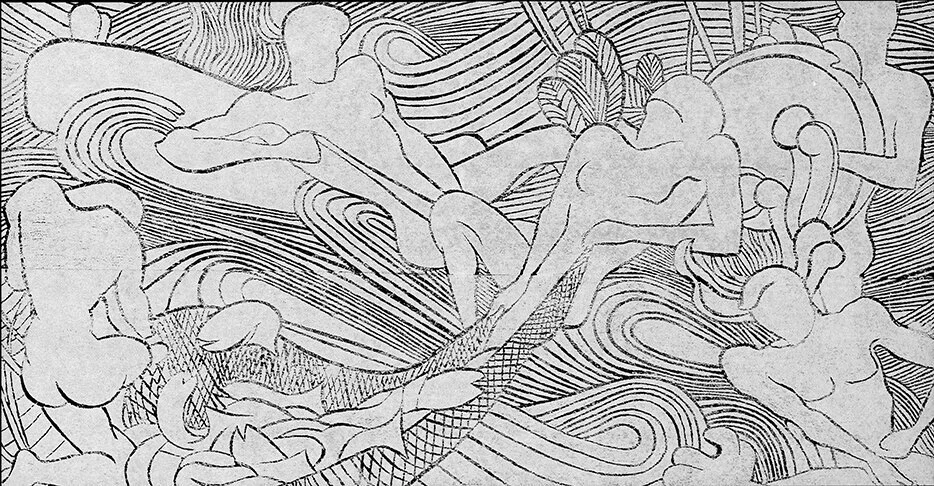
  • Rudolph’s very first professional project was the Atkinson Residence of 1940, built in Auburn, Alabama when he was 22 years old. The living room features a 6' high x 10' wide ornamental mural above the fireplace—most likely a consequence of Rudolph attending a required class on 'Mural Design' while in school. The mural’s linework is composed of V-shaped grooves, cut directly into the plaster.

  • The next time (and the last time that we know of) when we see Rudolph-as-artist is at least a quarter-century later: in his 1966 design for the Hirsch Townhouse in Manhattan (the residence that was later to become famous as the home of fashion designer Halston.) Rudolph covered a prominent wall in the living room with a large mural—about four times the area of the one done in Alabama—but also done in with the same technique: making lines by the cutting of grooves.

What the two artworks share in-common are:

  • both artworks are figurative,

  • viewers can readily discern several people and objects

  • they both have a dream-like (or story-book) quality

  • both have highly stylized imagery

The mural from Rudolph’s 1940 Atkinson Residence, in Auburn, AL, located above the Living Room’s fireplace.

The mural from Rudolph’s 1940 Atkinson Residence, in Auburn, AL, located above the Living Room’s fireplace.

The mural from Rudolph’s 1966 Hirsch Townhouse. Its scale can be judged by seeing the client standing in-front.

The mural from Rudolph’s 1966 Hirsch Townhouse. Its scale can be judged by seeing the client standing in-front.

HIS PROFESSIONAL ARTISTRY

Rudolph+book+cover.jpg

Paul Rudolph did engage in 2-dimensional artwork—but of an applied, professional nature.

We’re referring to his famous perspective renderings (especially section-perspectives). An entire book was devoted to these drawings (see cover at right)—with his section-perspective drawing of the Burroughs Wellcome building being given the front cover.

In Paul Rudolph’s renderings after he left Florida, he generally eschewed the use of continuous tone (a position consistent with his dislike for gouache renderings.) His fine control of linework (often linear, but sometimes flowing) was what Rudolph utilized when he needed to generate tonality—and he achieved that through hatching and line density, to arrive at the effects he desired.

Interestingly, Rudolph’s line-oriented techniques, which he used for his architectural renderings, are not-so-different from the techniques utilized in his two murals.

PAUL RUDOLPH AND TOPOLOGY-AS-ART

The relationship of a topo map’s curved lines (bottom) with the layers of a 3D model version (top.)

The relationship of a topo map’s curved lines (bottom) with the layers of a 3D model version (top.)

A portion of the Stafford Harbor model. The model’s topo layers, reflecting the hilly nature of the inland part of the development’s site, are most evident in the upper-right area of this photograph.

A portion of the Stafford Harbor model. The model’s topo layers, reflecting the hilly nature of the inland part of the development’s site, are most evident in the upper-right area of this photograph.

Before a more direct consideration of Paul Rudolph’s engagement with fine art, it’s worth noting the formal affinity between the sinuous sets of closely-spaced lines (that one finds in Rudolph’s two murals,) and the lines produced when making topo maps and topo models. Using a topo system, in drawings and models, was a standard practice in architectural offices—including Rudolph’s.

Most sites are not flat—so architects study such sites with “topo maps.” These maps have numerous lines, whose closeness-or-distance to each other graphically convey an area’s steepness-or-flatness. When this gets translated into 3-dimensions—to create a “topo model”—the model is made of a series of layers (of boards), the edges of which follow the curves of the map.

Rudolph’s office produced numerous models of his proposed designs—and when a site was hilly, the buildings were set upon such “topo model” bases. The flowing lines of these models (the result of showing the contours of the land in this way) was visually pleasing to Rudolph—so much so, that Rudolph “decorated” his work spaces with those models.

A prominent example of the use of the topo technique is his large model for Stafford Harbor, a project of the mid-1960’s. The Virginia project comprised a master plan, and the design for townhouses, apartment houses, a hotel, boatel, as well as commercial spaces. It embraced the site’s topography—and one can see in the model which Rudolph’s office produced for the project that each layer conveys a change in height.

The full model was gigantic—and Rudolph suspended it, vertically, in the entrance to his architectural office. He used the model’s aesthetic appeal (and surprising orientation) to create a wall-sized, art-like “hanging” that brought additional drama to his office’s multi-storey space.

Moreover, when Rudolph was Chair of the School of Architecture at Yale (in the Yale Art & Architecture Building that he designed, now rededicated as Rudolph Hall), he situated a topo-like mural by Sewell Sillman in the atrium of the main drafting space—both as inspiration and for its aesthetic appeal.

A topo-like mural by Sewell Sillman, placed above the main drafting room/atrium, in Paul Rudolph’s Yale Art & Architecture Building (now rededicated as Rudolph Hall.)

A topo-like mural by Sewell Sillman, placed above the main drafting room/atrium, in Paul Rudolph’s Yale Art & Architecture Building (now rededicated as Rudolph Hall.)

Rudolph “decorated” his work spaces with topo models—like this one of Stafford Harbor—placed dramatically at the entry of his Manhattan architectural office.

Rudolph “decorated” his work spaces with topo models—like this one of Stafford Harbor—placed dramatically at the entry of his Manhattan architectural office.

PAINTINGS BY RUDOLPH?

We’ve come across several works that have been attributed to Rudolph. Each have an aesthetic appeal—but are they really by Paul Rudolph-the-architect?

Third%252Brudolph%252Bartwork.jpg

EXAMPLE ONE:

The painting at right has been claimed to be by Rudolph. The back is has two labels giving the attribution, and the front has a signature.

While we cannot discount all possibilities, we’d say this painting’s compositional strategy is one characterized by the fracturing of the image—an aesthetic that Paul Rudolph does not usually follow. Rocco Leonardis (an architect and artist who had worked for Rudolph) says “Architects make Wholes”—and that well characterizes Rudolph’s work. In contradistinction, this painting’s collage-like conception is closer to the approach taken by Robert Delaunay in his famous depiction the Eiffel Tower (see below-left): a breaking-up of the object.

Paul Rudolph, in his perspective renderings, was noted for his linework—and the painting certainly relies on a multitude of lines to convey the subject. But whereas one senses that Rudolph’s lines are well-controlled—in the service of creating precise images of a projected architectural design—the lines in the painting are explosively staccato.

The painting’s “line quality” has more of an affinity with the work of Bernard Buffet, whose drawing-like paintings (and even his signature) are filled with a shrapnel-like energy (see below-center).

Combining the painting’s fragmented forms and line quality, we can see them used simultaneously in a canonical work of 20th century Modernism: Lyonel Feininger’s 1919 cover design for the manifesto of the Bauhaus (see below-right.)

Of course we’re not suggesting that any of those artists had a hand in the making of the painting (except, possibly, as inspirations)—but only point out that their artwork is closer to the painting than any of Paul Rudolph’s work.

A painting by Robert Delaunay

A painting by Robert Delaunay

A painting by Bernard Buffet

A painting by Bernard Buffet

A print by Lyonel Feninger.

A print by Lyonel Feninger.

Signatures on an artwork count for a great deal, and here we can see a close-up of the one on the painting:

Third%2Brudolph%2Bartwork%2Bsignature.jpg
Paul Rudolph’s actual signature.

Paul Rudolph’s actual signature.

In the course of our work at the Paul Rudolph Heritage Foundation, we’ve seen Paul Rudolph’s signature hundreds of times—and at right is a representative example.

As with any signature, one can find a bit of variation in Rudolph’s signatures—but our observation is that his signature is fairly consistent over his lifetime—and it does not seem to resemble the one in the painting. There’s also a label attached to the back, with a note on it, and it appears to be in another language (German). The name “Paul Rudolph” appears within the handwritten note—but it too does not match Rudolph’s signature.

Based on the discrepancies between the painting and Paul Rudolph’s work and signature, we do not believe the painting is by Paul Rudolph (at least not our Paul Rudolph)—but we are open to a reassessment if additional information is discovered.

EXAMPLES TWO AND THREE:

If you do a Google search for “ ‘Paul Rudolph’ painting ” only a couple of other artworks show up—and below is a screen grab of the results:

A screen capture of a portion of a page from Google Images, showing results when the search request is set for “ ‘Paul Rudolph’ painting”

A screen capture of a portion of a page from Google Images, showing results when the search request is set for “ ‘Paul Rudolph’ painting”

Both are attractive works, and each is done in oil (the left is oil-on-canvas, and the right is oil-on-paper)—and both were attributed to Paul Rudolph. They were offered or sold through galleries/auction houses who are distinguished for the quality of the artworks they offer and the depth of their knowledge. So, as with the painting in Example One, we conclude that such attributions were made in good faith, and to the best of the seller’s knowledge.

So might these be by Paul Rudolph?

We have a date for the right-hand one: 1958. The 1950’s was the era in Rudolph’s work when he began to move from Bauhaus orthogonal rectilinearly (as exemplified by the Walker Guest House, 1951-1952) towards a more muscular (and even sculptural) manifestation of that aesthetic (the most powerful example is his Yale Art & Architecture Building, 1958) and he was also beginning to incorporate dramatic curvilinear forms (as in his Garage Manager’s Office project, 1961). These Rudolph works don’t have a formal vocabulary which resonates with those paintings.

FINE ART OF THAT ERA: THE DOMINANT MODE

ABOVE: Harry Bertoia’s altar screen within the MIT Chapel;  BELOW: Jackson Pollock’s painting.

ABOVE: Harry Bertoia’s altar screen within the MIT Chapel; BELOW: Jackson Pollock’s painting.

Blue_Poles_%28Jackson_Pollock_painting%29.jpg

But, no matter how much Rudolph explored architectural forms, it must be acknowledged that he was still a child of the Modernist era—and that included being educated by the founding director of the Bauhaus itself—Walter Gropius.

When the paintings attributed to Rudolph were being made, abstraction and abstract expressionism were the popular style among painters and sculptors.

Two artists who manifested the sprit of that period were the sculptor Harry Bertoia (1915-1978) and the painter Jackson Pollock (1912-1956)—both born within about a half-decade of Paul Rudolph, and coming to prominence about the same time.

Consider two works by those artists: Bertoia’s altarpiece screen (reredos) for the MIT Chapel (the building was completed in 1956, and its architect was Eero Saarinen), and a 16 foot wide painting by Pollock from 1952.

Those two works share several characteristics—ones seen with some frequency in the artwork of the era:

  • energy/movement

  • fragmentation

  • linearity—but often without alignment

  • a discernable design—but one that embraces a mixture of chaos and order

  • generally they are non-non-figurative—or, if the figure (a building or body) is included, the imagery is pushed towards abstraction

  • a restricted palette (or limited range of tones/finishes/materials)

All of these are also shared by the paintings attributed to Paul Rudolph. You could say that those two works are consistent with the fine-arts style of the era in which they were created. In other words: they truly “make sense” for their time. But they don’t match Paul Rudolph’s form-vocabulary of that era.

THE QUESTION REMAINS: ARE THEY RUDOLPHS?

We can’t rule out that Paul Rudolph, some time mid-century, may have briefly tried his hand at painting. But, given all we know—

  • his practice was feverishly busy at the time

  • his work, at this time, does not have any formal resemblances to the artworks

  • linework—a significant part of all the artworks—is unlike the the type of linework which Rudolph used extensively in his work

  • he was simultaneously leading a major educational institution (as Chair of Yale’s School of Architecture from 1958 -to-1963), as well as engaged in the titanic work of designing its famous school building

  • his two known artworks (the murals) are figurative, and of an utterly different character

  • the signature we’ve seen (on the first painting shown above) doesn’t match the many signatures on Rudolph documents in our archive

  • no other Rudolph artworks of a similar style have come to light

So the “balance of probabilities” leads us to conclude that those paintings may be by a Paul Rudolph, but not likely by the architect Paul Rudolph.

BUT PAUL RUDOLPH DOES INSPIRES ARTISTS…

Rudolph himself might never have made two-dimensional artworks on paper or canvas—but he may have inspired the artwork of others, and below are two examples where that seems to be the case.

EMILY ARNOUX

Emilie+Arnaux+images+on+Fremin+page.jpg

Emily Arnoux is an artist from Normandy, and she has exhibited with the Fremin Gallery in New York City. Her recent show there featured vividly colored images of pool-side scenes, and her gallery says of her:

“From a young age, she became fascinated by the ocean and the laid back lifestyle surf-culture engenders. Her work captures the divine energy and the jubilation experienced when diving into cool water. . . . Arnoux’s [work feels]. . . .at once contemporary and modern, recalling beach-side postcards of the 1950s & 60s.”

What intrigued us is some of the architecture which is included in her works, and one of her wonderful paintings in particular—“Cubes Game”—seems quite resonant with Paul Rudolph’s Milam Residence of 1959, in Ponte Vedra Beach, Florida. Above is a mosaic of images from Ms. Arnoux’s paintings—and, below, you can see her “Cubes Game” side-by-side with Rudolph’s Milam Residence.

Paul Rudolph’s celebrated Milam Residence in Florida

Paul Rudolph’s celebrated Milam Residence in Florida

Emily Arnoux’s superb painting, “Cubes Game”

Emily Arnoux’s superb painting, “Cubes Game

Emily Arnoux’s paintings are full of life and color—and if Rudolph’s work was of any inspiration to her, we are delighted.

SARAH MORRIS

Sarah Morris is a New York based artist whose works are in major museums throughout the world. Her paintings embrace color and geometry. Occasionally they utilize forms from typography, but most often they are abstract, relying on composed linear and circular elements and areas of color.

Morris’ 2018 exhibit at the Berggruen Gallery in San Francisco showed then-recent drawings and paintings (as well as a film by her.) Her gallery said of Morris (and of that exhibit) that she is:

“. . . .widely recognized for her large-scale, graphic paintings and drawings that respond to the social, political, and economic force of the urban landscape through a visual language grounded in bold and ambitious abstraction. Her probing of the contemporary city inspires a consideration of the architectural and artistic climate of modernity and humanity’s footprint—a subject that Morris energizes and invigorates through a distinct use of geometry, scale, and color. . . .Asymmetrical grids form futuristic compositions of sharply delineated shapes separated by rigid borders and acute transitions between colors.  The grid-like quality of her work evokes city plans, architectural structures (including a staircase designed by Paul Rudolph), tectonic plates, or industrial machinery. . . .”

That text referred to a work by Sarah Morris titled “Paul Rudolph”. The painting’s medium is household gloss paint-on-canvas, and it is 84-1/4” square, and was created in 2017. In this work, too, we see Rudolph inspiring an artist’s creativity.

Sarah Morris’ fascinating painting from 2017, “Paul Rudolph”

Sarah Morris’ fascinating painting from 2017, “Paul Rudolph

RUDOLPH AND ART

Paul Rudolph engaged with art in various ways—his medium is architecture—but, to the best of our knowledge, we believe that the paintings that have been attributed to him are not by Paul Rudolph-the-architect.

But we are happy to see Paul Rudolph inspire others working in the fine arts!


IMAGE CREDITS

NOTES:

The Paul Rudolph Heritage Foundation (a non-profit 501(c)3 organization) gratefully thanks all the individuals and organizations whose images are used in this non-profit scholarly and educational project.

The credits are shown when known to us, and are to the best of our knowledge, but the origin and connected rights of many images (especially vintage photos and other vintage materials) are often difficult determine. In all cases the materials are used in-good faith, and in fair use, in our non-profit scholarly and educational efforts. If any use, credits, or rights need to be amended or changed, please let us know.

When Wikimedia Commons links are provided, they are linked to the information page for that particular image. Information about the rights to use each of those images, as well as technical information on the images, can be found on those individual pages.

CREDITS, FROM TOP-TO-BOTTOM, AND LEFT-TO-RIGHT:

Tuskegee dedication by President Reagan: source unknown;  Library building, for which Desmond & Lord was the architect: photo by Daderot, via Wikimedia Commons;  Section-perspective drawing: screen grab from Framingham State University web page;  Architectural Renderings book: a copy is in the collection of the Paul Rudolph Heritage Foundation;  Rendering of Hunts Point Market: Library of Congress Prints and Photographs Division;  Interior with mural of the Yale Art & Architecture Building: photo by Julius Shulman, © J. Paul Getty Trust. Getty Research Institute, Los Angeles;  Atkinson Residence: photograph by Andrew Berman, from the archives of the Paul Rudolph Heritage Foundation;  Hirsch Townhouse longitudinal construction section drawing: © The Estate of Paul Rudolph, The Paul Rudolph Heritage Foundation;  Atkinson Residence mural: © The Estate of Paul Rudolph, The Paul Rudolph Heritage Foundation;  Hirsch Townhouse mural: © The Estate of Paul Rudolph, The Paul Rudolph Heritage Foundation;  Paul Rudolph drawing book: a copy is in the collection of the Paul Rudolph Heritage Foundation;  Topo map diagram: Romary, via Wikimedia Commons;  Stafford Harbor model: photographer unknown;  Main drafting room of the Yale Art & Architecture Building, 1963: photo by Julius Shulman, © J. Paul Getty Trust. Getty Research Institute, Los Angeles;  Paul Rudolph’s architectural office’s entry area: © The Estate of Paul Rudolph, The Paul Rudolph Heritage Foundation;  Tall painting attributed to Rudolph: supplied to us by owner;  Robert Delaunay painting: via Wikimedia Commons;  Bernard Buffet painting:  AguttesNeuilly, via Wikimedia Commons;  Lyonel Feninger print: Cathedral (Kathedrale) for Program of the State Bauhaus in Weimar (Programm des Staatlichen Bauhauses in Weimar)1919;  Close-up of painting with signature: supplied to us by owner;  Paul Rudolph signature: from the archives of the Paul Rudolph Heritage Foundation;  Paintings attributed to Paul Rudolph: screen grabs from Google Images;  Walker Guest House: photo by Michael Berio. © 2015 Real Tours. Used with permission;  Yale Art & Architecture Building: photo by Julius Shulman, © J. Paul Getty Trust. Getty Research Institute, Los Angeles;  Garage Manager’s Office: © The Estate of Paul Rudolph, The Paul Rudolph Heritage Foundation;  Bertoia altar screen within MIT chapel: Daderot, via Wikimedia Commons;  Pollock painting: via Wikimedia Commons;  Mosaic of Emily Arnoux paintings: screen grab from Fremin Gallery web page devoted to the artist;  Milam Residence: Joseph W. Molitor architectural photographs collection. Located in Columbia University, Avery Architectural & Fine Arts Library, Department of Drawings & Archives;  Arnoux painting, “Cubes Game”: from Emily Arnoux web page;  Sarah Morris painting, “Paul Rudolph”, screen grab from Berggruen Gallery web page devoted to Sarah Morris’ 2018 exhibition.

UPDATE: Still an uncertain future for Rudolph's HURLEY BUILDING in Boston

The Hurley Building—a key part of the Boston Government Service Center complex, designed by Paul Rudolph—as seen from the courtyard. In the below aerial view drawing, also by Rudolph, it is on the left part of the site (enclosed in the oval.)

The Hurley Building—a key part of the Boston Government Service Center complex, designed by Paul Rudolph—as seen from the courtyard. In the below aerial view drawing, also by Rudolph, it is on the left part of the site (enclosed in the oval.)

The future of the BOSTON GOVERNMENT SERVICE CENTER—one of Paul Rudolph’s largest and most multifaceted public buildings—remains uncertain.

The Boston Government Service Center, as shown in Paul Rudolph’s aerial view drawing. The threatened Hurley Building is approximately enclosed by the red oval.

The Boston Government Service Center, as shown in Paul Rudolph’s aerial view drawing. The threatened Hurley Building is approximately enclosed by the red oval.

THE SITUATION—aS IT’S DEVELOPED

On of the strategies of those who want to demolish all or part of the Boston Government Service Center’s Hurley Building is to spread the idea that Rudolph was not the prime designer of the complex (including Hurley)—a myth we’ve addressed here.Show…

On of the strategies of those who want to demolish all or part of the Boston Government Service Center’s Hurley Building is to spread the idea that Rudolph was not the prime designer of the complex (including Hurley)—a myth we’ve addressed here.

Shown above is a model of the Boston Government Service Center complex, with the Hurley Building closest to the front-left of the picture (the model also includes Rudolphs design for the unbuilt office tower, rising in the center.) In the background can be seen architectural drawings: an elevation and numerous floor plans. Around the model are key players in the creation of the complex—and Paul Rudolph is standing at far right.

ORIGIN:

  • The Boston Government Service Center occupies a large triangular-shaped site in downtown Boston’s “Government Center” area [whose other most well-known modern building is the Boston City Hall.]

  • The entire block was designed under the strong leadership of Paul Rudolph.

  • Rudolph not only created the complex’s overall plan (the “parti”), but also: the design of each section closely following his direction, vision, and set of architetural standards which he defined. [We’ve addressed the nature of Rudolph’s involvement in our article here.]

  • The client was the state of Massachusetts. Approximately 2/3 of the complex was built as Rudolph envisioned it, and those buildings house a variety of vital civic/state functions.

DO NEW PLANS LEAD TO DEMOLITION?

  • DCAMM: the state of Massachusetts’ Division of Capital Asset Management and Maintenance) has proposed developing and upgrading the site.

  • A key part of their plan is handing-off an integral part of the complex—the HURLEY BUILDING—to a developer.

  • That could potentially mean the destruction of all-or-part of HURLEY—a building which is a significant part of the overall complex.

  • There have been various reports and meetings (as well as interdepartmental discussions) to present and review the state’s plans—and we’ve published several articles on the the situation, including ones examining and questioning this development project (like this one, which looked at the alternatives the state’s been considering.)

  • Several critical letters, statements, and reports have come out: protesting the assumption that demolition is the only path to a positive future for this complex.

  • We had the impression that all the feedback DCAMM had received had led to a positive development: they seemed to have become receptive to including preservation as a central tenet of the project.

ABOVE & BELOW:  the Report and Appendices, recently issued by DCAMM (the state of Massachusetts’ Division of Capital Asset Management and Maintenance), giving a clearer picture of their intentions for the project. Preservation of the Hurley Buil…

ABOVE & BELOW: the Report and Appendices, recently issued by DCAMM (the state of Massachusetts’ Division of Capital Asset Management and Maintenance), giving a clearer picture of their intentions for the project. Preservation of the Hurley Building does not seem to be a central tenant of the project.

Cover+of+Hurley+appendix.jpg

AND NOW: THE RELEASE OF KEY DOCUMENTS

In February, the department advocating the project, DCAMM, moved the project further along,: issuing its report to the state’s Asset Management Board. Their report summarizes the entire project: it shares the history and statistics they gathered, their planning processes, options considered, costs, goals, anticipated revenues and benefits, private sector participation, responses they’ve gotten (and their responses to them), how the project would be administered, and proposed steps & schedule for implementation—including laws and regulations they want waived. [You can see the full report HERE.]

The most interesting part accompanied their report: a set of Appendices which includes copies of their previous proposals/reports, information on the historical-architectural importance of the building complex, and—most fascinating of all: the feedback they’ve received in the form of letters, surveys, public hearings and meetings, and discussions. The “inputters” are from a wide range of stakeholders: neighbors, agencies, professionals, historians, community groups, historians, consultants, and the preservation community. Key documents include:

  • statements from the Paul Rudolph Heritage Foundation

  • the MASSACHUSETTS HISTORICAL COMMISSION’S report on the importance of the building (and their back-and-forth correspondence with DCAMM)

  • the BOSTON LANDMARK COMMISSSION’S report on the importance of the building

  • DOCOMOMO’s report and assessment

The feedback is mixed: While the above four entities fully document and defend the significance of the Boston Government Service Center buildings (and this is further supported by input from other groups and individuals), not all the feedback was positive: a number of the area’s residents and other groups would be happy to see the building replaced—though there doesn’t seem to be consensus on just what form the replacement should take, or what features it should incorporate. [You can see the full Appendices HERE.]

BUT WHAT DOES IT uLTIMATELY SAY?

The report pretty much sticks to what all of DCAMM’s previous reports have said: they want to go ahead with the development project, and there will be benefits for everybody (i.e.: revenues and cost reductions, efficiencies in the consolidation of government office space, better energy use, greater pedestrian friendliness in-and-around the complex, an improved neighborhood…)—which we acknowledge are all worthy goals.

To do this: They will need to engage a developer, and that “partner” will take over all-or-part of the Hurley building. None of this is necessarily problematic, but the danger lies in the terms under which their development partner will be required to work—-and specifically: how (and how much) of the Hurley Building will be preserved?

THE WEAK SPOT (THE DANGER): NO CLEAR COMMITTMENT TO PRESERVATION

Based on previous communication from DCAMM, we believed they had arrived to include preservation as a central tenet of the project. But—

Reading through their new report, we find only weak indications their intentions in that direction.

Here’s a quote from the report:

“While the majority of commenters advocated building preservation, there were several strong opinions expressed in favor of building demolition. DCAMM intends to express a preference in the RFP for redevelopment schemes that pursue adaptive reuse of the existing building – that is, schemes that retain some or all of the existing building, but include new improvements to modernize what is retained, and address some of the urban design challenges that many of the building’s detractors find so problematic. Given that the site is eligible for listing in the state and local registers of historic places, and that MHC has indicated that it expects DCAMM to prioritize preservation, this compromise is recommended.”

When you hear that “DCAMM intends to express a preference. . . .for redevelopment schemes that pursue adaptive reuse of the existing building – that is, schemes that retain some or all of the existing building, but. . . .” does that give you confidence?

And when they say “. . . .MHC [the Massachusetts Historical Commission] has indicated that it expects DCAMM to prioritize preservation, this compromise is recommended.” it seems to lead one to think that the responsibility for setting the rules on how the project proceeds is the responsibility of the MHC—whereas DCAMM is directing the project.

And look at another:

“. . . .The complex as a whole is admired by fans of Brutalist architecture for its distinct features and its monumental scale, which is in keeping with the dominant role government played in that Urban Renewal era. DCAMM is in consultation with the Massachusetts Historical Commission and preservation advocates on an adaptive reuse approach that respects the significance of the site while allowing for much-needed improvements. Including the “Open Space Improvement Area” in the disposition site is part of that work.”

Note the language of the above segments: It characterizes those who see value in the building as “fans” [just fans?]; and also places the origin of its form in a past era (making it no longer relevant?). It mentions “consultation with the Massachusetts Historical Commission and preservation advocates”—but there’s no clear, strong commitment to actually acting on the recommendations of those focused on the preservation of our cultural-historical heritage.

Finally, an indication of the attitude to the Hurley Building is the way they refer to it, calling it “the asset.” That may possibly be a technical term in the world of real estate and development—but here again language is important in shaping the way we think: this term drives the listener into valuing this architectural work at only the most basic material/financial level.

One of the two site-specific murals, by Constantino Nivola, in the lobby of the Hurley Building. One can get an idea of the overall scale of the mural from the person seen at the bottom of this view.

One of the two site-specific murals, by Constantino Nivola, in the lobby of the Hurley Building. One can get an idea of the overall scale of the mural from the person seen at the bottom of this view.

AND WHAT OF THE ART?

Many have expressed concern about the Hurley Building’s site-specific murals, by the internationally recognized artist, Constantino Nivola. There are two of them in the lobby: they are expansive, colorful, and rich with symbolism.

In their report, DCAMM says that they have:

“. . . .commissioned an art conservation study to enhance understanding of the significance of these murals, and considerations for restoration / relocation, if required. DCAMM intends to make the results of this study available to potential bidders who may find such information useful.”

Does that sound like much of a commitment to preserving them?

TAKE ACTION:

  • Sign the petition:Save the Boston Government Service Center” — sign it HERE - and share it with your friends and all who appreciate great architecture.

  • We can keep you up-to-date with bulletins about the latest developments. To get them, please join our foundation’s mailing list: you’ll get all the updates, (as well as other Rudolphian news.)—and you can sign-up at the bottom of this page.

A corner of the Hurley Building, as seen in Ned Daly’s film, “The Closer You Look”

A corner of the Hurley Building, as seen in Ned Daly’s film, “The Closer You Look


IMAGE CREDITS

NOTES:

The Paul Rudolph Heritage Foundation (a non-profit 501(c)3 organization) gratefully thanks all the individuals and organizations whose images are used in this non-profit scholarly and educational project.

The credits are shown when known to us, and are to the best of our knowledge, but the origin and connected rights of many images (especially vintage photos and other vintage materials) are often difficult determine. In all cases the materials are used in-good faith, and in fair use, in our non-profit scholarly and educational efforts. If any use, credits, or rights need to be amended or changed, please let us know.

When/If Wikimedia Commons links are provided, they are linked to the information page for that particular image. Information about the rights to use each of those images, as well as technical information on the images, can be found on those individual pages.

CREDITS, FROM TOP-TO-BOTTOM:

Hurley Building, corner as seen from the courtyard:  Image courtesy of the Massachusetts Institute of Technology, photograph by G. E. Kidder Smith;  Aerial View axonometric drawing of the Boston Government Service Center: by Paul Rudolph, © The estate of Paul Rudolph, The Paul Rudolph Heritage Foundation;  Model of the Boston Government Service Center, surrounded by key players in the creation of the complex: vintage news photo by Max Kotfila, Library of Congress, LoC Control Number 2020630066;  Cover page of the Report on the Charles F. Hurley Building Development Project: published by  DCAMM: the commonwealth of Massachusetts’ Division of Capital Asset Management and Maintenance;  Cover page of the Appendix to the Report on the Charles F. Hurley Building Development Project: published by  DCAMM: the commonwealth of Massachusetts’ Division of Capital Asset Management and Maintenance;  Nivola mural, in the lobby of the Hurley Building: photograph by Kelvin Dickinson, © The estate of Paul Rudolph, The Paul Rudolph Heritage Foundation;  Exterior corner of the Hurley Building: a still from the film “The Closer You Look” by director Ned Daly—and for more information on the film, also see our article here.

Happy 119th Birthday to Luis Barragán !

The Torres de Satélite ("Satellite Towers",) located outside of Mexico City—one of the country’s first major monumentally sized Modern sculpture groups (whose highest tower is 170 feet.) It is the result of a combination of input from…

The Torres de Satélite ("Satellite Towers",) located outside of Mexico City—one of the country’s first major monumentally sized Modern sculpture groups (whose highest tower is 170 feet.) It is the result of a combination of input from architect Luis Barragán, painter Jesús Reyes Ferreira, and sculptor Mathias Goeritz., and was inaugurated in 1958.

LUIS BARRAGAN WOULD HAVE BEEN 119 oN MARCH 9, 2012—AND TODAY WE CELEBRATE HIS BIRTHDAY!

If any architect’s work truly exemplifies Dieter Rams’ saying, “Less but Better”, it would be the Mexican architect Luis Barragán (1902–1988). Barragán’s oeuvre was known for an asceticism of form, and an utter avoidance of the casual or frivolous. Yet the buildings and spaces he created were brought to vivid life by careful composition, devoted detailing, keen juxtapositions and choices of materials, and—most famously—a florid use of color.

His work encompassed whole residential districts, artwork (like the Torres de Satélite show above), a chapel and convent, and other projects—but he is probably most well-known for individual homes he created, both for clients and for himself.

WITH BARRAGAN, MATERIAL BECOMES SPIRITUAL

Architect Luis Barragán (1902–1988)

Architect Luis Barragán (1902–1988)

Barragán is often classified as a “Minimalist”—but this would be an error, as the interior and exterior spaces he created are alive with a sensuous serenity. His is a body of work that aspires to embrace (and invoke) the spiritual. As Barragán himself put it:

“…the words beauty, inspiration, enchantment, magic, sorcery, charm and also serenity, silence, intimacy and amazement have disappeared at an alarming rate in publications devoted to architecture. All of them have found a loving welcome in my soul, and even if I am far from claiming to have made them complete justice in my work, they have never ceased to be my beacon.”

And:

“Any work of architecture which does not express serenity is a mistake.”

For those not familiar with Barragán’s oeuvre, here is a mosaic of images which may serve to convey the flavor—and, as important, the atmosphere—of his work:

Casa Gilardi

Casa Gilardi

Fuente de los Amantes

Fuente de los Amantes


Fountain spout and pool at Casa Barragán

Fountain spout and pool at Casa Barragán

Roof patio at Casa Barragán

Roof patio at Casa Barragán

Casa Gilardi

Casa Gilardi

A close-up of the Torres de Satélite

A close-up of the Torres de Satélite

A stair within Casa Barragán

A stair within Casa Barragán

Faro del Comercio

Faro del Comercio

FAME, INFLUENCE—AND THE AFTERLIFE OF AN ARCHITECT

The book, by Emilio Ambasz, which accompanied the Museum of Modern Art’s 1976 landmark exhibit on Barragán

The book, by Emilio Ambasz, which accompanied the Museum of Modern Art’s 1976 landmark exhibit on Barragán

Luis Barragán received the Pritzker Architecture Prize in 1980 (and you can read his insight-filled acceptance speech here)—but he had not been very well-known, outside of Mexico, until the 1976 retrospective exhibition of his work at New York’s Museum of Modern Art. That exhibition was accompanied by a book, “The Architecture of Luis Barragan”—also published by the MoMA—whose complete text (by Emilio Ambasz, who curated the exhibit) and luminous photographs and informative drawings you can see here.

He was a direct influence on Louis Kahn (who received advice from him about the great open space at the heart of Kahn’s Salk Institute) and he was consulted by designers from both Mexico and other parts of the world.

Barragán—besides the inspiration which can, ongoingly, be taken from his work—has had another kind of afterlife. After he passed in 1988, his will directed that his estate be divided into different categories of materials, and allocated to several people who had been important in his life. The legacy that comprised his professional archives and copyrights went through more-than-one ownership, until this important body-of-work reached its current residence in Switzerland at the Barragan Foundation.

But that was not the end of the story. Jill Magid is an artist (working in various media), writer, and film-maker—who has had exhibitions at major venues around-the-world. She became fascinated with the numerous facets of the Barragán estate—-not the least of which include its location an ocean away from the architect’s homeland, Mexico; and (at the time Magid was doing her work) the perceived restrictions on access to the archive. Her artistic activism on this topic resulted in works in a number of forms: several exhibits, a 2016 book, and a 2018 film (both titled “The Proposal”)—and Magid’s project achieved further prominence when it was written about in a series of articles in The New Yorker.

Her project asked important questions about art, creativity, relationships, identity (both personal and national,) and artistic legacies (both their control and protection). We know that these are complex matters, and all sides can bring forth pertinent evidence and cogent arguments. Moreover, there seems to have been further developments since Magid’s exhibits, book and film came out—so we can offer no pronouncement about the important issues she raises. Nevertheless, what Magid presents is compellingly told (and includes a strikingly unorthodox proposal!) and you might find it of interest to view the film. You can see the trailer here; as well as view a more recent symposium about her project here.

BARRAGAN: AN ARCHITECT TO CELEBRATE !

Whatever the issues around the archives—and however their status may stand or change—the important thing about Luis Barragán is the amazing body-of-work which created during more than a half-century of practice. So, for this, the 199th anniversary of his natal day, we wish him a HAPPY BIRTHDAY !

A twilight view of the Torres de Satélite, a project on which Barragán collaborated.

A twilight view of the Torres de Satélite, a project on which Barragán collaborated.


IMAGE CREDITS

The Paul Rudolph Heritage Foundation gratefully thanks all the individuals and organizations whose images are used in this scholarly and educational project. If any use, credits, or rights need to be amended or changed, please let us know.

Note: When Wikimedia Commons links are provided, they are linked to the information page for that particular image. Information about the rights to use each of those images, as well as technical information on the images, can be found on those individual pages.

Credits, from top-to-bottom, and left-to-right:

Torres de Satélite: photo by Octavio Alonso Maya Castro, via Wikimedia Commons;  Photo portrait of Luis Barragán: photo by Tomjc.55, via Wikimedia Commons;  Casa Gilardi with pool: photo by Ulises00, via Wikimedia Commons;  Fuente de los Amantes: photo by Susleriel, via Wikimedia Commons;  Fountain spout and pool at Casa Barragán: phot by Daniel Case, via Wikimedia Commons;  Roof patio at Casa Barragán: photo by  Ymblanter, via Wikimedia Commons;  Casa Gilardi interior: photo by Ulises00, via Wikimedia Commons;  A close-up of the Torres de Satélite: photo by ProtoplasmaKid, via Wikimedia Commons;  A stair within Casa Barragán: photo by  Francesco Bandarin, via Wikimedia Commons;  Faro del Comercio: photo by Cvmontuy, via Wikimedia Commons;  A twilight view of the Torres de Satélite: phot by Correogsk, via Wikimedia Commons  

Happy 160th Birthday to RUDOLF STEINER (Was he "The Original Brutalist" Architect?)

The entry façade of the SECOND GOETHEANUM, a building for the exploration of the arts, in Dornach, Switzerland. It was designed by Rudolf Steiner in the early 1920’s—and construction started in 1924 and was completed in 1928. Replacing an earlier wo…

The entry façade of the SECOND GOETHEANUM, a building for the exploration of the arts, in Dornach, Switzerland. It was designed by Rudolf Steiner in the early 1920’s—and construction started in 1924 and was completed in 1928. Replacing an earlier wooden building, also designed by Steiner, this version of the Goetheanum was constructed entirely of exposed, cast-in-place concrete.

CELEBRATING THE 160TH BIRTHDAY OF RUDOLF STEINER BORN FEBRURARY 25, 1861

RUDOLF STEINER (1861-1925) was the ultimate polymath. Though he did not live to a great age, he squeezed several lifetimes of achievements into his 64 years—and that included his work in architecture.

The breadth of his interests, activities, and accomplishments are impressive—and those various foci had him taking on (and mastering) multiple roles:

RUDOLF STEINER (1861-1925)—a master of multiple arts, including Architecture. His 160th birthday is on February 25th.

RUDOLF STEINER (1861-1925)—a master of multiple arts, including Architecture. His 160th birthday is on February 25th.

  • PHILOSOPHER

  • EDUCATOR — including developing an educational system and founding schools, which evolved into the Waldorf Movement, (which includes schools around-the-world)

  • PSYCHOLOGIST

  • SOCIAL REFORMER

  • RESEARCHER — including into advances in Agriculture, Medicine, and Pharmacology

  • INNOVATOR IN THE PERFORMING ARTS — embracing Drama, Music, and Dance

  • THEOLOGIAN-ESOTERICIST — intense research, teaching, and movement founder

  • AUTHOR and LECTURER — his Collected Works constitutes about 420 volumes, and that includes 43 volumes of his writings (books, essays, plays, and correspondence), over 6000 lectures, and some 80 volumes documenting his work in architecture, design, and the arts

  • PAINTER

  • SCULPTOR

STEINER AS ARCHITECT

But it is his work as an ARCHITECT that focuses our attention upon him. Rudolf Steiner designed numerous buildings, but it is crowning achievement—the GOETHEANUM, an architectural work of significant size and complexity, built entirely of exposed, cast-in-place concrete—that makes him a candidate to be called: “THE ORIGINAL BRUTALIAST” ARCHITECT.

THE TWO GOETHEANUMS

Actually, there were two “Goetheanum” buildings, both built in Dornach, Switzerland—and both designed by Rudolf Steiner, in association with a number of collaborators, craftspeople, and artists, most notably the sculptor Edith Maryon.

In considering Rudolf Steiner’s architectural work, it is important to keep in mind that central to his work and world-view was his focus on spiritual matters—not only his deep research, writing, and teaching on that subject, but he also led a growing community devoted to such explorations. He asserted that his designs (and his artworks within them) were guided by his philosophy—and you can find more about his thoughts on architecture and design (and how they grow from his larger concerns) here.

By-the-way: Steiner, as an architect, was unusual in another way: he was entirely self-taught—neither having gone to architecture school, nor having worked for another architect.

The FIRST GOETHEANUM, named after Johann Wolfgang von Goethe, was begun in 1913, and housed events (especially musical and performance) of the Anthroposophical Society—the organization he founded (which has branches all around the world today.) Dornach became the center for people devoted to Steiner’s work, and the Goetheanum was one of seventeen buildings in the area which he designed between 1908 and 1925. The First Goetheanum was preponderantly made of wood, set upon a concrete base—and it had an unusual double-dome wooden structure. Unfortunately, it was lost to a fire at the end of 1922.

The First Goetheanum, under construction. It was built of wood on a concrete base, and was begun in 1913.

The First Goetheanum, under construction. It was built of wood on a concrete base, and was begun in 1913.

The First Goetheanum, as finished. Unfortunately, it was lost to a fire less than a decade after completion.

The First Goetheanum, as finished. Unfortunately, it was lost to a fire less than a decade after completion.

After the first Goetheanum was lost to fire, Steiner soon designed and started construction on the Second Goetheanum—shown above at sunset.

After the first Goetheanum was lost to fire, Steiner soon designed and started construction on the Second Goetheanum—shown above at sunset.

A side view of the Goetheanum.  It was constructed entirely -both inside-and-out- of exposed, cast-in-place concrete—and Rudolf Steiner’s design handled the raw material with boldness.

A side view of the Goetheanum. It was constructed entirely -both inside-and-out- of exposed, cast-in-place concrete—and Rudolf Steiner’s design handled the raw material with boldness.

The SECOND GOETHEANUM was designed in the year after the first one was lost, and construction started in 1924 (being completed in 1928—just a few years after Steiner’s passing in 1925). 

It houses a variety of cultural facilities: performance spaces (including a 1,000 seat auditorium), a gallery, lecture spaces, and a library—as well as administrative spaces for the organization which Steiner founded, the Anthroposophical Society. It also includes stained-glass windows of richly luminous colors.

You can get an idea of the of the Second Goetheanum’s form and scale—and as a creation by an architect-artist of great power—in the brief video below: “Das Goetheanum” [included here courtesy of Moving Image, and its filmmaker: Roger Maeder.] In the video, it’s also worth noting the smaller buildings surrounding the Goetheanum: most were also done in Steiner’s Anthroposophical architectural mode—either by Rudolf Steiner himself, or subsequently by his followers.

Every view of the Second Goetheanum—like the side view (above) and a window (below)—reveals the plasticity of Rudolph Steiner’s architectural design.

Every view of the Second Goetheanum—like the side view (above) and a window (below)—reveals the plasticity of Rudolph Steiner’s architectural design.

Architectural historians seem to have had a hard time “placing” Rudolf Steiner within the evolutionary tree of Modern architecture. For example: Charles Jencks did not even mention him in the original edition of “Modern Movements In Architecture.” Henry-Russell Hitchcock, in his magisterial "Architecture: Nineteenth and Twentieth Centuries,” only gives Steiner the briefest mention—and that is with reference to Erich Mendelsohn’s work at his Einstein Tower (which was built in the same period as the two Goetheanums).

It was up to the historians Dennis Sharp and Conrads & Sperlich, in their fascinating books, to bring Steiner to the wider architectural community. In more recent years, one of the significant books to come out on Rudolf’s architecture is “Eloquent Concrete” by Raab, Klingbord, and Fant.

Despite his under-appreciation by some architectural historians, architects—including some of the most distinguished practitioners—have admired Steiner’s work. Henry van de Velde, Frank Lloyd Wright, Hans Scharoun, and Frank Gehry have all visited the Goetheanum.

Today, there are numerous books on Steiner’s thought, and even his architecture—and one that’s a good introduction to the Second Goetheanum building is this book by Hans Hasler.

The GOETHEANUM was constructed—inside and out—of exposed, cast-in-place concrete.

At below-left is a partial exterior view of the side, and below-right is a a close-up exterior view of a window. Below that are two views of the Goetheanum’s interior. All these images show how Steiner-as-architect used exposed concrete with “a sculptor’s hands” to create dramatic, effusive forms and interiors—including the details and the stairways.

side+view.jpg
window.jpg
steiner+stairway.jpg

WAS STEINER “THE FIRST BRUTALIST” ARCHITECT?

stair+with+figure.jpg

Rudolf Steiner sought, in all his works, an ultimate unity of spirt, action, humanity, and art—and he aimed for true harmony in every endeavor, seeking to unite the human and divine. So we doubt, if Steiner could have been asked, that he’d have embraced the seemingly hard term, “Brutalism.” But—words (and their associations) aside—his work at the Second Goetheanum most decidedly participates in the spirit and character of Architectural Brutalism (and that would also be true for the other buildings which he constructed for his community at Dornach.)

Those characteristics include:

  • boldness of form

  • use of materials (like exposed, cast-in-place concrete) in an unabashed manner—often “raw”—as a potent part of the pallete of a talented designer

  • shunning of the pretty or merely decorative, and, instead: aiming for a astonishing form of beauty that partakes of the sublime

  • not (or more often: not just) “form following function”—but rather: a sculpting and composition of forms to create works-of-architecture that are expressive of the creative spirit

Rudolf Steiner included all of these in his designs—with sensitivity, honesty, artistry, and a powerful exuberance.

And he did this early on, during the formative years of the emergence of Modern architecture. So—while there may be other contenders for the title—in celebration of Rudolf Steiner’s 160th Birthday, we crown him: The First Brutalist Architect !

The Goetheanum as seen from the air. The building’s main entry is at its lower-left. Numerous other buildings, surrounding the Goetheanum, were also designed by Rudolf Steiner (or later by his followers, in the mode in which Steiner worked). Perhaps…

The Goetheanum as seen from the air. The building’s main entry is at its lower-left. Numerous other buildings, surrounding the Goetheanum, were also designed by Rudolf Steiner (or later by his followers, in the mode in which Steiner worked). Perhaps the most famous of these other Steiner designs, second only to the Goetheanum in renown, is the Heizhaus: it contains the boiler for the Goetheanum’s heating system—and its flame-like chimney can be seen near the top-center of this photo.

FURTHER INFORMATION

The official website of the Goetheanum is here.

A matrix of other buildings, designed by Rudolf Steiner (and access to other information on his multi-faceted life and career) is available here.

Numerous documents, relating to Steiner’s architecture and philosophy of design, can be accessed here.

IMAGE CREDITS

The Paul Rudolph Heritage Foundation thanks all the individuals and organizations who have made their images available for this scholarly and educational work.

Note: Each Wikimedia Commons link is to the information page for that particular image. Information about the rights to use each image, as well as technical info, can be found on those pages.

Credits, from top-to-bottom, and left-to-right:

Front entrance view of the Second Goetheanum: photo by Wladyslaw (talk), edits by: Dontpanic (aka Dogcow), via Wikimedia Commons; Photograph of Rudolf Steiner, circa 1905, Abbildung übernommen aus Wolfgang G. Vögele, Der andere Rudolf Steiner - Augenzeugenbrichte, Interviews, Karikaturen, 2005, S. 116, in the Public Domain, via Wikimedia Commons; First Goetheanum, under construction: image from Jjdm at Hungarian Wikipedia as original uploader; edited by Jaybear, via Wikimedia Commons; First Goetheanum, completed: photo in public domain, via Wikimedia Commons; Second Goetheanum, at sunset: photo by Taxiarchos228, courtesy of Wikimedia Commons; Side view of Second Goetheanum: photo by Wladyslaw, via Wikimedia Commons; “Das Goetheanum”—the video of the second Goetheanum: courtesy of Moving Image, and its filmmaker: Roger Maeder; Side view of Second Goetheanum (with blue sky): photo by Barbara Steinemann, via Wikimedia Commons; Partial view of exterior side: via Wikimedia Commons; Window of Second Goetheanum: photo by Soare, via Wikimedia Commons; Staircase inside Second Goetheanum: photo by Maioting, via Wikimedia Commons; Interior of Second Goetheanum, with figure: via Wikimedia Commons; Aerial view of the Second Goetheanum: photo by Taxiarchos228, via Wikimedia Commons

How Architects See (LITERALLY)

even+smaller+How+To+See+cover.jpg
Rudolph%25252Bwith%25252Bglasses.jpg

HOW TO SEE (AND WHO’S NOT SEEING)

Though one of America’s most famed and sought-after designers, George Nelson (a contemporary of Paul Rudolph), who worked on industrial design and architecture commissions for well-known clients—was frustrated. He found that his clients—the leaders of major institutions and corporations—just couldn’t see.

The statue of Minerva presides over the drafting room in Paul Rudolph’s Yale Art & Architecture Building. Photo by Julius Shulman.© J. Paul Getty Trust. Getty Research Institute, Los Angeles.

The statue of Minerva presides over the drafting room in Paul Rudolph’s Yale Art & Architecture Building. Photo by Julius Shulman.© J. Paul Getty Trust. Getty Research Institute, Los Angeles.

Yes, they could see well enough to drive a car or hit a golf ball, but the visual distinctions which architects and designers make—the vibrancy with which they apprehend the world, which in-turn allows them to create objects and environments of vivid creativeness—were lost on almost everyone outside of the design community (including many of Nelson’s clients).

Visual awareness of the world (beyond the most basic needed to function) was virtually non-existent for most of the people for whom Nelson was working. Taking-on this challenge like a design-problem, he developed various tools: presentations, reports, and eventually a book—"How To See—to try to introduce non-designers to a the way architects, designers, and artists see the world around them.

[There’s an interesting convergence between Rudolph and Nelson: the figure on the cover of Nelson’s book, How To See, bears a striking resemblance to the statue of Minerva, the goddess of wisdomthe sculpture which Paul Rudolph chose as the focus for the main interior of his Yale Art & Architecture Building.]

CONSEQUENCES

There are serious consequences to this mass un-seeing: decision-makers who own or determine the future of Rudolph-designed buildings—who may have little ability to see and discern those buildings’ true value—have sometimes opted for changes that are not sympathetic with Rudolph’s architecture, or they’ve even decided for wholesale demolition.

Those who seek to preserve great architecture—one of the central missions of the Paul Rudolph Heritage Foundation—go up against this “unseeing” every day. So there is a continuous need for a “How to See” campaign, to open the vision of non-designers to the splendors and value of the visual-architectural world.

Wright was undeniably a man of great style, controlling his image though an ongoing program of self-generated publicity. He’s hardly ever shown in photographs wearing glasses—yet toward the end of his life he was captured with them, as shown in this…

Wright was undeniably a man of great style, controlling his image though an ongoing program of self-generated publicity. He’s hardly ever shown in photographs wearing glasses—yet toward the end of his life he was captured with them, as shown in this article from a late 1950’s issue of Architectural Record. Courtesy of: US Modernist Library.

BUT WHAT HELPS ARCHITECTS TO SEE?

One could argue that architects have no problem with appreciating the visible world. Indeed, they embrace it with the perceptual equivalent of a craving appetite. But what happens when their own ability to see—their acuity of vision—begins to literally falter?

What happens is: Glasses—and, if you can count on anything, it’s this: architects (and their colleagues: designers and artists) will not be content with just any pair of glasses. What they seek is a personal style which fully expresses their overall design vision, including their self-image—and that extends to their choice of glasses.

And what’s more expressive of the Modern spirit than that purist, platonic, and machine-like design: the Circle.

[Note: We’ve had an article on Rudolph’s focus of the circle in his design work—Paul Rudolph and Circular Delight—which you can read HERE.]

THE LE CORBUSIER LINEAGE

The origin-point of the “lineage” of architects adopting the perfect circle for their eyeglasses seems to start with Le Corbusier. Like Wright, he was strategic about his self-presentation—from the layout of his many publications -to- the details of his attire. As the exponent of mechanization in the conception of buildings (“The house is a machine for living.”), and geometric Purism in art, it’s natural that he’d choose circular eyeglasses—and they became his personal signature.

Le_Corbusier_with%2Bround%2Bglasses.jpg
Le Corbusier, wearing the circular eyeglasses which became his his personal signature. Left, his glasses have relatively thin frames outlining the lenses. Above, he’s shown with the thicker frames with which he is more frequently associated. Photos …

Le Corbusier, wearing the circular eyeglasses which became his his personal signature. Left, his glasses have relatively thin frames outlining the lenses. Above, he’s shown with the thicker frames with which he is more frequently associated. Photos courtesy of Wikipedia

THEN JOHNSON…

The next step in the lineage seems to be Philip Johnson. In Mark Lamster’s fascinating biography of Johnson—The Man in the Glass House: Philip Johnson, Architect of the Modern Century—he speaks of Johnson’s adopting the Corbusian eyewear by the mid-1960’s:

“. . . .Philip Johnson was happily stepping into the role of ‘Philip Johnson,’ a public persona that he cultivated and refined, now augmented by the owlish glasses that he had begun to wear, another borrowed statement, this time from Le Corbusier. . . .”

Architect Philip Johnson (1906-2005), photographed late in his life—and still wearing the Corbusian circular glasses that he had adopted as part of his image, much earlier in his career. Photograph by B. Pietro Filardo, courtesy of Wikipedia.

Architect Philip Johnson (1906-2005), photographed late in his life—and still wearing the Corbusian circular glasses that he had adopted as part of his image, much earlier in his career. Photograph by B. Pietro Filardo, courtesy of Wikipedia.

A scan of the New York Review of Books web-page with the opening of Martin Filler’s review of Lamster’s biography of Philip Johnson. On that page was David Levine’s caricature of Johnson—featuring his Corbusian glasses—and a forehead evocative of th…

A scan of the New York Review of Books web-page with the opening of Martin Filler’s review of Lamster’s biography of Philip Johnson. On that page was David Levine’s caricature of Johnson—featuring his Corbusian glasses—and a forehead evocative of the broken pediment of Johnson’s AT&T Building.

I. M. Pei—the famous architect also chose the circular glasses style. Image courtesy of Wikipedia.

I. M. Pei—the famous architect also chose the circular glasses style. Image courtesy of Wikipedia.

AND THEN PEI…

The next prominent architect who was widely noted for wearing the circular style of eyeglasses was I. M. Pei. Photographs of Pei, throughout his long and prolific career, show him wearing them, generally with black (or dark) frames. But in this late photograph, from 2006, he’s shown with medium-thickness, tortoise-shell frames (instead of the more Corbusian black ones.)

AND RUDOLPH-IAN ROUNDNESS…

At this point, we have to bring in Paul Rudolph, He wore a number of different styles of glasses (mainly with strong-looking black frames)—but seems to have settled on the circular Corbusier style as his glasses-of-choice.

Indeed, Paul Rudolph appears to have become attached to using that style alone— We’ve heard an anecdote about this from a fellow who had a friend who worked for Rudolph: he encountered his friend on the street, carrying an armful of those circular glass frames. The friend explained: Paul Rudolph had heard that those round frames might go out of production—so Rudolph sent his employee to the glasses shop to buy-out the entire stock of that design!

IMG_9173.jpg
rudolph+eyeglasses+photo.jpg
The collections of the Paul Rudolph Heritage Foundation includes several pairs of Rudolph’s eyeglasses—including the an example of the circular style (the right-most one in the above photograph). © The Paul Rudolph Heritage Foundation Archives

The collections of the Paul Rudolph Heritage Foundation includes several pairs of Rudolph’s eyeglasses—including the an example of the circular style (the right-most one in the above photograph). © The Paul Rudolph Heritage Foundation Archives

CIRCULAR CIRCULATION…

After the initiation of this lineage, and its first generations of adherents— Le Corbusier > Johnson > Pei > Rudolph—it’s not hard to find these geometric glasses spreading among architects. Nicholas Grimshaw is among the more famous wearers of the style—and, if one re-defines the net to a wider circle of the creative class, we’d be amiss to not mention the circular glasses which have become a trademark of artist David Hockney.

Before leaving the topic, we want to note three more truly historic figures—who, like Paul Rudolph, have altered the course of architecture—all of whom are adherents of the circular style in eyewear: Peter Cook, Denise Scott Brown, and Peter Eisenman.

Peter Cook. Photo by CRAB, courtesy of Wikipedia.

Peter Cook. Photo by CRAB, courtesy of Wikipedia.

Peter Eisenman. Photo by Columbia GSAPP, courtesy of Wikipedia.

Peter Eisenman. Photo by Columbia GSAPP, courtesy of Wikipedia.

Denise Scott Brown. Photo by Columbia GSAPP, courtesy of Wikipedia.

Denise Scott Brown. Photo by Columbia GSAPP, courtesy of Wikipedia.

P.S. WAS LE CORBUSIER REALLY THE FIRST?

Who really first initiated the circular eyeglasses style, among architects, might be—ultimately—an unsettleable question.

We do have these intriguing photos of the architect Julia Morgan (1872-1957), and her contemporary Hans Poelzig (1869-1936). Both of their lives overlapped Le Corbusier’s—but more relevant is that both their careers started well before Corbusier’s—and one might reasonably propose that Morgan’s and Poelzig’s sense of personal style (including eyewear?) coalesced before Corb’s.

Julia Morgan (1872-1957.). A skilled architect who worked on a variety of building types, is best remembered for her her design of the Hearst Castle complex. It’s hard to tell, in this vintage photo, if her glasses were perfectly circular—but if not…

Julia Morgan (1872-1957.). A skilled architect who worked on a variety of building types, is best remembered for her her design of the Hearst Castle complex. It’s hard to tell, in this vintage photo, if her glasses were perfectly circular—but if not, they were certainly close to that geometry. Photo courtesy of Wikipedia.

The architect Hans Poelzig (1869-1936). In both images—him at work (above), or in a more formal portrait (at right)—he is pictured wearing eyeglasses which embrace the purist circular geometry. Here he is photographed circa 1927 by Alexander Binder …

The architect Hans Poelzig (1869-1936). In both images—him at work (above), or in a more formal portrait (at right)—he is pictured wearing eyeglasses which embrace the purist circular geometry. Here he is photographed circa 1927 by Alexander Binder Both photos of Poelzig (above and right) are courtesy of Wikipedia.

Poelzig’s design work could be dreamlike and fanciful, or severely functionalist—but he always showed an appreciation of the power of geometry. That concern extends even to his his personal appearance. Photograph by M.E.

Poelzig’s design work could be dreamlike and fanciful, or severely functionalist—but he always showed an appreciation of the power of geometry. That concern extends even to his his personal appearance. Photograph by M.E.

Moreover, circular forms for eyeglasses go back to the beginnings of corrective eyewear—-the circular form of lenses being easier to shape (grind). Finally, one should always recall the eternal power and fascination of that perfect form, the circle—something that has has eternally fascinated philosophers and designers!

Conrad_von_Soest%2C_%27Brillenapostel%27_%281403%29.jpg
smaller%25252Bvitruvina%25252Bman.jpg

ROLLING FORWARD WITH THE THE CIRCULAR STYLE…

If you want to join with Le Corbusier, Paul Rudolph, and Denise Scott Brown in wearing the circular style, then fear not: there are abundant examples on the the market. In fact, just putting “architect’s circular eyeglasses” into an internet search box will yield results like this, or this below—

glasses%2Bon-line.jpg
Mister+Glasses+title+card.jpg

CIRCULAR CINEMA

And, if you want to revel in the way that the circular eyeglasses mode has been integrated—with humorous thoroughness—into the conventions of architectural attire, you’ll enjoy “MISTER GLASSES”—a series of short films created by Mitch Magee.

Mr.%2BGlasses%2Bfull%2Bface.jpg

Magee is a writer, director, producer, and actor—and he adroitly applied all those talents (in collaboration with a talented ensemble) in creating this series. Mitch Magee also plays the eponymous Mister Glasses—a character whose authentic concern for others is mixed (in a wonderfully strange way) with a lack of visible emotional affect.

Each of the brief-but-sharp episodes brings the main character and his team into a series of architecturally-related preachments. But the humor—and perhaps the point—of the series emerges not so much from the plots, but rather in the way that Magee shows (and caricatures) the ways that Modern architects think and respond to the world.

One of the joys of the series is the way that Mister Glasses is portrayed as the quintessential Modern architect—“Modern” in the particular sense of adamantly adhering to the classic palette of the International Style. But he also continually manifests that strand of Modernism in a highly personal way: he conveys, in his manner, speech, and self-presentation, a sense that he’s living in a Platonic world—or at least aspires to. Thus Mister Glasses’ speech verges on clipped, his suits are consummately tailored and maximally restrained in style (much like Mies van der Rohe’s), and—of course!—he wears platonically circular glasses.

AND IN RETROSPECT…

Eyeglasses (circular and otherwise) have been an everlasting motif in art—and this is delightfully studied in LENS ON AMERICN ART: The Depiction and Role of Eyeglasses. Richly illustrated, and beautifully published by Rizzoli/Electra, art historian John Wilmerding delves into the many occurrences, uses of, and varied possible meanings of eyeglasses, as they show up in American art. Enthusiasts of the circular mode in eyeglasses will be glad to know that a notable number of examples of their favorite style are shown in his delightful book.
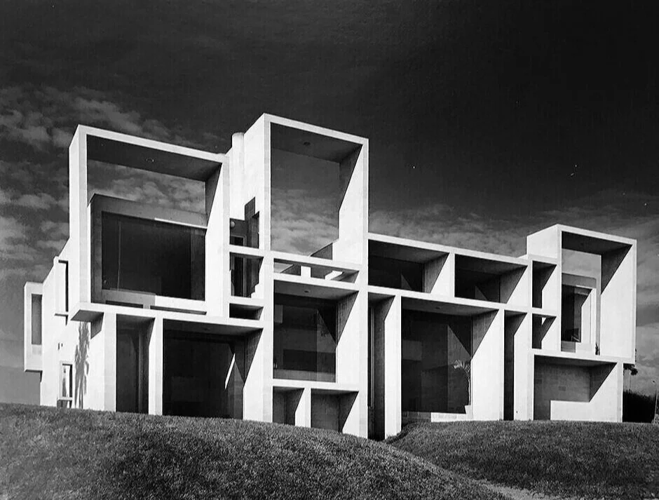
book+cover.jpg
John Wilmerding’s book, LENS ON AMERICAN ART: The Depiction and Role of Eyeglasses, includes numerous examples of the circular eyeglasses style in artworks made throughout American history. The author, shown above, has given an interview about the b…

John Wilmerding’s book, LENS ON AMERICAN ART: The Depiction and Role of Eyeglasses, includes numerous examples of the circular eyeglasses style in artworks made throughout American history. The author, shown above, has given an interview about the book, which was published by Rizzoli/Electra on the occasion of an exhibition at the Shelburne Museum. This insightful book can be ordered directly through the publisher.


Boston Government Service Center's Other Artwork: "Upward Bound"— and Rudolph’s engagement with Art

Paul Rudolph’s Boston Government Service Center shows Rudolph’s engagement with art—and it includes another fascinating work of public sculpture.

Saying No to Demolition: the Nivola Family & Museum’s Stand Against Destroying Art (and Rudolph’s Building) in Boston

The state government of Massachusetts wants to sell parts of Rudolph’s Boston Government Service Center—and that would mean the likely destruction of the two symbolic and lively murals by artist Constantino Nivola within the building. The Nivola family, foundation, and museum have come out with powerful statements in support of saving the murals (and the building for which they were designed). Your support could help save them.