Architecture and Food

Coffee (and Concrete) with Paul Rudolph

Inspiration can be found anywhere—and the designers of this new, concrete-encased expresso maker have expressed admiration for the work of Paul Rudolph. Like Rudolph’s Yale Art & Architecture building, their design uses contrasting materials & finishes—each of which helps enhance the presence of the others.

Inspiration can be found anywhere—and the designers of this new, concrete-encased expresso maker have expressed admiration for the work of Paul Rudolph. Like Rudolph’s Yale Art & Architecture building, their design uses contrasting materials & finishes—each of which helps enhance the presence of the others.

Rudolph’s Yale Art & Architecture Building is a design which can be characterized in many ways—and one of them is that the building is a celebration of concrete’s multiple potentials, both in form and texture.

Rudolph’s Yale Art & Architecture Building is a design which can be characterized in many ways—and one of them is that the building is a celebration of concrete’s multiple potentials, both in form and texture.

NEW ADVENTURES IN CONCRETE

In recent years we’ve seen an outpouring of new uses for concrete—including for functions and places where it was never expected to go: jewelry, watches, desk accessories, toys, a prototype model for an airplane—and even in candles and cologne (both of which claim to integrate the spirit of concrete into their aromas.)

Concrete jewelry, and…

Concrete jewelry, and…

a concrete watch, and…

a concrete watch, and…

toy blocks, and…

toy blocks, and…

a concrete candle!

a concrete candle!

But within Kitchens, other than for surfaces (countertops or floors), we’ve never seen concrete used in any way for food preparation. Until now—

AnZa is a small-but-enterprising, California-based company (founded by a designer.) They have an intriguing approach to the use of materials—and their unusual choices caught our eye in the form their prime product: an Espresso Maker.

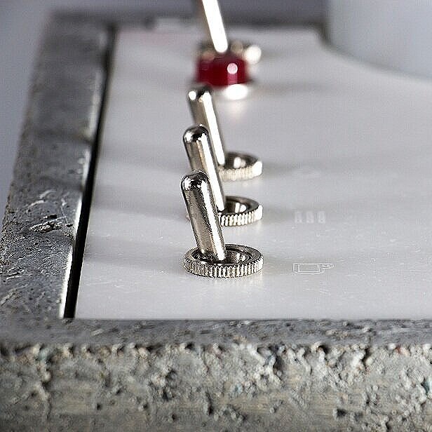
Here are some photos of AnZa’s concrete incarnation of their expresso machine:

snip%25252Bof%25252Bgeneral%25252Bview%25252Bwith%25252Bflower.jpg
Concrete_corner_Hero.jpg
front%2Bview.jpg
close-up+of+top+controls.jpg

As you can see in this wonderful object, concrete has finally made it into the realm of food preparation. We are delighted that Anza has taken this unexpected plunge into bringing together what must—up-until-now—have seemed the most unlikely pairing of function and material.

AnZa’s designers—Per Selvaag and Andrew Smith—used a range of unexpected materials (for an espresso maker): concrete, Corian, porcelain, brass, and wood, and Anza’s stated aim is to “. . . .deliver a machine as functional as it is aesthetically innovative. A sculptural fixture on any countertop…”

But let Andrew Smith speak tell us a bit more. When we asked him if he was aware of Rudolph’s work, he responded:

“This is amazing! Love Paul Rudolph’s work. . . .I have been aware of Rudolph since I studied design in the early 90s. I have a bit of fascination with concrete. Sverre Fehn + Lautner + Calatrava stand out for me.”

close+up+of+cross-valve.jpg

A MATERIAL VISION

He explained their design intent for using concrete:

“We wanted to provide a more human welcoming interaction than is available with a stainless steel / metal espresso machine. We want imperfection in the surface, we want the machine to emit a gentle heat when it's working, for it to have presence and the owners to admit they made a different choice to the pragmatic default.”

They further state about their choice of materials:

“AnZa Concrete is the opposite of bent stainless steel. It’s not shiny, precise, or smooth. It’s matte, rough, organic, and heavy. The precision of the ceramic steam knob and portafilter handle complement the concrete. You won’t find your usual black plastic knobs here.”

After offering the espresso maker in two versions—concrete -or- a smooth, white Corian—he also mentioned their surprise:

Anza’s alternative design for the espresso maker: it is beautifully made in smooth Corian, but—to their surprise—it was less popular than the concrete version.

Anza’s alternative design for the espresso maker: it is beautifully made in smooth Corian, but—to their surprise—it was less popular than the concrete version.

“We made a machine out of white Corian as we thought no one would buy a concrete espresso machine. The Concrete machine has outsold the Corian machine especially in Europe, so maybe people are less pragmatic and more romantic than we thought?”

In case one is worried about this “more romantic” approach to the selection of materials—in this case, concrete—Anza gives supplementary data on its use and care. Included among the information they provide is the following point:

“The concrete shell has been treated with a sealer to protect the surface. Due to its rough and porous surface the concrete will naturally develop a patina over time which will be impossible to prevent or remove. Wiping down areas of the shell which are in contact with coffee grounds and water will reduce the build up of patina.”

Having coffee with Rudolph, or your favorite architectural aficionado? Or rather: something stronger—espresso! Then we can’t imagine a more appropriate way to obtain it than from this strikingly designed, concrete expresso maker.

atmospheric+view.jpg

IMAGE CREDITS

NOTES:

The Paul Rudolph Heritage Foundation gratefully thanks all the individuals and organizations whose images are used in this non-profit scholarly and educational project.

The credits are shown when known to us, and are to the best of our knowledge, but the origin and connected rights of many images (especially vintage photos and other vintage materials) are often difficult determine. In all cases the materials are used in-good faith, and in fair use, in our non-profit, scholarly, and educational efforts. If any use, credits, or rights need to be amended or changed, please let us know.

When/If Wikimedia Commons links are provided, they are linked to the information page for that particular image. Information about the rights for the use of each of those images, as well as technical information on the images, can be found on those individual pages.

CREDITS:

All images of the AnZa espresso machines: courtesy of AnZa; Yale Art & Architecture Building: photo by G. E. Kidder Smith, courtesy of and © the Massachusetts Institute of Technology; Images of concrete jewelry, watch, toy, and candle: see previous blog posts about alternative uses of concrete.

Celebrating MIES van der ROHE

Mies van der Rohe’s Seagram Building, on Park Avenue in New York City. This photograph is unusual in that it allows us to see the building as-a-whole, in a straight-on elevation view. That’s something almost impossible for a camera to capture in a c…

Mies van der Rohe’s Seagram Building, on Park Avenue in New York City. This photograph is unusual in that it allows us to see the building as-a-whole, in a straight-on elevation view. That’s something almost impossible for a camera to capture in a conventional photograph (and even difficult for the human eye when viewing the building in-person.) But, through artful enhancements, this photographer has allowed us to see the building as a unique objet d’art—perhaps as Mies envisioned it!

CELEBRATING MIES vAN dER ROHE’s 135th BIRTHDAY

It’s no secret that Ludwig Mies van der Rohe (March 27, 1886 – August 17, 1969) is one of the 20th century’s most important architects. But let’s amend and extend that to included the 21stour—century too, as his influence continues ever onwards.

When, in he mid-1950’s, Phyllis Lambert was seeking an architect for her father’s company’s headquarters building—which all-the-world now knows as the Seagram Building—she considered a large number of names. The candidates ranged from the world-famous (Wright and Le Corbusier) —to— the established (Harrison & Abramovitz and Skidmore, Owings & Merrill) —to— the up-and-coming (Johnson, Saarinen, Pei, and Rudolph—and we wrote about Rudolph’s brief candidacy here). After much research and thought, the architect whom she ultimately arrived at was Mies—and she explained her conclusion with insight and forthrightness:

“Mies forces you to go in. You have to go deeper. You might think this austere strength, this ugly beauty, is terribly severe. It is, and yet all the more beauty in it.”

“The younger men, the second generation, are all talking in terms of Mies or denying him.”

It’s that second point which is pertinent today—even well into a new century. One might love or hate Mies (and all that was created in his wake), but he’s still one of architecture’s compass points: whether we sail toward-or-away from Mies, we still navigate by him.

REVISITING AN ICON

We all know the Barcelona Chair (and its matching stool)—but are you aware of another furniture design whose association with Mies is lesser known—and which, ironically, is an equally famous design? We’ll look at that, below.

We all know the Barcelona Chair (and its matching stool)—but are you aware of another furniture design whose association with Mies is lesser known—and which, ironically, is an equally famous design? We’ll look at that, below.

Most of us are familiar (maybe too familiar?) with Mies van der Rohe’s most famous designs - the Barcelona Pavilion, Seagram, the Farnsworth House, the Tugendhat house, Crown Hall, the New National Gallery in Berlin, the Monument to Luxemburg and Liebknecht, the Brick Country House, and his now-ubiquitous furniture. While scholars, critics, and philosophers will probably never run-out of things to say about these icons, perhaps it’s time for a “refresh”

The first major monograph on Mies was written by Philip Johnson—who was soon, with his own “Glass House” (done in the Miesian manner) to also become an internationally famous architect. The book was published in association with the 1947 Museum of M…

The first major monograph on Mies was written by Philip Johnson—who was soon, with his own “Glass House” (done in the Miesian manner) to also become an internationally famous architect. The book was published in association with the 1947 Museum of Modern Art’s retrospective exhibition on Mies van der Rohe’s work.

To do that, we’d like to introduce you to some Mies designs which you may never have heard of—or, if you have come across them, they may be ones to which you’ve not given much attention. Bringing forward these lesser-known works helps rejuvenate in our view of Mies’ already well-studied oeuvre.

Note: Several of these projects were shown in the book MIES VAN DER ROHE, published on the occasion of MoMA’s 1947 exhibition on Mies’ work. While the museum’s press release characterized the exhibit as a “retrospective,” Mies still had two decades of important work ahead of him—and many subsequent books have been written about his oeuvre. Even so, the 1947 volume still has fascinating material (and you can see it in-full here.) Written by Philip Johnson, it remains an significant contribution to studies of Mies and Modernism.

The six projects we’ll look at are:

  • TRAFFIC CONTROL TOWER

  • NUNS’ ISLAND GAS STATION

  • DRIVE-IN RESTAURANT

  • FURNITURE—The original “Parsons Table”?

  • “CHURCHILL VILLA” (VILLA URBIG)

  • REFRESHMENT STAND

TRAFFIC CONTROL TOWER

Mies’ tower design is in high contrast to the ones that had traditionally been used to control vehicular traffic. An example is this Beaux-Arts styled tower from the 1920’s. A distinguished structure (made of bronze,) it was one of seven placed alon…

Mies’ tower design is in high contrast to the ones that had traditionally been used to control vehicular traffic. An example is this Beaux-Arts styled tower from the 1920’s. A distinguished structure (made of bronze,) it was one of seven placed along the center of New York’s Fifth Avenue.

When we hear the term “traffic control tower,” we think of the kind one finds at airports, from which flights are directed to take-off and land. But the term had an earlier use; it also designating tall structures which controlled “traffic”—but that vintage meaning referred to the flow of ground-based vehicles: cars and trucks.

Today, such structures have been replaced with automatic traffic light systems, but (about a century ago) one would see such towers at major traffic intersections—like the example at right, which was situated at New York’s Fifth Avenue and 42nd Street. Police officers, stationed in the booths high above above street level, could accurately see and assess the traffic situation—and then utilize stop-and-go signals to regulate flow.

The design of these towers could range from utilitarian and banal -to- traditional and ornate. This was a new building type, and Mies van der Rohe offered his own Modern design design solution—as seen below. One reason this project is striking is that it almost seems like it could be the result of the Streamline Moderne approach to design. That movement was a cousin to Art Deco—coming later, and embracing an aesthetic of mechanized movement..

With that style’s inclusion of symbolism and ornament, it would be a mode which we’d expect Mies to avoid. Yet Mies’ tower has several of the key characteristics often found in Streamline Moderne designs: sweeping curves (at the front edge); the triplet of parallel lines that’s found so often in Deco/Streamline design (in this case: the railing, which merges into a triad of ribs on the base of the cabin); and an overall sense-of-movement and speed—even while standing still!

Perhaps, considering the overall thrust of Mies’ work, the tower’s non-purist look is why it was excluded it from the “definitive” Mies book mentioned above. Even so, it is a fascinating design—and it is fun to imagine what it would be like if the street intersections of major cities had these towering metallic sentinels.

Mies van der Rohe’s design for an automobile traffic control tower.

Mies van der Rohe’s design for an automobile traffic control tower.

NUNS’ ISLAND GAS STATION

Mies’ oeuvre certainly contains the highest level of “building types”—he even built a space for worship (the Carr Memorial Chapel on the campus of IIT)—as well as several monuments/memorials (both built and unbuilt.) He is often quoted as saying ”God is in the details.” That might refer not just to Mies van der Rohe's refined and superbly crafted construction details, but also to the details of the everyday life—including the design of less “noble” types of buildings.

Apropos the first design shown above, we’ll stay with the theme of vehicular traffic. Thus we present Mies’ design for a building of lesser “nobility”—but one that is elegant in conception and execution.

The Nuns’ Island Gas Station was built at the end of the 1960’s as a station for Esso (the firm now known as Exxon.) It is located on Nuns’ Island (an island located in the Saint Lawrence River), and is part of the Canadian city of Montreal. Joe Fujikawa, who worked for Mies, was the project architect. According to an article in the the Journal of the Society for the Study of Architecture in Canada, Fujikawa had been an architectural student of Mies, and later became one of his partners in his Chicago firm, and the local architect overseeing the project was Paul Lapointe. The article reports:

Fujikawa, now 67, still practices architecture in Chicago, and still remembers in detail the 23-year old Nun's Island project. He speaks affectionately about Mies, whom he describes as modest and human, in spite of others' assessment of him as cold and impersonal, like his architecture. Fujikawa noted that Metropolitan Structures [the developer which commissioned the project, as well as other buildings by Mies on the island] had worked with Mies on other projects, so it was natural they called on him to design their Nun's Island buildings. Of the station, Fujikawa stated it "is not very large, and it was never designed to be monumental. Imperial Oil was given the exclusive right to build a service station and they wanted it to be a prototype station, unique among stations."

e-architect gives the following description and speaks of its later use:

The station consists of two distinct volumes, one for car servicing and the other for sales, with a central pump island covered by a low steel roof that unifies the composition. The beams and columns were made of welded steel plates painted black that contrast with the white enameled steel deck and bare fluorescent tubes.

Over the years, the interiors have been modified to incorporate a car wash on the sales side, the finishes, built-in furniture and equipment have been replaced and the custom made pumps removed. It ceased to be commercially operated in 2008 and the city of Montreal listed it as a heritage building in 2009 before initiating the project of a youth and senior activity center.

The conversion was completed in 2011, and the center is now known as “La Station.” The architect of the conversion was Éric Gauthier of FABG—and you can see their page about the project (with photographs of the station’s converted state) here; as well as a news story about it here.

By-the-way: Mies was not the only distinguished architect to take-on the challenge of such auto-oriented building types. Frank Lloyd Wright designed at least two gas stations (one in Cloquet, Minn., and one in Buffalo, NY) as well as an auto showroom in Manhattan; and Paul Rudolph designed a parking garage and a garage manager’s office (both for New Haven).

The Nuns’ Island Gas Station, a design by Mies van der Rohe—which is now used as a community center.

The Nuns’ Island Gas Station, a design by Mies van der Rohe—which is now used as a community center.

DRIVE-IN RESTAURANT

We associate Mies van der Rohe with rather serious building types: office buildings, banks, schools, monuments, and exquisite residences (wherein one can only imagine lives of great refinement are being conducted!) But Mies did take-on the challenge of more utilitarian buildings (like the IIT campus Heating Plant), and more “democratic” buildings (as we can see, above)—-and what can more for the people than a drive-in, fast-food restaurant!

The design was intended for Indianapolis, and the circumstance of the commission was described by in an article, “Mies van der Rohe and the Creation of a New Architecture on the IIT Campus” by Lynn Becker (Chicago Reader, September 26, 2003). Becker writes:

An unlikely client had provided the precedent for the radical design [of IIT’s Crown Hall]. Lambert [a friend of the architect] describes how Mies was enlisted in 1945 by Indiana movie-house mogul Joseph Cantor to design a fast-food drive-in restaurant that would stand out from the banal clutter along the highway. Mies came up with a dramatically long, lanky building whose interior space was free of columns. Its all-glass walls let the interior glow, drawing diners in from the darkness like bugs to a zapper. The most stunning element was the ingenious structure: a pair of huge open trusses mounted on four thin end columns that spanned the entire length of the building and carried below them a flat slab roof that cantilevered out over the driveway.

The restaurant building was never constructed, but the design has an interesting afterlife: Becker contends that the exposed, raised horizontal structural members—originally proposed for this design—-were the seed for the similarly exposed & prominent structure Mies used for his Crown Hall architecture school building on the IIT campus.

Front view of a model of a drive-in: the Cantor “HIWAY” restaurant, designed by Mies Van der Rohe. The roof is supported by two large open trusses, and the roof plane cantilevers outward.

Front view of a model of a drive-in: the Cantor “HIWAY” restaurant, designed by Mies Van der Rohe. The roof is supported by two large open trusses, and the roof plane cantilevers outward.

Mies van der Rohe’s floor plan and elevation of a drive-in: the Cantor “HIWAY” restaurant, circa 1945-1950. The elevation (at the right edge of the paper) shows the broad cantilevering roof. Other than the layout of some of the “back of the house” f…

Mies van der Rohe’s floor plan and elevation of a drive-in: the Cantor “HIWAY” restaurant, circa 1945-1950. The elevation (at the right edge of the paper) shows the broad cantilevering roof. Other than the layout of some of the “back of the house” food preparation areas, the entire design is classically symmetrical.

FURNITURE (The origin of the “PARSONS TABLE”?)

There’s an ancient Roman saying, first appearing in Tacitus—and famously also used by President Kennedy:

The Parsons Table—a furniture “type” with its design distilled to its very essence (this creating a “platonic” or “ur” table)—here shown at the scale of a living room side table.

The Parsons Table—a furniture “type” with its design distilled to its very essence (this creating a “platonic” or “ur” table)—here shown at the scale of a living room side table.

“Success has many fathers, while Failure is an orphan”

This applies to the PARSONS TABLE, for no genric design has had as much (or as long-lasting) success: it shows-up in every kind of interior, and is capable of endless adaption via variation in size, proportion, and finish. And—like all success stories—there are numerous claims to its authorship:

  • Some design historians claim its origin in the thinking of Jean-Michel Frank (while he was teaching at the Parsons design school’s branch in France).

  • There’s also evidence of a design like this for children’s furniture by Marcel Breuer, circa 1923, during his time at the Bauhaus.

  • William Katavolos, who had taught at the Parsons School of Design in New York City, asserted that students would frequently insert such tables into their project drawings (since it could be conveniently drawn with their T-squares with little effort)—and that a building janitor, seeing so many of these diagrammatic tables in the students’ drawings, went ahead and constructed one.

But— Did Mies have anything to do with its origin?

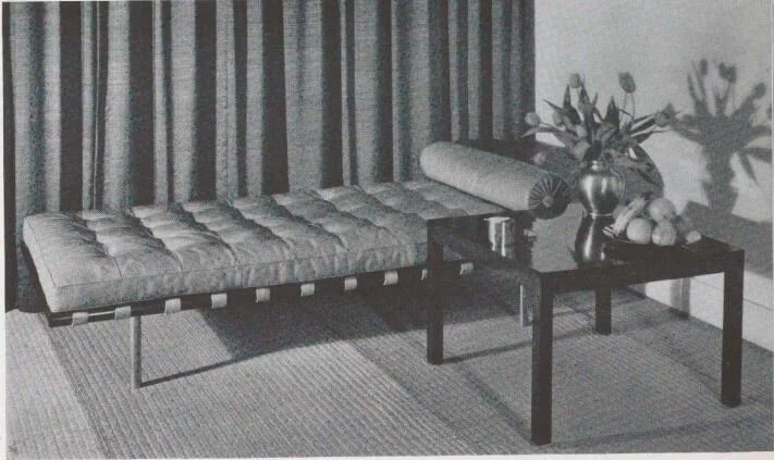
The MoMA book on Mies shows examples of his famous chair designs (the Barcelona, Tugendhat, and Brno chairs), as well as sketches of some speculative designs for furniture to be made of plastic. But the most intriguing image in the book’s furniture section is the one below. It shows Mies’ couch—a design which became iconic from being seen in endless photos of the interior of Philip Johnson’s Glass House. Shown next to it is what can’t be called anything but a Parsons Table.

The image is dated 1930—and that’s well after Breuer’s 1923 children’s table—but the book doesn’t tell us any more bout this particular piece. While the text makes praising statements about Mies’ furniture, it does not address the table in particular, so we don’t get any information on when Mies started using this form of table . We also see this table design—in larger, taller versions—for other spaces which Mies designed in the same era.

Of course, there was also a constant and lively exchange of design ideas throughout the international design community—and that always makes it hard for historians to ultimately determine who influenced whom. Mies might possibly have seen the design elsewhere, and adapted it. Or perhaps the Parsons Table—a design of platonic essence—was bound to be “discovered” multiple times, by several designers? [This happens repeatedly in scientific and engineering invention—and why not in furniture design as well?] A further question is: Was Lilly Reich (1885–1947)—Mies’ close collaborator on exhibition and furniture design—involved in any way? So: Was Mies van der Rohe the/an originating designer of the Parson Table? That’s remains a question to be explored by design historians. We however, find this image endlessly intriguing.

Mies van der Rohe’s couch design is shown here—and it became famous for its inclusion in Johnson’s Glass House. Next to it is a table that has not often been remarked upon: a design which is usually labeled a “Parsons Table”. Its stripped-back, puri…

Mies van der Rohe’s couch design is shown here—and it became famous for its inclusion in Johnson’s Glass House. Next to it is a table that has not often been remarked upon: a design which is usually labeled a “Parsons Table”. Its stripped-back, purist form makes one wonder: How much might Mies van der Rohe have had to do with that design’s origin?

THE “CHURCHILL VILLA” (VILLA URBIG)

Churchill, Truman, and Stalin at the 1945 Postdam Conference. While there, Churchill resided in Villa Urbig.

Churchill, Truman, and Stalin at the 1945 Postdam Conference. While there, Churchill resided in Villa Urbig.

ABOVE: A vintage view of the front of the Villa Urbig.. BELOW: The house’s ground floor plan. with the main entry located at the bottom-center.

ABOVE: A vintage view of the front of the Villa Urbig.. BELOW: The house’s ground floor plan. with the main entry located at the bottom-center.

Before Mies launched upon his Modernist career, It is generally known that he designed some traditionally-styled residences. They often have massing or details of interest, and a few of his early (pre-World War One) works—like the Riehl House—have received some greater attention. Mies’ “Churchill Villa” (more formally known as Villa Urbig) has not received as much focus as Mies’ other architectural works, yet it is of historical as well as formal interest.

urbig+plan.jpg

It is located on the shores of a lake in Potsdam (a municipality which borders on Berlin) and was built from 1915 -to -1917 for Franz Urbig (1864-1944), a prominent German banker—hence the name of house: Villa Urbig. While the house was named after the family which commissioned and originally occupied it, it is more frequently known as the “Churchill Villa”—and that’s because Winston Churchill resided there during the nearby Potsdam Conference—a key meeting, among the leaders of the allies (Churchill, Truman, and Stalin) for planning the post-war world. But Churchill was there for less than ten days. A new Prime Minister had been elected: Clement Atlee, and so Churchill departed the house and that historic conference—and Atlee replaced him at both. Subsequently, the house, which was within the borders of the German Democratic Republic (“East Germany”), was used for guest accommodation and classrooms for an academy. It is now privately owned.

Between the two World Wars, one of the things which Mies focused upon was asymmetrical planning—and this is most clearly manifest in his several layouts for courtyard houses (as well as his celebrated plans of the Barcelona Pavilion and the Tugendhat house.) But Mies never completely abandoned a classical approach to planning—one that relies on symmetrical orderliness—and this can be seen in some of his larger projects for European sites, and in much of the work he did after his emigration to the United States (i.e.: Crown Hall on the IIT campus, and the Seagram Building in New York.) The Urbig Villa is wonderfully planned, and partakes in that classical orderliness: the layout has clarity and is easy to navigate, rooms are generously sized and well proportioned, door and window openings are arranged on axis (“enfilade”), and the most important walls have symmetrical elevations—all features which a careful/caring architect like Mies would bring to his designs, whether they be traditional or Modern. In addition, the exterior elevation, even though it uses traditional and ornamental elements, is handled with Miesian distillation and rigor.

A more recent, color photo of the villa. Though clearly a design which relies on traditional organization, hierarchies, and ornament, the house also shows the geometric discipline and restraint to be found in Mies’ later work. One can even see this …

A more recent, color photo of the villa. Though clearly a design which relies on traditional organization, hierarchies, and ornament, the house also shows the geometric discipline and restraint to be found in Mies’ later work. One can even see this in Mies'’ handling of ornament, whose use is contained within a tight grid of frames; and in the intensely simplified pilasters.

REFRESHMENT STAND “TRINKHALLE”

Of all of Mies van der Rohe’s many works, designed over a period of 60 years, perhaps the most surprising for us was the discovery of a little building that he designed in 1932: the “Trinkhalle” in Dessau, Germany. The literal translation of “trinkhalle” is “drinking hall”—but this was really a small refreshment stand (a kiosk), where patrons would go up to the window to place their orders.

MIes was the director of the Bauhaus from 1930, until its closing in 1933. When he started his directorship, the school was still located in Dessau (in its famous complex of buildings designed by Walter Gropius)—but political pressure led Mies to move the school to Berlin in 1932. Before leaving Dessau, the “Trinkhalle” was the only building realized by Mies van der Rohe in Dessau during the time he was associated with school. According to the official website of the Bauhaus Dessau Foundation:

This book, by Helmut Erfurth and Elisabeth Tharandt, is an in-depth study of the history and design of Mies’ intriguing little building.

This book, by Helmut Erfurth and Elisabeth Tharandt, is an in-depth study of the history and design of Mies’ intriguing little building.

The idea of having a kiosk in this location came from the city of Dessau’s urban planning authority. It was the Lord Mayor of Dessau himself, Fritz Hesse, who asked Mies van der Rohe to come up with a design, because he considered another work of Bauhaus architecture near the Bauhaus buildings a must—even if it were only a kiosk. Under supervision, Mies’ student Edward Ludwig drew up the plans for the architectonically distinctive Kiosk, which was built in 1932.

The Kiosk was not designed as a standard pavilion, but effectively builds on the two-metre-high garden wall surrounding the Gropius House. From outside the wall, all one sees is a window opening with a roof above it; from inside the garden it cannot be seen. The Kiosk became a point-of-sale for alcohol-free beverages, confectionery, tobacco goods and postcards.

The Kiosk survived the war largely intact, but for unknown reasons it was then demolished in the 1960s and replaced by a fence. With the repair of the urban planning environment of the Masters’ Houses completed in 2014 by Berlin-based architects BFM the kiosk also returned to the junction, reduced to its pure form in a contemporary interpretation.

The Kiosk opened again in June 2016 after having been closed for over 70 years. It has now regained its former function and supplies refreshing drinks and coffee at weekends throughout the summer months.

We are glad that Mies little building survived!

After being closed for nearly three-quarters of a century, Mie van der Rohe’s “Trinkhalle” in Dessau has reopened.

After being closed for nearly three-quarters of a century, Mie van der Rohe’s “Trinkhalle” in Dessau has reopened.

LUDWIG MIES Van Der ROHE, WE WISH YOU A HAPPY BIRTHDAY !

P.S. A LITTLE MORE ON MIES: HIS RELATIONSHIP WITH PAUL RUDOLPH

This snapshot was found in the archives of the Paul Rudolph Heritage Foundation. We recognized Mies sitting at the right, but what was the occasion?—and whose arm is that coming out of the left side of the photo?)  In an earlier article, we looked i…

This snapshot was found in the archives of the Paul Rudolph Heritage Foundation. We recognized Mies sitting at the right, but what was the occasion?—and whose arm is that coming out of the left side of the photo?) In an earlier article, we looked into this Miesian mystery…

In addition to our article about how Rudolph was, briefly, considered for the Seagram Building commission (mentioned earlier, and which you can see here), we’ve written several other times about the relationship between Mies and Rudolph.

We’ve addressed Paul Rudolph’s appreciation for Mies most profound work, the Barcelona Pavilion; the influence Mies had on Rudolph’s design work; and about a time Mies and Rudolph encountered each other.

You can read those 3 articles through these links:


IMAGE CREDITS

NOTES:

The Paul Rudolph Heritage Foundation (a non-profit 501(c)3 organization) gratefully thanks all the individuals and organizations whose images are used in this non-profit scholarly and educational project.

The credits are shown when known to us, and are to the best of our knowledge, but the origin and connected rights of many images (especially vintage photos and other vintage materials) are often difficult determine. In all cases the materials are used in-good faith, and in fair use, in our non-profit scholarly and educational efforts. If any use, credits, or rights need to be amended or changed, please let us know.

When Wikimedia Commons links are provided, they are linked to the information page for that particular image. Information about the rights to use each of those images, as well as technical information on the images, can be found on those individual pages.

CREDITS, FROM TOP-TO-BOTTOM:

Seagram Building: photo by Ken OHYAMA, via Wikimedia Commons;  Barcelona Chair and Stool: photo from moDecor Furniture Pvt Ltd., via Wikimedia Commons;  Cover of 1947 Mies van der Rohe monograph: published by the Museum of Modern Art, in association with their 1947 exhibit on Mies;  Traffic Tower perspective rendering, designed by Mies van der Rohe: original source unknown;  Nun’s Island Gas Station: photo by Kate McDonnell, via Wikimedia Commons;  “HIWAY” drive-in restaurant model, designed by Mies van der Rohe: as shown in the 1947 Mies van der Rohe monograph: published by the Museum of Modern Art, in association with their 1947 exhibit on Mies;  “HIWAY” drive-in restaurant model, designed by Mies van der Rohe: pencil drawing by Mies, in the collection of the Museum of Modern Art;  Parsons Table: Woodwork City;  Couch and Table, as shown in the 1947 Mies van der Rohe monograph: published by the Museum of Modern Art, in association with their 1947 exhibit on Mies;  Churchill, Truman, and Stalin at the Potsdam Conference in 1945: U.S. National Archives and Records Administration, via Wikimedia Commons; Churchill Villa (black & white photo): as shown in the 1947 Mies van der Rohe monograph: published by the Museum of Modern Art, in association with their 1947 exhibit on Mies; Churchill Villa (floor plan): as shown on the archINFORM page devoted to the building; Churchill Villa (color photo): photo by Heike Vogt, via Wikimedia Commons;  Ice Cream Stand: photo by airbus777, via Wikimedia Commons;  Snapshot of Mies van der Rohe, seated at table: from the archives of the Paul Rudolph Heritage Foundation, © The estate of Paul Rudolph, The Paul Rudolph Heritage Foundation