Wright & Johnson & Rudolph

Frank Lloyd Wright (left) with Philip Johnson

Frank Lloyd Wright (left) with Philip Johnson

FRANK AND PHILIP

Wright and Johnson: given their contrasting personalizes, background, design orientations, and different generations—they were born nearly 40 years apart—they were not a likely pair.

Yet they had decades of interaction, and two main factors contributed to that ongoing phenomenon:

  • In some ways, architecture is a small world. If you’re in the field, chances are that you know (or know of) scores and even hundreds of colleagues though journal articles, exhibitions, lectures, teaching, organizations, juries, conferences - and now, on-line. And if you’re famous (or ambitious and working on it), it’s likely that you’ve personally met and engaged with each other at the kinds of venues mentioned above. That, in turn, begets even more such occasions and encounters: further exhibits, more meetings, additional panels & symposia, recommendations for fellowships, new conferences… as well as mutual acknowledgment on social media.

  • Charming, social, strategic, ambitious, energetic, mentally sharp - that set of characterizations can accurately be applied to both Wright and Johnson. Creatively, Wright was a force-of-nature - and he can be justly included as one of Modern architecture’s foundational trio (the other two, generally selected for that pantheon, are Mies and Corbusier) And Johnson - whatever you think of his design oeuvre (and we do like some parts of it) - can be well described as an architectural entrepreneur. Not just in the matter of obtaining clients, but rather in the broadest sense of his working to influence & explore culture through exhibits, writing, curation, making connections, public pronouncements, and pouring his personal resources into many projects (a.k.a.: various kinds of patronage.)

Wright did those things too, but with Johnson it was a bit different. It seems funny to say it, but in a way Johnson was the less selfish of the two. Wright was relentlessly focused on himself and his self-designed community/universe. But Johnson - while no slouch when it came to self-promotion, and in actively seeing out clients for his growing practice - was also sending energy outwards. So the exhibits, books, organizations, and other projects to which Johnson contributed or organized were not always just about him—and that’s a contrast with Wright.

There were a variety of occasions and reasons for them to interact - as recounted in a full-length study of the pairing by Hugh Howard.

Hugh Howard’s recent book on Wright and Johnson, “Architecture’s Odd Couple” Photo: Bloomsbury Press

Hugh Howard’s recent book on Wright and Johnson, “Architecture’s Odd Couple” Photo: Bloomsbury Press

Some of Johnson’s projects brought them together, most notably MoMA’s “Modern Architecture: International Exposition” of 1932, for which Philip Johnson and Henry-Russell Hitchcock were the curators (which also resulted in an equally famous and influential book & phrase: “The International Style”). Wright, possibly annoyed at not being the show’s center of attention, was grouchy about the whole thing and seems to have played “hard-to-get” - but he did eventually decide to take part in this historically significant exhibition.

Wright’s work, as shown in MoMA’s architecture exhibition. Photo: The Museum of Modern Art, New York

Wright’s work, as shown in MoMA’s architecture exhibition. Photo: The Museum of Modern Art, New York

PAUL AND PHILIP

A snapshot of Philip Johnson (with folder in hands), Paul Rudolph (in center, on stool), and Vincent Scully (to the right of Rudolph), at a Yale architecture school jury in 1960. Photo: Stanley Tigerman

A snapshot of Philip Johnson (with folder in hands), Paul Rudolph (in center, on stool), and Vincent Scully (to the right of Rudolph), at a Yale architecture school jury in 1960. Photo: Stanley Tigerman

Paul Rudolph and Johnson were old friends, rivals, and sociable sparring partners. For example: Rudolph invited Johnson to teach at Yale; they’d dine together at a pub about midway between their Manhattan homes; they’d poke fun at each other’s work; and Rudolph was a welcome guest at Johnson’s famous Glass House estate in New Canaan.

Sunset at Philip Johnson’s Glass House. Photo: Arthurious.com

Sunset at Philip Johnson’s Glass House. Photo: Arthurious.com

A WEEKEND IN THE COUNTRY

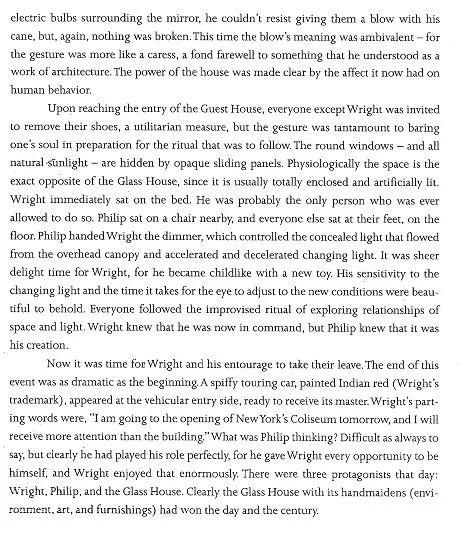
A special 1996 issue of ANY [Architecture New York] magazine was devoted to celebrating Philip Johnson’s 90th birthday. 33 essays, from luminaries ranging from Stanley Tigerman -to- Zaha Hadid -to- Hans Hollein -to- Kevin Roche (and 29 more!) offered their memories, thoughts, anecdotes, and tributes to Johnson - including one from Paul Rudolph, titled “A Sunday Afternoon.” As you’ll see, it records a unique occasion when the three of them - Wright, Johnson, and Rudolph - were together:

Now that’s what we’d call a perfect day.

Paul Rudolph's design for MoMA’s ‘FAMILY OF MAN’ Exhibition

Paul Rudolph’s plan-perspective drawing for the layout for the Museum of Modern Art’s Family of Man photography exhibition, which opened in 1955. Image: Library of Congress

Paul Rudolph’s plan-perspective drawing for the layout for the Museum of Modern Art’s Family of Man photography exhibition, which opened in 1955. Image: Library of Congress

A SPECTACULARLY SUCCESSFUL EXHIBIT

The Family of Man was a photography exhibition held at the Museum of Modern Art in New York City in 1955. Edward Steichen—himself a distinguished photographer, and the curator of the show (and whose widow eventually became a Rudolph client)—had the prodigious task of making the selection from submissions from all over the world. It ended up being a sweepingly large show, with over 500 photographs, from 69 countries, and by 222 photographers.

Edwin Steichen, the Director of the Museum of Modern Art’s Department of Photography, facing the task of selecting & organizing photographs for the exhibit. Photo: MoMA

Edwin Steichen, the Director of the Museum of Modern Art’s Department of Photography, facing the task of selecting & organizing photographs for the exhibit. Photo: MoMA

MoMA concisely describes the exhibit as follows:

This ambitious exhibition, which brought together hundreds of images by photographers working around the world, was a forthright declaration of global solidarity in the decade following World War II. Organized by noted photographer and director of MoMA’s Department of Photography Edward Steichen, the exhibition took the form of a photo essay celebrating the universal aspects of the human experience. Steichen had invited photographers to submit photographs for consideration, explaining that his aim was to capture “the gamut of life from birth to death”—a task for which, he argued, photography was uniquely suited. The exhibition toured the world for eight years, attracting more than 9 million visitors.

The show included photos that have become absolute “classics” in the history of photography, like this famous image of an American migrant worker and her children: Dorothea Lange’s photograph, “Migrant Mother”

Image: Library of Congress

Image: Library of Congress

By-the-way: MoMA’s point, about the exhibit touring the world, makes it more accurate to say that this was a set of exhibitions, for - after its initial showing at MoMA in 1955 (the one designed by Paul Rudolph) - copies or versions of the exhibit were shown all over the globe, in over 3 dozen nations (and sometimes in a several cities within a country). This included exhibits in some iron-curtain countries - which, itself, might be considered quite an achievement right in the heart of the Cold War.

The show has had further life as a book which, well over half-a-century since it came out, seems to have been continuously in-print—an amazing record. [And, not long ago, a special 60th Anniversary Edition was published.]

The meaningfulness of the show’s collection of photos---that particular selection, and the way they were organized—can not only be gauged by the attendance figures to the shows, but also by comments from readers of the book version. Here are two samples from readers (who commented on Amazon):

“I have read this book over and over again … and bought copies for my children and my aged grandfather. Since the MoMA republished it, all my grandchildren are getting a copy as birthday presents. The meaning of each photograph is easily understood by all cultures, and is a timeless portrayal of life from love, birth, living life and eventually, death.”

“In the maddening fast pace time we live in, where we are presented with false dichotomies and "news" that promotes division and futility of purpose this book - this magnificent book - draws the reader into a calmer, slower pace, awe inspiring appreciation for the beauty and wonder of our species. When I first opened its pages I was skeptical - prepared to be disappointed by another commercial knock off that pretends to be one thing and ends with a solicitation to buy into some self serving, blame evoking finger pointing view, on the one hand, or an unrealistic, romanticized characterization of a simple and simplistic view of the good old days. An hour into the book I was completely captured by the poets and artists portrayal of the human family.”

AN INTEREST IN EXHIBIT DESIGN

Rudolph created a number over exhibitions over the decades (including with the Museum of Modern Art, prior to the Family of Man show), and exhibit design seems to have been an ongoing interest of his. The Rudolph-designed duplex apartment, within the Modulightor Building, has a portion of Paul Rudolph’s library—and in it we found a copy of a book he owned on Franco Albini (1905-1977)—the multi-talented Italian architect.

Photo of the book in the Library of the Paul Rudolph Heritage Foundation

Photo of the book in the Library of the Paul Rudolph Heritage Foundation

Albini was a prolific designer of exhibits, as shown in these spreads from the book:

Photo of the book in the Library of the Paul Rudolph Heritage Foundation

Photo of the book in the Library of the Paul Rudolph Heritage Foundation

The book came out (and was acquired by Rudolph) decades after the Family of Man show—so we cannot say this publication influenced Rudolph. We only mention it as evidence of Rudolph’s ongoing interest in the topic of exhibit design.

A SUCCESSFUL EXHIBIT DESIGN

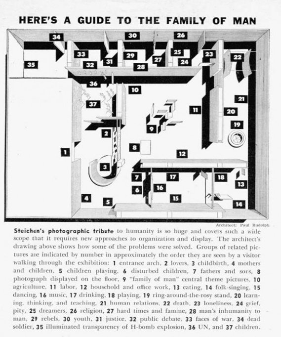
A plan of the Family of Man exhibit, with explanatory labels and notes. This version was in an article about the show that appeared in Popular Photography magazine.

A plan of the Family of Man exhibit, with explanatory labels and notes. This version was in an article about the show that appeared in Popular Photography magazine.

Rudolph used about all imaginable methods & arrangements to display/mount/show the hundreds of photographs in the show—and sometimes it seems like he wanted to try every possible variation. Yet the show seems to have had coherence, and the multiple display techniques worked well with the photographic materials.

These many techniques included:

  • Large-scale (wall-spanning) enlargements of a single photograph

  • Wall mounting in a pattern of De Stijl-ian grids

  • Suspension from rods (coming from the ceiling)

  • Mounting on rods (coming up from the floor)

  • Mounting over “island”-like, space-defining platforms

  • Suspending within a vignette, created by a cyclorama of fabric, below a glowing circular ceiling

  • Showing them against a transparent background window—so as to provide glimpses through the assemblage of photos, to the next space

  • Suspended in groupings of large panels—and…

  • And thickening the edges of those panels, to give them visual substance

  • Collected together in smaller, more intimate sizes

  • Isolating a single photo, so as to give it dramatic focus

  • Placing a horizontal line of photos along curved convex walls—indeed, having two such matching walls face each-other, so as to create a compressed spatial transition into the next gallery

  • Creating free-standing, curved, island-like display “objects”—with the photos placed at low viewing angles

  • Cantilevering photos—fin-like—off the wall (at 90 degrees to the wall’s main plane

  • Cantilevering photos—fin-like—off vertical poles

  • Placing a giant photo on the ceiling

  • Suspending large photos in visually-strong, contrastingly-dark wood framing elements

There are probably more, but the above list—and the below portfolio of installation images—will give you an idea of the inventiveness that Rudolph brought to this challenge.

A BOOK ABOUT THE EXHIBIT?

We’ve mentioned the well-known Family of Man book which came out of the show (and the new, anniversary edition)—but the exhibit design, per se, certainly deserves its own monograph. Did such a book ever come out?

No and yes. There’s never been, to our knowledge, a book focused on the design of the show. But we did discover that a deluxe edition of the Family of Man book was published: a version which includes an “A special portfolio of photographs by Ezra Stoller” showing the exhibit installation. That section starts off with this page:

Photo of the book in the Library of the Paul Rudolph Heritage Foundation

Photo of the book in the Library of the Paul Rudolph Heritage Foundation

Paul Rudolph’s participation in the exhibit had been fully acknowledged in MoMA’s own 1955 press release for the show—and it is also clearly indicated in the deluxe edition of the book:

Photo of the book in the Library of the Paul Rudolph Heritage Foundation

Photo of the book in the Library of the Paul Rudolph Heritage Foundation

Here’s an example of the installation shots, as shown from a section of the book:

Photo of the book in the Library of the Paul Rudolph Heritage Foundation

Photo of the book in the Library of the Paul Rudolph Heritage Foundation

Good news:  We have a copy of that deluxe edition in the library of the Paul Rudolph Heritage Foundation. But if you would like to have one of those deluxe editions for your own, it seems that copies do show up on the websites of on-line booksellers, like Abebooks and Amazon.

Up, Up, and Away! It’s a bird, it's a plane - IT’S CONCRETE?

LIGHTWEIGHT CONCRETE

There’s concrete that floats—“aerocrete”—and boats have been built of concrete. Now they’re seriously testing the material for the construction of submarines.

Photo: Wilfried Ellmer

Photo: Wilfried Ellmer

But can it also be used for flying?

 I MEAN - REALLY - FLY?

For a long time, the phase “like a concrete balloon” has been used to denote an extremely unworkable or unpopular idea. Yet the idea that concrete may have a place in the air has left traces through history. The Ilyushin II-2, the prolifically produced Soviet fighter aircraft of WWII, had many nicknames, and German pilots sometimes called it “Betonflugzeug” (concrete plane)—presumably for its toughness.

But has concrete ever actually been used in aeronautics (other than its widespread use for runways)?

It’s not for lack of trying. David Haberman and Tyler Pojanowski, a couple of clever students from the South Dakota School of Mines and Technology, built a remotely-controlled model aircraft which successfully flies and lands - and its 18 pounds include 40” wings, tail, and body - made of made of concrete!

Photo: Debra Cleghorn

Photo: Debra Cleghorn

Beyond that, the pickings are slim—and we may have to look in other directions.

HOW ABOUT FLYING ARCHITECTURE?

There are flying structures which have been made to look like buildings, like this flying cathedral:

53ea017beb691c55ab6431526f23cee6.jpg

And the late publisher & collector Malcom Forbes was famous for his unique set of joyously diverse balloons, one of which was designed to look like one of his own homes, a chateau on France:

PCUNOR014FS0006K_3.jpg

And then there are buildings which are not literally flying—but which look like they could. In that category, there are numerous examples to choose from—like this one, which looks like it just landed (but from what planet?): the Buzludzha Monument, built in Bulgaria and opened in 1981:

Photo: Mark Ahsmann via Wikipedia

Photo: Mark Ahsmann via Wikipedia

And there’s Will Alsop’s OCAD college building in Ontario, which looks like it would float off, were it not tethered to the ground:

Credit: Photograph by Taxiarchos228, with technical assistance by Niabot

Credit: Photograph by Taxiarchos228, with technical assistance by Niabot

BUILDINGS FOR FLIGHT

And that brings us to a last category: buildings made for flight - that is to say, to serve the world of aviation. Buildings in this category would include hangars - a fascinating building type in its own right. Some of the most amazing were made to store and protect large dirigibles and airships - and the structures had to be correspondingly huge, with substantial clear spans.

A famous example is Hangar One at Moffet Field in California - one of he world’s largest freestanding structures:

The USS Macon inside Hangar One at Moffett Field on October 15, 1933 — following a transcontinental flight from Lakehurst, New Jersey. Photo: Moffett Field Historical Society

The USS Macon inside Hangar One at Moffett Field on October 15, 1933 — following a transcontinental flight from Lakehurst, New Jersey. Photo: Moffett Field Historical Society

Much more familiar to us are the airline terminals themselves—after all, most of us are more likely to use and experience them, rather than any other kind of airport building. Some architects have certainly tried to instill a sense of the spirit of aviation in their buildings—and a fine example is by Hellmuth, Yamasaki and Leinweber (a predecessor of Hellmuth, Obata & Kassabaum). Their Lambert-St. Louis airport in St. Louis, 1951-1956:

Photo: Art Grossman

Photo: Art Grossman

And this really brings us to the ultimate expression of flight, via concrete: Eero Saarinen’s TWA Flight Center, at New York’s Kennedy Airport. Saarinen (1910-1961) was, like Paul Rudolph, considered a “formgiver” architect. What they meant by that term can be discerned from what architectural critic Paul Goldberger wrote of Saarinen’s work: 

“Buildings like Saarinen's TWA terminal at John F. Kennedy International Airport or his Dulles International Airport outside of Washington, D.C. … were of interest to architectural cognoscenti and laymen alike. Their swooping forms and sense of adventure excited everyone….”

Rudolph, Saarinen, Johansen, Yamasaki (as in the air terminal noted above), Belluschi, Le Corbusier - in his later phases - and others brought an exciting bravado to the forms they produced.

Even Wright’s Guggenheim Museum could be seen to be part of that set of boldly shaped buildings - and not only did it have a readily identifiable shape, it also had a sense of movement. Ditto for Paul Rudolph’s Temple Street Garage in Boston - an exceptionally fine part of his oeuvre - and one that celebrated automotive movement through the buildings dramatically sculpted curves.

Photo: New Haven Preservation Trust Archives

Photo: New Haven Preservation Trust Archives

But of all the works designed during that period, Saarinen’s TWA must be placed at the top of the pantheon of buildings dedicated to the constituent spirits of aviation: swiftness, arising, loftiness, adventure, transcendence, and grace. While often likened to a giant concrete bird, Saarinen said it was not meant to look or symbolize an avian, but rather to convey the spirit of flight itself. If concrete could ever be said to take flight, it was here!

INSERT 3 IMAGES:

First image: 

Credit: Roland Arhelger
Credit: Library of Congress, Prints & Photographs Division, Balthazar Korab Archive at the Library of Congress

Credit: Library of Congress, Prints & Photographs Division, Balthazar Korab Archive at the Library of Congress

Credit: pheezy

Credit: pheezy

Eero Saarinen received the commission from TWA in 1955, and the building had a long, fascinating development and seems to have been very successful—all of which is delightfully recorded in a monograph devoted to it. The great architectural photographer, Ezra Stoller, made the canonical photos of it, and they too were collected into a volume. It opened in 1962—the year after the architects sad, sudden, and early passing—buy in the wake of TWA’s financial troubles, operations at the terminal ended in late 2001. 

But that was not the end. Numerous proposals for the buildings use have been offered—like it becoming a conference center or museum—and the building was to be part of Jet Blue’s operations at Kennedy Airport. Yet the building has been largely empty for nearly 2 decades, and nothing ever seemed to fully develop to the point of construction.

Until now.

MCR Development is the 6th largest hotel owner-operator in the US. One project of theirs, of especially architectural interest, is in a mid-1800’s building: they’ve transformed a portion of the Union Theological Seminary, in Manhattan’s Chelsea neighborhood, into a stylish hotel. And MCR is now moving ahead with the transformation of the TWA terminal into a luxury hotel.

Image: MCR Development

Image: MCR Development

Groundbreaking was in December, 2018, and some time in 2019 they expect that you can come to Saarinen’s masterpiece to stay the night, dine, wed, confer, swim—and enjoy this superb work of Modernism.

Can concrete fly?

Yes, the way that Saarinen did it at Kennedy Airport—and TWA’s great building flies again!

Image: Time Out New York

Image: Time Out New York

Paul Rudolph & Education

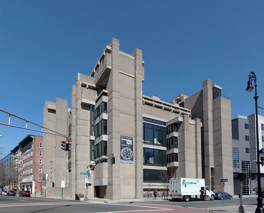
The Yale Art & Architecture Building—now rededicated as Rudolph Hall—which Paul Rudolph designed (and was constructed and completed) during the time he was chair of the Yale’s school of architecture. Photo: Sage Ross, Wikipedia

The Yale Art & Architecture Building—now rededicated as Rudolph Hall—which Paul Rudolph designed (and was constructed and completed) during the time he was chair of the Yale’s school of architecture. Photo: Sage Ross, Wikipedia

Paul Rudolph was involved in so many tributaries of the world of design—architecture, urbanism, interiors, furniture, and lighting. But also in design education in its many forms: teaching, writing, lecturing, mentoring, and—most famously—as chair of Yale’s architecture school from 1958 to 1965.

In his Yale Alumni Day speech, given as he was about to assume the chairmanship, he concluded with these ever-thrilling, adventurous, and toughly challenging words:

 We must understand that after all the building committees, the conflicting interests, the budget considerations, and the limitations of his fellow man have been taken into consideration, the architect’s responsibility has just begun. He must understand that exhilarating, awesome moment.

 When he takes pencil in hand, and holds it poised above a white sheet of paper, he has suspended there all that has gone before and all that will ever be.

Under his leadership, he helped the school become one of the country’s most dynamic places to get an architectural education—and not the least of those reasons is the great diversity and quality of teachers and guest jurors which Rudolph invited to the school.

These were certainly not all people who agreed with Rudolph. An example would be Serge Chermayeff, who was invited by Rudolph to come to Yale—and became a rather controversial figure within the school.

Serge Chermayeff (1900-1996), architect, designer, and educator. Photo: Alchetron

Serge Chermayeff (1900-1996), architect, designer, and educator. Photo: Alchetron

Serge Chermayeff’s studio-vacation house in Cape Cod. Photo: The Modern House

In an oral history interview about his years of educational work (in Chicago and elsewhere), Chermayeff recalled:

I left in 1962 to go to Rudolph in Yale and he very typically said, “I’d love to have somebody on the jury with whom I can argue in front of the students.” That suited me very well because I’m very argumentative. I had a lovely time because he was a very nice man, I liked him very much and we got on very, very well.

The 7 years that Rudolph was chair at Yale - a good long run, for any chair or dean - continue to fascinate.

Photo: Google

Photo: Google

Numerous former students of Rudolph affirm that it was a super-intense (and maybe the) key educational experience of their lives, as Norman Foster did in his heart-felt essay on Rudolph. [It is one of several chapters devoted to Paul Rudolph in Architects on Architects, edited by Susan Gray.]

In the compulsively readable, pulls-no-punches memoir by the ever-creative Stanley Tigerman, Designing Bridges To Burn—truly a must-read!—he also shares scenes and feelings from his years as a student at Yale (and, simultaneously, a part-time employee of Rudolph.)

Stanley Tigerman

Stanley Tigerman

Tigerman’s book ‘Designing Bridges to Burn’

Tigerman’s book ‘Designing Bridges to Burn’

Here’s a brief quote from it:

“For Paul Rudolph, architecture and life were inextricably intertwined. He lived, breathed, slept, lectured, taught, and of course practiced architecture. I was thoroughly bedazzled by the depth of his commitment to unpacking the never-endling layers of space and mas that architecture represented for him. He was, other than simply being a superb teacher, the consummate architect, if by that one means a person who, in a Zen-like sense “became” his work. In all these years of practicing the discipline, if there was anyone I met who “walked the walk” it was Paul Marvin Rudolph.”

Robert A. M. Stern, former Dean of Yale’s school of architecture. He is shown standing on a portion of Rudolph’s Yale Art & Architecture building. Yale’s Harkness Tower is in the background. Photo: Peter Aaron/OTTO

Robert A. M. Stern, former Dean of Yale’s school of architecture. He is shown standing on a portion of Rudolph’s Yale Art & Architecture building. Yale’s Harkness Tower is in the background. Photo: Peter Aaron/OTTO

Robert A. M. Stern was an architecture student at Yale during the Rudolph years - in fact, Stern’s thesis was presented at the last review which Rudolph attended before leaving the chairmanship in 1965. Paprika (the student publication of Yale’s architecture school) conducted a fascinating, wise, and hilarious interview with Stern, just before he stepped-down from the deanship at Yale. Paul Rudolph comes up quite alot - and we really recommend a full reading of this extraordinarily frank and fun session.

60843d0a6e99a6ee5e28f0fffd470094.jpg

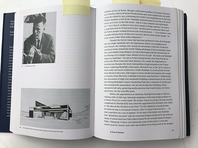
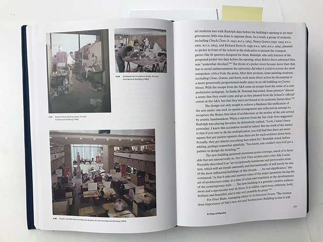
For a comprehensive overview - a deep and utterly interesting dive - into a century of the history of Yale’s School of Architecture, we recommend looking at this fascinating book - a copy of which we’ve just acquired for the library of the Paul Rudolph Heritage Foundation:

Pedagogy and Place: 100 Years of Architecture Education at Yale
By Robert A. M. Stern and Jimmy Stamp
Published by the Yale University Press
https://yalebooks.yale.edu/book/9780300211924/pedagogy-and-place

The book—spanning from 1916 -to- the school’s centennial in 2016—covers its early traditional and Beaus-Arts beginnings, it’s turn towards Modernism, the Rudolph era, and the interesting transformations since then. But, while deeply & fully-researched and aplenty with citations, this is not dry academic writing—instead: it is a richly told story, with strong personalities that are vividly portrayed.

The section dealing with the years when Rudolph was chair is titled “A Time of Heroics 1958-1965”—and here are a few shots of illustrated page spreads from that chapter:

AN INVITATION:

Rudolph-as-Educator is an enticing potential focus for further research, and we would like to return to it in the future. If any readers would like to share memoires (or materials) relating to this, we’d certainly welcome them - and that would fuel additional explorations of this important subject.

If there’s anything you’d like to share, please feel welcome to contact us at office@paulrudolphheritagefoundation.org

Paul Rudolph's Parcells Residence

Paul Rudolph’s Parcells Residence. Photo: The Architect’s Newspaper; photo by Michelle & Chris Gerard

Paul Rudolph’s Parcells Residence. Photo: The Architect’s Newspaper; photo by Michelle & Chris Gerard

Location:  3 Cameron Place, Grosse Point, Michigan, 48230
Designed for:  Dr. Frank H. Parcells and Mrs. Anne Parcells (and their five children)
Design initiated:  1967
Construction completed:  1971

A MOTIF EXPLORED—AND RETURNED TO

Paul Rudolph’s oeuvre was large: he did many projects, built & unbuilt, over a half-century career - and the over 150,000 drawings that he and his team produced (with no computers in sight!) are testament to his energy & activity. 

And his oeuvre was broad: he worked on everything from government centers to churches to guest houses to a dentist’s office.

Further, his oeuvre varied:  Many people only associate him with concrete, used in bold and/or sculpted forms. But Rudolph worked in all kinds of materials (including some handled with great delicacy), and his formal vocabulary varied with the project, from severely volumetric to balletically nimble.

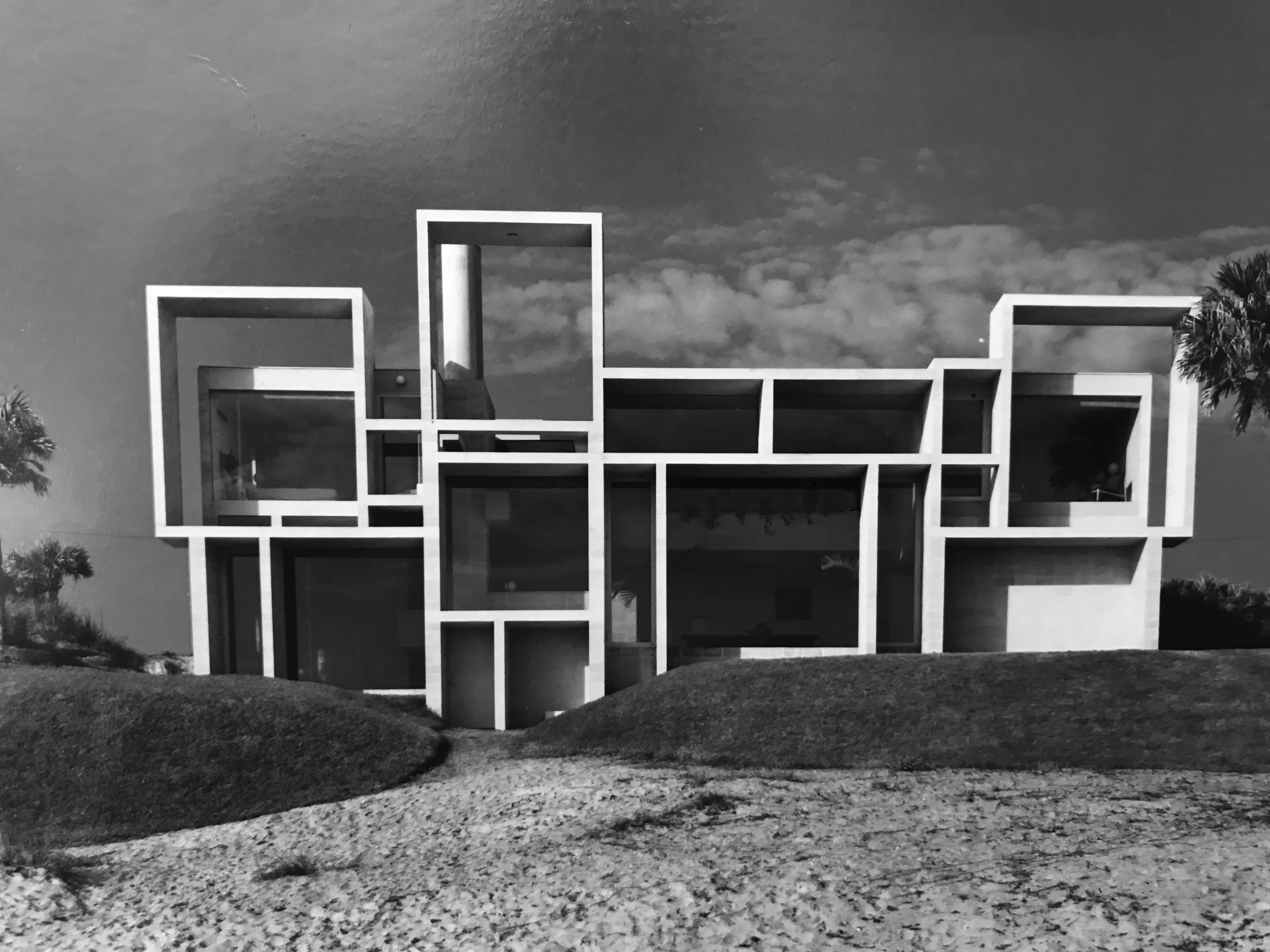
For facade design, one of the formal motifs he explored—over the decades—could be characterized as a Mondrian-like composition of overlapping/interpenetrating rectangles. In one of his very greatest, most iconic designs, the Milam House (Jacksonville, Florida, 1961), he uses rectangles that are made of concrete block (for the vertical elements) and concrete slabs (for the horizontal elements). The rectangles, facing the water, have deep recesses which work very well for sun-shade, and they give the building its signature “Mondrian-ian” look. The faces of the rectangles are all in the same plane.

The Milam Residence. Photo: Joseph Molitor, courtesy Avery Architectural & Fine Arts Library

The Milam Residence. Photo: Joseph Molitor, courtesy Avery Architectural & Fine Arts Library

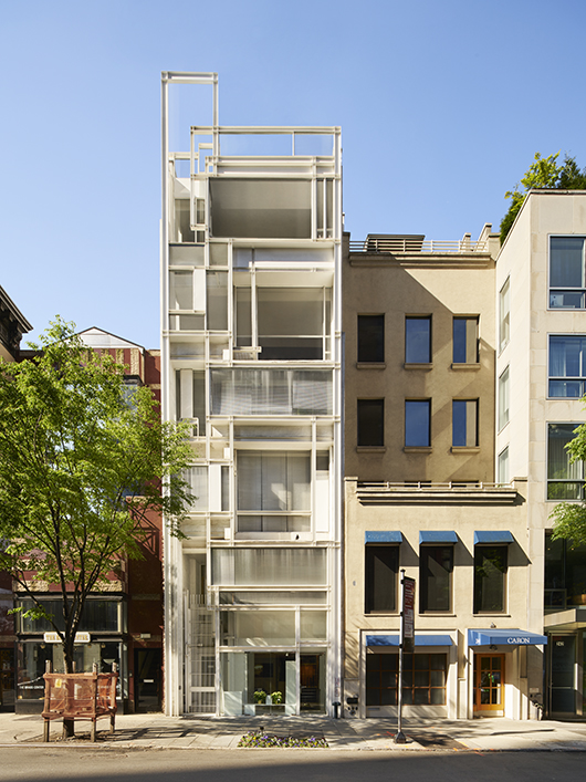
Decades later, Rudolph returned to these motifs in the 58th Street elevation of the Modulightor Building in New York City (which commenced construction in 1989). It is the home of the Modulightor company (that Rudolph co-founded), and the place where he had his office for over half-a-decade. But there, instead of the rectangles having a primarily planar relationship, they move back-and-forth in space, receding and advancing: Rudolph is sculpting with those elements. Also, instead of masonry & concrete (as at Milam), the Modulightor facade is made from a very different pallete: primarily steel and glass—and that gives it a significantly lighter feel. It is Mondrian meets Mies---but sculpted with significantly greater spatial complexity than Mies brought to most of his facades.

The Modulightor Building, home to the Paul Rudolph Heritage Foundation. Photo: Annie Schlecter, Paul Rudolph Heritage Foundation Archives

The Modulightor Building, home to the Paul Rudolph Heritage Foundation. Photo: Annie Schlecter, Paul Rudolph Heritage Foundation Archives

More than a half-decade after Milam, in the Parcells Residence, Rudolph returns to the Mondrian-ish mold. As with his Callahan Residence project (of 1965—approximately the same time) Parcells is also a symphony of interpenetrating & adjacent rectangles, with the plane of the window glass well recessed from each rectangles’ face plane.

Callahan Residence project, Birmingham, AL, 1965. Image: Paul Rudolph Heritage Foundation Archives

Callahan Residence project, Birmingham, AL, 1965. Image: Paul Rudolph Heritage Foundation Archives

But in Parcells (and Callahan)—in a design done more than a half-decade after Milam—he plays with them in a different way:  the rectangles become less actors in an integrated planar facade, and instead turn into identifiable, separate rectangular volumes. These boxes, of various sizes and proportions, are composed in a complex interplay: it is Mondrian’s “neo-plasticism”—but this time in three dimensions.

PRECEDENTS AND LINEAGES

Some may claim that Rietveld’s Schröder House, of 1924, anticipated this three-dimensional exploration—but a careful viewing of that architectural icon will show that it is more about the play of planes than of volumes.

Schröder House, Utrecht, Netherlands. Photo: Husky from Wikipedia

Schröder House, Utrecht, Netherlands. Photo: Husky from Wikipedia

A similar claim could be made for Frank Lloyd Wright’s Fallingwater, of the mid-1930’s. Wright is often cited as one of the two great influences on Rudolph (the other being Le Corbusier). We would never want to begrudge anything to Wright—that master and “force-of-nature”—but in this case, Fallingwater might not be a very relevant precedent. Fallingwater’s signature view shows giant, dramatically floating and separate volumes, rather than the interpenetration and close association of volumes that Rudolph achieves at the Parcells Residence.

With all the citations of possible precedent and influences - the historians’ favorite game! - perhaps it might be fairest to say that Paul Rudolph was working in a lineage (or a family) of forms & relationships that had been earlier pioneered by several of the founders of Modernism - works that Rudolph would be well aware of.

THE PARCELLS RESIDENCE

Michigan Modern—an organization devoted to researching, celebrating, and expanding apperception of the “Great Lakes State’s” extensive legacy of Modernism—has a web page devoted to the Parcells Residence. It gives this excellent summary of the project:

The house at 3 Cameron Place in Grosse Pointe was constructed in 1970 for Frank H. Parcells, his wife, Anne, and their five children. Desiring a contemporary design for their new home, the Parcells attended numerous open houses in the western Detroit suburbs and conducted research to hone in on their architectural likes and dislikes. Acting on a friend's recommendation, they contacted and eventually selected architect Paul Rudolph for the commission.

The Parcells' program for the new house included five bedrooms on multiple levels, an office with a separate entrance, views of Lake St. Clair from the kitchen and living room, and "lots of wood." Although the Parcells' home would be one of the first constructed in the new subdivision, they were sensitive to the fact that they would be inserting a contemporary design into a neighborhood that consisted largely of traditional Colonial and Tudor-inspired residences. The lakefront property's location at the end of a cul-de-sac and its abundance of trees created a somewhat isolated setting and worked well to buffer the house visually from the rest of the neighborhood. Construction of the residence proved to be a challenge for local builders. Ultimately, they prevailed and the Parcells moved into their new home in January 1970.

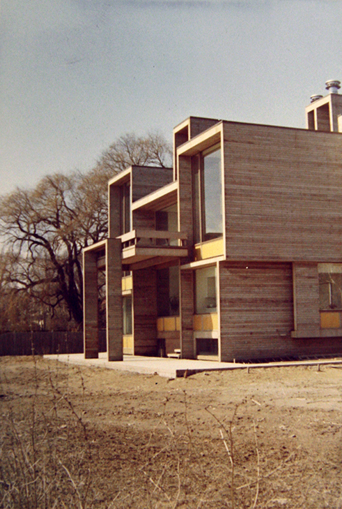
The Parcells House is located in an affluent neighborhood in Grosse Pointe. The lake-front property is located at the extreme southern end of Cameron Place, and the house is sited in the center of the lot. Landscaping consists of a manicured lawn on the lake side of the property to facilitate views of the water from the house, while the rear, or street-side of the property, is heavily planted with large trees and bushes to provide privacy. The lot is accessed by a narrow drive extending from the end of the cul-de-sac. The house is barely visible from the public right-of-way. The three-story residence is sculptural in its form. The south elevation facing the water consists of a series of box-like projections, differing in size and shape and infilled with walls of glass. The tripartite window walls are recessed within the "boxes" and are divided by heavy muntins with a light-colored spandrel panel below. A porch supported by wide wood columns projects from the center of the elevation. The entire building is clad with horizontally oriented redwood boards painted dark brown. The north-facing elevation is made up of similar projecting boxes, however, there is much less glazing present. The boxes extend further from the central mass of the structure on this elevation. The extensions include two offset single car garage bays.

They also point out that “The Parcells House is the only residence in Michigan designed by renowned architect Paul Rudolph.”

SITING

For the context, it is worth looking at this aerial view. The Parcells Residence is at the bottom-center of this image (in this picture it has a pinkish roof) - and one can see its pleasurable relationship to the water. The circular drive (at top-center) is the cul-de-sac at the end of Cameron Place.

Image: Google Maps

Image: Google Maps

A LESSER USED MATERIAL?

Notable is Rudolph’s use of wood in this house. Paul Rudolph is most often identified with concrete (and later, concrete block)—but throughout his career, Rudolph used about every possible material, and was sometimes quite adventurous in his choices. Wood was certainly prominent in the first phase of his work in Florida, where it was often dominant (along with glass) in the houses he designed. But, though less-used by Rudolph, from time-to-time he returned to wood during his career: sometimes as the frame within buildings, sometimes enclosed in another material (as in the Micheels Residence of 1979), and sometimes as exposed structure (as in the hefty interior beams of the Tuttle Residence of 1984). Rudolph did not often go for a “woodsy” material look (as at Parcells)—but it was not utterly alien to his palette, and one can see an elegant example of his using it in his Bernhard Residence Addition of 1976

Bernhard Residence Addition by Paul Rudolph, using primarily wood elements. Photo: Paul Rudolph Heritage Foundation Archives

Bernhard Residence Addition by Paul Rudolph, using primarily wood elements. Photo: Paul Rudolph Heritage Foundation Archives

A PARCELLS PORTFOLIO

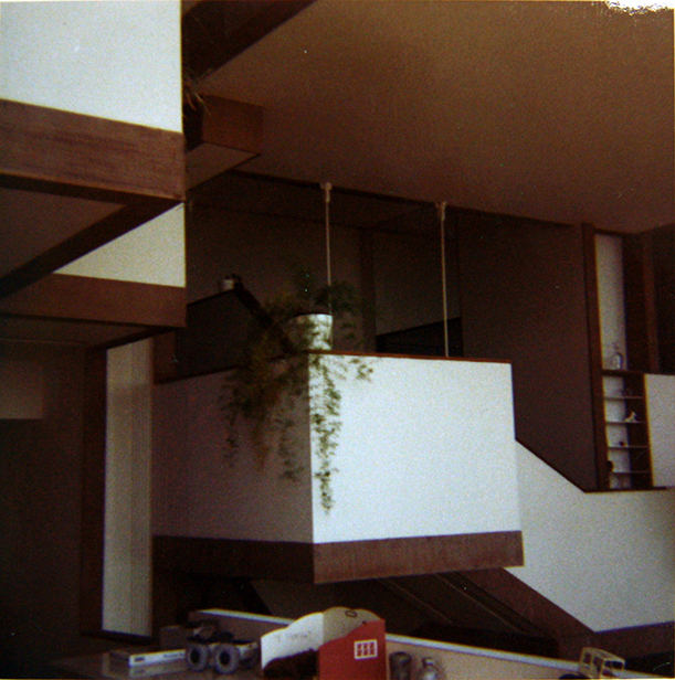
Below are some images of the house: drawings, and exterior & interior views. They convey the creativity and attention which Rudolph brought to projects like this.

The issue of “attention” is an important one—and this residence is an example of what’s been called “through design”: where the architect designs everything from the overall conception though to the smallest details. But “through design” doesn’t only indicate an attentive designer, it also denotes a project where the overall concept has been faithfully expressed at all scales.]

DRAWINGS:

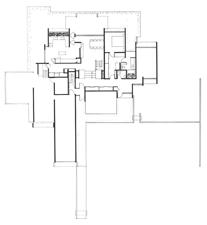
Ground Floor Plan. Image: Paul Rudolph Heritage Foundation Archives

Ground Floor Plan. Image: Paul Rudolph Heritage Foundation Archives

Second Floor Plan. Image: Paul Rudolph Heritage Foundation Archives

Second Floor Plan. Image: Paul Rudolph Heritage Foundation Archives

Third Floor Plan. Image: Paul Rudolph Heritage Foundation Archives

Third Floor Plan. Image: Paul Rudolph Heritage Foundation Archives

Section through the building. Image: Paul Rudolph Heritage Foundation Archives

Section through the building. Image: Paul Rudolph Heritage Foundation Archives

CONSTRUCTION PHOTOS:

EXTERIOR VIEWS:

INTERIOR VIEWS:

Paul Rudolph - On Film & Video

Image: Dreamstime.com

Image: Dreamstime.com

If you’re interested in Paul Rudolph, you’re probably already getting to know his many buildings and urban design projects. The Paul Rudolph Heritage Foundation’s Project Pages are a great way to learn about the great breadth of his work, over Rudolph’s half-century of practice.

Of course, there are superb books on Rudolph—and perhaps you might already be looking into Rudolph’s own writings—of which there is a fine anthology published by Yale University Press.

Writings on Architecture book cover.JPG

But what was he like, in person? - what was Rudolph’s voice and presence like? We have, in books (and in the PRHF’s files) a variety of testimonies by students, employees, friends, and clients. Some of them will be published in the upcoming catalog of the recent centennial exhibit: Paul Rudolph: The Personal Laboratory (and we may also share even more of them, in upcoming postings).

But for a more lifelike experience, there are also a several videos that you might want to seek out:

PAUL RUDOLPH’S LECTURE: “THE DNA OF ARCHITECTURE”

Paul Rudolph speaking about the ‘DNA of Architecture’. Photo: SCI-Arc Media Archive, YouTube

Paul Rudolph speaking about the ‘DNA of Architecture’. Photo: SCI-Arc Media Archive, YouTube

Rudolph wrote an essay with this same title—you can read it in the anthology of his writings mentioned above—and he also delivered it as an illustrated lecture, of which this is a recording. This video is viewable on YouTube, and is from the SCI-Arc Media Archive. This lecture was given on September 2, 1995, and is described as follows:

Ray Kappe introduces Paul Rudolph, discussing Rudolph’s break onto the post WWII architecture scene and his influence on Kappe and his contemporaries. Kappe goes on to explain Rudolph’s significant role in architectural institutions including his tenure as dean of Yale’s architecture school. Ultimately, he describes Rudolph as a man of architectural principles unencumbered by fad.

Rudolph begins his lecture by discussing the importance of urbanism and site in his thinking about architecture, focusing on the assembly of parts rather than on issues of style. He describes the transition in architecture away from the traditional hierarchies in building types and toward architecture of multiple usages including the flows and geometries of automotive transportation. He cites examples such as the use of air-space for structures above the expressway along the East River in New York and looks back to classical examples of flexible column spacing to accommodate chariot dimensions.

Rudolph describes architecture as used space that accommodates the human spirit. He sees characteristics such as forms, dimensions, colors, and method of entry as appropriate or not appropriate for building types in terms of the psychological satisfaction to the user. He additionally focuses on movement through space and the balance of forces involved in movement’s creation, its velocity, and its ultimate destination. He decries the lack of well-designed public space in the United States and the isolation of most highrises. He presents some recent examples of his attempts to resolve this issue in highrise construction through greater connectivity at multiple levels.

Rudolph stresses the importance of both structure and scale. Rudolph’s primary interest in structure is in the generation of space, asserting that truth of structure is much less important than the resulting spatial relationships. He goes on to touch on the use of materials as similarly important in the creation of the spirit of the space, citing Louis Sullivan, Mies van der Rohe and Le Corbusier who played with and pushed the boundaries of material properties. Rudolph also suggests that there is no such thing as “in” or “out of scale.” Instead, all architecture operates at multiple scales and the play of light and the implied relationships are the important outcomes. Rudolph concludes his lecture by addressing function, the selling of a building to a client and the importance of spirit in architecture. Going through a few recent works, Rudolph discusses the use of the ostensibly functional in generating architecture that both achieves its stated goal while providing additional urban and psychological benefits for those who engage with it. He explains the importance of this spirit in architecture with examples from Machu Picchu to Frank Lloyd Wright’s Johnson Wax building which demonstrate urban delight, the importance of the play of light and the ability for architecture to move space.

BOND CENTER INTERVIEW WITH PAUL M. RUDOLPH

Paul Rudolph speaking about the Bond Centre. Image: Film Factory, YouTube

Paul Rudolph speaking about the Bond Centre. Image: Film Factory, YouTube

This brief video was made by the Film Factory in 1989, and is viewable on Youtube. It shows Rudolph speaking about his major built project in Hong Kong: the magnificent double-towers of the Bond Centre (also known as the Lippo Centre).

SPACES: THE ARCHITECTURE OF PAUL RUDOLPH

Spaces film title image.JPG

Robert Eisenhardt is a very distinguished filmmaker - and his work as director, producer, writer, cinematographer, and editor has resulted in an extensive CV of beautiful and important films. A fine example is Spaces: The Architecture of Paul Rudolph, his 1983 Academy Award-nominated documentary about the great architect. It is not presently available to see on-line, and was last available as a videotape. A few years ago, Mr. Eisenhardt presented it at in New York, at the Architecture & Design Film Festival - to the delight of all who attended. It is not currently available, to our knowledge, on DVD or in any other form, but the Paul Rudolph Heritage Foundation shows it to students and guests who tour the Paul Rudolph-designed Modulightor Building.

Ernst Wagner, a friend and colleague of Paul Rudolph, offered the following notes on the film:

This 1983 film, made while Paul Rudolph was alive (and with his cooperation), was nominated for an Academy Award (Best Documentary, Short Subjects, 1984), and won an Emmy (Outstanding Achievement in a Craft in News and Documentary Programming – Directors, 1984).

It is important to know the cultural setting within which this film was made. From the early-to-mid-1970’s, onwards, there was a nationwide cultural development: it was as though Modernism in architecture was “out and ugly”—and the shift in attitude seemed to arrive almost overnight.   

One might say: “Rightfully so!” - judging from the poor quality of what had been built then, particularly in the lower tiers of construction and design. But, as we experienced, the raging age of Postmodernism was short-lived - and, ironically, it also often resulted in designs that were essentially ordinary and mediocre.   

Eisenhardt’s documentary, Spaces, was created during that era, at the height of the anti-Modernism cultural wave. As a consequence, various people in the film, offering their assessments Rudolph, are critical about the value of his work. But that has to be considered as a manifestation of the times - and it is worth noting that, a number of years later, some of the same “opinionators” shifted their ratings, offering substantially more positive views of Rudolph (as their later testimonials show.)

Thus we see that most fashions (and the critical opinions they generate) are fragile and contingent. Whereas Modernism, growing from the Bauhaus culture, then taking root in the United States, is now regarded as an respected architectural period - just as we experience other distinguished historic periods in the history of architecture.

In its many and richly varied versions, Modernism has also become an important “export” of America’s culture - and Paul Rudolph was one of its most prolific, strongest, creative, and vivid practitioners.

We hope that this wonderful documentary will be more widely available in the future.

1983, USA
29 Minutes
Film Documentary, 16mm, Color, Sound
Written, Directed, and Edited by Bob Eisenhardt
Eisenhardt Productions
Narrated by Cliff Robertson
Cinematography by John Corso, Edward Lachman, Don Lenzer, and Mark Obenhaus
Music by Teo Macero

Paul Rudolph: Section-Master

Rudolph’s unbuilt Wayne State University Humanities Building. Image: Paul Rudolph Heritage Foundation Archives

Rudolph’s unbuilt Wayne State University Humanities Building. Image: Paul Rudolph Heritage Foundation Archives

SECTION DRAWINGS ARE GETTING ATTENTION

 We’ve recently seen an on-line article from the news site, Architizer, “Architectural Drawings: 10 Cultural Landmarks in Section.”  In it, marvelously done section drawings are shown, along with the photos and info on the buildings they depict.  Here’s a fine example: a fascinating design for the Louisiana State Museum and Sports Hall of Fame by Trahan Architects 

A celebration of section-drawings is always welcome - but we wonder: where is any acknowledgment of Rudolph? - truly, one of the masters of the form.

SECTION STUDY

A recent book, Manual of Section, by Paul Lewis, Marc Tsurumaki, and David J. Lewis, was published by Princeton Architectural Press.

Image: Paul Lewis, Marc Tsurumaki, and David J. Lewis

Image: Paul Lewis, Marc Tsurumaki, and David J. Lewis

The publisher’s page on the book shows that it has an extensive selection of building sections—all redrawn to a uniform standard (which facilitates comparison).  Though the book’s selection of buildings is generally skewed to rather recently constructed ones, happily they do include a Rudolph building: his Yale Art & Architecture Building:

Section of Paul Rudolph’s Art & Architecture Building (now Rudolph Hall). Image: Paul Lewis, Marc Tsurumaki, and David J. Lewis from Manual of Section.

Section of Paul Rudolph’s Art & Architecture Building (now Rudolph Hall). Image: Paul Lewis, Marc Tsurumaki, and David J. Lewis from Manual of Section.

One of the best aspects of the book is its opening sections, which give a well-illustrated introduction to the history of the use of sections in architecture, and the development of this kind of drawing.

[And, as an additional treat, the authors—who are partners in an eponymously named architecture firm—are also offering a coloring book version of their book.]

The Coloring Book version. Image: Paul Lewis, Marc Tsurumaki, and David J. Lewis.

The Coloring Book version. Image: Paul Lewis, Marc Tsurumaki, and David J. Lewis.

RUDOLPH DRAWING

The Library of Congress has the largest collection of Rudolph’s drawings & papers, and they’ve put online good scans of several hundred of his drawings. These include numerous examples of his famous sections - and below are several examples:

The Cohen Residence. Image: Library of Congress

The Cohen Residence. Image: Library of Congress

A section through Rudolph’s architectural office in Manhattan. Image: Library of Congress

A section through Rudolph’s architectural office in Manhattan. Image: Library of Congress

Rudolph’s penthouse “Quadruplex” apartment, on Beekman Place, NYC. Image: Library of Congress

Rudolph’s penthouse “Quadruplex” apartment, on Beekman Place, NYC. Image: Library of Congress

Burroughs Wellcome Company headquarters, North Carolina. Image: Library of Congress

Burroughs Wellcome Company headquarters, North Carolina. Image: Library of Congress

The Concourse, Beach Road, Singapore. Image: Library of Congress

The Concourse, Beach Road, Singapore. Image: Library of Congress

Of course, Rudolph’s most famous drawing is probably his own section through his most famous building—Yale’s Art & Architecture Building (now rededicated as Rudolph Hall). It is always worth taking another look at that drawing—appreciating its subtleties, the way that Rudolph conveyed light entering the space, and the way he was able to convey so much information into a single drawing (without muddying the overall message):

Art and Architecture Building, now Rudolph Hall, Yale University, New Haven, Connecticut. Perspective section. Photograph of drawing by Paul Rudolph, circa 1964, printed later. Image: Library of Congress

Art and Architecture Building, now Rudolph Hall, Yale University, New Haven, Connecticut. Perspective section. Photograph of drawing by Paul Rudolph, circa 1964, printed later. Image: Library of Congress

THINKING IN SECTION

To cap this off, here are two drawings shown in the Paul Rudolph Heritage Foundation’s recent exhibit to celebrate the centennial of Rudolph’s birth:  Paul Rudolph: The Personal Laboratory.

In designing the Modulightor Building, Rudolph - as ever - explored many, many ideas: a variety of facade treatments, different uses for the various levels, alternative materials, varying building profiles—and sectional designs. While he never lived in the Modulightor Building, Rudolph did have his architectural office there for at least half-a-decade (where, most of the time, it occupied the building’s 2nd floor.) But Rudolph had alternative conceptions for the building, which included having a several-story atrium-like architectural office at the top.

Here is a Rudolph drawing which shows one such design with angled glazing and multiple levels. This colorful section is full of scale figures, and notes to himself and his team. It shows his concern about how light enters, vistas from various levels, structure, circulation, the placement of drafting boards for his staff - and even the practical consideration of drawing storage. Here, you can really see Rudolph thinking - thinking in section.

Paul Rudolph’s proposed upper level addition to the Modulightor Building. Image: Paul Rudolph Heritage Foundation archives.

Paul Rudolph’s proposed upper level addition to the Modulightor Building. Image: Paul Rudolph Heritage Foundation archives.

That drawing shows Rudolph concentrating on the uppermost levels of the building. But there’s another drawing which shows him considering the Modulightor Building as-a-whole. It’s not a very preprocessing graphic: it’s just some small, black & white pencil sketches on a letter-sized piece of paper. Indeed, when faced with the attractions of Rudolph’s other magnetically involving drawings, this is one most people would probably pass by.

Paul Rudolph’s study of the section of the Modulightor Building. Image: Paul Rudolph Heritage Foundation archives.

Paul Rudolph’s study of the section of the Modulightor Building. Image: Paul Rudolph Heritage Foundation archives.

But a careful look shows that Rudolph is trying-out alternatives for the sectional arrangement of the building. It looks like he’s taking a cue from the way Le Corbusier wove apartments together in his “Unite” apartment house designs. That’s shown in Le Corbusier’s section of two apartments, (over 3 levels), sharing a common corridor:

A section through Le Corbusier’s “Unite”

A section through Le Corbusier’s “Unite”

In the little Rudolph drawing, one can see a similar approach: he’s fitting the parts together like a puzzle, just-so—the various units are closely packed—but the arrangement allows each unit to have internal access to more than one level. Of course, Rudolph would not be satisfied with just one attempt at a design, and the drawing shows him trying varying approaches.

Once more we see: Rudolph is thinking in section.

How many other architects make that such a leading part of their design thinking?

P.S. — TAKING NOTICE

It’s nice to know that we’re not the only ones who have appreciated Rudolph’s section drawings. Here are some other resources:

  • Fosco Lucarelli has written a fine appreciation for Rudolph’s drawings, and it includes a good selection of them to enjoy and study on this website.

  • In the fascinating, recently-published collection of papers, “Reassessing Rudolph” (published by Yale University Press), the book’s editor—and preeminent Rudolph scholar—Timothy M. Rohan has an essay: “Drawing as Signature: Paul Rudolph and the Perspective Section.”

  • And Tony Monk’s excellent study, “The Art and Architecture of Paul Rudolph” includes a consideration of Rudolph’s presentation techniques. You can read Tony Monk’s essay on our website here.

Paul Rudolph's Futuristic Vision: The Galaxon

Rendering of Paul Rudolph’s ‘Galaxon’. Image: Shimahara Illustration

Rendering of Paul Rudolph’s ‘Galaxon’. Image: Shimahara Illustration

VISIONS OF THE FUTURE

There are not many phrases more evocative than “THE FUTURE”. Whether in joyous expectation or fear (of a mixture of both), imagining, predicting, envisioning, and forecasting The Future has been one of humanity’s longest obsessions - and indeed, many religious and social practices, going back to the most ancient of times, are concerned with prognostication.

New York World’s Fair Button from the General Motors Futurama Exhibit. Image: www.tedhake.com

New York World’s Fair Button from the General Motors Futurama Exhibit. Image: www.tedhake.com

But, beyond the products of imagination (literature, art, and film), where can one actually go to get a tangible touch, a taste of the future? Not a virtual reality version, but rather an experience where one can actually wander around samples of a futurific world? The answer is—or rather, was—world’s fairs.

WORLD’S FAIRS — THE GEOGRAPHY OF WONDER

Humans also have a taste for novelty, adventure, the exotic, and news from beyond our borders (and products, material and cultural.) One phenomenon brings such appetites together with our fascination with the future: World’s Fairs.

World’s fairs were international events, taking place in intervals varying from several years to several decades. A city—like Paris, London, Osaka, New York, Seville, Rome - would be selected, and countries, states, companies, and trade organizations (and even religions) would erect pavilions - each of which would show the sponsor’s self-image and aspirations to the fair’s visitors (coming, often from all-over-the-world, during the fair’s few months duration.)

For countries, their industrial, consumer, and agricultural products would be featured, along with something of the nation’s culture—and generally there would be a lauding of the leaders, government, and “way of life”.

Companies, too, would extol their accomplishments, productive might, and the quality of their products. Most interestingly, they would often present displays about the forefront - The Future - of technology in their field. Sometimes such demonstrations were startlingly dramatic, but sometimes amusingly humanizing—like the talking (and joking) robot, Elektro (with his robot dog, Sparko), who were featured in the Westinghouse pavilion of the 1939-1940 New York World’s Fair.

The architecture of the pavilions in world’s fairs have been particularly powerful evokers of “tomorrow.” Examples range from the jaw-droppingly giant (for that time) open space (377 feet x 1378 feet, and open to a height of 13 storeys) of the Galerie des machines in the 1889 Paris fair to the gargantuan geodesic dome of the US pavilion in Montreal’s Expo 67. Each building competed for the visitor’s attention—and, through striking shapes, unusual construction systems, and the manipulation of light (natural and artificial), often created dream-like, fantasy, forward-looking/futuristic icons. Sometimes a whole landscape would be populated by these odd, wonderful, future-dreamy buildings—like this view from Expo 67:

Photo: Laurent Bélanger from wikipedia

Photo: Laurent Bélanger from wikipedia

One of the most famous pavilions of the 1939-1940 New Fair was the “Futurama” exhibit created by Norman Bel Geddes for General Motors: using architecture, and giant, detailed, moving, and carefully lit models, it showed kinetic, luminous visions of tomorrow, beguiling visitors with an image of a motorized utopia. Upon leaving, attendees were given a button that read “I Have Seen The Future”—and no they doubt felt they had.

Even at the distance of decades, the images created by Bel Geddes and his team—and the future-oriented displays and architecture of the fair’s other pavilions—continue to fascinate, and evoke that “If only…” feeling. The great author William Gibson wrote of the ongoing seductiveness of such visions in his short story, “The Gernsback Continuum.”

NEW YORK AND THE FUTURE—AGAIN!

The New York World’s Fair, spoken of above - considered to be one of the greatest fairs of all - took place in 1939 and 1940, just before World War Two. But well after that war - in the midst of the 60’s, one of the USA’s most economically & militarily strong (and socially vibrant) periods - a second world’s fair was held in New York City.

Photo: Anthony Conti; scanned and published by PLCjr

Photo: Anthony Conti; scanned and published by PLCjr

That fair—the 1964-1965 New York World’s Fair—was planned on the same pattern as the previous one: countries, companies, and groups each showing themselves off—only this time, with updated images of the future. For better-or-worse, the world had moved from planes to jets, from vacuum tubes to transistors, and from hydro to atomic power. The Future had new horizons—and that future was: Outer Space.

EVERY FAIR NEEDS A SYMBOL

Almost all world’s fairs have had a central building or structure—that serves to symbolize the fair. It is used both to distill the message of the fair, as well as to create an icon around which communication and marketing can be done (as well as being suitable for souvenirs!)

For the 1939 New York World’s Fair, that symbol had been the Trylon and Perisphere: these were huge platonic forms - a gigantic sphere and a spiky, towering, elongated tetrahedron (designed by Harrison and Fouilhoux). They were large enough for visitors to enter, and there was an exhibit inside about the city of the future (designed by Henry Dreyfuss).

Trylon & Perisphere Monuments of 1939 World's Fair in Flushing Meadows Linen Postcard. Photo: Michael Perlman

Trylon & Perisphere Monuments of 1939 World's Fair in Flushing Meadows Linen Postcard. Photo: Michael Perlman

But for New York’s 1964-1965 fair, a new symbol would be needed. Here’s what Robert Moses - the fair’s boss - said about the search for a symbolic structure:

“We looked high and low for a challenging symbol for the New York World's Fair of 1964 and 1965. It had to be of the space age; it had to reflect the interdependence of man on the planet Earth, and it had to emphasize man's achievements and aspirations. … and built to remain as a permanent feature of the park, reminding succeeding generations of a pageant of surpassing interest and significance.”

A LOFTY VISION - IN CONCRETE

Concrete may be hard and heavy—but it can be manipulated make soaring structures of deft grace and even visual nimbleness. Nor does the concrete industry  want to be thought of as stodgy, as they are always showing that they are moving ahead with forward-looking research and engineering—indeed, the American Concrete Institute once produced a set of research findings and projections on the possibility of using their material in a non-terrestrial environment, a book called “Lunar Concrete”!

The Portland Cement Association is, since 1916 “ the premier policy, research, education, and market intelligence organization serving America’s cement manufacturers.  …  PCA promotes safety, sustainability, and innovation in all aspects of construction, fosters continuous improvement in cement manufacturing and distribution, and generally promotes economic growth and sound infrastructure investment.”

Like other trade associations and companies, the Portland Cement Association wanted to be represented at the fair—and in a very forward-looking way. So they put forward a design for the fair’s central, symbolic structure—one that would embody a feeling of future-oriented optimism (and, of course, use portland cement!)—and they hired Paul Rudolph to design it.

THE GALAXON

Paul Rudolph came up with one of his most daring designs—and, given that Rudolph was one of the world’s most adventurous architects, that’s saying a lot.

His design was christened “The Galaxon”, and Architectural Record magazine reported:

“The Galaxon, a concrete ‘space park’ designed by Paul Rudolph, head of the Department of Architecture at Yale University, has been announced by the Portland Cement Association as ‘a proposed project’ for the 1964 New York World’s Fair. Its cost is estimated at $4 million.

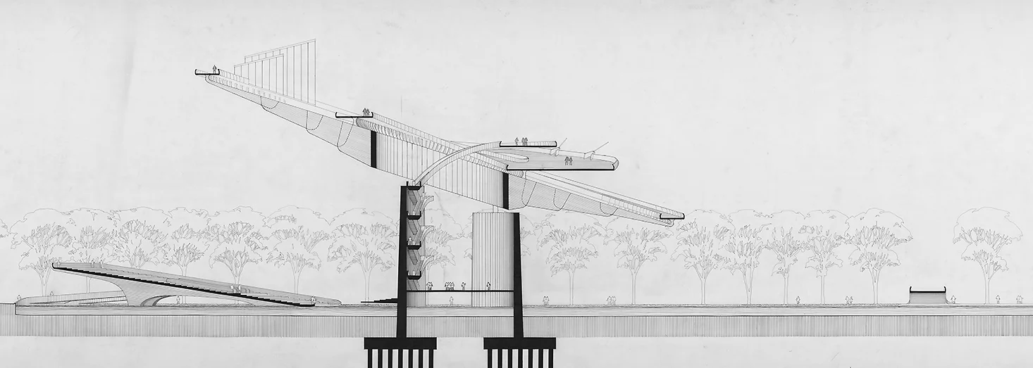
Commissioned by the P.C.A. as ‘a dramatic and imaginative design in concrete,’ the Galaxon consists of a giant, saucer-shaped platform tilted at an 18-degree angle to the earth and held high above it by two curved walls rising from a circular lagoon. The gleaming 300-foot diameter disc of reinforced concrete would hover in the air like some huge space ship. Visitors would be lifted to the center of the ‘saucer’ by escalators and elevators inside the curved supporting walls. From the central ring they would walk outward over curved ramps to a constantly moving sidewalk on the disc’s outside perimeter. The sidewalk would rise and fall from the 160-foot high apex of the inclined disc, to a low point approximately 70-feet above the ground.

A stage is projected from one of its two supporting walls and a restaurant, planetary viewing station and other educational or recreational features could be located at points along its top surface to make it an entertainment center. The Galaxon was among several designs displayed at an exhibition in New York of the use of concrete in so-called ‘visionary’ architecture.”

- Architectural Record, July 1961

Rudolph did not disappoint—and he created drawings and a model to convey his striking design. The drawings themselves are impressive, with the main one stretching to nearly 20 feet long.

rendering.jpg
section.jpg
site plan.jpg
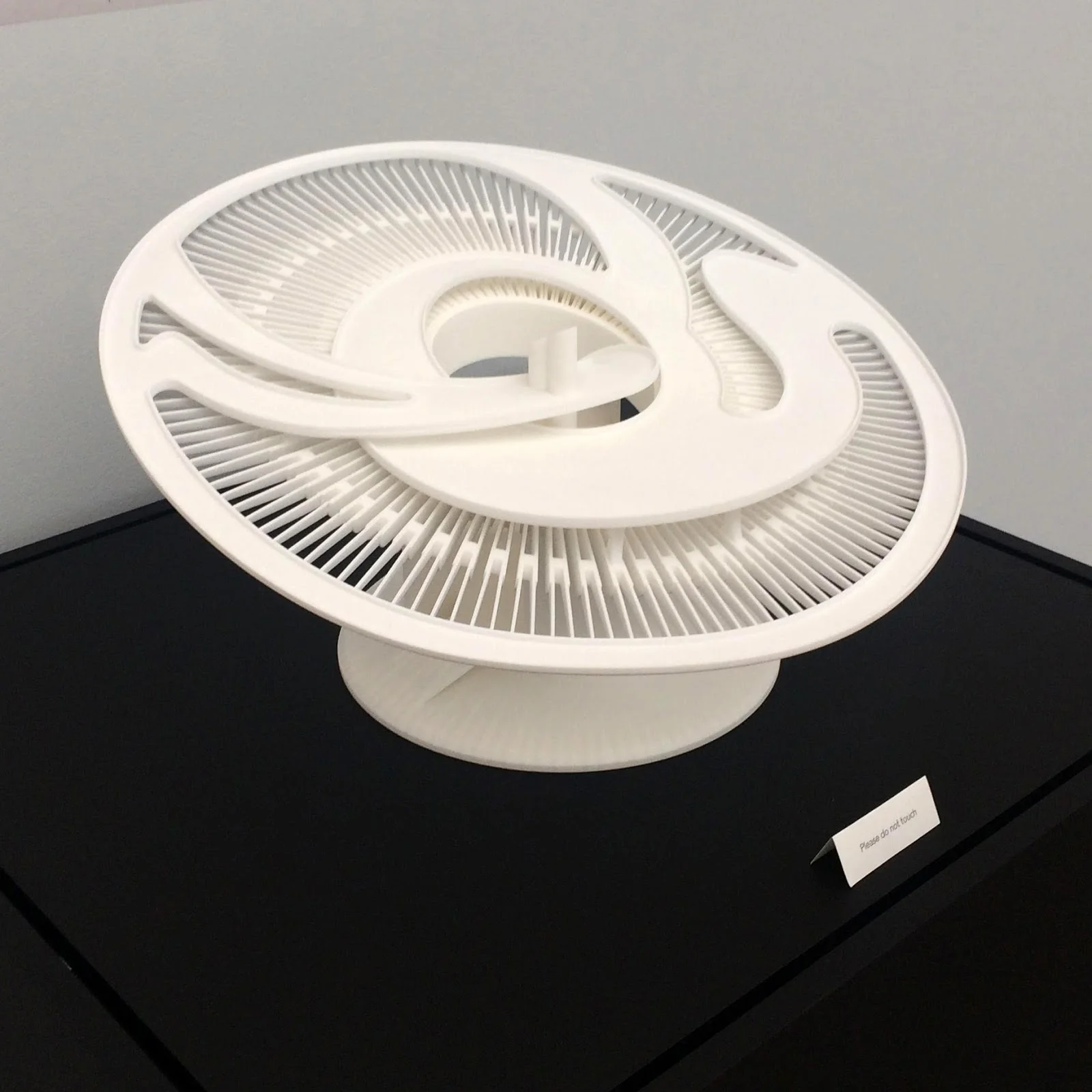
Photo of Rudolph’s presentation model. Image: http://www.nywf64.com

Photo of Rudolph’s presentation model. Image: http://www.nywf64.com

Drawing of night view (with spotlights). Image: "Remembering the Future," "Something for Everyone: Robert Moses and the Fair" by Marc H. Miller, published to accompany the 1989 Queens Museum exhibition "Remembering the Future: The New York World's F…

Drawing of night view (with spotlights). Image: "Remembering the Future," "Something for Everyone: Robert Moses and the Fair" by Marc H. Miller, published to accompany the 1989 Queens Museum exhibition "Remembering the Future: The New York World's Fair from 1939 to 1964."

A VISION SPURNED

The real power (to select the central, symbolic structure) rested with Moses - the famous (or, to some, infamous) Robert Moses, who’d built so many bridges, roads, and other facilities, all over the tri-state area. Of searching for an iconic central structure for the fair, he said:

“We were deluged with theme symbols - mostly abstract, aspirational, spiral, uplifting, flashing, or burning with a hard and gemlike flame, whose resemblance to anything living or dead was purely coincidental.”

Among the several many designs that Moses rejected was the Galaxon.

And so another structure was chosen, the Unisphere (made from a rather different material: stainless steel - and sponsored by a major manufacturer: US Steel). The Unisphere—still in place after all these years—admittedly has some uplifting visual power, and does still speak to the goal of a unified world.

But it’s not the forward-looking, FUTURE-evoking, space-expansive, upward-aspiring GALAXON.

Fortunately, we have Rudolph’s beautifully drawn visions to sustain our dreams.

PUBLICATIONS, ARCHIVE, AND EXHIBITION

When the Galaxon was originally proposed, it got some press—and it has since also appeared or been mentioned in books on Rudolph, and been on-exhibit.

Paul Rudolph was known for his virtuoso presentation drawings (especially perspectives and sections), and Paul Rudolph: Drawings is a beautiful, large book of them. It was edited by Yukio Futagawa, and published by A.D.A Edita Tokyo Co., Ltd. In 1972. The book includes a well-reproduced perspective view and a section of the Galaxon.

The preponderance of Paul Rudolph’s architectural drawings (well over 300,000 documents!) are in the Library of Congress. The collection includes several fascinating drawings of the Galaxon, which have been scanned and can be seen on-line.

Paul Rudolph’s original rendering. Image: Library of Congress

Paul Rudolph’s original rendering. Image: Library of Congress

From the Library of Congress, impressively large, full-size reproductions of Paul Rudolph’s Galaxon drawing were made, which were very prominently displayed in the exhibit, Never Built New York (which was on-view at the Queens Museum from 2017-2018.) While the Galaxon didn’t make it into the exhibit’s catalog (the curators discovered it after the book had gone to press), the catalog is still well worth obtaining, as it is an exceptionally rich collection of visionary proposals for New York City - and it does include other fascinating projects designed by Paul Rudolph.

Build-Your-Own-Rudolph!

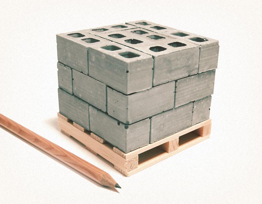
When you want to build a Rudolph, but lack the upper body strength. Photo: Mini Materials

When you want to build a Rudolph, but lack the upper body strength. Photo: Mini Materials

TABLE-TOP CONSTRUCTION

 You’ve probably seen the growing number of Lego kits devoted to great architecture: sets that allow you build distinguished buildings such as Frank Lloyd Wright’s Guggenheim Museum, his Fallingwater Residence, London’s Buckingham Palace, Berlin’s famous Brandenburg Gate, and even Mies’ Farnworth House!  [Hint: These special sets, in Lego’s “Architecture” series, often sell out - so if you’re a design-oriented Lego-phile, get them while you can!]

Fallingwater in Lego. Image: Amazon

Fallingwater in Lego. Image: Amazon

One has to admit that it must have been a challenge to translate some of these buildings into such sets: not all of these buildings’ geometries readily lend themselves to the modules of Lego’s system. Even so, we commend all attempts to encourage more audiences to appreciate architecture—and especially salute Lego’s efforts.

But hey, Lego! - Why don’t you take on a building that would wonderfully translate into an impressive Lego structure:  Paul Rudolph’s most famous design, the Yale Art & Architecture Building (now redidicated as Rudolph Hall).

Now that would make an exceptional Lego set!

Anybody want to start a petition?

Imagine this - in Lego! Photo: Gunnar Klack from Wikipedia

Imagine this - in Lego! Photo: Gunnar Klack from Wikipedia

Meanwhile:  What’s the table-top builder to do?

MATERIALS AT LILLIPUTIAN SCALE

 There is an answer!

 For those of you who want to build at home - or rather, in your home, right on your kitchen table - there are sets of diminuitive construction materials that will allow you to get started.

For example:

  • There are miniature concrete blocks, made of real concrete, and real miniature bricks—which can be laid with minute amounts of mortar.

  • There are scale sets of miniature wood 2x4’s, 2x6’s, and plywood—all ready for your handy hands to assemble!

  • There are even mini palettes, to help you transport these materials across your table-top construction site! [And it’s been suggested that they make good drink-coasters too.]

Take a look at the full range of materials and accessories that Mini Materials offers. We’re sure you’ll be inspired to get building!

P.S. 

The only problem:  

There are no ribbed concrete blocks—like the kind that Rudolph created & used for many of his projects. 

Anybody want to start another petition?

Paul Rudolph's Picasso

Photo: Seth Weine, Paul Rudolph Heritage Foundation Archives

Photo: Seth Weine, Paul Rudolph Heritage Foundation Archives

An Intriguing Object

Many visitors to the Modulightor Building are intrigued by the Picasso sculpture that’s on display within it—or rather, the several Picasso sculptures.

The origin of the artwork, and how they got here, is an interesting story…

A Very Public Artist

Pablo Picasso (1881-1973) is widely considered to be the most famous artist of the 20th Century. He worked in a plenitude of mediums: painting, drawing, ceramics, printmaking, stage design, and sculpture.

But his art is not found only in museums and private collections—for his sculptural work includes several commissions of monumental scale, to be used in public settings. The “Chicago Picasso,” a 50 foot high sculpture in Chicago’s Daley Plaza, is probably the most well-known example:

Picasso sculpture in Daley Plaza, Chicago, Illinois, US. Photo: J. Crocker, marked as public domain from Wikipedia

Picasso sculpture in Daley Plaza, Chicago, Illinois, US. Photo: J. Crocker, marked as public domain from Wikipedia

New York City also proudly has one of Picasso’s large public works: the concrete “Bust of Sylvette”, situated in the plaza of “University Village” (a complex of three apartment towers designed by I. M. Pei):

NYC - Greenwich Village: Picasso's Bust of Sylvette. Photo: Wally Gobetz

NYC - Greenwich Village: Picasso's Bust of Sylvette. Photo: Wally Gobetz

A Commission for both Architecture and Art

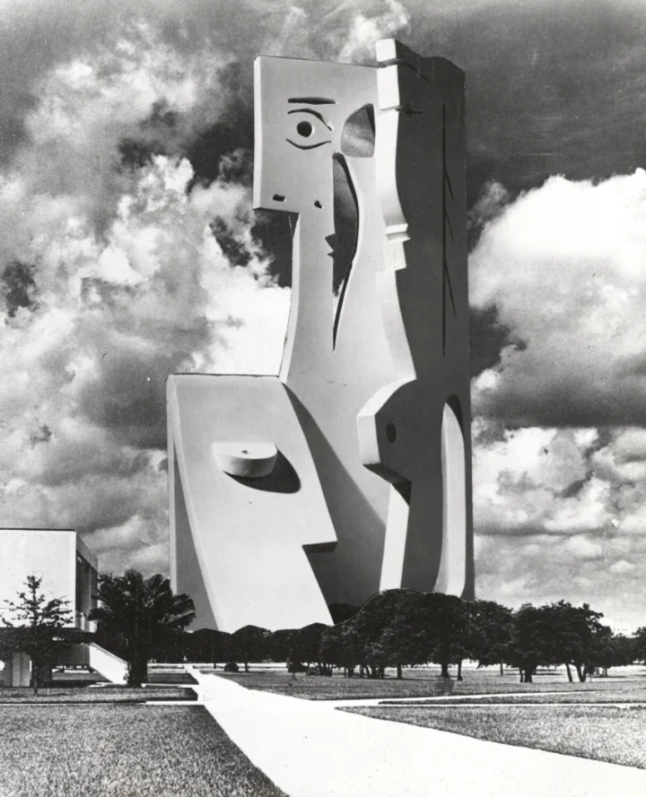
In the late 1960’s-early 70’s the University of South Florida wanted to build a visitors & arts center for their Tampa-area campus. The building design was by Paul Rudolph, and Picasso was approached to provide a sculpture that would be the centerpiece of the center’s exterior plaza. It was to be over 100 feet high, and - had it been built - would have been the largest Picasso in the world.

Rendering of Paul Rudolph’s building with Picasso’s sculpture. Image: USF Special Collection Library.

Rendering of Paul Rudolph’s building with Picasso’s sculpture. Image: USF Special Collection Library.

An OK from Picasso

As a famous artist - indeed, a world-wide celebrity - one can imagine that Picasso was continually besieged about all kinds of projects. Carl Nesjar (a Norwegian sculptor—and also Picasso’s trusted collaborator, who fabricated his some of his large, public works) spoke to Picasso about the Florida project, and got an approval.

Nesjar said: “He liked the whole idea very much….  He liked the architectural part of it, and the layout, and so forth. That was not the only reason, but it was one of the reasons that he said yes. Because it happens, you come to him with a project, and he will say oui ou non … he reacts like a shotgun.” [Recently, a tape of Carl Nesjar speaking about the project has been found—a fascinating document of art history.]

Picasso’s Proposal

Picasso supplied a “maquette” of the sculpture—the term usually used for models of proposed sculptures. His title for this artwork was “Bust of a Woman.”

Picasso’s model. Photo: USF Special Collection Library.

Picasso’s model. Photo: USF Special Collection Library.

The model was about 30” high, and made of wood with a white painted finish. Picasso gave the original to the University, and it is currently in the collection of the University of South Florida’s library.

“Bust of a Woman” sculpture with the audio reel of Carl Nesjar’s interview. Photo: Kamila Oles

“Bust of a Woman” sculpture with the audio reel of Carl Nesjar’s interview. Photo: Kamila Oles

The sculpture was to be towering—more than twice as high as his work in Chicago—and, at that time, would have been the biggest concrete sculpture in the world. Carl Nesjar made a photomontage of the intended sculpture, which gives an idea of its dramatic presence.

Carl Nesjar’s photomontage showing how “Bust of a Woman” would appear on the University of Southern Florida’s campus. Image: USF Special Collection Library

Carl Nesjar’s photomontage showing how “Bust of a Woman” would appear on the University of Southern Florida’s campus. Image: USF Special Collection Library

Not To Be

But, for a variety of reasons—cultural, political, and financial—the project never moved into construction: the university didn’t build the Picasso sculpture, nor Paul Rudolph’s building. That sad aspect of the story is covered in this fine article.

A Sculpture Greatly Admired by Rudolph

Although the project didn’t proceed, Paul Rudolph liked the sculpture so much that he requested (and received) official permission from Picasso to make copies of the maquette. Several faithful copies were made: the ones that are on view in the Modulightor Building.

Photo: Kelvin Dickinson, Paul Rudolph Heritage Foundation Archives

Photo: Kelvin Dickinson, Paul Rudolph Heritage Foundation Archives

A Virtual Life?

But this might not be quite the end for that Picasso sculpture, nor for Rudolph’s building design for that campus: they now have an existence - at least in the virtual world.

Kamila Oles (an art historian) & Lukasz Banaszek (a landscape archaeologist), working with the USF’s Center for Virtualization and Applied Spatial Technologies (CVAST) have created virtual models of what the building and sculpture would have looked like. You can also see a video of their process here.

Exciting visions - but ones that dramatically show an architectural & artistic lost opportunity.

NOTE:  Several authorized copies were made - one of which will always be on permanent display in the Rudolph-designed residential duplex within his Modulightor Building. But the other authorized copies are available for sale to benefit the Paul Rudolph Heritage Foundation. Please contact the Paul Rudolph Heritage Foundation for further information.

BRUTMOBILE!

Wolf Vostell, Concrete Traffic, 1970. Campus Art Collection, The University of Chicago. Photo by Michael Tropea. Art © The Wolf Vostell Estate.

Wolf Vostell, Concrete Traffic, 1970. Campus Art Collection, The University of Chicago. Photo by Michael Tropea. Art © The Wolf Vostell Estate.

Wolf Vostell (1932-1998) might not be a readily-recognized name today, but - primarily from the 60’s -to- the 80’s - he was known as one of the world’s most creatively provocative artists. He often made stimulating & challenging visual statements by incorporating the products of industrial civilization - cars, motorcycles, planes, and [especially] televisions - into his work, and he’s reputedly the first artist in history to integrate a television set into a work of art.

Even if less known today, Vostell might be familiar to the generation of architects educated in the 1970’s, as he was co-author of the 1971 book Fantastic Architecture - a wonder-filled little compendium of artist-generated projects with architectonic flavor.

The simple-minded think that Brutalism is just about concrete - but we know that’s not even close to accurate. Even so, it is often-enough identified with concrete - and that’s where the intersection with Vostell comes in. The man had an intense relationship with both cars and concrete—and in a number of his works, he encased whole automobiles in the material.

One such example is his 1970 artwork, “Concrete Traffic”, now located in a garage in Chicago:  it is a 1957 Cadillac, to be precise, which is entombed in 15 cubic yards of gray loveliness!

It’s an extraordinary sight - Brutalism that looks like it’s about to speed off! - and additional views (and more) can be seen here.

A rear view of Vostell’s concrete car. Photo by Michael Tropea.

A rear view of Vostell’s concrete car. Photo by Michael Tropea.

Paul Rudolph's 1953 Umbrella Residence is on the list of 'Florida Buildings I Love'

Paul Rudolph’s Umbrella residence in 2018. Photo: Kelvin Dickinson, Paul Rudolph Heritage Foundation Archives

Paul Rudolph’s Umbrella residence in 2018. Photo: Kelvin Dickinson, Paul Rudolph Heritage Foundation Archives

As with Paul Rudolph’s Cocoon House, Sarasota High School, and Sanderling Beach Club, Harold Bubil—the distinguished Real Estate Editor Emeritus for Sarasota’s Herald-Tribune—has put Rudolph’s Umbrella House on his list of “Florida Buildings I Love.”

And with good reason, as the 1953 building (which has been nominated to be on the National Register of Historic Places) embraces so many still fresh architectural ideas, and was executed with economical elegance.

An Amazing Client

Philip Hiss was an extraordinary and endlessly energic character: adventurer, writer, photographer, developer, educator, traveler (with an eye to anthropology and indigenous building solutions)—and a discerning patron of Modern architecture. His own library-studio, designed by Tim Siebert in 1953, was also a local (and very Modern) landmark: a cleanly rectilinear volume, using modern construction materials, raised on a steel structure. It even included the innovation of air conditioning (to protect Hiss’ book collection)—an unusual (and, for the time, pricey) feature.

The Architect

When developing the Lido Shores neighborhood in Sarasota, Hiss chose Paul Rudolph to design the flagship home: the Umbrella House.

Pearl Harbor happened very shortly after Rudolph began his graduate architecture studies at Harvard (under the famous former director of the Bauhaus, Walter Gropius), and Rudolph (and his cohort of classmates) enlisted. Rudolph became a U.S. Navy officer, stationed at the Brooklyn Navy Yard, where he learned important lessons on construction, materials, organization, and even the style of command—a body of knowledge that was to serve him for the rest of his career. Rudolph’s adventurous & innovative use of materials—perhaps seeded by his experience of maritime construction—can be repeatedly seen n his Florida work.

After the war, Rudolph returned to for his degree. Harvard was among a number of design programs which created accelerated programs for veterans, and Rudolph was able to graduate in less than a year. Moving to Florida (which he had been told was a place of opportunity for architects), his career really got started in the Sarasota area in the mid-1940’s (tho’ he eventually did work in several parts of Florida.)

Philp Hiss had good grounds for selecting Paul Rudolph as his architect:

  • in the approximate half-decade since starting practice in Florida, Rudolph had already built an impressive number of houses

  • even though the design of his houses had a fresh and Modern feel, such construction was not necessarily more expensive: Rudolph had shown the practical ability to build on a budget

  • Hiss, from his wide travels - especially to tropical environments - had developed definite ideas about how to build for hot climates - and Rudolph’s designs were simpatico to Hiss’ concerns and requirements

Modern Character (and Innovations) in the Umbrella House’s Design

Modern architecture has been much derided (sometimes with good reason) for its endless proliferation of banal & characterless container-like buildings - or as those productions are dubbed, the “Harvard Box.” Even though Rudolph was educated, at Harvard, by Gropius - the very fountainhead of that boxy approach - you could never say that a Rudolph building is boring! Here, at the Umbrella House, he brought his always inventive-yet-practical creativity to the design of this home.

Ground Floor Plan. Image: Paul Rudolph Heritage Foundation Archives

Ground Floor Plan. Image: Paul Rudolph Heritage Foundation Archives

First Floor Plan. Image: Paul Rudolph Heritage Foundation Archives

First Floor Plan. Image: Paul Rudolph Heritage Foundation Archives

Some of its design features include:

  • One of the most intractable problems of building design in hot and sunny climates is the solar heat-load on the roof. Covering the building’s entire area, the roof becomes a giant solar heat “magnet.” Even the best-insulated roof can only ameliorate the problem to a rather limited extent—and any mitigation is further reduced when the whole environment is hot (“Florida hot!”) day-after-day. One solution - very effective, but rarely tried - is a roof-over-a-roof: the upper roof blocks the sun, and a lower roof - well-separated by air-space, and shaded from above - is the actual enclosure of the house. Rudolph went far in the direction of this approach by erecting a large, trellis-like structure over the entire house (living volume, pool, and deck) - an “umbrella” - thus giving the house its famous name.

Side Elevation. Image: Paul Rudolph Heritage Foundation Archives

Side Elevation. Image: Paul Rudolph Heritage Foundation Archives

  • Rudolph raised the volume (enclosing the interior living spaces) above the ground plane. Not only did this separate the body of the house from ground-borne moisture, but it also reinforced the visual purity of the architecture: the main component of the house—the one that defined the interiors—seemed to float, and the volume’s edges were well-defined by the shadow-line at its bottom.

Pool-side Elevation. Image: Paul Rudolph Heritage Foundation Archives

Pool-side Elevation. Image: Paul Rudolph Heritage Foundation Archives

  • Most architects, when designing, primarily focus on the plan (and then the elevations). But Paul Rudolph thought in section—something that even his colleagues jealously admit is rare among architects. His orientation to sectional analysis led him to creating spaces with a profound variety of ceiling heights—and his ability to manipulate space allowed him to create the two major kinds of environments that people like to occupy:  large, open spaces (which Rudolph characterized as “the fishbowl”) and enclosed, snug spaces (which he called “the cave”). The height of the Umbrella House was the canvas within which he could compose such spatial experiences. The double-height living room was airy and commodious—but, tucked beneath the stairs, was the Florida incarnation of a fireplace inglenook for reading and cozy conversation.

  • Even though the entire house—including pool and its deck—was under the roof’s trellis-like shade, Rudolph provided a particularly protected sitting area (at the far end of the pool): this is a lowered, solid roof, which not only offered definitive blocking to the sun, but also fulfilled the occupants’ psychological needs for a well-defined seating area.

Preservation

In the mid-1960’s, the house suffered some hurricane damage, and in the subsequent decades it came into a state of disrepair. In 2005 it was partially restored---and then later sold, and restored by Hall Architects (for which it won several outstanding awards for preservation.)

Christopher J. Berger did an extensive thesis about the challenges of preserving works of the “Sarasota School”—and one of the buildings he focused-upon is the Umbrella house. You can see his full, well-researched thesis—which includes extensive historical context on building in Sarasota, and the fascinating cast-of-characters involved—here: http://etd.fcla.edu/UF/UFE0041751/berger_c.pdf

City Recognition—and National Register Nomination

The Umbrella House has been designated as an historic landmark of the City of Sarasota. 

Photo: Kelvin Dickinson, Paul Rudolph Heritage Foundation Archives

Photo: Kelvin Dickinson, Paul Rudolph Heritage Foundation Archives

David Conway—deputy managing editor of the Sarasota-based YourObserver.comwrites that the Umbrella House is a “a defining work of the Sarasota School of Architecture,” and reports:

Backed by the state Bureau of Historic Preservation, the Umbrella House has been nominated for a slot on the National Register of Historic Places. The two-story home in Lido Shores, designed by Paul Rudolph and built in 1953, is frequently cited as one of the standout works from the midcentury Sarasota School of Architecture movement.

Although dozens of structures within the city are listed on the National Register of Historic Places, most of them date to previous waves of development in the early 1900s. The Umbrella House is set to become one of the few Sarasota School works on the National Register, joining the Rudolph-designed Sarasota High School addition and the Scott Building at 265 S. Orange Ave.

The Umbrella House already has a local historic designation, which offers incentives for rehabilitation and requires city review of proposed changes to the home. In 2015, the Umbrella House was renovated to re-create its namesake “umbrella” structure, designed to shade the residence.

City Planner Cliff Smith said the national designation was another way the property owners are attempting to secure the Umbrella House’s historic legacy. On Tuesday, the city’s Historic Preservation Board voted unanimously to endorse the application, which a national committee will consider in August.

Smith said the designation would add to the significance of an architectural movement in which the community has taken great pride.

“The Sarasota School of Architecture, that unique form of building that’s indigenous to the city of Sarasota — we’re very happy that’s reached national status,” Smith said.

Brutalism in Virtual Reality

Image: Moshe Linke

Moshe Linke creates beautiful art games in which you can freely explore Brutalist environments. Most of them can be downloaded here: https://moshelinke.itch.io 

Here are a couple of our favorite images from his work:

Fugue in Void

According to the developer’s description:

Explore all kind of mysterious places and dive into a world full of atmosphere. Let this experience unfold in your head.  Let it inspire you.

Brutalism - Prelude on Stone

According to the developer’s description:

Brutalism: Prelude on Stone was a rather small project for me under the theme "Forces".  It is a small installation art exhibition set in brutal environment. You can freely explore a huge brutalist building. Here and there you are going to find art installations. All the art installations deal with the elements and nature. With it comes a rich soundscape that plays perfectly together with the visuals. I wanted to depict a harsh contrast between the elements and brutalist architecture. In the future there is still erosion from water, wind and other forces.

Wonders Between Dunes

According to the developer’s description:

Travel through a wonderful mysterious world and explore huge brutal architecture. Stroll through deserts. Stroll through lush jungles. Walk deep inside the belly of concrete monsters and feel the enormous weight of the city above you. Discover wonders between dunes.

A almost dream like experience waiting for you. Relax and take a break from all those action packed games out there.

Image: Moshe Linke

Image: Moshe Linke

Brutalism, with its simple forms and dramatic environments, is a powerful experience in virtual space.

With virtual gaming getting more popular, we look forward to the day we can virtually walkthrough a Paul Rudolph designed space. Until then, we will sit back and try not to look too far over the edge of that staircase.

Paul Rudolph's Walker Guest House For Sale

Image: © Ezra Stoller / Esto

Image: © Ezra Stoller / Esto

The Paul Rudolph Heritage Foundation has learned that Paul Rudolph’s iconic Walker Guest House will be for sale in the coming weeks. The listing will include the Walker Guest House and the main gulf-front residence on a 1.6 acre lot for $6,795,000.

The 1952 project was the first commission received by the thirty-four year old Rudolph after he left his partnership with Ralph Twitchell. Rudolph would later describe it as one of his favorite homes, saying the home “crouches like a spider in the sand.” The project would also be known as the ‘Cannonball House’ because of Rudolph’s use of red cannonballs as weights to hold the home’s signature wood panels in place.

Rudolph’s renderings showing the movable flaps for privacy. Image: Paul Rudolph Heritage Foundation Archives

According to Rudolph in the 1970 book The Architecture of Paul Rudolph by Sibyl Moholy-Nagy,

"Two bays on each side of this guest cottage are filled with pivoting panels which function as
1  the enclosing wall,
2  the ventilating element,
3  the shading device,
4  the hurricane shelter.
The third bay is filled with glass, to admit light and splendid views. When the panels are closed, the pavilion is snug and cave-like, when open the space psychologically changes and one is virtually in the landscape."

Plan with raised wall elements.  Two sections each of all four walls can be swung upwards into a horizontal position, steel balls suspended from steel cables provide counter balances.  All connections of the white painted wooden structure are joined…

Plan with raised wall elements. Two sections each of all four walls can be swung upwards into a horizontal position, steel balls suspended from steel cables provide counter balances. All connections of the white painted wooden structure are joined by screws. Image: Paul Rudolph Heritage Foundation Archives

Author Tim Rohan wrote about the significance of the guest house in Curbed,

The Walker House was Rudolph's complex tribute to and critique of the International Style's most celebrated dwelling, the Farnsworth House by Mies van der Rohe (Plano, IL, 1946-51). With its lightweight, white wood frame, the Walker House was Rudolph's "poor man's" version of the Farnsworth's expensive white, steel frame, whose beauty he could not help but admire. Rudolph corrected the main drawback of the Farnsworth House, evident as well in the Glass House (New Canaan, CT, 1945-49) by Philip Johnson: lack of privacy. Edith Farnsworth felt exposed by her house's glass walls, which she was powerless to change. For privacy, Johnson retreated to the almost windowless confines of his adjacent Brick House. Rudolph rectified this drawback by allowing the user to adjust the shutters of the Walker House for privacy and to suit their moods. Rudolph explained, "With all the panels lowered the house is a snug cottage, but when the panels are raised it becomes a large screened pavilion. If you desire to retire from the world you have a cave, but when you feel good there is the joy of an open pavilion." The Walker House set Rudolph upon the path to concluding that architecture was the art of manipulating space in order to affect and reflect human emotions, as was evident from the interior complexity of his Brutalist buildings, the most famed being his Yale Art & Architecture Building (New Haven, CT, 1958-63).

Many architecture students have studied the design and built models of it while in school making it one of Rudolph’s best known early works along with his 1961 Milam Residence. The home was also recognized by the AIA Florida chapter as ‘Best Residential Building in the State of Florida’ in 2012.

Please spread the word about the upcoming sale and if you know anyone interested in preserving the house, please reach out to us at office@paulrudolphheritagefoundation.org

Paul Rudolph's 1952 Sanderling Beach Club is one of the 'Florida Buildings I Love'

Photo: Paul Rudolph Heritage Foundation Archives

Photo: Paul Rudolph Heritage Foundation Archives

Harold Bubil, Real Estate Editor Emeritus for the Herald-Tribune, writes in the newspaper that Paul Rudolph’s Sanderling Beach Club is one of his favorite buildings in Florida.

The project was begun when developer Elbridge S. Boyd originally formed Siesta Properties, Inc. in 1946 with the plan to create a residential community in the area. In 1951, a homeowners association for residents of Siesta Properties known as the Siesta Club was founded. A year later in 1952, a cabana club was proposed to house guests of the local residents.

According to the website Satasota History Alive,

Local architect Paul Rudolph was selected to design the clubhouse, cabanas and observation tower. The initial phase, built in 1952, consisted of a concrete patio with a small white wooden observatory. The platform, about 10 feet up, was reached by a simple set of stairs, along the east side and furnished with chairs and a table. On either side of the patio was a single-story structure containing five cabanas each. A two-bay restroom building was located east of the tower. Each of these structures displayed a distinctive roof consisting of a series of shallow vaults constructed of thin plywood. Several resident-members participated in the construction of these early buildings.

Rudolph’s first proposal for the project. Image: Paul Rudolph Heritage Foundation Archives

Rudolph’s final proposal - note the revised design of the lookout. Image: Paul Rudolph Heritage Foundation Archives

Rudolph’s final proposal - note the revised design of the lookout. Image: Paul Rudolph Heritage Foundation Archives

Rudolph’s rendering of the final scheme. Image: Paul Rudolph Heritage Foundation Archives

Paul Rudolph looking out from the constructed observatory. Photo: Library of Congress

According to the website Satasota History Alive:

By 1958 three more buildings, with five cabanas each, were constructed by local contractor John Innes. Three new cabana buildings, which followed Paul Rudolph's design for the original two buildings, were arranged in a stepped line extending south of the original group. “A tennis court had been built, a life boat and telephone provided a measure of swimming safety to the area, and Sunday lunches were being held underneath table umbrellas.”

A clubhouse was not constructed until 1960, although included in Rudolph's original plans. John Crowell was hired to prepare the plans for the new two-story building. It was to abut the existing restroom building on the south and contain five Rudolph-style cabanas on the second floor. It was also expected to align with the shell roofed observation tower. However, a lack of structural integrity was recognized in the tower soon after its construction. For a time people were no longer allowed on the platform. The entire tower was torn down in the late 1960s.

The current site. Photo: Google Maps

Typical Cabana Floor Plan. Image: Paul Rudolph Heritage Foundation Archives

Writes Bubil:

The Gulf-front site demanded modestly sized structures that sat lightly on the sand and provided shelter for the tenants, some of whom have rented their cabanas for decades and have decorated the interiors to suit personal tastes and needs.

Rudolph’s early Sarasota structures often were experiments, and that was the case at Sanderling. The arched roofs are made from curved plywood, a material he learned about while serving at the Brooklyn Navy Yard during World War II. The posts are economically made of doubled-up 2-by-4s.

But it is the spirit of the cabanas that defines Rudolph’s creativity. The wave-like form of the roofs is appropriate for the site, and the simply geometry of the cabanas makes them look like delicately sized temples for sun worshipping.

On June 29, 1994, the project was added to the U.S. National Register of Historic Places.

Previously unseen Rudolph project donated to the Foundation's archives

Rudolph’s Medical Arts Building project in Singapore. Image: Paul Rudolph Heritage Foundation Archives

Rudolph’s Medical Arts Building project in Singapore. Image: Paul Rudolph Heritage Foundation Archives

Paul Rudolph’s 1990 proposal for a Medical Arts Building in Singapore was donated to the archives of the Paul Rudolph Heritage Foundation by Jeremy Moser, a former Rudolph employee. He also donated other project materials which will be covered in future posts.

The site today. Image: Google Maps

Rudolph’s proposed site plan. Image: Paul Rudolph Heritage Foundation Archives

The project was never built. Along with a site plan and elevation, copies of the floor plans showing Rudolph’s characteristic alternating pinwheel floorplans:

The plans are dated February 16th, 1990 and list Rudolph’s office as 246 East 58th Street. Rudolph’s offices were on the second floor of the building, where the offices of the Paul Rudolph Heritage Foundation are located today.

Photos of Rudolph's residence added to the archives of the Paul Rudolph Heritage Foundation

Photo of Rudolph’s residence taken in the early 90’s. Photo: Robert Schwartz; Paul Rudolph Heritage Foundation Archives

Photo of Rudolph’s residence taken in the early 90’s. Photo: Robert Schwartz; Paul Rudolph Heritage Foundation Archives

The Paul Rudolph Heritage Foundation was visited by Robert Schwartz, an architect who came to see the recent exhibit, ‘Paul Rudolph: The Personal Laboratory’ at the Foundation’s headquarters in the Modulightor building which featured Mr. Rudolph’s residence on 31 High Street. Afterwards, he spoke to us and showed photos of the space when he lived there from 1990-1993.

He donated copies of the photos to the Foundation’s growing archives of Paul Rudolph’s architectural works. These will be used to update the model which was based on Mr. Rudolph’s drawings and black and white historical photos.

Rudolph’s drawing of the first floor. Image: Paul Rudolph Heritage Foundation Archives

Rudolph’s drawing of the first floor. Image: Paul Rudolph Heritage Foundation Archives

Rudolph’s drawing of the second floor. Image: Paul Rudolph Heritage Foundation Archives

Rudolph’s drawing of the second floor. Image: Paul Rudolph Heritage Foundation Archives

According to Mr. Schwartz, the floor was white marble (we had assumed brick!) in a herringbone pattern. The steps were the same white marble inset into a metal frame, hung off the wall. The brown cushion shown in the photos was original from Rudolph’s design.

Mr. Schwartz noted a few errors in the model such as a small water feature located outside in the yard. He also said the house had a number of tenants after Mr. Rudolph moved out before he lived in the space - including a rumored funeral parlor. He also pointed out details like doors and areas of the building that were not included in Rudolph’s drawings of the addition.

Sadly, the building was eventually turned into a residence for a local fraternity who made major changes including enclosing Rudolph’s floating staircase.

Thanks to Mr. Schwartz’s contribution to the Foundation’s archives we have another chapter to add to the history of this iconic project. For more photos, please see the links below.


Paul Rudolph's Rolling Chair now available for sale to the public

The Paul Rudolph Rolling Chair Photo: Modulightor

The Paul Rudolph Rolling Chair Photo: Modulightor

Paul Rudolph’s sketch of the original design Image: Library of Congress

Paul Rudolph’s sketch of the original design
Image: Library of Congress

This chair was designed by Paul Rudolph (1918-1997), one of America’s greatest Modern architects. Rudolph was famous for his strong, expressive forms, powerful spaces, and innovative use of materials & light. A very prolific designer of both architecture and interiors, his active career extended to nearly the end of the 20th century, and across the decades he continued developing his aesthetic and experimenting with space & materials.

Rudolph’s own residences were his “laboratories” for exploring ways to shape space and create dynamic forms. When he was looking for furniture for his own home, he found that there was nothing on the market that would fit well with the interiors he was creating - so he designed his own furniture, of which this chair is a prime example.

Paul Rudolph was thoroughly knowledgeable about design history - and had met many of the leading figures of 20th Century architecture. One can see the roots of this chair’s design in the work of Rietveld and Le Corbusier, both architects greatly admired by Rudolph. But, as with all his work, Rudolph puts his own creative stamp on the design - in this case: using a system of modular components to create furniture of great visual lightness & transparency. In addition, its use of casters makes it very flexible for moving into a variety of room arrangements.

Above: After he designed the chair, Paul Rudolph had an employee produce documentation of the design Images: Library of Congress

Rudolph was intensely interested in the flexibility and efficiency offered by modular systems. Whether it be for the design of a large-scale building, a set of furniture, or a light fixture, he thought architects should “speak the language of modularity.” This chair uses a system of stainless steel tubes & joints, carefully fabricated and assembled, to create a practical piece of furniture and a fine object of design. This same system can be also be used to make other kinds of furniture, and even light fixtures.

NOTE:  This chair is made by Modulightor, a company co-founded by Paul Rudolph and Ernst Wagner. This chair is often used in conjunction with other furniture designed by Rudolph: the Rolling Side Table and the Small Side Table. They’re also made by Modulightor and are available, and can be viewed on their website www.modulightor.com If you have any questions about the chair and how to order one, please email us at office@paulrudolphheritagefoundation.org

Specifications:

  • Title:  Paul Rudolph Rolling Chair

  • Size:  Approx. 29-3/8” tall  x  approx. 28” wide  x  approx. 22-1/2” deep (Note: All dimensions are approximate.)

  • Material:  Stainless steel, Plexiglas, and casters

  • Manufactured and Sold By:  This Paul Rudolph-designed chair is made and sold by Modulightor - a firm co-founded by Paul Rudolph

Pricing & Availability:

  • Price:  $3,450   Note: a portion of the proceeds from each sale will be donated to the Paul Rudolph Heritage Foundation.

  • Availability:  Any quantity is available

  • Ordering:  Must be pre-ordered and pre-paid. Please email office@paulrudolphheritagefoundation.org to order

  • Lead Time:  Approximately 8 weeks, from receipt of paid order

Shipping & Packing:  Will depend on the destination. The purchaser can either:

  • Pick-up the chair at Modulightor’s New York City showroom

  • Make their own arrangements to have it crated and shipped

  • Arrange for Modulightor to have it crated and shipped (at additional cost, to be determined based on destination)

'Paul Rudolph: A Way of Working' greeted by full house at the Center for Architecture

Speakers Rocco Leonardis, R.D. Chin, Jeremy Moser, Nora Leung and moderator Roberto de Alba. Photo: Kelvin Dickinson, Paul Rudolph Heritage Foundation

Speakers Rocco Leonardis, R.D. Chin, Jeremy Moser, Nora Leung and moderator Roberto de Alba. Photo: Kelvin Dickinson, Paul Rudolph Heritage Foundation

On Friday December 14 The Paul Rudolph Heritage Foundation joined the Center for Architecture for a special presentation, ‘Paul Rudolph: A Way of Working’. The program was presented in coordination with the exhibition ‘Paul Rudolph: The Hong Kong Years’ on display in the gallery adjacent to the event.

The night began with an introduction about the Paul Rudolph Heritage Foundation by President Kelvin Dickinson. Roberto de Alba, author of the book ‘Paul Rudolph - the Late Years’, introduced keynote speaker Nora Leung who spoke about her experience working with Mr. Rudolph on several projects in Hong Kong.

The program concluded with a panel discussion featuring several past employees speaking about what it was like to work with Mr. Rudolph.

The event was part of the Paul Rudolph Centennial which features two exhibitions about his work. For more information about the two exhibits celebrating Mr. Rudolph’s life and work for his centennial please follow this link.

Upcoming lecture: 'Paul Rudolph: Influences & Opportunities' at the Center for Architecture

Paul Rudolph asking concrete what it wants to be.  Photo: Library of Congress

Paul Rudolph asking concrete what it wants to be. Photo: Library of Congress

Please join the Paul Rudolph Heritage Foundation
for a special program for Paul Rudolph: The Hong Kong Journey.
 

PAUL RUDOLPH:
INFLUENCES & OPPORTUNITIES


Wednesday, December 19 2018
6pm-8pm


At the Center For Architecture
536 LaGuardia Place, New York, NY 10012


For reservations, go to the Center for Architecture’s site here.


Paul Rudolph considered an allowance for growth in his architecture and once said his buildings “took on a life of their own” after they were designed.  The Paul Rudolph Heritage Foundation in association with the Center for Architecture present a panel speakers influenced by the richness of Paul Rudolph’s architectural legacy. The program will present stories by those who have had the the opportunity to adapt his work to present-day needs.

Introduction:
Kelvin Dickinson, President, Paul Rudolph Heritage Foundation

Speakers:
Kate Wagner, Founder, McMansionHell
Eric Wolff, Owner, the Fullam Residence
John Wolstenholme, AIA, LEED AP, Principal, Wolstenholme Associates LLC
Andrew Bernheimer, FAIA, Principal, Bernheimer Architecture
Robert Miklos, FAIA, Founding Principal, designLAB architects
Ben Youtz, AIA, designLAB architects
Kelly Haigh, AIA IIDA, design LAB architects
 

For more information about the event go to our website here.
For speaker bios follow the link here.