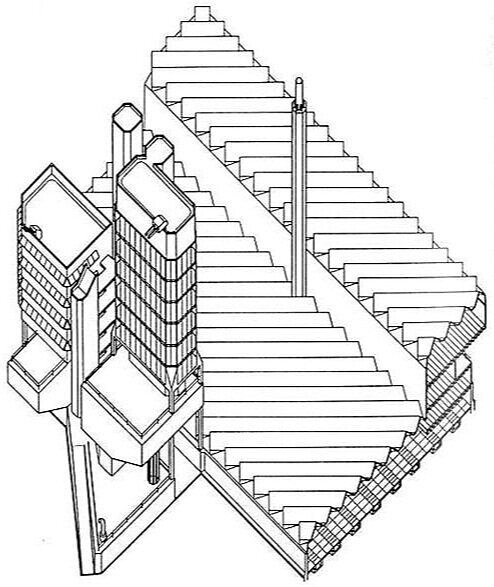
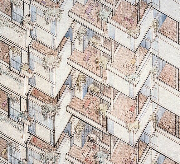
A detail from Paul Rudolph’s drawing for the Colonnade Condominiums in Singapore (a project built in the final phase of Rudolph’s career, when he was doing much work in Asia.) While Rudolph is famous for his perspective drawings, here he is using an “axononmetric” drawing technique—which was unusual for him, but is not unknown in his graphic oeuvre. © The Estate of Paul Rudolph, The Paul Rudolph Heritage Foundation.
MASTER OF PERSPECTIVE
Well of course Rudolph could draw—beautifully, masterfully, with stunning skill. His fame is intertwined with his brilliant perspective drawings (including, and especially, his perspective-sections). He made them starting right from the beginning of his career—indeed, while he was still a student, as the below example shows:
“Weekend House for an Architect”—a school project of the mid-1940’s, when Rudolph was finishing his Masters at Harvard—and an early example of the intense perspective rendering style which he’d use for the rest of his half-century career (and for which he became famous.) © The Estate of Paul Rudolph, The Paul Rudolph Heritage Foundation.
While much has been written about Rudolph’s drawings, little-known is Rudolph’s own text on the topic, which speaks of his overall approach and attitude to drawing. The essay, “From Conception to Sketch to Rendering to Building" forms the introduction to the magnificent book, Paul Rudolph: Architectural Drawings. The book came out in the early 1970’s, and was published by the great Japanese architectural photographer, Yukio Futagawa. Futagawa had, in previous years, extensively photographed Rudolph’s work, and had also created a publishing firm (still extant) focused on architecture.
The best presentation of Paul Rudolph’s drawings is this large-format book, “Paul Rudolph: Architectural Drawings.” The cover features one of the perspective-sections for which the architect was so well-known—this one through the body of the Burroughs Wellcome headquarters building. The book was published by Yukio Futagawa (who had made superb photographs of Rudolph’s work—and whom Rudolph greatly admired.)
In that essay, Rudolph says:
“It should be noted that the drawings and renderings shown here were done over a period of almost thirty years, but the technique used for them has changed very little. During my school years and immediately thereafter I searched for a technique of drawing which would allow my personal vision to be suggested, and after a period of searching, arrived at the systems shown in this book.”
Rudolph’s drawings (and especially his use of perspective-section drawings) has been widely remarked upon—most extensively written about by the author of the comprehensive study of Rudolph, Timothy M. Rohan—particularly in an essay by him in a recent book devoted to Rudolphian studies. In an earlier post we addressed Rudolph’s focus on sections—and there you can find further information on that topic.
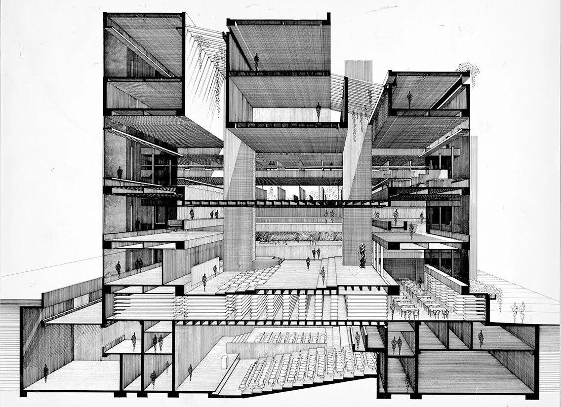
Perhaps Rudolph’s most famous drawing is this one, done near the height of his career: his perspective-section through the Yale Art & Architecture Building (now known as Rudolph Hall). Space, light, scale, and structure are conveyed simultaneously. There is a vivid sense of depth—and a strong effort is made to communicate spacial relationships among the various levels. © The Estate of Paul Rudolph, The Paul Rudolph Heritage Foundation.
BUT RUDOLPH DID USE OTHER TECHNIQUES…
A review of Rudolph’s drawings—which number in the hundreds-of-thousands—show that he used a variety of techniques:
Plans
Sections (including Site-Sections)
Elevations
1-Point Perspective
2-point Perspective (including—though rarely—where the 2nd perspective is a vertical one, with the vanishing-point below-ground)
Plan-Perspectives
Section-Perspectives
Diagrams
Quick Sketches (ranging from schematic doodles to more advanced studies—the sorts of visual overtures a designer makes, for themselves, when considering an idea)
Isometrics
Axonometrics
That’s the graphic tool-kit of any architect—the “armamentarium” of all designers. Such techniques are used to solve problems, to present proposed solutions to clients and government bodies, and ultimately to communicate instructions and intentions to builders [and when H.H. Richardson said that the first principle of architecture is “Get the job!”, he could well have added that drawings are a marketing tool.]
Rudolph is most well-known for his section-perspectives—but he wielded all of the above. It is the last type of drawing on that list, axonometric—one rarely discussed in Rudolphian studies—which deserves attention.
PERSPECTIVE IS NOT THE ONLY WAY
Perspective drawing—that great innovation of the Renaissance—uses lines which seem to converge, and spaces the lines so that objects which are further away are drawn smaller. This gives perspective drawings a similarity to the way we naturally see.
But there are other ways to draw, used by designers, which don’t act in the same way as perspective drawings. It may seem counter-intuitive to use anything but perspective drawings, as they create a simulation which is closest to the way we perceive things—but there are times when one can covey a great deal of complex information by using other-than-perspective approaches.
Isometric drawings and Axonometric drawings are the main alternatives—and they can be combined with other techniques (like sections). Auguste Choisy, an historian and teacher of the French Beaux-Arts era, was famous for his ability to combine plan, section, and elevation into a single drawing—and thus convey architectural information about a building in a coordinated and concise way. Here’s an example from one of Choisy’s books of architectural history:
In the late 19th and early 20th century, Auguste Choisy (1841-1909) published several architectural history books, in which he used his technique of combining the plan, section, and elevation of a building (or a representative part of a building) into a single drawing. This example shows how informationally potent such a combination could be: much is conveyed—particularly how each aspect of the building coordinates with the others. In this drawing, Choisy is showing the various planes (plan, section, and elevation) as isometric views. Thus areas that would be squares or rectangles are modified into diamond-like shapes—but that seeming “distortion” allows Choisy to fit all the planes together in a coordinated way. Choisy also used axonometric drawings in his books.
How would Rudolph have come to know about such other-than-perspective drawing techniques?
Rudolph’s disparaging remark about his first architecture school (in Alabama, before he went to Harvard) has been frequently quoted. He is reported to have said that their “faculty was best when they left you alone.” That’s been taken to mean that he got nothing out of the traditional, classically-based curriculum which the school offered. Yet in his extended conversation with Peter Blake, another side emerges. Rudolph declared:
“I have always felt lucky that I started studying architecture in a school that followed the Beaux-Arts system.”
Choisy’s architectural history books were well-known within Beaux-Arts educational culture. It is possible that, in such a traditional school as Rudolph attended, he would have been exposed to them—including their drawings with their use of isometric and axonometric techniques.
ISOMETRIC VS. AXONOMETRIC
There’s some controversy about the exact terminology for those two related-but-different drawing techniques—but one thing is clear: they’re both part of the same family: Paraline drawings. Without getting into a full tutorial on drawing methodologies, it’s useful to distinguish them:
In the family of Paraline drawings, sets of lines—for example: the lines that define all the vertical edges of the walls) are parallel to each other.
With Isometric drawings, one main plane (like the plan or the roof) is distorted—for example: if a part of the plan would in reality be a square, then on the drawing it would be shown as a diamond-like shape. Also, all the vertical edges of the walls are perpendicular to the bottom of the drawing.
With Axonometric drawings, the main plane (for example: the plan) would not be distorted: so a square would remain a square, and a rectangle would remain a rectangle. Also, the other sets of lines (like the vertical edges of the walls) are all parallel to each other.
Here’s a drawing that shows the difference between Isometric and Axonometric drawings.
Two approaches to drawing a rectilinear volume (which could be a brick, a building, a part of a building, or a room…):
The isometric Drawing, at the far-Left, distorts the top and bottom [plan] surface, and all the other planes too—making them into diamond-like shapes.
But the two examples of axonometric drawings shown here preserve the exact shape of the upper and bottom planes. Two variants are shown here: the Middle version, where the angle of the plan is tipped up equally on both sides (at 45 degrees); and the one at the Right, where the plan is tipped up un-equally (which leads to a more realistic look).
In both these versions of axonometric drawings, the vertical edges of the walls are perpendicular to the ground (the bottom edge of the drawing)—but sometimes, for clarity, other angles are used (like in the Edersheim Apartment example, below.)
AXONOMETRIC DRAWINGS BY ARCHITECTS
Axonometric drawings are beloved by generations of architecture students: they allow one to quickly create a convincing-looking drawing (one that has a sense of volume, but also maintains all the parts and proportions in proper relationship to each other). All one has to do is draw a plan, and then draw (“pull”) lines down from the corners to show the walls. Presto!—the drawing is ready to bring to class.
But professionals have also been using axonometric drawings for decades—and they’ve come in-an-out of popularity during the Modern movement in architecture. Some designers, like the ones associated with De Stijl, favored it (as it probably corresponded well with their overall rectilinear aesthetic.) Here’s an example from Theo Van Doesburg:
Study for “Design for Cité de Circulation,” a district with residential blocks by Theo van Doesburg: a pencil and ink drawing made circa 1929. It is a good example of an axonometric drawing: the planes of the buildings’ roofs and bases remain undistorted (in this case, a composition mainly of squares). The drawing shown, via Wikipedia, is in the public domain, as per PD-US or other provisions.
In the 1960’s-70’s, axonometric drawings came to prominence again, most notably in the work of James Stirling and Peter Eisenman (in the drawings for Eisenman’s early series of numbered houses).
Here’s a well-known example by Sterling:
James Stirling’s drawing for the Engineering Building at Leicester University—one of the most famous axonometric drawings of the post-World War II era. As with all axonometric drawings, the plan shapes (for example the rectilinear top surfaces the towers and terraces) are un-distorted: if they’re rectangles or squares in reality, then they’re shown as rectangles or squares in this axonometric drawing. As is frequently the case, the vertical lines of the walls are shown perpendicular to the ground.
RUDOLPH’S USE OF tHE AXONOMETRIC tECHNIQUE
Paul Rudolph did, from time-to-time, turn to axonometrics. But why, with his profound mastery of the perspective technique, did Rudolph sometimes use this alternative way of drawing?
To answer that, it would be good to look at some examples:
The Edersheim Apartment in New York
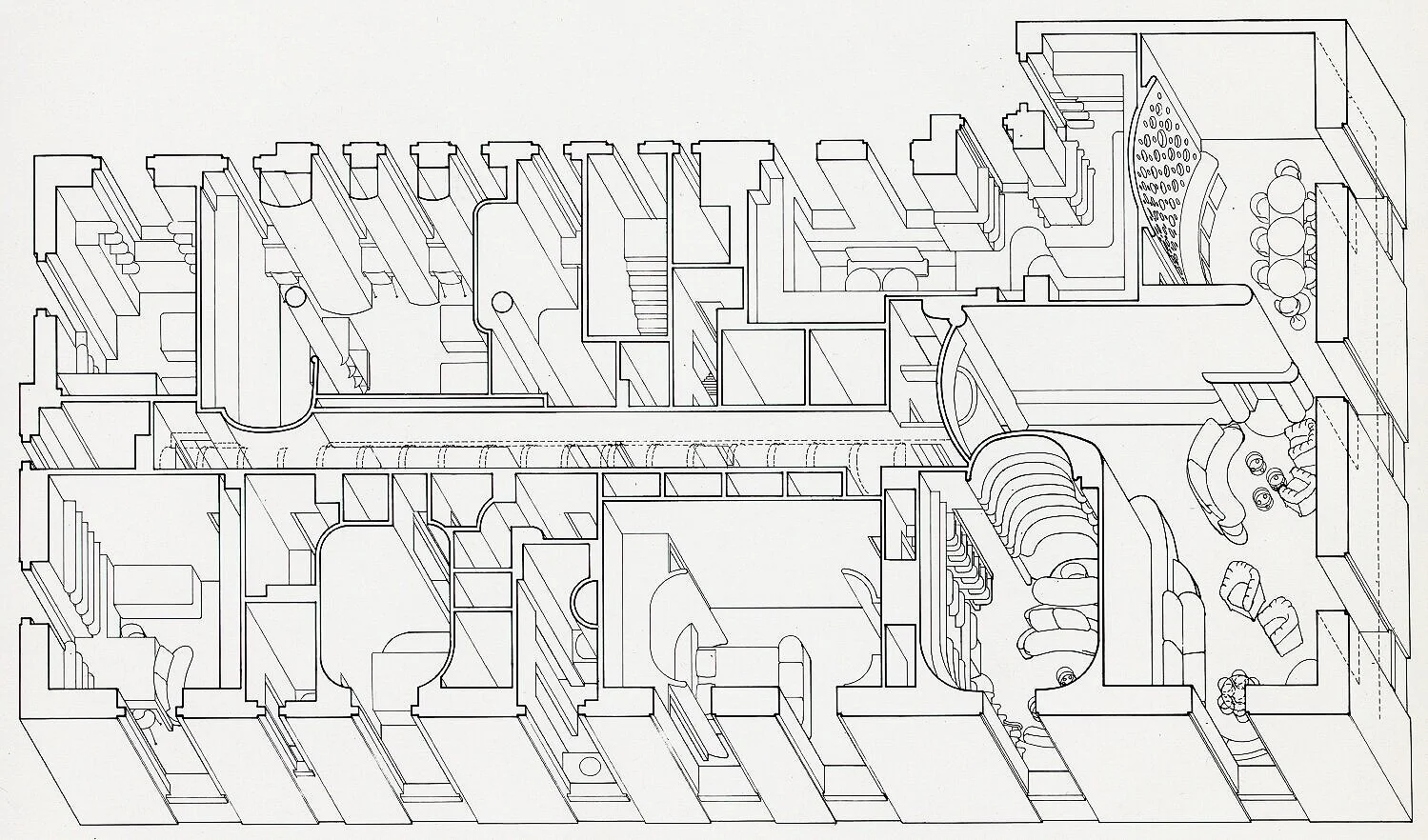
When we were creating 2018’s Paul Rudolph centenary exhibition, Paul Rudolph: The Personal Laboratory, one of the projects included was the apartment he had created for the Edersheim family: a complex of rooms occupying a full floor in a Manhattan apartment house. The program is complex, the rooms are plentiful, and each room is shaped to match its function (as was the custom furniture—built-in and freestanding—which Rudolph designed for those rooms.) Moreover, as is typical in New York City (even in luxury apartment houses like the one in which this apartment sits), there’s little room to spare. So all the above must be densely packed together—a challenge for any designer to work out. Then, once the design is solved, as it is a further of a challenge convey such a complex design to the client.
To make this whole assemblage of spaces understandable to the Edersheims, Rudolph created this drawing—an axonometric!
The Edersheim apartment, on New York’s Upper East Side—a Rudolph project from 1970. Rudolph used an axonometric view: and it looks as though the roof has been lifted-off and one is looking down into the apartment’s many multi-shaped spaces. Despite the complexity of the design, it is still understandable—and what helps create clarity is the fact that Rudolph here used the axonometric technique: the plan-shapes of the rooms are un-distorted, and also the building’s perimeter walls are drawn true to their actual shapes. © The Estate of Paul Rudolph, The Paul Rudolph Heritage Foundation.
Below is an enlarged portion of the above drawing, showing one of the most complex parts of the apartment. It’s a fine example of how an axonometric drawing can be used to show, with clarity, even intricate arrangements of spaces and architectural elements.
An enlargement of a portion of the above axonometric drawing of the Edersheim Apartment. © The Estate of Paul Rudolph, The Paul Rudolph Heritage Foundation.
The Colonnade Condominiums in Singapore
The Colonnade is one of the most sought-after places to live in Singapore, with each high-rise apartment demanding luxury-level prices. In this 1970 project, Rudolph wove together a multitude of multi-level apartments into a rich composition, whose overall effect is a shimmering geometric dance.
Paul Rudolph’s Colonnade Condominium in Singapore—a project of the early 1970’s. In the subsequent decades, he would do numerous projects throughout Asia.
To communicate his intentions—which included a complex arrangement of interleaving balconies and windows—Rudolph used a variety of types of drawings: plans, perspectives—and the axonometric drawing seen at the top of this article.
The Orange County Government Center in Goshen, NY
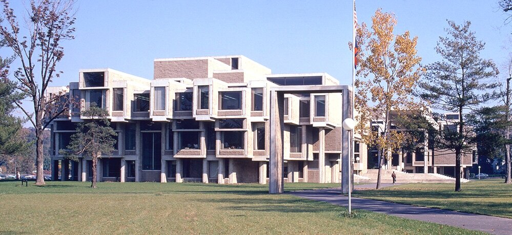
In the middle-1960’s, Paul Rudolph started upon one of his most compositionally and spatially rich government buildings—a civic brother to his Yale Art & Architecture Building. The structure—or rather, compound of structures—that he built in Goshen embraced a complex program to answer the civic needs of the region’s citizens: one could do anything there from getting a marriage license to being tried for serious crimes.
Paul Rudolph’s Orange County Government Center in Goshen, NYC—as seen before it was demolished and/or altered to the point where Rudolph’s design has been all-but-erased.
For this project, Rudolph used a variety of drawings to explore the design and convey his intent.
Did he use perspectives? Certainly—and here’s his perspective drawing for the exterior:
Paul Rudolph’s perspective rendering of the Orange County Government Center. © The Estate of Paul Rudolph, The Paul Rudolph Heritage Foundation.
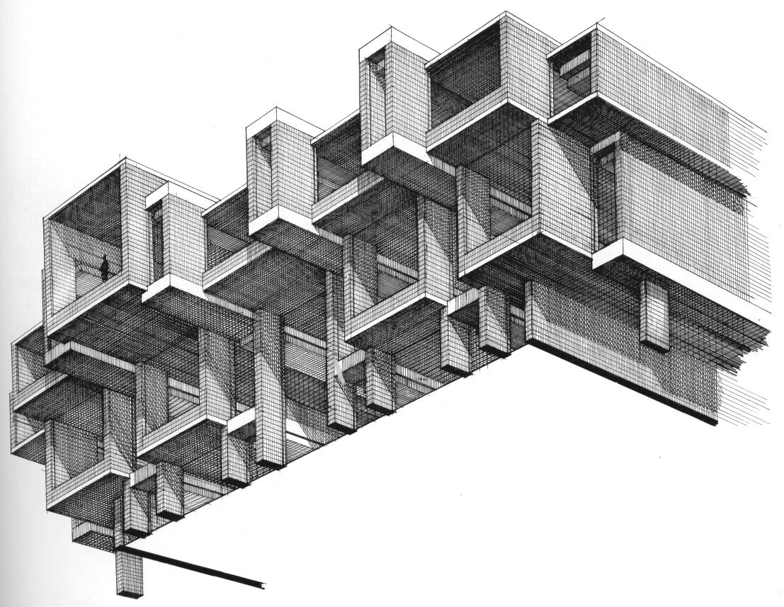
Did he use any isometric drawings? Yes—and here’s his study of projecting and receding masses and window openings—a tour de force of levitating masonry.
An isometric drawing, by Rudolph, looking up at a portion of the Orange County Government Center building. © The Estate of Paul Rudolph, The Paul Rudolph Heritage Foundation.
But when it came to the roof—a complex landscape of rising, overlapping, and interpenetrating rectilinear masses (in a plenitude of sizes)—he used an axonometric view:
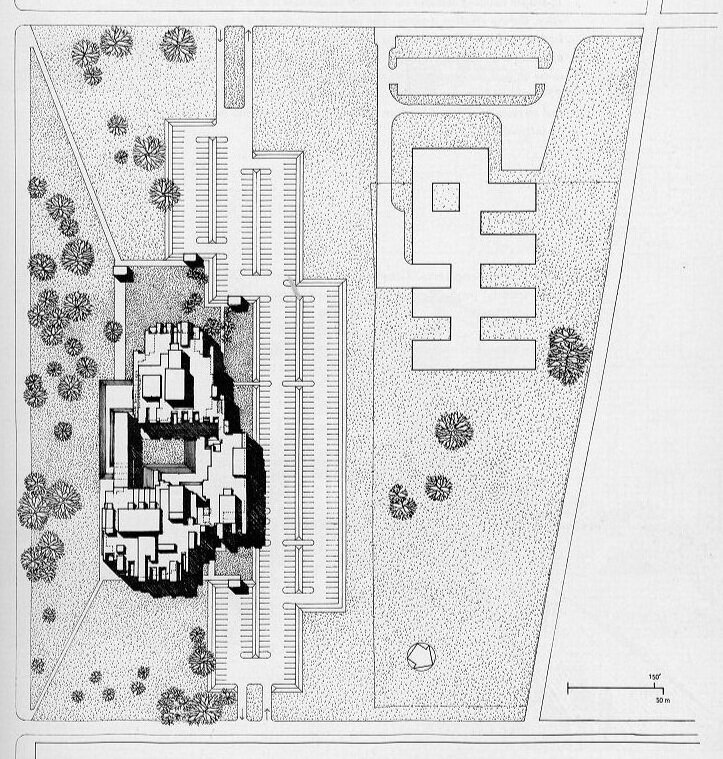
Paul Rudolph’s drawing of the roofscape and masses of Orange County Government Center. The three main masses of the building—left, top, and right right—surround a courtyard. Rendered as an axonometric, probably no other drawing technique would have as clearly conveyed the overall conception of the building’s massing, as well as the complexity of its composition. Rudolph, aware that dignity is as important as basic function (especially in civic buildings), created a modern version of a stately entry: there is an elongated plane, set high, spanning across the southern side of the courtyard (shown at the bottom-center of this drawing)—and that created a space-defining gateway to the complex. © The Estate of Paul Rudolph, The Paul Rudolph Heritage Foundation.
Paul Rudolph’s site plan for the Orange County Government Center. Something of the richness of the design is communicated by his using an axonometric view (conveyed by the shadows) to render the variety of masses from which the building is composed. N.B.: in this drawing, the body of the building has been turned 90 degrees, clockwise, from the view above. © The Estate of Paul Rudolph, The Paul Rudolph Heritage Foundation.
AXONOMETRICS FOR RUDOLPH?—iT’S A mATTER OF PRACTICALITY
Rudolph is sometimes characterized as the very embodiment of the heroically individualist genius architect. There’s a lot of truth in that—with consequences, good and bad. One of the negatives is that one can then get tagged as being impractical or hard to work with.
Paul Rudolph shows that this is not necessarily the case: he had a 50-year career, with over 300 commissions—and some clients report on what a pleasure it was to work with him (and some became repeat clients—the ultimate accolade in client relations.) Moreover, Rudolph got things built—all over the country, internationally, doing numerous types and sizes of building, and at every budget level—so he had a track record of being practical.
Architectural drawings—though they are artistic creations—are equally tools: the means by which an architect conveys his ideas to clients and builders. Edwin Lutyens, speaking of construction drawings, likened them to writing a letter, telling the builder what to do. Drawings must communicate with clarity, whether it be the specifics of a construction detail, a building’s overall composition, or even the flavor of a design. Rudolph most often chose perspective drawings as the most effective way to communicate his intentions—but as a practical architect, he knew there were other techniques which could be more effective in specific situations. Rudolph mastered those techniques and used them too—and as a result we have some fascinating axonometric drawings from him.




![Two approaches to drawing a rectilinear volume (which could be a brick, a building, a part of a building, or a room…):The isometric Drawing, at the far-Left, distorts the top and bottom [plan] surface, and all the other planes too—making them into d…](https://images.squarespace-cdn.com/content/v1/5a75ee0949fc2bc37b3ffb97/1569611468636-M4EYPT5S2Q16MOXPGFUD/axonomtric%2Bdiagram-two%2Bangles.jpg)

